Managing oncology services requires precision, speed, and clarity. Healthcare leaders must track cancer types, treatments, doctors, revenues, and patient trends—all at the same time. However, when this critical information sits in scattered Excel files, decision-making becomes slow and unclear.
That is exactly why an Oncology Services Dashboard in Excel plays a vital role in modern healthcare analytics.
In this detailed, SEO-friendly guide, you will clearly understand what an Oncology Services Dashboard in Excel is, how it works, how each dashboard page helps decision-makers, and why this ready-to-use solution simplifies oncology performance monitoring. Moreover, you will explore its advantages, best practices, use cases, and frequently asked questions—all explained in simple, practical language.
Click to Purchases Oncology Services Dashboard in Excel
What Is an Oncology Services Dashboard in Excel?
An Oncology Services Dashboard in Excel is an interactive and ready-to-use analytics solution designed to track, analyze, and visualize oncology-related operational and financial data in one centralized view.
Instead of manually reviewing multiple spreadsheets, healthcare administrators, finance teams, and clinical managers can instantly monitor:
-
Cancer-wise revenue trends
-
Treatment performance
-
Doctor-wise charges and revenue
-
Monthly financial outcomes
-
Insurance and surgery indicators
Because Excel remains widely used in healthcare organizations, this dashboard fits seamlessly into existing reporting workflows.
Why Do Healthcare Organizations Need an Oncology Services Dashboard?
Oncology departments face complex challenges every day. Therefore, leaders need accurate and timely insights to support both clinical and financial decisions.
Common Challenges Without a Centralized Dashboard
-
Data scattered across departments
-
Delayed financial reporting
-
Limited visibility into treatment-wise revenue
-
Difficulty comparing doctors or cancer types
-
Time-consuming manual analysis
However, an Oncology Services Dashboard in Excel eliminates these issues by providing a single source of truth.
What Makes This Oncology Services Dashboard in Excel Unique?
This dashboard is not just another spreadsheet. Instead, it works as a complete analytics system designed specifically for oncology services.
Key Design Highlights
-
✅ Ready-to-use Excel file
-
✅ No complex setup required
-
✅ Interactive slicers for dynamic filtering
-
✅ Clean and professional visual layout
-
✅ Page-based navigation for user convenience
What Are the Key Features of the Oncology Services Dashboard in Excel?
Let us now explore the features that make this dashboard powerful and easy to use.
✅ Page Navigator for Easy Navigation
The Page Navigator, located on the left side, allows users to move smoothly between different dashboard pages. As a result, users can quickly switch analysis views without confusion.
How Does the Overview Page Help in Oncology Performance Monitoring?
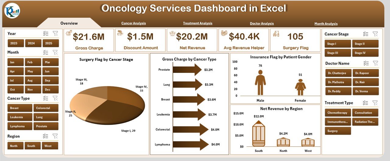
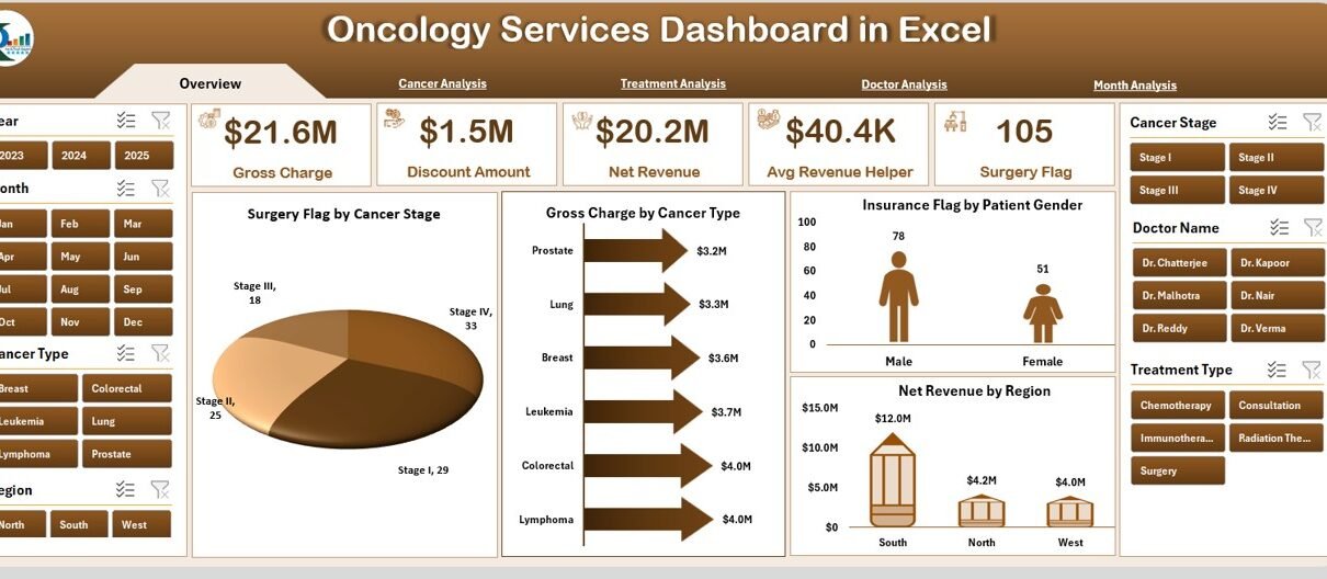
The Overview Page serves as the starting point of the Oncology Services Dashboard in Excel. It provides a high-level snapshot of oncology operations and revenue.
Overview Page Components
🔹 Interactive Slicer
-
Located on the right side
-
Enables quick filtering of data
🔹 KPI Cards
Five summary cards highlight key metrics at a glance. These cards allow decision-makers to instantly understand performance indicators.
🔹 Charts on the Overview Page
Click to Purchases Oncology Services Dashboard in Excel
-
Surgery Flag by Cancer Stage
Helps analyze how surgical interventions vary across cancer stages. -
Gross Charge by Cancer Type
Displays revenue billed for each cancer type. -
Insurance Flag by Patient Gender
Shows insurance coverage patterns across male and female patients. -
Net Revenue by Region
Reveals geographic revenue distribution for oncology services.
Together, these visuals deliver immediate and actionable insights.
How Does the Cancer Analysis Page Support Better Decisions?
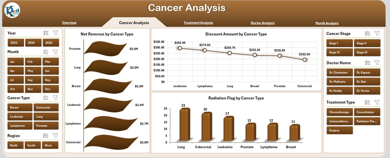
The Cancer Analysis Page focuses entirely on cancer-type-specific performance. Because oncology departments treat diverse cancer cases, this page helps understand revenue and discount behavior per cancer type.
Key Insights from Cancer Analysis
📊 Charts Included
-
Net Revenue by Cancer Type
Highlights which cancer treatments generate higher revenue. -
Discount Amount by Cancer Type
Identifies cancer types with higher discount levels. -
Radiation Flag by Cancer Type
Shows radiation therapy distribution across cancer categories.
This information helps administrators balance treatment costs and financial outcomes.
Why Is Treatment Analysis Critical in Oncology Dashboards?
Treatment planning and execution directly affect both patient outcomes and hospital revenue. Therefore, the Treatment Analysis Page plays a critical role.
Treatment Analysis Page Features
🔹 Right-Side Slicer
Supports instant filtering by relevant treatment dimensions.
🔹 Key Charts
-
Gross Charge by Treatment Type
Shows billed charges for different treatments. -
Net Revenue by Treatment Type
Displays the actual revenue after adjustments. -
Average Revenue Helper by Treatment Type
Helps compare average revenue across treatment options.
These insights assist in evaluating treatment profitability and operational efficiency.
How Does the Doctor Analysis Page Improve Performance Transparency?
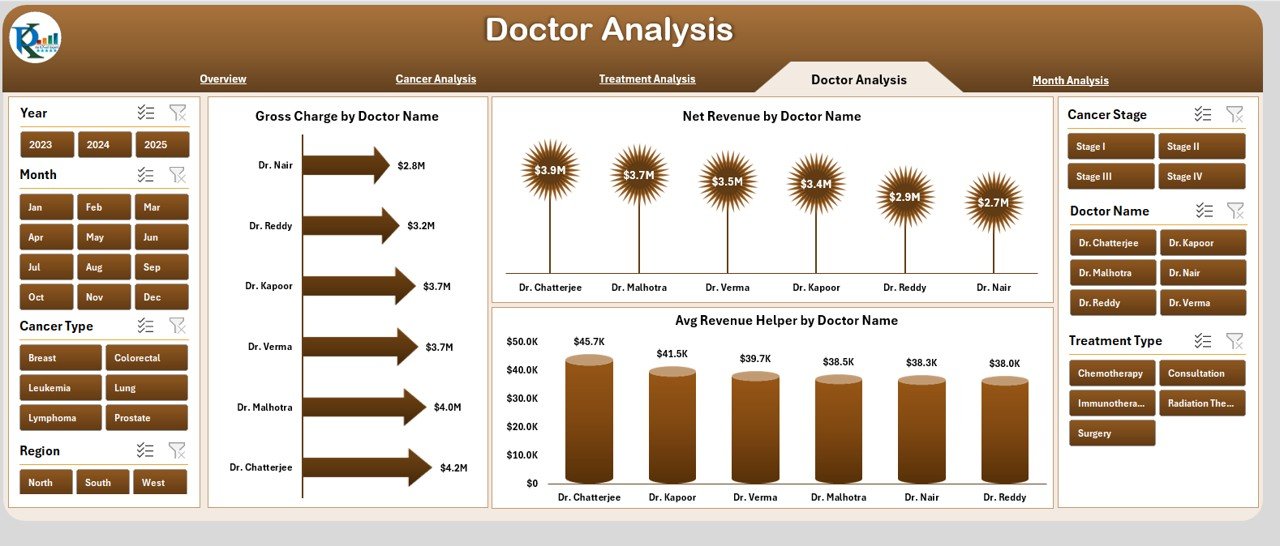
Doctors represent the backbone of oncology services. Hence, fair and data-driven performance evaluation becomes essential.
Doctor Analysis Page Breakdown
📈 Charts Included
-
Gross Charge by Doctor
Highlights billed revenue generated by each doctor. -
Net Revenue by Doctor
Shows actual realized revenue per physician. -
Average Revenue Helper by Doctor
Helps compare efficiency and outcomes among doctors.
This page supports performance reviews, capacity planning, and strategic staffing decisions.
What Insights Can You Derive from the Month Analysis Page?
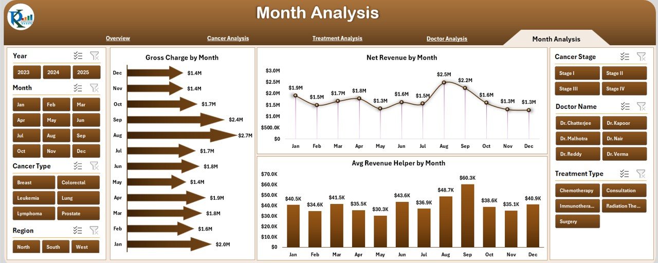
Trends change over time. Therefore, the Month Analysis Page helps users understand monthly fluctuations.
Month Analysis Page Highlights
📊 Charts Included
-
Gross Charge by Month
Displays billing trends across months. -
Net Revenue by Month
Shows actual revenue performance over time. -
Average Revenue Helper by Month
Supports trend comparison and seasonal analysis.
Using this data, hospitals can identify growth periods, slow months, and improvement opportunities.
What Is the Role of Data and Support Sheets?
Behind every dashboard sits a strong data structure.
📁 Data Sheet
-
Stores all raw oncology-related data
-
Acts as the backbone of dashboard calculations
-
Supports pivot tables and charts
📁 Support Sheet
-
Contains helper calculations
-
Stores lookup values and backend logic
-
Improves dashboard performance and accuracy
Together, these sheets ensure reliability and scalability.
Advantages of Oncology Services Dashboard in Excel
Click to Purchases Oncology Services Dashboard in Excel
Using an Oncology Services Dashboard in Excel brings multiple advantages to healthcare organizations.
✅ Advantages
-
📊 Centralized oncology performance tracking
-
⏱ Faster and data-driven decision-making
-
💰 Clear visibility of revenue and discounts
-
👨⚕️ Doctor-wise performance transparency
-
🧩 Easy customization without coding
-
📅 Monthly and treatment-wise trend analysis
-
🔍 Improved strategic planning and forecasting
Who Can Benefit from an Oncology Services Dashboard in Excel?
This dashboard supports multiple stakeholders within a healthcare ecosystem.
🎯 Key Beneficiaries
-
Oncology department heads
-
Hospital administrators
-
Healthcare finance teams
-
Medical directors
-
Operational managers
-
Data analysts in healthcare
Each role gains tailored insights from the same dashboard.
Best Practices for the Oncology Services Dashboard in Excel
To maximize value, organizations should follow best practices.
✅ Best Practices (Bullet Points)
-
📌 Maintain clean and structured data
-
📌 Update data regularly
-
📌 Use consistent naming for cancer and treatment types
-
📌 Limit unnecessary manual edits
-
📌 Track KPIs that align with oncology goals
-
📌 Review dashboard insights monthly
-
📌 Train users on slicers and navigation
Following these practices ensures long-term dashboard success.
How Can You Customize the Oncology Dashboard Further?
One of Excel’s biggest strengths lies in flexibility.
Customization Ideas
-
Add patient count metrics
-
Include average treatment duration
-
Add doctor specialty filters
-
Incorporate outcome indicators
-
Expand regional analysis
Because the dashboard uses Excel, customization remains straightforward.
Conclusion: Why Should You Use an Oncology Services Dashboard in Excel?
In today’s healthcare environment, relying on static reports limits growth and clarity. An Oncology Services Dashboard in Excel transforms raw data into actionable insights, enabling faster decisions and better oncology management.
By combining financial metrics, cancer analysis, treatment performance, doctor evaluation, and monthly trends, this dashboard provides a complete picture of oncology services—without complexity.
Ultimately, this ready-to-use Excel dashboard helps healthcare organizations focus less on reporting and more on delivering better care.
Frequently Asked Questions (FAQs)
Click to Purchases Oncology Services Dashboard in Excel
What is an Oncology Services Dashboard in Excel used for?
An Oncology Services Dashboard in Excel helps track cancer-wise revenue, treatment performance, doctor analysis, and monthly trends in one interactive file.
Can non-technical users operate this dashboard?
Yes, the dashboard uses Excel-based slicers and charts, making it easy for non-technical users to operate.
Does this dashboard require advanced Excel skills?
No, users need only basic Excel knowledge to filter and analyze data.
Can hospitals customize this dashboard?
Yes, organizations can easily customize charts, KPIs, and data fields based on their requirements.
Is this dashboard suitable for small oncology clinics?
Yes, both small clinics and large hospitals can use this dashboard effectively.
How often should data be updated?
Organizations should update the data monthly or weekly to maintain accurate insights.
Does the dashboard support historical analysis?
Yes, the Month Analysis page helps track historical revenue and trend patterns.
Can this dashboard replace manual oncology reports?
Yes, it significantly reduces the need for manual Excel reporting while improving accuracy and speed.
Visit our YouTube channel to learn step-by-step video tutorials