Every modern workplace depends on a smooth IT support process. Employees need quick solutions, fast response times, and complete visibility into ticket progress. When teams grow and technology expands, IT issues increase fast. Because of this, managers need a simple way to track performance, measure workload, review ticket trends, and control operational cost.
An Office IT Helpdesk Dashboard in Excel offers all the insights in one place. It brings clarity, improves decisions, and reduces the time spent on manual reporting. In this detailed article, you will learn what this dashboard does, why every IT team needs it, how each sheet works, and how you can use it to improve service quality.
You will also find advantages, best practices, and common FAQs at the end.
Click to buy Office IT Helpdesk Dashboard in Excel
What Is an Office IT Helpdesk Dashboard in Excel?
An Office IT Helpdesk Dashboard in Excel is a ready-to-use analytical tool that converts raw helpdesk data into clear visuals, KPIs, and trends. IT teams track tickets, cost, response time, pending work, and performance across departments, locations, and request channels.
The dashboard updates automatically when you refresh the data. You only select a month or enter new numbers, and all KPIs, charts, and comparisons change instantly. So instead of reviewing long spreadsheets, you get a clean and simple view of the entire helpdesk operation.
Because Excel offers formulas, pivot tables, conditional formatting, and slicers, this dashboard becomes powerful, fast, and reliable—without any coding or expensive software.
Why Do You Need an IT Helpdesk Dashboard?
IT teams handle many challenges daily:
- High ticket load
- Slow response times
- Delayed closures
- Repeated issues
- High service cost
- Workload imbalance
Without a dashboard, managers struggle to track these issues. Reports take time. Data stays scattered across multiple files. Trends stay hidden. Decision-making becomes slow.
An IT Helpdesk Dashboard solves these problems by offering:
One view for all KPIs
Automated monthly comparison
Quick problem identification
Instant insights for leadership
Therefore, the dashboard becomes a must-have tool for IT managers who want real visibility and controlled operations.
How Does the Office IT Helpdesk Dashboard Work?
This dashboard contains multiple sheets, each designed for a specific type of analysis. You get a full 360-degree view of what happens inside your helpdesk—from ticket creation to closure.
Below is a complete explanation of each section you mentioned.
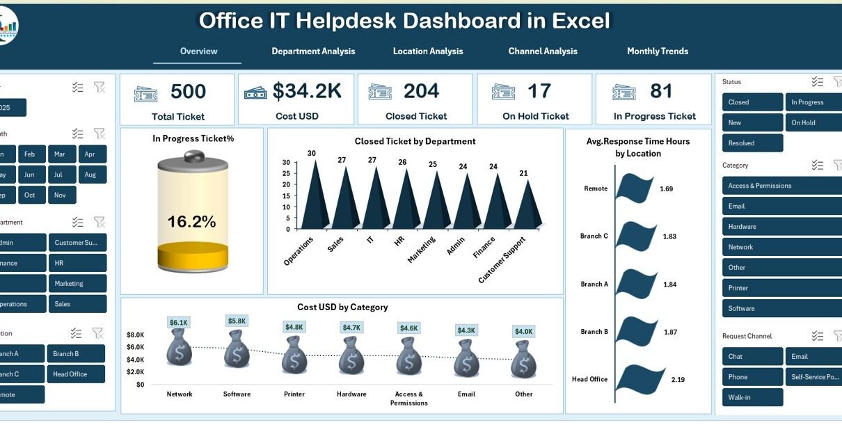
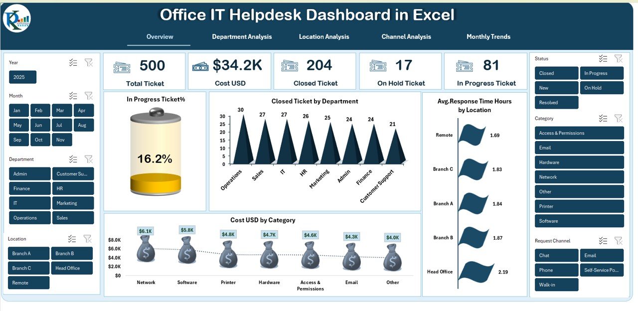
Overview Sheet – The Main Performance Hub
The Overview Page gives a quick snapshot of all critical helpdesk metrics. Managers use this page for daily monitoring and monthly reviews. It includes:
Total Tickets
Shows the complete count of all tickets logged for the selected period.
Cost (USD)
Displays total service cost—includes resource cost, incident cost, vendor cost, or category cost.
Closed Tickets
Tracks how many issues reached full resolution.
On-Hold Tickets
Shows tickets waiting for approval, information, vendor response, or dependency resolution.
In-Progress Tickets
Displays tickets currently handled by IT engineers.
In-Progress Ticket %
Helps managers see how much work remains open compared to total load.
Charts in the Overview Page
The dashboard also includes meaningful visuals:
Closed Tickets by Department
Reveals which department raises more issues and which one gets quicker closures.
Cost USD by Category
Shows which ticket categories consume the most budget—hardware, software, network, or security.
Avg. Response Time Hours by Location
Helps discover locations that take more time to respond, so managers act immediately.
All these charts update automatically and make reporting smooth and fast.
Click to buy Office IT Helpdesk Dashboard in Excel
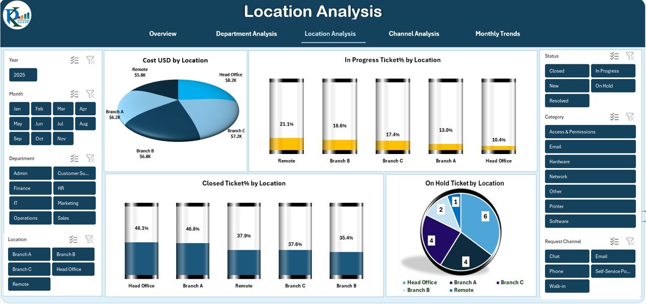
Location Analysis – How Each Branch Performs
Different offices produce different workloads. The Location Analysis sheet shows:
Cost USD by Location
Managers compare IT cost across multiple branches or regions.
In-Progress Ticket % by Location
Shows which location needs more resources or better coordination.
Closed Ticket % by Location
Indicates overall service performance at each branch.
On-Hold Ticket by Location
Helps identify bottlenecks, delays, or vendor dependencies.
This sheet supports decisions related to staffing, budgeting, and priority setting.
Click to buy Office IT Helpdesk Dashboard in Excel
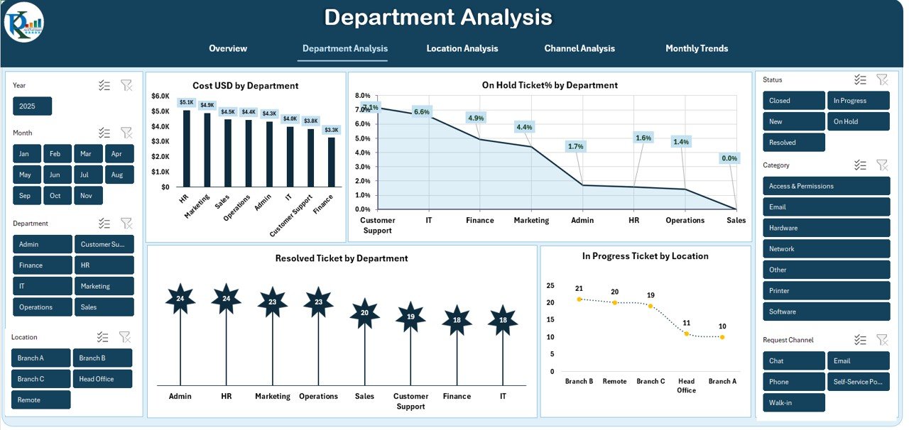
Department Analysis – Understand Internal Workload Distribution
Every department creates a different volume of IT issues. The Department Analysis page shows:
Cost USD by Department
Reveals which department consumes the highest budget.
On-Hold Ticket % by Department
Helps identify operational gaps or repeated delays.
Resolved Ticket by Department
Shows the efficiency of helpdesk support for each team.
Click to buy Office IT Helpdesk Dashboard in Excel
In-Progress Ticket by Location (Linked View)
Gives deeper context by linking department performance with location workload.
This page helps balance resources, improve response times, and optimize departmental support.
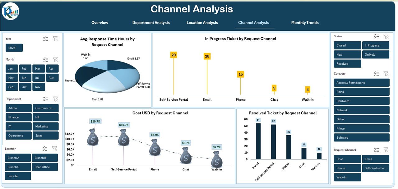
Channel Analysis – Which Request Channel Performs Better?
Employees raise tickets through different channels such as email, portal, phone, or chat. The Channel Analysis page shows:
Avg. Response Time (Hours) by Request Channel
Helps identify which channel needs improvement.
In-Progress Ticket by Request Channel
Shows how efficiently tickets move across channels.
Cost USD by Request Channel
Indicates which channel is cost-effective.
Resolved Ticket by Request Channel
Shows channel success rate and customer satisfaction patterns.
This analysis helps improve the ticketing experience and reduce service friction.
Click to buy Office IT Helpdesk Dashboard in Excel
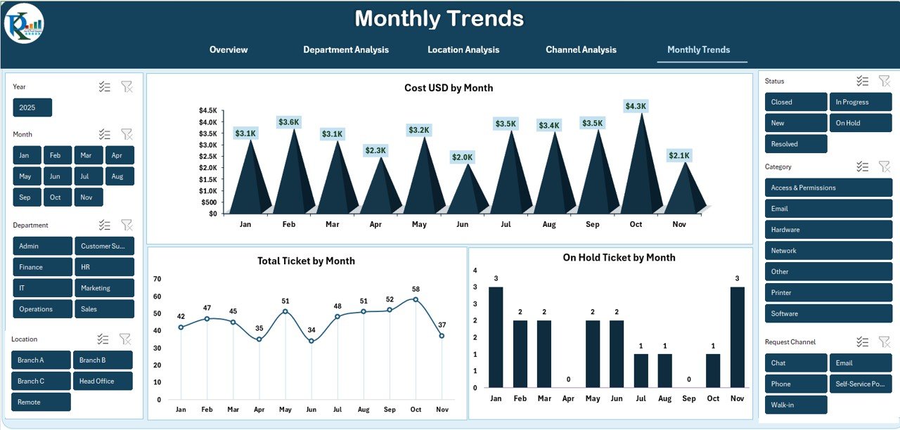
Monthly Trends – Track Performance Over Time
Trends show hidden patterns. The Monthly Trends sheet includes:
Cost USD by Month
Helps track seasonal cost variations and budget impact.
Total Ticket by Month
Shows months with the highest incidents.
On-Hold Ticket by Month
Indicates delays and operational backlogs.
Trend analysis helps leadership see progress fast and identify long-term patterns clearly.
Click to buy Office IT Helpdesk Dashboard in Excel
Advantages of an Office IT Helpdesk Dashboard in Excel
A dedicated section like this improves SEO and adds instant value for readers.
- Clarity in Daily IT Performance
The dashboard shows all KPIs in one place. Managers no longer search through multiple reports.
- Easy Tracking of Ticket Status
Teams track open, closed, and delayed tickets instantly.
- Better Control of IT Cost
Charts highlight high-cost categories and locations, so managers plan budgets smartly.
- Faster Decision-Making
Clear visuals help leadership understand trends without reading complex data.
- Improved Employee Satisfaction
When response time improves, employees face fewer delays in their work.
- Stronger Accountability
The dashboard shows performance by department, location, and channel, creating transparency.
- No Expensive Software Needed
Everything works inside Microsoft Excel, so small and medium companies save money.
- Easy Monthly Review
Managers compare MTD vs YTD numbers with a single click.
Opportunities for Improvement in Helpdesk Operations
Although dashboards improve visibility, teams can enhance performance even more.
Reduce Dependency Delays
Many tickets stay on hold due to missing information or approval delays.
Improve Response Time
Teams can train support engineers to reduce response gaps.
Balance Ticket Load
Workload stays uneven sometimes. The dashboard highlights this problem early.
Strengthen Ticket Categorization
Clear categories help reduce confusion and speed up ticket routing.
Increase Closure Accuracy
Teams should focus on solving root causes, not just closing tickets.
Best Practices for the Office IT Helpdesk Dashboard
To use the dashboard effectively, follow the steps below.
- Refresh your data regularly
Daily or weekly refresh helps maintain accurate insights.
- Use clean and structured data
Correct ticket numbers, dates, and categories improve analysis quality.
- Review the Overview page every day
This helps managers identify urgent issues early.
- Compare departments and locations weekly
This reveals patterns that affect cost and resolution time.
- Track monthly trends for strategic planning
Seasonal analysis helps IT teams plan resources better.
- Take action based on insights
Charts only show data. Improvements happen when managers take action.
- Train support teams using dashboard insights
Use real data to improve response skills and SLA adherence.
How to Use This Dashboard for Better IT Management
You can use this dashboard for:
- SLA monitoring
- Workload planning
- Budgeting
- Vendor evaluation
- Team performance review
- Monthly reporting
- Ticket trend analysis
- Process improvement
Because Excel is flexible, you can extend the dashboard anytime. Add new KPIs, new locations, or extra departments without major changes.
Conclusion
The Office IT Helpdesk Dashboard in Excel gives you complete control over your IT support process. You track tickets, monitor delays, measure cost, compare departments, and evaluate response time in a single file. Since the dashboard updates instantly, you save countless hours each month.
When you use the insights well, you improve service quality, reduce cost, and offer a better experience to every employee. So this dashboard becomes an essential tool for every IT manager who wants a smoother, more transparent, and more efficient helpdesk operation.
Frequently Asked Questions (FAQs)
- What is an Office IT Helpdesk Dashboard in Excel?
It is a ready-to-use Excel dashboard that tracks IT tickets, cost, response time, and performance metrics using dynamic charts and KPIs.
- Who can use this dashboard?
IT managers, analysts, team leaders, support engineers, and operations heads can use it daily for performance monitoring.
- Do I need advanced Excel skills to use it?
No. You only select a month or refresh the data. The dashboard updates automatically.
- Can small companies use this dashboard?
Yes. It is perfect for small, medium, and large organizations because it needs no expensive tools.
- Can I add more KPIs or charts?
Yes. Excel allows full customization. You can add new sheets, KPIs, or visuals any time.
- Does this dashboard support monthly analysis?
Yes. The Monthly Trends sheet shows cost, ticket volume, and on-hold patterns clearly.
- Why is channel analysis important?
Because it helps managers understand which channels offer better response and resolution time.
- Can I use this dashboard for SLA tracking?
Yes. You can monitor response time, resolution time, and pending ticket patterns easily.
Visit our YouTube channel to learn step-by-step video tutorials
Watch the step-by-step video tutorial:
Click to buy Office IT Helpdesk Dashboard in Excel