Sewage treatment plants run complex operations every day. They handle huge volumes of wastewater, comply with environmental rules, and maintain high treatment quality. Because of this, plant managers track many KPIs to keep everything efficient, safe, and cost-effective. However, manual reporting slows the team, leads to errors, and delays decision-making. A Sewage Treatment KPI Dashboard in Excel solves these issues. It turns raw treatment data into clean visuals and real insights.
In this detailed guide, you will learn everything about this dashboard. You will also understand how each worksheet works, how KPIs refresh instantly, and how teams use this tool to improve performance. Moreover, you will also explore the advantages, best practices, and answers to commonly asked questions.
Click to buy Sewage Treatment KPI Dashboard in Excel
What Is a Sewage Treatment KPI Dashboard in Excel?
A Sewage Treatment KPI Dashboard in Excel helps treatment plants track their essential KPIs in a structured and visual format. It brings all operational, environmental, and performance metrics into one place. You choose a month from a dropdown, and the entire dashboard refreshes instantly. Because of this simple design, users save hours every month and gain full clarity on plant performance.
The dashboard focuses on MTD (Month-to-Date) and YTD (Year-to-Date) metrics. You also compare Actual vs Target and Actual vs Previous Year. As a result, managers take faster decisions and improve compliance and efficiency.
This article explains every sheet, shows how the dashboard works, and highlights all benefits for sewage treatment operations.
How Does the Sewage Treatment KPI Dashboard Work?
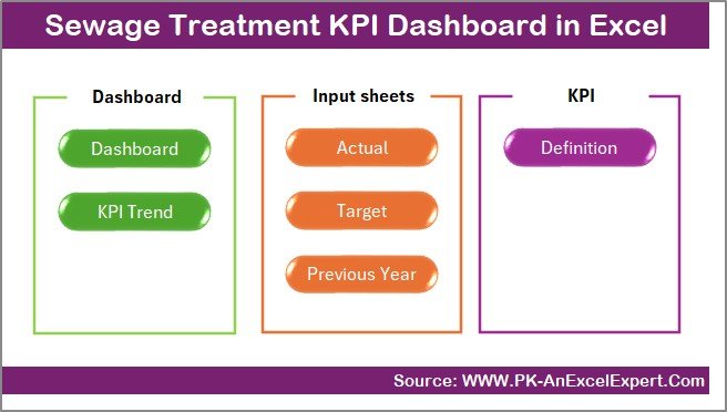
The dashboard contains 7 important worksheets, and each one plays a special role. Although the dashboard looks simple on the surface, every sheet supports quick reporting and smooth automation.
Let us understand each sheet in detail.
Summary Page – Your Navigation Control Center
The Summary Page acts as the home screen of the dashboard. It contains six buttons that allow you to jump to the Dashboard, Trend, Targets, Actual Numbers, Definitions, and PY sheets. Because of this quick navigation system, you move across worksheets without searching manually. It also gives a clean, professional feel to the Excel file.
When users open the file, they always start from this sheet. It sets the tone for a clear and organized workflow.
Click to buy Sewage Treatment KPI Dashboard in Excel
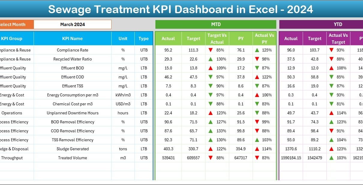
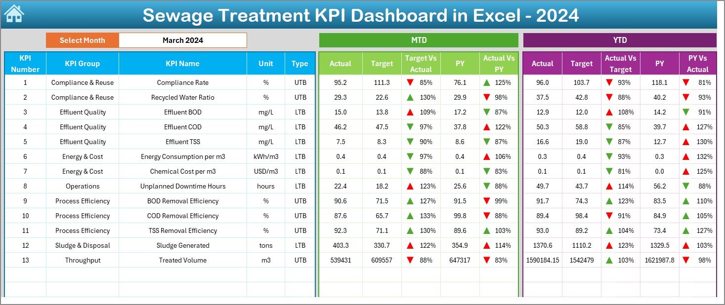
Dashboard Sheet – The Main KPI View
The Dashboard sheet serves as the core of the entire tool. It displays all core KPIs in one place. In cell D3, you select the month from a dropdown, and the entire dashboard updates instantly. This helps teams track performance month by month without any manual effort.
Here, you see two major sections:
MTD (Month-to-Date) Performance
- MTD Actual
- MTD Target
- MTD Previous Year
- Actual vs Target (with up/down arrow formatting)
- Actual vs Previous Year (with arrows)
YTD (Year-to-Date) Performance
- YTD Actual
- YTD Target
- YTD Previous Year
- Actual vs Target comparison
- Actual vs Previous Year comparison
The conditional formatting arrows make interpretation very easy. When values increase or decrease, the arrow changes direction and color. Because of this visual cue, managers identify issues quickly and take action without delay.
Click to buy Sewage Treatment KPI Dashboard in Excel
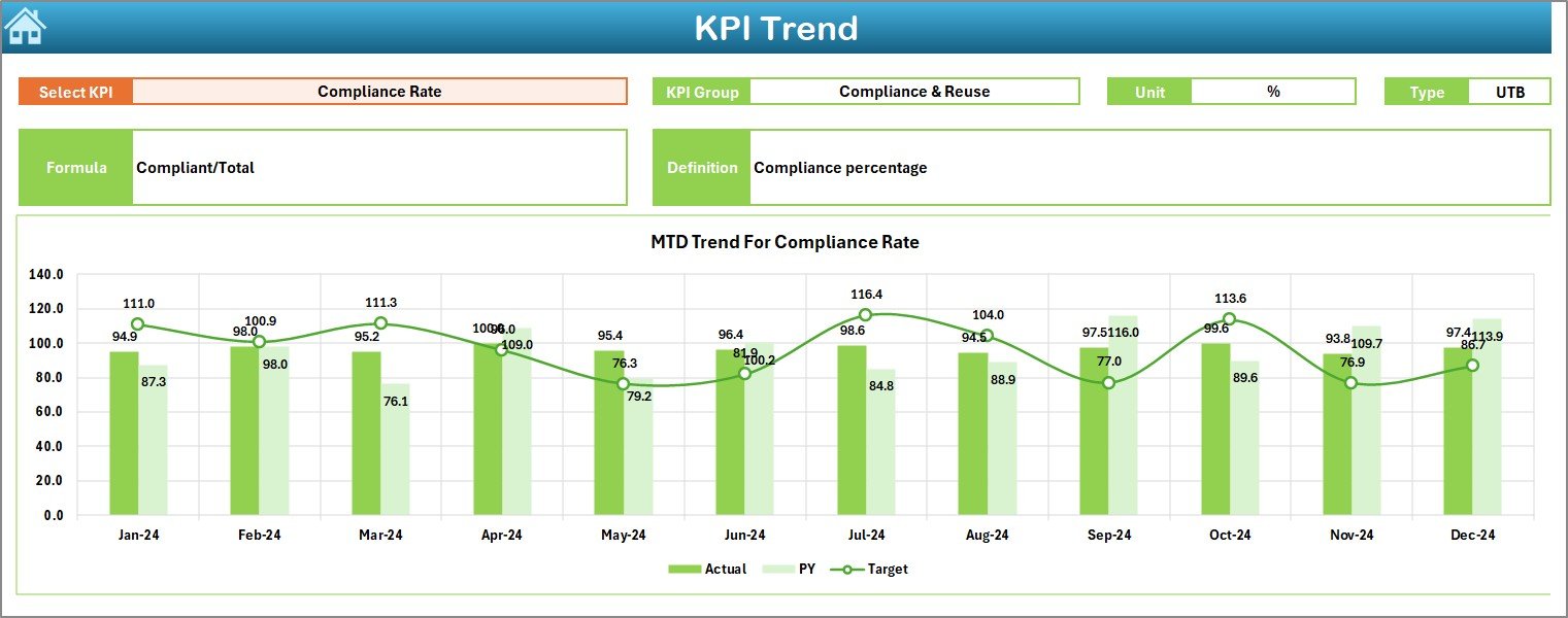
Trend Sheet – View KPI Trends Across the Year
The Trend sheet gives users a deeper understanding of performance patterns. You select a KPI from the dropdown in cell C3. After that, the sheet displays:
- KPI Group
- KPI Unit
- KPI Type (Upper the Better or Lower the Better)
- Formula
- KPI Definition
This sheet also shows MTD and YTD trend charts for Actual, Target, and Previous Year numbers. These charts show how performance moves across months. When trends rise or fall, management teams take proactive decisions to improve treatment quality, reduce deviations, and optimize resources.
Click to buy Sewage Treatment KPI Dashboard in Excel
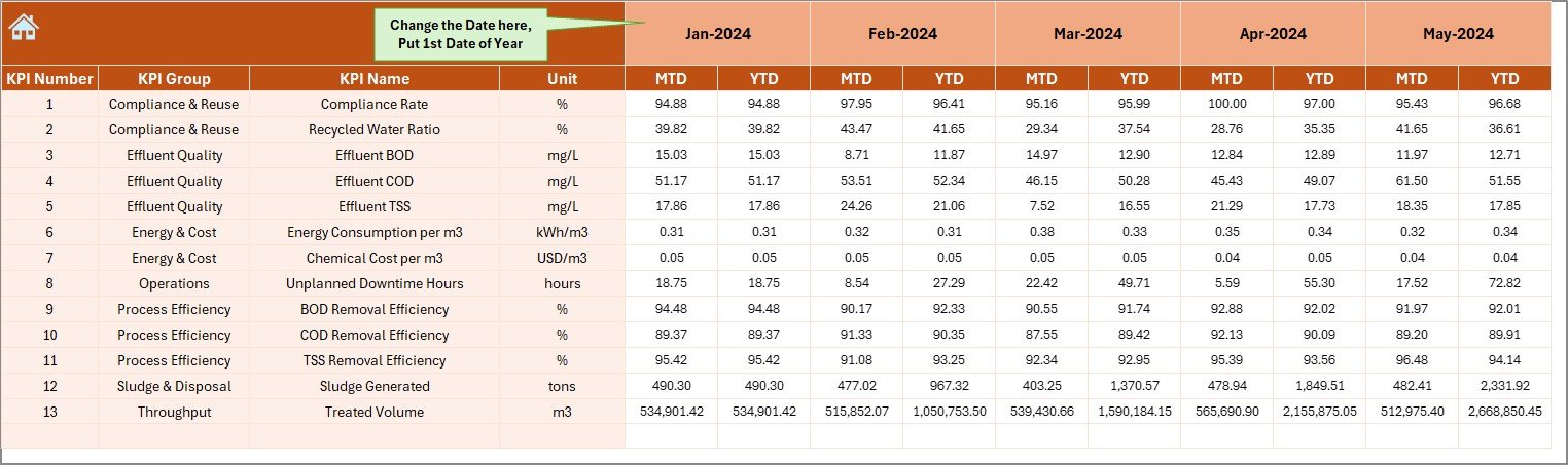
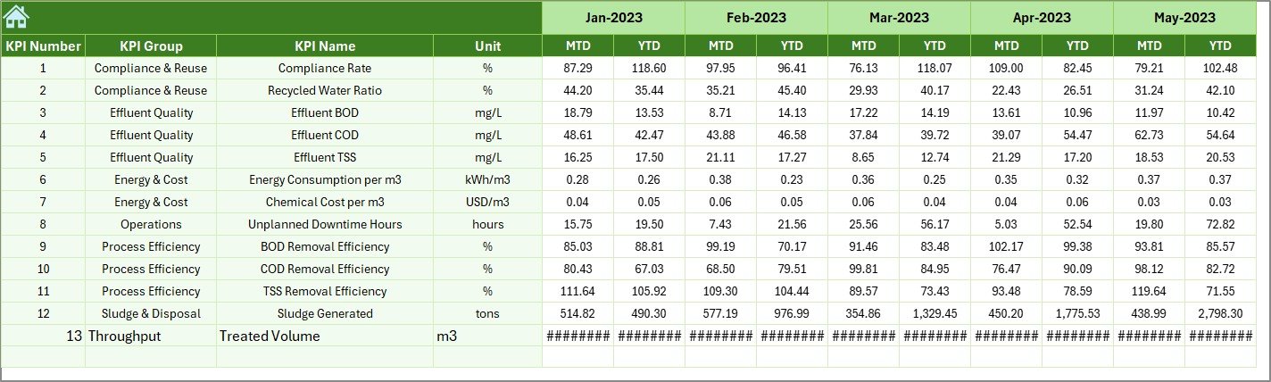
Actual Numbers Input Sheet – Enter MTD and YTD Values
This sheet allows you to enter the actual MTD and YTD values for each KPI. Enter the first month of the year in cell E1. The sheet adjusts the rest of the months automatically. Because of this automation, data entry becomes easier and more accurate.
Teams update this sheet once every month. As soon as numbers change, the dashboard refreshes instantly.
Target Sheet – Enter Monthly KPI Targets
This sheet stores the MTD and YTD Target values for each KPI. Each department enters its target here. Since targets change every month, this sheet allows complete flexibility.
The dashboard reads these values and compares Actual vs Target in both MTD and YTD. As a result, managers understand where performance meets expectations and where improvement is needed.

Click to buy Sewage Treatment KPI Dashboard in Excel
Previous Year Numbers Sheet – Enter PY MTD & YTD Data
This sheet stores the actual values from the previous year. You enter MTD and YTD data the same way you enter current-year numbers. Because the dashboard compares current performance to previous-year results, teams understand progress clearly.
If the plant performs better this year, the dashboard highlights growth. If performance falls, the Trend sheet helps identify the root cause.
KPI Definition Sheet – Maintain KPI Master Dictionary
This sheet lists:
- KPI Name
- KPI Group
- KPI Unit
- KPI Type
- KPI Formula
- KPI Definition
This serves as the reference book for all KPIs. Anyone who opens the dashboard understands exactly what each KPI measures. This improves consistency and eliminates confusion across teams.

Click to buy Sewage Treatment KPI Dashboard in Excel
Why Should Sewage Treatment Plants Use a KPI Dashboard in Excel?
Sewage treatment operations involve many teams, processes, and quality checks. Because of this complexity, managers cannot rely on manual methods. An Excel dashboard offers a clean, structured, and error-free solution.
Here are the key reasons to use it:
- It tracks all KPIs in one place.
- It updates instantly when you change a month.
- It compares Actual vs Target and Previous Year.
- It displays trends clearly.
- It reduces reporting time.
- It improves performance analysis.
As a result, every sewage treatment plant gains more control and clarity.
What KPIs Can You Track in a Sewage Treatment Dashboard?
Although plants may use different KPIs, some of the most common ones include:
- Inflow Water Volume
- Treated Water Output
- BOD Removal Efficiency
- COD Removal Efficiency
- Sludge Production
- Chemical Consumption
- Energy Consumption
- Pump Efficiency
- Turbidity Levels
- Treated Water Quality Index
- Complaint Count
- Plant Downtime
- Equipment Breakdown Count
These KPIs help plant teams monitor performance and improve reliability.
Advantages of a Sewage Treatment KPI Dashboard in Excel
A well-designed KPI dashboard offers many advantages. Let us understand them one by one.
- Saves Reporting Time
Teams spend less time preparing reports and more time solving problems. You update numbers once, and the dashboard updates automatically.
- Improves Data Accuracy
Because the dashboard pulls numbers directly from structured tables, it reduces calculation mistakes. This improves data quality and decision-making.
- Helps Teams Identify Issues Faster
With MTD, YTD, and trend charts in one place, managers quickly notice any changes or deviations. This quick insight helps them take action before problems grow.
- Enhances Regulatory Compliance
Sewage treatment plants follow strict environmental rules. This dashboard helps keep all quality KPIs in check. As a result, compliance becomes easier and more reliable.
- Ensures Smooth Team Collaboration
Each department enters their KPIs in a central file. This brings clarity, transparency, and alignment across the organization.
- Helps Track Year-on-Year Improvement
Previous-year comparisons show whether treatment KPIs improve over time. This helps leadership measure the impact of new strategies and investments.
Best Practices for Using a Sewage Treatment KPI Dashboard in Excel
A dashboard becomes more powerful when users follow best practices. Let us explore them in detail.
Update the Numbers Every Month
Always update MTD and YTD values on time. This keeps the dashboard accurate and useful throughout the year.
Enter Clean and Consistent Data
Use the same units, formats, and rules every month. This avoids errors and ensures the formulas work smoothly.
Use Clear KPI Definitions
Make sure every KPI has a definition and formula. This helps new team members understand the dashboard immediately.
Review Trend Charts Frequently
Trend charts reveal hidden issues that monthly numbers do not show. Review them regularly to ensure plant efficiency stays strong.
Align Targets with Plant Goals
Set targets that support environmental compliance, safety, and cost efficiency. When targets match goals, performance always improves.
Keep the File Organized
Use structured tables, proper formulas, and protected sheets to maintain quality. This keeps the dashboard reliable for the long term.
How This Dashboard Helps Different Teams
A single dashboard supports multiple teams in sewage treatment operations.
Operations Team
They track daily output, inflow, process quality, and downtime.
Maintenance Team
They monitor equipment performance, breakdown count, and preventive maintenance.
Quality Control Team
They track BOD, COD, turbidity, dissolved oxygen, and treated water quality.
Management Team
They review targets, trends, and plant-level performance.
Because every team uses the same dashboard, coordination improves drastically.
Conclusion
A Sewage Treatment KPI Dashboard in Excel gives treatment plants a complete performance management system. It tracks MTD, YTD, Target, and Previous Year numbers. It also presents clear visuals, trend charts, KPI definitions, and monthly summaries. Because of its simple structure, anyone can use it without technical training.
When teams follow best practices, update numbers on time, and review trends regularly, they improve plant efficiency fast. They reduce errors, improve treatment quality, and achieve better compliance.
This dashboard becomes an essential tool for every sewage treatment operation that wants clarity, speed, and smarter decisions.
Frequently Asked Questions (FAQs)
- What is a Sewage Treatment KPI Dashboard in Excel?
It is a ready-to-use Excel tool that tracks treatment plant KPIs with visual charts, MTD/YTD numbers, and comparisons.
- Who can use this dashboard?
Operations teams, maintenance teams, quality departments, and management teams use it effectively.
- Do I need advanced Excel knowledge to use it?
No, the dashboard works with simple dropdowns and structured input sheets.
- Can I customize the KPIs?
Yes, you can edit KPI names, formulas, units, and definitions in the KPI Definition sheet.
- How often should I update the data?
Update MTD and YTD values once every month to keep insights accurate.
- Does the dashboard support trend analysis?
Yes, the Trend sheet shows MTD and YTD trend charts for Actual, Target, and Previous Year values.
- Can I expand this dashboard for additional KPIs?
Yes, you can add new KPIs by extending the tables and updating formulas.
Click to buy Sewage Treatment KPI Dashboard in Excel
Visit our YouTube channel to learn step-by-step video tutorials
Watch the step-by-step video tutorial: