In today’s fast-moving global trade environment, freight forwarding companies must operate with speed, accuracy, and visibility. However, managing shipments, monitoring operational efficiency, meeting service targets, and tracking profitability becomes extremely difficult without a structured performance system. As a result, many logistics teams still depend on manual reports, scattered Excel files, and delayed insights.
That is exactly where a Freight Forwarding KPI Dashboard in Power BI becomes a powerful and practical solution.
This detailed article explains what a Freight Forwarding KPI Dashboard in Power BI is, why logistics companies need it, how it works, its page-wise structure, key features, advantages, best practices, and frequently asked questions. Moreover, the article uses simple language, strong transitions, and real-world explanations to ensure clarity and SEO effectiveness.
Click to Purchases Freight Forwarding KPI Dashboard in Power BI
What Is a Freight Forwarding KPI Dashboard in Power BI?
A Freight Forwarding KPI Dashboard in Power BI is an interactive analytics tool designed to track, measure, and visualize key performance indicators across freight forwarding operations.
Instead of reviewing multiple spreadsheets or static reports, this dashboard consolidates operational, financial, and performance KPIs into one dynamic Power BI report. As a result, logistics managers, operations teams, and leadership gain instant visibility into how the business performs against targets.
Additionally, because the dashboard uses Excel as the data source, it remains easy to maintain, flexible to update, and suitable for companies of all sizes.
Why Do Freight Forwarding Companies Need a KPI Dashboard?
Freight forwarding operations involve tight timelines, complex coordination, and strict service-level commitments. Therefore, companies must track performance continuously instead of reacting after problems occur.
Here is why a KPI dashboard becomes essential:
-
First, freight forwarders manage multiple KPIs across departments, such as operations, finance, and customer service.
-
Second, management teams need Month-to-Date (MTD) and Year-to-Date (YTD) performance insights.
-
Third, comparing current year vs previous year helps identify real growth trends.
-
Finally, visual performance indicators enable faster and more confident decisions.
Because of these reasons, a Freight Forwarding KPI Dashboard in Power BI becomes a strategic necessity rather than a reporting option.
How Does a Freight Forwarding KPI Dashboard in Power BI Work?
The dashboard follows a simple and effective workflow.
First, users enter KPI data into an Excel file.
Next, Power BI connects to this Excel file as a data source.
Then, Power BI processes, models, and visualizes the data dynamically.
Finally, users interact with slicers, tables, cards, and charts to analyze performance.
Because of this design, the dashboard delivers real-time insights without complex system integrations.
What Are the Key Features of the Freight Forwarding KPI Dashboard in Power BI?
This dashboard includes several thoughtfully designed features that support operational clarity and business growth.
Key Highlights
-
Excel-based data input for easy maintenance
-
Interactive Power BI visuals
-
Month and KPI Group slicers
-
MTD and YTD performance tracking
-
Target vs Actual analysis
-
Current Year vs Previous Year comparison
-
Drill-through KPI definitions
Together, these features transform logistics data into meaningful business insights.
Click to Purchases Freight Forwarding KPI Dashboard in Power BI
Page-Wise Structure of the Freight Forwarding KPI Dashboard in Power BI
The dashboard contains three well-structured pages inside the Power BI Desktop file.
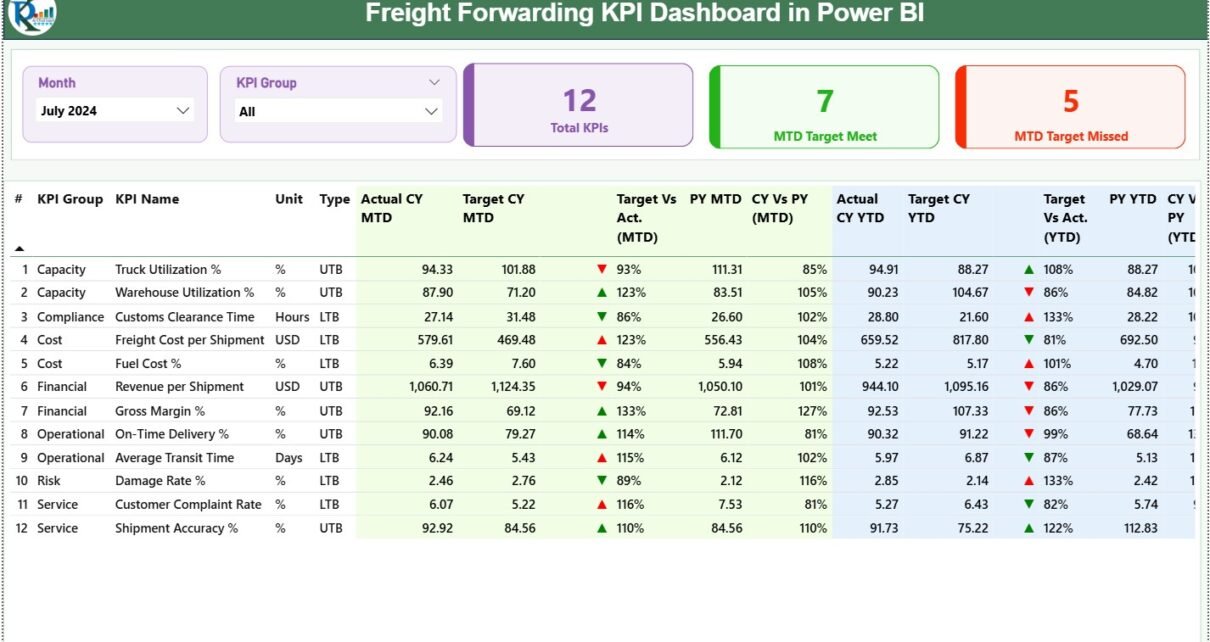
1. What Information Does the Summary Page Provide?
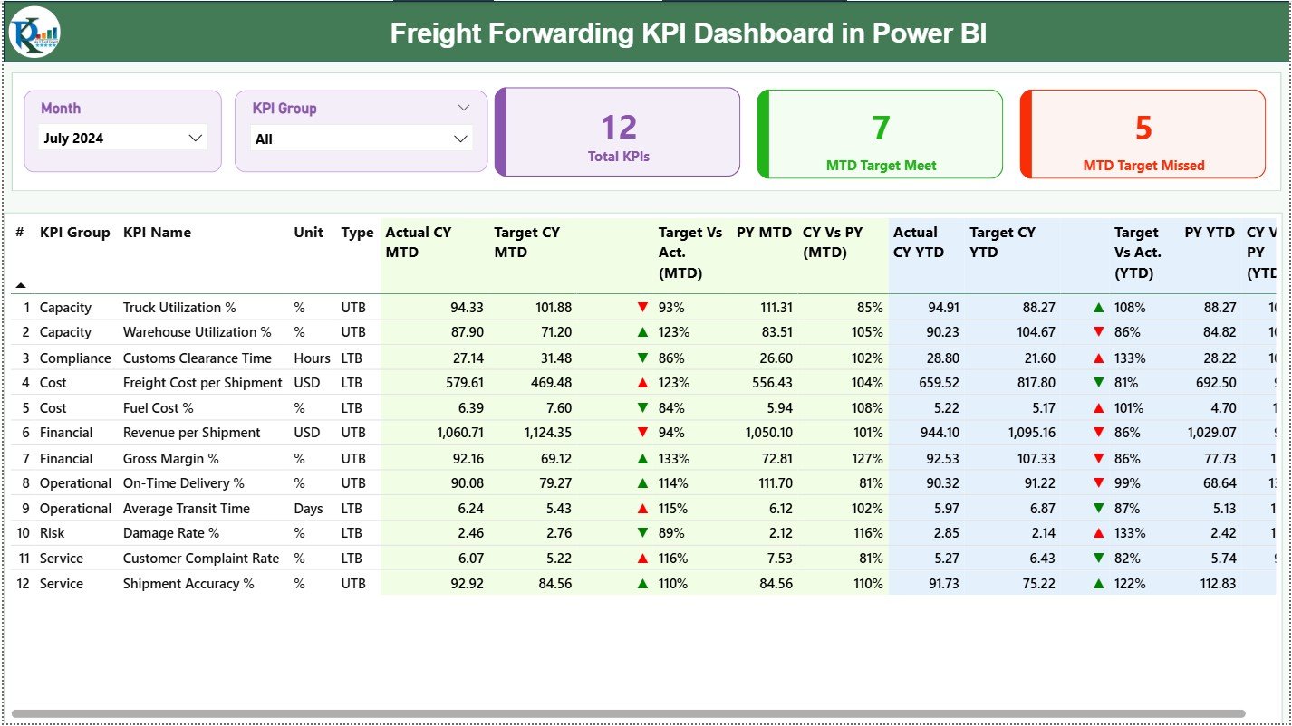
The Summary Page serves as the central monitoring hub for all freight forwarding KPIs.
Interactive Slicers
At the top of the page, two slicers allow users to filter data easily:
-
Month slicer for selecting the reporting period
-
KPI Group slicer for filtering KPI categories
These slicers instantly refresh all visuals on the page.
KPI Cards for Instant Status Check
Below the slicers, three KPI cards provide high-level performance insights:
-
Total KPIs Count
-
MTD Target Met Count
-
MTD Target Missed Count
As a result, managers can immediately understand overall performance health.
Detailed KPI Table Explained
The detailed table delivers a complete KPI breakdown.
KPI Structure Overview
-
KPI Number
Displays the sequence number of each KPI. -
KPI Group
Groups KPIs by category such as Operations, Finance, or Service Quality. -
KPI Name
Shows the specific performance metric being tracked. -
Unit
Defines the unit of measurement, such as %, count, or currency. -
Type (LTB / UTB)
Identifies whether:-
LTB (Lower the Better) applies, or
-
UTB (Upper the Better) applies.
-
MTD Performance Metrics
The dashboard clearly tracks Month-to-Date (MTD) performance.
-
Actual CY MTD – Current Year actual MTD value
-
Target CY MTD – Target MTD value
-
MTD Icon – ▲ or ▼ icon showing target status
-
Target vs Actual (MTD) – Actual ÷ Target
-
PY MTD – Previous Year MTD value
-
CY vs PY (MTD) – Current Year ÷ Previous Year
YTD Performance Metrics
Similarly, the dashboard tracks Year-to-Date (YTD) performance.
-
Actual CY YTD
-
Target CY YTD
-
YTD Icon – Visual target status
-
Target vs Actual (YTD) – Actual ÷ Target
-
PY YTD
-
CY vs PY (YTD) – Current Year ÷ Previous Year
Because of this structure, users gain both short-term and long-term insights.
Click to Purchases Freight Forwarding KPI Dashboard in Power BI
2. How Does the KPI Trend Page Improve Analysis?
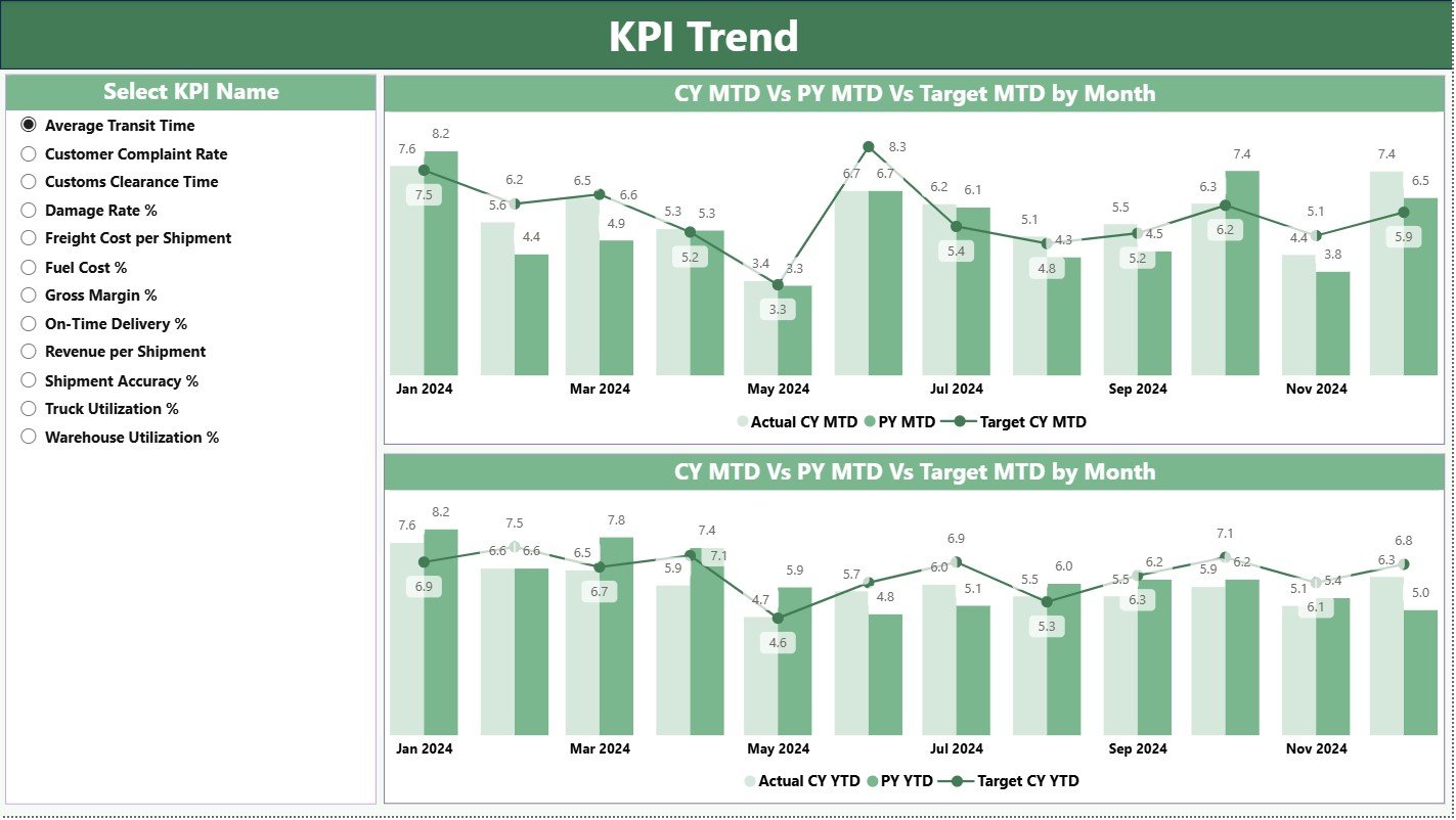
The KPI Trend Page focuses on performance trends over time.
KPI Selection Slicer
A KPI Name slicer on the left allows users to select one KPI at a time. Once selected, all charts update instantly.
Combo Charts for Trend Visualization
This page includes two combo charts:
-
MTD Trend Chart
-
YTD Trend Chart
Each chart displays:
-
Current Year Actual values
-
Previous Year Actual values
-
Target values
Therefore, users can visually compare performance and detect patterns quickly.
3. What Is the Purpose of the KPI Definition Page?
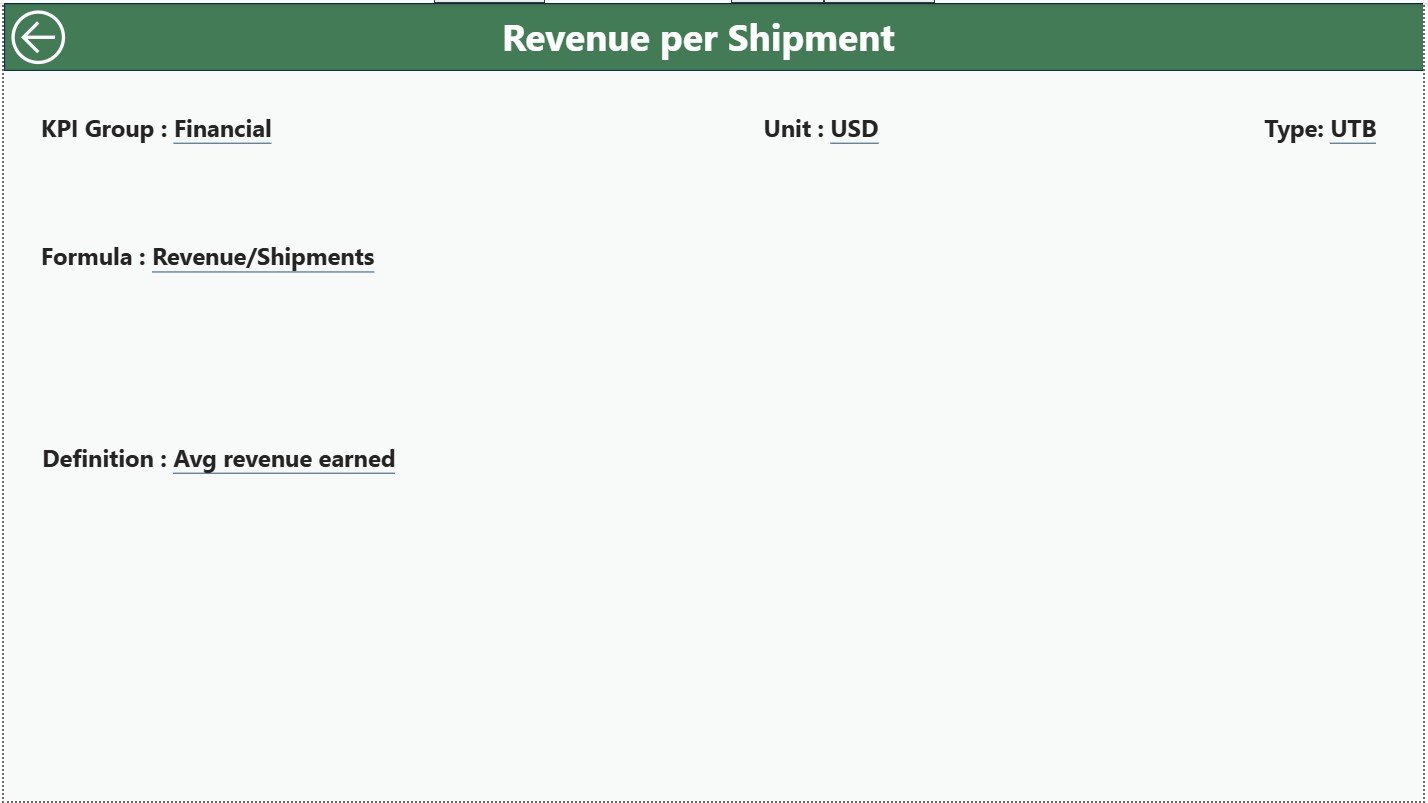
The KPI Definition Page acts as a hidden drill-through page.
Why This Page Matters
-
Explains KPI Formula
-
Describes KPI Definition
-
Displays Unit, Group, and Type
Users access this page by drilling through from the Summary Page.
Easy Navigation
A Back button at the top-left corner allows users to return to the Summary Page instantly, ensuring smooth navigation.
What Excel Data Is Required for the Dashboard?
The dashboard uses an Excel file as its data source, making updates simple and controlled.
1. Input_Actual Sheet
This sheet stores actual KPI performance data.
Required Fields
-
KPI Name
-
Month (first date of the month)
-
MTD Actual value
-
YTD Actual value
2. Input_Target Sheet
This sheet stores KPI target values.
Required Fields
-
KPI Name
-
Month (first date of the month)
-
MTD Target value
-
YTD Target value
3. KPI Definition Sheet
This sheet defines each KPI clearly.
Required Fields
-
KPI Number
-
KPI Group
-
KPI Name
-
Unit
-
Formula
-
Definition
-
Type (LTB or UTB)
This structure ensures clarity, consistency, and scalability.
Advantages of Freight Forwarding KPI Dashboard in Power BI
Using this dashboard delivers measurable business benefits.
Key Advantages
-
✔ Centralized KPI monitoring
-
✔ Faster and smarter decisions
-
✔ Clear Target vs Actual visibility
-
✔ Accurate year-over-year comparison
-
✔ Interactive and visual insights
-
✔ Easy Excel-based maintenance
-
✔ Scalable across locations and teams
Because of these advantages, logistics leaders gain stronger control over operations.
Click to Purchases Freight Forwarding KPI Dashboard in Power BI
How Does This Dashboard Support Better Decision-Making?
This dashboard helps teams:
-
Identify operational gaps early
-
Improve service reliability
-
Optimize freight costs
-
Track productivity trends
-
Align teams with performance goals
As a result, decisions become proactive instead of reactive.
Best Practices for the Freight Forwarding KPI Dashboard in Power BI
Follow these best practices to maximize dashboard value.
1. Define KPIs Clearly
Always maintain clear definitions and formulas.
2. Keep Data Consistent
Use consistent KPI names and month formats in Excel.
3. Review KPIs Regularly
Analyze MTD and YTD performance monthly.
4. Focus on Visual Indicators
Use icons and percentages for quick interpretation.
5. Train Business Users
Ensure teams understand how to read KPI trends.
6. Update Targets Periodically
Align targets with business strategy changes.
Conclusion
A Freight Forwarding KPI Dashboard in Power BI transforms logistics data into clear, actionable insights. By combining Excel-based data entry with interactive Power BI visuals, this dashboard enables freight forwarders to track performance accurately, compare trends confidently, and make faster decisions.
In a competitive logistics landscape, this dashboard becomes a vital tool for operational excellence and sustained growth.
Frequently Asked Questions (FAQs)
What is a Freight Forwarding KPI Dashboard in Power BI?
It is an interactive dashboard that tracks logistics KPIs using Power BI and Excel data.
Can I customize KPIs in this dashboard?
Yes, you can easily add or modify KPIs using the Excel data file.
Does the dashboard support MTD and YTD tracking?
Yes, it tracks both MTD and YTD performance.
Is Excel mandatory as a data source?
Yes, Excel ensures easy data entry and maintenance.
Can non-technical users use this dashboard?
Yes, the dashboard design focuses on simplicity and usability.
Does it compare current year and previous year data?
Yes, it includes CY vs PY comparisons for MTD and YTD.
Can this dashboard scale across multiple branches?
Yes, you can extend the model to support multiple locations.
Click to Purchases Freight Forwarding KPI Dashboard in Power BI
Visit our YouTube channel to learn step-by-step video tutorials