Public broadcasting plays a vital role in informing, educating, and entertaining audiences. However, public broadcasters face constant pressure to justify funding, improve content reach, manage costs, and demonstrate performance transparency. Therefore, data-driven performance monitoring has become essential.
That is exactly where a Public Broadcasting KPI Dashboard in Excel delivers immense value.
In this detailed and SEO-friendly guide, you will learn what a Public Broadcasting KPI Dashboard in Excel is, why it matters, how it works, its sheet-wise structure, key benefits, best practices, and frequently asked questions. Moreover, this article uses simple language, smooth transitions, and practical explanations so that anyone can understand and apply it easily.
Click to Purchases Public Broadcasting KPI Dashboard in Excel
What Is a Public Broadcasting KPI Dashboard in Excel?
A Public Broadcasting KPI Dashboard in Excel is a ready-to-use performance tracking tool designed to monitor key performance indicators (KPIs) related to public media operations.
Instead of tracking performance using multiple spreadsheets and manual reports, this dashboard consolidates actuals, targets, and previous-year data into a single interactive Excel file. As a result, broadcasters gain clear visibility into operational efficiency, audience performance, and goal achievement.
Because the dashboard is built in Microsoft Excel, teams can use it without technical complexity or additional software costs.
Why Do Public Broadcasting Organizations Need a KPI Dashboard?
Public broadcasting organizations operate in a highly accountable environment. Therefore, they must track performance consistently and transparently.
Key Reasons to Use a KPI Dashboard
-
To monitor MTD and YTD performance in one place
-
To compare actual results against targets and previous years
-
To identify underperforming KPIs early
-
To improve reporting accuracy and consistency
-
To support data-driven strategic decisions
Moreover, a KPI dashboard reduces manual effort and improves confidence in reporting.
How Does the Public Broadcasting KPI Dashboard in Excel Work?
The dashboard follows a simple and logical workflow.
-
Users enter data in structured input sheets
-
Excel formulas calculate MTD, YTD, and comparisons
-
Conditional formatting highlights performance status
-
Drop-downs allow instant filtering by month and KPI
-
Charts and tables update automatically
Because of this approach, users save time and avoid repetitive calculations.
What Are the Worksheets in the Public Broadcasting KPI Dashboard?
This ready-to-use dashboard includes 7 well-structured worksheets, each designed for a specific purpose.
What Is the Home Sheet Used For?
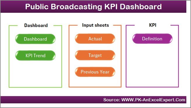
The Home sheet acts as an index or navigation page.
Key Features of the Home Sheet
-
Clean and simple layout
-
Six navigation buttons
-
One-click access to key sheets
As a result, users move between sections quickly without scrolling or confusion.
Click to Purchases Public Broadcasting KPI Dashboard in Excel
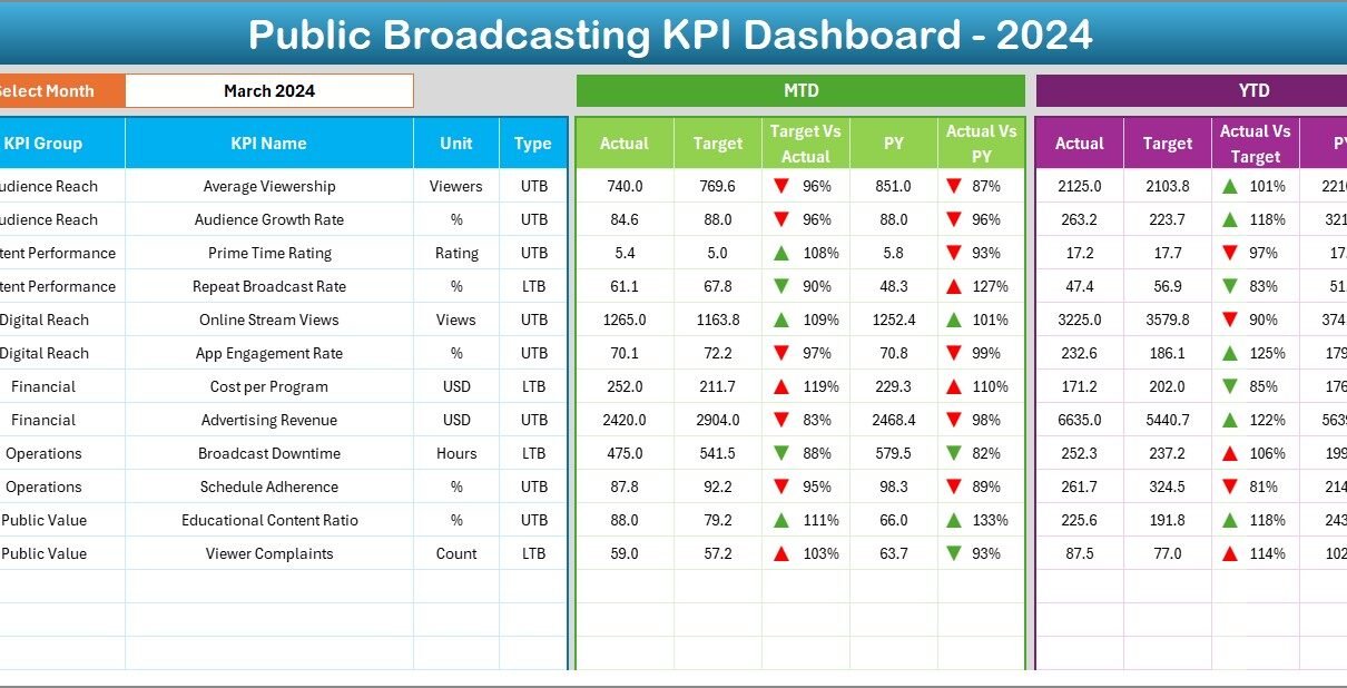
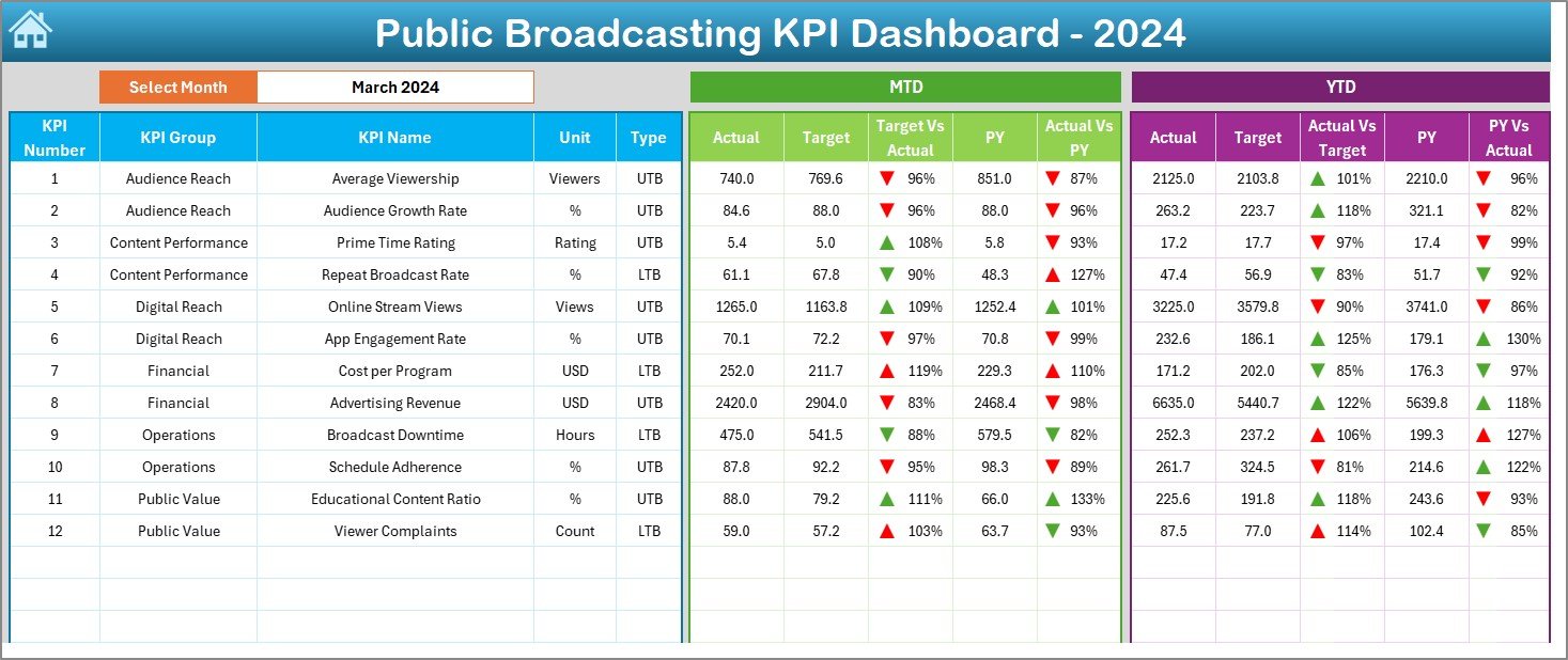
What Does the Dashboard Sheet Show?
The Dashboard sheet serves as the main performance view.
Month Selection
-
Cell D3 contains a month drop-down
-
Selecting a month instantly updates the entire dashboard
This feature allows users to analyze performance for any specific month easily.
MTD Performance Section
The dashboard displays:
-
MTD Actual
-
MTD Target
-
MTD Previous Year
-
Target vs Actual %
-
Previous Year vs Actual %
Conditional formatting with up and down arrows highlights whether performance improved or declined.
YTD Performance Section
Similarly, the dashboard shows:
-
YTD Actual
-
YTD Target
-
YTD Previous Year
-
Target vs Actual %
-
Previous Year vs Actual %
Because both MTD and YTD metrics appear together, users gain a complete performance picture.
What Insights Does the KPI Trend Sheet Provide?
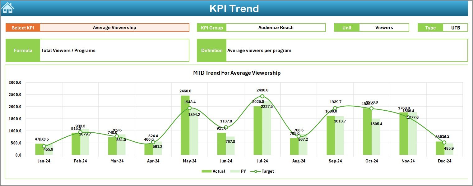
The KPI Trend sheet focuses on detailed KPI-level analysis.
KPI Selection
-
KPI Name drop-down available at cell C3
-
Selecting a KPI updates all displayed information
KPI Metadata Displayed
For the selected KPI, the sheet shows:
-
KPI Group
-
KPI Unit
-
KPI Type (Lower the Better or Upper the Better)
-
KPI Formula
-
KPI Definition
This context ensures correct interpretation of each KPI.
Trend Charts
The sheet includes:
-
MTD trend chart (Actual, Target, Previous Year)
-
YTD trend chart (Actual, Target, Previous Year)
As a result, users can easily track performance trends over time.
Click to Purchases Public Broadcasting KPI Dashboard in Excel
What Is the Actual Numbers Input Sheet?
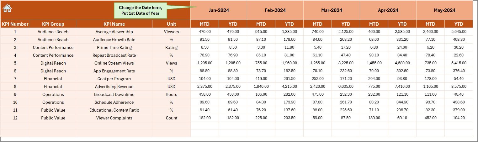
The Actual Numbers Input sheet stores current-year performance data.
How to Use This Sheet
-
Enter the first month of the year in cell E1
-
Input MTD and YTD actual values for each KPI
-
Update data monthly
Because data entry remains structured, calculations stay accurate.
What Is the Target Sheet Used For?
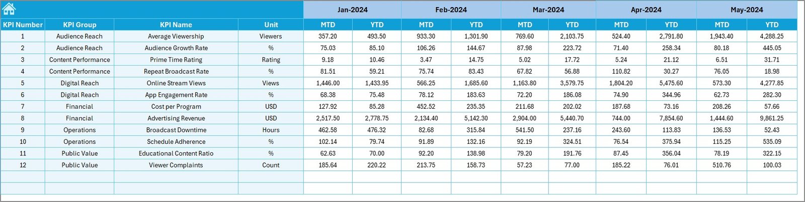
The Target Sheet captures performance goals.
Data Entered in This Sheet
-
Monthly MTD target values
-
Monthly YTD target values
-
Targets defined for each KPI
This structure allows easy comparison between actual performance and planned goals.
What Is the Previous Year Number Sheet?
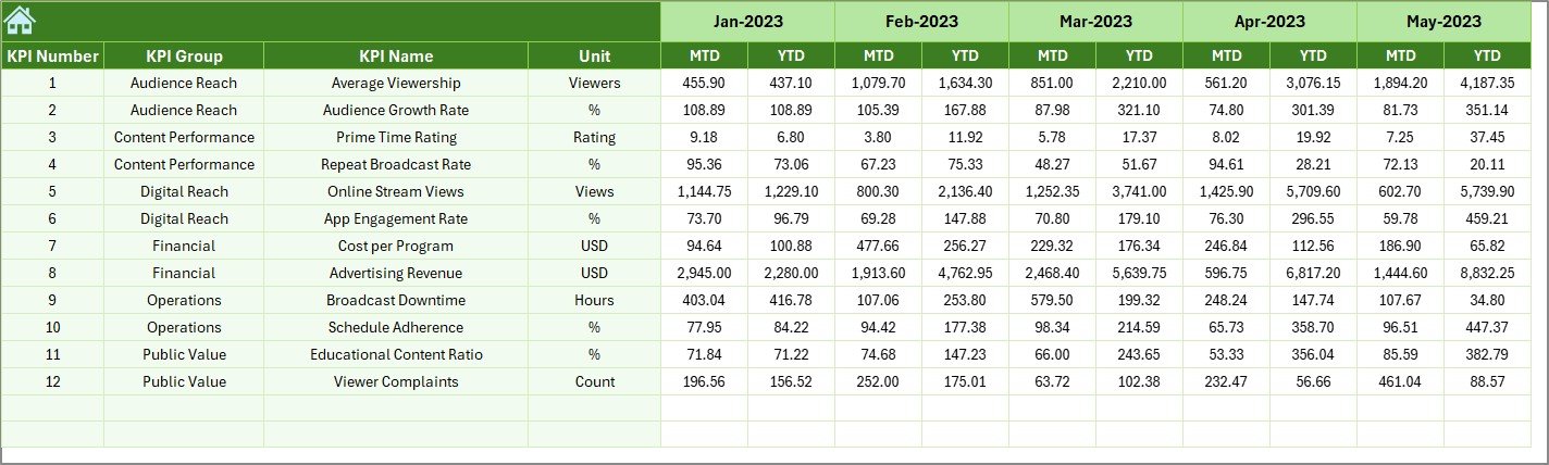
The Previous Year Number sheet stores historical data.
Purpose of This Sheet
-
Enables year-over-year comparisons
-
Supports trend analysis
-
Improves performance benchmarking
By keeping historical data separate, the dashboard remains clean and organized.
What Is the KPI Definition Sheet?
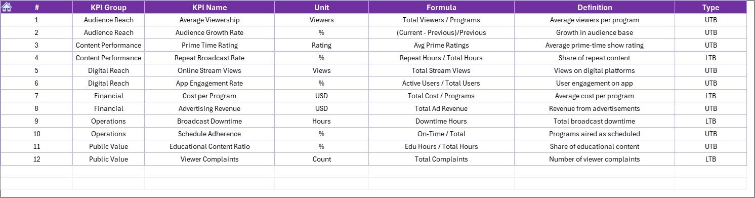
The KPI Definition sheet acts as a master reference.
Information Stored
-
KPI Name
-
KPI Group
-
KPI Unit
-
KPI Formula
-
KPI Definition
This sheet ensures clarity, consistency, and standardization across reports.
What Are the Advantages of a Public Broadcasting KPI Dashboard in Excel?
1. Centralized Performance Tracking
The dashboard consolidates all KPIs into one file. Therefore, teams avoid scattered spreadsheets.
2. Easy to Use and Maintain
Because it runs in Excel, users do not need advanced technical skills.
3. Clear Target Monitoring
Target vs Actual and PY comparisons highlight performance gaps instantly.
4. Improved Accountability
Visual indicators make it clear which KPIs meet expectations and which require action.
5. Better Decision-Making
Trends and comparisons support informed and timely decisions.
6. Cost-Effective Solution
The dashboard avoids expensive BI tools while delivering strong analytical value.
Who Should Use a Public Broadcasting KPI Dashboard?
This dashboard suits a wide range of users, including:
-
Public broadcasting executives
-
Media operations managers
-
Finance and reporting teams
-
Content and programming planners
-
Government and funding stakeholders
Because the dashboard is intuitive, both analysts and managers can use it confidently.
Click to Purchases Public Broadcasting KPI Dashboard in Excel
Best Practices for the Public Broadcasting KPI Dashboard in Excel
1. Keep KPI Definitions Clear
Always maintain accurate formulas and definitions in the KPI Definition sheet.
2. Update Data Regularly
Update actuals, targets, and previous-year data monthly for reliable insights.
3. Validate Inputs Before Review
Check for missing or incorrect values before analyzing results.
4. Use KPI Groups Wisely
Group KPIs logically, such as audience, finance, operations, and content quality.
5. Focus on Trends, Not Just Status
Review trend charts regularly to understand long-term performance.
6. Train Users on KPI Interpretation
Ensure users understand Lower the Better and Upper the Better logic.
What Challenges Does This Dashboard Solve?
-
Manual and time-consuming reporting
-
Inconsistent KPI tracking
-
Limited visibility into performance trends
-
Difficulty comparing targets and actuals
-
Errors caused by complex formulas
Because of its structured design, the dashboard addresses these challenges effectively.
How Does This Dashboard Support Strategic Planning?
By combining MTD, YTD, and historical data, the dashboard supports:
-
Budget planning and control
-
Performance forecasting
-
Content strategy optimization
-
Funding justification and reporting
As a result, leadership teams can align operations with strategic goals.
Conclusion
A Public Broadcasting KPI Dashboard in Excel provides a powerful yet simple way to track performance, monitor targets, and analyze trends. Instead of relying on disconnected reports, public broadcasters gain a centralized, transparent, and easy-to-use performance management system.
With structured input sheets, dynamic dashboards, and clear visual indicators, this KPI dashboard supports smarter decisions and stronger accountability. Therefore, any public broadcasting organization aiming to improve performance reporting should adopt this solution.
Click to Purchases Public Broadcasting KPI Dashboard in Excel
Frequently Asked Questions (FAQs)
What is a Public Broadcasting KPI Dashboard in Excel?
It is a ready-to-use Excel-based dashboard that tracks MTD, YTD, target, and previous-year performance using KPIs.
Can I customize KPIs in this dashboard?
Yes, you can add or modify KPIs easily through the KPI Definition sheet.
Does the dashboard support monthly and yearly analysis?
Yes, it supports both MTD and YTD analysis with historical comparisons.
Is Excel sufficient for large datasets?
For most public broadcasting KPIs, Excel works efficiently. However, users can optimize data size if needed.
Can non-technical users operate this dashboard?
Yes, the dashboard uses drop-downs, buttons, and clear visuals, making it user-friendly.
How often should the dashboard be updated?
You should update it monthly to ensure accurate and relevant insights.
Click to Purchases Public Broadcasting KPI Dashboard in Excel
Visit our YouTube channel to learn step-by-step video tutorials