Smart cities continue to reshape how governments, municipalities, and urban planners design, execute, and monitor projects. Roads, utilities, public transport, energy systems, water management, and digital infrastructure all operate together in a smart city ecosystem. However, managing these projects without clarity, structure, and real-time insight creates delays, cost overruns, and accountability gaps.
That is exactly where a Smart Cities Project Management Dashboard in Excel becomes a powerful and practical solution.
In this detailed article, you will learn what a Smart Cities Project Management Dashboard in Excel is, why it matters, how it works, its complete worksheet structure, key KPIs, advantages, best practices, and frequently asked questions. By the end, you will clearly understand how this Excel dashboard supports better decision-making, stronger governance, and smoother project execution in smart city initiatives.
Click to Purchases Smart Cities Project Management Dashboard in Excel
What Is a Smart Cities Project Management Dashboard in Excel?
A Smart Cities Project Management Dashboard in Excel is a ready-to-use, interactive Excel-based reporting tool designed to track, analyze, and monitor smart city project performance from a single file.
Instead of managing disconnected spreadsheets, manual status reports, and delayed updates, this dashboard consolidates budget, cost, delay, progress, and performance KPIs into structured visual pages.
Because the dashboard runs in Microsoft Excel, teams benefit from:
-
Familiar interface
-
Zero dependency on expensive BI tools
-
Easy customization
-
Fast deployment across departments
As a result, city authorities, project managers, contractors, and planners gain clear visibility into ongoing and completed projects.
Why Do Smart Cities Need a Project Management Dashboard?
Smart city projects involve multiple stakeholders, contractors, departments, and cities. Therefore, coordination becomes complex very quickly.
Without a centralized dashboard:
-
Project status remains unclear
-
Budget overruns surface too late
-
Delays remain hidden
-
Accountability weakens
-
Decision-making slows down
However, when teams use a Smart Cities Project Management Dashboard in Excel, they instantly gain:
-
Centralized project tracking
-
Department-wise and city-wise analysis
-
Cost variance visibility
-
Delay monitoring
-
Data-driven planning
Consequently, cities improve governance, transparency, and operational efficiency.
Click to Purchases Smart Cities Project Management Dashboard in Excel
How Does the Smart Cities Project Management Dashboard in Excel Work?
The dashboard works by converting raw project data into structured KPIs, charts, and comparisons.
Here is how the workflow typically functions:
-
Teams enter or import project data into the Data Sheet
-
Excel formulas calculate costs, delays, progress, and variance
-
Pivot tables summarize performance across dimensions
-
Charts update automatically using slicers
-
Decision-makers analyze insights from one dashboard
Because everything connects dynamically, users see real-time results without manual recalculation.
Key Features of the Smart Cities Project Management Dashboard in Excel
This dashboard comes with a well-structured design that focuses on clarity, usability, and insight.
Page Navigator for Easy Navigation
The Page Navigator, located on the left side, allows users to jump instantly between analytical pages.
Because smart city dashboards contain multiple views, this feature saves time and improves usability.
Dashboard Structure: 5 Analytical Pages Explained
The Smart Cities Project Management Dashboard in Excel includes five powerful analytical pages, each designed to answer specific management questions.
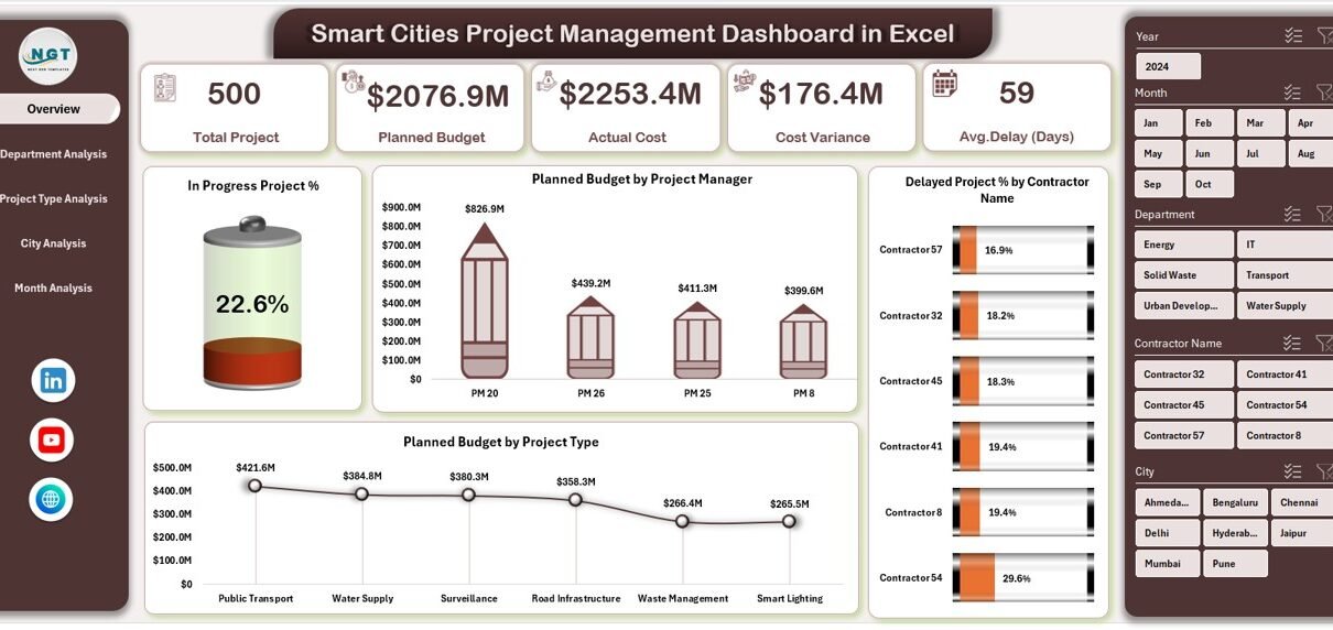
1. Overview Page: What Is the Overall Project Health?
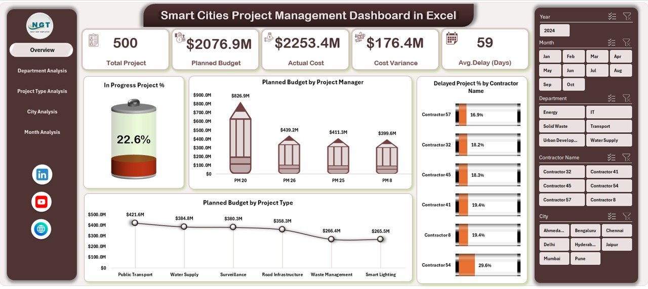
The Overview Page acts as the command center of the dashboard.
Key Cards on the Overview Page
This page displays four high-level KPI cards, which instantly communicate project health:
-
In Progress Project %
-
Planned Budget
-
Delayed Project %
-
Total Projects (or contextual metrics based on design)
These cards help leadership understand the situation at a glance.
Charts on the Overview Page
Additionally, this page includes four insightful charts:
-
In Progress Project % by Status or Dimension
-
Planned Budget by Project Manager
-
Delayed Project % by Contractor
-
Planned Budget by Project Type
As a result, leaders identify bottlenecks and budget concentration areas quickly.
Click to Purchases Smart Cities Project Management Dashboard in Excel
2. Department Analysis: Which Departments Perform Better?
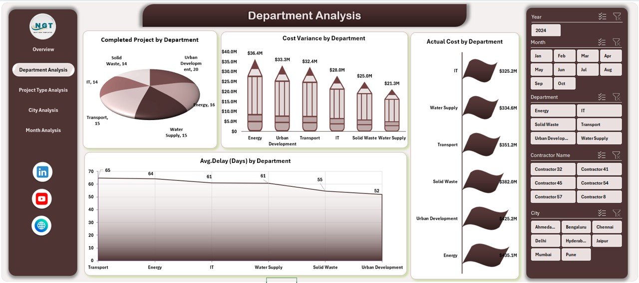
The Department Analysis Page focuses on department-level performance.
Why Department Analysis Matters
Smart city projects often span multiple departments such as transport, utilities, IT, water, and energy. Therefore, department-level insights improve accountability.
Charts on the Department Analysis Page
This page includes four critical charts:
-
Completed Projects by Department
-
Cost Variance by Department
-
Actual Cost by Department
-
Average Delay by Department
Through this view, managers identify departments that exceed budgets or face frequent delays.
3. Project Type Analysis: Which Project Types Create Risk?
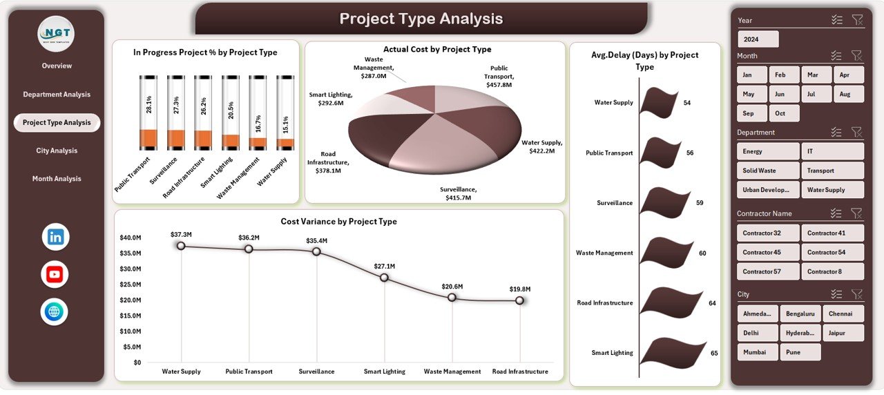
Different project types behave differently. For example, infrastructure projects often face delays, while digital projects may exceed budgets.
Charts on the Project Type Analysis Page
This page provides four targeted charts:
-
In Progress Project % by Project Type
-
Actual Cost by Project Type
-
Average Delay by Project Type
-
Cost Variance by Project Type
Because of this analysis, planners allocate resources more effectively for future initiatives.
4. City Analysis: How Do Cities Compare?
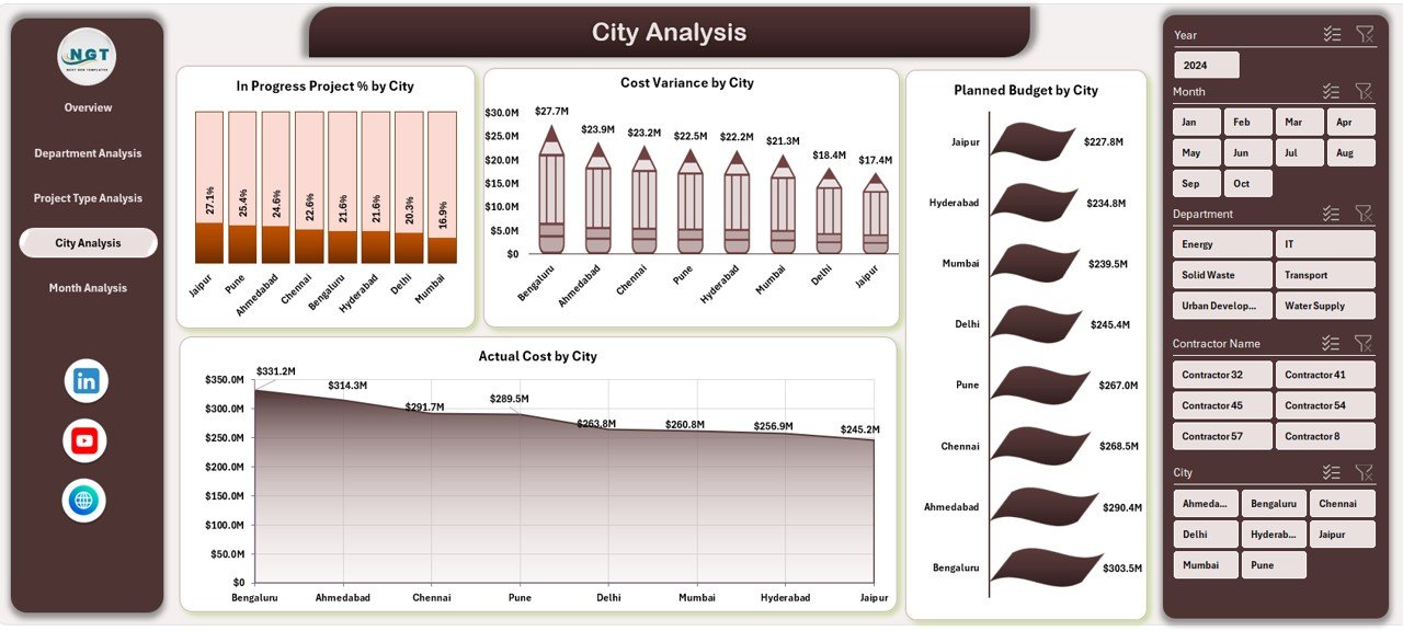
Smart city initiatives often span multiple cities or regions. Therefore, comparison becomes essential.
Charts on the City Analysis Page
This page contains four city-focused charts:
-
In Progress Project % by City
-
Cost Variance by City
-
Planned Budget by City
-
Actual Cost by City
With this view, authorities identify cities that need corrective action or additional support.
5. Month Analysis: How Does Performance Change Over Time?
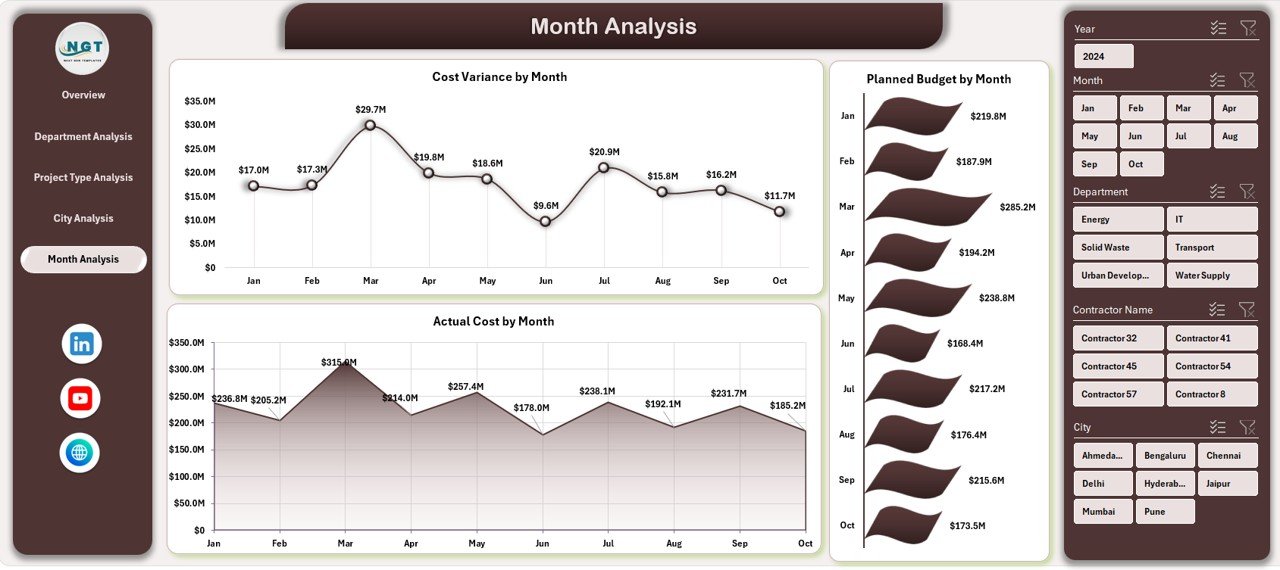
Trends matter just as much as current performance.
Charts on the Month Analysis Page
This page highlights three time-based charts:
-
Cost Variance by Month
-
Planned Budget by Month
-
Actual Cost by Month
Because of this analysis, teams detect seasonal patterns, spending spikes, and recurring delays early.
Support Sheet and Data Sheet: The Backbone of the Dashboard
Data Sheet
The Data Sheet stores all raw project data, such as:
-
Project Name
-
City
-
Department
-
Project Type
-
Contractor
-
Project Manager
-
Planned Budget
-
Actual Cost
-
Start Date
-
End Date
-
Delay Days
-
Status
All dashboard calculations depend on this structured data.
Support Sheet
The Support Sheet handles:
-
Pivot tables
-
Helper calculations
-
Intermediate metrics
This separation ensures stability and performance.
Key KPIs Tracked in the Dashboard
The Smart Cities Project Management Dashboard in Excel tracks several critical KPIs, including:
-
In Progress Project %
-
Completed Project Count
-
Planned Budget
-
Actual Cost
-
Cost Variance
-
Average Delay (Days)
-
Delayed Project %
-
Budget Distribution
Because these KPIs update dynamically, users always see current insights.
Advantages of Smart Cities Project Management Dashboard in Excel
Click to Purchases Smart Cities Project Management Dashboard in Excel
1. Centralized Project Visibility
This dashboard consolidates all smart city project data into one Excel file. As a result, teams avoid scattered reports and manual consolidation.
2. Faster Decision-Making
Because charts and KPIs update instantly, decision-makers respond faster to delays, overruns, and risks.
3. Improved Cost Control
Cost variance analysis helps teams detect overspending early and implement corrective actions.
4. Stronger Accountability
Department, contractor, and city-level insights increase transparency and responsibility.
5. Easy Customization
Excel allows teams to add KPIs, charts, or filters without technical expertise.
6. Budget-Friendly Solution
Unlike enterprise BI tools, Excel dashboards require no expensive licenses or infrastructure.
Who Can Use a Smart Cities Project Management Dashboard in Excel?
This dashboard suits a wide range of stakeholders:
-
City authorities
-
Urban planners
-
Smart city mission teams
-
Project management offices (PMOs)
-
Infrastructure consultants
-
Government agencies
-
Contractors and vendors
Because Excel remains universally accessible, adoption becomes effortless.
Best Practices for the Smart Cities Project Management Dashboard in Excel
1. Maintain Clean and Consistent Data
Always standardize department names, city names, and project types. Consistency ensures accurate reporting.
2. Update Data Regularly
Schedule weekly or monthly updates to keep insights current.
3. Use Defined KPIs
Stick to clearly defined KPIs so everyone interprets results the same way.
4. Protect Support Sheets
Lock formulas and pivot tables to prevent accidental changes.
5. Review Trends, Not Just Totals
Focus on month-wise trends to identify early warning signs.
6. Train Stakeholders
Ensure teams understand how to interpret charts and KPIs.
How Does This Dashboard Improve Smart City Governance?
Strong governance requires transparency, accountability, and timely information.
This dashboard supports governance by:
-
Providing auditable project records
-
Improving reporting accuracy
-
Reducing manual manipulation
-
Supporting data-driven decisions
-
Enhancing public accountability
Therefore, cities achieve better outcomes with fewer risks.
Can This Dashboard Scale with Smart City Growth?
Yes, the dashboard scales easily.
Teams can:
-
Add more cities
-
Add new departments
-
Introduce new project types
-
Expand KPIs
-
Integrate additional analysis pages
Excel handles this growth efficiently when data structure remains clean.
Conclusion: Why This Dashboard Is Essential for Smart Cities
Smart city projects demand precision, visibility, and control. Without structured reporting, even well-funded initiatives struggle.
The Smart Cities Project Management Dashboard in Excel offers a practical, powerful, and cost-effective solution. It transforms raw project data into actionable insights across overview, department, project type, city, and time dimensions.
Because the dashboard runs in Excel, teams adopt it quickly, customize it easily, and scale it confidently. Ultimately, it helps smart cities deliver projects on time, within budget, and with greater accountability.
Frequently Asked Questions (FAQs)
What data do I need for a Smart Cities Project Management Dashboard in Excel?
You need project-level data such as project name, city, department, project type, planned budget, actual cost, start date, end date, delay days, and status.
Can non-technical users operate this dashboard?
Yes, Excel familiarity is enough. Users interact with slicers and charts without complex steps.
How often should the dashboard be updated?
Most teams update it weekly or monthly, depending on project size and reporting needs.
Can I add more KPIs to this dashboard?
Yes, Excel allows easy customization. You can add KPIs such as risk score, contractor rating, or milestone completion.
Is this dashboard suitable for government reporting?
Yes, it supports transparency, audit readiness, and standardized reporting, which suits government requirements.
Does the dashboard support multi-city analysis?
Yes, the City Analysis page specifically compares performance across multiple cities.
Can this dashboard replace project management software?
While it does not replace execution tools, it complements them by providing clear performance reporting and oversight.
Visit our YouTube channel to learn step-by-step video tutorials