Managing smart city tenders without structured performance tracking creates delays, cost overruns, and weak accountability. However, modern smart city programs involve complex procurement processes, multiple vendors, strict timelines, and public accountability. Therefore, decision-makers need a clear, transparent, and data-driven way to monitor tender performance.
That is exactly where a Smart Cities Tender KPI Dashboard in Power BI plays a critical role.
In this in-depth and SEO-friendly article, you will learn what a Smart Cities Tender KPI Dashboard in Power BI is, why it matters, how it works, its detailed page structure, KPI logic, Excel data design, advantages, opportunities for improvement, best practices, and frequently asked questions. By the end, you will clearly understand how this dashboard transforms tender monitoring into a powerful decision-making system.
Click to buy Smart Cities Tender KPI Dashboard in Power BI
What Is a Smart Cities TendeSmart Cities Tender KPI Dashboard in Power BIr KPI Dashboard in Power BI?
A Smart Cities Tender KPI Dashboard in Power BI is a ready-to-use analytical reporting solution designed to monitor, analyze, and evaluate key performance indicators related to smart city tender processes.
Instead of working with scattered Excel sheets and manual reports, this dashboard consolidates all tender KPIs into a single interactive Power BI report. As a result, procurement teams, project managers, and government officials gain real-time visibility into tender performance.
Moreover, because smart city tenders involve public funds and strict governance, this dashboard ensures transparency, accountability, and performance consistency across departments.
Why Is a Smart Cities Tender KPI Dashboard Important?
Smart city initiatives depend heavily on efficient tender execution. However, without structured KPI monitoring, organizations struggle to track progress, identify risks, and measure outcomes.
Therefore, a Smart Cities Tender KPI Dashboard becomes essential because it:
- Provides centralized visibility across all tender KPIs
- Improves decision-making with real-time insights
- Enhances transparency and compliance
- Identifies performance gaps early
- Supports data-driven governance
Additionally, Power BI enables interactive analysis, which allows stakeholders to explore data dynamically instead of relying on static reports.
How Does a Smart Cities Tender KPI Dashboard in Power BI Work?
The dashboard works by combining structured Excel data with Power BI’s analytical capabilities. First, users capture actual and target KPI values in Excel. Then, Power BI processes this data using predefined measures and visuals.
As a result, the dashboard automatically calculates:
- Month-to-Date (MTD) performance
- Year-to-Date (YTD) performance
- Target vs Actual percentages
- Current Year vs Previous Year comparisons
Because the dashboard refreshes easily, users always work with up-to-date information.
Key Features of Smart Cities Tender KPI Dashboard in Power BI
The Smart Cities Tender KPI Dashboard includes a well-structured layout with three powerful pages. Each page serves a specific analytical purpose.
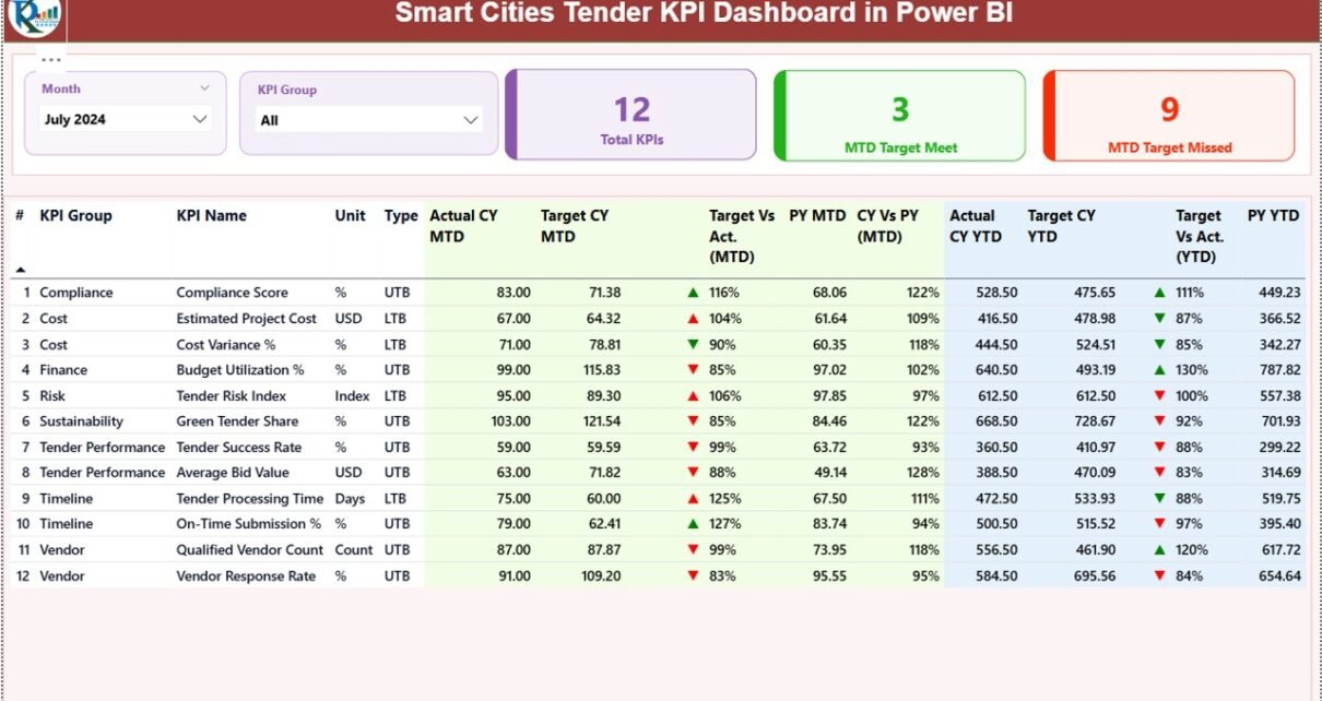
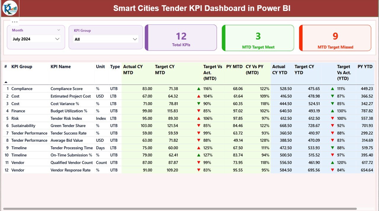
Summary Page: How Does the Dashboard Provide a Complete KPI Overview?
The Summary Page acts as the main control center of the dashboard. Here, users immediately see the overall performance status.
Top-Level Slicers
- Month Slicer for period selection
- KPI Group Slicer for category-wise analysis
KPI Cards
At the top, the dashboard displays three summary cards:
- Total KPIs Count
- MTD Target Met Count
- MTD Target Missed Count
These cards provide an instant performance snapshot.
Detailed KPI Table
Below the cards, the dashboard shows a detailed KPI table with the following fields:
- KPI Number – Unique sequence identifier
- KPI Group – Category of the KPI
- KPI Name – Name of the KPI
- Unit – Measurement unit
- Type – LTB (Lower the Better) or UTB (Upper the Better)
Performance Metrics (MTD)
- Actual CY MTD – Current Year actual MTD value
- Target CY MTD – Current Year target MTD value
- MTD Icon – ▲ or ▼ icons with green and red indicators
- Target vs Actual (MTD) – Actual ÷ Target percentage
- PY MTD – Previous Year MTD value
- CY vs PY (MTD) – Current vs Previous Year comparison
Performance Metrics (YTD)
- Actual CY YTD – Current Year actual YTD value
- Target CY YTD – Current Year target YTD value
- YTD Icon – Performance status indicator
- Target vs Actual (YTD) – YTD performance percentage
- PY YTD – Previous Year YTD value
- CY vs PY (YTD) – Year-over-year comparison
Therefore, this single table delivers complete performance visibility without switching reports.
Click to buy Smart Cities Tender KPI Dashboard in Power BI
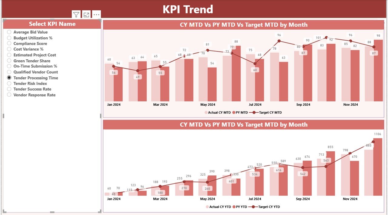
KPI Trend Page: How Can You Analyze KPI Performance Over Time?
The KPI Trend Page focuses on performance movement rather than static numbers.
Key Visuals
- MTD Combo Chart – Actual CY, PY, and Target
- YTD Combo Chart – Actual CY, PY, and Target
Interactive KPI Selection
A slicer on the left allows users to select a specific KPI. As a result, the charts update instantly.
Therefore, users can:
- Track performance trends
- Identify seasonal patterns
- Compare targets vs achievements visually
This page helps stakeholders understand why performance changes, not just what changed.
Click to buy Smart Cities Tender KPI Dashboard in Power BI
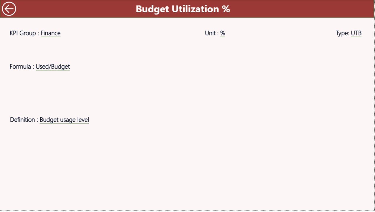
KPI Definition Page: Why Is KPI Transparency Important?
The KPI Definition Page works as a drill-through page and remains hidden by default.
From the Summary Page, users can drill through to view:
- KPI Formula
- KPI Definition
- KPI Unit
- KPI Type (LTB or UTB)
Because of this design, users always understand the logic behind each KPI. Additionally, the back button allows easy navigation to the main page.
Click to buy Smart Cities Tender KPI Dashboard in Power BI
Excel Data Structure: How Is the Data Captured?
The dashboard uses Excel as its data source. This approach ensures simplicity and flexibility.
Input_Actual Sheet
Users enter:
- KPI Name
- Month (first date of the month)
- MTD Actual Value
- YTD Actual Value
Input_Target Sheet
Users enter:
- KPI Name
- Month (first date of the month)
- MTD Target Value
- YTD Target Value
KPI Definition Sheet
Users define:
- KPI Number
- KPI Group
- KPI Name
- Unit
- Formula
- Definition
- Type (LTB or UTB)
Therefore, users maintain full control over KPI logic and data updates.
What KPIs Can You Track in Smart Cities Tender Management?
Common KPIs include:
- Tender Processing Time
- Bid Evaluation Duration
- Contract Award Cycle Time
- Cost Variance Percentage
- Vendor Compliance Rate
- Tender Success Rate
- Re-Tender Frequency
However, the dashboard supports unlimited KPIs based on organizational needs.
Advantages of Smart Cities Tender KPI Dashboard in Power BI
This dashboard delivers strong operational and strategic benefits.
Key Advantages
- Centralized tender performance tracking
- Real-time MTD and YTD analysis
- Clear target vs actual comparisons
- Strong visual indicators for quick decisions
- Improved transparency and governance
- Easy Excel-based data input
- Scalable for multiple smart city projects
Therefore, organizations gain better control over tender execution.
Opportunities for Improvement in Smart Cities Tender KPI Dashboards
Although the dashboard is powerful, organizations can further enhance it.
Improvement Opportunities
- Automate Excel data feeds using SharePoint or OneDrive
- Add vendor-level drill-down pages
- Include geographic or city-wise filters
- Integrate risk scoring KPIs
- Enable scheduled Power BI refresh
These enhancements increase analytical depth over time.
Best Practices for the Smart Cities Tender KPI Dashboard in Power BI
To maximize dashboard value, follow these proven best practices.
Best Practices
- Define KPIs clearly before implementation
- Use consistent KPI units and definitions
- Update actual and target data monthly
- Validate LTB and UTB logic carefully
- Review trends instead of single-month results
- Train stakeholders on drill-through usage
- Maintain clean and structured Excel data
Because of these practices, the dashboard remains reliable and trusted.
Who Should Use a Smart Cities Tender KPI Dashboard?
This dashboard benefits:
- Smart City Mission Offices
- Government Procurement Teams
- Urban Development Authorities
- Public Sector Project Managers
- Policy and Compliance Teams
- Audit and Oversight Bodies
Therefore, it supports both operational and governance roles.
How Does This Dashboard Improve Decision-Making?
The dashboard converts raw data into actionable insights. Because decision-makers see performance gaps instantly, they act faster and more confidently.
Moreover, trend analysis supports proactive planning rather than reactive problem-solving. As a result, organizations improve tender efficiency and project outcomes.
Conclusion: Why Should You Adopt a Smart Cities Tender KPI Dashboard in Power BI?
A Smart Cities Tender KPI Dashboard in Power BI transforms tender monitoring from manual reporting into intelligent performance management.
Because it combines structured Excel data, interactive Power BI visuals, and standardized KPI logic, the dashboard delivers transparency, control, and insight. Therefore, organizations managing smart city tenders can improve efficiency, accountability, and decision-making with confidence.
Frequently Asked Questions (FAQs)
What is a Smart Cities Tender KPI Dashboard in Power BI?
It is an interactive Power BI dashboard designed to monitor and analyze smart city tender performance using KPIs.
Can I customize KPIs in the dashboard?
Yes, you can add, remove, or modify KPIs easily using the KPI Definition Excel sheet.
Does the dashboard support MTD and YTD analysis?
Yes, it provides both MTD and YTD metrics with target comparisons.
Is Excel mandatory as a data source?
The default setup uses Excel, but you can integrate other data sources later.
Can non-technical users operate this dashboard?
Yes, the dashboard uses slicers, visuals, and drill-throughs that are easy to understand.
How often should data be updated?
Monthly updates work best for tender performance tracking.
Is this dashboard suitable for multiple smart city projects?
Yes, you can scale it by adding project or city-level dimensions.
Visit our YouTube channel to learn step-by-step video tutorials
Watch the step-by-step video tutorial:
Click to buy Smart Cities Tender KPI Dashboard in Power BI