Corporate learning has evolved rapidly in recent years. Today, organizations no longer rely only on classroom sessions or static training reports. Instead, they focus on data-driven learning strategies that align training investments with business outcomes. That is exactly where a Corporate Universities Dashboard in Power BI becomes essential.
A Corporate Universities Dashboard in Power BI helps organizations monitor training performance, learner engagement, program effectiveness, and cost efficiency in one interactive platform. Moreover, it enables leadership teams to make informed decisions based on real-time insights rather than assumptions.
In this comprehensive guide, you will learn what a Corporate Universities Dashboard in Power BI is, why organizations need it, how it works, and how each dashboard page supports better learning decisions. Additionally, you will explore advantages, best practices, use cases, and frequently asked questions. By the end, you will clearly understand how this dashboard transforms corporate learning analytics.
Click to Purchases Corporate Universities Dashboard in Power BI
What Is a Corporate Universities Dashboard in Power BI?
A Corporate Universities Dashboard in Power BI is a centralized analytics solution designed to track, analyze, and visualize learning and development activities within an organization’s corporate university or training ecosystem.
Instead of using multiple Excel files, manual reports, and disconnected learning systems, this dashboard consolidates all training-related data into a single Power BI report. As a result, stakeholders gain a clear and unified view of training performance.
Key Objectives of a Corporate Universities Dashboard
-
Track training completion and participation
-
Measure learning effectiveness and assessment outcomes
-
Monitor training costs and budget utilization
-
Compare performance across departments, regions, and programs
-
Identify trends and improvement opportunities
Because Power BI supports interactive visuals and slicers, users can filter data dynamically by department, program type, region, or time period.
Why Do Organizations Need a Corporate Universities Dashboard?
Corporate universities play a strategic role in building skills, leadership, and innovation. However, without proper analytics, organizations struggle to measure the true impact of learning initiatives.
A Corporate Universities Dashboard in Power BI solves this challenge by converting raw learning data into actionable insights.
Key Reasons to Use This Dashboard
-
It improves visibility into training performance
-
It helps justify learning investments with data
-
It supports continuous learning improvement
-
It aligns training goals with business objectives
-
It enables faster and smarter decision-making
Therefore, organizations that adopt learning dashboards gain a competitive advantage in talent development.
How Does a Corporate Universities Dashboard in Power BI Work?
A Corporate Universities Dashboard in Power BI works by connecting training data from one or more sources, such as Excel files, LMS exports, or databases.
Once the data loads into Power BI, the dashboard applies predefined calculations, KPIs, and visualizations. Then, users interact with the report using slicers, filters, and drill-downs.
Typical Data Captured in the Dashboard
-
Program details
-
Department information
-
Trainer types
-
Delivery modes
-
Assessment scores
-
Program costs
-
Enrollment and completion status
-
Monthly training trends
Because Power BI updates data dynamically, users always see the most recent insights.
What Are the Key Features of the Corporate Universities Dashboard in Power BI?
This Corporate Universities Dashboard in Power BI includes five powerful analytical pages, each designed to answer specific learning and performance questions.
Let us explore each page in detail.
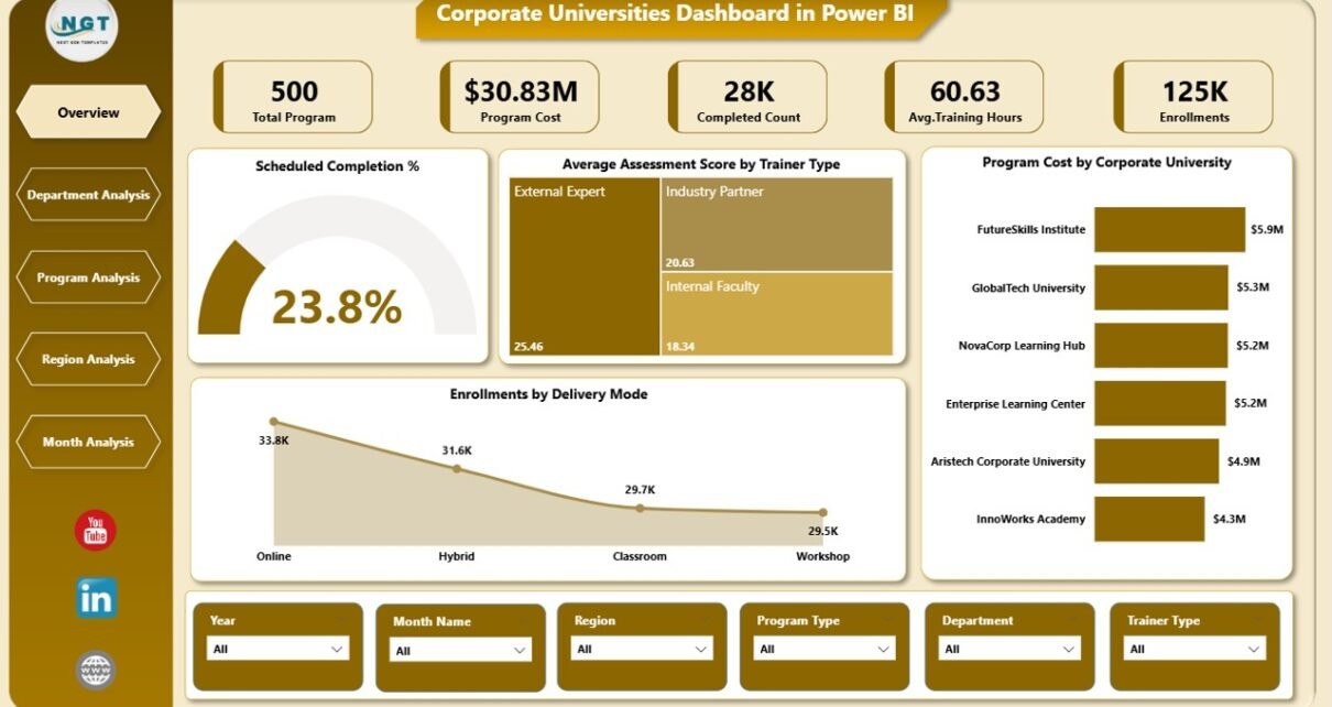
Overview Page: What Does the Overview Page Show?
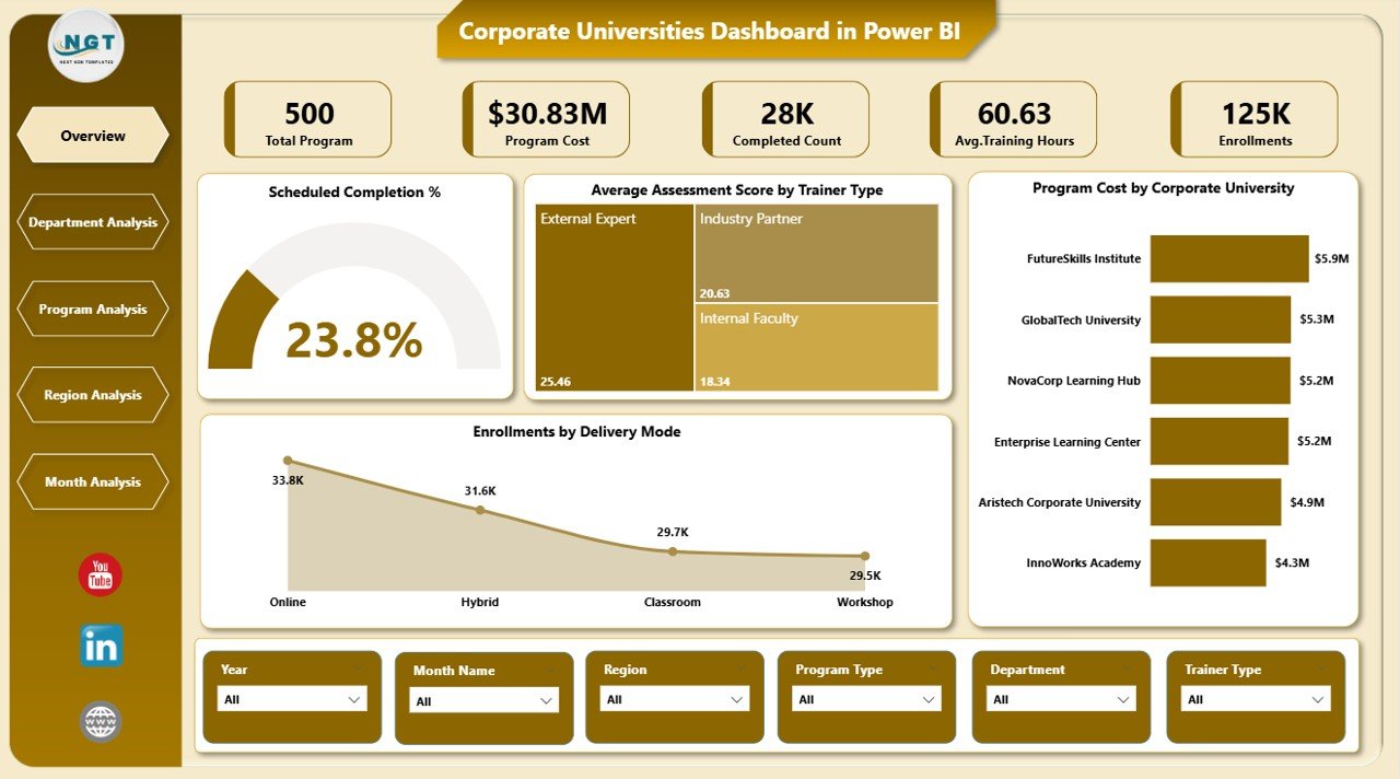
The Overview Page serves as the main landing page of the dashboard. It provides a high-level snapshot of corporate learning performance across the organization.
Key Components of the Overview Page
Interactive Slicers
-
Filter data by relevant dimensions such as department, program, region, or period
-
Instantly update all visuals based on selections
KPI Cards
The dashboard displays four KPI cards that summarize key learning metrics:
-
Scheduled Completion %
-
Average Assessment Score
-
Total Program Cost
-
Total Enrollment Count
These cards help leaders understand performance at a glance.
Core Charts on the Overview Page
-
Scheduled Completion %
Shows how effectively training programs meet planned schedules. -
Average Assessment Score by Trainer Type
Compares learning effectiveness across internal and external trainers. -
Program Cost by Corporate University
Highlights cost distribution across different corporate universities. -
Enrollment by Delivery Mode
Shows participation trends across classroom, virtual, and blended learning modes.
Because this page delivers instant insights, it supports executive-level decision-making.
Department Analysis Page: How Do Departments Perform in Training Programs?
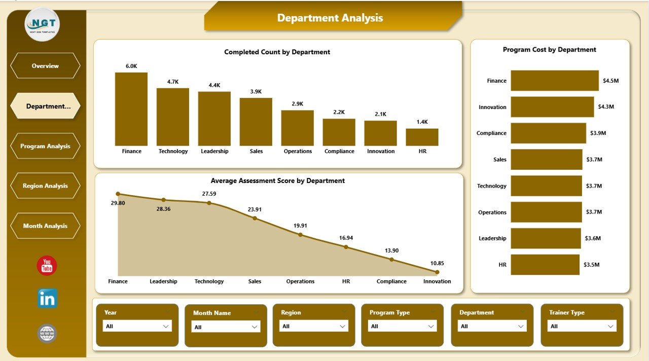
The Department Analysis Page focuses on training performance at the departmental level. It helps learning teams compare engagement, costs, and assessment outcomes across departments.
Key Charts on the Department Analysis Page
-
Completed Count by Department
Displays how many participants completed programs in each department. -
Program Cost by Department
Highlights training investment distribution across departments. -
Average Assessment Score by Department
Measures learning effectiveness and knowledge retention by department.
This page helps organizations identify:
-
High-performing departments
-
Departments needing additional learning support
-
Cost-heavy departments with low returns
As a result, learning leaders can reallocate resources more effectively.
Click to Purchases Corporate Universities Dashboard in Power BI
Program Analysis Page: Which Programs Deliver the Best Results?
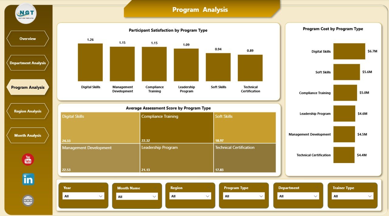
The Program Analysis Page evaluates training effectiveness by program type. It answers critical questions about program value and learner satisfaction.
Key Charts on the Program Analysis Page
-
Participant Satisfaction by Program Type
Shows how learners rate different types of training programs. -
Program Cost by Program Type
Compares cost efficiency across leadership, technical, compliance, and soft-skill programs. -
Average Assessment Score by Program Type
Measures learning outcomes for each program category.
Using this page, organizations can:
-
Identify high-impact programs
-
Optimize low-performing programs
-
Balance cost and learning outcomes
Therefore, program design becomes more data-driven and effective.
Region Analysis Page: How Does Training Performance Vary by Region?
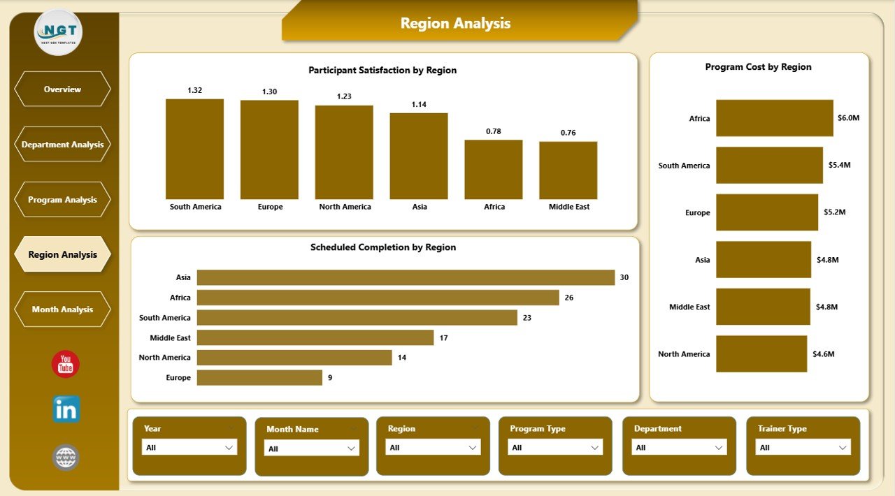
The Region Analysis Page provides insights into training performance across geographic regions. It supports global organizations with distributed learning operations.
Key Charts on the Region Analysis Page
-
Participant Satisfaction by Region
Highlights learner experience differences across regions. -
Program Cost by Region
Shows regional training spend patterns. -
Average Assessment Score by Region
Compares learning effectiveness across locations.
This page helps organizations:
-
Standardize training quality globally
-
Identify regional training gaps
-
Optimize regional training budgets
Because regional insights matter, this page supports global learning strategy alignment.
Monthly Trends Page: What Trends Appear Over Time?
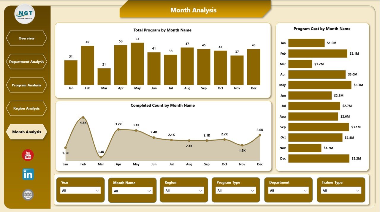
The Monthly Trends Page focuses on time-based analysis. It helps stakeholders track training progress and performance over months.
Key Charts on the Monthly Trends Page
-
Total Program by Month
Shows training volume trends over time. -
Program Cost by Month
Tracks monthly training expenditure. -
Completed Count by Month
Highlights completion trends and seasonal patterns.
This page helps learning teams:
-
Forecast future training needs
-
Identify peak training periods
-
Monitor budget usage trends
Therefore, organizations gain better planning and forecasting capabilities.
Advantages of a Corporate Universities Dashboard in Power BI
A Corporate Universities Dashboard in Power BI delivers significant advantages for organizations of all sizes.
Key Advantages
-
Centralized learning analytics in one dashboard
-
Real-time performance tracking
-
Improved decision-making with visual insights
-
Better alignment between training and business goals
-
Reduced manual reporting effort
-
Enhanced accountability for learning investments
-
Improved learner experience through data-backed improvements
Because data drives clarity, this dashboard becomes a strategic asset.
Who Can Benefit from a Corporate Universities Dashboard?
This dashboard serves multiple stakeholders across the organization.
Primary Beneficiaries
-
Learning and Development Managers
-
HR Leadership Teams
-
Corporate University Administrators
-
Training Coordinators
-
Business Unit Heads
-
Executive Leadership
Each role gains tailored insights that support smarter decisions.
How Does This Dashboard Improve Learning ROI?
Return on Investment (ROI) remains a critical concern for corporate learning. A Corporate Universities Dashboard in Power BI directly addresses this challenge.
Ways the Dashboard Improves ROI
-
Tracks cost versus learning outcomes
-
Identifies underperforming programs early
-
Highlights high-impact training initiatives
-
Supports budget optimization
-
Enables continuous improvement cycles
As a result, learning investments deliver measurable business value.
Best Practices for the Corporate Universities Dashboard in Power BI
Click to Purchases Corporate Universities Dashboard in Power BI
To maximize the value of your dashboard, you must follow proven best practices.
Best Practices to Follow
-
Use clean and consistent data sources
-
Define clear KPIs aligned with learning objectives
-
Update data regularly for accuracy
-
Use meaningful slicers for easy navigation
-
Keep visuals simple and focused
-
Avoid overcrowding dashboard pages
-
Train users to interpret insights correctly
-
Review dashboard insights during leadership meetings
When organizations follow these best practices, dashboard adoption and impact increase significantly.
Common Use Cases of Corporate Universities Dashboards
Organizations use Corporate Universities Dashboards in Power BI across various scenarios.
Popular Use Cases
-
Executive training performance reviews
-
Annual learning budget planning
-
Program effectiveness evaluation
-
Department-level skill gap analysis
-
Trainer performance assessment
-
Regional learning strategy alignment
Because of its flexibility, the dashboard adapts to multiple learning needs.
How to Get Started with a Corporate Universities Dashboard in Power BI?
Getting started does not require complex systems.
Simple Steps to Start
-
Define learning KPIs and objectives
-
Collect training data from LMS or Excel files
-
Structure data in a clean format
-
Build Power BI visuals and measures
-
Validate insights with stakeholders
-
Deploy the dashboard to users
-
Review and improve continuously
By following these steps, organizations can launch learning analytics quickly.
Challenges in Corporate Learning Analytics and How This Dashboard Solves Them
Learning analytics often face common challenges.
Common Challenges
-
Data scattered across systems
-
Lack of standardized KPIs
-
Manual reporting delays
-
Poor visibility into learning impact
How the Dashboard Solves These Challenges
-
Centralizes all learning data
-
Standardizes metrics and KPIs
-
Automates reporting
-
Provides visual clarity
-
Supports timely decisions
Therefore, analytics becomes simple and actionable.
Future of Corporate Learning Dashboards in Power BI
Corporate learning continues to evolve. As organizations embrace digital transformation, learning dashboards will become even more critical.
Future Trends
-
AI-driven learning insights
-
Predictive learning analytics
-
Personalized learning dashboards
-
Deeper LMS integrations
-
Real-time performance alerts
Organizations that invest early will stay ahead in talent development.
Conclusion: Why a Corporate Universities Dashboard in Power BI Matters
A Corporate Universities Dashboard in Power BI transforms how organizations manage, evaluate, and improve learning initiatives. Instead of relying on assumptions, organizations gain clarity through data.
This dashboard brings together completion metrics, assessment scores, cost analysis, and trend insights into one powerful analytics solution. As a result, learning leaders make smarter decisions, improve ROI, and align training with business strategy.
In today’s competitive landscape, data-driven learning is no longer optional. Therefore, a Corporate Universities Dashboard in Power BI becomes a must-have tool for modern organizations.
Frequently Asked Questions (FAQs)
What is a Corporate Universities Dashboard in Power BI?
A Corporate Universities Dashboard in Power BI is an interactive analytics tool that tracks training performance, costs, and learning outcomes across an organization’s corporate university.
Who should use this dashboard?
Learning managers, HR leaders, corporate university administrators, and executives benefit the most from this dashboard.
Can this dashboard integrate with LMS data?
Yes, the dashboard can integrate with LMS exports, Excel files, and other structured data sources.
How often should the dashboard data be updated?
Organizations should update data monthly or weekly, depending on training volume and reporting needs.
Does this dashboard support global organizations?
Yes, the Region Analysis page supports multi-region and global learning operations.
Can this dashboard help reduce training costs?
Yes, by highlighting cost inefficiencies and low-performing programs, the dashboard supports better budget optimization.
Is Power BI suitable for learning analytics?
Yes, Power BI offers interactive visuals, real-time insights, and scalability, making it ideal for learning analytics.
Visit our YouTube channel to learn step-by-step video tutorials