Managing an asset management company without real-time performance visibility creates risk, delays, and missed opportunities. Asset managers must constantly track revenue, profit, costs, asset classes, fund types, client segments, and monthly trends. However, when this information stays scattered across spreadsheets and static reports, decision-making becomes slow and reactive.
That is exactly why an Asset Management Companies Dashboard in Power BI plays a critical role in modern investment and portfolio management. This dashboard converts complex financial and operational data into clear, interactive, and actionable insights. As a result, leadership teams gain clarity, confidence, and control over their asset management performance.
In this in-depth article, you will learn what an Asset Management Companies Dashboard in Power BI is, how it works, why it matters, how each dashboard page supports business decisions, and how to use it effectively. Additionally, you will explore its advantages, best practices, use cases, and frequently asked questions. By the end, you will clearly understand how this dashboard transforms raw data into strategic intelligence.
Click to Purchases Asset Management Companies Dashboard in Power BI
What Is an Asset Management Companies Dashboard in Power BI?
An Asset Management Companies Dashboard in Power BI is an interactive business intelligence solution designed to track, analyze, and visualize key performance indicators (KPIs) for asset management firms. Instead of relying on manual reports, this dashboard consolidates data into a single visual platform.
Moreover, the dashboard enables asset managers to monitor profitability, operating costs, revenue distribution, risk exposure, and performance trends across asset classes, fund types, regions, and client segments. Because Power BI supports dynamic filters and real-time visuals, decision-makers can explore data from multiple angles without technical complexity.
In simple terms, this dashboard acts as a performance command center for asset management companies.
Why Do Asset Management Companies Need a Power BI Dashboard?
Asset management firms operate in a highly competitive and regulated environment. Therefore, leaders must make fast, informed decisions while managing risk and maximizing returns. However, traditional reporting methods often slow down this process.
An Asset Management Companies Dashboard in Power BI solves these challenges by delivering:
-
Centralized performance visibility
-
Faster decision-making
-
Accurate profitability tracking
-
Better risk and cost control
-
Clear trend identification
Furthermore, the dashboard enables proactive management rather than reactive reporting. Because leaders see issues early, they can take corrective actions before problems escalate.
How Does an Asset Management Dashboard in Power BI Work?
The dashboard works by connecting structured data—often from Excel, databases, or ERP systems—into Power BI. After data loading, predefined measures calculate key metrics such as revenue, profit, profit margin, and operating cost.
Once the data model is ready, Power BI visuals display insights across multiple pages. Additionally, slicers allow users to filter data by asset class, fund type, client segment, region, or time period.
As a result, users can interact with data instantly and explore performance at both high-level and detailed views.
What Are the Key Pages of the Asset Management Companies Dashboard in Power BI?
This dashboard includes five powerful pages, each designed to answer specific business questions. Let us explore each page in detail.
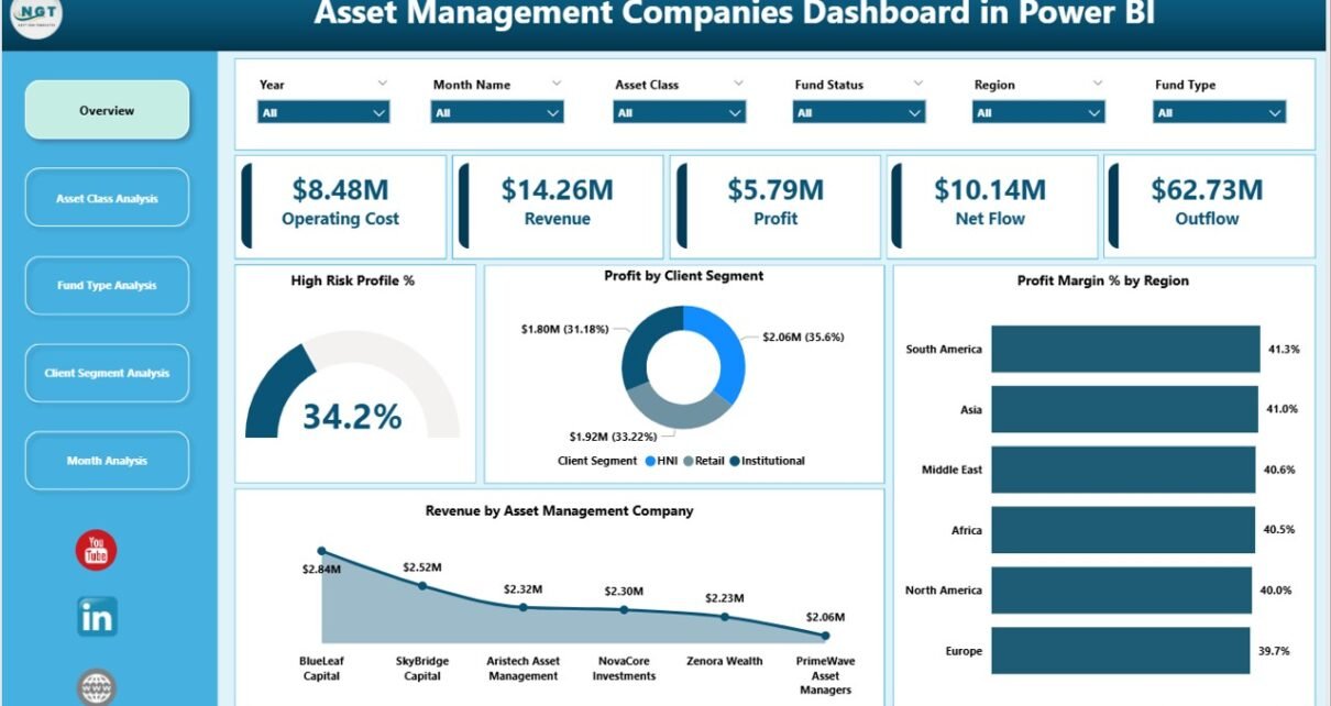
Overview Page: How Does It Provide a High-Level Performance Snapshot?
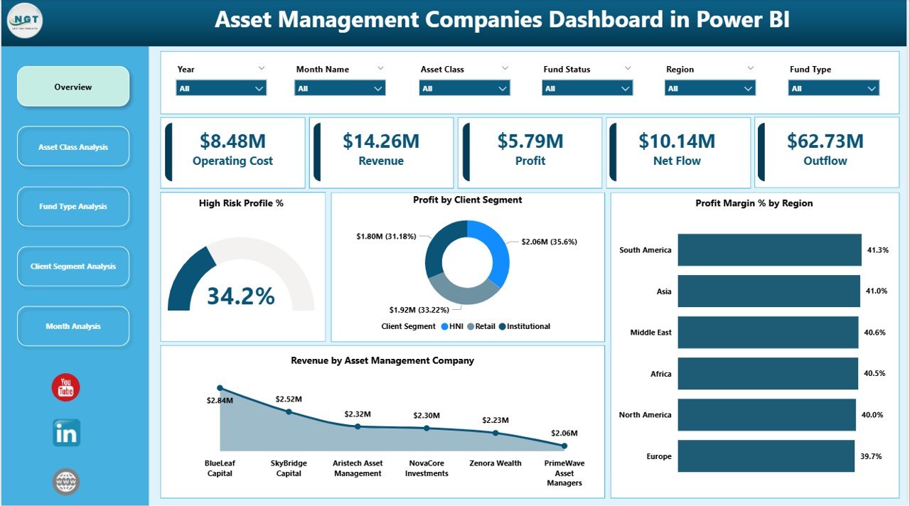
The Overview Page serves as the main landing page of the dashboard. It provides an immediate snapshot of overall business performance.
Key Elements of the Overview Page
-
Slicers
Users can filter data dynamically using slicers. These slicers help focus analysis on specific dimensions such as asset management companies, regions, or periods. -
KPI Cards (4 Cards)
The dashboard displays four key cards that highlight critical performance indicators. These cards quickly communicate essential numbers without requiring deep analysis. -
Visual Charts (4 Charts)
-
High Risk Profit %
This chart helps assess how much profit comes from high-risk investments. Therefore, managers can balance risk and return effectively. -
Profit by Client Segment
This visual shows which client segments generate the highest profit. Consequently, teams can prioritize profitable relationships. -
Profit Margin % by Region
This chart reveals regional profitability differences. As a result, firms can refine regional strategies. -
Revenue by Asset Management Company
This chart compares revenue contribution across asset management entities.
-
Why the Overview Page Matters
Because leadership teams need fast insights, the Overview Page acts as a strategic dashboard. It allows executives to understand business health within seconds.
Asset Class Analysis: How Do Different Asset Classes Perform?
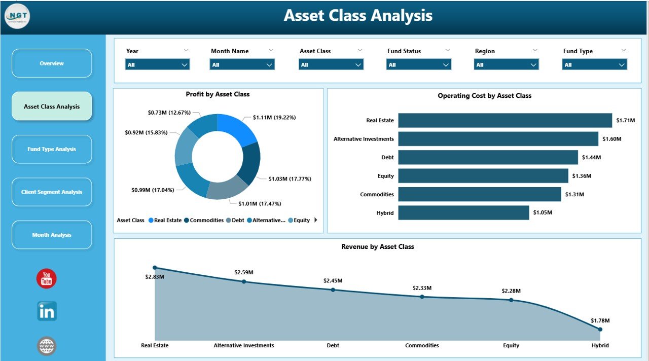
The Asset Class Analysis Page dives deeper into performance by asset category. Since asset management firms handle diverse portfolios, this page becomes essential.
Charts Included on This Page
-
Profit by Asset Class
This chart identifies which asset classes generate the highest profit. Therefore, managers can adjust allocation strategies. -
Operating Cost by Asset Class
This visual highlights cost distribution across asset classes. As a result, firms can identify cost-heavy segments. -
Revenue by Asset Class
This chart shows revenue contribution by asset type, helping teams understand income sources.
Business Value of Asset Class Analysis
Because asset classes carry different risk and return profiles, this page helps optimize portfolio composition. Moreover, it supports data-driven rebalancing decisions.
Click to Purchases Asset Management Companies Dashboard in Power BI
Fund Type Analysis: Which Fund Types Drive Growth?
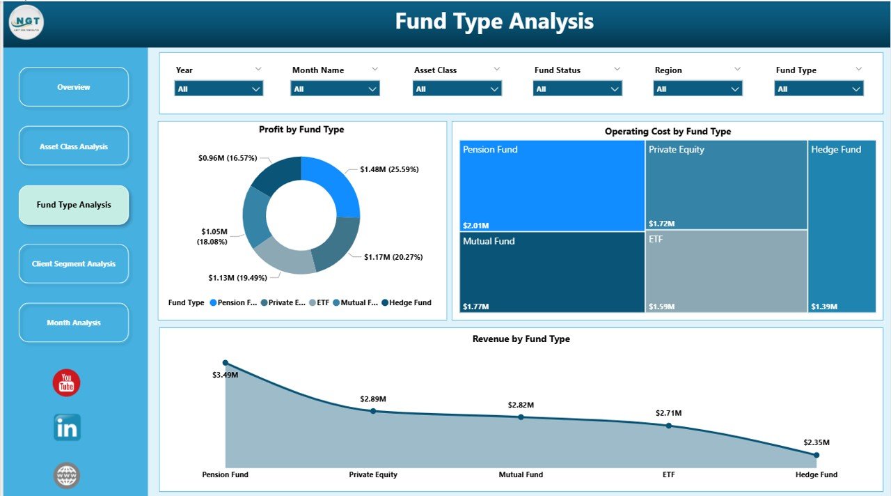
The Fund Type Analysis Page focuses on performance across different fund structures such as equity funds, debt funds, hybrid funds, or alternative investments.
Charts on the Fund Type Analysis Page
-
Profit by Fund Type
This chart reveals which fund types deliver the highest profitability. -
Operating Cost by Fund Type
This visual helps monitor cost efficiency across fund offerings. -
Revenue by Fund Type
This chart shows revenue contribution by fund category.
Why Fund Type Analysis Is Important
Because not all fund types perform equally in every market condition, this page helps asset managers adapt product strategies quickly. Additionally, it supports informed fund expansion or consolidation decisions.
Client Segment Analysis: Which Clients Create Maximum Value?
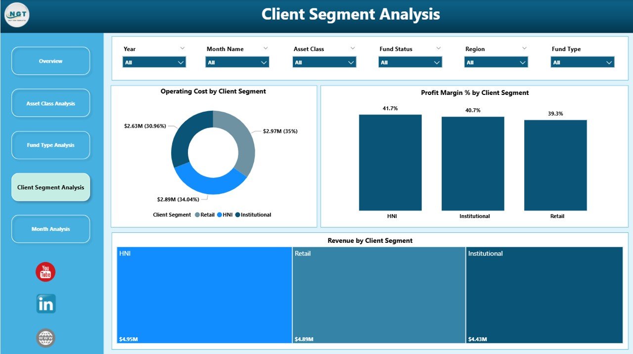
The Client Segment Analysis Page focuses on understanding client profitability and cost behavior.
Key Visuals on This Page
-
Operating Cost by Client Segment
This chart highlights which client segments incur the highest servicing costs. -
Profit Margin % by Client Segment
This visual shows margin differences across client categories. -
Revenue by Client Segment
This chart displays revenue distribution by client type.
How Client Segment Analysis Supports Strategy
Because different clients generate different value, this page helps firms refine pricing, service models, and relationship strategies. Consequently, asset managers can focus on high-value clients while optimizing costs.
Monthly Trends: How Does Performance Change Over Time?
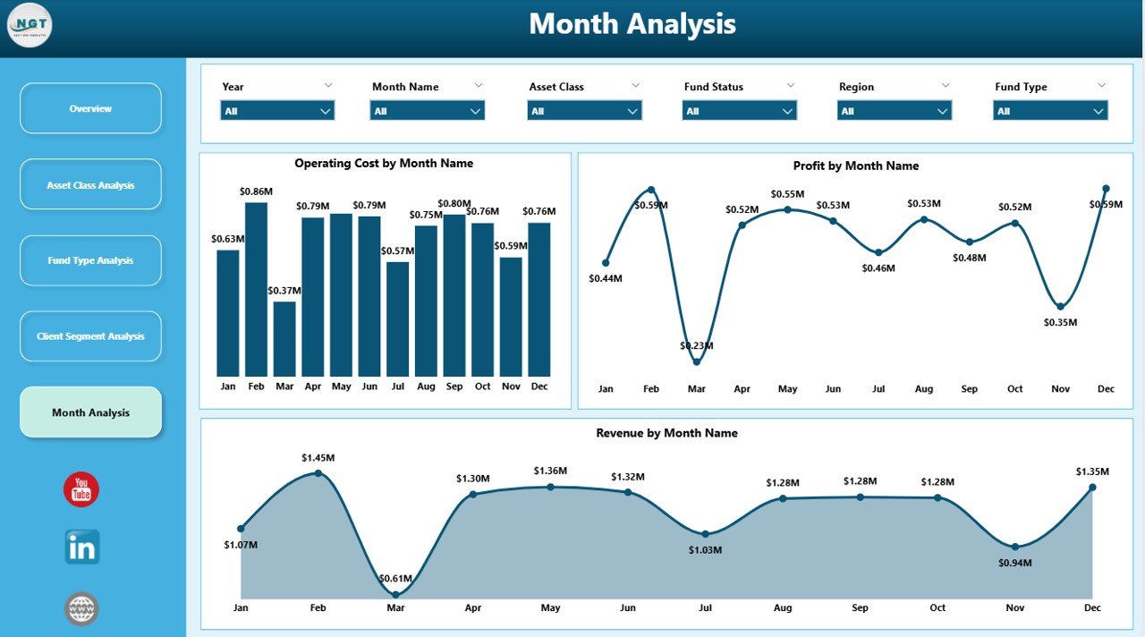
The Monthly Trends Page provides a time-based view of performance.
Charts Included in Monthly Trends
-
Operating Cost by Month
This chart tracks cost trends over time. -
Profit by Month
This visual highlights profitability trends and seasonal patterns. -
Revenue by Month
This chart shows revenue growth or decline month by month.
Importance of Monthly Trend Analysis
Because trends reveal patterns, this page supports forecasting, budgeting, and performance planning. Moreover, it helps identify anomalies early.
Click to Purchases Asset Management Companies Dashboard in Power BI
Advantages of Asset Management Companies Dashboard in Power BI
Using an Asset Management Companies Dashboard in Power BI delivers multiple advantages for investment firms.
Key Advantages
-
Centralized Performance Monitoring
All KPIs stay available in one dashboard, reducing reporting complexity. -
Improved Decision-Making
Interactive visuals allow faster and more accurate decisions. -
Enhanced Profitability Analysis
Managers can identify high-performing assets, funds, and clients easily. -
Better Cost Control
Detailed cost insights help optimize operational efficiency. -
Scalability and Flexibility
The dashboard adapts as the business grows.
How Does This Dashboard Support Strategic Decision-Making?
This dashboard supports strategic decision-making by:
-
Highlighting profitable and underperforming segments
-
Enabling data-driven portfolio adjustments
-
Supporting risk assessment through profit-risk visuals
-
Improving transparency across teams
Because leaders rely on accurate data, the dashboard becomes a trusted decision-support system.
Best Practices for the Asset Management Companies Dashboard in Power BI
To maximize dashboard value, organizations should follow proven best practices.
Best Practices You Should Follow
-
Define Clear KPIs
Always align KPIs with business objectives. -
Maintain Data Quality
Clean, accurate data ensures reliable insights. -
Use Consistent Naming and Formatting
Consistency improves usability and understanding. -
Limit Visual Clutter
Focus on clarity rather than excessive charts. -
Review and Update Regularly
Keep the dashboard aligned with evolving business needs.
Common Use Cases of Asset Management Dashboard in Power BI
This dashboard supports multiple real-world use cases:
-
Portfolio performance review
-
Client profitability analysis
-
Fund performance comparison
-
Cost optimization initiatives
-
Monthly management reporting
Because the dashboard adapts to various needs, teams across finance, operations, and leadership can use it effectively.
What Challenges Can This Dashboard Help Solve?
Asset management companies often face challenges such as:
-
Fragmented reporting
-
Delayed insights
-
Limited transparency
-
Inefficient cost tracking
This Power BI dashboard addresses these issues by centralizing data and enabling real-time analysis.
Conclusion: Why Should Asset Management Firms Adopt Power BI Dashboards?
An Asset Management Companies Dashboard in Power BI empowers firms to move beyond static reports and manual analysis. It delivers clarity, speed, and actionable insights across asset classes, fund types, client segments, and time periods.
Because investment decisions depend on accurate data, this dashboard becomes an essential tool for modern asset management. Firms that adopt it gain a competitive advantage through better visibility, improved efficiency, and smarter decision-making.
Frequently Asked Questions (FAQs)
What data sources can feed an Asset Management Companies Dashboard in Power BI?
Power BI can connect to Excel, databases, cloud systems, and ERP platforms commonly used by asset management firms.
Can this dashboard handle large volumes of data?
Yes, Power BI efficiently manages large datasets with optimized data models.
Is this dashboard suitable for small asset management firms?
Yes, both small and large firms can customize the dashboard based on their scale and needs.
How often should the dashboard update?
Most firms update data daily or monthly, depending on reporting requirements.
Can users customize visuals and filters?
Yes, Power BI allows full customization of visuals, slicers, and measures.
Does this dashboard support strategic planning?
Absolutely. It supports forecasting, budgeting, and long-term investment strategy planning.
Visit our YouTube channel to learn step-by-step video tutorials