Emergency Medical Services (EMS) operate in high-pressure environments where every second matters. Therefore, leaders must track performance continuously, identify gaps quickly, and take corrective action without delay. However, when EMS data stays scattered across spreadsheets and manual reports, decision-making becomes slow and reactive.
That is exactly why an Emergency Medical Services KPI Dashboard in Power BI plays a critical role in modern emergency response systems.
In this in-depth, SEO-friendly, and easy-to-understand guide, you will learn what an Emergency Medical Services KPI Dashboard in Power BI is, why it matters, how it works, and how each dashboard page supports smarter operational and strategic decisions. Moreover, this article explains its advantages, opportunities for improvement, best practices, and frequently asked questions so you can confidently implement and use this dashboard.
Click to buy Emergency Medical Services KPI Dashboard in Power BI
What Is an Emergency Medical Services KPI Dashboard in Power BI?
An Emergency Medical Services KPI Dashboard in Power BI is a ready-to-use analytical solution designed to monitor, analyze, and improve EMS performance using structured key performance indicators (KPIs).
Instead of relying on static Excel reports or disconnected systems, this dashboard converts EMS operational data into interactive visuals, comparisons, and trends. As a result, EMS directors, hospital administrators, and emergency planners gain real-time visibility into response efficiency, service quality, and resource utilization.
Because the dashboard uses Power BI as the visualization layer and Excel as the data source, it remains both powerful and easy to maintain.
Why Do Emergency Medical Services Need a KPI Dashboard?
Emergency Medical Services face constant challenges such as rising call volumes, limited resources, strict response time targets, and increasing public expectations. Therefore, EMS organizations must track performance accurately and consistently.
Without a KPI dashboard, teams struggle with:
- Delayed response time analysis
- Lack of visibility into target achievement
- Manual KPI calculations
- Limited historical comparison
- Slow performance reviews
However, when you implement an Emergency Medical Services KPI Dashboard in Power BI, you gain clarity, speed, and control over critical operations.
How Does the Emergency Medical Services KPI Dashboard in Power BI Work?
This dashboard follows a simple yet powerful architecture. First, you capture EMS KPI data in structured Excel sheets. Then, Power BI reads this data, applies calculations, and displays insights through interactive visuals.
Because the design stays modular, you can update data easily without changing dashboard logic. Additionally, decision-makers can filter data by month or KPI group to analyze performance instantly.
What Are the Key Pages in the Emergency Medical Services KPI Dashboard?
The Emergency Medical Services KPI Dashboard in Power BI contains three well-structured pages, each designed for a specific analytical purpose.
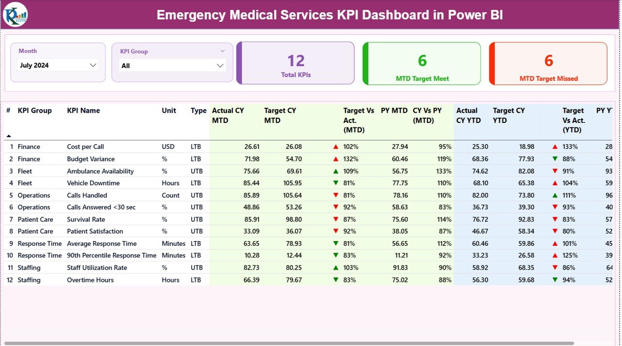
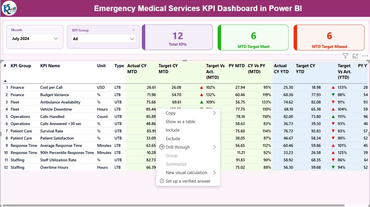
Summary Page Show
The Summary Page serves as the main control center of the dashboard. From this page, users get a complete snapshot of EMS performance.
Key Elements of the Summary Page
- Month Slicer
Select a specific month to view MTD and YTD performance instantly. - KPI Group Slicer
Filter KPIs by operational, clinical, or response categories.
Performance Cards
Total KPIs Count
MTD Target Meet Count
MTD Target Missed Count
These cards help leaders quickly understand overall performance health.
What Information Does the KPI Table Contain?
The detailed KPI table provides deep visibility into every EMS KPI.
It includes:
- KPI Number – Sequence number of the KPI
- KPI Group – Category of the KPI
- KPI Name – Name of the performance indicator
- Unit – Unit of measurement
- Type – LTB (Lower the Better) or UTB (Upper the Better)
- Actual CY MTD – Current Year Month-to-Date actual value
- Target CY MTD – Current Year MTD target
- MTD Icon – Red ▼ or Green ▲ indicating target status
- Target vs Actual (MTD) – Actual ÷ Target percentage
- PY MTD – Previous Year MTD value
- CY vs PY (MTD) – Current vs Previous Year comparison
- Actual CY YTD – Current Year Year-to-Date actual
- Target CY YTD – Current Year YTD target
- YTD Icon – Status indicator for YTD
- Target vs Actual (YTD) – Actual ÷ Target YTD
- PY YTD – Previous Year YTD value
- CY vs PY (YTD) – Current vs Previous Year YTD comparison
Because everything stays in one table, users can scan performance quickly without switching screens.
Click to buy Emergency Medical Services KPI Dashboard in Power BI
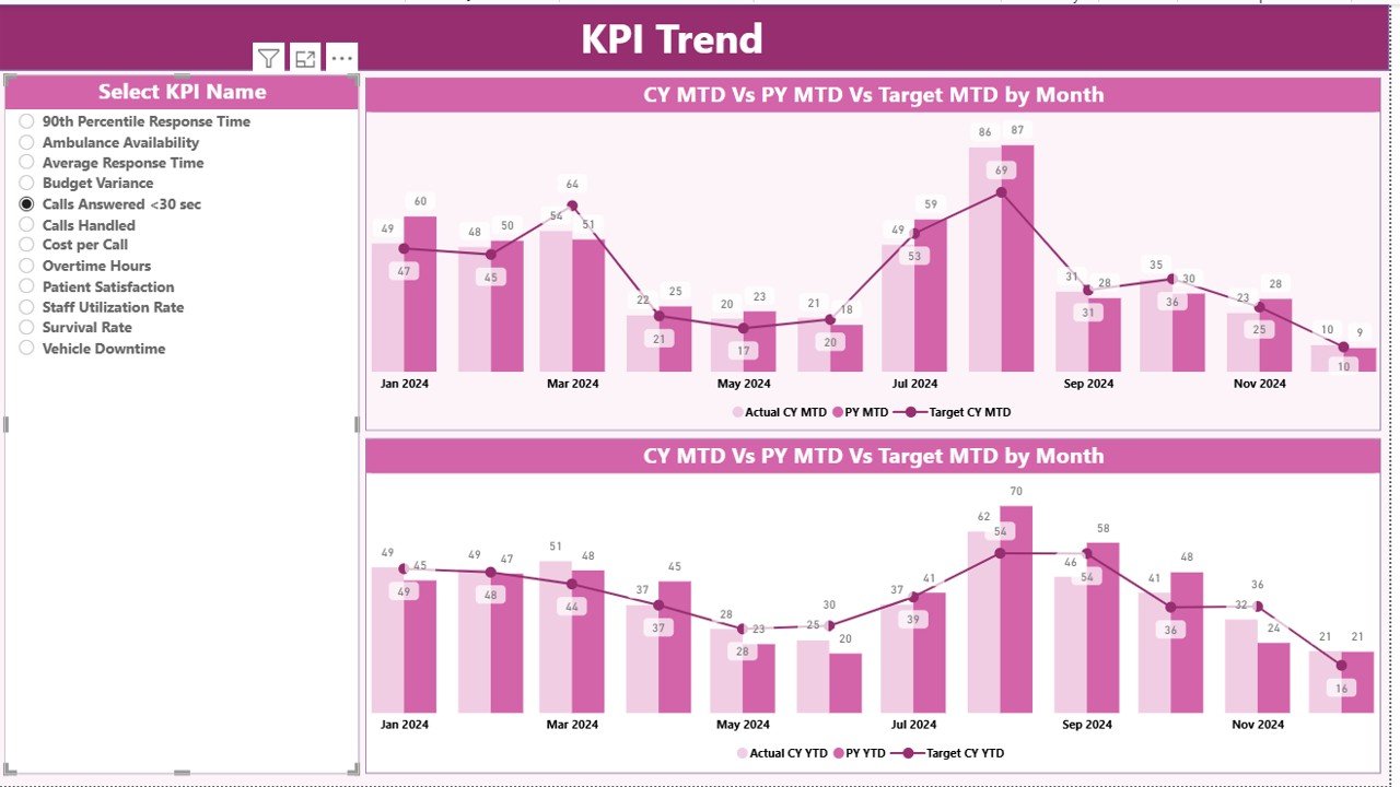
KPI Trend Page
The KPI Trend Page focuses on time-based analysis. While the summary page shows status, the trend page explains why performance changes.
Key Features of the KPI Trend Page
Two Combo Charts
MTD Actual vs Target vs Previous Year
YTD Actual vs Target vs Previous Year
KPI Name Slicer
Select any KPI to analyze trends instantly.
Because combo charts display bars and lines together, trends become easy to interpret even for non-technical users.
Click to buy Emergency Medical Services KPI Dashboard in Power BI
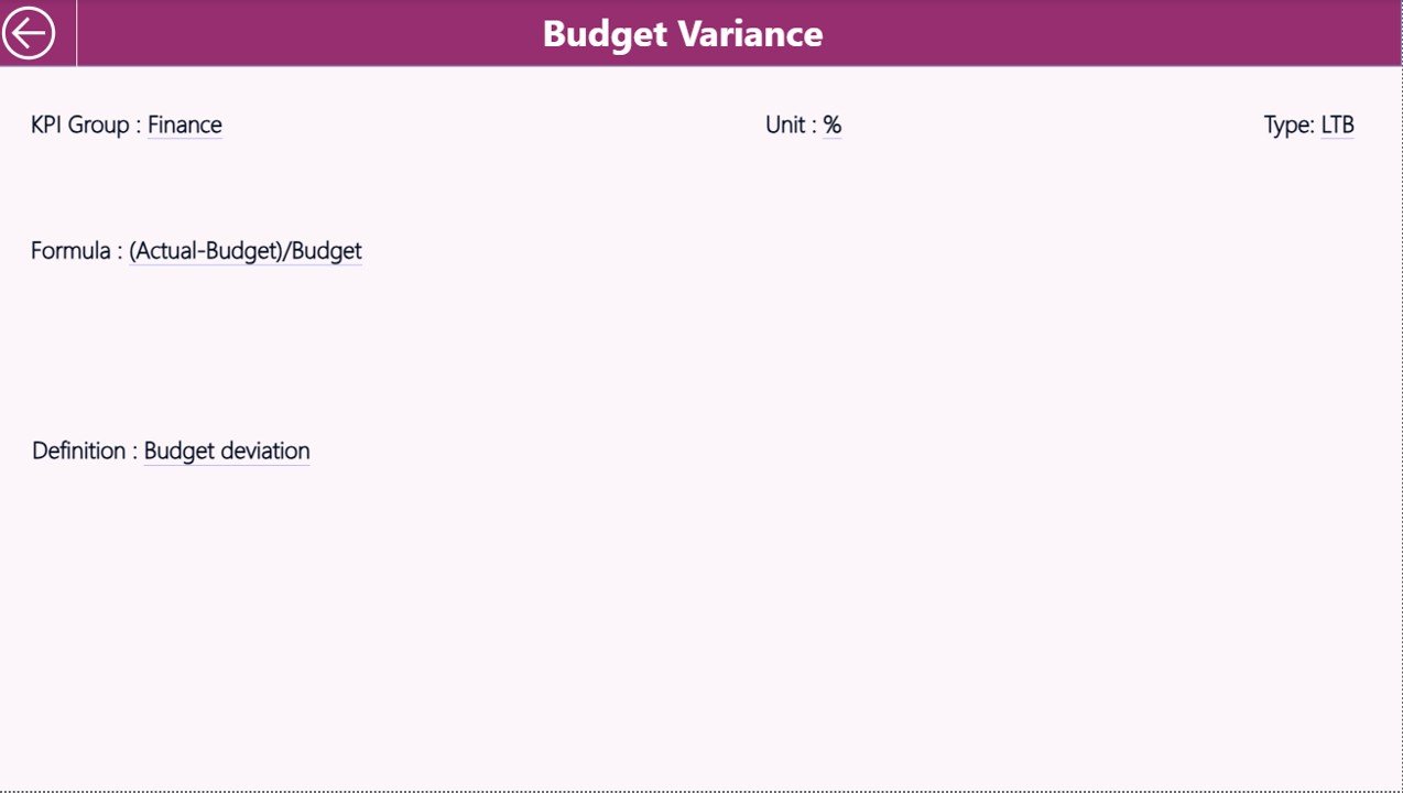
the KPI Definition Page
The KPI Definition Page provides clarity and governance. This page stays hidden by default and works as a drill-through page.
From the summary page, users can drill through to see:
- KPI Formula
- KPI Definition
- Unit of Measurement
- KPI Type (LTB or UTB)
This design ensures that everyone interprets KPIs consistently.
Click to buy Emergency Medical Services KPI Dashboard in Power BI
How Does Navigation Work in the Dashboard?
Navigation remains simple and intuitive. When users finish reviewing KPI definitions, they can click the Back button located in the top-left corner to return to the summary page instantly.
Excel Data Structure Behind the Dashboard
The Emergency Medical Services KPI Dashboard in Power BI uses an Excel file as its data source. This approach keeps data entry flexible and accessible.
Input_Actual Sheet
In the Input_Actual sheet, users enter actual EMS performance data.
You need to fill:
- KPI Name
- Month (use the first date of the month)
- MTD Actual Value
- YTD Actual Value
Because the structure stays consistent, Power BI refreshes visuals automatically.
Click to buy Emergency Medical Services KPI Dashboard in Power BI
Input_Target Sheet
In the Input_Target sheet, users define performance expectations.
You need to fill:
- KPI Name
- Month (first date of the month)
- MTD Target Value
- YTD Target Value
Targets drive variance analysis across the dashboard.
KPI Definition Sheet
The KPI Definition sheet stores master data.
It includes:
- KPI Number
- KPI Group
- KPI Name
- Unit
- Formula
- Definition
- Type (LTB or UTB)
This sheet ensures KPI governance and documentation.
Advantages of Emergency Medical Services KPI Dashboard in Power BI
Using an Emergency Medical Services KPI Dashboard in Power BI delivers multiple benefits across operational and strategic levels.
Key Advantages
- Centralized Performance Monitoring
Track all EMS KPIs in one executive-ready dashboard. - Faster Decision-Making
Identify performance gaps instantly using visual indicators. - Improved Response Time Management
Monitor trends and act before service levels decline. - Clear Target Accountability
Compare actuals against targets for MTD and YTD. - Historical Performance Insight
Measure improvement using previous year comparisons. - Easy Data Maintenance
Update Excel data without complex integrations.
Opportunities for Improvement Using EMS KPI Dashboards
While the dashboard already delivers strong insights, organizations can unlock even more value with continuous improvement.
- Add call-type segmentation for deeper analysis
- Introduce geographic response mapping
- Track crew-level performance metrics
- Integrate hospital handover time KPIs
- Expand predictive trend analysis
Because Power BI scales easily, enhancements remain simple.
Best Practices for the Emergency Medical Services KPI Dashboard in Power BI
To maximize value, EMS organizations should follow proven best practices.
Best Practices
- Define KPIs clearly before data entry
- Use consistent units and time periods
- Review dashboards weekly, not monthly
- Train users on KPI interpretation
- Keep target values realistic and achievable
- Audit KPI definitions quarterly
- Limit KPI count to what truly matters
By following these practices, dashboards remain actionable rather than overwhelming.
Who Can Benefit from an Emergency Medical Services KPI Dashboard?
This dashboard supports a wide range of stakeholders.
- EMS Directors
- Emergency Operations Managers
- Hospital Administrators
- Quality Improvement Teams
- Public Health Officials
- City and Regional Planners
Because insights stay visual and intuitive, everyone benefits.
How Does Power BI Improve EMS Performance Tracking?
Power BI transforms raw EMS data into actionable intelligence. It enables filtering, drilling, and trend analysis without technical complexity. As a result, leaders spend less time preparing reports and more time improving outcomes.
Conclusion: Why Should You Use an Emergency Medical Services KPI Dashboard in Power BI?
An Emergency Medical Services KPI Dashboard in Power BI is not just a reporting tool. Instead, it becomes a performance management system for emergency response operations.
By combining structured Excel data with powerful Power BI visuals, EMS organizations gain clarity, accountability, and control. Moreover, they improve response times, meet targets consistently, and build data-driven cultures.
If your EMS organization wants faster insights, better decisions, and improved service quality, this dashboard offers a proven and practical solution.
Frequently Asked Questions (FAQs)
What is an Emergency Medical Services KPI Dashboard in Power BI?
It is a ready-to-use Power BI dashboard that tracks EMS KPIs using Excel data and interactive visuals.
Do I need advanced Power BI skills to use this dashboard?
No. You only need basic Excel knowledge to update data and simple Power BI navigation skills.
Can I customize KPIs in the dashboard?
Yes. You can add, remove, or modify KPIs by updating the Excel sheets.
How often should EMS KPIs be reviewed?
Ideally, teams should review KPIs weekly to identify trends early.
Is this dashboard suitable for small EMS organizations?
Yes. The Excel-based structure makes it scalable for both small and large EMS teams.
Can this dashboard support regulatory reporting?
Yes. The structured KPI definitions and historical comparisons support audits and compliance reviews.
Visit our YouTube channel to learn step-by-step video tutorials
Watch the step-by-step video tutorial:
Click to buy Emergency Medical Services KPI Dashboard in Power BI