Environmental services organizations operate in a complex environment. They manage costs, meet service-level agreements, reduce emissions, and still deliver reliable services across regions and channels. However, many teams still rely on disconnected Excel sheets and manual reports. As a result, leaders struggle to gain a clear and timely view of performance.
That is exactly where an Environmental Services Dashboard in Excel becomes a powerful solution.
In this in-depth guide, you will learn what an Environmental Services Dashboard in Excel is, why it matters, how it works, and how each dashboard sheet supports smarter decisions. Moreover, you will discover its advantages, best practices, real-world use cases, and answers to common questions. By the end, you will clearly understand how this dashboard can transform environmental operations, financial tracking, and sustainability reporting.
Click to buy Environmental Services Dashboard in Excel
What Is an Environmental Services Dashboard in Excel?
An Environmental Services Dashboard in Excel is a ready-to-use analytical tool that consolidates operational, financial, and sustainability data into a single interactive workbook.
Instead of reviewing multiple files for cost, revenue, SLA performance, fuel consumption, and emissions, this dashboard brings everything together in one structured view. Moreover, it allows decision-makers to monitor trends, compare regions, evaluate service channels, and act faster.
Because the dashboard runs in Microsoft Excel, teams can easily customize it, integrate it with existing data, and share insights without complex software investments.
Why Do Environmental Service Organizations Need a Dashboard in Excel?
Environmental service providers face increasing pressure. Regulations tighten, fuel costs fluctuate, and sustainability targets grow stricter. Therefore, organizations must track performance accurately and respond quickly.
An Environmental Services Dashboard in Excel helps because it:
- Centralizes operational, financial, and environmental data
- Improves visibility across sites, regions, and service channels
- Supports SLA compliance and performance improvement
- Enables cost control and profitability analysis
- Strengthens sustainability and emissions reporting
As a result, leaders no longer depend on delayed reports or guesswork.
How Does an Environmental Services Dashboard in Excel Work?
The dashboard works by structuring raw data into logical sheets and visual summaries. Each sheet focuses on a specific performance area. Together, they provide a complete picture of environmental service operations.
The dashboard typically includes the following sheet tabs:
- Overview
- Service Operation Analysis
- Channel Analysis
- Financial Analysis
- Monthly Trends
Each section answers a different business question. Therefore, users can move from high-level insights to detailed analysis with ease.
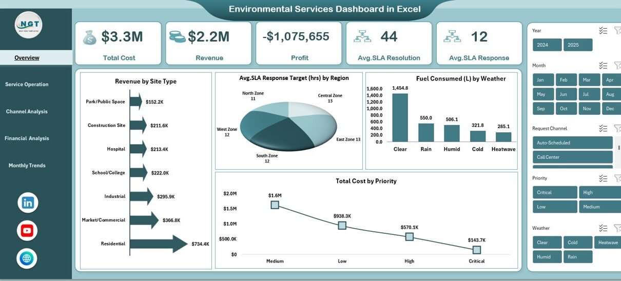
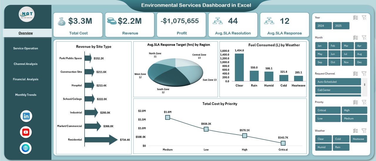
Overview Sheet
The Overview sheet acts as the executive summary of the Environmental Services Dashboard in Excel. It highlights critical KPIs at a glance and sets the context for deeper analysis.
Key Metrics on the Overview Sheet
- Total Cost – Displays overall operational expenditure
- Revenue – Shows total income generated from services
- Profit – Calculates the difference between revenue and cost
- Average SLA Resolution Target (hrs) – Tracks service resolution efficiency
- Average SLA Response Target (hrs) – Monitors response performance
Key Visual Insights
- Revenue by Site Type – Identifies high-performing service locations
- Avg. SLA Response Target (hrs) by Region – Highlights regional performance gaps
- Fuel Consumed (L) by Weather – Connects fuel usage with environmental conditions
- Total Cost by Priority – Reveals cost drivers based on service urgency
Because this sheet summarizes performance instantly, executives can identify risks and opportunities within seconds.
Click to buy Environmental Services Dashboard in Excel
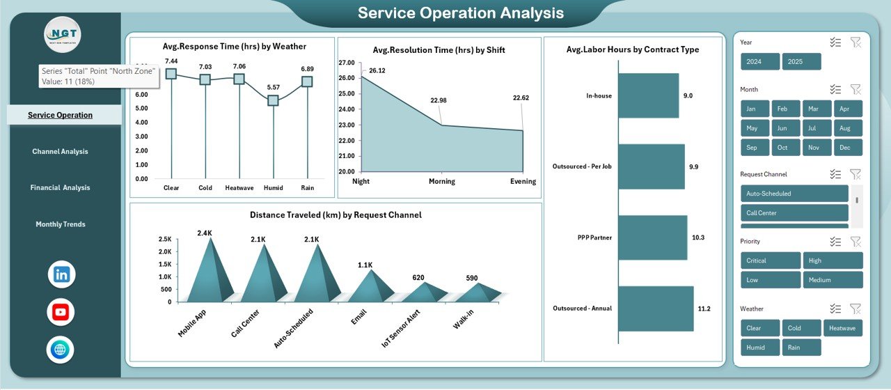
Service Operation Analysis
The Service Operation Analysis sheet focuses on operational efficiency. It helps managers understand how services perform under different conditions and structures.
Operational KPIs Tracked
- Avg. Response Time (hrs) by Weather
- Avg. Resolution Time (hrs) by Shift
- Distance Traveled (km) by Request Channel
- Avg. Labor Hours by Contract Type
Why This Analysis Matters
- It shows how weather impacts service response times
- It highlights which shifts resolve issues faster
- It reveals inefficiencies in travel and routing
- It compares labor effort across contract types
As a result, managers can optimize staffing, improve routing, and adjust service strategies proactively.
Click to buy Environmental Services Dashboard in Excel
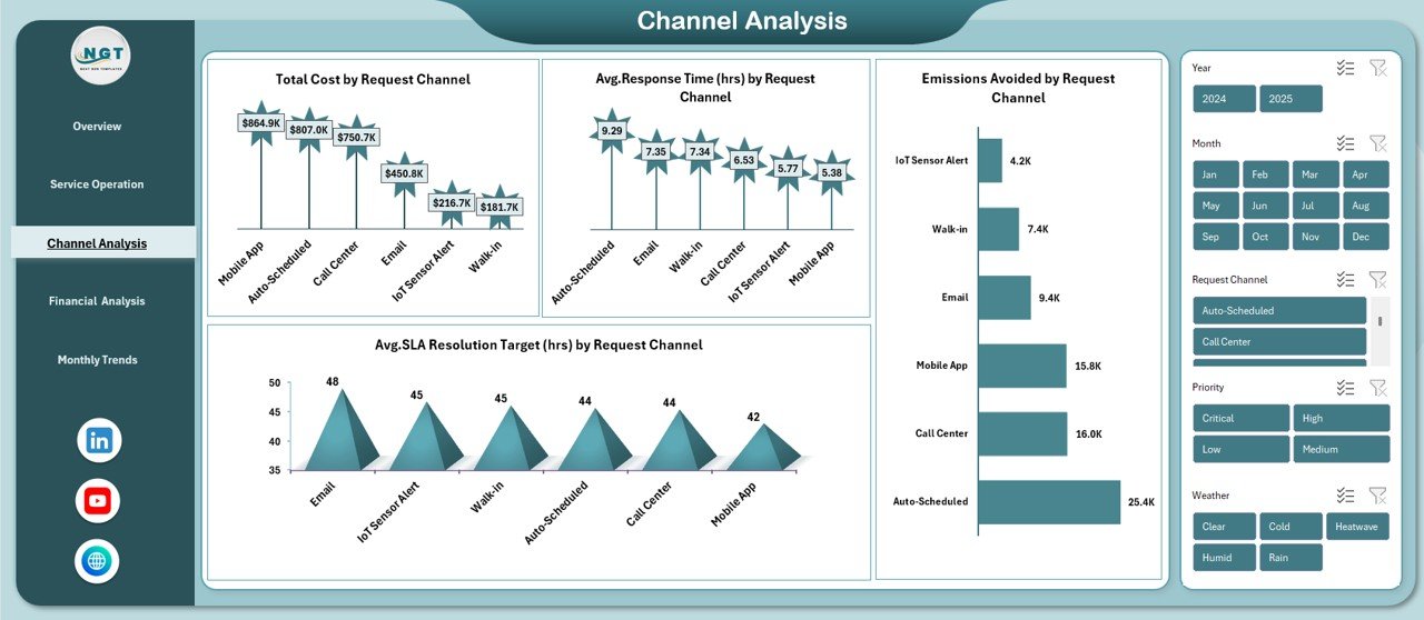
Channel Analysis
Environmental service requests arrive through multiple channels. Therefore, organizations must understand how each channel affects cost, response time, and sustainability.
The Channel Analysis sheet focuses on this exact need.
Channel-Wise Metrics Included
- Total Cost by Request Channel
- Avg. Response Time (hrs) by Request Channel
- Emissions Avoided by Request Channel
- SLA Resolution Target (hrs) by Request Channel
Business Value of Channel Analysis
- It identifies cost-efficient request channels
- It highlights faster and slower response paths
- It supports emissions reduction strategies
- It helps prioritize sustainable service channels
Consequently, leaders can promote channels that reduce cost and environmental impact simultaneously.
Click to buy Environmental Services Dashboard in Excel
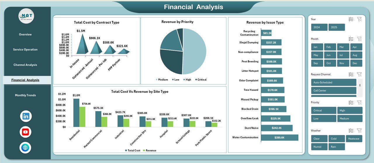
Financial Analysis
The Financial Analysis sheet connects operational performance with financial outcomes. It helps finance teams and operations leaders work from the same data.
Financial KPIs Covered
- Total Cost by Contract Type
- Revenue by Priority
- Total Cost vs Revenue by Site Type
- Revenue by Issue Type
Why Financial Analysis Is Critical
- It exposes unprofitable contracts
- It links service priority with revenue generation
- It compares cost recovery across site types
- It identifies high-value service issues
Because financial clarity improves accountability, organizations can align budgets with strategic goals.
Click to buy Environmental Services Dashboard in Excel
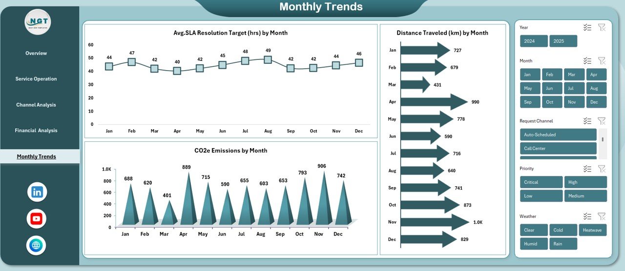
Monthly Trends
Trends reveal patterns that daily reports often miss. Therefore, the Monthly Trends sheet plays a vital role in long-term planning.
Monthly Metrics Tracked
- Avg. SLA Resolution Target (hrs) by Month
- CO2e Emissions by Month
- Distance Traveled (km) by Month
How Monthly Trends Help
- They show performance improvements or declines over time
- They support sustainability and emissions reporting
- They help forecast fuel and travel requirements
- They assist in capacity and workforce planning
As a result, leaders can shift from reactive decisions to strategic planning.
Click to buy Environmental Services Dashboard in Excel
Advantages of an Environmental Services Dashboard in Excel
An Environmental Services Dashboard in Excel delivers measurable value across operations, finance, and sustainability.
Key Advantages
- Centralized Visibility – View all KPIs in one place
- Improved Decision-Making – Act quickly with real-time insights
- Cost Control – Identify and reduce cost drivers
- SLA Compliance – Monitor response and resolution targets
- Sustainability Tracking – Measure fuel usage and emissions
- Flexibility – Customize metrics without heavy IT support
- Cost-Effective – Use Excel instead of expensive BI tools
Because of these benefits, many organizations adopt Excel dashboards as their primary performance management tool.
How Can Environmental Services Teams Use This Dashboard Daily?
Teams across the organization can use the dashboard in different ways.
Operations Managers
- Track response and resolution times
- Optimize routes and shifts
- Improve service efficiency
Finance Teams
- Monitor costs and revenue
- Analyze profitability by contract and site
- Support budgeting and forecasting
Sustainability Officers
- Track fuel consumption and emissions
- Measure emissions avoided
- Support regulatory and ESG reporting
Senior Leadership
- Review high-level KPIs
- Identify risks and growth opportunities
- Align strategy with performance data
Therefore, the dashboard supports cross-functional collaboration.
Best Practices for the Environmental Services Dashboard in Excel
To maximize value, organizations should follow proven best practices.
Data Management Best Practices
- Maintain clean and consistent data formats
- Validate SLA, cost, and fuel data regularly
- Use standardized categories for regions and channels
Dashboard Design Best Practices
- Keep visuals simple and focused
- Highlight KPIs that drive decisions
- Use consistent units and labels
Usage Best Practices
- Review the dashboard weekly or monthly
- Share insights across departments
- Update targets based on trend analysis
Governance Best Practices
- Define KPI ownership clearly
- Document metric definitions
- Align dashboard metrics with business goals
By following these practices, teams ensure accuracy, trust, and long-term adoption.
What Challenges Can This Dashboard Help Solve?
Environmental service organizations face recurring challenges. This dashboard addresses many of them.
Common Challenges Solved
- Lack of visibility across regions and sites
- Poor understanding of cost drivers
- Difficulty tracking SLA compliance
- Limited sustainability reporting
- Fragmented operational data
Because the dashboard integrates multiple perspectives, it reduces silos and improves transparency.
How Does This Dashboard Support Sustainability Goals?
Sustainability has become a strategic priority. This dashboard supports that goal directly.
It helps organizations:
- Monitor fuel consumption by weather and month
- Track CO2e emissions trends
- Measure emissions avoided by request channel
- Optimize routes to reduce travel distance
As a result, sustainability initiatives move from theory to measurable action.
Conclusion: Why Should You Use an Environmental Services Dashboard in Excel?
An Environmental Services Dashboard in Excel transforms raw operational data into actionable insights. It improves visibility, strengthens financial control, and supports sustainability goals. Moreover, it empowers teams to act faster, reduce costs, and improve service quality.
Because the dashboard remains flexible, cost-effective, and easy to use, it fits organizations of all sizes. If you want clarity, control, and confidence in your environmental service operations, this dashboard provides the foundation you need.
Frequently Asked Questions (FAQs)
What is an Environmental Services Dashboard in Excel used for?
An Environmental Services Dashboard in Excel tracks operational, financial, and sustainability KPIs in one interactive workbook. It supports decision-making, compliance, and performance improvement.
Who should use this dashboard?
Operations managers, finance teams, sustainability officers, and senior leaders can all use this dashboard to monitor performance and guide strategy.
Can I customize the dashboard for my organization?
Yes. You can easily modify KPIs, charts, and data sources in Excel to match your specific service model and reporting needs.
Does this dashboard support sustainability reporting?
Yes. It tracks fuel consumption, CO2e emissions, and emissions avoided, which supports sustainability and ESG reporting.
How often should the dashboard be updated?
Most organizations update it weekly or monthly. However, you can adjust the frequency based on data availability and decision requirements.
Is Excel suitable for environmental service analytics?
Yes. Excel offers flexibility, accessibility, and powerful analysis features. When designed correctly, Excel dashboards deliver strong insights without complex BI tools.
Visit our YouTube channel to learn step-by-step video tutorials
Watch the step-by-step video tutorial:
Click to buy Environmental Services Dashboard in Excel