Libraries and archives play a vital role in preserving knowledge, supporting education, and enabling research. However, as collections grow and user expectations increase, managing performance becomes more complex every year. Therefore, libraries and archives must track service quality, operational efficiency, resource utilization, and strategic outcomes with clarity and speed. That is exactly where a Libraries & Archives KPI Dashboard in Power BI becomes essential.
This detailed article explains what a Libraries & Archives KPI Dashboard in Power BI is, why it matters, how it works, and how institutions can use it effectively. Moreover, this guide explores advantages, best practices, real-world use cases, challenges, and frequently asked questions so you can confidently implement this dashboard in your organization.
Click to buy Libraries & Archives KPI Dashboard in Power BI
What Is a Libraries & Archives KPI Dashboard in Power BI?
A Libraries & Archives KPI Dashboard in Power BI is an interactive performance management tool designed to track, analyze, and visualize key performance indicators related to library services and archival operations.
Instead of relying on scattered Excel sheets and static reports, this dashboard consolidates all KPI data into one centralized Power BI solution. As a result, library directors, archivists, administrators, and decision-makers gain instant visibility into performance trends.
Moreover, this dashboard uses Excel as a data source, which makes data entry simple while keeping analysis powerful and dynamic inside Power BI.
Why Do Libraries and Archives Need KPI Dashboards?
Libraries and archives operate with limited budgets, growing collections, and increasing digital demands. Therefore, leaders must track performance continuously to improve services and justify funding.
A KPI dashboard helps because:
- It shows performance clearly and visually
- It highlights gaps between targets and actual results
- It supports data-driven decisions
- It improves transparency and accountability
- It saves time by reducing manual reporting
Consequently, libraries and archives can focus more on service improvement and less on report preparation.
How Does a Libraries & Archives KPI Dashboard in Power BI Work?
The dashboard follows a structured and logical flow. First, users enter data into Excel. Then, Power BI automatically transforms that data into interactive visuals.
Data Flow Overview
- Enter KPI data in Excel worksheets
- Connect Excel to Power BI
- Power BI calculates MTD, YTD, and comparisons
- Dashboards update automatically
- Users analyze results using slicers and visuals
As a result, performance insights remain accurate, timely, and easy to understand.
Key Features of the Libraries & Archives KPI Dashboard in Power BI
This ready-to-use dashboard includes three powerful pages, each designed for a specific analytical purpose.
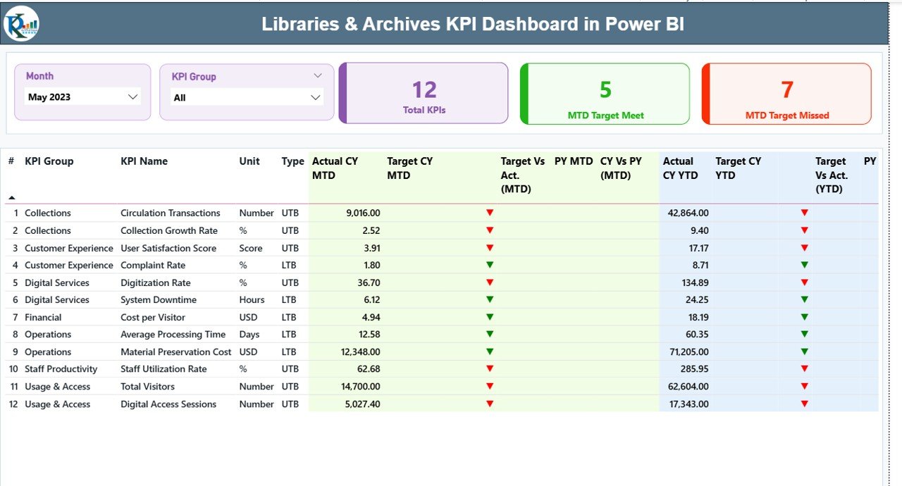
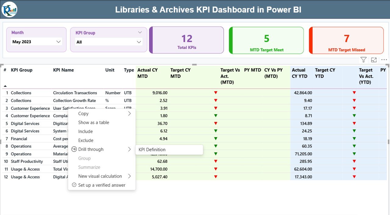
Summary Page
The Summary Page acts as the main control center of the dashboard.
Top-Level Filters and Cards
At the top of the page, you will find:
- Month slicer for time-based analysis
- KPI Group slicer to filter categories
Additionally, three key cards provide instant insights:
- Total KPIs Count
- MTD Target Met Count
- MTD Target Missed Count
Therefore, users can quickly understand overall performance status.
Detailed KPI Performance Table
Below the cards, a detailed KPI table displays comprehensive performance metrics.
Key Columns Explained
- KPI Number – Sequential identifier of each KPI
- KPI Group – Category or functional group of the KPI
- KPI Name – Name of the performance indicator
- Unit – Measurement unit (%, count, hours, etc.)
- Type – KPI nature:
UTB (Upper the Better)
LTB (Lower the Better)
Monthly Performance Metrics (MTD)
- Actual CY MTD – Current year actual month-to-date value
Target CY MTD – Target month-to-date value
MTD Icon –
▲ Green arrow for target achieved
▼ Red arrow for target missed
Target vs Actual (MTD) –
Formula: Actual MTD / Target MTD
PY MTD – Previous year MTD value
CY vs PY (MTD) –
Formula: Current Year MTD / Previous Year MTD
Yearly Performance Metrics (YTD)
- Actual CY YTD – Current year year-to-date actual
- Target CY YTD – Current year YTD target
- YTD Icon – Visual indicator of YTD performance
- Target vs Actual (YTD) –
Formula: Actual YTD / Target YTD
PY YTD – Previous year YTD value
CY vs PY (YTD) –
Formula: Current Year YTD / Previous Year YTD
Because of this structure, users can analyze short-term and long-term performance simultaneously.
Click to buy Libraries & Archives KPI Dashboard in Power BI
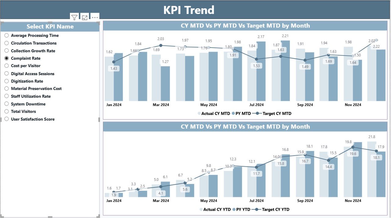
KPI Trend Page
The KPI Trend Page focuses on performance movement over time.
Key Elements of the KPI Trend Page
- Two combo charts showing:
Actual CY values
Actual PY values
Target values
- MTD Trend Chart
- YTD Trend Chart
- KPI Name slicer on the left
Therefore, users can select any KPI and instantly see how it performs against targets and historical data.
Click to buy Libraries & Archives KPI Dashboard in Power BI
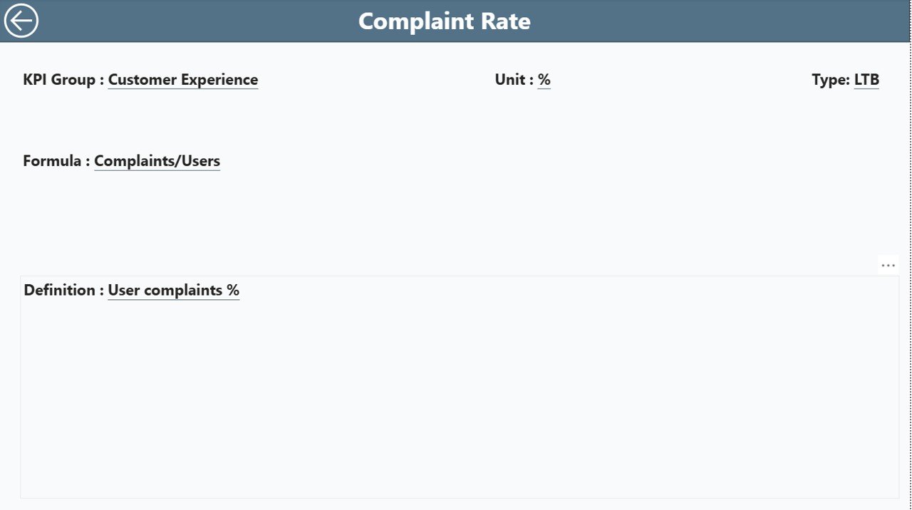
KPI Definition Page
The KPI Definition Page provides detailed context for each KPI.
Key Characteristics
- Hidden drill-through page
- Accessible from the Summary Page
- Displays:
KPI Formula
KPI Definition
Measurement logic
Users can return to the main page using the Back button available at the top-left corner.
As a result, stakeholders clearly understand what each KPI means and how it is calculated.
Click to buy Libraries & Archives KPI Dashboard in Power BI
How Is Excel Used as the Data Source?
This dashboard uses a structured Excel file with three worksheets.
Input_Actual Sheet
In this sheet, users enter:
- KPI Name
- Month (use first date of the month)
- MTD Actual values
- YTD Actual values
Click to buy Libraries & Archives KPI Dashboard in Power BI
Input_Target Sheet
In this sheet, users enter:
- KPI Name
- Month (use first date of the month)
- MTD Target values
- YTD Target values
KPI Definition Sheet
This sheet contains master data:
- KPI Number
- KPI Group
- KPI Name
- Unit
- Formula
- Definition
- Type (LTB or UTB)
Because of this design, data maintenance stays simple while analysis remains powerful.
Advantages of Libraries & Archives KPI Dashboard in Power BI
Using this dashboard delivers multiple operational and strategic benefits.
- Centralized Performance Monitoring
All KPIs appear in one dashboard. Therefore, users no longer switch between files or reports.
- Clear Visual Indicators
Icons, cards, and charts highlight performance instantly. As a result, decision-makers act faster.
- Improved Accountability
Targets and actuals appear side by side. Consequently, teams take ownership of results.
- Better Strategic Planning
MTD and YTD comparisons support long-term planning and goal alignment.
- Time Savings
Automated calculations and visuals reduce manual reporting work significantly.
- Easy Customization
Users can add or modify KPIs by updating the Excel file without redesigning the dashboard.
What KPIs Can Libraries and Archives Track?
This dashboard supports a wide range of KPIs, such as:
- Visitor footfall
- Digital resource usage
- Collection growth rate
- Cataloging turnaround time
- Archive preservation backlog
- User satisfaction scores
- Reference query response time
- Budget utilization rate
Therefore, institutions can align KPIs with their strategic goals.
Real-World Use Cases of Libraries & Archives KPI Dashboard
Academic Libraries
Track student usage, research support performance, and digital access growth.
Public Libraries
Monitor visitor trends, community program participation, and service efficiency.
National Archives
Analyze preservation backlog, digitization progress, and access requests.
Corporate Archives
Measure document retrieval time, compliance performance, and archival costs.
Best Practices for the Libraries & Archives KPI Dashboard in Power BI
Following best practices ensures long-term success.
- Define KPIs Clearly
Always document formulas and definitions in the KPI Definition sheet.
- Use Consistent Time Periods
Always use the first date of the month for consistency.
- Review Targets Regularly
Update targets annually or quarterly to reflect realistic goals.
- Limit the Number of KPIs
Focus on meaningful KPIs instead of tracking everything.
- Train Users
Ensure staff understand how to read charts and indicators.
- Validate Data Frequently
Check Excel inputs regularly to avoid incorrect insights.
How Does This Dashboard Support Better Decision-Making?
Because the dashboard shows real-time insights, leaders can:
- Identify underperforming services
- Reallocate resources effectively
- Improve user experience
- Justify funding with data
- Track improvement initiatives
As a result, libraries and archives become more agile and data-driven.
Conclusion: Why Should Libraries & Archives Use a KPI Dashboard in Power BI?
A Libraries & Archives KPI Dashboard in Power BI transforms raw data into actionable insights. It simplifies performance tracking, improves transparency, and supports informed decision-making. Moreover, its Excel-based data entry and Power BI analytics make it both user-friendly and powerful.
By adopting this dashboard, libraries and archives can improve service quality, optimize operations, and demonstrate their impact clearly to stakeholders.
Frequently Asked Questions (FAQs)
What is a Libraries & Archives KPI Dashboard in Power BI?
It is an interactive Power BI dashboard that tracks key performance indicators for library and archival operations using Excel as a data source.
Can non-technical users use this dashboard?
Yes. Users only need to update Excel files. Power BI handles all calculations and visuals automatically.
Can I add new KPIs to the dashboard?
Yes. You can add new KPIs by updating the KPI Definition and input sheets in Excel.
What does LTB and UTB mean?
LTB means Lower the Better, while UTB means Upper the Better.
Does the dashboard support MTD and YTD analysis?
Yes. It shows both MTD and YTD performance along with targets and previous year comparisons.
Can this dashboard work for digital libraries?
Yes. You can track digital usage, access requests, and online engagement KPIs.
Is this dashboard customizable?
Yes. You can customize KPIs, targets, and visuals based on your requirements.
Visit our YouTube channel to learn step-by-step video tutorials
Watch the step-by-step video tutorial: