Agriculture is evolving rapidly, and modern farming now depends heavily on data-driven decisions. As farms scale operations, machinery costs rise, and productivity targets increase, tracking performance manually becomes difficult. Because of this, organizations involved in farming, equipment manufacturing, and agricultural services need a centralized analytics solution.
That is exactly where an Agricultural Machinery KPI Dashboard in Power BI becomes essential.
This dashboard provides a structured, visual, and interactive way to monitor machinery-related KPIs. Instead of juggling multiple spreadsheets and static reports, decision-makers can track targets, actuals, trends, and performance gaps in one powerful Power BI file.
In this article, you will learn what an Agricultural Machinery KPI Dashboard in Power BI is, how it works, its key pages, advantages, best practices, and frequently asked questions. Moreover, you will clearly understand how this dashboard supports smarter planning and operational excellence.
Click to Purchases Agricultural Machinery KPI Dashboard in Power BI
What Is an Agricultural Machinery KPI Dashboard in Power BI?
An Agricultural Machinery KPI Dashboard in Power BI is a ready-to-use analytical dashboard designed to track and evaluate key performance indicators related to agricultural machinery operations.
Instead of relying on disconnected Excel files or manual reports, this dashboard consolidates all KPI data into a single Power BI Desktop application. As a result, users can monitor performance across months, compare targets with actuals, and identify trends instantly.
Additionally, this dashboard uses Excel as a data source, which makes data entry simple and flexible. You only need to update the Excel file, and Power BI automatically refreshes visuals.
Why Do Agricultural Businesses Need a KPI Dashboard?
Agricultural machinery represents a significant investment. Therefore, organizations must ensure that equipment utilization, maintenance efficiency, productivity, and cost control remain on track.
However, traditional reporting creates several challenges:
-
Manual tracking increases errors
-
Static reports hide trends
-
Delayed insights slow decisions
-
KPI performance becomes unclear
Because of these challenges, a Power BI KPI dashboard becomes a game-changer.
With this dashboard, agricultural teams gain:
-
Real-time visibility into KPIs
-
Clear performance status indicators
-
Month-to-date (MTD) and year-to-date (YTD) tracking
-
Easy comparison with previous years
How Does the Agricultural Machinery KPI Dashboard in Power BI Work?
The dashboard works by connecting Power BI to a structured Excel file. Once data is entered correctly, Power BI transforms it into interactive visuals.
Moreover, the dashboard uses slicers, icons, and trend charts to simplify analysis. Users can filter by month or KPI group and instantly see updated results.
Most importantly, the dashboard follows KPI best practices such as UTB (Upper the Better) and LTB (Lower the Better) classification.
Click to Purchases Agricultural Machinery KPI Dashboard in Power BI
What Are the Key Pages in the Agricultural Machinery KPI Dashboard?
This dashboard contains three structured pages, each serving a specific analytical purpose.
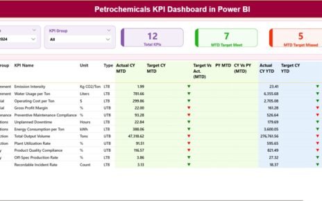
What Is Included in the Summary Page?

The Summary Page acts as the central control panel of the dashboard. It provides a high-level snapshot of all KPIs at once.
What Slicers Are Available on the Summary Page?
At the top of the Summary Page, you will find:
-
Month Slicer – Allows users to select the reporting month
-
KPI Group Slicer – Enables filtering KPIs by category
These slicers help users focus on relevant data without scrolling or manual filtering.
What KPI Cards Are Displayed?
Below the slicers, the dashboard displays three KPI cards:
-
Total KPIs Count – Shows the total number of KPIs tracked
-
MTD Target Meet Count – Indicates how many KPIs met their targets
-
MTD Target Missed Count – Highlights KPIs that missed targets
These cards provide instant performance awareness.
What Information Is Shown in the Detailed KPI Table?
The Summary Page also includes a comprehensive KPI table with the following columns:
-
KPI Number – Sequence number of the KPI
-
KPI Group – Category or group of the KPI
-
KPI Name – Name of the performance indicator
-
Unit – Measurement unit of the KPI
-
Type – KPI type (LTB or UTB)
How Does the Dashboard Track MTD Performance?
For Month-to-Date (MTD) analysis, the dashboard shows:
-
Actual CY MTD – Current year actual MTD value
-
Target CY MTD – Target MTD value for the current year
-
MTD Icon – Red ▼ or Green ▲ indicating performance status
-
Target vs Actual (MTD) – Percentage calculated as
Actual MTD / Target MTD -
PY MTD – Previous year MTD value
-
CY vs PY (MTD) – Growth percentage comparing current year and previous year
This structure allows users to evaluate short-term performance quickly.
Click to Purchases Agricultural Machinery KPI Dashboard in Power BI
How Does the Dashboard Track YTD Performance?
Similarly, the dashboard tracks Year-to-Date (YTD) performance using:
-
Actual CY YTD – Current year actual YTD value
-
Target CY YTD – Target YTD value
-
YTD Icon – Performance indicator using arrows
-
Target vs Actual (YTD) – Actual YTD / Target YTD
-
PY YTD – Previous year YTD value
-
CY vs PY (YTD) – Growth comparison percentage
Because of this structure, long-term performance trends become visible instantly.
What Is the KPI Trend Page Used For?

The KPI Trend Page focuses on visual trend analysis.
What Charts Are Included on the KPI Trend Page?
This page contains two combo charts:
-
MTD Trend Chart
-
Current Year Actual
-
Previous Year Actual
-
Target Values
-
-
YTD Trend Chart
-
Current Year Actual
-
Previous Year Actual
-
Target Values
-
Combo charts allow users to compare actuals and targets on the same visual.
How Can Users Filter KPIs on the Trend Page?
On the left side of the page, the dashboard includes a KPI Name slicer.
This slicer enables users to:
-
Select a specific KPI
-
View trends over time
-
Analyze performance fluctuations
As a result, root cause analysis becomes faster and more effective.
Click to Purchases Agricultural Machinery KPI Dashboard in Power BI
What Is the KPI Definition Page?

The KPI Definition Page is a hidden drill-through page designed for deeper understanding.
What Information Is Available on the KPI Definition Page?
This page displays:
-
KPI Formula
-
KPI Definition
-
KPI Unit
-
KPI Type (LTB or UTB)
Users can drill through from the Summary Page to access detailed KPI explanations.
How Do Users Navigate Back to the Main Page?
To return to the Summary Page, users simply click the Back button located in the top-left corner.
This navigation ensures a smooth and user-friendly experience.
What Excel Data Is Required for the Dashboard?
The dashboard uses an Excel file with three structured worksheets.
What Is the Input_Actual Sheet Used For?
The Input_Actual sheet stores actual performance data.
Users must fill in:
-
KPI Name
-
Month (first date of the month)
-
MTD Actual Value
-
YTD Actual Value
Accurate data entry ensures reliable reporting.
What Is the Input_Target Sheet Used For?
The Input_Target sheet contains planned or target values.
Users must fill in:
-
KPI Name
-
Month (first date of the month)
-
MTD Target Value
-
YTD Target Value
Because targets drive performance analysis, consistency is critical.
What Is the KPI Definition Sheet Used For?
The KPI Definition sheet defines each KPI clearly.
It includes:
-
KPI Number
-
KPI Group
-
KPI Name
-
Unit
-
Formula
-
Definition
-
Type (LTB or UTB)
This sheet acts as the foundation of the dashboard logic.
Advantages of Agricultural Machinery KPI Dashboard in Power BI
Using this dashboard offers several strategic benefits.
1. Centralized Performance Tracking
All KPIs remain in one dashboard, which reduces confusion.
2. Faster Decision-Making
Visual indicators highlight issues immediately.
3. Improved Target Monitoring
MTD and YTD tracking ensures continuous control.
4. Historical Performance Comparison
CY vs PY analysis reveals growth patterns.
5. User-Friendly Interface
Slicers and icons simplify navigation.
6. Scalable Design
The dashboard supports additional KPIs easily.
Click to Purchases Agricultural Machinery KPI Dashboard in Power BI
Best Practices for Agricultural Machinery KPI Dashboard in Power BI
To get maximum value, follow these best practices.
1. Maintain Consistent Data Entry
Always use the first date of the month.
2. Clearly Define KPI Types
Ensure correct UTB and LTB classification.
3. Review Targets Regularly
Update targets when strategies change.
4. Monitor Trends Monthly
Do not rely only on annual reviews.
5. Use Drill-Through Features
Understand KPIs deeply before taking action.
6. Validate Excel Data Before Refresh
Clean data improves dashboard accuracy.
How Does This Dashboard Support Decision-Making?
This dashboard helps stakeholders:
-
Identify underperforming machinery KPIs
-
Detect cost overruns early
-
Improve maintenance planning
-
Optimize resource utilization
-
Align operational goals with targets
As a result, organizations gain stronger control over machinery performance.
Click to Purchases Agricultural Machinery KPI Dashboard in Power BI
Conclusion: Why Should You Use an Agricultural Machinery KPI Dashboard in Power BI?
An Agricultural Machinery KPI Dashboard in Power BI transforms raw machinery data into actionable insights. Instead of struggling with spreadsheets, teams gain clarity, speed, and accuracy.
Because it combines structured Excel inputs, powerful Power BI visuals, and KPI best practices, this dashboard becomes an essential performance management tool.
Ultimately, it supports smarter decisions, improved productivity, and better long-term results.
Frequently Asked Questions (FAQs)
What is the purpose of an Agricultural Machinery KPI Dashboard?
It helps track, analyze, and improve machinery performance using KPIs.
Can beginners use this Power BI dashboard?
Yes, because it uses Excel-based inputs and simple slicers.
Does the dashboard support monthly and yearly analysis?
Yes, it includes both MTD and YTD tracking.
Can new KPIs be added?
Yes, the structure supports easy KPI expansion.
Is Excel mandatory as a data source?
Yes, this dashboard uses Excel for simplicity and flexibility.
How often should data be updated?
Monthly updates ensure accurate insights.
Click to Purchases Agricultural Machinery KPI Dashboard in Power BI
Visit our YouTube channel to learn step-by-step video tutorials