Credit card companies operate in a fast-paced and highly competitive financial environment. Every day, they manage millions of transactions, customer interactions, risk assessments, and revenue decisions. Therefore, they need clear visibility into performance at all times. However, when performance data stays scattered across Excel files and static reports, decision-making becomes slow and risky.
That is exactly why a Credit Card Companies KPI Dashboard in Power BI plays a crucial role. This dashboard converts raw operational and financial data into meaningful insights. As a result, leadership teams can track performance, control risks, and improve profitability with confidence.
In this detailed guide, you will learn what a Credit Card Companies KPI Dashboard in Power BI is, how it works, its page-wise structure, advantages, best practices, and frequently asked questions. Moreover, this article uses simple language, practical examples, and clear explanations so you can easily apply these ideas to your organization.
Click to buy Credit Card Companies KPI Dashboard in Power BI
What Is a Credit Card Companies KPI Dashboard in Power BI?
A Credit Card Companies KPI Dashboard in Power BI is a centralized performance monitoring and reporting tool designed specifically for credit card issuers and financial institutions. It tracks key performance indicators related to revenue, customer behavior, operational efficiency, and risk management.
Instead of reviewing multiple reports, teams use one interactive Power BI dashboard to monitor Month-to-Date (MTD) and Year-to-Date (YTD) performance. Consequently, decision-makers save time and focus on actions rather than data collection.
Moreover, this dashboard connects to an Excel data source. Therefore, users can update KPI values easily without changing the dashboard design.
Why Do Credit Card Companies Need a KPI Dashboard?
Credit card companies deal with high volumes of sensitive and time-critical data. Because of this, even small performance gaps can lead to financial losses or compliance issues. A KPI dashboard solves these challenges in several ways.
Key Reasons to Use a KPI Dashboard
- It provides a single source of truth for all KPIs
- It improves visibility into MTD and YTD performance
- It highlights target achievements and misses instantly
- It supports faster and data-driven decisions
- It reduces manual reporting effort
As a result, organizations gain better control over operations and financial outcomes.
How Does the Credit Card Companies KPI Dashboard in Power BI Work?
The dashboard uses Power BI Desktop for visualization and Excel as the data source. Users update actual and target values in Excel. Then, Power BI automatically refreshes visuals based on those inputs.
Because of this setup, even non-technical users can maintain the dashboard easily. At the same time, leadership teams enjoy advanced analytics and interactive visuals.
Page-Wise Structure of the Credit Card Companies KPI Dashboard in Power BI
This ready-to-use dashboard contains three well-structured pages, each designed for a specific purpose. Together, they provide complete performance visibility.
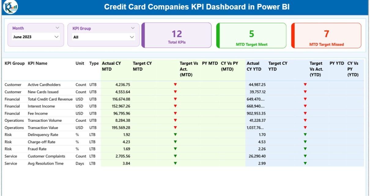
Summary Page: How Does the KPI Summary Page Help Decision-Makers?
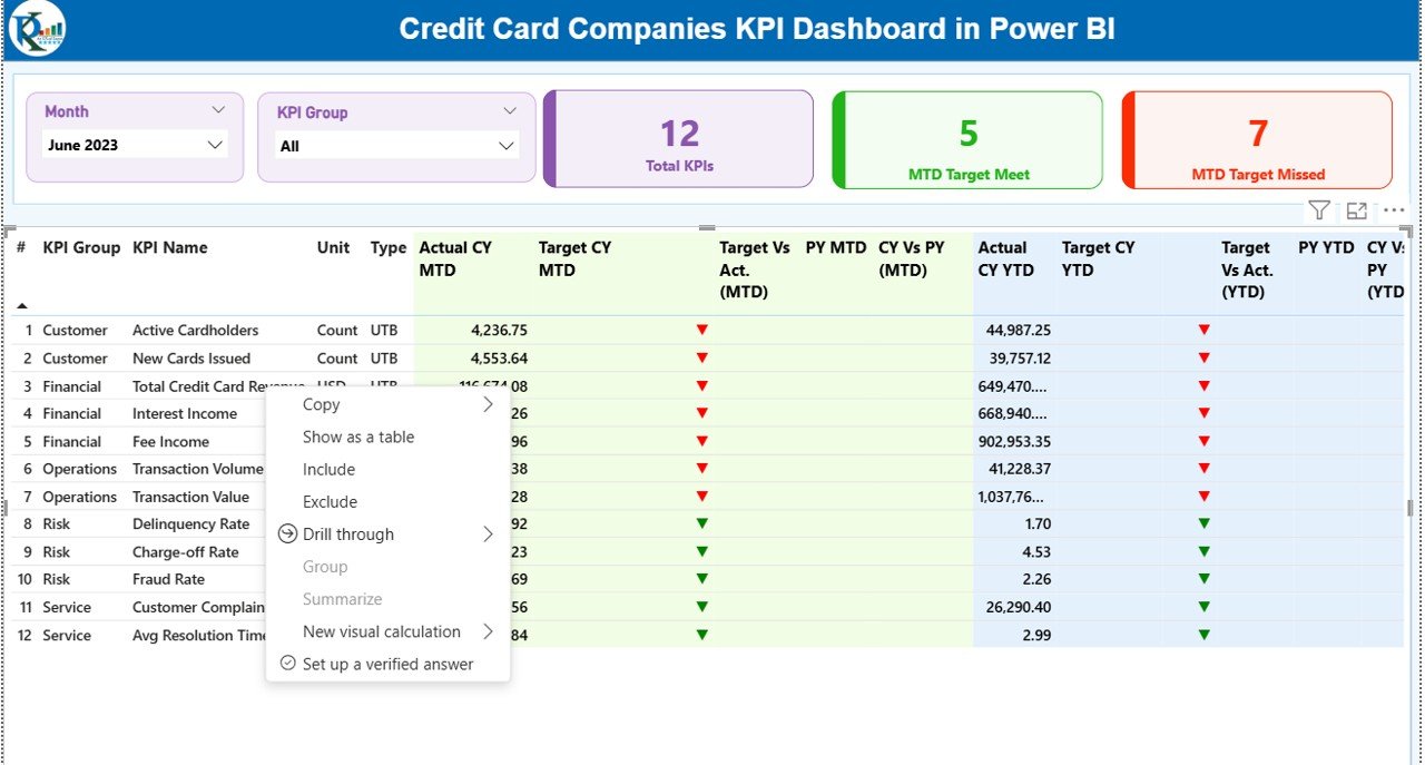
The Summary Page acts as the main control center of the dashboard. It presents a high-level view of all KPIs in one place. Therefore, executives can quickly assess overall performance.
Key Elements of the Summary Page
Interactive Slicers
- Month Slicer: Filters data by reporting month
- KPI Group Slicer: Filters KPIs by category
These slicers allow users to focus on specific time periods or KPI groups without navigating away.
KPI Cards
At the top of the page, three KPI cards provide instant insights:
- Total KPIs Count
- MTD Target Met Count
- MTD Target Missed Count
Because these cards update dynamically, leaders always see the current status.
Detailed KPI Table Explained
Below the KPI cards, the dashboard displays a detailed KPI table with the following fields:
- KPI Number: Unique sequence number for each KPI
- KPI Group: Category or functional group of the KPI
- KPI Name: Name of the performance indicator
- Unit: Unit of measurement (%, number, amount, etc.)
- Type: UTB (Upper the Better) or LTB (Lower the Better)
Performance Metrics (MTD)
- Actual CY MTD: Current year actual Month-to-Date value
- Target CY MTD: Target Month-to-Date value
- MTD Icon: ▲ or ▼ icon in green or red to show target status
- Target vs Actual (MTD): Actual ÷ Target percentage
- PY MTD: Previous year Month-to-Date value
- CY vs PY (MTD): Current MTD ÷ Previous year MTD percentage
Performance Metrics (YTD)
- Actual CY YTD: Current year actual Year-to-Date value
- Target CY YTD: Target Year-to-Date value
- YTD Icon: ▲ or ▼ icon showing YTD performance status
- Target vs Actual (YTD): Actual ÷ Target YTD percentage
- PY YTD: Previous year Year-to-Date value
- CY vs PY (YTD): Current YTD ÷ Previous year YTD percentage
Because of conditional formatting, users identify issues immediately without reading numbers deeply.

Click to buy Credit Card Companies KPI Dashboard in Power BI
KPI Trend Page: How Can You Analyze KPI Trends Over Time?
The KPI Trend Page focuses on trend analysis. It helps users understand how KPIs perform over time rather than at a single point.
Features of the KPI Trend Page
- Two Combo Charts:
MTD Trend Chart
YTD Trend Chart
Each chart displays:
- Current Year Actual
- Previous Year Actual
- Target Values
Additionally, a KPI Name Slicer on the left allows users to select any KPI. As a result, trends update instantly for focused analysis.
This page supports forecasting, performance reviews, and strategic planning.

Click to buy Credit Card Companies KPI Dashboard in Power BI
KPI Definition Page: Why Is KPI Documentation Important?
The KPI Definition Page acts as a drill-through page. It stays hidden from the main navigation to keep the dashboard clean.
What Does the KPI Definition Page Show?
- KPI Formula
- KPI Definition
- KPI Unit
- KPI Type (UTB or LTB)
Users can drill through from the Summary Page to understand each KPI clearly. Then, they can return to the main page using the Back button on the top-left corner.
Because of this design, teams avoid confusion and maintain consistent KPI interpretation.

Click to buy Credit Card Companies KPI Dashboard in Power BI
Excel Data Structure: How Do You Maintain the Dashboard Data?
The dashboard uses an Excel file as its data source. This approach keeps data management simple and flexible.
Input_Actual Sheet
In this sheet, users enter:
- KPI Name
- Month (use the first date of the month)
- MTD Actual Value
- YTD Actual Value
Click to buy Credit Card Companies KPI Dashboard in Power BI
Input_Target Sheet
In this sheet, users enter:
- KPI Name
- Month (use the first date of the month)
- MTD Target Value
- YTD Target Value
KPI Definition Sheet
In this sheet, users define:
- KPI Number
- KPI Group
- KPI Name
- Unit
- Formula
- Definition
- Type (UTB or LTB)
Because of this structured approach, data remains clean and consistent.
Advantages of Credit Card Companies KPI Dashboard in Power BI
A Credit Card Companies KPI Dashboard in Power BI offers several strong advantages.
- Centralized Performance Monitoring
All KPIs stay in one dashboard. Therefore, teams avoid switching between reports.
- Faster Decision-Making
Real-time visuals and icons highlight issues immediately. As a result, managers act faster.
- Improved Accuracy
Automated calculations reduce manual errors and inconsistencies.
- Better Target Tracking
MTD and YTD comparisons show whether teams meet targets or not.
- Easy Data Maintenance
Excel-based input makes updates simple for business users.
- Enhanced Transparency
Clear definitions and drill-through pages ensure everyone understands KPIs.
Best Practices for the Credit Card Companies KPI Dashboard in Power BI
To get maximum value from your dashboard, follow these best practices.
- Define KPIs Clearly
Always document formulas, units, and targets clearly.
- Update Data Regularly
Refresh actual and target values on a fixed schedule.
- Use Meaningful KPI Groups
Group KPIs logically such as Revenue, Risk, Customer, and Operations.
- Monitor Trends, Not Just Numbers
Use the KPI Trend Page to identify patterns early.
- Keep Targets Realistic
Set achievable yet challenging targets to motivate teams.
- Train Users Properly
Ensure users understand slicers, drill-through, and icons.
Who Can Benefit from This Dashboard?
This dashboard supports multiple stakeholders:
- Credit Card Company Executives
- Finance and Strategy Teams
- Risk and Compliance Managers
- Operations Teams
- Business Analysts
Because of its flexible design, both strategic and operational users benefit.
How Does This Dashboard Improve Business Outcomes?
This dashboard improves outcomes by:
- Reducing reporting time
- Increasing performance visibility
- Supporting proactive risk management
- Aligning teams with business goals
As a result, credit card companies operate more efficiently and competitively.
Conclusion: Why Should Credit Card Companies Use a KPI Dashboard in Power BI?
A Credit Card Companies KPI Dashboard in Power BI transforms performance management from a manual task into a strategic advantage. It combines structured data, interactive visuals, and clear KPIs into one powerful solution.
Because of its Excel-based data source and Power BI visuals, this dashboard remains easy to maintain and powerful to analyze. Moreover, it supports better decisions, improved accountability, and long-term growth.
If your organization wants clarity, speed, and confidence in performance tracking, this dashboard offers the perfect solution.
Frequently Asked Questions (FAQs)
What is a Credit Card Companies KPI Dashboard in Power BI?
It is an interactive Power BI dashboard that tracks key performance indicators for credit card companies using MTD and YTD analysis.
Can non-technical users maintain this dashboard?
Yes. Users only update data in Excel, and Power BI handles calculations and visuals automatically.
What type of KPIs can this dashboard track?
It can track financial, operational, customer, and risk-related KPIs.
How often should data be updated?
Ideally, teams should update data monthly or as per business needs.
Does the dashboard support trend analysis?
Yes. The KPI Trend Page shows MTD and YTD trends with actual, target, and previous year values.
Can the dashboard scale for more KPIs?
Yes. You can add more KPIs by updating the Excel input sheets.
Visit our YouTube channel to learn step-by-step video tutorials
Watch the step-by-step video tutorial:
Click to buy Credit Card Companies KPI Dashboard in Power BI