The subscription box industry continues to grow rapidly across food, beauty, fashion, wellness, and lifestyle segments. However, growth alone does not guarantee success. Companies must track costs, revenue, customer satisfaction, and acquisition efficiency consistently. Therefore, businesses increasingly rely on a Subscription Box Services Dashboard in Power BI to make faster, smarter, and data-driven decisions.
In this detailed guide, you will learn what a Subscription Box Services Dashboard in Power BI is, why it matters, how it works, page-wise dashboard structure, key insights, advantages, best practices, and frequently asked questions. Moreover, this article uses clear language, active voice, and real-world logic so you can apply the concepts confidently.
Click to Purchases Subscription Box Services Dashboard in Power BI
What Is a Subscription Box Services Dashboard in Power BI?
A Subscription Box Services Dashboard in Power BI is an interactive analytics solution built using Microsoft Power BI that helps subscription-based businesses monitor operational, financial, and customer-related KPIs in one centralized view.
Instead of managing scattered Excel files or static reports, this dashboard consolidates critical data such as:
-
Shipping costs
-
Customer acquisition cost (CAC)
-
Monthly recurring revenue (MRR)
-
Fulfillment and operating costs
-
Customer satisfaction ratings
As a result, decision-makers gain real-time visibility into business performance across subscription plans, box types, regions, and acquisition channels.
Why Do Subscription Box Businesses Need a Power BI Dashboard?
Subscription box companies operate on thin margins and recurring revenue models. Therefore, even small inefficiencies can impact profitability. A Power BI dashboard solves this challenge effectively.
Key Reasons to Use This Dashboard
-
It provides real-time performance monitoring
-
It improves cost control and margin analysis
-
It supports customer retention strategies
-
It highlights high-performing subscription plans
-
It enables data-driven pricing decisions
Moreover, the dashboard allows leadership teams to respond quickly to trends rather than reacting too late.
How Does a Subscription Box Services Dashboard in Power BI Work?
The dashboard works by connecting structured data sources—usually Excel or databases—to Power BI. Once connected, Power BI transforms the raw data into interactive visuals, slicers, and charts.
Typical Data Flow
-
Data Entry
-
Subscription plans
-
Box types
-
Acquisition channels
-
Regions
-
Monthly cost and revenue data
-
-
Data Modeling
-
Relationships between customers, plans, regions, and costs
-
Measures for MRR, CAC, and operating costs
-
-
Visualization
-
Cards for KPIs
-
Charts for trends and comparisons
-
Slicers for dynamic filtering
-
Because of this structure, users can explore insights instantly without technical complexity.
What Pages Are Included in the Subscription Box Services Dashboard in Power BI?
This dashboard contains five powerful pages, each designed to answer specific business questions clearly.
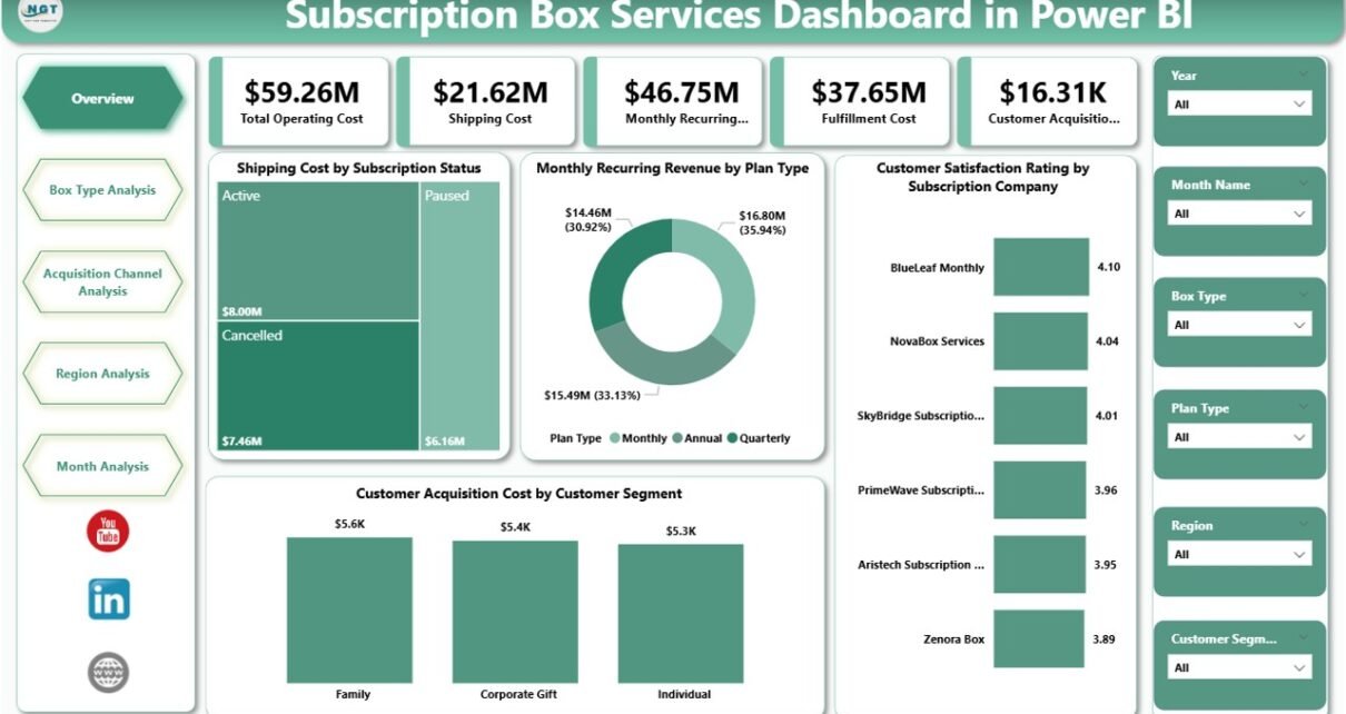
1. Overview Page – How Is Overall Business Performance Tracked?
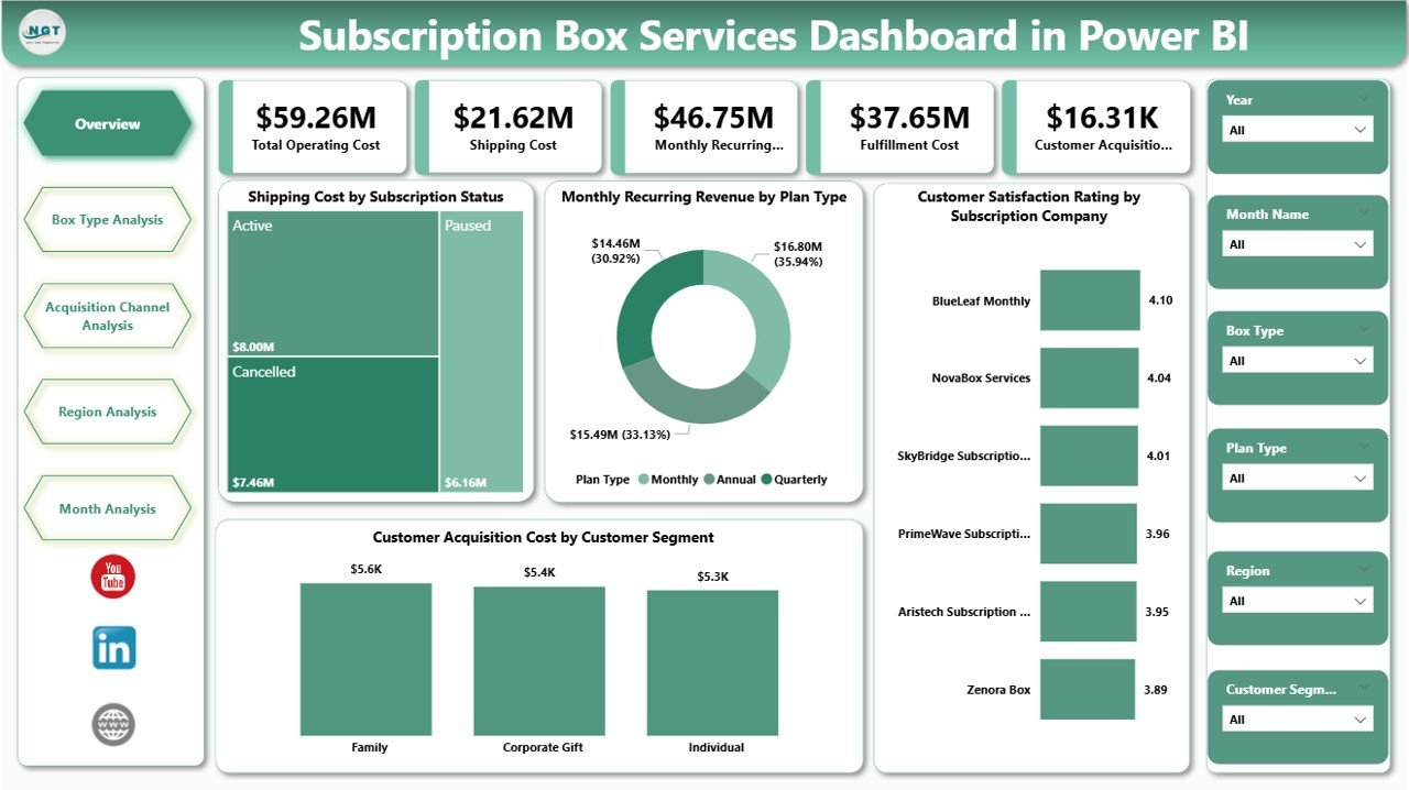
The Overview Page acts as the central command center of the dashboard. It gives management a quick snapshot of the entire subscription business.
Key Features of the Overview Page
-
Interactive slicers for filtering data dynamically
-
Four KPI cards for instant performance visibility
-
Four analytical charts for high-level insights
KPI Cards Included
-
Key operational or financial summary metrics (customizable based on business needs)
Charts on the Overview Page
-
Shipping Cost by Subscription Status
Helps identify cost differences between active, paused, and canceled subscriptions. -
Monthly Recurring Revenue by Plan Type
Shows which subscription plans generate the highest recurring income. -
Customer Satisfaction Rating by Subscription Company
Highlights customer experience trends across brands or partners. -
Customer Acquisition Cost by Customer Segment
Reveals how much the business spends to acquire different customer groups.
As a result, leaders can identify profitability drivers and risk areas within seconds.
2. Box Type Analysis – Which Box Types Perform Best?
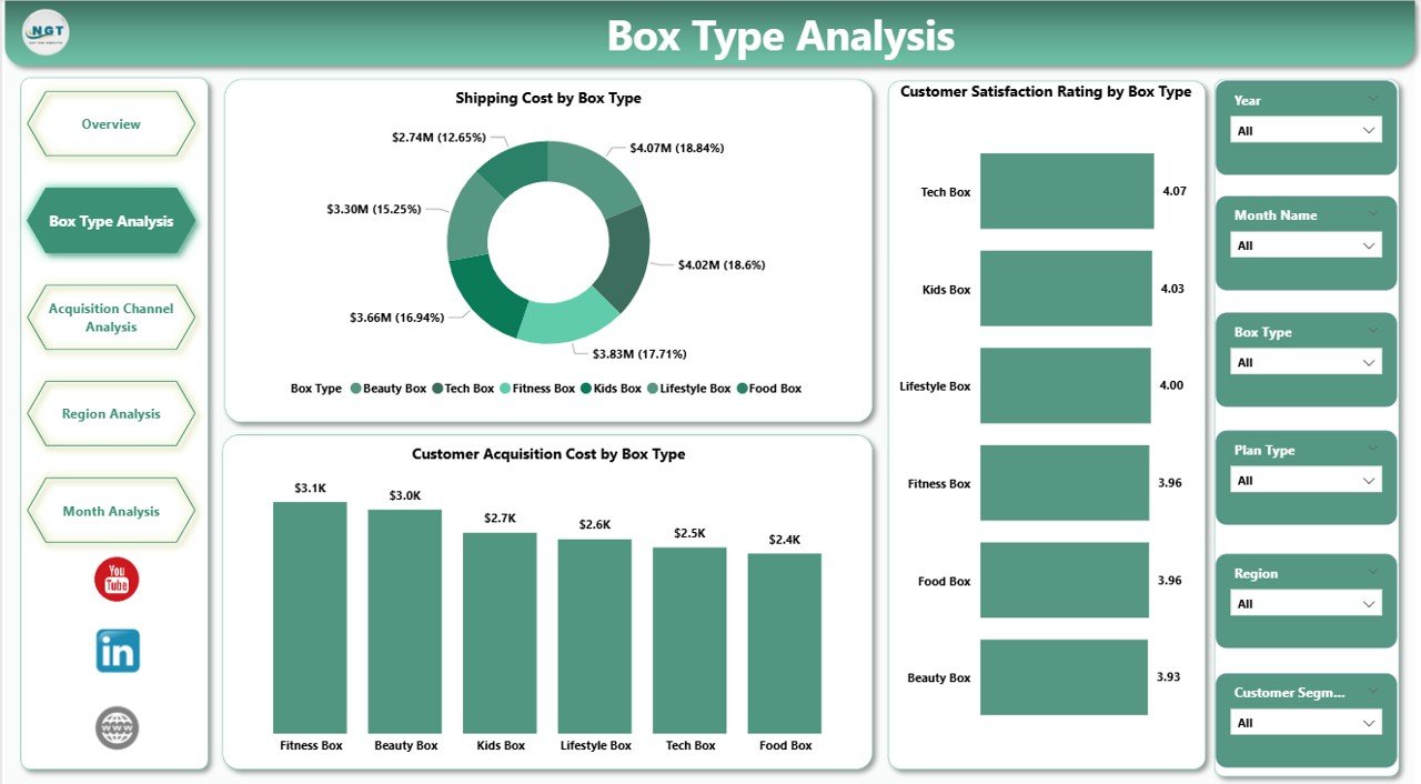
The Box Type Analysis Page focuses on performance across different subscription box categories.
Why This Page Matters
Different box types often have different cost structures and customer expectations. Therefore, analyzing them separately improves strategic clarity.
Charts Included
-
Shipping Cost by Box Type
Identifies logistics expenses associated with each box category. -
Customer Satisfaction Rating by Box Type
Reveals which box types delight customers the most. -
Customer Acquisition Cost by Box Type
Shows how acquisition costs vary across box offerings.
Because of this analysis, businesses can refine product offerings and discontinue underperforming boxes confidently.
Click to Purchases Subscription Box Services Dashboard in Power BI
3. Acquisition Channel Analysis – Which Marketing Channels Deliver ROI?
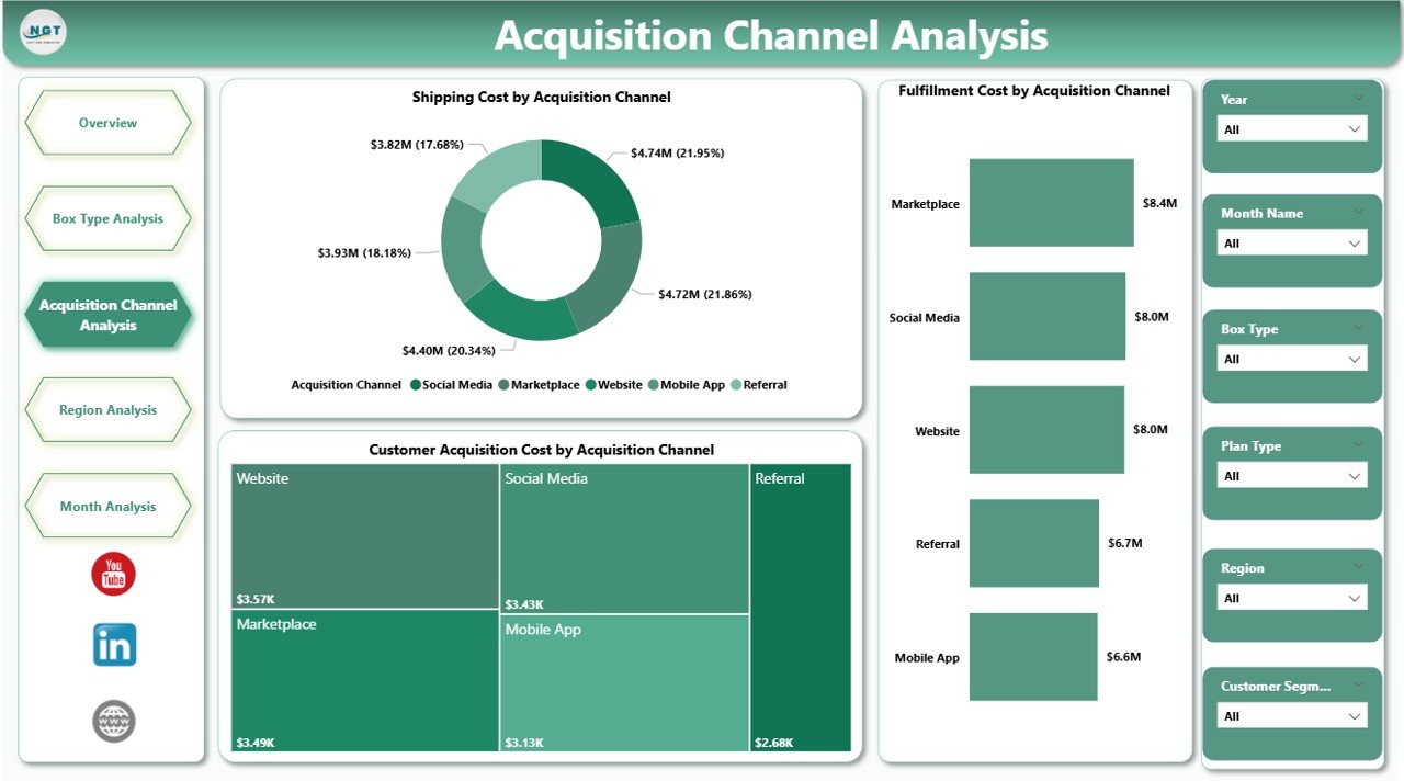
The Acquisition Channel Analysis Page evaluates marketing and fulfillment efficiency across customer acquisition sources.
Why Channel Analysis Is Critical
Subscription businesses rely heavily on digital marketing. Therefore, tracking channel-wise performance ensures optimal spending.
Charts Included
-
Shipping Cost by Acquisition Channel
Compares logistics expenses across marketing sources. -
Fulfillment Cost by Acquisition Channel
Highlights operational efficiency per channel. -
Customer Acquisition Cost by Acquisition Channel
Helps identify high-cost and low-cost channels.
As a result, marketing teams can reallocate budgets toward high-ROI channels quickly.
4. Region Analysis – How Do Costs and Performance Vary by Location?
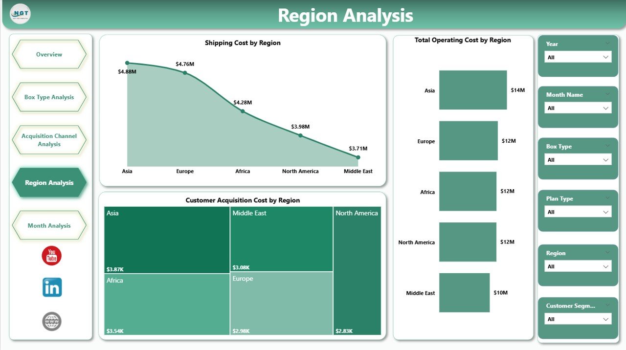
The Region Analysis Page provides a geographic breakdown of costs and efficiency.
Why Regional Insights Matter
Shipping, fulfillment, and acquisition costs often vary significantly by location. Therefore, regional analysis improves operational planning.
Charts Included
-
Shipping Cost by Region
Identifies expensive delivery zones. -
Total Operating Cost by Region
Combines fulfillment, logistics, and overhead costs. -
Customer Acquisition Cost by Region
Shows where customer acquisition remains most cost-effective.
Because of these insights, businesses can optimize warehouse locations and regional pricing strategies.
5. Monthly Trends – How Is Performance Changing Over Time?
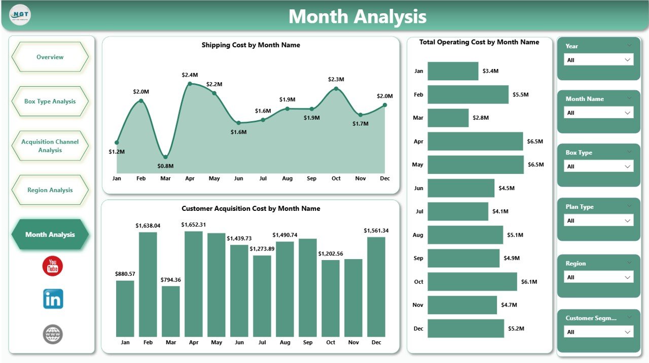
The Monthly Trends Page focuses on time-based performance analysis.
Why Monthly Trends Matter
Subscription businesses depend on consistency. Therefore, tracking trends helps detect early warning signs.
Charts Included
-
Shipping Cost by Month
Tracks logistics cost fluctuations. -
Total Operating Cost by Month
Shows overall cost movement. -
Customer Acquisition Cost by Month
Highlights marketing efficiency trends.
As a result, teams can act early before costs spiral out of control.
Advantages of Subscription Box Services Dashboard in Power BI
Using a Subscription Box Services Dashboard in Power BI offers multiple strategic benefits.
Key Advantages
-
📊 Centralized data visibility across departments
-
⚡ Faster decision-making with real-time insights
-
💰 Improved cost control and margin optimization
-
😊 Better customer satisfaction tracking
-
📈 Enhanced revenue forecasting
-
🔄 Reduced manual reporting effort
Moreover, the dashboard scales easily as the business grows.
How Does This Dashboard Improve Business Decision-Making?
This dashboard transforms raw data into actionable insights. Therefore, leaders can:
-
Adjust pricing based on cost trends
-
Optimize box offerings using satisfaction data
-
Improve marketing ROI with channel analysis
-
Reduce shipping expenses through regional insights
Because of this clarity, decision-making becomes proactive instead of reactive.
Click to Purchases Subscription Box Services Dashboard in Power BI
Best Practices for the Subscription Box Services Dashboard in Power BI
To get maximum value from your dashboard, follow these proven best practices.
1. Keep Data Clean and Consistent
-
Standardize naming conventions
-
Validate cost and revenue entries
-
Avoid duplicate customer records
2. Use Meaningful Slicers
-
Add slicers for month, region, plan, and channel
-
Keep slicers intuitive and limited
3. Focus on Actionable KPIs
-
Track KPIs that influence decisions
-
Avoid vanity metrics
4. Review the Dashboard Regularly
-
Schedule weekly or monthly reviews
-
Compare trends rather than isolated values
5. Align Dashboard with Business Goals
-
Customize KPIs based on growth, retention, or profitability goals
Because of these practices, your dashboard remains relevant and impactful.
Who Can Use a Subscription Box Services Dashboard in Power BI?
This dashboard benefits multiple stakeholders, including:
-
Subscription business founders
-
Operations managers
-
Finance and accounting teams
-
Marketing managers
-
Supply chain teams
-
Business analysts
Therefore, it supports cross-functional collaboration effectively.
Conclusion: Why Should You Use a Subscription Box Services Dashboard in Power BI?
A Subscription Box Services Dashboard in Power BI provides clarity, control, and confidence in decision-making. It brings all critical metrics—costs, revenue, satisfaction, and acquisition—into one interactive platform. Moreover, it helps businesses scale sustainably while maintaining profitability.
If you want to reduce inefficiencies, improve margins, and enhance customer experience, this dashboard becomes an essential analytics solution.
Frequently Asked Questions (FAQs)
1. What is the main purpose of a Subscription Box Services Dashboard in Power BI?
The dashboard helps subscription businesses track costs, revenue, customer satisfaction, and acquisition efficiency from a single centralized view.
2. Can small subscription businesses use this dashboard?
Yes, small and growing businesses can use this dashboard effectively. It scales easily as data volume increases.
3. Does this dashboard require advanced Power BI knowledge?
No, users can navigate and analyze the dashboard easily once it is set up.
4. Can I customize KPIs in the dashboard?
Yes, you can customize KPIs, charts, and slicers based on business requirements.
5. How often should I update the data?
Most businesses update data monthly or weekly. However, Power BI also supports near real-time updates.
6. Is Excel required as a data source?
Excel works commonly, but Power BI also supports databases, cloud platforms, and APIs.
7. How does this dashboard help improve profitability?
It identifies high-cost areas, inefficient channels, and low-performing box types, allowing timely corrective action.
Visit our YouTube channel to learn step-by-step video tutorials