Managing freight forwarding operations has become more complex than ever. While shipment volumes grow, customer expectations rise, and margins remain tight, logistics teams must make faster and smarter decisions every day. However, many freight forwarders still rely on scattered Excel files, manual reports, and delayed summaries. As a result, visibility drops, errors increase, and profitability suffers.
That is exactly where a Freight Forwarding Dashboard in Power BI becomes a powerful and practical solution.
In this detailed and SEO-friendly guide, you will learn what a Freight Forwarding Dashboard in Power BI is, how it works, why it matters, and how each dashboard page delivers real business value. Moreover, you will discover its advantages, best practices, and answers to the most common questions. Throughout the article, the language stays simple, clear, and actionable so you can apply the insights immediately.
Click to Purchases Freight Forwarding Dashboard in Power BI
What Is a Freight Forwarding Dashboard in Power BI?
A Freight Forwarding Dashboard in Power BI is an interactive analytics and reporting solution designed to track, analyze, and visualize logistics and freight performance from one centralized platform.
Instead of reviewing multiple reports, you can monitor shipment status, transit times, costs, revenue, profit margins, carriers, shipment modes, origin countries, and monthly trends in real time. Therefore, decision-makers gain full operational and financial visibility without technical complexity.
Moreover, this dashboard connects seamlessly with Excel or database data sources. Consequently, you only update the source data and refresh Power BI to see updated insights instantly.
Why Do Freight Forwarding Businesses Need a Power BI Dashboard?
Freight forwarding businesses operate in a high-pressure environment. Therefore, even small inefficiencies can lead to delays, customer dissatisfaction, and revenue loss.
Here is why a Freight Forwarding Dashboard in Power BI becomes essential:
-
It replaces manual and time-consuming reporting
-
It provides real-time shipment and profitability insights
-
It highlights cost leakages and margin gaps
-
It improves carrier and route performance evaluation
-
It supports faster, data-driven decision-making
As a result, logistics managers move from reactive problem-solving to proactive performance management.
How Does a Freight Forwarding Dashboard in Power BI Work?
The working process remains simple and user-friendly:
-
Data Collection
First, you collect shipment, cost, revenue, carrier, incoterm, and transit data in Excel or a database. -
Data Modeling in Power BI
Next, Power BI cleans, structures, and relates the data across multiple dimensions. -
Dashboard Visualization
Then, Power BI converts the data into interactive cards, charts, and slicers. -
Real-Time Analysis
Finally, users apply filters and slicers to analyze performance by shipment mode, country, carrier, or month.
Because of this flow, teams spend less time preparing reports and more time acting on insights.
What Pages Are Included in the Freight Forwarding Dashboard in Power BI?
This Freight Forwarding Dashboard includes five well-structured pages, each designed to answer specific business questions.
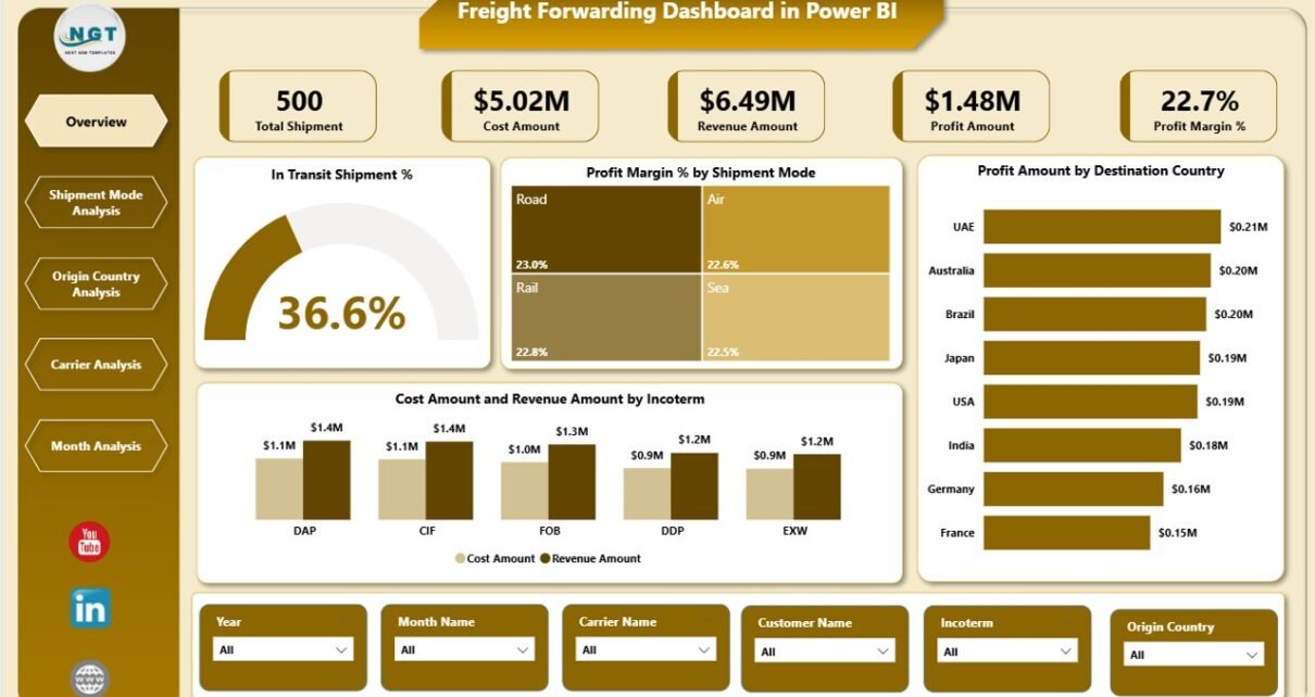
Overview Page: What Is Happening Across All Freight Operations?
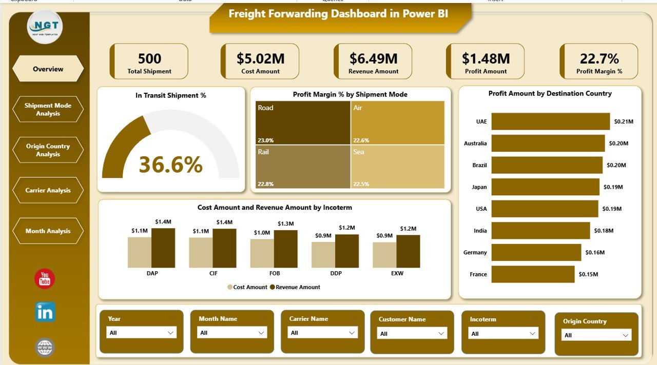
The Overview Page acts as the control center of the entire dashboard. From this page, managers quickly understand the overall health of freight operations.
Key Features of the Overview Page
-
Interactive slicers for dynamic filtering
-
High-level KPI cards
-
Summary charts for instant insights
KPI Cards on the Overview Page
-
In-Transit Shipment % – Tracks shipments currently in transit
-
Profit Margin % – Measures overall profitability
Charts on the Overview Page
-
Profit Margin % by Shipment Mode
This chart shows which shipment modes generate higher margins. -
Profit Amount by Destination Country
This view highlights profitable and underperforming destinations. -
Cost Amount and Revenue Amount by Incoterm
This comparison reveals which incoterms drive revenue and which increase costs.
Because of this design, executives get a clear snapshot within seconds.
Click to Purchases Freight Forwarding Dashboard in Power BI
Shipment Mode Analysis Page: Which Shipment Modes Perform Best?

The Shipment Mode Analysis Page focuses on performance comparison across shipment types such as air, sea, and road.
Why Is Shipment Mode Analysis Important?
Shipment modes directly affect transit time, cost, and customer satisfaction. Therefore, analyzing them helps optimize logistics strategies.
Charts on the Shipment Mode Analysis Page
-
Average Transit Days by Shipment Mode
This chart identifies faster and slower shipment methods. -
Profit Amount by Shipment Mode
This view highlights the most profitable shipment modes. -
Cost Amount and Revenue Amount by Shipment Mode
This comparison reveals cost efficiency and revenue contribution.
As a result, logistics teams can balance speed, cost, and profitability more effectively.
Origin Country Analysis Page: Which Countries Drive Profitability?
The Origin Country Analysis Page evaluates freight performance based on shipment origin.
Why Should You Analyze Origin Countries?
Different countries involve different costs, regulations, and transit challenges. Therefore, understanding origin-wise performance supports better route planning.
Charts on the Origin Country Analysis Page
-
Profit Margin % by Origin Country
This chart shows which origins deliver stronger margins. -
Profit Amount by Origin Country
This view highlights top and bottom-performing origins. -
Cost Amount and Revenue Amount by Origin Country
This comparison reveals cost-revenue balance per origin.
Consequently, businesses can renegotiate contracts, adjust routes, or revise pricing strategies.
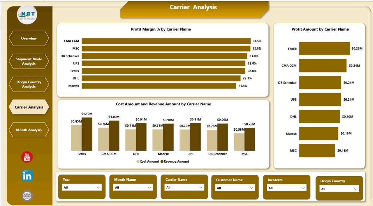
Carrier Analysis Page: Which Carriers Deliver the Best Value?
The Carrier Analysis Page evaluates carrier performance from both cost and profitability perspectives.
Why Does Carrier Analysis Matter?
Carriers play a critical role in delivery reliability and cost control. Therefore, selecting the right carriers directly impacts business success.
Charts on the Carrier Analysis Page
-
Profit Margin % by Carrier Name
This chart identifies carriers with strong margins. -
Profit Amount by Carrier Name
This view shows total profit contribution by carrier. -
Cost Amount and Revenue Amount by Carrier Name
This comparison highlights cost efficiency and revenue performance.
As a result, freight forwarders can strengthen partnerships with high-performing carriers and address issues with weaker ones.
Monthly Trends Page: How Does Performance Change Over Time?
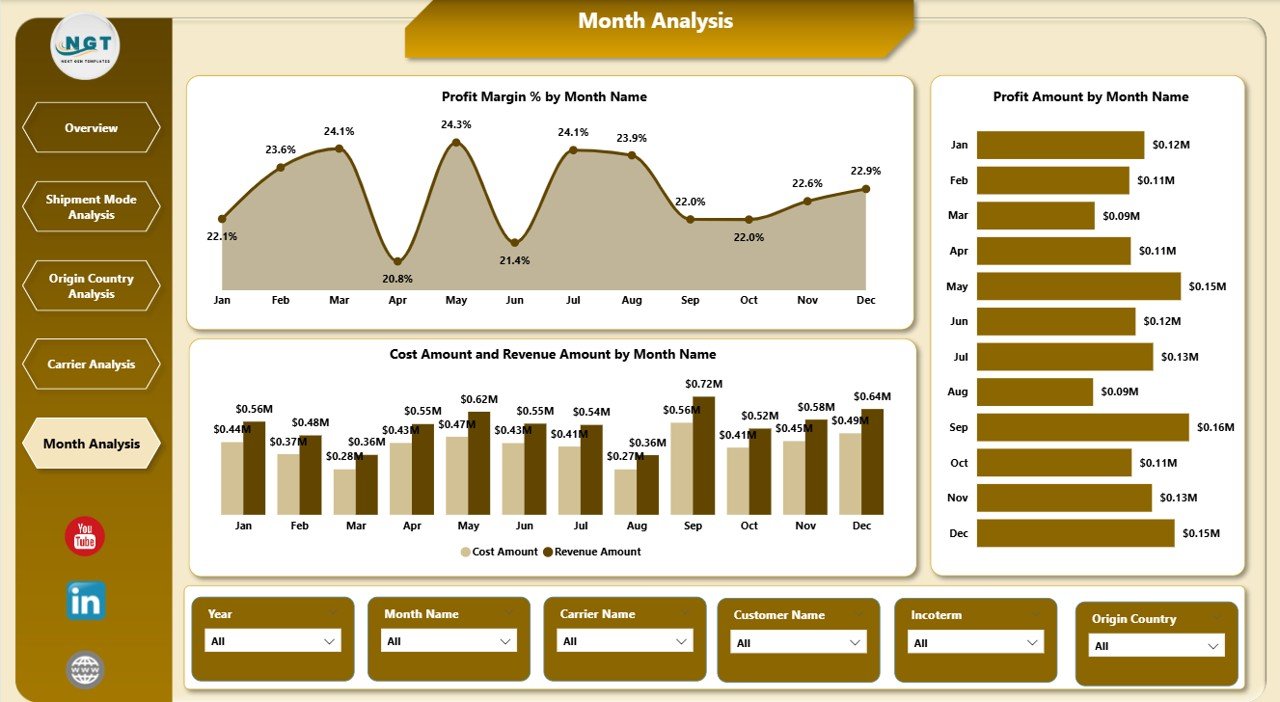
The Monthly Trends Page tracks freight performance across months.
Why Are Monthly Trends Important?
Trends reveal seasonality, demand cycles, and long-term performance patterns. Therefore, monthly analysis supports forecasting and planning.
Charts on the Monthly Trends Page
-
Profit Margin % by Month
This chart highlights margin fluctuations over time. -
Profit Amount by Month
This view shows revenue growth or decline patterns. -
Cost Amount and Revenue Amount by Month
This comparison reveals cost control effectiveness.
Because of these insights, managers can prepare for peak seasons and control cost spikes.
Advantages of a Freight Forwarding Dashboard in Power BI
Using a Freight Forwarding Dashboard in Power BI delivers multiple business advantages.
1. Centralized Data Visibility
You track shipments, costs, revenue, and margins from one dashboard. Therefore, confusion caused by multiple reports disappears.
2. Faster Decision-Making
Real-time insights allow teams to act immediately. As a result, delays and losses reduce significantly.
3. Improved Profitability Control
The dashboard highlights margin gaps and cost overruns. Consequently, managers protect profitability more effectively.
4. Better Carrier and Route Management
Clear comparisons help select optimal carriers and routes. Therefore, service quality improves.
5. Reduced Manual Reporting Effort
Automation eliminates repetitive reporting tasks. Hence, teams focus on analysis instead of data preparation.
Best Practices for the Freight Forwarding Dashboard in Power BI
To maximize dashboard value, follow these proven best practices.
1. Keep Data Clean and Structured
Always maintain consistent formats for dates, countries, carriers, and shipment modes. Clean data ensures accurate insights.
2. Use Meaningful KPIs Only
Avoid overcrowding the dashboard. Instead, focus on KPIs that directly impact cost, revenue, and service quality.
3. Design with Business Questions in Mind
Each page should answer a specific question. Therefore, users find insights faster.
4. Use Slicers Wisely
Add slicers for shipment mode, country, carrier, and time. However, avoid excessive filters that confuse users.
5. Refresh Data Regularly
Schedule frequent data refreshes. As a result, decisions rely on the latest information.
Who Should Use a Freight Forwarding Dashboard in Power BI?
Click to Purchases Freight Forwarding Dashboard in Power BI
This dashboard suits a wide range of professionals:
-
Freight forwarding companies
-
Logistics and supply chain managers
-
Operations teams
-
Finance and profitability analysts
-
Carrier management teams
-
Senior executives and decision-makers
Because of its flexibility, both small logistics firms and large freight operators benefit from it.
How Does This Dashboard Improve Customer Satisfaction?
Customer satisfaction improves when shipments arrive on time and costs remain transparent.
With this dashboard:
-
Teams monitor transit delays early
-
Managers identify inefficient routes quickly
-
Carrier performance remains visible
-
Service quality improves consistently
As a result, customers experience reliable and predictable logistics services.
Conclusion: Why Should You Use a Freight Forwarding Dashboard in Power BI?
A Freight Forwarding Dashboard in Power BI transforms complex logistics data into clear, actionable insights. Instead of reacting to problems late, freight forwarders gain the ability to anticipate issues, control costs, and improve profitability.
Because the dashboard combines operational and financial analysis across shipment modes, countries, carriers, and time, it becomes an essential tool for modern freight businesses. Therefore, adopting this dashboard means moving toward smarter, faster, and more profitable logistics management.
Frequently Asked Questions (FAQs)
What is a Freight Forwarding Dashboard in Power BI used for?
A Freight Forwarding Dashboard in Power BI tracks shipment performance, costs, revenue, profit margins, carriers, routes, and monthly trends from one interactive platform.
Can small freight forwarding companies use this dashboard?
Yes. Small and mid-sized freight forwarders benefit greatly because the dashboard reduces manual work and improves visibility without heavy IT investment.
Does the dashboard require advanced Power BI skills?
No. Users only need basic Power BI navigation skills. The dashboard design remains intuitive and user-friendly.
Can I customize the dashboard KPIs?
Yes. You can add, remove, or modify KPIs based on your business requirements.
How often should I refresh the dashboard data?
You should refresh data daily or weekly, depending on shipment volume and decision-making needs.
Does this dashboard support real-time decision-making?
Yes. Once you update the data source and refresh Power BI, the dashboard reflects the latest performance instantly.
Visit our YouTube channel to learn step-by-step video tutorials