Managing community services without clear visibility often leads to confusion, delays, and missed impact. However, when organizations use a Community Services Dashboard in Power BI, they gain clarity, control, and confidence in every decision. Moreover, because community programs involve multiple service types, beneficiary groups, staff roles, locations, and budgets, decision-makers need one centralized reporting system. That is exactly where a well-designed dashboard in Microsoft Power BI becomes essential.
In this detailed, SEO-friendly guide, you will learn what a Community Services Dashboard in Power BI is, how it works, why organizations need it, its complete page-wise structure, advantages, best practices, and frequently asked questions. Additionally, the article uses clear language, active voice, and practical explanations so you can apply everything immediately.
Click to Purchases Community Services Dashboard in Power BI
What Is a Community Services Dashboard in Power BI?
A Community Services Dashboard in Power BI is a centralized analytics and reporting tool that tracks community service performance using interactive visuals and real-time data. Instead of reviewing multiple spreadsheets or static reports, organizations monitor all key indicators in one dynamic dashboard.
Because the dashboard runs in Power BI, it offers:
-
Real-time data refresh
-
Interactive filters and slicers
-
Visual storytelling through charts and KPIs
-
Secure sharing across teams and stakeholders
As a result, community leaders make faster, smarter, and more transparent decisions.
Why Do Community Organizations Need a Dashboard in Power BI?
Community organizations handle diverse programs and limited resources. Therefore, they must track performance accurately and continuously. A Power BI dashboard solves these challenges effectively.
Key Reasons to Use a Community Services Dashboard
-
Centralizes all service and beneficiary data
-
Improves transparency for donors and stakeholders
-
Tracks budget allocation and actual costs clearly
-
Measures service completion and progress instantly
-
Supports evidence-based decision-making
Moreover, because Power BI handles large datasets smoothly, organizations scale their reporting without complexity.
How Does a Community Services Dashboard in Power BI Work?
The dashboard connects raw operational data—such as beneficiaries served, service status, costs, and funding sources—to Power BI. Then, it transforms that data into visuals across multiple analytical pages.
Typical Data Inputs Include:
-
Service Type
-
Beneficiary Group
-
Staff Role
-
Location
-
Funding Source
-
Budget Allocation
-
Actual Cost
-
Service Status
-
Month and Year
Once the data loads, slicers and visuals allow users to analyze performance from different perspectives instantly.
What Are the Key Pages in a Community Services Dashboard in Power BI?
This dashboard contains five structured pages, each designed to answer specific operational and strategic questions.
Click to Purchases Community Services Dashboard in Power BI
1. What Does the Overview Page Show?
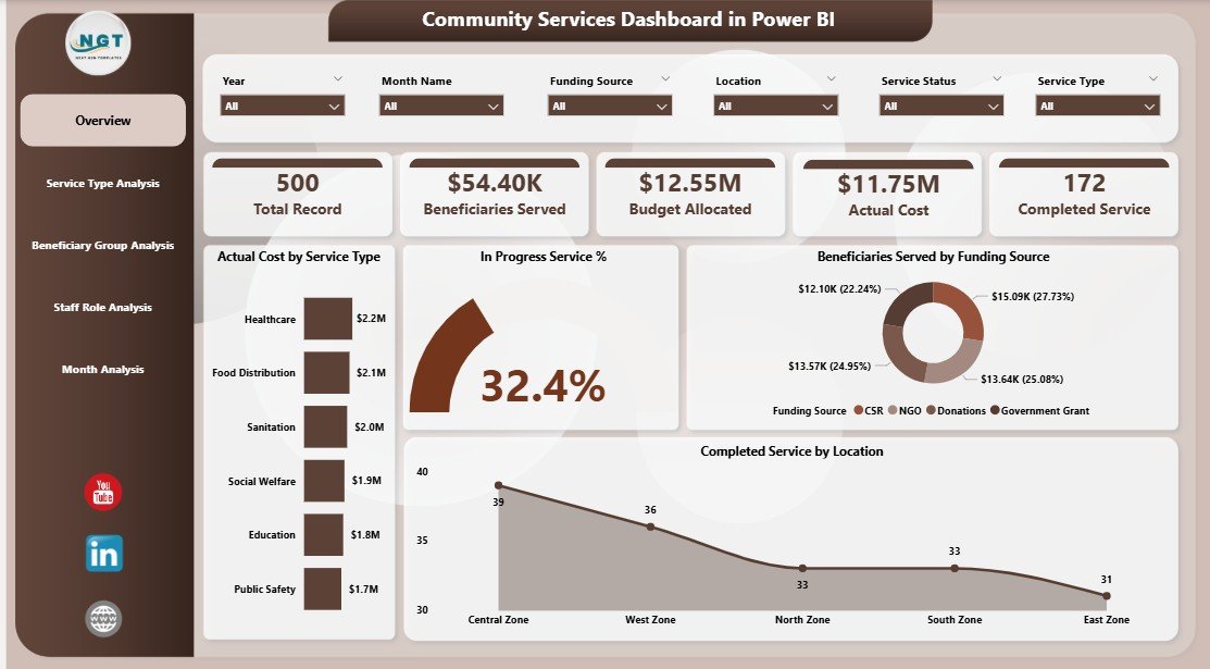
The Overview Page acts as the command center of the dashboard. Because it summarizes high-level performance, leaders use this page daily.
Key Features of the Overview Page
-
Slicers for quick filtering (service type, location, time period, etc.)
-
KPI Cards, including:
-
Actual Cost by Service Type
-
In-Progress Service %
-
Beneficiaries Served by Funding Source
-
Completed Services by Location
-
Why the Overview Page Matters
-
Provides instant performance visibility
-
Highlights cost consumption patterns
-
Shows service progress at a glance
-
Supports quick executive decisions
As a result, stakeholders understand the overall health of community programs immediately.
2. How Does Service Type Analysis Help Decision-Making?
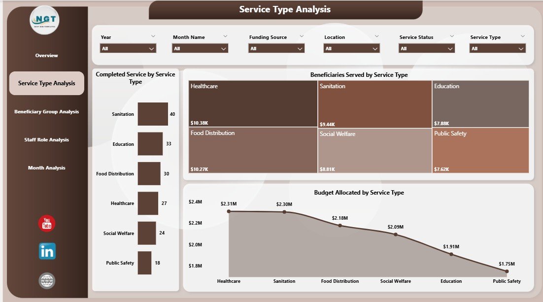
The Service Type Analysis Page focuses on performance by service category. Because community organizations deliver multiple services, this page becomes extremely valuable.
Charts Included in Service Type Analysis
-
Beneficiaries Served by Service Type
-
Completed Services by Service Type
-
Budget Allocation by Service Type
Insights You Can Gain
-
Identify high-impact services
-
Detect underperforming service categories
-
Optimize budget allocation by service demand
Therefore, managers allocate resources more effectively and improve service reach.
3. Why Is Beneficiary Group Analysis Important?

Different beneficiary groups often require different levels of support. Consequently, the Beneficiary Group Analysis Page helps organizations tailor their programs.
Charts in Beneficiary Group Analysis
-
Beneficiaries Served by Beneficiary Group
-
Budget Allocation by Beneficiary Group
-
Actual Cost by Beneficiary Group
Benefits of This Analysis
Click to Purchases Community Services Dashboard in Power BI
-
Understand which groups receive the most support
-
Ensure fair and data-driven fund distribution
-
Identify gaps in service delivery
Moreover, this page strengthens accountability and inclusion.
4. How Does Staff Role Analysis Improve Operations?

Staff performance directly impacts service outcomes. Therefore, the Staff Role Analysis Page evaluates how different roles contribute to service delivery.
Charts on the Staff Role Analysis Page
-
Beneficiaries Served by Staff Role
-
Budget Allocation by Staff Role
-
Actual Cost by Staff Role
Operational Advantages
-
Measure staff utilization
-
Balance workload across roles
-
Optimize staffing budgets
As a result, organizations improve efficiency without increasing costs.
5. Why Are Monthly Trends Critical for Community Programs?
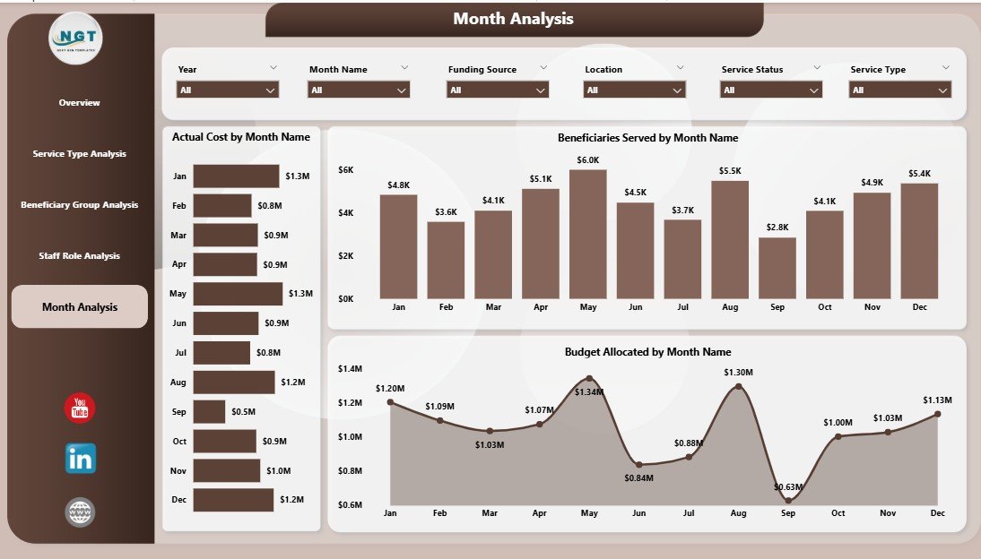
Community services change over time. Thus, the Monthly Trends Page tracks performance across months.
Charts Included in Monthly Trends
-
Beneficiaries Served by Month
-
Budget Allocation by Month
-
Actual Cost by Month
What Monthly Trends Reveal
-
Seasonal demand patterns
-
Cost spikes or savings
-
Program growth or decline
Because of this, leadership plans proactively instead of reacting late.
Advantages of Community Services Dashboard in Power BI
A Power BI dashboard delivers significant operational and strategic benefits.
Key Advantages
-
📊 Centralized and interactive reporting
-
⏱ Faster decision-making
-
💰 Clear budget vs actual cost tracking
-
🧭 Improved transparency and accountability
-
📈 Scalable analytics for growing programs
-
🔄 Real-time data refresh
Moreover, Power BI dashboards reduce manual reporting work drastically.
Who Can Benefit from a Community Services Dashboard?
This dashboard suits a wide range of users.
Ideal Users Include
-
NGOs and non-profit organizations
-
Government and municipal departments
-
CSR and social impact teams
-
Community program managers
-
Donors and funding agencies
Because the dashboard remains flexible, each stakeholder views relevant insights easily.
How to Design an Effective Community Services Dashboard in Power BI?
Design matters as much as data. Therefore, follow these principles carefully.
Design Tips
-
Keep visuals clean and consistent
-
Use meaningful colors for status and trends
-
Limit the number of KPIs per page
-
Add clear titles and labels
-
Align visuals logically
As a result, users understand insights instantly.
Best Practices for the Community Services Dashboard in Power BI
Following best practices ensures long-term success and usability.
Best Practices You Should Follow
-
Maintain clean and validated data
-
Use standardized naming conventions
-
Optimize measures for performance
-
Apply role-based security where needed
-
Schedule automatic data refresh
-
Document KPI definitions clearly
Because of these practices, your dashboard remains reliable and scalable.
How Does Power BI Improve Transparency and Reporting?
Power BI enables secure sharing and controlled access. Therefore, organizations share insights with donors, auditors, and leadership confidently.
Transparency Benefits
-
Single source of truth
-
Consistent reporting across teams
-
Easy export to PDF or PowerPoint
-
Interactive exploration during reviews
Consequently, reporting becomes trustworthy and professional.
Common Challenges and How to Overcome Them
Even powerful dashboards face challenges. However, smart planning solves them.
Common Challenges
-
Poor data quality
-
Overloaded visuals
-
Slow performance
-
Unclear KPIs
Practical Solutions
-
Clean data before loading
-
Focus on decision-critical metrics
-
Optimize DAX measures
-
Document KPI logic
Therefore, your dashboard delivers consistent value.
Click to Purchases Community Services Dashboard in Power BI
Conclusion: Why a Community Services Dashboard in Power BI Is Essential
A Community Services Dashboard in Power BI transforms raw service data into meaningful insights. Moreover, it empowers organizations to track beneficiaries, budgets, staff roles, and trends in one unified view. Because community impact depends on timely decisions, this dashboard becomes a strategic necessity rather than a luxury.
When designed correctly, it improves transparency, efficiency, and outcomes—while saving time and resources.
Frequently Asked Questions (FAQs)
1. What is a Community Services Dashboard in Power BI used for?
It tracks service delivery, beneficiaries, budgets, and performance using interactive visuals.
2. Can NGOs use Power BI for community reporting?
Yes, NGOs widely use Power BI for transparent, scalable, and donor-friendly reporting.
3. Does this dashboard support real-time data?
Yes, Power BI supports scheduled and real-time data refresh.
4. Can I customize the dashboard pages?
Absolutely. You can modify visuals, filters, KPIs, and layouts.
5. Is Power BI suitable for large community datasets?
Yes, Power BI handles large datasets efficiently with proper modeling.
6. Does the dashboard require advanced technical skills?
No. Basic Power BI knowledge is enough to use and maintain it.
Click to Purchases Community Services Dashboard in Power BI
Visit our YouTube channel to learn step-by-step video tutorials