Managing transportation operations without a clear reporting system always leads to rising costs, missed deliveries, and poor decisions. Moreover, when data stays scattered across spreadsheets, emails, and manual reports, transportation managers lose visibility and control. Therefore, organizations that depend on logistics, fleet movement, and transport services need a structured and visual solution.
That is exactly where a Transportation Services Dashboard in Excel becomes a powerful and practical tool.
In this detailed and SEO-friendly article, you will learn what a Transportation Services Dashboard in Excel is, why it is important, how it works, its complete page-wise structure, advantages, best practices, and frequently asked questions. Additionally, this guide uses simple language, strong transitions, and real-world logic so you can apply it immediately.
Click to Purchases Transportation Services Dashboard in Excel
What Is a Transportation Services Dashboard in Excel?
A Transportation Services Dashboard in Excel is a ready-to-use, interactive reporting system designed to track, analyze, and monitor transportation operations in one centralized Excel file.
Instead of reviewing multiple reports for costs, revenue, routes, fuel usage, and service types, this dashboard brings everything together on visual pages. As a result, decision-makers gain instant clarity.
Because the dashboard runs in Microsoft Excel, it remains flexible, affordable, and easy to customize. Therefore, even non-technical users can manage complex transportation data efficiently.
Why Do Transportation Businesses Need a Dashboard in Excel?
Transportation services operate in a high-cost and time-sensitive environment. Consequently, even small inefficiencies reduce profit margins. Without proper tracking, teams struggle to answer basic questions.
For example:
-
Which transport mode costs the most?
-
Which service type generates higher profit?
-
Which fuel type impacts margins negatively?
-
Which routes perform better?
-
How do monthly costs and revenue trends change?
A Transportation Services Dashboard in Excel answers all these questions visually. Moreover, it supports faster and more confident decisions.
How Does a Transportation Services Dashboard in Excel Work?
The dashboard works on a simple but powerful flow:
-
Data Entry
Transportation data gets stored in a structured data sheet. -
Data Processing
Excel formulas, pivot tables, and calculations process raw data. -
Visualization
Charts, KPI cards, and slicers display insights dynamically. -
User Interaction
Slicers and page navigators allow instant filtering and navigation.
As a result, users analyze data without writing complex formulas repeatedly.
What Are the Key Features of the Transportation Services Dashboard in Excel?
This dashboard includes several powerful features that improve usability and analysis.
Page Navigator for Easy Navigation
The Page Navigator, located on the left side, allows users to move between dashboard pages instantly. Therefore, users never waste time searching for sheets.
Right-Side Slicers for Dynamic Filtering
Each analytical page includes right-side slicers. These slicers help users filter data by relevant dimensions such as service type, route, fuel type, or month. Consequently, analysis becomes faster and more focused.
KPI Cards for Quick Insights
The Overview Page includes four KPI cards. These cards provide instant performance indicators without scrolling or drilling down.
Visual Charts for Decision-Making
Each page uses clear and business-friendly charts. Therefore, trends and problem areas become visible immediately.
What Pages Are Included in the Transportation Services Dashboard in Excel?
This dashboard contains five analytical pages and supporting sheets. Each page focuses on a specific aspect of transportation performance.
What Is Shown on the Overview Page of the Transportation Services Dashboard?
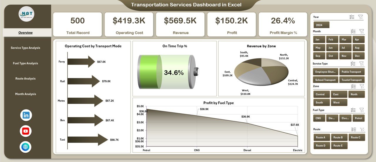
The Overview Page acts as the control center of the dashboard. Therefore, decision-makers start their analysis here.
Key Elements on the Overview Page
Right-Side Slicer
The slicer allows users to filter the entire dashboard dynamically. As a result, users view performance for specific selections instantly.
KPI Cards
The four KPI cards show:
-
Overall performance snapshot
-
High-level operational indicators
-
Immediate red flags or success areas
Charts on the Overview Page
-
Operating Cost by Transport Mode
This chart highlights which transport modes drive higher costs. Therefore, managers identify cost-heavy modes quickly. -
On-Time Trip %
This chart shows delivery reliability. Consequently, service quality becomes measurable. -
Revenue by Zone
This chart identifies revenue contribution by zones. As a result, management allocates resources strategically. -
Profit by Fuel Type
This chart highlights profitability differences across fuel types. Therefore, fuel strategy decisions become data-driven. -
Click to Purchases Transportation Services Dashboard in Excel
What Insights Does the Service Type Analysis Page Provide?
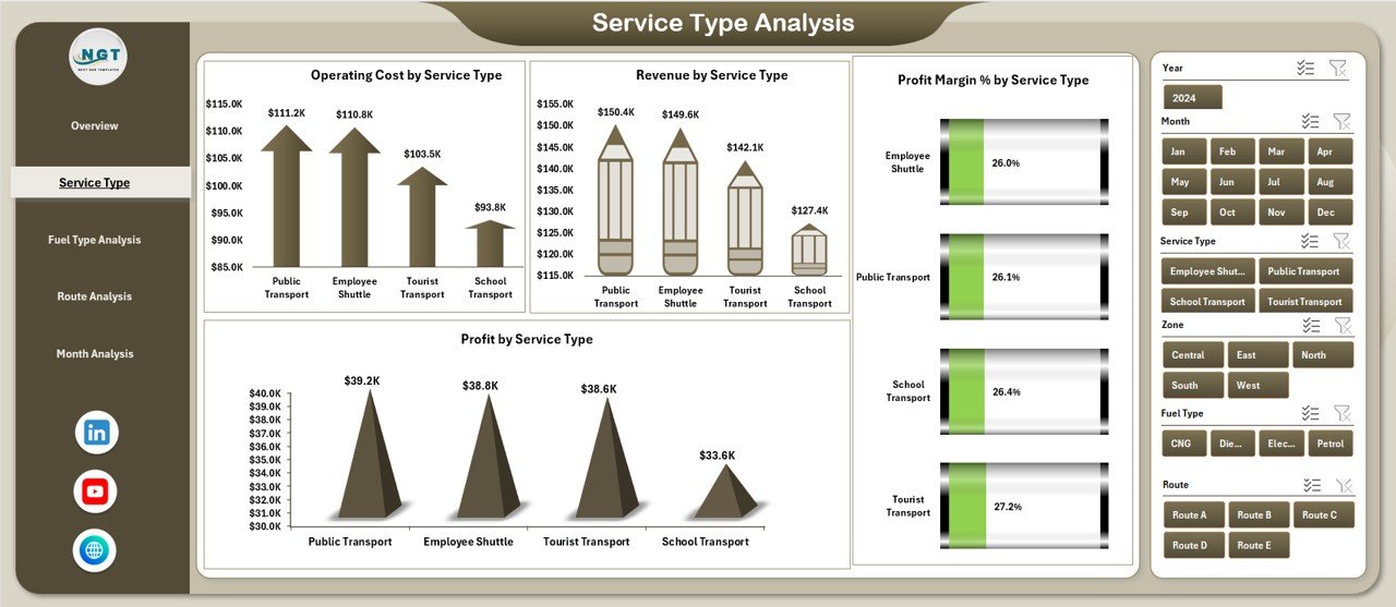
The Service Type Analysis Page focuses on performance by transportation service categories.
Why Is Service Type Analysis Important?
Different service types often have different cost structures and margins. Therefore, this page helps optimize service offerings.
Charts on the Service Type Analysis Page
-
Operating Cost by Service Type
Identifies high-cost services. -
Revenue by Service Type
Highlights top revenue-generating services. -
Profit Margin % by Service Type
Shows which services deliver better margins. -
Profit by Service Type
Combines cost and revenue insights into net profitability.
As a result, managers improve pricing, contracts, and service mix.
What Does the Fuel Type Analysis Page Show?
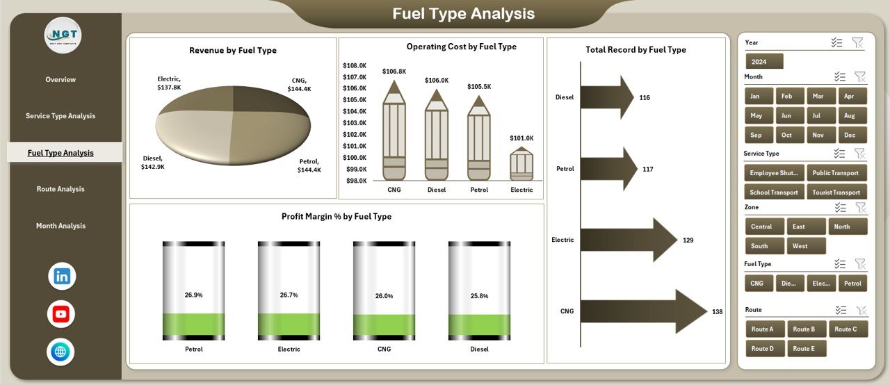
Fuel costs significantly affect transportation profitability. Therefore, the Fuel Type Analysis Page plays a critical role.
Charts on the Fuel Type Analysis Page
-
Operating Cost by Fuel Type
Shows how fuel choices impact expenses. -
Revenue by Fuel Type
Connects fuel usage with revenue performance. -
Profit Margin % by Fuel Type
Highlights margin differences across fuel types. -
Total Record by Fuel Type
Shows volume or transaction distribution by fuel type.
As a result, organizations optimize fuel strategies and sustainability planning.
Why Is Route Analysis Critical in Transportation Dashboards?
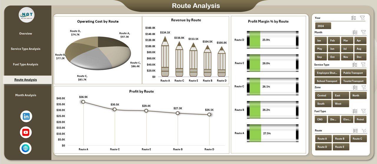
Routes define cost efficiency, delivery time, and profitability. Therefore, the Route Analysis Page focuses on route-level performance.
Charts on the Route Analysis Page
-
Operating Cost by Route
Identifies expensive routes. -
Revenue by Route
Shows revenue contribution per route. -
Profit Margin % by Route
Highlights profitable and unprofitable routes. -
Profit by Route
Displays net profitability clearly.
As a result, route optimization becomes data-driven rather than assumption-based.
What Can You Learn from the Month Analysis Page?
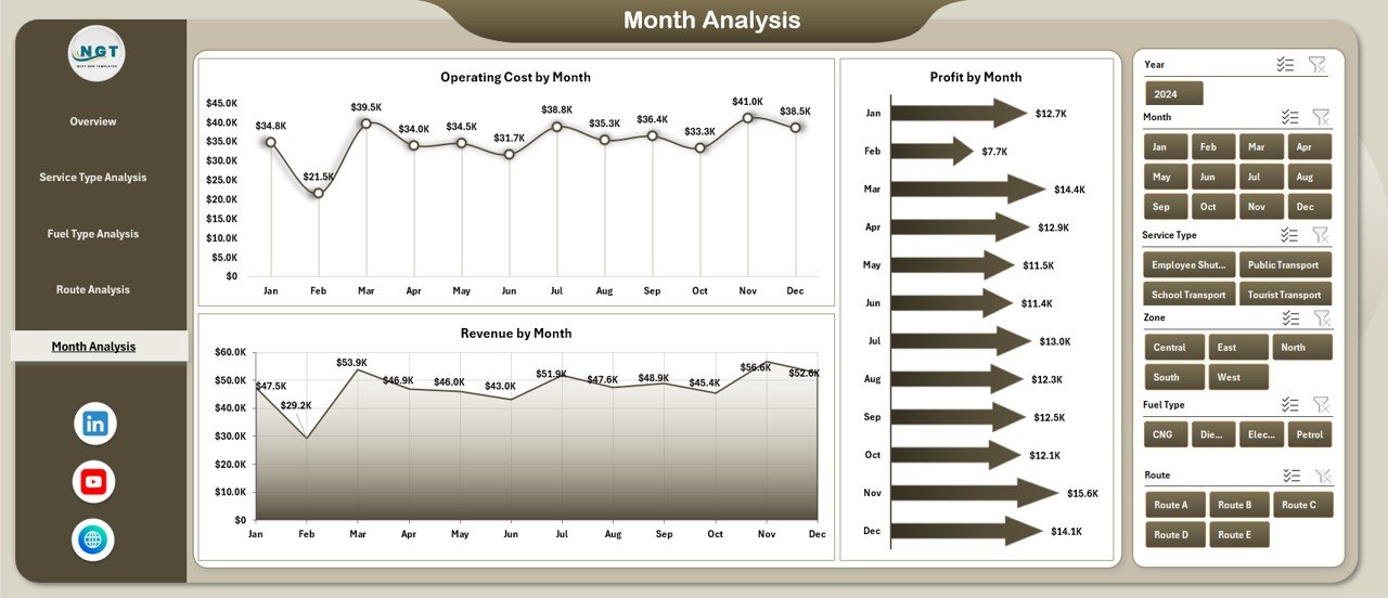
Transportation performance changes over time. Therefore, the Month Analysis Page focuses on trends.
Charts on the Month Analysis Page
-
Operating Cost by Month
Shows seasonal cost patterns. -
Revenue by Month
Highlights revenue trends. -
Profit by Month
Displays monthly profitability movement.
As a result, forecasting and budgeting improve significantly.
What Are the Supporting Sheets in the Transportation Services Dashboard?
Click to Purchases Transportation Services Dashboard in Excel
Behind every strong dashboard, structured data plays a key role.
Data Sheet
The Data Sheet stores raw transportation data. It includes all necessary fields such as:
-
Date
-
Transport mode
-
Service type
-
Fuel type
-
Route
-
Cost
-
Revenue
-
Profit
-
On-time status
Because data stays clean and structured, the dashboard refreshes easily.
Support Sheet
The Support Sheet contains helper calculations, lookup tables, or mappings. Therefore, the dashboard logic remains stable and easy to maintain.
Advantages of Transportation Services Dashboard in Excel
Using this dashboard delivers several business benefits.
✔ Centralized Transportation Reporting
All transportation KPIs stay in one Excel file. Therefore, reporting becomes simple and consistent.
✔ Cost Control and Profit Visibility
Clear cost, revenue, and profit tracking improves margin management.
✔ Faster Decision-Making
Visual insights reduce analysis time dramatically.
✔ User-Friendly Interface
Excel familiarity ensures quick adoption across teams.
✔ Customizable and Scalable
Organizations easily add new routes, services, or metrics.
✔ No Additional Software Cost
Excel-based dashboards reduce dependency on expensive BI tools.
Best Practices for the Transportation Services Dashboard in Excel
To maximize dashboard value, follow these best practices.
Keep the Data Sheet Clean
Always maintain consistent formats and avoid manual overwriting.
Use Slicers Strategically
Limit slicers to key dimensions to avoid confusion.
Review KPIs Regularly
Update KPIs based on business goals and performance changes.
Avoid Overcrowding Charts
Focus on clarity instead of adding too many visuals.
Validate Data Before Refresh
Ensure data accuracy to maintain dashboard reliability.
Train Users Briefly
Provide a short guide so users understand navigation and slicers.
Who Can Use a Transportation Services Dashboard in Excel?
This dashboard suits many roles and industries.
-
Transportation companies
-
Logistics service providers
-
Fleet managers
-
Supply chain managers
-
Operations heads
-
Finance and cost control teams
-
Small and mid-sized logistics businesses
Because Excel supports flexibility, both small teams and growing organizations benefit.
Conclusion: Why Should You Use a Transportation Services Dashboard in Excel?
A Transportation Services Dashboard in Excel transforms raw transportation data into actionable insights. Instead of guessing performance, organizations track costs, revenue, routes, fuel usage, and service efficiency visually.
Moreover, the dashboard structure ensures clarity, control, and confidence in decision-making. Because it runs in Excel, it remains accessible, affordable, and scalable. Therefore, transportation teams gain a competitive edge without complexity.
Frequently Asked Questions About Transportation Services Dashboard in Excel
Click to Purchases Transportation Services Dashboard in Excel
What is the main purpose of a Transportation Services Dashboard in Excel?
The main purpose is to monitor transportation costs, revenue, profit, and operational performance in one visual system.
Can beginners use this dashboard easily?
Yes, because the dashboard uses Excel-based navigation, slicers, and charts that most users already understand.
Can I customize the dashboard for my business?
Absolutely. You can add new KPIs, routes, fuel types, and service categories easily.
Does the dashboard update automatically?
Yes. When you update the data sheet, charts and KPIs refresh automatically.
Is this dashboard suitable for small transportation companies?
Yes. Small and mid-sized businesses benefit greatly because it does not require expensive BI tools.
Can this dashboard support monthly and yearly analysis?
Yes. The Month Analysis page and slicers allow time-based performance tracking.
Do I need advanced Excel skills to maintain it?
No. Basic Excel knowledge works well for daily use and maintenance.
Visit our YouTube channel to learn step-by-step video tutorials