4D printing stands at the intersection of advanced manufacturing, smart materials, and innovation. However, as organizations invest more in 4D printing technologies, tracking performance becomes just as important as developing the technology itself. Without clear metrics, leaders struggle to understand efficiency, quality, cost, and innovation outcomes.
That is exactly where a 4D Printing KPI Dashboard in Excel becomes a powerful and practical solution.
In this detailed and SEO-friendly guide, you will learn what a 4D Printing KPI Dashboard in Excel is, why it matters, how it works, its complete sheet-wise structure, advantages, opportunities for improvement, best practices, and frequently asked questions. Moreover, this article uses simple language, active voice, and real-world explanations so you can apply everything immediately.
Click to buy 4D Printing KPI Dashboard in Excel
What Is a 4D Printing KPI Dashboard in Excel?
A 4D Printing KPI Dashboard in Excel is a centralized performance monitoring tool that tracks, measures, and visualizes key performance indicators related to 4D printing operations.
Instead of reviewing multiple spreadsheets, emails, or manual reports, this dashboard brings all critical KPIs into one interactive Excel file. As a result, manufacturing managers, R&D teams, and leadership gain instant visibility into operational performance.
Because the dashboard runs in Excel, it offers flexibility, ease of use, and wide accessibility across teams.
Why Do Organizations Need a 4D Printing KPI Dashboard?
4D printing involves complex variables such as material behavior, transformation accuracy, production timelines, and cost efficiency. Therefore, teams need structured performance tracking.
A 4D Printing KPI Dashboard in Excel helps organizations:
- Monitor MTD and YTD performance in real time
- Compare Actual vs Target vs Previous Year data
- Identify process gaps and efficiency losses
- Support data-driven decisions
- Improve innovation outcomes and ROI
Without a dashboard, teams react slowly. With a dashboard, teams act confidently.
How Does a 4D Printing KPI Dashboard in Excel Work?
The dashboard works on a simple yet powerful logic.
First, you enter actual, target, and previous-year data into dedicated input sheets. Then, Excel formulas automatically calculate MTD and YTD values. After that, visual elements such as tables, indicators, and charts update instantly.
As you change the Month selection, the entire dashboard refreshes automatically. Consequently, decision-makers always see the latest performance picture.
What Are the Key Features of the 4D Printing KPI Dashboard in Excel?
This dashboard focuses on clarity, accuracy, and usability.
Key Highlights
- Interactive Month selector
- MTD and YTD calculations
- Actual vs Target vs Previous Year comparison
- Conditional formatting with up/down arrows
- KPI trend analysis
- Structured KPI definition framework
- Button-based navigation for easy movement
Each feature works together to create a smooth analytical experience.
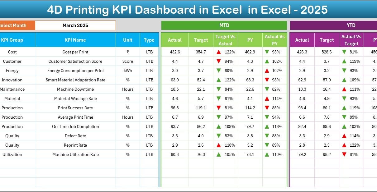
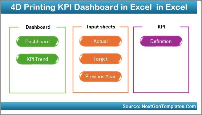
What Is the Sheet-Wise Structure of the 4D Printing KPI Dashboard in Excel?
This dashboard contains 7 well-structured worksheets, each designed for a specific purpose.
Summary Page – Why Is It Important?
The Summary Page works as the index of the dashboard.
What Does the Summary Page Include?
- Six navigation buttons to jump to other sheets
- Clean and simple layout
- Easy access to all analytical sections
Because of this design, users do not waste time searching for sheets.
Click to buy 4D Printing KPI Dashboard in Excel
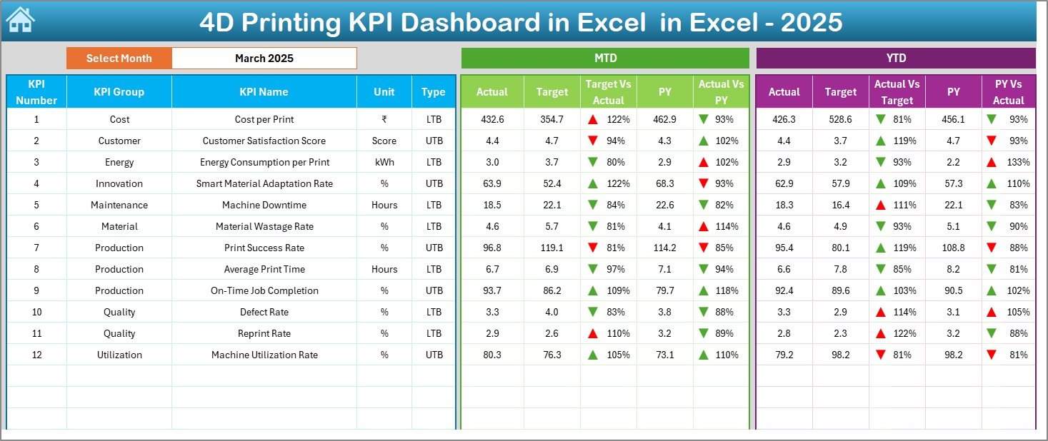
Dashboard Sheet – What Insights Does It Provide?
The Dashboard Sheet acts as the heart of the KPI dashboard.
Key Features of the Dashboard Sheet
- Month selection available at cell D3
- Automatic dashboard refresh based on selected month
- Detailed KPI-level table
- Clear performance comparison views
Metrics Displayed on This Sheet
- MTD Actual, Target, and Previous Year
- Target vs Actual variance with arrows
- PY vs Actual variance with arrows
- YTD Actual, Target, and Previous Year
Because everything updates dynamically, managers always stay informed.
Click to buy 4D Printing KPI Dashboard in Excel
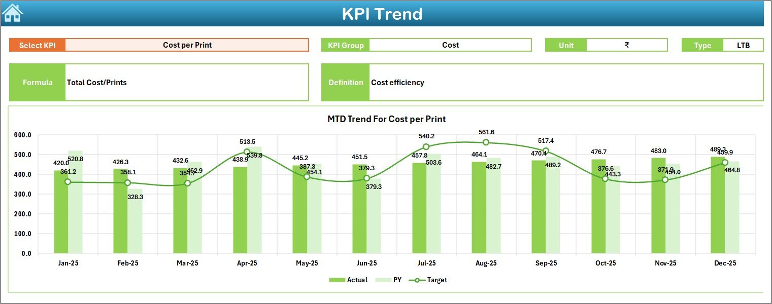
Trend Sheet – How Can You Track KPI Performance Over Time?
The Trend Sheet focuses on historical and trend-based analysis.
What Can You Do on the Trend Sheet?
- Select a KPI from the dropdown at cell C3
- View KPI Group, Unit, and KPI Type (LTB or UTB)
- Review KPI Formula and Definition
- Analyze MTD and YTD trends visually
Charts Included
- Actual vs Target vs PY (MTD)
- Actual vs Target vs PY (YTD)
Therefore, teams can quickly identify patterns, improvements, or declines.
Click to buy 4D Printing KPI Dashboard in Excel
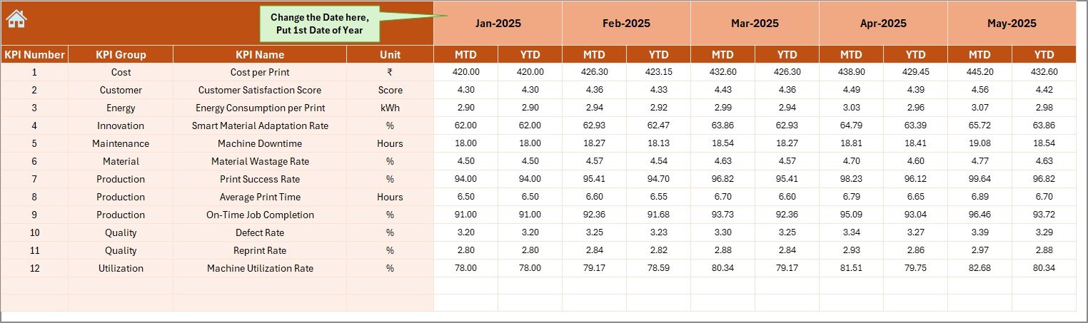
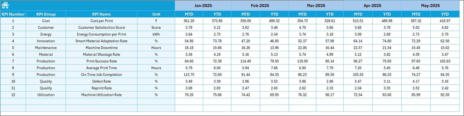
Actual Numbers Input Sheet – How Do You Enter Data?
The Actual Numbers Input Sheet captures real operational data.
How Does It Work?
- Enter actual MTD and YTD values
- Change the starting month at cell E1
- Excel automatically adjusts calculations
Because of this flexibility, users can adapt the dashboard to any fiscal calendar.
Click to buy 4D Printing KPI Dashboard in Excel
Target Sheet – Why Are Targets Critical?
The Target Sheet defines expected performance levels.
What Should You Enter Here?
- Monthly MTD targets
- YTD cumulative targets
- KPI-wise target values
Targets create benchmarks. Without targets, performance lacks direction.
Click to buy 4D Printing KPI Dashboard in Excel
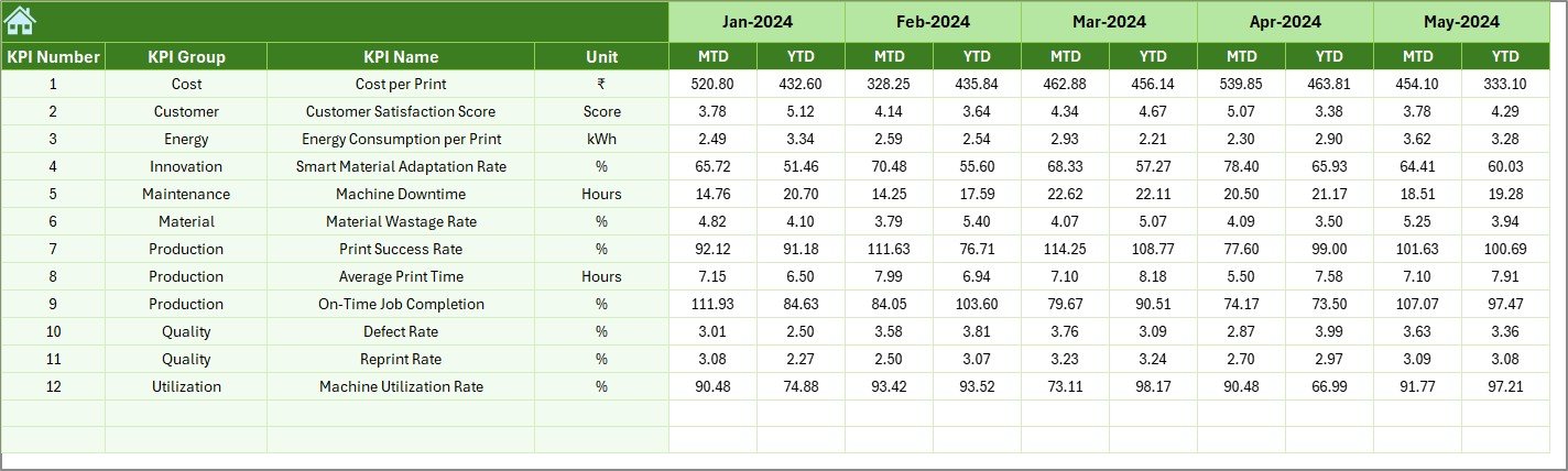
Previous Year Number Sheet – Why Compare with History?
The Previous Year Number Sheet captures historical data.
Benefits of This Sheet
- Enables year-over-year comparison
- Highlights growth or decline
- Supports strategic planning
By comparing current performance with the past, leaders gain valuable context.
Click to buy 4D Printing KPI Dashboard in Excel
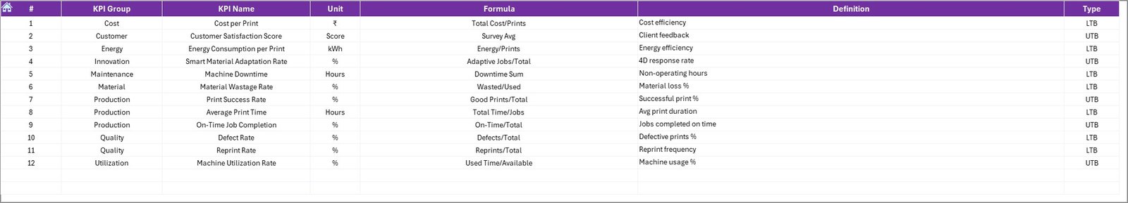
KPI Definition Sheet – Why Is Standardization Important?
The KPI Definition Sheet ensures consistency and clarity.
Information Captured
- KPI Name
- KPI Group
- Unit of Measurement
- Formula
- KPI Definition
Because everyone uses the same definitions, confusion disappears.
Click to buy 4D Printing KPI Dashboard in Excel
What Types of KPIs Can You Track in a 4D Printing KPI Dashboard?
A 4D Printing KPI Dashboard in Excel can track a wide range of KPIs, such as:
- Material transformation accuracy
- Print cycle time
- Reconfiguration success rate
- Defect rate
- Cost per print
- Energy consumption
- Innovation cycle time
- Scrap percentage
- R&D efficiency
- Machine utilization
You can customize KPIs based on your organization’s goals.
Advantages of a 4D Printing KPI Dashboard in Excel
A well-designed dashboard delivers measurable benefits.
Key Advantages
- Improves decision-making speed
- Centralizes all KPI data
- Tracks performance trends clearly
- Aligns teams with targets
- Supports innovation management
- Helps control costs
- Increases transparency
Because of these advantages, teams move from reactive to proactive management.
Opportunities for Improvement in 4D Printing KPI Dashboards
Although Excel dashboards are powerful, continuous improvement always helps.
Areas to Enhance
- Automate data import from machines
- Add scenario analysis models
- Integrate Power BI for advanced visuals
- Include predictive analytics
- Expand KPI coverage as operations grow
By improving gradually, organizations maximize dashboard value.
Best Practices for the 4D Printing KPI Dashboard in Excel
Following best practices ensures long-term success.
Recommended Best Practices
- Keep KPI definitions clear and short
- Limit KPIs to what truly matters
- Review targets regularly
- Update data consistently
- Use conditional formatting wisely
- Train users on dashboard usage
- Protect formula cells
When teams follow these practices, dashboards remain reliable and relevant.
Who Can Benefit from a 4D Printing KPI Dashboard in Excel?
This dashboard suits many roles and industries.
Ideal Users
- Advanced manufacturing companies
- R&D and innovation teams
- Production managers
- Quality control teams
- Operations leadership
- Engineering departments
Anyone involved in 4D printing performance gains value from this dashboard.
How Does This Dashboard Support Strategic Decision-Making?
Because the dashboard provides real-time insights, leaders can:
- Identify underperforming KPIs early
- Allocate resources efficiently
- Improve process reliability
- Measure innovation ROI
- Align operations with strategy
As a result, decisions become faster and smarter.
Why Choose Excel for a 4D Printing KPI Dashboard?
Excel remains one of the most trusted analytics tools.
Key Reasons
- No additional software cost
- Easy customization
- Familiar interface
- Powerful formulas
- Wide user adoption
Therefore, Excel works perfectly for KPI dashboards.
How Can You Customize This Dashboard for Your Organization?
Customization remains simple and flexible.
Customization Options
- Add or remove KPIs
- Modify KPI groups
- Adjust fiscal year logic
- Change charts and visuals
- Add automation
Because Excel supports customization, the dashboard grows with your business.
Conclusion: Why a 4D Printing KPI Dashboard in Excel Is Essential
A 4D Printing KPI Dashboard in Excel transforms raw operational data into meaningful insights. It brings clarity, control, and confidence to performance management.
Instead of guessing outcomes, teams rely on facts. Instead of reacting late, leaders act early. As a result, organizations achieve better efficiency, stronger innovation, and sustainable growth.
If you work in advanced manufacturing or innovation-driven environments, this dashboard becomes an essential management tool.
Frequently Asked Questions (FAQs)
What is a 4D Printing KPI Dashboard in Excel?
A 4D Printing KPI Dashboard in Excel is a performance tracking tool that monitors key metrics related to 4D printing operations using Excel-based analytics.
Can beginners use this dashboard?
Yes, the dashboard uses simple Excel logic and a user-friendly layout.
How often should data be updated?
Teams should update data monthly or as frequently as operations require.
Can I add more KPIs later?
Yes, Excel allows easy KPI expansion and customization.
Does this dashboard support MTD and YTD analysis?
Yes, the dashboard automatically calculates and displays MTD and YTD values.
Can this dashboard support management reporting?
Absolutely. It provides clear visuals and structured data for management reviews.
Visit our YouTube channel to learn step-by-step video tutorials
Watch the step-by-step video tutorial: