Running a language school requires constant monitoring of academic quality, student engagement, operational efficiency, and financial performance. However, when data stays scattered across spreadsheets, emails, and systems, leaders struggle to see the full picture. As a result, decisions become reactive instead of strategic.
Therefore, a Language Schools KPI Dashboard in Power BI becomes an essential solution. It transforms raw Excel data into clear, interactive, and visual insights. Moreover, it helps school owners, academic heads, and administrators track performance in real time.
In this detailed guide, you will learn what a Language Schools KPI Dashboard in Power BI is, how it works, its structure, key metrics, advantages, best practices, and common questions. Additionally, you will understand how this ready-to-use dashboard supports smarter decisions and long-term growth.
Click to Purchases Language Schools KPI Dashboard in Power BI
What Is a Language Schools KPI Dashboard in Power BI?
A Language Schools KPI Dashboard in Power BI is an interactive reporting and analytics tool designed to track and visualize key performance indicators related to language education institutes. Instead of reviewing multiple Excel sheets, users monitor all KPIs in one centralized Power BI report.
Moreover, this dashboard focuses on MTD (Month-to-Date) and YTD (Year-to-Date) performance. As a result, management gains visibility into short-term progress and long-term trends at the same time.
In addition, Power BI offers dynamic slicers, drill-through capabilities, and interactive charts. Therefore, users explore data from different angles without technical complexity.
Why Do Language Schools Need a KPI Dashboard?
Language schools operate in a competitive education market. Therefore, performance tracking plays a crucial role. A KPI dashboard helps schools:
-
Track student enrollments and retention consistently
-
Monitor faculty performance and class utilization
-
Measure revenue, targets, and growth trends
-
Compare current results with targets and previous years
-
Identify gaps early and take corrective actions
As a result, schools improve transparency, accountability, and decision-making.
How Does a Language Schools KPI Dashboard in Power BI Work?
The dashboard works by connecting Excel-based input data to Power BI visuals. Once data updates in Excel, the Power BI dashboard refreshes automatically.
Moreover, Power BI applies calculations for MTD, YTD, target comparisons, and year-over-year analysis. As a result, users focus on insights rather than manual calculations.
In addition, slicers allow filtering by Month and KPI Group, which improves analysis flexibility.
Overall Structure of the Language Schools KPI Dashboard in Power BI
This ready-to-use dashboard contains three well-structured pages. Each page serves a specific analytical purpose.
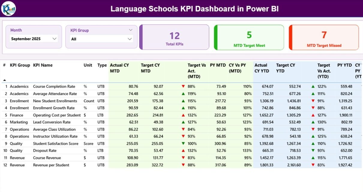
What Is Included in the Summary Page of the Dashboard?

The Summary Page acts as the control center of the dashboard. It provides a complete overview of all KPIs at a glance.
Key Elements of the Summary Page
Top Slicers
-
Month slicer to analyze a specific month
-
KPI Group slicer to focus on academic, operational, or financial KPIs
KPI Cards
-
Total KPIs Count
-
MTD Target Meet Count
-
MTD Target Missed Count
These cards instantly highlight overall performance health.
Detailed KPI Table on the Summary Page
The KPI table provides granular details for every metric:
-
KPI Number – Sequence number of the KPI
-
KPI Group – Category of the KPI
-
KPI Name – Name of the performance metric
-
Unit – Measurement unit (%, count, currency, hours, etc.)
-
Type – UTB (Upper the Better) or LTB (Lower the Better)
MTD Performance Indicators
Click to Purchases Language Schools KPI Dashboard in Power BI
-
Actual CY MTD – Current year actual MTD value
-
Target CY MTD – Target MTD value
-
MTD Icon – ▲ (green) or ▼ (red) to show status
-
Target vs Actual (MTD) – Actual ÷ Target
-
PY MTD – Previous year MTD value
-
CY vs PY (MTD) – Current year vs previous year comparison
As a result, users quickly identify monthly strengths and weaknesses.
YTD Performance Indicators
-
Actual CY YTD – Current year actual YTD value
-
Target CY YTD – Target YTD value
-
YTD Icon – ▲ or ▼ based on target achievement
-
Target vs Actual (YTD) – Actual ÷ Target
-
PY YTD – Previous year YTD value
-
CY vs PY (YTD) – Year-over-year comparison
Therefore, management understands long-term performance trends clearly.
How Does the KPI Trend Page Improve Analysis?
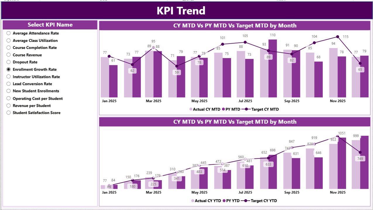
The KPI Trend Page focuses on performance movement over time.
Key Highlights of the KPI Trend Page
-
Two combo charts for MTD and YTD analysis
-
Actual vs Target vs Previous Year comparison
-
KPI Name slicer on the left for focused analysis
These visuals make trends easy to understand. As a result, users detect patterns, seasonality, and performance gaps instantly.
What Is the Purpose of the KPI Definition Page?

The KPI Definition Page acts as a reference layer for deeper understanding.
Features of the KPI Definition Page
-
Hidden drill-through page
-
Displays KPI Formula
-
Shows KPI Definition
-
Explains KPI Type (UTB or LTB)
Users drill through from the Summary Page to view KPI details. Moreover, a back button allows smooth navigation.
What Excel Data Sources Power This Dashboard?
The dashboard uses a structured Excel file as its data source. This design keeps data entry simple and reliable.
Input_Actual Sheet
In this sheet, users enter:
-
KPI Name
-
Month (first date of the month)
-
MTD Actual value
-
YTD Actual value
This sheet captures real performance data.
Input_Target Sheet
In this sheet, users enter:
-
KPI Name
-
Month (first date of the month)
-
MTD Target value
-
YTD Target value
As a result, target tracking remains consistent.
KPI Definition Sheet
This sheet contains master KPI details:
-
KPI Number
-
KPI Group
-
KPI Name
-
Unit
-
Formula
-
Definition
-
Type (LTB or UTB)
Therefore, KPI governance stays standardized.
What KPIs Can Language Schools Track Using This Dashboard?
Click to Purchases Language Schools KPI Dashboard in Power BI
Language schools can track a wide range of KPIs, such as:
Academic KPIs
-
Student attendance rate
-
Course completion rate
-
Exam pass percentage
-
Average class size
Operational KPIs
-
Teacher utilization rate
-
Class cancellation rate
-
Student complaints count
Financial KPIs
-
Monthly revenue
-
Revenue growth rate
-
Cost per student
-
Profit margin
As a result, the dashboard supports holistic performance management.
Advantages of a Language Schools KPI Dashboard in Power BI
1. Centralized Performance Monitoring
All KPIs stay in one interactive report. Therefore, users save time and avoid confusion.
2. Clear MTD and YTD Visibility
Users track short-term execution and long-term trends simultaneously.
3. Visual and Interactive Reporting
Charts, icons, and slicers improve understanding and engagement.
4. Data-Driven Decision Making
Leaders act based on facts instead of assumptions.
5. Easy Scalability
Schools can add new KPIs without redesigning the dashboard.
Best Practices for the Language Schools KPI Dashboard in Power BI
1. Define KPIs Clearly
Always maintain a detailed KPI Definition sheet.
2. Update Data Regularly
Update actual and target data monthly to keep insights accurate.
3. Use UTB and LTB Correctly
Set KPI types properly to avoid misinterpretation.
4. Validate Excel Inputs
Check data consistency before refreshing Power BI.
5. Review Trends, Not Just Numbers
Focus on patterns and movements, not isolated values.
How Does This Dashboard Support Strategic Decisions?
This dashboard supports leadership by:
-
Highlighting underperforming areas early
-
Comparing targets with actuals visually
-
Monitoring year-over-year improvements
-
Aligning academic and financial goals
As a result, schools improve planning, resource allocation, and student outcomes.
Who Should Use a Language Schools KPI Dashboard in Power BI?
This dashboard benefits:
-
Language school owners
-
Academic directors
-
Operations managers
-
Finance teams
-
Education consultants
Therefore, it fits both small institutes and large education groups.
Conclusion: Why This Dashboard Is Essential for Language Schools
A Language Schools KPI Dashboard in Power BI transforms scattered data into actionable insights. It simplifies performance tracking, improves transparency, and supports confident decision-making.
Moreover, its Excel-based input structure makes it easy to maintain. Combined with Power BI’s visualization power, it becomes a reliable performance management system for modern language schools.
Frequently Asked Questions (FAQs)
What is a Language Schools KPI Dashboard in Power BI?
It is an interactive Power BI report that tracks academic, operational, and financial KPIs for language schools using Excel data.
Can beginners use this dashboard?
Yes. The Excel input and Power BI visuals are simple and user-friendly.
Does this dashboard support MTD and YTD analysis?
Yes. It includes both MTD and YTD metrics with target and previous year comparisons.
Can I add more KPIs to the dashboard?
Yes. You can extend the KPI Definition and input sheets easily.
Why use Power BI instead of Excel charts?
Power BI offers better interactivity, automation, and visual clarity.
Visit our YouTube channel to learn step-by-step video tutorials