Managing an equipment leasing business requires constant tracking of performance, targets, costs, and utilization. However, raw data stored in spreadsheets rarely gives a clear picture. Therefore, companies increasingly rely on an Equipment Leasing KPI Dashboard in Power BI to transform scattered data into actionable insights.
In this detailed guide, you will learn what an Equipment Leasing KPI Dashboard in Power BI is, how it works, its page-wise structure, advantages, best practices, and real-world use cases. Moreover, you will understand how a ready-to-use dashboard connected with Excel simplifies KPI monitoring and improves decision-making across the organization.
Click to buy Equipment Leasing KPI Dashboard in Power BI
What Is an Equipment Leasing KPI Dashboard in Power BI?
An Equipment Leasing KPI Dashboard in Power BI is a centralized analytical tool that visually tracks key performance indicators related to equipment leasing operations. Instead of checking multiple Excel sheets, managers can review all KPIs from a single interactive dashboard.
Because Power BI supports slicers, drill-through pages, and dynamic calculations, this dashboard helps leasing companies monitor performance at both MTD (Month-to-Date) and YTD (Year-to-Date) levels. Additionally, the dashboard compares actual performance with targets and previous year values.
As a result, business leaders can quickly identify performance gaps, trends, and improvement areas.
Why Do Equipment Leasing Companies Need KPI Dashboards?
Equipment leasing operations involve multiple moving parts. For example, teams manage asset utilization, revenue targets, maintenance costs, and contract performance at the same time. Without a structured dashboard, tracking these metrics becomes slow and error-prone.
An Equipment Leasing KPI Dashboard in Power BI helps because it:
- Centralizes all KPI data in one place
- Reduces dependency on manual reports
- Improves transparency across departments
- Enables faster and better decisions
Therefore, companies that adopt KPI dashboards gain a strong competitive advantage.
What Are the Key Features of the Equipment Leasing KPI Dashboard in Power BI?
This ready-to-use Equipment Leasing KPI Dashboard in Power BI connects directly with an Excel data source. Moreover, it follows a clean and scalable design that works for small and large leasing businesses.
High-Level Dashboard Features
- Built in Power BI Desktop
- Excel-based data input (easy to maintain)
- Month and KPI Group slicers
- MTD and YTD performance tracking
- Target vs Actual comparison
- Previous Year comparison
- Visual KPI status indicators (▲ / ▼)
How Is the Dashboard Structured?
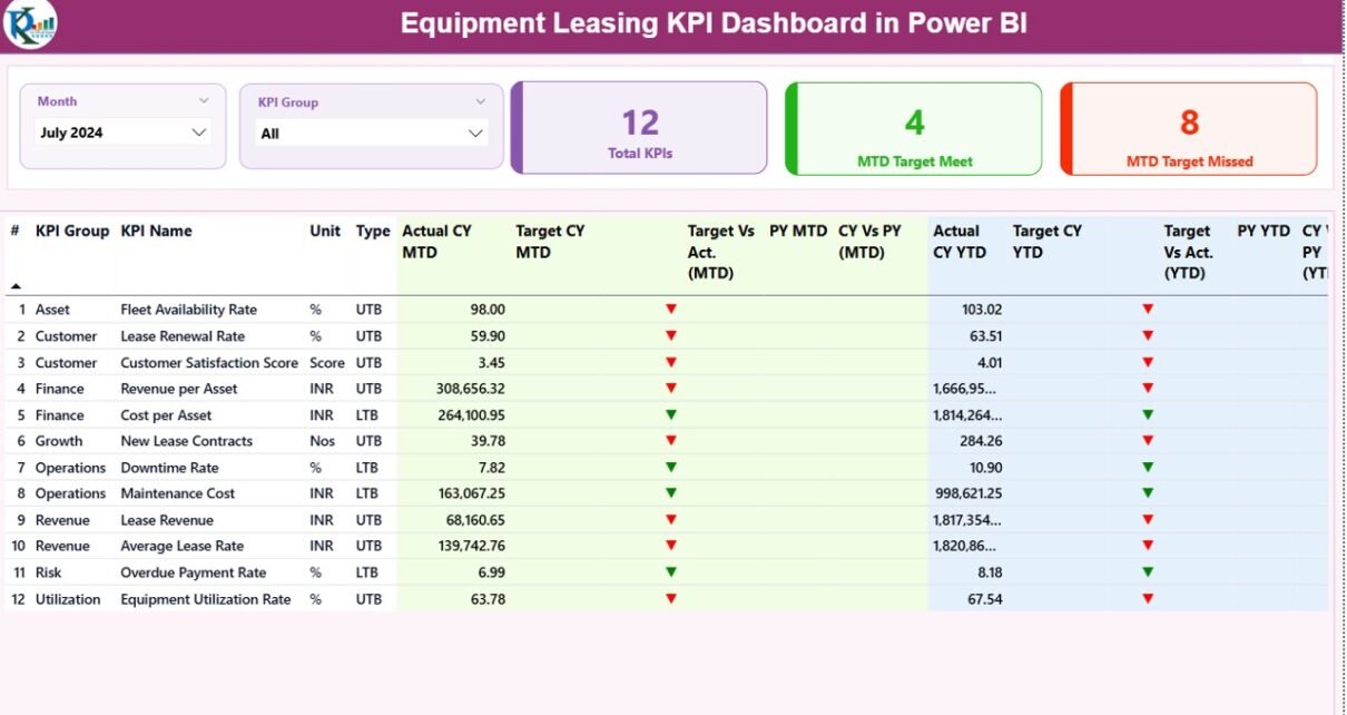
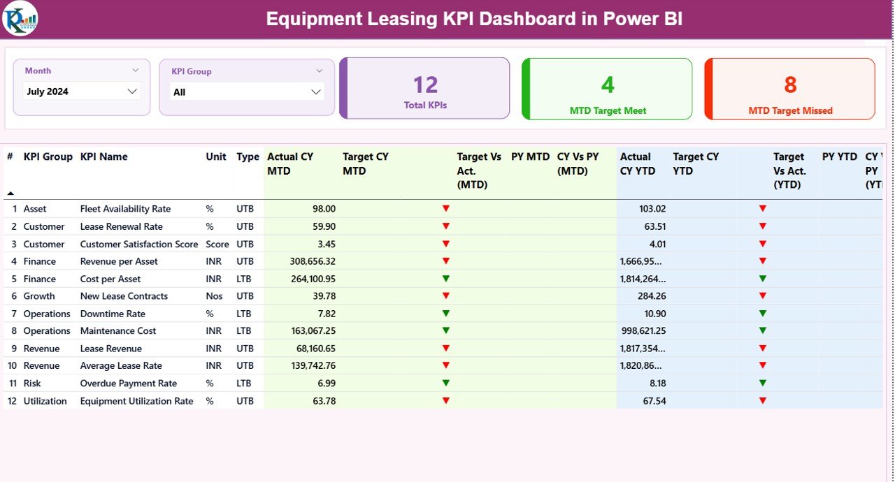
The dashboard includes three structured pages, each designed for a specific analytical purpose.
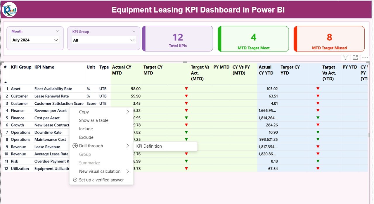
Summary Page
The Summary Page acts as the main landing page of the dashboard. From here, decision-makers can review overall KPI performance at a glance.
Key Elements of the Summary Page
Slicers at the Top
- Month Slicer: Allows users to select a specific month
- KPI Group Slicer: Filters KPIs by category
Because of these slicers, users can instantly narrow down the analysis.
KPI Cards
At the top of the page, three cards show:
- Total KPIs Count
- MTD Target Met Count
- MTD Target Missed Count
These cards quickly highlight overall performance health.
Detailed KPI Table Explained
Below the cards, a detailed table displays KPI-level performance.
Columns Included in the Table:
- KPI Number – Sequence number of the KPI
- KPI Group – Category of the KPI
- KPI Name – Name of the KPI
- Unit – Measurement unit (%, Count, Amount, etc.)
- Type – LTB (Lower the Better) or UTB (Upper the Better)
MTD Performance Columns
- Actual CY MTD – Current Year actual MTD value
- Target CY MTD – Current Year target MTD value
- MTD Icon – ▲ (green) or ▼ (red) based on target achievement
- Target vs Actual (MTD) – Actual ÷ Target
- PY MTD – Previous Year MTD value
- CY vs PY (MTD) – CY MTD ÷ PY MTD
YTD Performance Columns
- Actual CY YTD
- Target CY YTD
- YTD Icon
- Target vs Actual (YTD)
- PY YTD
- CY vs PY (YTD)
Because of this structure, users can analyze short-term and long-term performance together.
Click to buy Equipment Leasing KPI Dashboard in Power BI
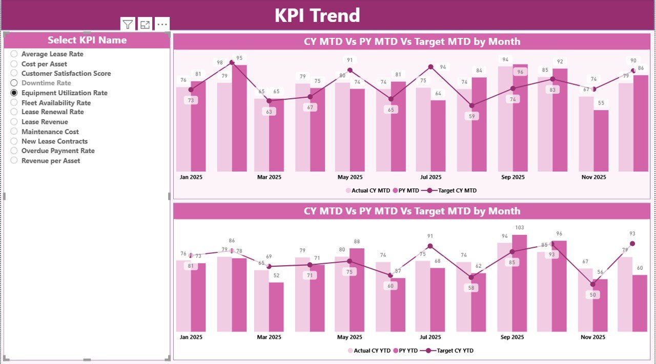
KPI Trend Page
The KPI Trend Page focuses on trend analysis. Instead of showing all KPIs at once, this page allows users to deep dive into a single KPI.
Key Highlights of the KPI Trend Page
- KPI Name slicer on the left
- Two combo charts:
MTD trend: Actual CY, PY, and Target
YTD trend: Actual CY, PY, and Target
Because of this setup, users can easily identify performance patterns, seasonal trends, and deviations from targets.
Click to buy Equipment Leasing KPI Dashboard in Power BI
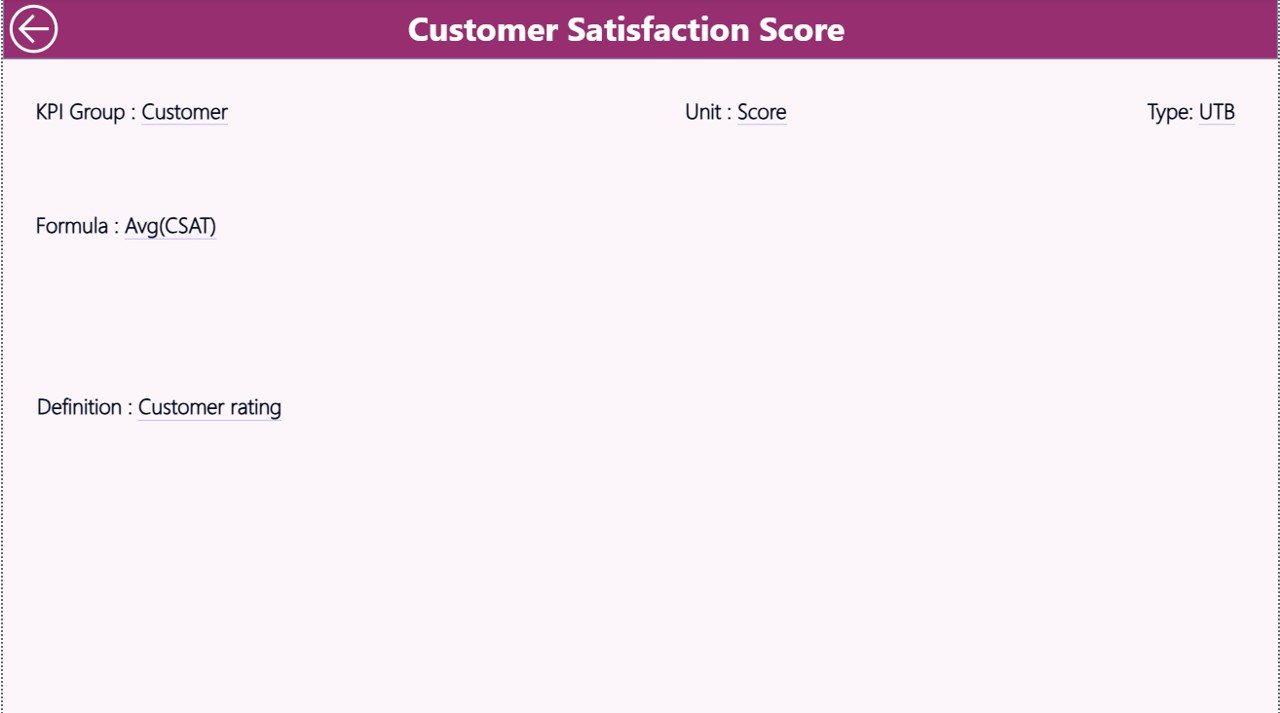
KPI Definition Page
The KPI Definition Page works as a drill-through page. Although it remains hidden, users can access it directly from the Summary Page.
Information Available on KPI Definition Page
- KPI Number
- KPI Group
- KPI Name
- Unit
- Formula
- KPI Definition
- KPI Type (LTB or UTB)
This page ensures clarity and consistency across teams. Additionally, new team members can quickly understand each KPI without external documentation.
Click to buy Equipment Leasing KPI Dashboard in Power BI
How Does Drill-Through Navigation Work?
From the Summary Page, users can right-click on any KPI and drill through to the KPI Definition Page. Moreover, a Back Button placed on the top-left corner helps users return to the main page easily.
How Is Excel Used as the Data Source?
The dashboard uses an Excel file as its data source. This approach keeps data entry simple and flexible.
Excel Sheets Used in the Dashboard
Input_Actual Sheet
In this sheet, users enter:
- KPI Name
- Month (first date of the month)
- MTD Actual value
- YTD Actual value
Click to buy Equipment Leasing KPI Dashboard in Power BI
Input_Target Sheet
Here, users enter:
- KPI Name
- Month
- MTD Target value
- YTD Target value
KPI Definition Sheet
This sheet stores metadata:
- KPI Number
- KPI Group
- KPI Name
- Unit
- Formula
- Definition
- Type (LTB / UTB)
Because of this structure, data updates remain quick and error-free.
What KPIs Can Be Tracked in an Equipment Leasing Dashboard?
Although KPIs vary by business, common equipment leasing KPIs include:
- Equipment Utilization Rate (UTB)
- Lease Revenue Growth (UTB)
- On-Time Lease Renewal Rate (UTB)
- Maintenance Cost Ratio (LTB)
- Asset Downtime Percentage (LTB)
- Contract Default Rate (LTB)
- Average Lease Duration (UTB)
Advantages of Equipment Leasing KPI Dashboard in Power BI
Using a Power BI KPI dashboard brings several strategic benefits.
Key Advantages
- Centralized performance tracking
- Faster decision-making
- Clear target monitoring
- Easy comparison with previous year
- Improved KPI transparency
- Early identification of underperforming KPIs
Opportunities for Improvement in Equipment Leasing Analytics
Even a strong dashboard leaves room for enhancement.
Improvement Opportunities
- Add asset-level drill-downs
- Integrate maintenance cost analytics
- Include contract lifecycle KPIs
- Automate Excel data refresh using Power BI Service
- Add region-wise or branch-wise analysis
Best Practices for the Equipment Leasing KPI Dashboard in Power BI
Following best practices ensures long-term dashboard success.
Recommended Best Practices
- Define KPIs clearly before implementation
- Maintain consistent KPI definitions
- Use UTB and LTB correctly
- Update Excel data regularly
- Validate targets periodically
- Limit KPIs to what truly matters
- Train users on slicers and drill-through features
Who Can Benefit from This Dashboard?
This dashboard serves multiple roles within an organization.
- Equipment Leasing Managers
- Operations Heads
- Finance Teams
- Business Analysts
- Senior Leadership
Because of its flexible design, both operational and strategic teams can use it effectively.
Conclusion: Why Choose an Equipment Leasing KPI Dashboard in Power BI?
An Equipment Leasing KPI Dashboard in Power BI transforms raw leasing data into meaningful insights. Instead of reacting to problems late, businesses can monitor KPIs proactively. Moreover, the Excel-driven input structure keeps data management simple, while Power BI visuals deliver professional-grade analytics.
As leasing operations grow more complex, KPI dashboards become essential tools for sustainable growth, profitability, and operational excellence.
Frequently Asked Questions (FAQs)
What is the main purpose of an Equipment Leasing KPI Dashboard in Power BI?
The main purpose is to track, compare, and analyze equipment leasing KPIs in a centralized and visual manner.
Can beginners use this Power BI dashboard?
Yes, because the dashboard uses Excel for data input and simple slicers for analysis.
What does UTB and LTB mean in KPIs?
UTB means Upper the Better, while LTB means Lower the Better.
Can I customize KPIs in this dashboard?
Yes, you can add or modify KPIs by updating the Excel KPI Definition sheet.
How often should data be updated?
Ideally, teams should update MTD data monthly and YTD data automatically through formulas.
Is this dashboard suitable for large leasing companies?
Yes, because Power BI scales easily with growing data volumes.
Visit our YouTube channel to learn step-by-step video tutorials
Watch the step-by-step video tutorial:
Click to buy Equipment Leasing KPI Dashboard in Power BI