Managing health insurance data without clear visibility creates confusion, delays, and financial risks. Every health insurance organization deals with large volumes of data related to premiums, claims, policy types, regions, hospitals, and processing timelines. However, raw Excel sheets alone cannot deliver meaningful insights. That is exactly where a Health Insurance Dashboard in Excel becomes a powerful solution.
In this detailed article, you will learn what a Health Insurance Dashboard in Excel is, how it works, why organizations need it, and how each dashboard page helps in decision-making. Moreover, this guide explains the key features, advantages, best practices, and frequently asked questions in a clear and practical way.
Click to Purchases Health Insurance Dashboard in Excel
What Is a Health Insurance Dashboard in Excel?
A Health Insurance Dashboard in Excel is a ready-to-use analytical tool that transforms complex insurance data into clear, visual, and actionable insights. Instead of reviewing multiple sheets and manual reports, users can track premiums, claims, approvals, pending cases, and processing time from a single interactive dashboard.
This dashboard uses pivot tables, pivot charts, slicers, and KPIs to present insurance performance data in a structured format. As a result, insurance teams can make faster decisions, identify risks early, and improve operational efficiency.
Because the dashboard runs entirely in Microsoft Excel, it remains cost-effective, flexible, and easy to maintain without advanced technical skills.
Why Do Health Insurance Companies Need a Dashboard in Excel?
Health insurance operations involve multiple stakeholders, policies, hospitals, and regulatory requirements. Therefore, manual analysis slows down performance tracking and increases error risks. A Health Insurance Dashboard in Excel solves these challenges effectively.
Key Reasons to Use a Health Insurance Dashboard
-
Centralizes all insurance data in one place
-
Improves claim tracking and approval monitoring
-
Enhances transparency across policy types and regions
-
Reduces manual reporting effort
-
Supports data-driven decisions
-
Helps identify delays in claim processing
-
Improves customer satisfaction through faster insights
Because Excel remains widely used, teams can adopt this dashboard quickly without additional software costs.
What Are the Key Features of the Health Insurance Dashboard in Excel?
The Health Insurance Dashboard in Excel includes several built-in features that enhance usability and analysis.
Page Navigator for Easy Navigation
The Page Navigator, located on the left side, allows users to move smoothly between dashboard pages. Instead of scrolling or searching for sheets, users can jump directly to the required analysis page.
Interactive Slicers for Smart Filtering
Each dashboard page includes right-side slicers. These slicers help users filter data by time, policy type, region, or other dimensions. As a result, users can analyze specific scenarios instantly.
Five Structured Analytical Pages
The dashboard includes five dedicated analytical pages, each designed to answer specific business questions.
What Insights Does the Overview Page Provide?
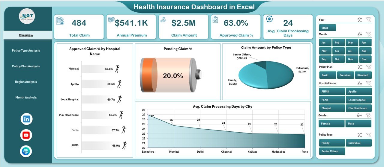
The Overview Page acts as the control center of the Health Insurance Dashboard in Excel. It delivers a quick snapshot of overall insurance performance.
Key Components of the Overview Page
-
Right-side slicers for dynamic filtering
-
Four KPI cards for high-level metrics
-
Four insightful charts for performance analysis
Charts Available on the Overview Page
-
Approved Claim % by Hospital Name
This chart shows approval efficiency across hospitals. It helps identify hospitals with faster and more accurate claim approvals. -
Pending Claim % by Hospital Name
This visual highlights hospitals with higher pending claims. Therefore, teams can focus on resolving bottlenecks. -
Claim Amount by Policy Type
This chart compares claim amounts across policy categories. As a result, insurers can identify high-cost policy types. -
Average Claim Processing Days by City
This chart highlights processing delays by city. Consequently, management can optimize regional workflows.
Why the Overview Page Matters
The Overview Page allows decision-makers to understand overall performance within seconds. Moreover, it highlights risk areas without deep data exploration.
How Does the Policy Type Analysis Page Help?
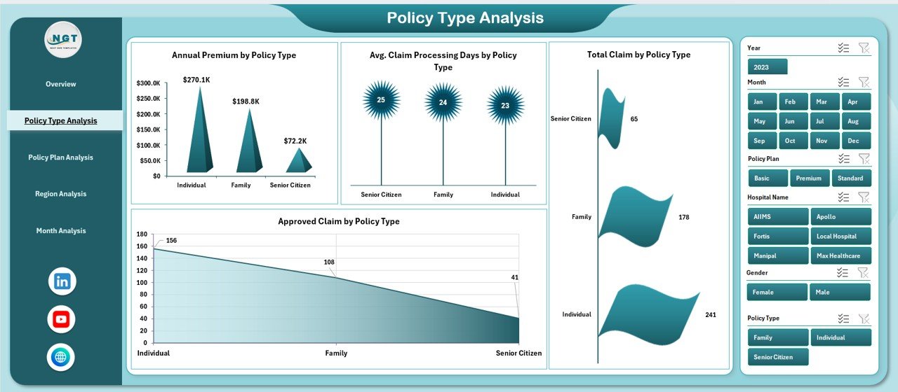
The Policy Type Analysis Page focuses on performance comparison across different policy categories.
Key Insights Available
-
Right-side slicers for dynamic policy selection
-
Four focused charts for in-depth analysis
Charts on the Policy Type Analysis Page
-
Annual Premium by Policy Type
This chart shows premium contribution by policy category. Therefore, insurers can identify high-revenue policies. -
Average Claim Processing Days by Policy Type
This analysis highlights which policy types require more processing time. -
Total Claim by Policy Type
This chart compares total claims raised under each policy type. -
Approved Claim by Policy Type
This visual helps measure approval efficiency by policy category.
Business Value of Policy Type Analysis
This page supports product strategy, pricing decisions, and risk assessment. Moreover, it helps insurers refine policy offerings based on claim behavior.
Why Is Policy Plan Analysis Important?
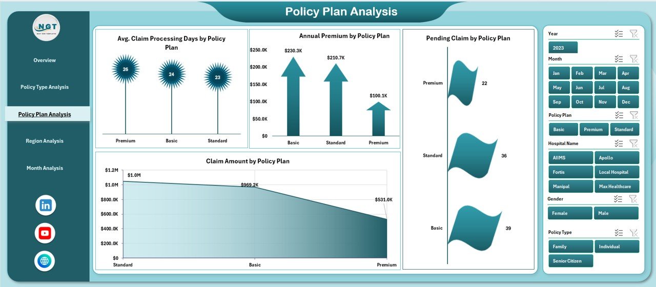
Policy plans define coverage depth, benefits, and claim complexity. Therefore, analyzing policy plans becomes essential for profitability and customer satisfaction.
Features of the Policy Plan Analysis Page
-
Right-side slicers for plan-level filtering
-
Four targeted charts for performance evaluation
Charts on the Policy Plan Analysis Page
-
Average Claim Processing Days by Policy Plan
This chart identifies plans that require longer processing time. -
Annual Premium by Policy Plan
This visual shows revenue contribution by plan. -
Pending Claim by Policy Plan
This chart highlights operational backlogs by plan type. -
Claim Amount by Policy Plan
This chart compares financial exposure across policy plans.
Why Policy Plan Analysis Matters
This page helps insurers optimize policy design, underwriting rules, and operational efficiency. Additionally, it supports data-driven plan restructuring.
How Does the Region Analysis Page Improve Regional Performance?
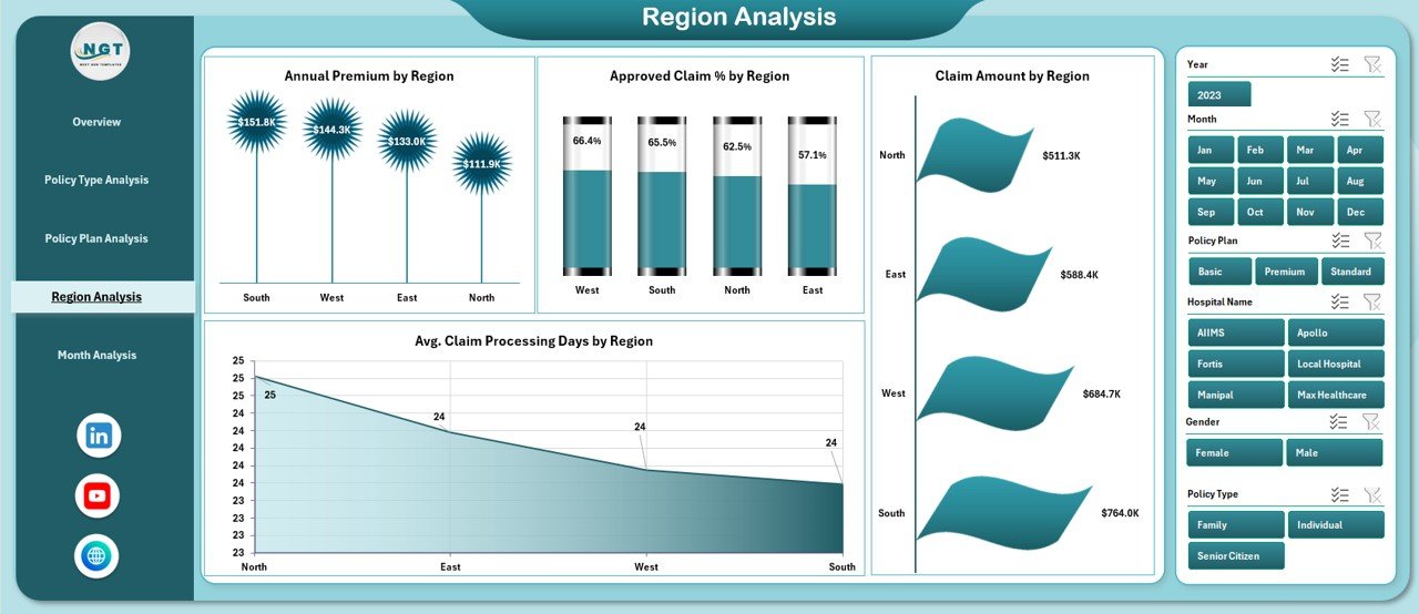
Regional performance varies due to hospitals, customer demographics, and operational capacity. Therefore, regional insights remain critical.
Key Elements of the Region Analysis Page
Click to Purchases Health Insurance Dashboard in Excel
-
Right-side slicers for regional selection
-
Four regional comparison charts
Charts on the Region Analysis Page
-
Annual Premium by Region
This chart highlights revenue contribution across regions. -
Approved Claim % by Region
This visual shows approval efficiency by geography. -
Claim Amount by Region
This chart compares claim costs across regions. -
Average Claim Processing Days by Region
This analysis identifies regions with processing delays.
Benefits of Regional Analysis
Regional insights help insurers allocate resources efficiently, improve regional workflows, and address operational gaps proactively.
What Does the Month Analysis Page Reveal?
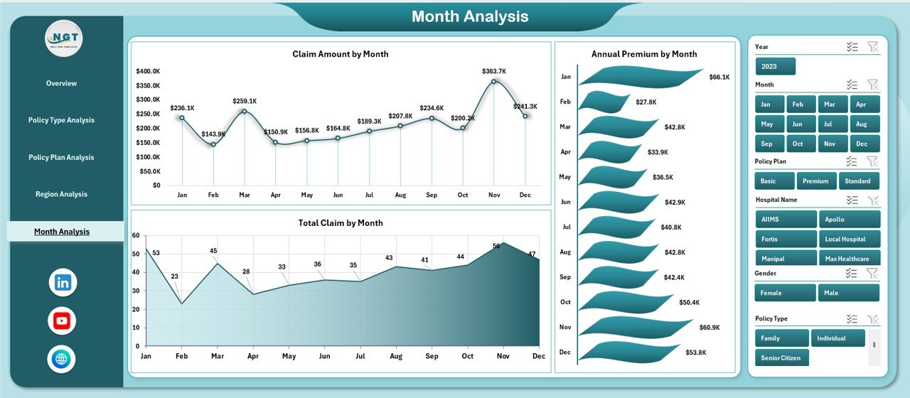
Time-based analysis helps insurers identify seasonal trends and performance fluctuations.
Key Features of the Month Analysis Page
-
Right-side slicers for period selection
-
Three month-wise trend charts
Charts on the Month Analysis Page
-
Claim Amount by Month
This chart reveals claim seasonality and peak periods. -
Annual Premium by Month
This visual highlights premium collection trends. -
Total Claim by Month
This chart shows monthly claim volume fluctuations.
Importance of Month Analysis
Month-wise analysis supports forecasting, budgeting, and capacity planning. Moreover, it helps insurers prepare for high-claim seasons.
What Role Do Data and Support Sheets Play?
Data Sheet
The Data Sheet acts as the backbone of the Health Insurance Dashboard in Excel. It stores all raw transactional data, including:
-
Policy details
-
Premium values
-
Claim amounts
-
Processing days
-
Regions, cities, hospitals, and months
Because the dashboard connects directly to this sheet, updating data automatically refreshes all visuals.
Support Sheet
The Support Sheet stores helper calculations, lookup tables, and pivot data. It ensures dashboard stability and clean performance.
Advantages of Health Insurance Dashboard in Excel
Using a Health Insurance Dashboard in Excel offers multiple benefits across operations, finance, and management.
Key Advantages
-
Improves decision-making speed
-
Reduces manual reporting work
-
Enhances claim monitoring accuracy
-
Identifies delays and inefficiencies early
-
Supports strategic planning
-
Improves transparency across departments
-
Works without additional software cost
-
Easy to customize and scale
Because Excel remains widely accessible, teams can adopt this dashboard without training overhead.
Opportunities for Improvement in Health Insurance Dashboards
Click to Purchases Health Insurance Dashboard in Excel
Even a powerful dashboard offers room for improvement.
Improvement Opportunities
-
Add predictive analytics for claim forecasting
-
Integrate fraud detection indicators
-
Automate data refresh using Power Query
-
Add drill-through hospital-level analysis
-
Include customer satisfaction metrics
By enhancing these areas, insurers can increase analytical maturity over time.
Best Practices for the Health Insurance Dashboard in Excel
Following best practices ensures maximum value and long-term usability.
Best Practices You Should Follow
-
Keep raw data clean and structured
-
Use consistent naming conventions
-
Limit slicers to relevant dimensions
-
Avoid unnecessary charts
-
Focus on actionable KPIs
-
Refresh data regularly
-
Protect formulas and pivot structures
-
Document assumptions and calculations
By following these practices, teams maintain dashboard accuracy and reliability.
Who Can Use a Health Insurance Dashboard in Excel?
This dashboard suits multiple roles within the insurance ecosystem.
Ideal Users
-
Health insurance companies
-
Third-party administrators (TPAs)
-
Insurance analysts
-
Claims managers
-
Finance teams
-
Operations managers
-
Senior leadership
Because the dashboard delivers insights visually, both technical and non-technical users benefit.
Conclusion: Why a Health Insurance Dashboard in Excel Is a Smart Investment
A Health Insurance Dashboard in Excel transforms scattered insurance data into meaningful insights. Instead of spending hours on manual reports, teams gain instant visibility into premiums, claims, approvals, regions, and timelines.
This ready-to-use dashboard improves efficiency, transparency, and decision quality. Moreover, it empowers insurance organizations to stay competitive in a data-driven environment. If you want better control over insurance operations, this dashboard becomes an essential business tool.
Frequently Asked Questions About Health Insurance Dashboard in Excel
What is a Health Insurance Dashboard in Excel used for?
A Health Insurance Dashboard in Excel helps monitor premiums, claims, approvals, pending cases, and processing timelines using interactive charts and KPIs.
Can beginners use this dashboard?
Yes, the dashboard uses simple Excel features like pivot tables and slicers, which makes it beginner-friendly.
Does the dashboard support real-time updates?
Yes, updating the data sheet automatically refreshes all charts and KPIs.
Can this dashboard handle large datasets?
Yes, Excel can manage large datasets effectively when data remains well-structured.
Can I customize the dashboard?
Yes, users can modify charts, slicers, and KPIs based on business needs.
Does this dashboard require macros or VBA?
No, the dashboard works using standard Excel features, which ensures easy maintenance.
Visit our YouTube channel to learn step-by-step video tutorials