Running a language school involves much more than teaching grammar and vocabulary. You must track enrollments, monitor attendance, analyze course performance, evaluate trainers, and measure student outcomes. However, managing all this data manually wastes time and creates confusion. That is exactly why a Language Schools Dashboard in Excel becomes a powerful solution.
In this detailed article, you will learn what a Language Schools Dashboard in Excel is, why it matters, how it works, and how you can use it to improve academic quality and business performance. Moreover, the article explains every page of a ready-to-use Excel dashboard, its advantages, best practices, and common questions.
If you manage a language institute, coaching center, or training academy, this guide will help you gain clarity, control, and confidence using Excel.
Click to Purchases Language Schools Dashboard in Excel
What Is a Language Schools Dashboard in Excel?
A Language Schools Dashboard in Excel is a centralized reporting and analytics tool designed to track, analyze, and visualize key metrics related to language training institutes. It converts raw operational and academic data into clear insights using Excel charts, pivot tables, slicers, and formulas.
Instead of working with multiple spreadsheets, registers, or manual reports, you can monitor everything from student enrollment to assessment scores in one interactive dashboard.
Because Excel remains widely used, this dashboard works without complex software or technical skills. As a result, administrators, academic heads, and owners can easily understand performance trends and take action.
Why Do Language Schools Need a Dashboard in Excel?
Language schools deal with multiple courses, levels, trainers, cities, and students. Therefore, decision-making becomes difficult without structured data analysis.
A Language Schools Dashboard in Excel helps you:
-
Track enrollments and attendance in real time
-
Compare course performance across languages and levels
-
Evaluate trainer effectiveness
-
Analyze monthly and seasonal trends
-
Improve student outcomes and profitability
Moreover, Excel dashboards allow flexibility. You can customize metrics, add new courses, and update data without redesigning the entire system.
Overview of the Language Schools Dashboard in Excel
This ready-to-use Language Schools Dashboard in Excel includes a Page Navigator on the left side and five powerful analytical pages. Each page focuses on a specific area of analysis. Additionally, slicers on the right side allow dynamic filtering.
Key Structural Elements
-
Page Navigator: Located on the left side for easy movement across pages
-
Right-side slicers: Filter data by relevant dimensions
-
Cards and charts: Show KPIs and trends visually
-
Support Sheet: Backend calculations and helper tables
-
Data Sheet: Raw input data source
This structure ensures smooth navigation and consistent analysis.
How Does the Page Navigator Improve Usability?
The Page Navigator improves user experience by allowing quick access to each analytical section. Instead of scrolling through sheets, users can jump directly to the required page.
This design saves time and makes the dashboard suitable for daily operational reviews and management meetings.
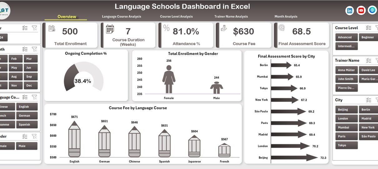
Overview Page: What Insights Does the Main Dashboard Provide?
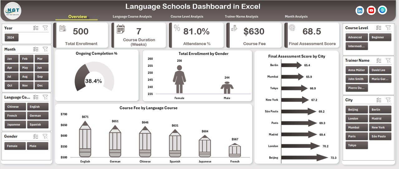
The Overview Page serves as the central summary of the entire language school’s performance.
Key Features of the Overview Page
-
Right-side slicer for quick filtering
-
Four KPI cards for instant metrics
-
Four interactive charts for high-level analysis
Charts Included on the Overview Page
-
Ongoing vs Completed %
-
Shows course completion status
-
Helps identify dropout risks
-
-
Total Enrollment by Gender
-
Displays gender distribution
-
Supports diversity and inclusion analysis
-
-
Final Assessment Score by City
-
Compares student performance across locations
-
Identifies high-performing and low-performing centers
-
-
Course Fee by Language Course
-
Shows revenue distribution by language
-
Helps prioritize profitable courses
-
Because this page summarizes key metrics, decision-makers can quickly understand overall performance.
Click to Purchases Language Schools Dashboard in Excel
Language Course Analysis: How Do Different Languages Perform?
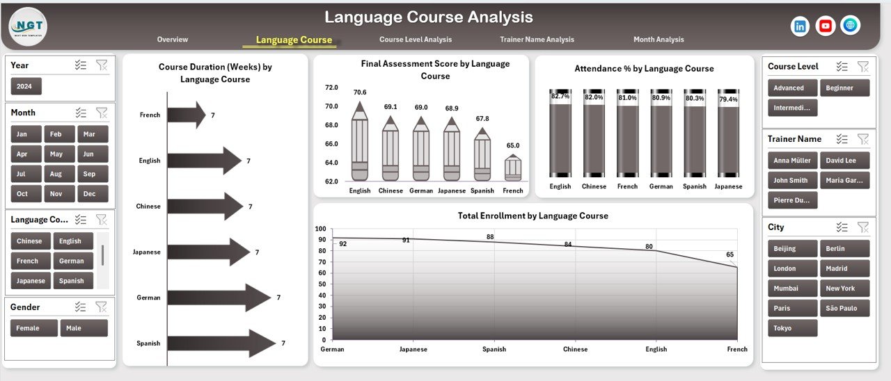
The Language Course Analysis page focuses on performance by language course, such as English, French, Spanish, German, or Japanese.
Key Charts on the Language Course Analysis Page
-
Course Duration by Language Course
-
Compares average duration across languages
-
Helps optimize course structures
-
-
Final Assessment Score by Language Course
-
Measures learning outcomes
-
Highlights courses needing curriculum improvement
-
-
Attendance % by Language Course
-
Tracks student engagement
-
Identifies courses with attendance issues
-
-
Total Enrollment by Language Course
-
Shows popularity of each language
-
Supports marketing and capacity planning
-
With slicers on the right side, you can instantly filter data and compare results.
Course Level Analysis: How Do Beginner, Intermediate, and Advanced Levels Compare?
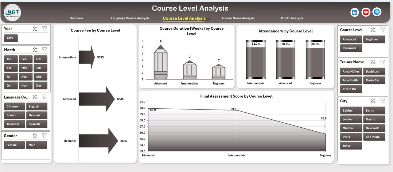
Different students perform differently at each level. Therefore, the Course Level Analysis page becomes essential.
Key Charts on the Course Level Analysis Page
-
Course Fee by Course Level
-
Compares pricing across levels
-
Helps adjust fee structures
-
-
Course Duration by Course Level
-
Analyzes time investment
-
Ensures consistency across levels
-
-
Attendance % by Course Level
-
Identifies engagement challenges
-
Helps improve retention strategies
-
-
Final Assessment Score by Course Level
-
Evaluates learning outcomes
-
Supports curriculum planning
-
This page helps academic teams ensure balanced performance across all levels.
Trainer Name Analysis: How Effective Are Your Trainers?
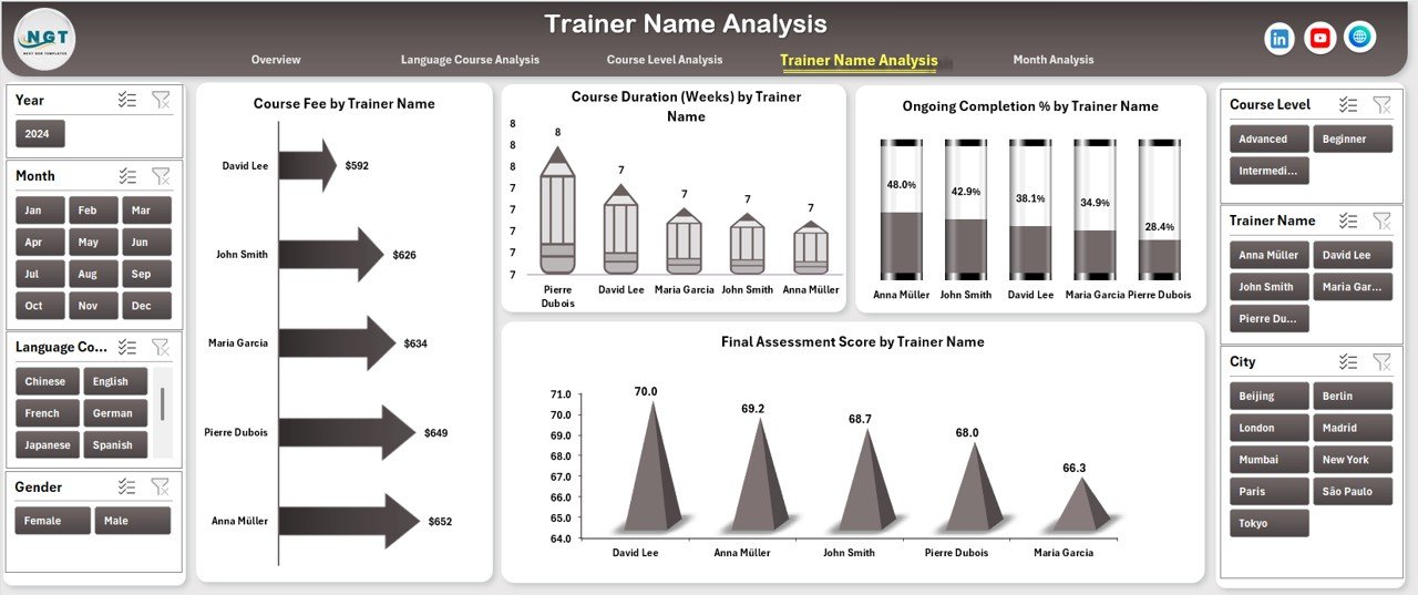
Trainer quality directly impacts student success. That is why the Trainer Name Analysis page plays a critical role.
Key Charts on the Trainer Name Analysis Page
-
Course Fee by Trainer Name
-
Shows revenue contribution per trainer
-
Helps allocate premium courses
-
-
Course Duration by Trainer Name
-
Analyzes teaching workload
-
Supports fair trainer assignment
-
-
Ongoing Completion % by Trainer Name
-
Measures course completion success
-
Identifies trainers needing support
-
-
Final Assessment Score by Trainer Name
-
Evaluates teaching effectiveness
-
Supports performance reviews
-
Using this analysis, management can reward top trainers and improve training programs.
Month Analysis: How Does Performance Change Over Time?
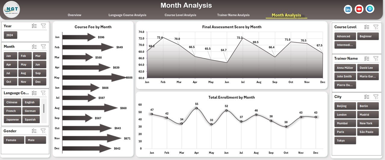
Seasonality plays a major role in language schools. Therefore, the Month Analysis page focuses on time-based trends.
Key Charts on the Month Analysis Page
-
Course Fee by Month
-
Tracks monthly revenue
-
Helps forecast cash flow
-
-
Final Assessment Score by Month
-
Monitors academic trends
-
Identifies peak and low-performance periods
-
-
Total Enrollment by Month
-
Shows admission trends
-
Supports marketing campaign planning
-
This page enables proactive planning instead of reactive decisions.
Click to Purchases Language Schools Dashboard in Excel
What Is the Role of the Data Sheet and Support Sheet?
Data Sheet
The Data Sheet stores all raw data, such as:
-
Student details
-
Gender
-
City
-
Language course
-
Course level
-
Trainer name
-
Enrollment date
-
Attendance percentage
-
Assessment scores
-
Course fees
This sheet acts as the single source of truth.
Support Sheet
The Support Sheet handles:
-
Calculations
-
Helper columns
-
Lookup tables
-
Intermediate logic
Because of this separation, the dashboard remains clean and efficient.
Advantages of a Language Schools Dashboard in Excel
A Language Schools Dashboard in Excel offers multiple benefits for academic and business teams.
Key Advantages
-
📊 Centralized reporting across all departments
-
⏱️ Time-saving analysis with automated updates
-
🎯 Data-driven decisions instead of assumptions
-
📈 Improved student performance tracking
-
💰 Better revenue and fee analysis
-
👩🏫 Trainer performance visibility
-
📅 Clear monthly and seasonal trends
Because Excel supports pivot charts, the dashboard remains flexible and scalable.
Opportunities for Improvement Using the Dashboard
Beyond reporting, the dashboard highlights improvement areas.
Common Improvement Opportunities
-
Low attendance in specific courses
-
Poor assessment scores at certain levels
-
Trainer performance gaps
-
Underperforming cities or branches
-
Seasonal enrollment dips
By acting on these insights, schools can improve both learning outcomes and profitability.
Best Practices for the Language Schools Dashboard in Excel
To get maximum value, you must follow proven best practices.
Best Practices Checklist
-
✅ Keep the data sheet clean and structured
-
✅ Use consistent naming conventions
-
✅ Update data regularly (daily or weekly)
-
✅ Avoid manual edits in dashboard sheets
-
✅ Use slicers instead of filters
-
✅ Validate data before analysis
-
✅ Limit charts to meaningful KPIs
-
✅ Train staff to interpret dashboard insights
Following these practices ensures accuracy and trust in your reports.
Who Can Benefit from a Language Schools Dashboard in Excel?
This dashboard suits a wide range of users.
Ideal Users
-
Language school owners
-
Academic coordinators
-
Operations managers
-
Trainers and faculty heads
-
Franchise managers
-
Education consultants
Whether you manage one center or multiple branches, this dashboard adapts easily.
How Does This Dashboard Support Strategic Decision-Making?
Click to Purchases Language Schools Dashboard in Excel
Because the dashboard combines academic and financial metrics, leaders can:
-
Launch new language courses confidently
-
Optimize course pricing
-
Improve trainer allocation
-
Plan marketing campaigns
-
Enhance student satisfaction
As a result, decisions become proactive and strategic.
Conclusion: Why a Language Schools Dashboard in Excel Is Essential
A Language Schools Dashboard in Excel transforms raw educational data into meaningful insights. It helps schools monitor performance, improve learning outcomes, and grow revenue using a familiar tool.
With five analytical pages, interactive slicers, and clear visualizations, this dashboard simplifies complex data. Moreover, it supports both academic excellence and business growth.
If you want clarity, control, and confidence in managing your language school, this Excel dashboard becomes an essential asset.
Frequently Asked Questions (FAQs)
1. What data do I need to build a Language Schools Dashboard in Excel?
You need student enrollment data, attendance records, assessment scores, course details, trainer names, course fees, and dates.
2. Can I customize the dashboard for my language school?
Yes, you can modify courses, levels, trainers, and charts based on your requirements.
3. Do I need advanced Excel skills to use this dashboard?
No, basic Excel knowledge is enough. The dashboard uses slicers and charts for easy interaction.
4. How often should I update the data?
You should update data weekly or monthly for accurate insights.
5. Can this dashboard support multiple branches or cities?
Yes, the city-based analysis allows multi-location performance tracking.
6. Is this dashboard suitable for small language institutes?
Absolutely. Both small and large institutes can benefit from this dashboard.
7. Does the dashboard support pivot charts only?
Yes, the dashboard design supports pivot-based charts, ensuring flexibility and performance.
Visit our YouTube channel to learn step-by-step video tutorials