Employee engagement plays a critical role in organizational success. When employees feel connected, motivated, and valued, productivity increases, retention improves, and workplace culture becomes stronger. However, measuring engagement manually through surveys and spreadsheets creates gaps, delays, and confusion.
That is exactly where an Employee Engagement Dashboard in Power BI makes a powerful difference.
This detailed guide explains what an Employee Engagement Dashboard in Power BI is, why businesses need it, how it works, and how each dashboard page supports better people decisions. Additionally, you will explore its advantages, best practices, and frequently asked questions to help you implement it effectively.
Click to buy Employee Engagement Dashboard in Power BI
What Is an Employee Engagement Dashboard in Power BI?
An Employee Engagement Dashboard in Power BI is an interactive reporting solution that visualizes employee engagement data in a clear, dynamic, and actionable format.
Instead of tracking engagement through static reports, HR teams and leaders can instantly analyze:
- Engagement scores
- Satisfaction levels
- Survey participation
- Recognition trends
- Training hours
- Project involvement
Because Power BI supports slicers, filters, and dynamic visuals, users can explore engagement data by department, location, job role, and time period. As a result, organizations move from guesswork to data-driven people management.
Why Do Organizations Need an Employee Engagement Dashboard?
Employee engagement directly impacts business performance. However, many organizations struggle to identify engagement issues early.
An Employee Engagement Dashboard in Power BI helps because:
- It centralizes engagement data in one place
- It removes manual reporting effort
- It highlights disengaged teams quickly
- It supports proactive HR decisions
- It improves leadership visibility
Moreover, when engagement data becomes visual and easy to understand, managers take faster and more effective actions.
How Does an Employee Engagement Dashboard in Power BI Work?
The dashboard works by connecting employee data, survey results, recognition records, and training logs into Power BI.
Once connected, Power BI transforms raw data into:
- KPI cards
- Charts and graphs
- Trend analysis
- Department and role comparisons
Additionally, slicers allow users to filter data by time period, department, location, or job role. Therefore, stakeholders always see relevant and up-to-date insights.
Key Features of Employee Engagement Dashboard in Power BI
This Employee Engagement Dashboard in Power BI contains six well-structured pages, each designed to answer specific engagement-related questions.
Let us explore each page in detail.
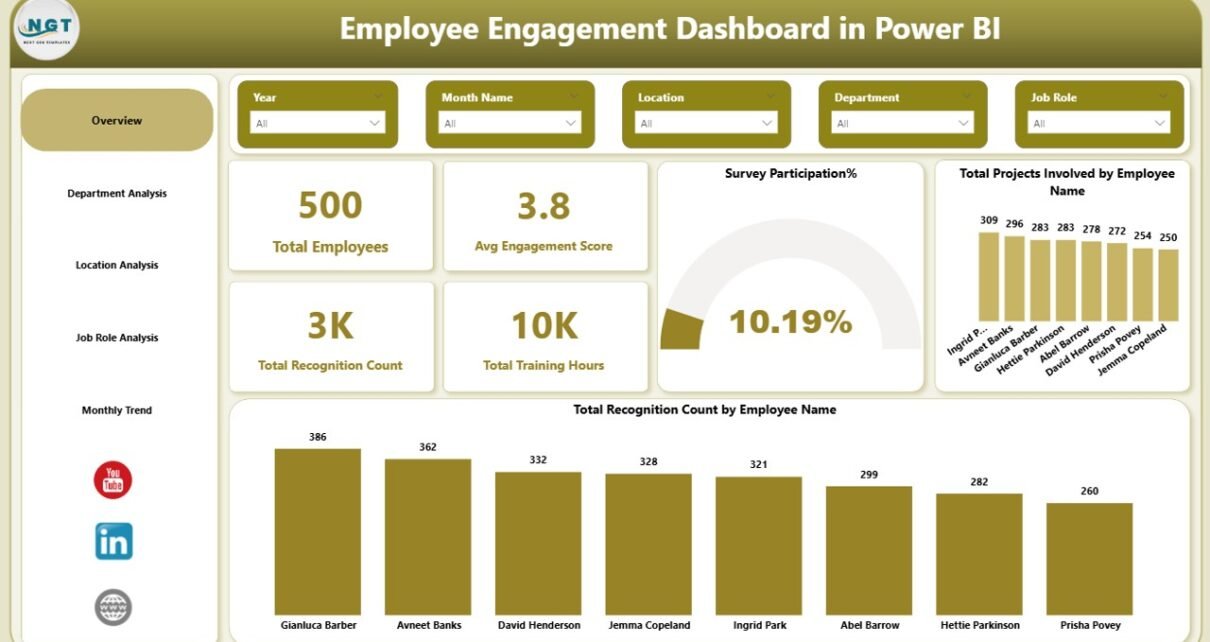
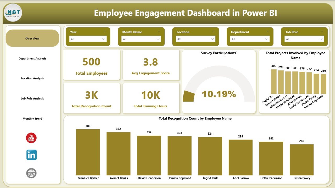
What Does the Overview Page Show in the Employee Engagement Dashboard?
The Overview Page serves as the starting point of the dashboard. It provides a high-level snapshot of overall employee engagement.
Key Metrics on the Overview Page
This page includes interactive slicers and KPI cards such as:
- Total Employees
- Average Engagement Score
- Total Recognition Count
- Total Training Hours
- Survey Participation Percentage
Visual Insights Included
In addition, the Overview Page displays:
- Total project involvement by employee name
- Total recognition count by employee name
Because everything appears on one screen, decision-makers can instantly assess workforce engagement health.
Click to buy Employee Engagement Dashboard in Power BI
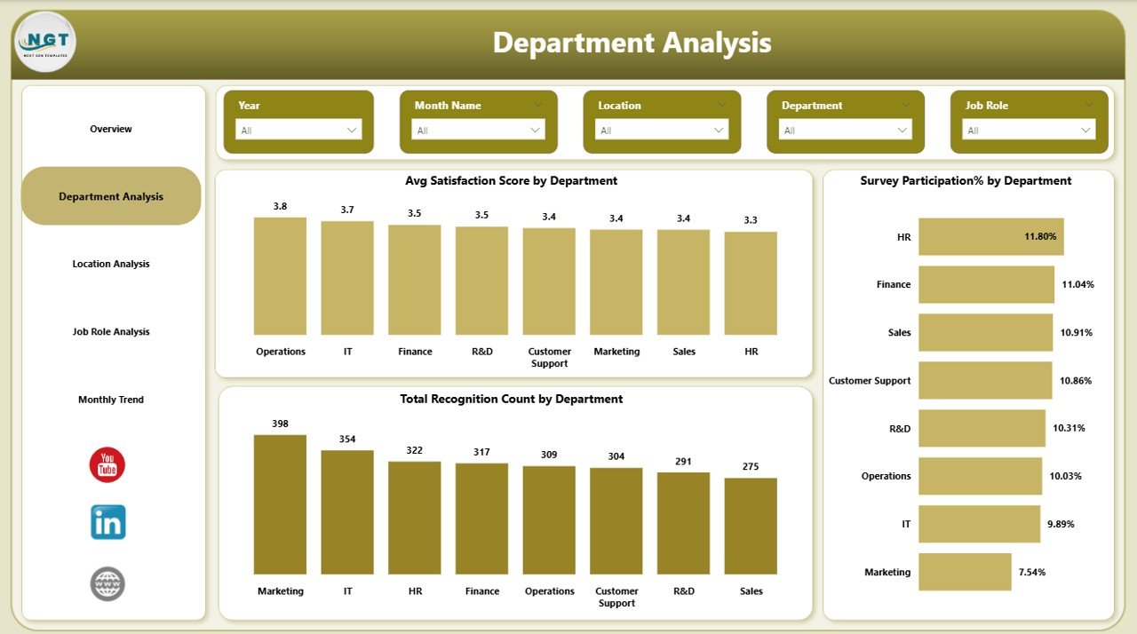
How Does Department Analysis Improve Engagement Tracking?
The Department Analysis Page focuses on comparing engagement across departments.
Key Charts in Department Analysis
This page includes:
- Average satisfaction score by department
- Survey participation percentage by department
- Total recognition count by department
Why Department Analysis Matters
Different departments experience different challenges. Therefore, this page helps HR teams:
- Identify low-engagement departments
- Compare satisfaction across teams
- Understand recognition gaps
As a result, leaders can target improvements where they matter most.
Click to buy Employee Engagement Dashboard in Power BI
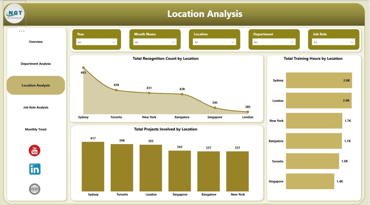
Why Is Location Analysis Important in an Employee Engagement Dashboard?
The Location Analysis Page highlights engagement patterns across office locations or regions.
Visuals Included in Location Analysis
This page displays:
- Total recognition count by department
- Total training hours by department
- Total project involvement by location
How Location Insights Help
Because work culture varies by location, this analysis helps organizations:
- Compare engagement across branches
- Identify training imbalances
- Improve regional engagement strategies
Consequently, global and multi-location organizations gain consistent engagement visibility.
Click to buy Employee Engagement Dashboard in Power BI
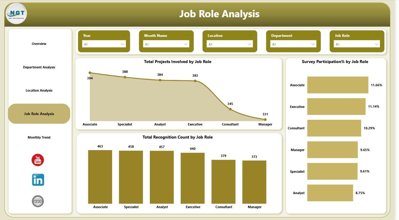
How Does Job Role Analysis Support Better Workforce Decisions?
The Job Role Analysis Page examines engagement trends across job roles.
Key Metrics by Job Role
This page includes:
- Total project involvement by job role
- Survey participation percentage by job role
- Total recognition count by job role
Benefits of Job Role Analysis
Through this page, HR teams can:
- Identify overworked roles
- Detect disengaged job functions
- Improve role-specific engagement programs
Therefore, organizations align engagement strategies with role expectations.
Click to buy Employee Engagement Dashboard in Power BI
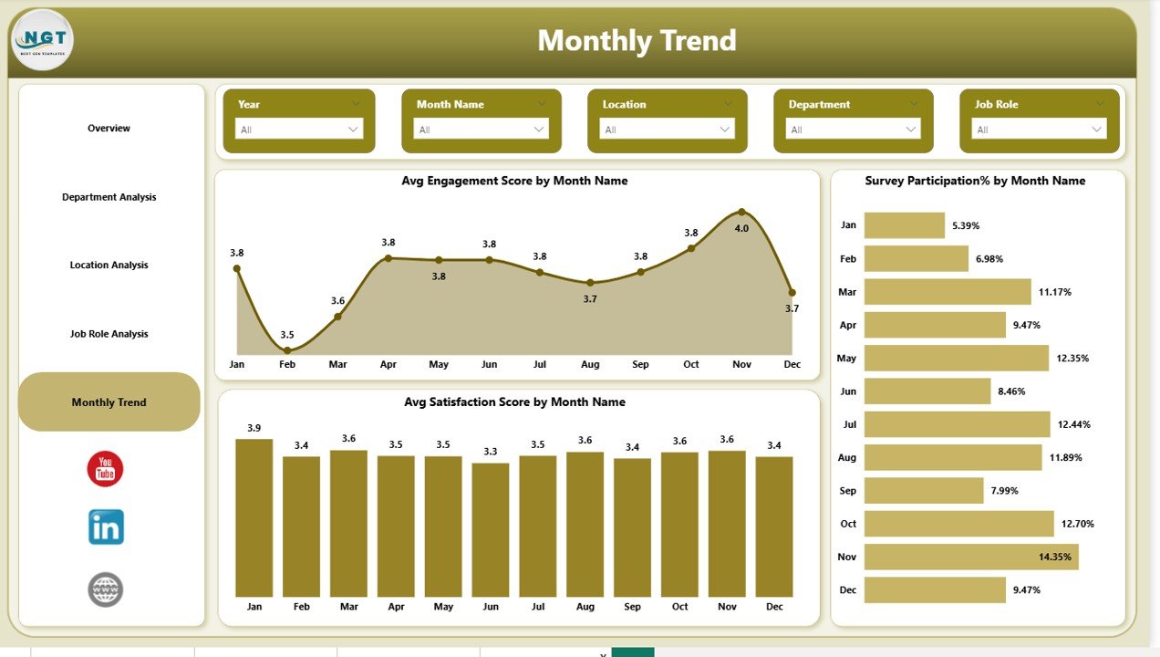
Why Should You Track Monthly Trends in Employee Engagement?
The Monthly Trends Page reveals how engagement changes over time.
Monthly Trends Visuals
This page shows:
- Average engagement score by month
- Survey participation percentage by month
- Average satisfaction score by month
Value of Trend Analysis
Monthly tracking helps organizations:
- Detect early signs of disengagement
- Measure the impact of HR initiatives
- Monitor engagement consistency
As a result, leaders can act before engagement drops significantly.
Click to buy Employee Engagement Dashboard in Power BI
How Does Power BI Improve Employee Engagement Analysis?
Power BI enhances engagement analysis through:
- Interactive visuals
- Real-time data refresh
- Easy filtering and drill-downs
- Clean and professional dashboards
Moreover, Power BI allows HR teams to share insights securely across the organization.
Advantages of Employee Engagement Dashboard in Power BI
An Employee Engagement Dashboard in Power BI offers several strategic advantages.
- Centralized Engagement Insights
All engagement data appears in one place. Therefore, teams no longer depend on scattered files.
- Data-Driven HR Decisions
Because visuals highlight patterns clearly, HR leaders make informed decisions quickly.
- Improved Employee Retention
When organizations identify disengagement early, they reduce attrition effectively.
- Enhanced Leadership Visibility
Managers gain instant access to engagement metrics without technical effort.
- Time and Cost Efficiency
Automation reduces manual reporting work and saves valuable HR time.
Who Can Use an Employee Engagement Dashboard?
This dashboard suits multiple roles, including:
- HR Managers
- People Analytics Teams
- Department Heads
- Senior Leadership
- Business Owners
Because Power BI dashboards remain intuitive, both technical and non-technical users can use them confidently.
What Data Is Required for an Employee Engagement Dashboard?
To build an effective dashboard, organizations typically use:
- Employee master data
- Engagement survey scores
- Recognition records
- Training hours data
- Project involvement data
Once connected, Power BI transforms this data into actionable insights.
How to Implement an Employee Engagement Dashboard in Power BI?
Implementation follows a simple process:
- Collect clean and structured engagement data
- Define engagement KPIs clearly
- Build visuals aligned with business goals
- Apply slicers for dynamic analysis
- Validate insights with HR stakeholders
By following these steps, organizations ensure meaningful dashboard outcomes.
Best Practices for the Employee Engagement Dashboard in Power BI
To maximize value, follow these best practices.
- Define Clear Engagement Metrics
- Always standardize engagement and satisfaction scoring methods.
- Keep Dashboards Simple and Focused
- Avoid overcrowding visuals. Instead, prioritize clarity.
- Use Consistent Time Periods
- Ensure monthly and yearly trends remain comparable.
- Refresh Data Regularly
- Updated data keeps insights accurate and trustworthy.
- Combine Engagement with Action Plans
- Insights alone do not improve engagement. Therefore, link results to actions.
Conclusion: Why an Employee Engagement Dashboard in Power BI Is Essential
Employee engagement drives productivity, retention, and culture. However, without clear insights, organizations struggle to improve it.
An Employee Engagement Dashboard in Power BI transforms raw engagement data into meaningful, visual, and actionable intelligence. By analyzing engagement across departments, locations, roles, and time periods, organizations take proactive steps toward a motivated workforce.
As a result, businesses move from reactive HR management to strategic people leadership.
Frequently Asked Questions (FAQs)
What is the main purpose of an Employee Engagement Dashboard in Power BI?
The dashboard helps organizations measure, analyze, and improve employee engagement using visual insights.
Can small businesses use an Employee Engagement Dashboard?
Yes. Power BI dashboards scale easily for both small and large organizations.
How often should engagement data be updated?
Most organizations update engagement data monthly or quarterly for accurate trends.
Does Power BI require coding knowledge?
No. Power BI offers a user-friendly interface suitable for non-technical users.
Can this dashboard integrate survey tools?
Yes. Power BI connects with multiple survey platforms and data sources.
How does this dashboard improve employee retention?
By identifying disengagement early, organizations take corrective actions before attrition increases.
Visit our YouTube channel to learn step-by-step video tutorials
Watch the step-by-step video tutorial:
Click to buy Employee Engagement Dashboard in Power BI