Managing corporate cash, loans, bank exposure, and interest rates requires accuracy and speed. However, many finance teams still rely on scattered spreadsheets and disconnected reports. As a result, they lose visibility. Moreover, decision-makers struggle to track liquidity, monitor counterparty risk, and control interest costs in real time.
So, how can treasury teams gain full control over cash flow, loans, and bank performance?
The answer is simple.
You need a Treasury Management Dashboard in Power BI.
Click to Purchases Treasury Management Dashboard in Power BI
This article explains everything in detail. You will learn:
-
What a Treasury Management Dashboard in Power BI is
-
Why treasury teams need it
-
Detailed explanation of all 5 analytical pages
-
Advantages of Treasury Management Dashboard in Power BI
-
Best practices for implementation
-
Frequently Asked Questions with Answers
Let us explore it step by step.
What Is a Treasury Management Dashboard in Power BI?
A Treasury Management Dashboard in Power BI is an interactive business intelligence solution that helps finance and treasury teams monitor:
-
Loan exposure
-
Cash inflow
-
Opening balances
-
Bank-wise transactions
-
Counterparty risk
-
Interest rate trends
-
Monthly financial movements
Instead of reviewing multiple Excel files, you can view everything in one dynamic dashboard. Furthermore, Power BI allows you to use slicers (filters) to drill down by:
-
Bank Name
-
Counterparty
-
Region
-
Account Type
-
Month
As a result, you can analyze financial performance instantly and take faster decisions.
Why Do Treasury Teams Need a Power BI Dashboard?
Treasury departments handle high-value financial data every day. However, manual reporting slows down the process. Therefore, teams need automation and real-time visibility.
Here is why a Power BI dashboard becomes essential:
1. Real-Time Financial Visibility
You can monitor loan amounts, interest rates, and cash inflows instantly.
2. Better Risk Management
You can track exposure by counterparty and region. Consequently, you reduce financial risk.
3. Faster Decision Making
Because the dashboard updates automatically, management can act quickly.
4. Improved Bank Performance Tracking
You can compare loan exposure and transaction volume across banks.
5. Clear Interest Rate Monitoring
You can analyze interest rate % across counterparties and regions.
In short, the dashboard transforms complex financial data into simple visual insights.
What Are the Key Features of the Treasury Management Dashboard in Power BI?
This dashboard contains 5 powerful analytical pages inside the Power BI Desktop file. Each page focuses on a specific treasury area.
Let us explore each page in detail.
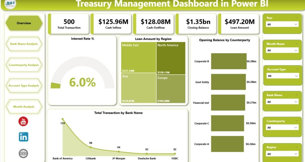
1️⃣ Overview Page – How Can You See the Complete Financial Snapshot?
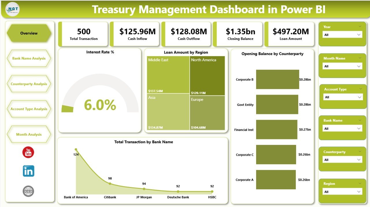
The Overview Page acts as the command center of the dashboard.
Here, you get a high-level summary of treasury performance.
Key Cards on Overview Page:
-
Interest Rate %
-
Loan Amount by Region
-
Opening Balance by Counterparty
-
Total Transaction by Bank Name
What Does This Page Help You Analyze?
-
Overall interest exposure
-
Total outstanding loan amount
-
Counterparty opening balances
-
Transaction distribution across banks
Because this page uses slicers, you can filter by month, region, or bank. Therefore, you can quickly identify financial patterns.
For example:
-
If loan exposure rises in a specific region, you can act immediately.
-
If interest rate % increases, you can review funding strategy.
Thus, the Overview page provides clarity at a glance.
2️⃣ Bank Name Analysis – How Can You Evaluate Bank Performance?
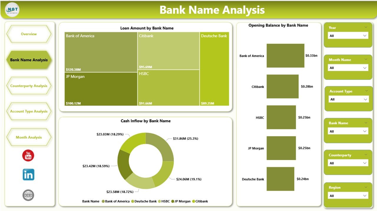
The second page focuses entirely on bank-level analysis.
Treasury teams often deal with multiple banks. Therefore, they must evaluate each bank separately.
Charts Included:
Click to Purchases Treasury Management Dashboard in Power BI
-
Loan Amount by Bank Name
-
Opening Balance by Bank Name
-
Cash Inflow by Bank Name
Why Is This Important?
-
You can compare loan exposure across banks.
-
You can identify which bank handles the highest transactions.
-
You can track cash inflow performance bank-wise.
For example:
If one bank shows consistently high loan exposure, you can diversify risk. Similarly, if another bank provides better inflow management, you can strengthen that relationship.
Therefore, this page supports strategic banking decisions.
3️⃣ Counterparty Analysis – How Can You Control Exposure by Counterparty?
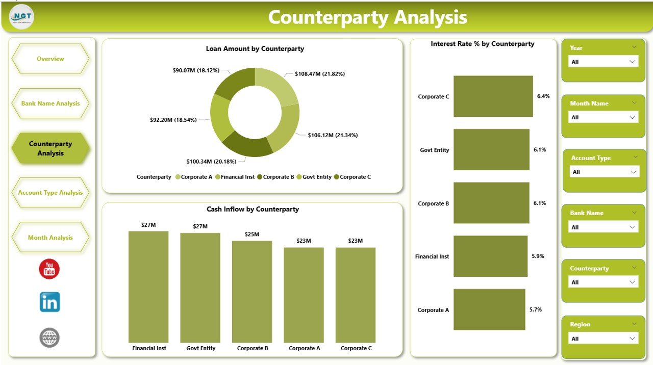
Counterparty risk directly impacts treasury stability. Hence, you must monitor it closely.
The Counterparty Analysis Page helps you track:
-
Loan Amount by Counterparty
-
Interest Rate % by Counterparty
-
Cash Inflow by Counterparty
What Insights Can You Gain?
-
Which counterparty carries the highest loan exposure?
-
Which counterparty charges higher interest rates?
-
Which counterparty contributes the most cash inflow?
Moreover, you can identify concentration risk. If one counterparty dominates exposure, you can take preventive measures.
Therefore, this page improves risk control and financial stability.
4️⃣ Account Type Analysis – How Can You Analyze Performance by Account Type?
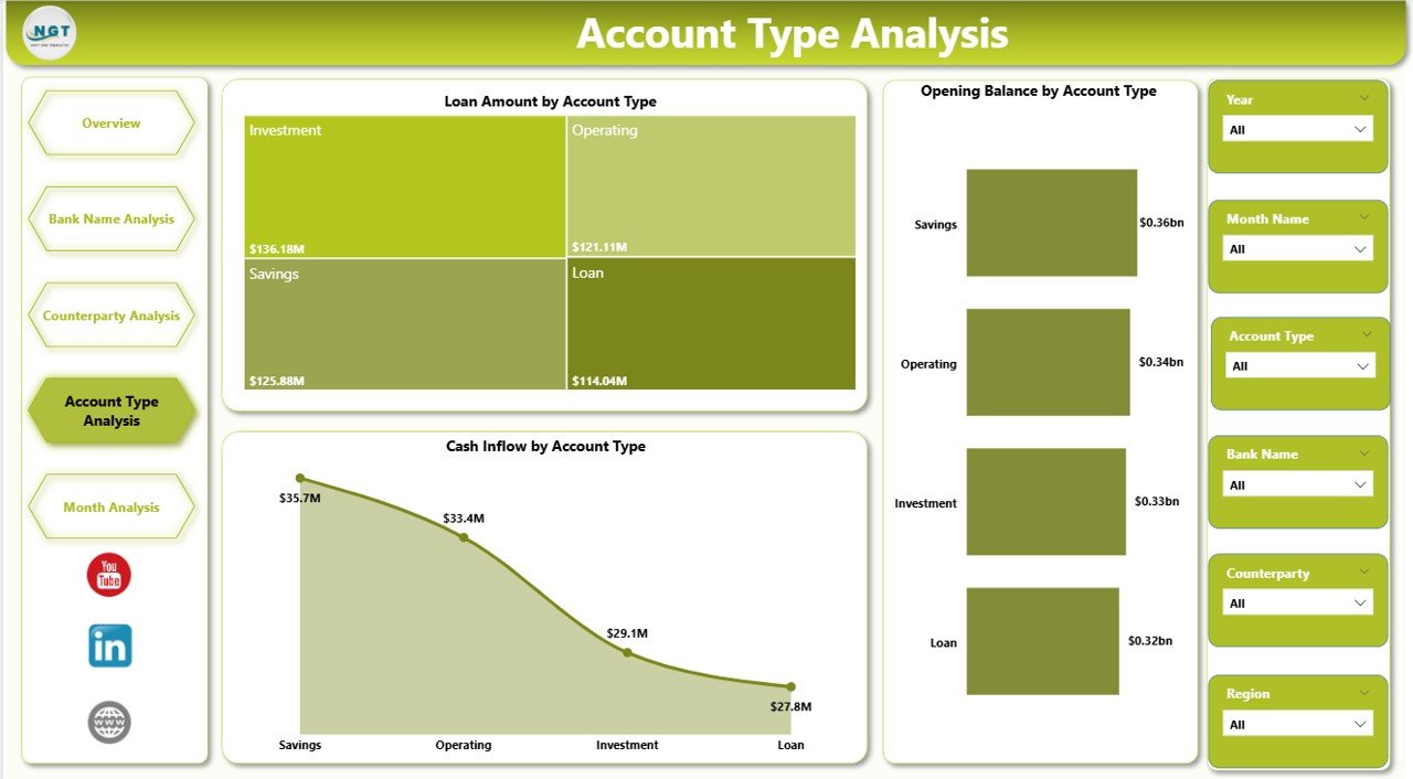
Treasury operations involve different account types, such as:
-
Current Accounts
-
Savings Accounts
-
Loan Accounts
-
Overdraft Accounts
The Account Type Analysis Page includes:
-
Loan Amount by Account Type
-
Cash Inflow by Account Type
-
Opening Balance by Account Type
Why Does This Matter?
You can understand which account type:
-
Holds the highest loan balance
-
Generates the maximum inflow
-
Maintains the strongest opening balance
Consequently, you can optimize account structure and improve liquidity planning.
Click to Purchases Treasury Management Dashboard in Power BI
5️⃣ Month Analysis – How Can You Track Monthly Financial Trends?
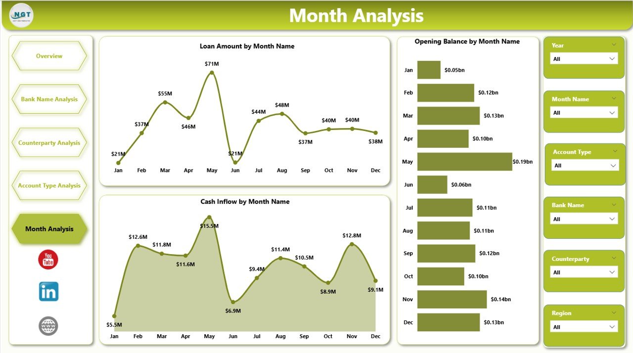
The final page focuses on time-based analysis.
It includes:
-
Loan Amount by Month
-
Cash Inflow by Month
-
Opening Balance by Month
What Can You Identify?
-
Seasonal loan trends
-
Monthly cash inflow patterns
-
Fluctuation in opening balances
For example:
If loan exposure increases in certain months, you can prepare funding strategies in advance. Similarly, if inflow decreases during specific periods, you can adjust liquidity planning.
Thus, the Month Analysis page supports forecasting and budgeting.
Advantages of Treasury Management Dashboard in Power BI
Now let us explore the key advantages.
✅ 1. Centralized Financial Monitoring
You can view all treasury data in one dashboard.
✅ 2. Interactive Filtering
You can use slicers to drill down into details instantly.
✅ 3. Faster Decision Making
Because data updates automatically, management responds quickly.
✅ 4. Improved Risk Control
You can track exposure by bank, counterparty, region, and account type.
✅ 5. Better Interest Rate Monitoring
You can compare interest rates across multiple entities.
✅ 6. Visual and Easy to Understand
Charts and cards present data clearly.
✅ 7. Scalable and Customizable
You can add new KPIs as your treasury operations grow.
Best Practices for the Treasury Management Dashboard in Power BI
To get maximum value, follow these best practices:
1️⃣ Keep Data Updated Regularly
Always refresh data to maintain accuracy.
2️⃣ Use Clear KPI Definitions
Define Loan Amount, Interest Rate %, and Cash Inflow clearly.
3️⃣ Monitor High-Risk Exposure Weekly
Do not wait for month-end reporting.
4️⃣ Diversify Bank and Counterparty Risk
Avoid concentration in one bank or entity.
5️⃣ Track Monthly Trends
Use month analysis for forecasting and liquidity planning.
6️⃣ Review Interest Rates Frequently
Compare market rates and negotiate better terms.
7️⃣ Limit Manual Data Entry
Use automated data connections wherever possible.
How Does This Dashboard Improve Financial Strategy?
When you use this dashboard:
-
You reduce dependency on manual spreadsheets.
-
You improve financial transparency.
-
You strengthen risk management.
-
You support leadership with clear data insights.
-
You align treasury strategy with corporate goals.
Therefore, the dashboard does not just show numbers. It drives smarter financial decisions.
Who Should Use the Treasury Management Dashboard in Power BI?
This dashboard benefits:
-
Treasury Managers
-
CFOs
-
Finance Controllers
-
Risk Managers
-
Corporate Finance Teams
-
Banking Relationship Managers
If your organization manages multiple banks and counterparties, you need this dashboard.
Conclusion: Why Should You Implement a Treasury Management Dashboard in Power BI?
Treasury operations require control, clarity, and speed. However, manual reporting slows progress. Therefore, organizations must adopt intelligent tools.
The Treasury Management Dashboard in Power BI provides:
-
Real-time financial visibility
-
Risk exposure monitoring
-
Bank-wise performance tracking
-
Counterparty analysis
-
Monthly trend insights
As a result, you gain confidence in your financial strategy.
If you want better control over cash, loans, and interest exposure, this dashboard offers the perfect solution.
Frequently Asked Questions with Answers
Click to Purchases Treasury Management Dashboard in Power BI
1. What is the main purpose of a Treasury Management Dashboard in Power BI?
It helps treasury teams monitor loan exposure, cash inflow, opening balances, and interest rates in one interactive platform.
2. Can I filter data by bank or counterparty?
Yes. You can use slicers to filter by bank name, counterparty, region, account type, and month.
3. Does the dashboard support monthly trend analysis?
Yes. The Month Analysis page shows loan amount, cash inflow, and opening balance trends by month.
4. Can this dashboard reduce financial risk?
Yes. It helps you monitor exposure concentration and interest rate variations. Therefore, you can take preventive actions.
5. Is Power BI better than Excel for treasury dashboards?
Power BI offers advanced visualization, interactive filtering, and automated refresh. Therefore, it works better for large and dynamic treasury data.
6. Can I customize this dashboard?
Yes. You can add new KPIs, charts, and filters based on your organization’s needs.
Visit our YouTube channel to learn step-by-step video tutorials