Managing leased equipment across departments and regions often becomes complex. Many organizations still rely on scattered spreadsheets and manual reports. As a result, decision-makers struggle to monitor lease costs, vendor performance, and equipment downtime in one place.
Therefore, businesses need a centralized and interactive monitoring system. More importantly, they need real-time visibility into leasing performance.
That is exactly where the Equipment Leasing Dashboard in Excel becomes a powerful solution.
In this comprehensive guide, you will learn everything about the Equipment Leasing Dashboard in Excel, including its features, structure, benefits, and best practices. Moreover, you will discover how this ready-to-use dashboard can transform your lease monitoring process.
Click to Purchases Equipment Leasing Dashboard in Excel
What Is an Equipment Leasing Dashboard in Excel?
An Equipment Leasing Dashboard in Excel is an interactive performance tracking tool designed to monitor leased equipment data in one centralized view.
Instead of reviewing multiple reports, this dashboard helps you:
-
Track monthly lease costs
-
Monitor vendor-wise equipment distribution
-
Analyze downtime trends
-
Evaluate department performance
-
Control maintenance expenses
Because the dashboard uses Excel’s powerful features like Pivot Tables, slicers, and dynamic charts, users can instantly filter and analyze data.
As a result, organizations can make faster and more confident decisions.
Why Do Businesses Need an Equipment Leasing Dashboard?
Equipment leasing involves multiple moving parts. For example, companies must track vendors, departments, regions, deposits, escalation percentages, and maintenance costs.
However, without a structured dashboard:
-
Reports become inconsistent
-
Costs remain hidden
-
Downtime increases
-
Vendor performance becomes unclear
-
Decision-making slows down
Therefore, implementing an Equipment Leasing Dashboard in Excel helps businesses maintain full control over their leasing operations.
Key Features of the Equipment Leasing Dashboard in Excel
This ready-to-use dashboard includes powerful analytical capabilities. Moreover, it offers a user-friendly interface for quick navigation.
🚀 Page Navigator (Left Side)
The dashboard includes a Page Navigator located on the left side. As a result, users can quickly switch between analytical pages without confusion.
Benefits of the Page Navigator:
-
Smooth user experience
-
Faster report access
-
Professional dashboard layout
-
Easy navigation for non-technical users
Dashboard Structure: 5 Powerful Analytical Pages
The Equipment Leasing Dashboard in Excel contains five fully interactive pages. Each page focuses on a specific analytical area.
Let us explore each page in detail.
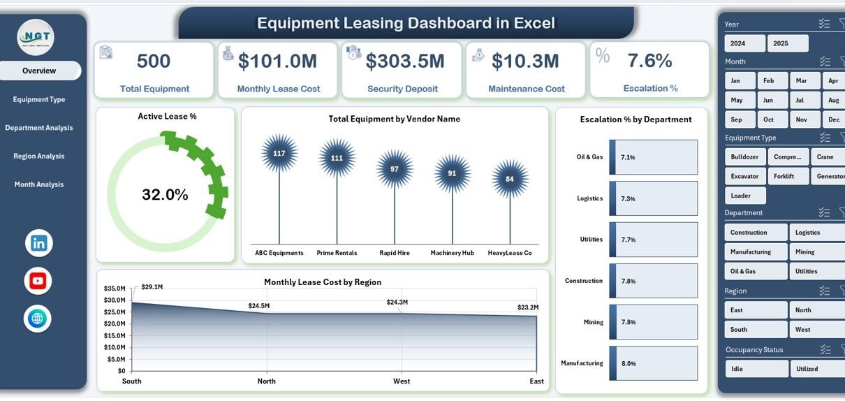
📊 1. Overview Page — Your Executive Snapshot
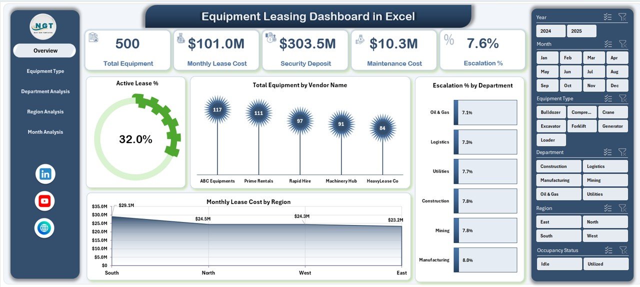
The Overview Page acts as the main control center of the dashboard. It provides a high-level summary of leasing performance.
Key Elements
-
Right-side slicer for dynamic filtering
-
Four KPI cards
-
Four interactive charts
KPI Cards Display
The dashboard highlights four important metrics:
-
Active Lease %
-
Total Equipment
-
Total Monthly Lease Cost
-
Average Downtime Days
Because these cards update instantly with slicer selections, executives can quickly understand overall performance.
Charts on the Overview Page
🔹 Active Lease %
This visual shows the percentage of currently active leases. Therefore, management can quickly assess asset utilization.
🔹 Total Equipment by Vendor Name
This chart highlights vendor distribution. As a result, businesses can identify vendor dependency risks.
🔹 Escalation % by Department
This visual tracks cost escalation trends across departments. Consequently, finance teams can monitor cost control.
🔹 Monthly Lease Cost by Region
This chart reveals regional spending patterns. Therefore, leadership can identify high-cost regions quickly.
Click to Purchases Equipment Leasing Dashboard in Excel
🔧 2. Equipment Type Analysis — Deep Asset Insights
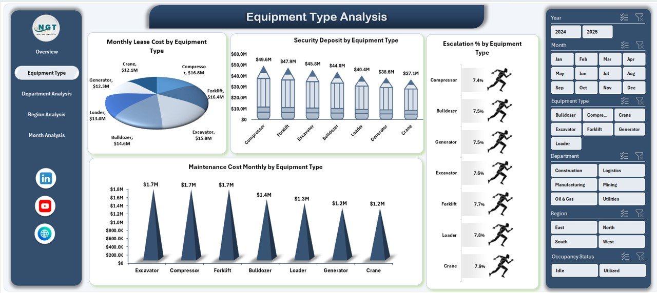
The Equipment Type Analysis page focuses on performance by equipment category.
Key Highlights
-
Right-side slicer
-
Four equipment-focused charts
-
Detailed cost visibility
Charts Included
📈 Monthly Lease Cost by Equipment Type
This chart helps identify which equipment categories consume the highest lease budget.
💰 Security Deposit by Equipment Type
This visual shows capital blocked in deposits. As a result, finance teams can optimize cash flow.
📊 Escalation % by Equipment Type
This chart highlights cost increases across equipment types. Therefore, procurement teams can renegotiate contracts.
🛠 Maintenance Cost Monthly by Equipment Type
This visual tracks maintenance expenses. Consequently, operations teams can detect high-maintenance assets.
🏢 3. Department Analysis — Performance by Business Unit
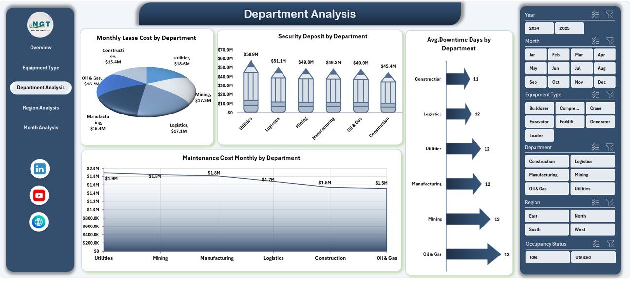
The Department Analysis page provides insights into how different departments use leased equipment.
Key Components
-
Dynamic slicer
-
Four department-focused charts
-
Operational visibility
Charts Included
📉 Monthly Lease Cost by Department
This chart identifies which departments incur the highest leasing costs.
💳 Security Deposit by Department
Click to Purchases Equipment Leasing Dashboard in Excel
This visual shows deposit allocation across departments. Therefore, finance teams can monitor fund utilization.
⏱ Avg. Downtime Days by Department
This chart reveals equipment reliability issues by department.
🔧 Maintenance Cost Monthly by Department
This visual highlights maintenance spending trends.
🌍 4. Region Analysis — Geographic Performance View
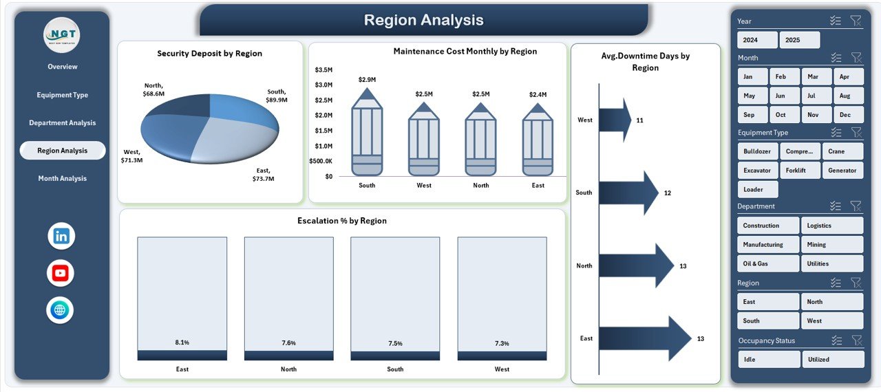
The Region Analysis page provides location-based insights. As a result, organizations can compare regional performance easily.
Page Features
-
Right-side slicer
-
Four regional charts
-
Geographic cost tracking
Charts Included
📊 Escalation % by Region
This chart shows where lease costs rise faster.
💰 Security Deposit by Region
This visual highlights region-wise deposit exposure.
⏱ Avg. Downtime Days by Region
This chart helps identify regions with operational issues.
🛠 Maintenance Cost Monthly by Region
This visual tracks regional maintenance spending.
📅 5. Month Analysis — Time-Based Trends
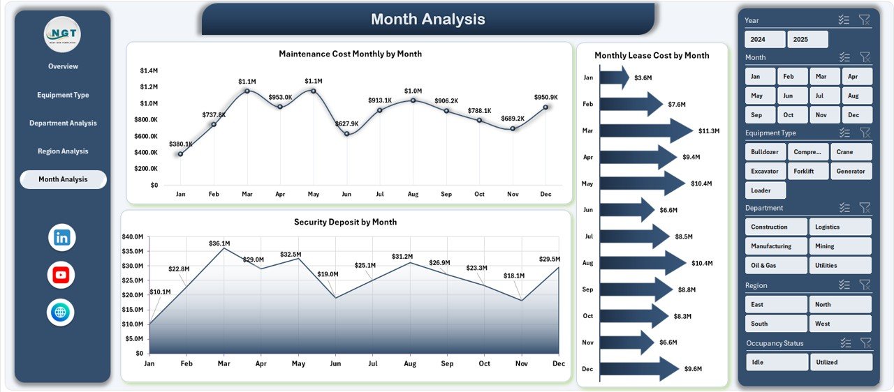
The Month Analysis page focuses on monthly trends. Therefore, it helps management track seasonality and cost patterns.
Charts Included
-
Security Deposit by Month
-
Maintenance Cost Monthly by Month
-
Monthly Lease Cost by Month
Because this page highlights time trends, finance teams can forecast future expenses more accurately.
Click to Purchases Equipment Leasing Dashboard in Excel
📂 Support Sheet — The Engine Behind the Dashboard
The Support Sheet plays a critical role in calculations and intermediate logic.
What the Support Sheet Handles
-
Helper formulas
-
Pivot table sources
-
Data transformations
-
Calculation support
Although users rarely interact with this sheet, it ensures the dashboard runs smoothly.
🗂 Data Sheet — The Foundation of Insights
The Data Sheet stores the raw leasing data. Therefore, data accuracy directly affects dashboard reliability.
Typical Columns in the Data Sheet
-
Lease ID
-
Equipment Name
-
Equipment Type
-
Vendor Name
-
Department
-
Region
-
Lease Start Date
-
Lease End Date
-
Monthly Lease Cost
-
Security Deposit
-
Escalation %
-
Maintenance Cost
-
Downtime Days
-
Lease Status
Because the dashboard uses Pivot Tables, keeping the data structured remains essential.
Advantages of Equipment Leasing Dashboard in Excel
Implementing this dashboard provides significant operational benefits.
✅ Centralized Lease Monitoring
-
All leasing data appears in one place
-
Teams avoid scattered reports
-
Leadership gains full visibility
✅ Faster Decision-Making
-
Real-time KPI tracking
-
Instant slicer filtering
-
Quick performance comparison
✅ Improved Cost Control
-
Track monthly lease expenses
-
Monitor escalation trends
-
Identify high-cost departments
✅ Better Vendor Management
-
Analyze vendor distribution
-
Detect over-dependency
-
Support contract renegotiation
✅ Enhanced Operational Efficiency
-
Monitor downtime trends
-
Track maintenance costs
-
Improve asset utilization
Best Practices for the Equipment Leasing Dashboard in Excel
To get maximum value from the dashboard, follow these proven best practices.
🔹 Keep Data Clean and Structured
Always maintain consistent formatting in the Data Sheet. Moreover, avoid merged cells and blank rows.
🔹 Update Data Regularly
Update lease records monthly. As a result, the dashboard will always reflect current performance.
🔹 Use Standard Naming Conventions
Keep vendor names, departments, and regions consistent. Otherwise, Pivot Tables may split categories incorrectly.
🔹 Monitor High-Risk KPIs
Click to Purchases Equipment Leasing Dashboard in Excel
Pay special attention to:
-
Escalation %
-
Downtime Days
-
Maintenance Cost
Because these metrics directly impact profitability.
🔹 Protect Formula Cells
Lock calculation areas to prevent accidental changes.
🔹 Optimize Pivot Tables
Refresh Pivot Tables after every data update to ensure accurate visuals.
Who Can Benefit from This Dashboard?
The Equipment Leasing Dashboard in Excel serves multiple stakeholders.
👨💼 Finance Teams
-
Monitor lease expenses
-
Track deposits
-
Control budget variance
🏭 Operations Managers
-
Track equipment uptime
-
Monitor maintenance trends
-
Improve asset planning
🧑💻 Procurement Teams
-
Evaluate vendor performance
-
Support negotiations
-
Reduce cost escalation
🏢 Senior Management
-
View executive summary
-
Compare regions and departments
-
Make strategic decisions
How Does This Dashboard Improve Business Decisions?
This dashboard transforms raw data into actionable insights.
For example:
-
If downtime increases, operations teams can investigate quickly.
-
If one vendor dominates, procurement can diversify suppliers.
-
If lease costs spike in a region, finance can review contracts.
Therefore, organizations move from reactive management to proactive control.
Common Mistakes to Avoid
Even though the dashboard is powerful, users should avoid these mistakes.
❌ Irregular Data Updates
Outdated data leads to wrong decisions.
❌ Inconsistent Naming
Different spellings break Pivot Table grouping.
❌ Ignoring Downtime Metrics
Downtime directly affects productivity.
❌ Overloading the Dashboard
Too many visuals reduce clarity.
Conclusion: Take Control of Equipment Leasing Today
Managing leased equipment no longer needs to feel complicated. With the Equipment Leasing Dashboard in Excel, organizations gain clear visibility into costs, performance, and operational risks.
Moreover, the dashboard combines powerful analytics with an easy-to-use interface. As a result, teams can monitor KPIs, control expenses, and improve decision-making with confidence.
If your organization relies on leased equipment, this dashboard can become your single source of truth. Therefore, implementing it today can significantly improve financial control and operational efficiency.
Frequently Asked Questions (FAQs)
❓ What is the purpose of the Equipment Leasing Dashboard in Excel?
The dashboard helps organizations track lease costs, equipment performance, vendor distribution, and downtime in one interactive Excel view.
❓ Do I need advanced Excel skills to use this dashboard?
No. The dashboard uses slicers and Pivot Tables. Therefore, basic Excel knowledge is enough for most users.
❓ How often should I update the data?
You should update the Data Sheet monthly. However, high-volume environments may update weekly.
❓ Can I customize the dashboard?
Click to Purchases Equipment Leasing Dashboard in Excel
Yes. You can add new KPIs, charts, or filters based on your business needs.
❓ Does the dashboard support multiple regions and departments?
Yes. The slicers allow dynamic filtering across regions, departments, vendors, and equipment types.
❓ Why do Pivot Tables matter in this dashboard?
Pivot Tables power all charts and summaries. Therefore, they enable fast aggregation and flexible analysis.
Visit our YouTube channel to learn step-by-step video tutorials