Educational institutions generate massive amounts of data every day. Schools, universities, training centers, and education service providers continuously track student performance, enrollment trends, financial outcomes, and institutional efficiency. However, many organizations still struggle to transform this data into meaningful insights.
As a result, decision-makers often rely on scattered spreadsheets and manual reports. Consequently, leadership teams lose visibility into performance trends and operational efficiency.
This is exactly where an Education Services Dashboard in Power BI becomes extremely powerful.
An Education Services Dashboard in Power BI helps institutions monitor student metrics, financial performance, academic quality, and operational efficiency through interactive visual analytics. Instead of analyzing complex reports, administrators can instantly understand performance using dynamic charts, filters, and KPIs.
In this comprehensive guide, you will learn everything about the Education Services Dashboard in Power BI, including features, benefits, structure, best practices, and practical applications.
Click to buy Education Services Dashboard in Power BI
What Is an Education Services Dashboard in Power BI?
An Education Services Dashboard in Power BI is an interactive business intelligence solution designed to analyze and visualize educational data in real time.
It combines multiple datasets such as:
- Student enrollment records
- Academic performance metrics
- Financial transactions
- Institutional performance indicators
- Departmental analytics
Power BI transforms this raw data into visual dashboards that support faster and smarter decision-making.
Therefore, instead of reviewing lengthy reports, education leaders can instantly identify trends, risks, and opportunities.
Why Do Educational Institutions Need a Power BI Dashboard?
Educational organizations operate in a competitive and performance-driven environment. They must maintain quality education while managing costs and improving student outcomes.
However, without centralized analytics:
- Data remains fragmented.
- Reporting becomes slow.
- Strategic decisions lack accuracy.
On the other hand, a Power BI dashboard creates a single source of truth.
Key Challenges Solved
- Difficulty tracking student growth trends
- Limited visibility into departmental performance
- Manual financial analysis
- Lack of real-time reporting
- Complex accreditation monitoring
Because of these challenges, institutions increasingly adopt data-driven dashboards.
Key Features of the Education Services Dashboard in Power BI
This dashboard contains five interactive pages inside the Power BI Desktop application. Each page focuses on a specific analytical perspective.
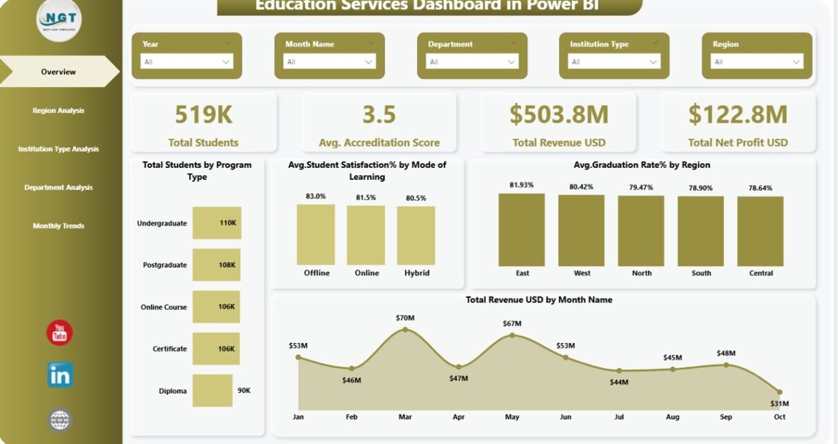
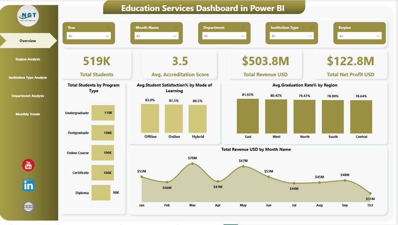
Overview Page – How Can You See Institutional Performance at a Glance?
The Overview Page acts as the central command center of the dashboard. It provides a quick summary of institutional performance using KPI cards and visual charts.
KPI Cards
The dashboard displays four key performance indicators:
- Total Students
- Average Accreditation Score
- Total Revenue (USD)
- Total Net Profit (USD)
These KPIs allow leadership teams to evaluate overall performance immediately.
Charts Included
- Total Students by Program Type
Helps understand enrollment distribution across programs. - Average Student Satisfaction (%) by Mode of Learning
Compares online, hybrid, and classroom learning experiences. - Average Graduation Rate (%) by Region
Highlights regional academic success levels. - Total Revenue (USD) by Month Name
Shows monthly financial performance trends.
Additionally, slicers allow users to filter results dynamically, which improves analytical flexibility.
Click to buy Education Services Dashboard in Power BI
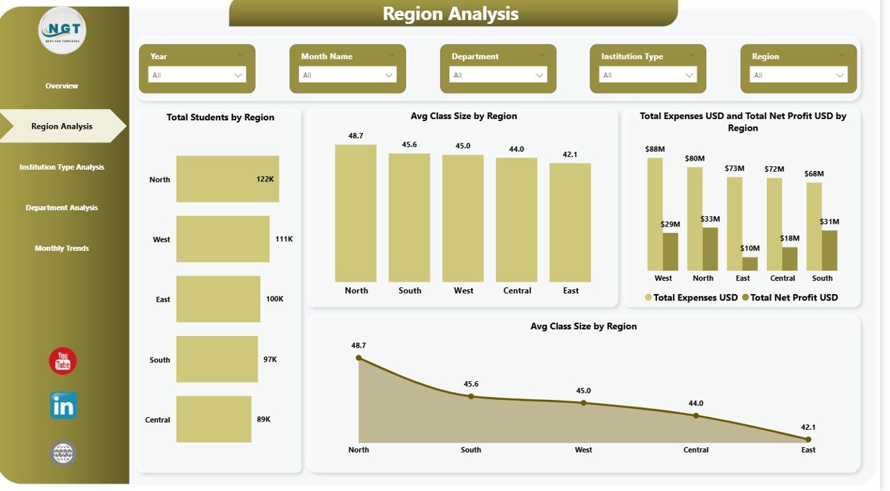
Region Analysis – How Do Different Regions Perform?
Regional performance plays a critical role in educational success. Therefore, the Region Analysis Page focuses on geographic comparisons.
Charts Available
- Total Students by Region
- Average Class Size by Region
- Total Expenses vs Total Net Profit by Region
- Average Class Size by Region
Using these visuals, institutions can:
- Identify high-performing regions
- Detect operational inefficiencies
- Allocate resources strategically
Moreover, regional insights help administrators plan expansion strategies.
Click to buy Education Services Dashboard in Power BI
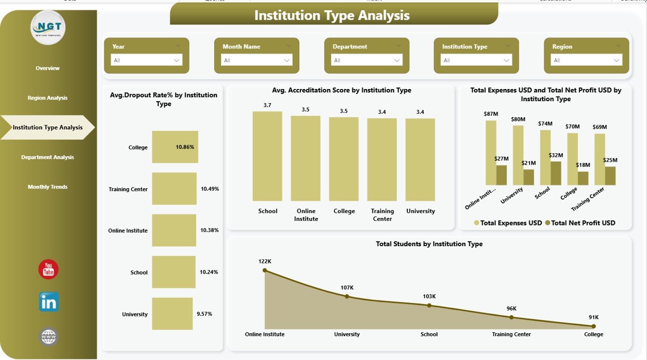
Institution Type Analysis – Which Institution Types Deliver Better Results?
Educational organizations often operate multiple institution models such as universities, colleges, training institutes, or online academies.
The Institution Type Analysis Page compares performance across these categories.
Charts Included
- Average Dropout Rate (%) by Institution Type
- Average Accreditation Score by Institution Type
- Total Expenses vs Total Net Profit by Institution Type
- Total Students by Institution Type
Because of this analysis, decision-makers can evaluate operational effectiveness and academic quality simultaneously.
For example:
- High dropout rates indicate engagement issues.
- Strong accreditation scores reflect educational quality.
Click to buy Education Services Dashboard in Power BI
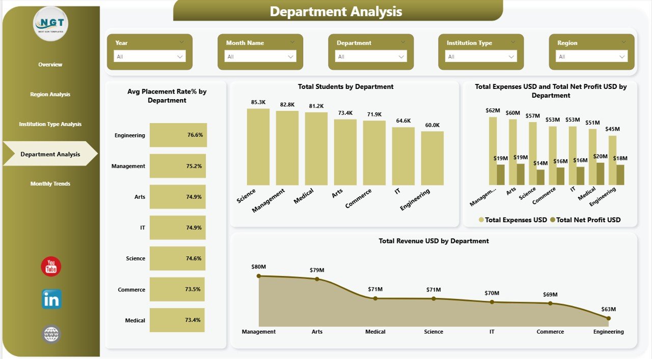
Department Analysis – Which Departments Drive Success?
Departments form the academic backbone of any institution. Therefore, analyzing departmental performance remains essential.
Charts Available
- Average Placement Rate (%) by Department
- Total Students by Department
- Total Expenses vs Total Net Profit by Department
- Total Revenue (USD) by Department
This page helps leadership teams:
- Measure employability outcomes
- Compare department profitability
- Optimize budget allocation
- Improve academic strategies
Consequently, institutions can invest more effectively in high-performing departments.
Click to buy Education Services Dashboard in Power BI
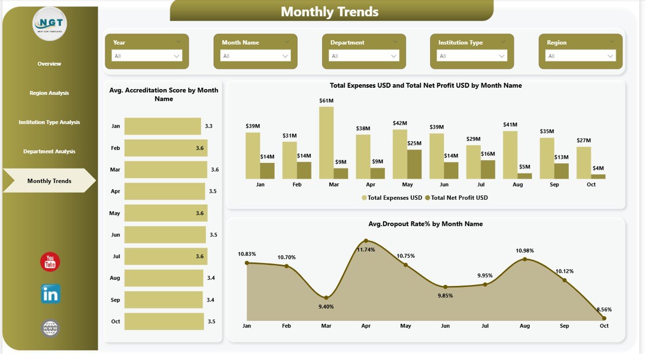
Monthly Trends – How Does Performance Change Over Time?
Trend analysis enables proactive decision-making. Instead of reacting late, institutions can forecast performance patterns.
The Monthly Trends Page focuses on time-based analytics.
Charts Included
- Average Accreditation Score by Month
- Total Expenses and Net Profit by Month
- Average Dropout Rate (%) by Month
These visuals help institutions:
- Monitor seasonal enrollment patterns
- Detect financial fluctuations
- Improve student retention strategies
As trends become visible, leadership can act faster and prevent performance decline.
Click to buy Education Services Dashboard in Power BI
Advantages of Education Services Dashboard in Power BI
Organizations gain multiple benefits after implementing this dashboard.
Centralized Data Management
- Combines academic and financial data in one platform.
- Eliminates disconnected reporting systems.
Real-Time Decision Making
- Updates automatically when data refreshes.
- Provides instant performance visibility.
Improved Student Outcomes
- Identifies dropout risks early.
- Tracks satisfaction and graduation rates.
Financial Transparency
- Monitors revenue, expenses, and profits clearly.
- Supports budget planning.
Interactive Reporting
- Users filter dashboards using slicers.
- Leaders explore insights without technical skills.
How Does Power BI Improve Educational Analytics?
Power BI introduces advanced analytical capabilities that traditional tools cannot provide.
Interactive Visualization
Users explore data visually instead of reading numbers.
Drill-Down Analysis
Decision-makers move from summary to detailed insights quickly.
Automated Reporting
Reports refresh automatically, saving valuable time.
Cross-Department Insights
Institutions compare academic and financial performance together.
Therefore, analytics becomes faster, smarter, and more reliable.
Who Can Benefit from This Dashboard?
Many education stakeholders can use this solution.
Educational Institutions
- Universities
- Colleges
- Schools
- Online learning platforms
Administrative Teams
- Academic directors
- Financial managers
- Operations teams
Strategic Leaders
- Institutional planners
- Policy analysts
- Education consultants
Because the dashboard simplifies analytics, both technical and non-technical users can benefit.
Best Practices for the Education Services Dashboard in Power BI
To achieve maximum value, organizations should follow proven best practices.
Maintain Clean Data Sources
Ensure consistent data formats and accurate entries.
Define Clear KPIs
Choose measurable indicators aligned with institutional goals.
Use Meaningful Filters
Add slicers for region, department, or institution type.
Refresh Data Regularly
Schedule automatic refresh cycles.
Focus on Actionable Insights
Avoid overcrowding visuals with unnecessary charts.
Train Users
Provide basic dashboard training for staff members.
When institutions follow these practices, dashboards deliver stronger outcomes.
How to Implement an Education Services Dashboard Successfully?
Implementation becomes easier when organizations follow a structured approach.
Step 1: Identify Objectives
Define what performance metrics you want to monitor.
Step 2: Collect Data Sources
Gather enrollment, financial, and academic datasets.
Step 3: Clean and Prepare Data
Remove duplicates and standardize formats.
Step 4: Build Data Model in Power BI
Create relationships between tables.
Step 5: Design Dashboard Pages
Develop overview and analytical pages.
Step 6: Validate Insights
Verify calculations and metrics.
Step 7: Deploy and Share
Publish dashboards securely.
Future of Education Analytics with Power BI
Education continues to evolve toward data-driven management.
In the future, dashboards will include:
- Predictive student performance analytics
- AI-driven recommendations
- Automated intervention alerts
- Real-time campus monitoring
Therefore, adopting Power BI today prepares institutions for tomorrow’s education ecosystem.
Conclusion
The Education Services Dashboard in Power BI transforms how educational institutions analyze performance. Instead of relying on manual reporting, organizations gain interactive, real-time insights across students, departments, finances, and regions.
Moreover, leadership teams make faster decisions because they understand performance instantly. Departments improve accountability, financial planning becomes easier, and student outcomes improve significantly.
As education becomes increasingly competitive, data-driven decision-making no longer remains optional. Institutions that adopt intelligent dashboards gain a strong strategic advantage.
Frequently Asked Questions (FAQs)
- What is an Education Services Dashboard in Power BI?
It is an interactive analytics dashboard that visualizes student, financial, and institutional performance using Power BI.
- Who should use this dashboard?
Educational administrators, analysts, academic leaders, and financial managers benefit the most.
- Can beginners use this dashboard?
Yes. Power BI dashboards provide user-friendly navigation and interactive visuals.
- Does the dashboard support real-time updates?
Yes. Data refresh features allow automatic updates when new data becomes available.
- What KPIs does the dashboard track?
It tracks student enrollment, accreditation scores, graduation rates, financial performance, and departmental analytics.
- Why is Power BI suitable for education analytics?
Power BI offers interactive visuals, automation, scalability, and powerful data modeling capabilities.
- Can institutions customize the dashboard?
Yes. Organizations can modify KPIs, visuals, and filters according to their requirements.
Visit our YouTube channel to learn step-by-step video tutorials
Watch the step-by-step video tutorial:
Click to buy Education Services Dashboard in Power BI