Student exchange programs play a vital role in modern education. Universities, international organizations, and educational institutions continuously collaborate to provide students with global exposure, cultural learning, and academic opportunities. However, managing exchange programs involves multiple variables such as program types, funding sources, regions, student participation, travel costs, scholarships, and satisfaction levels.
Many institutions still depend on scattered spreadsheets and manual reports to track program performance. As a result, administrators struggle to analyze data quickly and make informed decisions. Therefore, organizations increasingly adopt advanced analytics tools to simplify monitoring and reporting.
Click to Purchases Student Exchange Programs Dashboard in Power BI
This is exactly where the Student Exchange Programs Dashboard in Power BI becomes extremely valuable. It transforms complex program data into clear visual insights, enabling education managers to track performance, optimize budgets, and improve student experiences.
In this comprehensive guide, you will learn everything about the Student Exchange Programs Dashboard in Power BI, including features, structure, benefits, best practices, and implementation strategies.
What Is a Student Exchange Programs Dashboard in Power BI?
A Student Exchange Programs Dashboard in Power BI is an interactive analytics solution designed to monitor and analyze student exchange activities using dynamic visualizations and automated calculations.
Instead of reviewing multiple reports, decision-makers can view all important metrics in one centralized dashboard. Moreover, Power BI automatically updates visuals when users apply filters or slicers, which helps institutions analyze performance instantly.
This dashboard allows organizations to:
-
Track exchange programs across different regions
-
Monitor program costs and funding sources
-
Evaluate student satisfaction scores
-
Analyze travel and living expenses
-
Compare performance month by month
-
Improve planning using real-time insights
As a result, administrators shift from reactive reporting to proactive decision-making.
Why Do Educational Institutions Need a Student Exchange Dashboard?
Managing international programs involves multiple stakeholders, budgets, and timelines. Without a structured monitoring system, teams often face reporting delays and data inconsistencies.
However, a Power BI dashboard solves these challenges effectively.
Key Challenges Without a Dashboard
-
Data scattered across departments
-
Manual calculations causing errors
-
Difficulty tracking funding utilization
-
Limited visibility into program performance
-
Slow decision-making processes
How Power BI Changes the Process
Power BI centralizes data and presents it through interactive visuals. Consequently, administrators gain instant visibility into program performance while reducing reporting effort.
Key Features of the Student Exchange Programs Dashboard in Power BI
This dashboard contains five interactive pages, each designed to analyze exchange programs from a different perspective. Every page includes slicers that allow users to filter data dynamically.
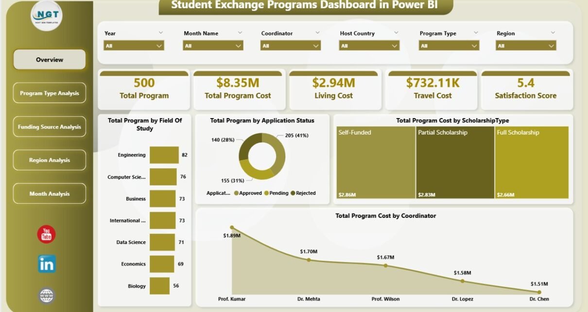
1. Overview Page – How Can You Monitor Overall Program Performance?

The Overview Page acts as the main control center of the dashboard. Users start their analysis here because it provides a summarized view of all exchange program activities.
Key Highlights
The page includes interactive slicers that allow users to filter data by categories and instantly update visuals.
KPI Cards Displayed
-
Total Programs by Field of Study
-
Total Programs by Application Status
-
Total Program Cost by Scholarship Type
-
Total Program Cost by Coordinator
-
Overall performance summary indicators
These KPI cards help administrators understand program distribution and financial allocation quickly. Therefore, leaders can identify trends without reviewing detailed reports.
2. Program Type Analysis – Which Programs Deliver the Best Value?
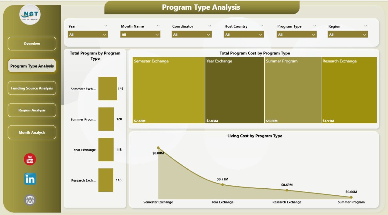
The Program Type Analysis page focuses on evaluating performance based on program categories.
Charts Included
-
Total Programs by Program Type
-
Total Program Cost by Program Type
-
Living Cost by Program Type
Insights You Can Gain
-
Identify popular program categories
-
Compare costs across program types
-
Evaluate financial efficiency
-
Optimize future program planning
-
Click to Purchases Student Exchange Programs Dashboard in Power BI
For example, institutions can quickly see whether semester exchanges cost more than short-term programs and adjust budgets accordingly.
3. Funding Source Analysis – How Does Funding Impact Program Success?
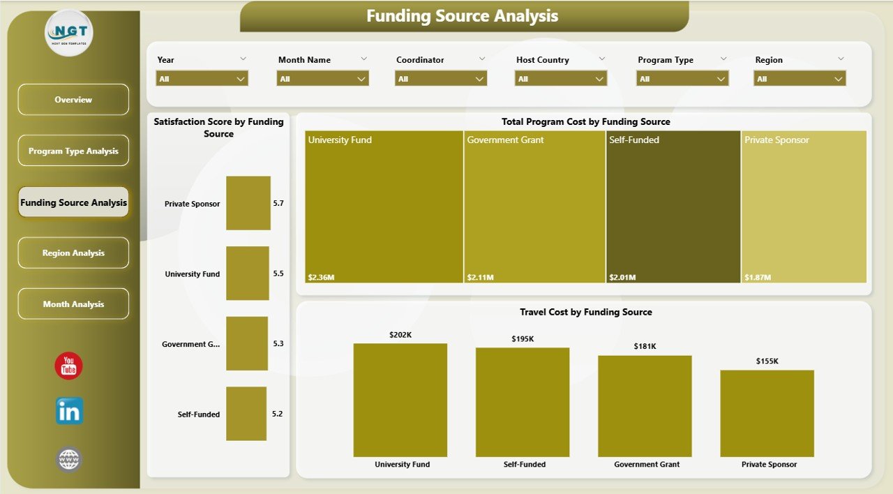
Funding plays a crucial role in student exchange initiatives. Therefore, this page analyzes financial support sources and their outcomes.
Charts Included
-
Total Program Cost by Funding Source
-
Total Satisfaction Score by Funding Source
-
Travel Cost by Funding Source
Why This Analysis Matters
-
Helps institutions evaluate funding effectiveness
-
Identifies which funding sources deliver higher satisfaction
-
Supports better allocation of scholarships
-
Improves transparency in financial planning
As a result, organizations can prioritize funding partnerships that generate stronger educational outcomes.
Click to Purchases Student Exchange Programs Dashboard in Power BI
4. Region Analysis – Which Regions Perform the Best?
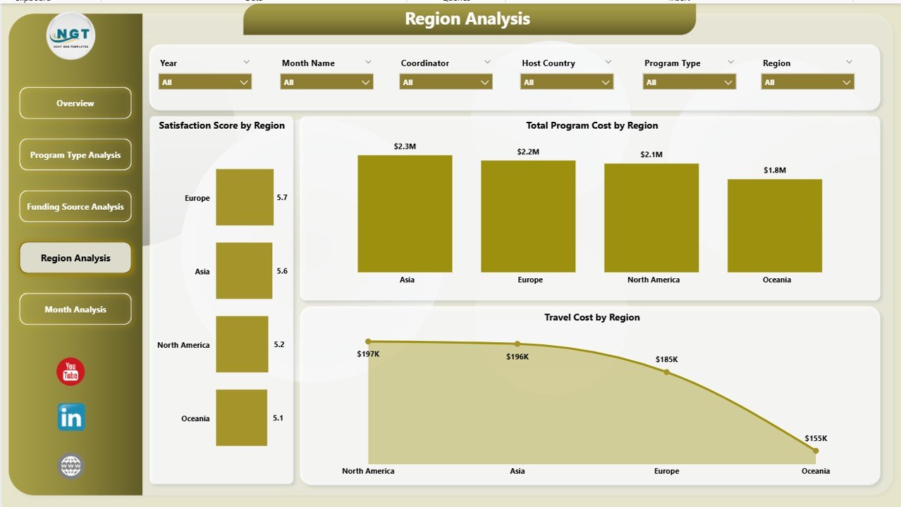
Student exchange programs operate globally. Consequently, institutions must understand regional performance differences.
Charts Included
-
Total Program Cost by Region
-
Total Satisfaction Score by Region
-
Travel Cost by Region
Benefits of Regional Analysis
-
Compare program success across continents
-
Identify high-performing regions
-
Analyze travel cost variations
-
Improve geographic expansion strategies
Therefore, universities can decide where to expand partnerships or optimize investments.
5. Month Analysis – How Do Programs Perform Over Time?
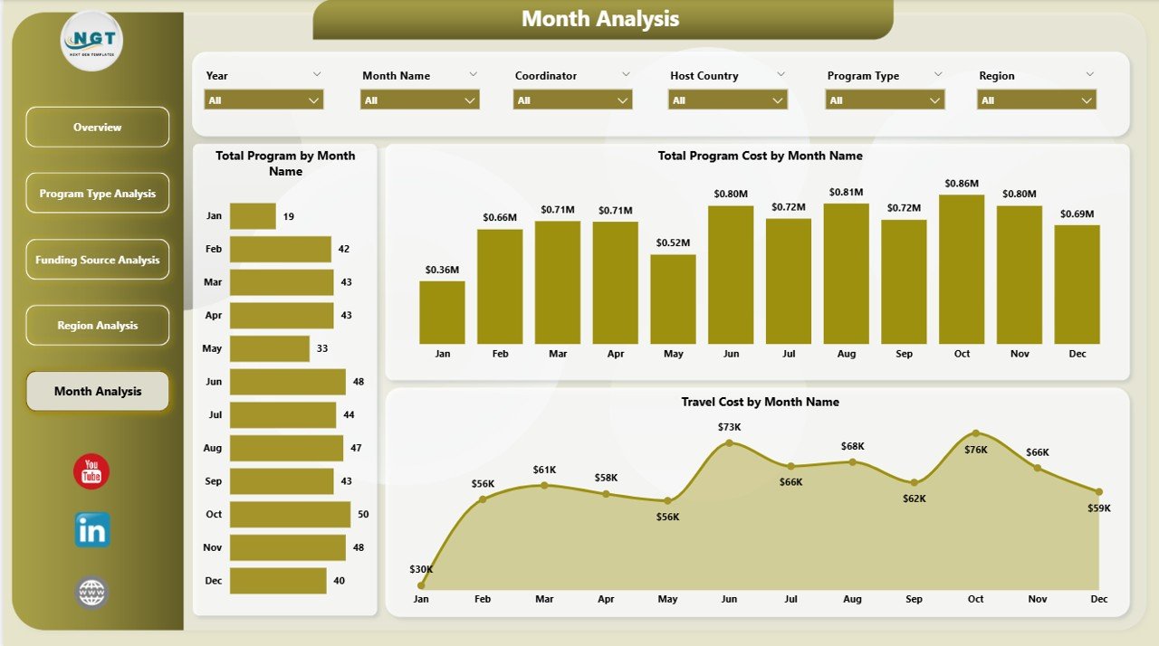
The Month Analysis page focuses on time-based performance tracking.
Charts Included
-
Total Program Cost by Month
-
Total Programs by Month
-
Travel Cost by Month
Insights Provided
-
Seasonal participation trends
-
Budget utilization patterns
-
Monthly cost fluctuations
-
Planning support for upcoming academic cycles
Because of this analysis, institutions can prepare resources ahead of peak exchange periods.
What Makes Power BI Ideal for Student Exchange Analytics?
Power BI provides advanced analytics capabilities that traditional spreadsheets cannot match.
Core Advantages
-
Interactive filtering using slicers
-
Automatic visual updates
-
Real-time data integration
-
Professional visual storytelling
-
Easy sharing across teams
-
Scalable reporting environment
Moreover, Power BI allows institutions to combine multiple data sources into a single analytics ecosystem.
Advantages of Student Exchange Programs Dashboard in Power BI
Click to Purchases Student Exchange Programs Dashboard in Power BI
Organizations gain multiple operational and strategic benefits after implementing this dashboard.
🎯 Improved Decision-Making
Administrators analyze performance instantly and make faster decisions.
📊 Centralized Data Management
All program data remains available in one location.
💰 Better Budget Control
Institutions monitor scholarship, travel, and living costs efficiently.
🌍 Enhanced Program Planning
Regional and program insights support expansion strategies.
😊 Increased Student Satisfaction
Data helps identify successful programs and improve weaker ones.
⏱ Time Savings
Automation reduces manual reporting work significantly.
How Does the Dashboard Improve Institutional Strategy?
The dashboard supports long-term planning through data visibility.
For example:
-
Universities identify cost-efficient programs.
-
Coordinators monitor application trends.
-
Finance teams analyze funding performance.
-
Leadership evaluates global partnerships.
Consequently, institutions align operational decisions with strategic goals.
Best Practices for the Student Exchange Programs Dashboard in Power BI
To achieve maximum value, organizations should follow proven best practices.
1. Maintain Clean Data Sources
Always standardize program names, regions, and funding categories.
2. Update Data Regularly
Schedule weekly or monthly updates to keep insights accurate.
3. Use Consistent KPIs
Define metrics clearly to avoid confusion among stakeholders.
4. Train Dashboard Users
Provide training sessions for coordinators and administrators.
5. Focus on Actionable Metrics
Track KPIs that directly support decision-making.
6. Monitor Student Feedback
Combine satisfaction scores with financial metrics for balanced analysis.
7. Review Trends Periodically
Analyze monthly and yearly patterns to refine strategies.
How Can Institutions Implement This Dashboard Successfully?
Implementation becomes easier when organizations follow a structured approach.
Step-by-Step Implementation
-
Collect exchange program data.
-
Clean and structure datasets.
-
Import data into Power BI.
-
Build relationships between tables.
-
Create visuals and KPI cards.
-
Add slicers for filtering.
-
Publish dashboard to Power BI Service.
-
Share with stakeholders securely.
Because of this process, institutions create a scalable analytics system.
Who Can Benefit from This Dashboard?
Click to Purchases Student Exchange Programs Dashboard in Power BI
Many stakeholders across education ecosystems can use this solution.
Primary Users
-
Universities and colleges
-
International education offices
-
Exchange program coordinators
-
Government education departments
-
Scholarship organizations
-
Study abroad agencies
Each user group gains insights tailored to their responsibilities.
Future Trends in Student Exchange Analytics
Education analytics continues to evolve rapidly. Therefore, dashboards will play an even larger role in decision-making.
Emerging Trends
-
AI-driven predictive analytics
-
Student success forecasting
-
Real-time mobility tracking
-
Automated funding optimization
-
Integration with learning management systems
Institutions adopting analytics early will gain competitive advantages.
Common Mistakes to Avoid While Using Exchange Dashboards
Even powerful dashboards require proper usage.
Avoid These Errors
-
Ignoring data quality checks
-
Tracking too many KPIs
-
Not updating datasets regularly
-
Overcomplicating visuals
-
Failing to train users
Instead, organizations should focus on clarity and usability.
Conclusion
Student exchange programs strengthen global education by connecting students, institutions, and cultures. However, managing these programs efficiently requires structured performance monitoring.
The Student Exchange Programs Dashboard in Power BI provides a powerful solution by transforming raw data into actionable insights. Through five analytical pages—Overview, Program Type Analysis, Funding Source Analysis, Region Analysis, and Month Analysis—institutions gain complete visibility into program performance.
As a result, universities improve budgeting, enhance student experiences, and make smarter strategic decisions. Moreover, automation saves time while improving accuracy.
In today’s data-driven education environment, adopting analytics dashboards no longer remains optional. Instead, it becomes essential for institutions aiming to manage international programs successfully.
Frequently Asked Questions (FAQs)
1. What is a Student Exchange Programs Dashboard in Power BI?
It is an interactive analytics dashboard that tracks exchange program performance, costs, funding sources, and satisfaction metrics using visual reports.
2. Who should use this dashboard?
Universities, education administrators, coordinators, and scholarship organizations can use it to monitor program performance.
3. Can beginners use this dashboard?
Yes. Power BI dashboards provide user-friendly visuals, so non-technical users can analyze data easily.
4. Does the dashboard support real-time updates?
Yes. When connected to live data sources, Power BI automatically updates visuals.
5. What metrics can institutions track?
Institutions can track program counts, costs, satisfaction scores, travel expenses, funding performance, and regional analysis.
6. Why is Power BI better than spreadsheets for this purpose?
Power BI offers automation, interactive visuals, scalability, and faster analysis compared to manual spreadsheet reporting.
7. How often should institutions update the dashboard?
Organizations should update data monthly or whenever new program information becomes available.
Visit our YouTube channel to learn step-by-step video tutorials