Educational nonprofit organizations play a critical role in shaping communities, improving literacy, supporting students, and expanding access to quality education. However, managing nonprofit operations involves handling large volumes of financial, operational, and performance data every day. Leaders must track donations, grants, expenses, program outcomes, and student satisfaction simultaneously.
Therefore, organizations increasingly adopt analytics tools to simplify decision-making. One of the most effective solutions is the Educational Nonprofits Dashboard in Power BI, a centralized reporting system that converts raw nonprofit data into meaningful insights.
Click to Purchases Educational Nonprofits Dashboard in Power BI
In this comprehensive guide, you will learn everything about the Educational Nonprofits Dashboard in Power BI, including its structure, features, advantages, implementation strategy, best practices, and frequently asked questions.
What Is an Educational Nonprofits Dashboard in Power BI?
An Educational Nonprofits Dashboard in Power BI is an interactive business intelligence solution designed to monitor nonprofit educational activities using visual analytics and performance indicators.
Instead of reviewing multiple spreadsheets, nonprofit managers can analyze performance through a single dashboard. As a result, leadership teams gain clarity, improve transparency, and make faster strategic decisions.
The dashboard integrates key nonprofit metrics such as:
-
Program expenses
-
Operating costs
-
Grants received
-
Donations received
-
Regional performance
-
Student satisfaction scores
Because Power BI updates visuals dynamically, users instantly understand trends and performance changes.
Why Do Educational Nonprofits Need a Data Dashboard?
Educational nonprofits operate under strict budget constraints while aiming to maximize social impact. Consequently, leaders must ensure every dollar contributes to measurable outcomes.
Without a structured dashboard:
-
Data remains scattered across departments.
-
Reporting consumes excessive time.
-
Decision-making slows down.
-
Performance gaps remain hidden.
However, when organizations implement a Power BI dashboard, they transform raw data into actionable intelligence.
Key Challenges Solved by the Dashboard
-
Difficulty tracking funding utilization
-
Limited visibility into regional performance
-
Manual reporting delays
-
Lack of program effectiveness measurement
-
Inefficient donor reporting
Therefore, dashboards become essential tools for modern nonprofit management.
How Does the Educational Nonprofits Dashboard in Power BI Work?
The dashboard collects data from multiple sources such as accounting systems, program records, surveys, and donor databases. Then, Power BI processes and visualizes the information through interactive charts and KPI cards.
Users can filter data using slicers, which allows deeper analysis across regions, programs, funding sources, and time periods.
As a result, decision-makers quickly answer questions like:
-
Which programs deliver the highest satisfaction?
-
Which region requires more funding?
-
How do operating costs change monthly?
-
Which funding sources generate maximum impact?
Key Features of the Educational Nonprofits Dashboard in Power BI
The dashboard contains five analytical pages, each designed to provide a unique perspective on nonprofit performance.
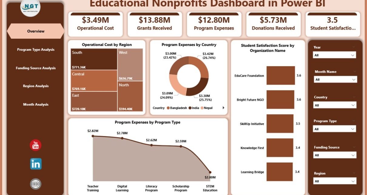
1. Overview Page – What Does the Organization Look Like at a Glance?
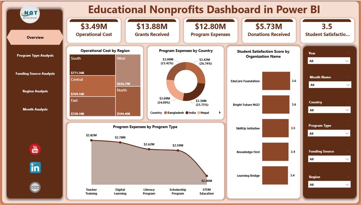
The Overview Page acts as the central command center of the dashboard.
Key Elements
-
Interactive slicers for dynamic filtering
-
KPI cards summarizing major metrics
-
High-level performance visuals
KPI Cards Included
-
Operating Cost by Region
-
Program Expenses by Country
-
Student Satisfaction Score by Organization Name
-
Program Expenses by Program Type
Because leaders often need quick insights, this page highlights overall organizational performance immediately.
Benefits of the Overview Page
-
Instant understanding of financial allocation
-
Quick evaluation of program effectiveness
-
Faster executive reporting
-
Simplified performance monitoring
-
Click to Purchases Educational Nonprofits Dashboard in Power BI
2. Program Type Analysis – Which Programs Perform Best?
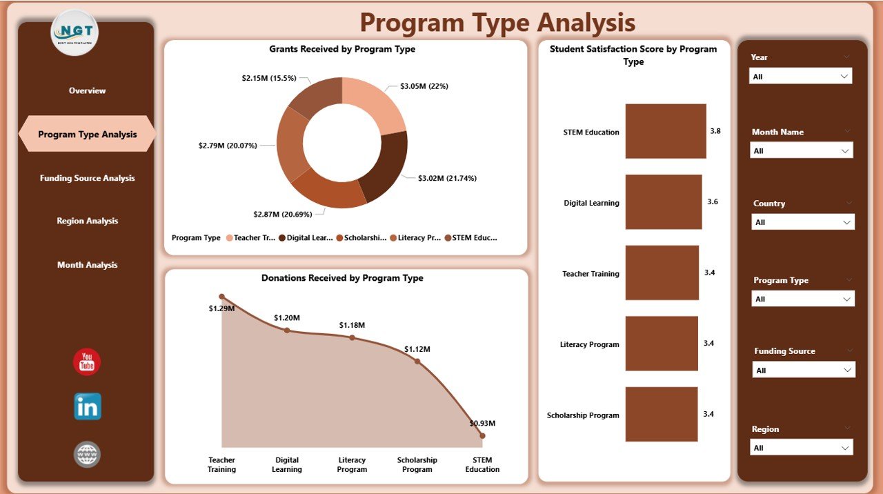
Educational nonprofits often run multiple programs such as scholarships, training workshops, digital learning initiatives, and community education projects. Therefore, analyzing program performance becomes essential.
Charts Included
-
Student Satisfaction Score by Program Type
-
Grants Received by Program Type
-
Donations Received by Program Type
Insights You Can Generate
-
Identify high-impact programs
-
Compare funding distribution
-
Understand donor preferences
-
Optimize resource allocation
Moreover, organizations can quickly detect underperforming programs and adjust strategies accordingly.
3. Funding Source Analysis – Where Does the Money Come From?
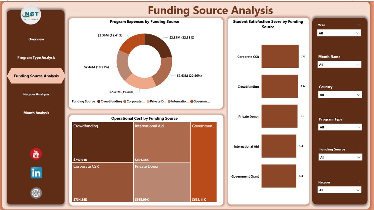
Funding sustainability determines nonprofit success. Hence, understanding funding sources plays a major role in financial planning.
Visualizations Included
-
Student Satisfaction Score by Funding Source
-
Program Expenses by Funding Source
-
Operating Cost by Funding Source
Why This Page Matters
This analysis helps organizations:
-
Evaluate funding efficiency
-
Compare grants vs donations
-
Align spending with funding objectives
-
Improve donor reporting transparency
Consequently, nonprofits strengthen relationships with sponsors and donors.
4. Region Analysis – How Does Performance Differ by Location?
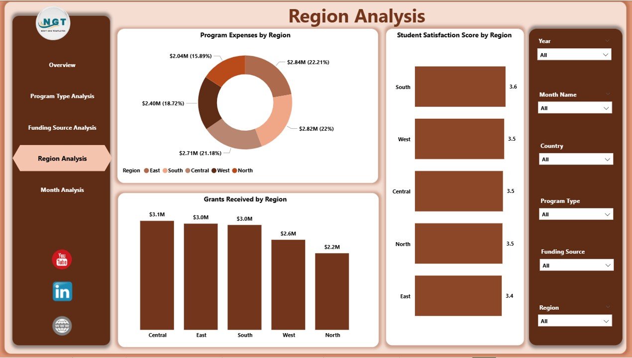
Educational programs often operate across multiple regions. However, performance varies due to demographic, economic, or operational differences.
Charts Included
-
Student Satisfaction Score by Region
-
Program Expenses by Region
-
Grants Received by Region
Key Benefits
-
Detect regional performance gaps
-
Allocate resources strategically
-
Improve regional program planning
-
Monitor geographic impact
Therefore, leadership teams can expand successful initiatives while improving weaker regions.
Click to Purchases Educational Nonprofits Dashboard in Power BI
5. Month Analysis – How Do Trends Change Over Time?
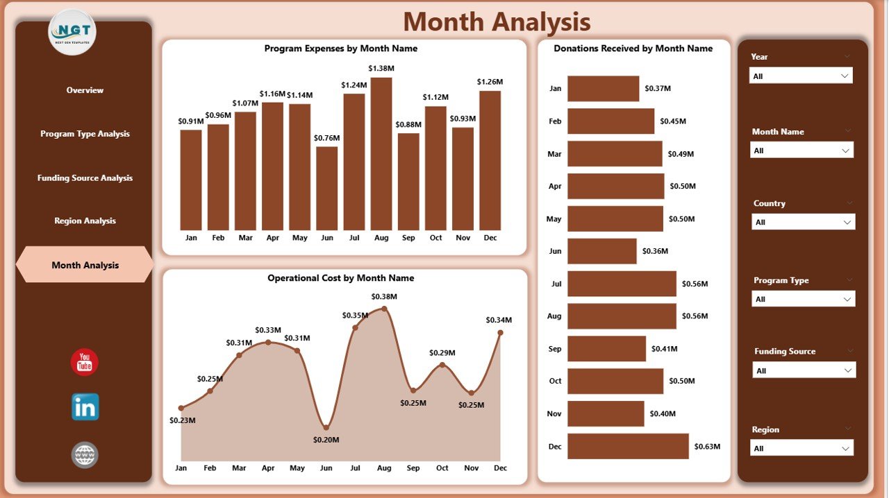
Tracking monthly trends allows nonprofits to plan budgets and predict future needs.
Visualizations Included
-
Program Expenses by Month
-
Donations Received by Month
-
Operating Cost by Month
Insights Provided
-
Seasonal donation trends
-
Expense fluctuations
-
Budget forecasting
-
Operational efficiency tracking
Because trends appear visually, decision-makers quickly recognize patterns.
What KPIs Should Educational Nonprofits Track?
A successful dashboard relies on meaningful KPIs. Below are commonly tracked indicators:
Financial KPIs
-
Total Donations
-
Grants Received
-
Operating Costs
-
Program Expenses Ratio
Impact KPIs
-
Student Satisfaction Score
-
Program Completion Rate
-
Beneficiary Growth Rate
Operational KPIs
-
Cost per Student
-
Regional Efficiency
-
Funding Utilization Rate
Together, these KPIs provide a complete performance picture.
Advantages of Educational Nonprofits Dashboard in Power BI
Implementing this dashboard offers several strategic benefits.
✅ Improved Decision-Making
Leaders access real-time insights, therefore they act faster and smarter.
✅ Enhanced Transparency
Stakeholders clearly see how funds support programs.
✅ Better Resource Allocation
Organizations invest in programs that create maximum impact.
✅ Time-Saving Reporting
Automated visuals eliminate manual report preparation.
✅ Stronger Donor Confidence
Clear analytics build trust with funding partners.
✅ Data-Driven Strategy
Organizations rely on evidence instead of assumptions.
How Can Nonprofits Implement This Dashboard Successfully?
Implementation requires planning and structured execution.
Step 1: Define Objectives
First, identify reporting goals such as financial monitoring or impact analysis.
Step 2: Collect Reliable Data
Next, consolidate data from finance, programs, and surveys.
Step 3: Clean and Structure Data
Ensure consistent formats and accurate records.
Step 4: Build Data Model in Power BI
Create relationships between tables for accurate analysis.
Step 5: Design Interactive Visuals
Use charts, cards, and slicers for usability.
Step 6: Train Team Members
Ensure staff understands how to use the dashboard effectively.
Best Practices for the Educational Nonprofits Dashboard in Power BI
Following best practices ensures long-term success.
Keep Visuals Simple
Avoid overcrowded charts. Clear visuals improve understanding.
Use Consistent KPIs
Maintain uniform definitions across departments.
Update Data Regularly
Frequent updates keep insights accurate.
Focus on Impact Metrics
Track outcomes, not only financial numbers.
Enable Interactive Filtering
Allow users to explore insights independently.
Maintain Data Governance
Protect sensitive donor and student information.
Common Mistakes to Avoid When Building Nonprofit Dashboards
Even strong dashboards fail when organizations overlook key factors.
-
Using too many visuals on one page
-
Ignoring data accuracy
-
Tracking irrelevant metrics
-
Lack of user training
-
Poor data refresh schedules
Therefore, simplicity and clarity remain essential.
Future of Data Analytics in Educational Nonprofits
Click to Purchases Educational Nonprofits Dashboard in Power BI
Technology continues to reshape nonprofit management. In the coming years, organizations will increasingly adopt:
-
AI-driven insights
-
Predictive analytics
-
Automated reporting
-
Real-time donor analytics
-
Impact measurement frameworks
Therefore, dashboards will become central to nonprofit strategy.
Conclusion
Educational nonprofits must balance financial accountability with social impact. However, managing complex data manually limits growth and transparency. The Educational Nonprofits Dashboard in Power BI solves this challenge by transforming scattered data into clear, actionable insights.
Through five structured analytical pages — Overview, Program Type Analysis, Funding Source Analysis, Region Analysis, and Month Analysis — organizations gain complete visibility into operations and outcomes.
Consequently, leaders improve decisions, optimize funding, and maximize educational impact. As nonprofits continue embracing digital transformation, dashboards like this will remain essential tools for sustainable success.
Frequently Asked Questions (FAQs)
What is the main purpose of an Educational Nonprofits Dashboard in Power BI?
The dashboard helps organizations monitor financial performance, program outcomes, and operational efficiency using interactive analytics.
Who should use this dashboard?
Nonprofit managers, program directors, financial analysts, donors, and executive leadership teams benefit from it.
Can small nonprofits use Power BI dashboards?
Yes. Even small organizations can use Power BI to simplify reporting and improve decision-making.
Does the dashboard require technical expertise?
Basic Power BI knowledge helps, however users can easily interact with visuals without technical skills.
How often should nonprofits update dashboard data?
Organizations should update data weekly or monthly depending on reporting needs.
Can the dashboard track donor performance?
Yes. It analyzes donations, grants, and funding sources to evaluate financial sustainability.
Why is student satisfaction included as a KPI?
Student satisfaction measures program effectiveness and educational impact.
Is Power BI better than traditional reports?
Yes, because it provides interactive insights, automation, and faster analysis.
Visit our YouTube channel to learn step-by-step video tutorials