Wind energy plays a major role in the global transition toward clean and sustainable power generation. Governments and energy companies continue to invest heavily in wind farms to reduce carbon emissions and improve energy independence. However, managing wind energy operations requires continuous monitoring, accurate reporting, and data-driven decision-making.
Many wind farm operators still depend on scattered reports, manual spreadsheets, or disconnected analytics systems. As a result, teams struggle to understand performance trends, identify operational issues, and meet production targets on time.
Therefore, organizations increasingly adopt intelligent analytics solutions like the Wind Energy Farms KPI Dashboard in Power BI. This ready-to-use dashboard centralizes performance metrics, simplifies analysis, and helps decision-makers monitor operational efficiency in real time.
In this comprehensive guide, you will learn:
-
What a Wind Energy KPI Dashboard in Power BI is
-
Why KPI monitoring matters in wind energy operations
-
Detailed explanation of dashboard pages
-
Excel data structure used as the source
-
Key KPIs for wind farms
-
Advantages and best practices
-
Implementation steps
-
Frequently asked questions
Let’s explore how Power BI transforms wind energy performance management.
Click to Purchases Wind Energy Farms KPI Dashboard in Power BI
What Is a Wind Energy Farms KPI Dashboard in Power BI?
A Wind Energy Farms KPI Dashboard in Power BI is an interactive business intelligence solution that tracks wind farm performance using structured Key Performance Indicators (KPIs).
The dashboard connects to an Excel data source and converts operational data into visual insights through charts, slicers, cards, and drill-through analysis.
Instead of reviewing multiple reports, users analyze performance through a single dynamic interface.
The dashboard enables users to:
-
Monitor MTD (Month-to-Date) and YTD (Year-to-Date) performance
-
Compare Actual vs Target results
-
Analyze Current Year vs Previous Year performance
-
Track KPI achievement status visually
-
Drill into KPI definitions and formulas
Because Power BI provides interactive visualization, decision-makers understand performance quickly and accurately.
Why Is KPI Monitoring Important for Wind Energy Farms?
Wind farm performance depends on several dynamic factors such as weather conditions, turbine efficiency, maintenance schedules, and grid availability. Without structured monitoring, operators face operational uncertainty.
Common Challenges Without KPI Dashboards
-
Delayed performance evaluation
-
Inefficient maintenance planning
-
Target deviations unnoticed
-
Poor operational visibility
-
Difficult historical comparison
However, KPI dashboards solve these issues by providing centralized analytics.
Benefits of KPI Monitoring
-
Improve operational transparency
-
Detect performance gaps early
-
Support strategic planning
-
Increase energy production efficiency
-
Strengthen data-driven decisions
Consequently, organizations achieve higher operational reliability.
Click to Purchases Wind Energy Farms KPI Dashboard in Power BI
Overview of Wind Energy Farms KPI Dashboard in Power BI
This ready-to-use dashboard contains three interactive pages inside the Power BI Desktop file.
Each page serves a specific analytical purpose.
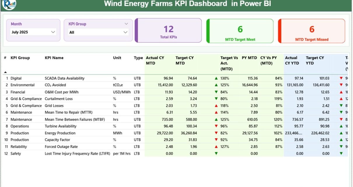
1️⃣ Summary Page – Central Performance Overview
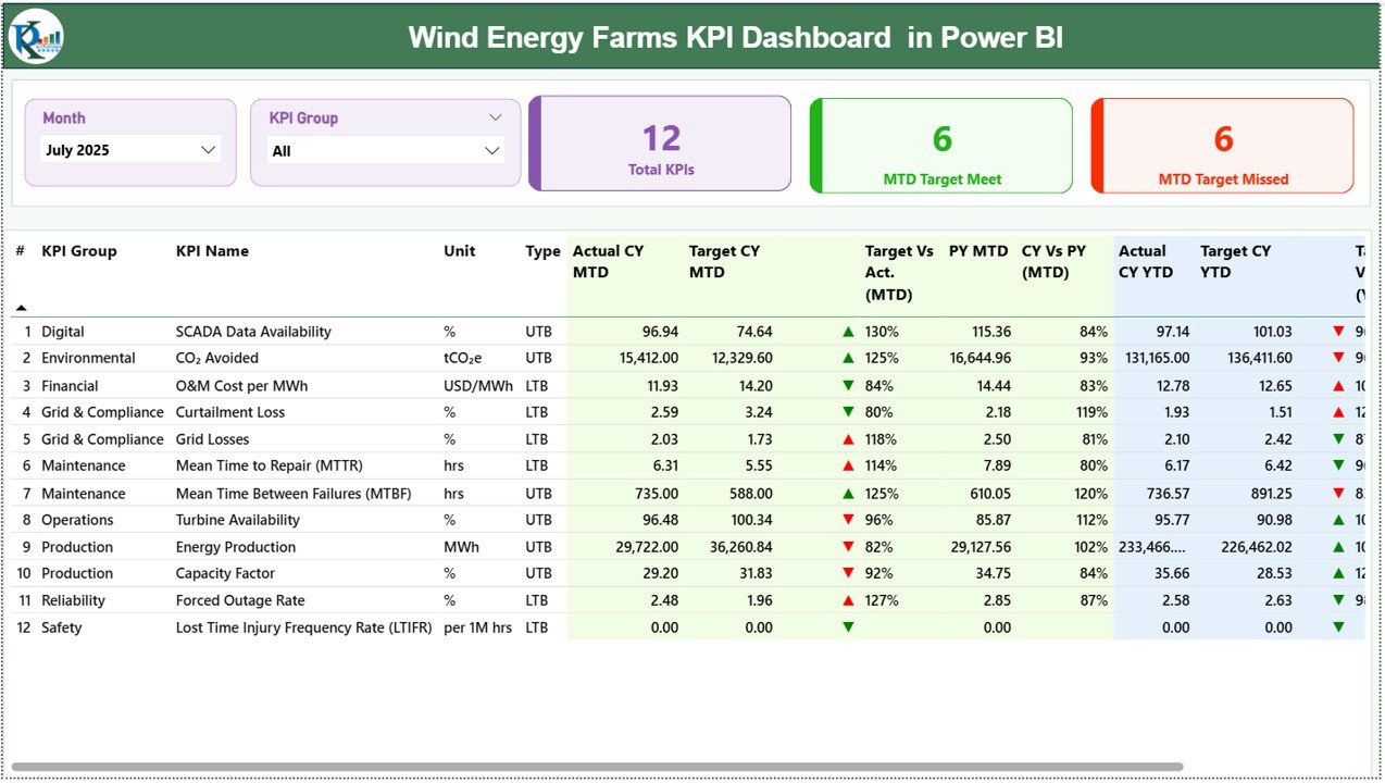
The Summary Page acts as the main dashboard interface.
It provides a complete overview of all KPIs.
Top Section Features
-
Month slicer for time-based analysis
-
KPI Group slicer for category filtering
-
Interactive filtering across visuals
KPI Performance Cards
Three cards instantly summarize performance:
-
Total KPI Count
-
MTD Target Meet Count
-
MTD Target Missed Count
These indicators help managers evaluate overall performance immediately.
Detailed KPI Table Explained
Below the cards, a detailed KPI table displays comprehensive performance information.
KPI Fields Included
KPI Number
Sequential identification number of KPI.
KPI Group
Category classification of KPI.
KPI Name
Name of performance metric.
Unit
Measurement unit of KPI.
Type
Defines KPI behavior:
-
LTB (Lower the Better)
-
UTB (Upper the Better)
MTD Performance Metrics
-
Actual CY MTD – Current Year actual MTD value
-
Target CY MTD – Planned MTD value
-
MTD Icon – Visual indicator:
-
▲ Green = Target achieved
-
▼ Red = Target missed
-
Target vs Actual (MTD)
Formula:
PY MTD
Previous Year MTD performance.
CY vs PY (MTD)
Formula:
YTD Performance Metrics
-
Actual CY YTD
-
Target CY YTD
-
YTD Icon showing performance direction
Target vs Actual (YTD)
Formula:
PY YTD
Previous Year YTD values.
CY vs PY (YTD)
Formula:
Therefore, users compare short-term and long-term performance simultaneously.
Click to Purchases Wind Energy Farms KPI Dashboard in Power BI
2️⃣ KPI Trend Page – Performance Trend Analysis
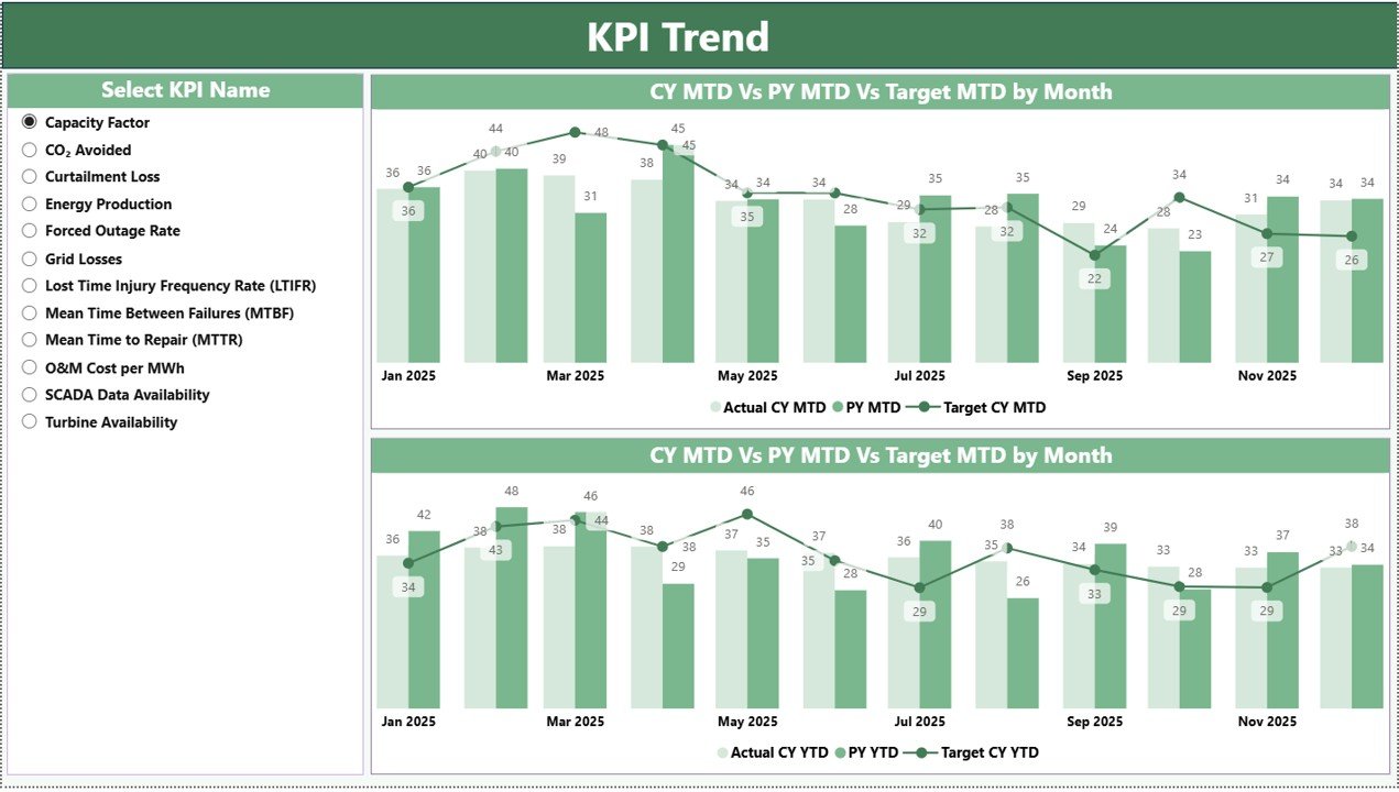
The KPI Trend Page focuses on analytical visualization.
Key Features
-
KPI Name slicer on the left
-
Two combo charts:
-
MTD Trend Analysis
-
YTD Trend Analysis
-
Each chart compares:
-
Current Year Actual
-
Previous Year Actual
-
Target Values
Because combo charts combine bars and lines, users easily identify growth patterns and performance deviations.
3️⃣ KPI Definition Page – Drill-Through Analysis
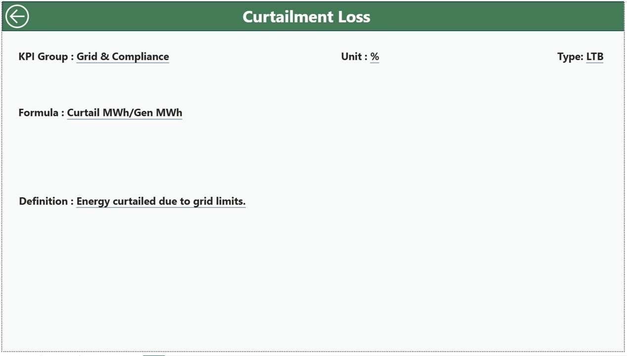
The KPI Definition Page works as a hidden drill-through page.
Users access it directly from the Summary Page.
Information Displayed
-
KPI Formula
-
KPI Definition
-
KPI Classification
-
Measurement details
Users simply drill through from a KPI row to see detailed explanations.
A back button on the top-left corner allows easy navigation to the main dashboard.
Excel Data Source Structure
The dashboard uses an Excel file as the data source. Users maintain data in three worksheets.
1️⃣ Input_Actual Sheet
Users enter actual KPI performance values.
Required fields:
-
KPI Name
-
Month (first date of month)
-
MTD Numbers
-
YTD Numbers
Power BI automatically updates visuals after refresh.
2️⃣ Input_Target Sheet
This sheet stores KPI targets.
Users input:
-
KPI Name
-
Month
-
Target MTD
-
Target YTD
These values drive performance comparison calculations.
3️⃣ KPI Definition Sheet
This sheet documents KPI metadata.
Fields include:
-
KPI Number
-
KPI Group
-
KPI Name
-
Unit
-
Formula
-
Definition
-
Type (LTB or UTB)
This ensures standardized KPI understanding across teams.
Click to Purchases Wind Energy Farms KPI Dashboard in Power BI
Which KPIs Should Wind Energy Farms Track?
Operational KPIs
-
Turbine Availability
-
Energy Production (MWh)
-
Capacity Factor
-
Downtime Hours
-
Grid Connectivity Rate
Maintenance KPIs
-
Mean Time Between Failures
-
Maintenance Response Time
-
Repair Cost per Turbine
Financial KPIs
-
Revenue per MW
-
Operating Cost Efficiency
-
Energy Sales Performance
Sustainability KPIs
-
Carbon Emission Reduction
-
Renewable Contribution Ratio
Tracking these KPIs ensures balanced performance management.
Click to Purchases Wind Energy Farms KPI Dashboard in Power BI
Advantages of Wind Energy Farms KPI Dashboard in Power BI
✅ Interactive Visualization
Users explore data dynamically using slicers.
✅ Centralized Reporting
All KPIs appear in one dashboard.
✅ Real-Time Insights
Data refresh updates analytics instantly.
✅ Easy Performance Comparison
MTD, YTD, and Previous Year analysis available together.
✅ Drill-Through Capability
Users access KPI definitions instantly.
✅ Scalable Analytics
Dashboard grows with operational expansion.
✅ Professional Reporting
Power BI visuals improve executive presentations.
How Does Power BI Improve Wind Farm Decision-Making?
Power BI converts raw operational data into actionable intelligence.
Faster Analysis
Managers identify performance issues immediately.
Predictive Insights
Trend charts reveal performance patterns.
Better Accountability
Teams monitor KPI responsibility clearly.
Strategic Planning
Historical comparisons support future planning.
Consequently, organizations operate proactively rather than reactively.
Click to Purchases Wind Energy Farms KPI Dashboard in Power BI
Best Practices for Wind Energy Farms KPI Dashboard in Power BI
Maintain Clean Data Structure
Keep Excel inputs standardized.
Refresh Data Regularly
Update dashboards monthly or weekly.
Focus on Critical KPIs
Avoid excessive metrics.
Validate KPI Definitions
Ensure consistent calculation logic.
Use Slicers Effectively
Filter data for focused analysis.
Train Users
Provide dashboard usage training.
Monitor Trends Continuously
Analyze long-term patterns instead of isolated months.
Who Can Use This Dashboard?
This dashboard supports multiple stakeholders:
-
Wind farm operators
-
Renewable energy companies
-
Operations managers
-
Energy analysts
-
Maintenance teams
-
Sustainability officers
-
Investors and executives
Why Use Power BI for Renewable Energy Analytics?
Advanced Visualization
Power BI provides rich interactive visuals.
Automation
Data refresh simplifies reporting.
Scalability
Handles large datasets efficiently.
Integration
Connects easily with Excel and other sources.
Executive-Level Reporting
Professional dashboards improve communication.
Therefore, Power BI becomes an ideal platform for renewable energy analytics.
Future Trends in Wind Energy Analytics
Wind energy analytics continues evolving rapidly.
Future dashboards may include:
-
IoT turbine data integration
-
Predictive maintenance AI models
-
Real-time weather analytics
-
Cloud-based monitoring systems
-
Automated anomaly detection
However, structured KPI dashboards remain the foundation of performance monitoring.
Click to Purchases Wind Energy Farms KPI Dashboard in Power BI
Conclusion: Drive Wind Farm Success with Power BI KPI Dashboards
Wind energy operations demand accurate monitoring and continuous improvement. Without structured analytics, organizations struggle to achieve operational excellence.
The Wind Energy Farms KPI Dashboard in Power BI provides a powerful solution by combining interactive visuals, KPI tracking, historical comparison, and drill-through insights into one centralized platform.
By implementing this dashboard, organizations can:
-
Improve operational efficiency
-
Track performance proactively
-
Optimize maintenance planning
-
Enhance strategic decision-making
Ultimately, KPI-driven analytics empowers wind energy companies to achieve sustainable growth and operational excellence.
Frequently Asked Questions (FAQs)
1. What is a Wind Energy KPI Dashboard in Power BI?
It is an interactive dashboard that tracks wind farm KPIs using Power BI visuals connected to Excel data.
2. Does the dashboard require coding knowledge?
No. Users operate it using Power BI interface features.
3. How often should data be updated?
Organizations typically update data monthly or weekly.
4. Can I customize KPIs?
Yes. You can modify KPI definitions and Excel data sources.
5. What data source does the dashboard use?
It uses structured Excel worksheets for Actual, Target, and KPI Definition data.
6. Can executives use this dashboard?
Yes. The dashboard provides executive-level performance insights.
7. Is Power BI suitable for renewable energy analytics?
Yes. Power BI supports advanced visualization and scalable analytics.
Click to Purchases Wind Energy Farms KPI Dashboard in Power BI
Visit our YouTube channel to learn step-by-step video tutorials