The global cloud hosting market is projected to exceed $200 billion by 2028, yet most small and mid-size hosting businesses still track revenue, server utilization, and SLA performance in disconnected spreadsheets. According to Gartner, over 60% of cloud cost overruns stem from inadequate visibility into infrastructure usage and billing cycle patterns. The Cloud Hosting Services Dashboard in Excel addresses this gap directly — delivering 5 interactive analysis pages, 20 pre-built charts, and multi-dimension slicer filters in a single, pivot-driven Excel file.
If your cloud hosting business tracks MRR, manages multiple data centers, or monitors support agent workloads, this dashboard replaces ad-hoc spreadsheet analysis with a structured, auto-refreshing reporting system. Setup takes under 10 minutes — replace the sample data, click Refresh All, and every chart updates automatically.
Click here to Purchase Cloud Hosting Services Dashboard in Excel
Key Features of Cloud Hosting Services Dashboard in Excel
The Cloud Hosting Services Dashboard in Excel is built around 5 core KPI cards and 20 pre-configured charts across 5 analysis pages. Here are the features that set it apart:
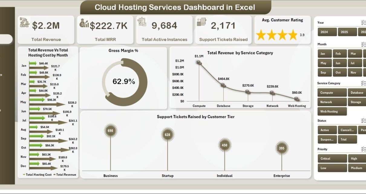
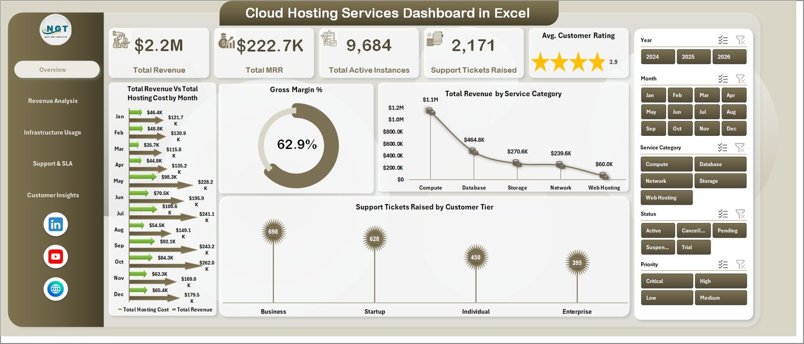
- 5 KPI Summary Cards on the Overview Page — Total Revenue, Total MRR, Total Active Instances, Support Tickets Raised, and Avg. Customer Rating give an at-a-glance hosting performance snapshot.
- 20 pre-built charts covering revenue trends, gross margin by data center, infrastructure provisioning, SLA cost allocation, and customer satisfaction by channel and industry.
- Multi-dimension slicer filters — filter all dashboard charts simultaneously by Data Center, Service Category, Customer Tier, Billing Cycle, Industry, and Acquisition Channel with a single click.
- Revenue vs. Hosting Cost monthly trend line — a side-by-side chart that makes Gross Margin % immediately visible without any manual calculations.
- Pivot-driven architecture — all charts are powered by pivot tables in a hidden Support Sheet. One click on Data → Refresh All in the Excel Ribbon refreshes every table and chart at once.
- No VBA, no macros — built on native Excel pivot tables and charts. Compatible with Microsoft Excel 2016 and above on Windows and Mac.
Dashboard Pages Explanation
Page 1: Overview
The Overview page is the executive summary of your cloud hosting operation. It displays 5 KPI cards — Total Revenue, Total MRR, Total Active Instances, Support Tickets Raised, and Avg. Customer Rating — alongside 4 charts: Total Revenue Vs Total Hosting Cost by Month, Gross Margin %, Total Revenue by Service Category, and Support Tickets Raised by Customer Tier. Multiple slicers across the top enable instant filtered views without navigating away from the page.
Page 2: Revenue Analysis
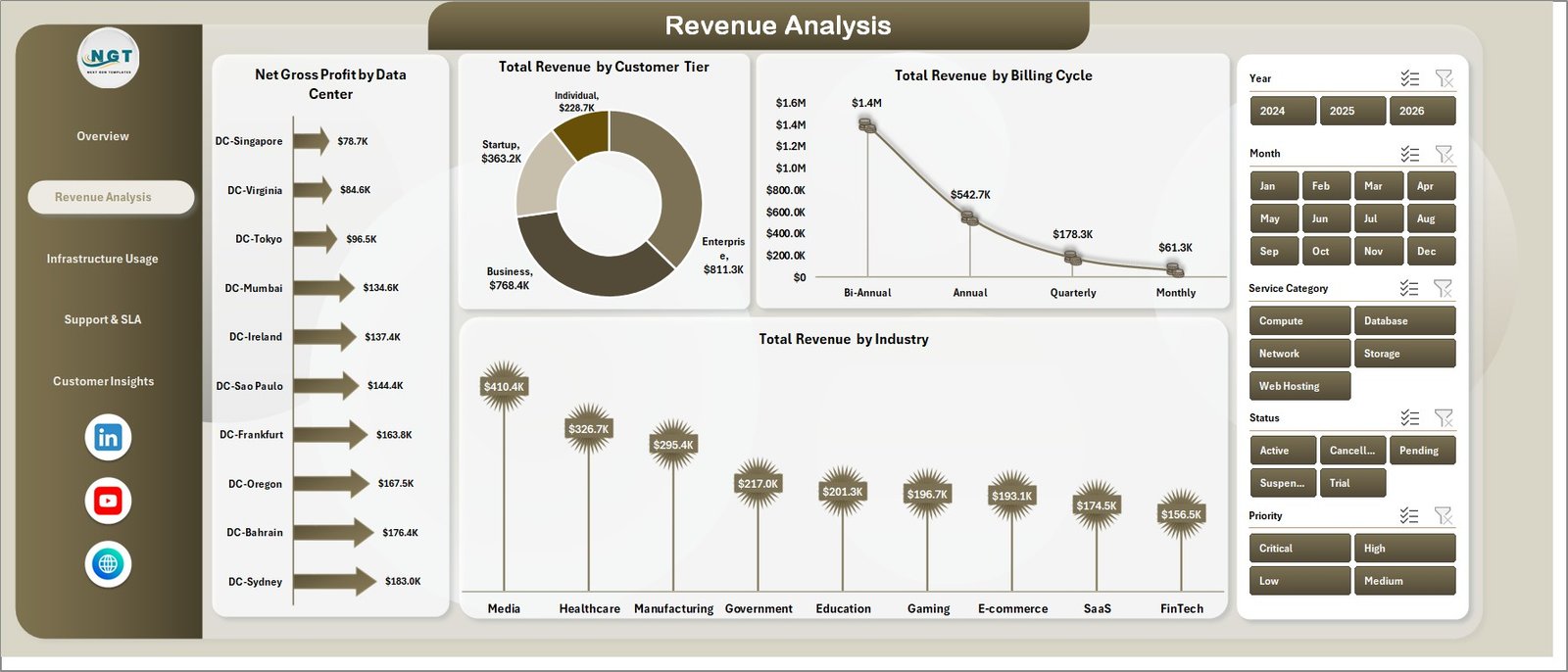
The Revenue Analysis page breaks down income across four dimensions: Net Gross Profit by Data Center, Total Revenue by Customer Tier, Total Revenue by Billing Cycle, and Total Revenue by Industry. This page answers the core commercial question — where is your highest-margin revenue coming from, and which billing models and customer segments drive it?
Page 3: Infrastructure Usage
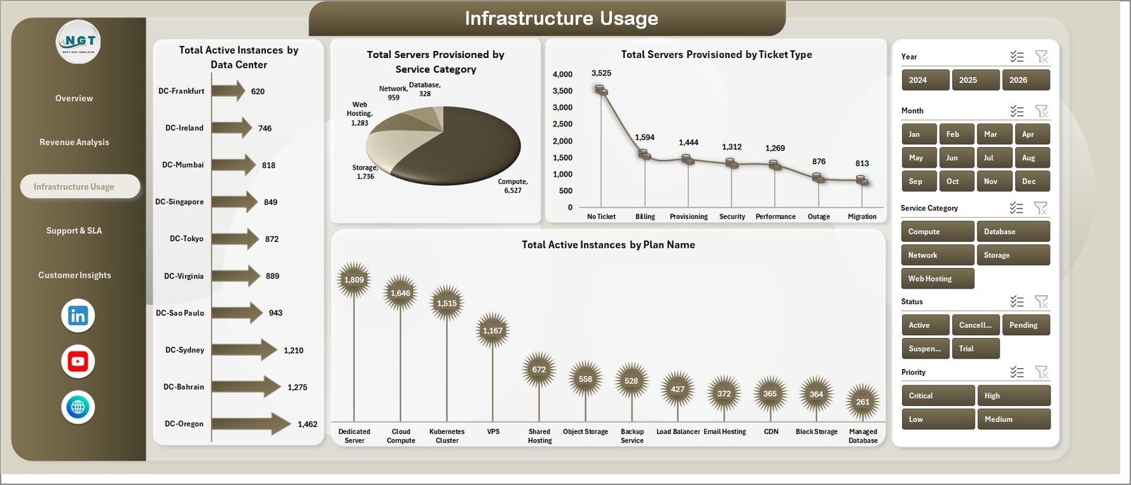
The Infrastructure Usage page provides full resource visibility with 4 charts: Total Active Instances by Data Center, Total Servers Provisioned by Service Category, Total Servers Provisioned by Ticket Type, and Total Active Instances by Plan Name. MSPs and hosting operators use this page to identify over-provisioned server capacity and right-size infrastructure spending.
Page 4: Support & SLA
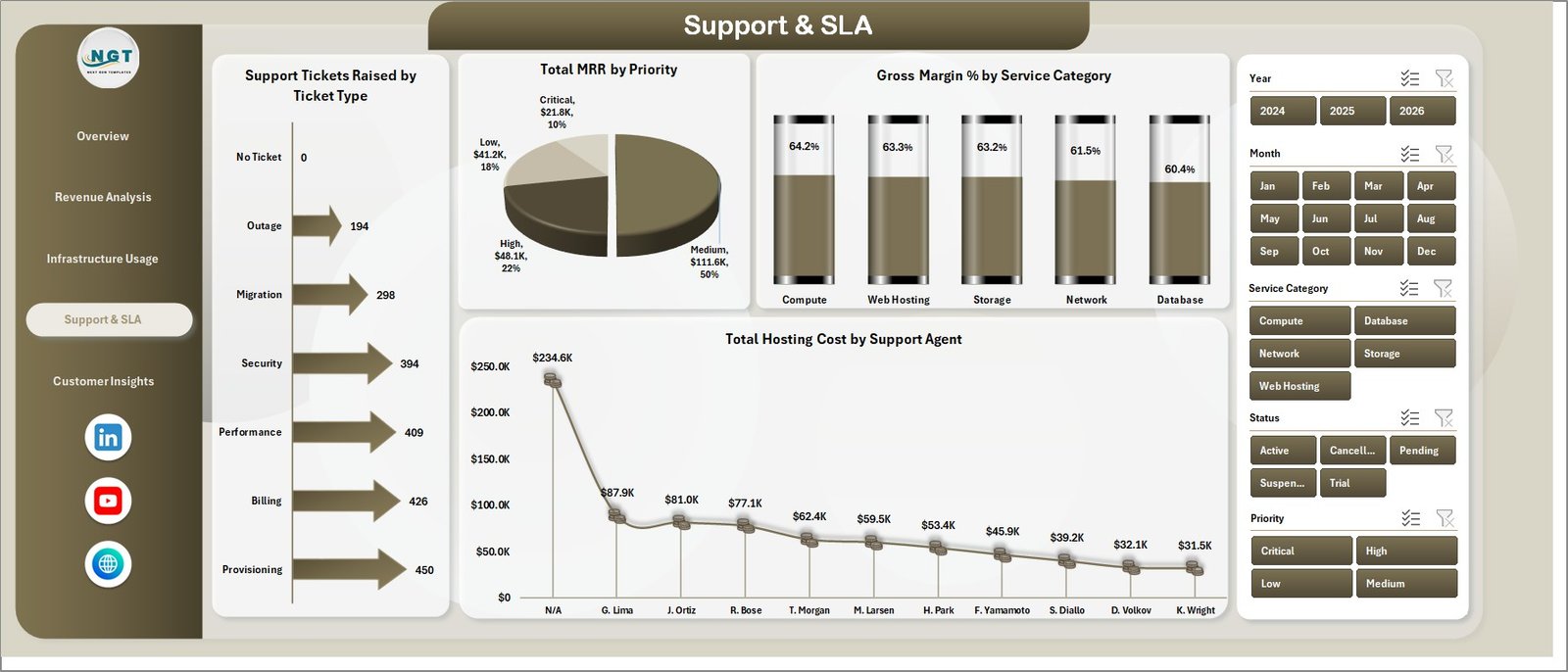
The Support & SLA page maps service delivery costs and agent performance with 4 charts: Support Tickets Raised by Ticket Type, Total MRR by Priority, Gross Margin % by Service Category, and Total Hosting Cost by Support Agent. This page enables operations managers to balance agent workloads, identify ticket categories that drive cost overruns, and evaluate gross margin against service-level tiers.
Page 5: Customer Insights
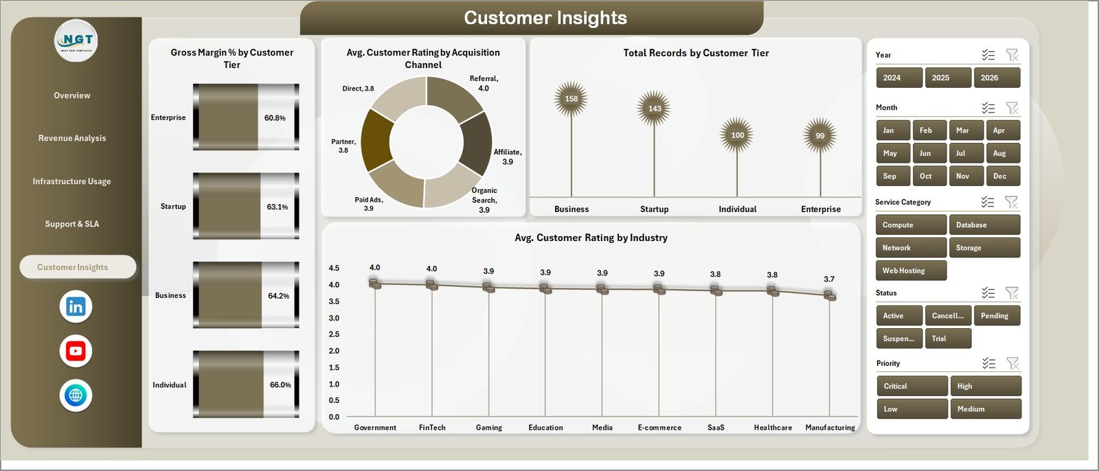
The Customer Insights page reveals satisfaction and profitability by customer segment through 4 charts: Gross Margin % by Customer Tier, Avg. Customer Rating by Acquisition Channel, Total Records by Customer Tier, and Avg. Customer Rating by Industry. This page informs pricing strategy, churn prevention, and acquisition channel investment decisions.
Data Sheet
The Data Sheet is where you enter all raw hosting records in a structured tabular format. Replace the sample data with your actual records — covering Data Center, Service Category, Customer Tier, Billing Cycle, Industry, Acquisition Channel, and all revenue and support metrics — and the full dashboard refreshes automatically.

Support Sheet
The Support Sheet houses all pivot tables that drive the dashboard charts. You can keep this sheet hidden. After updating the Data Sheet, click Data → Refresh All in the Excel Ribbon to refresh every pivot and every chart across all 5 dashboard pages simultaneously. This Microsoft Excel pivot refresh workflow requires no VBA or automation tools.

Cloud Hosting Services Dashboard in Excel vs. Google Sheets Dashboard vs. Paid Cloud Management SaaS — Feature Comparison
| Feature | Cloud Hosting Dashboard in Excel | Google Sheets Dashboard | CloudHealth / ManageEngine |
|---|---|---|---|
| Cost | ✅ $17.99 one-time | Free (limited) | $500–$2,000+/month |
| Platform | ✅ Microsoft Excel | Google Sheets | Web SaaS |
| Setup time | ✅ Under 10 minutes | 10–30 minutes | Days to weeks |
| Real-time collaboration | SharePoint/OneDrive | ✅ Yes | ✅ Yes |
| Mobile access | Excel mobile app | ✅ Yes | ✅ Yes |
| Customizable fields | ✅ Fully customizable | Moderate | Limited/rigid |
| Cloud KPIs + Charts | ✅ 5 KPIs + 20 charts | Manual setup required | Pre-built but rigid |
| Year-1 cost (5 users) | ✅ $17.99 total | $0–$50 | $6,000–$24,000+ |
| Data ownership | ✅ 100% yours | ✅ Google servers | Vendor servers |
For cloud hosting teams that need structured revenue and infrastructure analytics without enterprise SaaS pricing, the Cloud Hosting Services Dashboard in Excel sits in the sweet spot.
Who Should Use This Template
Perfect for:
- Cloud hosting businesses tracking MRR and revenue across multiple data centers and customer segments
- IT managers and MSPs monitoring server provisioning, active instances, and SLA compliance
- Finance and operations teams at hosting companies analyzing gross margin by service category and industry
- Teams already using Excel who want a structured SaaS analytics dashboard without a new software subscription
Not a fit if:
- You need automated real-time API pulls from AWS Cost Explorer, Azure Cost Management, or GCP billing
- Your team requires live data syncing with cloud billing systems without manual data entry
- You don’t have Microsoft Excel 2016 or above available on your devices
Real-World Use Cases
Ravi runs a cloud hosting company with 3 regional data centers across Asia. He uses the Cloud Hosting Services Dashboard in Excel monthly to compare Total Revenue against Total Hosting Cost per data center, spot which customer tiers generate the highest MRR, and identify billing cycles with the strongest retention — replacing a $900/month SaaS platform with a $17.99 one-time Excel download.
Sarah is an IT manager at a managed service provider serving 80 enterprise clients. She uses the Support & SLA page to track which ticket types consume the most agent hours, correlate Total Hosting Cost with SLA priority levels, and present weekly operational reports to leadership — without any additional software costs. She also references the Cybersecurity Report in Excel for her quarterly security posture reviews.
Ahmed’s fintech startup manages multi-cloud infrastructure costs across two providers. He uses the Infrastructure Usage page to monitor active instances by data center and plan name, spot over-provisioned servers, and build business cases for infrastructure right-sizing — complementing his Financial Tech Startups KPI Dashboard with hosting-specific cost visibility.
Advantages of Cloud Hosting Services Dashboard in Excel
- Time savings — teams that previously spent 4–6 hours per month manually compiling hosting reports reduce this to under 30 minutes after the initial data entry.
- Cost efficiency — at $17.99 for lifetime access, the dashboard pays for itself in the first month compared to any cloud analytics SaaS subscription.
- Flexibility — every field, chart, and pivot table can be customized without developer support. Add new dimensions to the Data Sheet and build new pivot tables in the Support Sheet independently.
- Offline access — unlike web-based SaaS tools, the Excel file works fully offline, making it suitable for operations in bandwidth-limited or security-restricted environments.
- Cross-platform compatibility — Excel 2016+ on both Windows and Mac ensures broad team access without license fragmentation.
Opportunities for Improvement
- No live API integration — data must be entered manually into the Data Sheet. Teams needing automated pulls from AWS, GCP, or Azure billing APIs will need to supplement with Power Query or an ETL tool.
- Single-user editing — while the file can be shared via SharePoint or OneDrive, simultaneous co-editing is more limited than in Google Sheets.
- No alerting or threshold triggers — the dashboard is visual-only. Teams needing automated alerts when KPIs breach thresholds will need to add conditional formatting rules or Excel notification macros manually.
Best Practices
- Standardize your Data Sheet column entries — consistent naming for Data Center, Service Category, and Customer Tier ensures slicer filters work correctly across all pages.
- Refresh after every data update — use Data → Refresh All immediately after pasting new records to ensure charts reflect the latest data.
- Keep the Support Sheet hidden — avoid accidental pivot modifications by hiding the Support Sheet in normal use. Unhide only when adding new pivot fields.
- Archive monthly snapshots — save a copy of the file at the end of each month to maintain a historical data trail alongside the rolling current view.
- Use slicers for client presentations — filter by Customer Tier or Data Center before screen-sharing to create tailored views for specific stakeholder audiences.
Explore Relevant Templates
🔹 SaaS Product Usage Dashboard in Excel — track feature adoption, active users, and engagement patterns for SaaS businesses.
🔹 Financial Tech Startups KPI Dashboard in Excel — monitor ARR, burn rate, and growth metrics for technology-focused businesses.
🔹 Cybersecurity Report in Excel — track incidents, vulnerability status, and IT security compliance metrics.
🔹 IT Hardware Upgrade Request Tracker in Excel — manage hardware refresh cycles and upgrade approvals across IT teams.
Also available in: SaaS Product Usage Dashboard in Power BI for teams using Power BI for cloud analytics reporting.
Frequently Asked Questions
What KPIs does the Cloud Hosting Services Dashboard in Excel track?
The Cloud Hosting Services Dashboard in Excel tracks 5 KPIs: Total Revenue, Total MRR, Total Active Instances, Support Tickets Raised, and Avg. Customer Rating. All 5 metrics appear as summary cards on the Overview page and update automatically across all 5 dashboard pages when you replace the sample data and click Refresh All.
How does this compare to CloudHealth or ManageEngine?
CloudHealth and ManageEngine deliver automated cloud billing integration but cost $500–$2,000+ per month, require IT setup, and lock you into vendor ecosystems. The Cloud Hosting Services Dashboard in Excel provides structured revenue, infrastructure, and SLA analytics for a one-time $17.99 purchase with no subscription, no per-user fees, and full data ownership.
Can I add my own KPIs or chart types to the dashboard?
Yes. All charts are driven by Excel pivot tables in the Support Sheet. Add new columns to the Data Sheet, create additional pivot fields in the Support Sheet, and build new charts as needed. No VBA or developer knowledge is required — everything uses standard Excel pivot table and chart functionality.
Does the Cloud Hosting Services Dashboard work on Excel for Mac?
Yes. The Cloud Hosting Services Dashboard in Excel is compatible with Microsoft Excel 2016 and above on both Windows and Mac. Slicer filtering and pivot refresh work natively on both platforms without any additional add-ins or plugins.
How do I update the dashboard with new monthly data?
Navigate to the Data Sheet and append your new hosting records below the existing rows using the same column format as the sample data. Then click Data → Refresh All in the Excel Ribbon. All pivot tables and charts across all 5 dashboard pages update automatically to reflect the new data.
Is there a Google Sheets version of this dashboard available?
NextGenTemplates offers cloud and SaaS analytics templates in Google Sheets format as well. You can browse the full catalog at nextgentemplates.com to find a Google Sheets cloud analytics dashboard that fits your workflow.
About the Author
Built by PK — Microsoft Certified Professional with 15+ years of Excel, Google Sheets, and Power BI experience. Founder of NextGenTemplates, reaching 300K+ subscribers across YouTube channels (@PK-AnExcelExpert, @NextGenTemplates, @NeoTechNavigators). Every template is hand-built and tested before release.
Conclusion
The Cloud Hosting Services Dashboard in Excel gives cloud hosting businesses, IT managers, and MSPs a structured, pivot-driven system for tracking revenue, infrastructure usage, SLA costs, and customer satisfaction — without paying enterprise SaaS prices or setting up complex API integrations. With 5 analysis pages, 20 pre-built charts, and multi-dimension slicer filters, it covers the full reporting stack in a single Excel file that you own for life.
Click here to Purchase Cloud Hosting Services Dashboard in Excel
Instant download · One-time payment · No subscription
📅 Last updated: May 2026
For more Excel dashboard tutorials, visit our YouTube channel: Youtube.com/@PK-AnExcelExpert