Knowledge Hubs Dashboard in Excel is a ready-to-use reporting workbook for teams that need to track knowledge hub traffic, content usage, support questions, downloads, content cost, revenue, helpful votes, quality rating, and net content value. In many organizations, knowledge content is spread across help centers, intranets, enablement portals, FAQs, and training libraries. The challenge is not only creating content, but knowing which hub, topic, author team, channel, or content type is creating measurable value.
This Excel dashboard gives teams a structured way to review those signals in one place. Instead of building a report from a blank workbook, users can replace the sample data, refresh the workbook, and use slicers to explore the dashboard pages. You can download the product here: Knowledge Hubs Dashboard in Excel.
Key Features of Knowledge Hubs Dashboard in Excel
- Seven worksheet tabs for Overview, Hub Performance, Content Mix, Engagement, Cost Value, Data Sheet, and Support Sheet.
- High-level KPI cards for Total Visitors, Total Page Views, Total Downloads, and Total Questions.
- Interactive slicers for quick filtering across dashboard pages.
- Charts for revenue, content cost, downloads, page views, helpful votes, question answer percentage, quality rating, and net content value.
- Editable Data Sheet where users can paste their own knowledge hub records in the same format.
- Support Sheet with pivot tables used to create the dashboard dynamically.
- Excel-based workflow with Refresh All after updating the source data.
Dashboard Pages Explanation
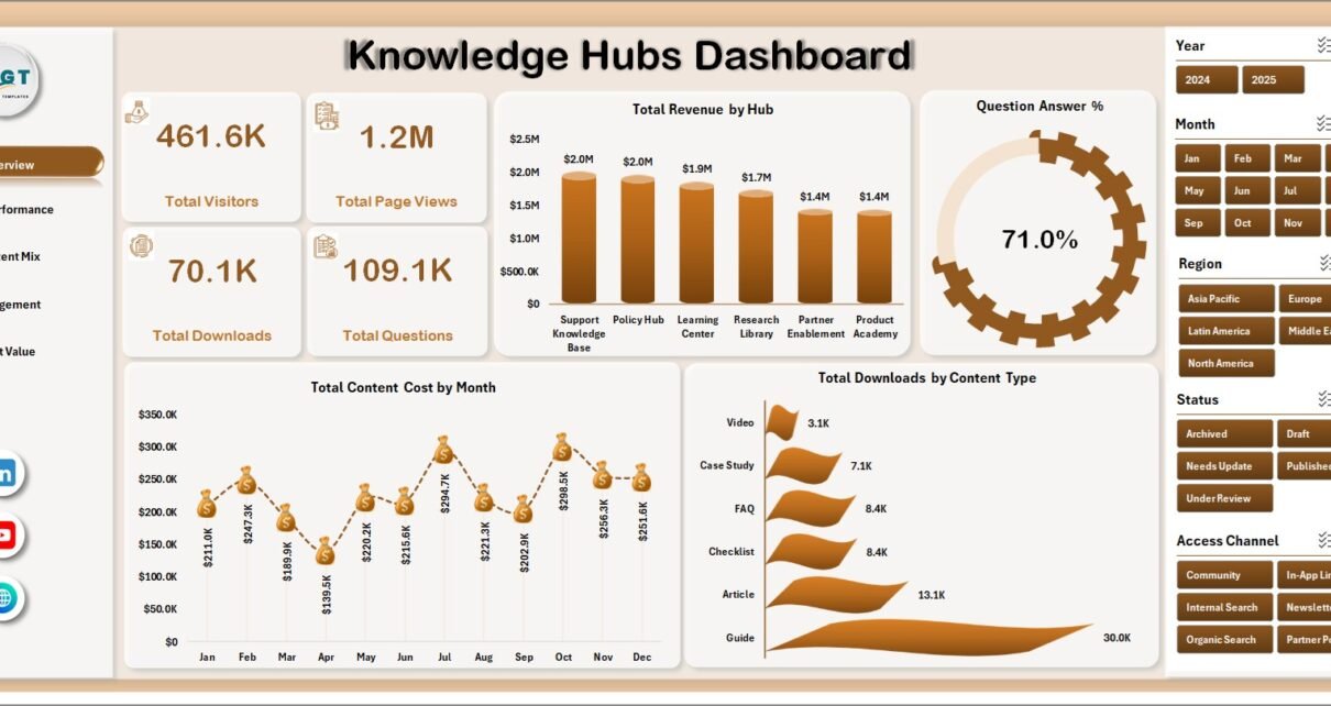
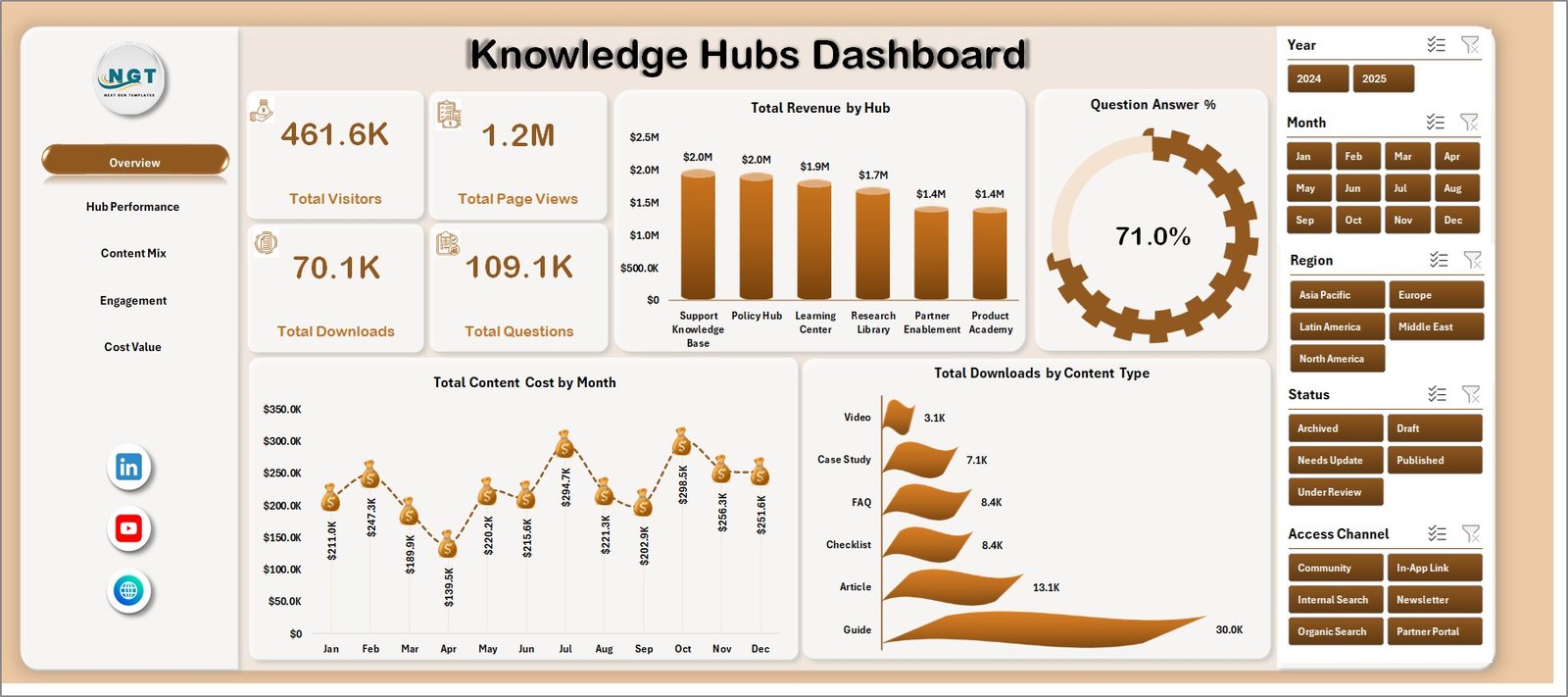
1. Overview Page
The Overview page gives managers a fast summary of total visitors, total page views, total downloads, and total questions. These cards are useful for measuring whether the knowledge hub is attracting users, answering demand, and driving engagement.
Total Revenue by Hub: This chart compares revenue across different knowledge hubs. It helps identify which hubs are generating the highest commercial or internal value.
Question Answer % by Overall Dashboard: This visual shows the overall question answer percentage. It helps teams understand whether knowledge content is reducing unanswered or unresolved questions.
Total Content Cost by Month: This monthly trend tracks content investment over time. It helps managers see whether content cost is increasing, stable, or aligned with planned publishing cycles.
Total Downloads by Content Type: This chart compares download activity by content type. It helps identify whether guides, templates, FAQs, checklists, or other formats are being used most often.
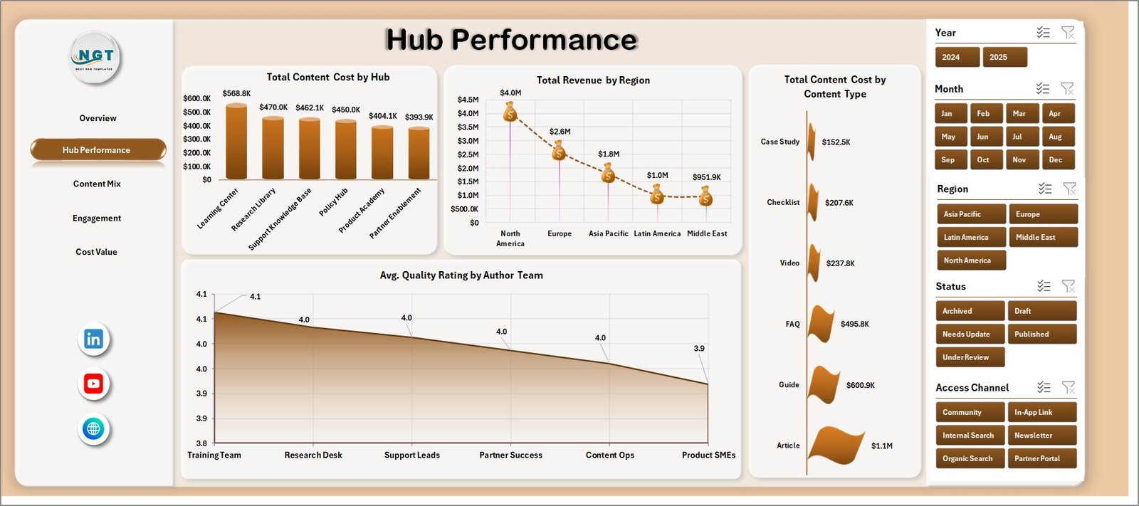
2. Hub Performance
The Hub Performance tab compares knowledge hubs by cost, revenue, content type, region, and author team performance. It is designed for managers who need to see which hubs are performing well and where content investment may need review.
Total Content Cost by Hub: This chart shows how much content investment is assigned to each hub. It helps spot hubs that may be consuming high cost without matching value.
Total Revenue by Region: This view compares revenue across regions. It helps teams understand where knowledge hub usage or monetization is strongest.
Total Content Cost by Content Type: This chart breaks content cost by format or type. It helps managers compare the cost of producing articles, downloads, videos, FAQs, or other content groups.
Avg. Quality Rating by Author Team: This visual compares content quality ratings by author team. It helps identify teams producing consistently high-rated content and teams that may need review or support.
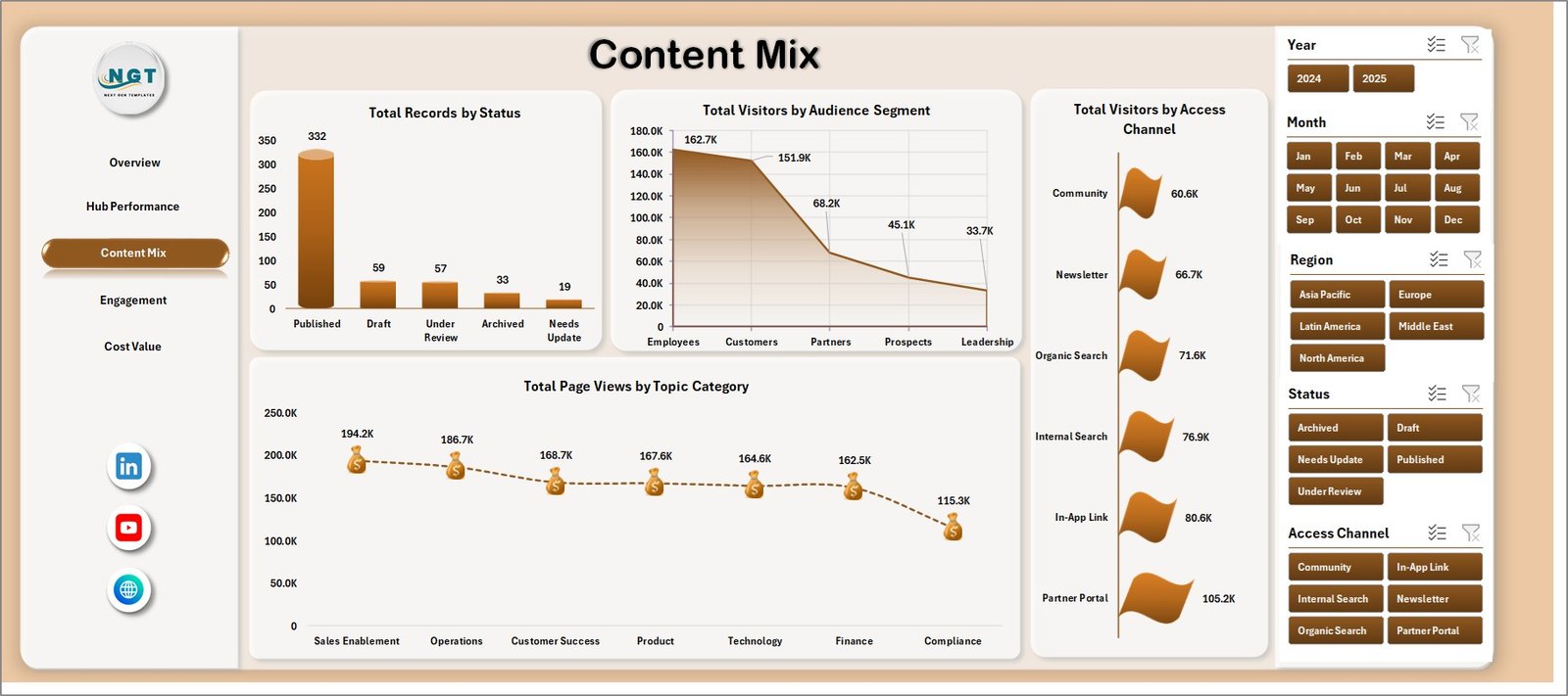
3. Content Mix
The Content Mix page explains how knowledge records are distributed by status, audience segment, access channel, and topic category. This page is useful for content operations planning because it connects content structure with user behavior.
Total Records by Status: This chart shows how many content records are active, draft, archived, pending, or in another workflow status. It helps teams manage publishing and cleanup work.
Total Visitors by Audience Segment: This chart compares visitors by audience group. It helps identify whether employees, customers, partners, students, or other audiences are using the hub.
Total Visitors by Access Channel: This visual shows visitor activity by channel. It helps teams understand whether users arrive through direct access, search, internal navigation, email, or other paths.
Total Page Views by Topic Category: This chart compares topic categories by page views. It helps content teams identify topics that attract the most attention.
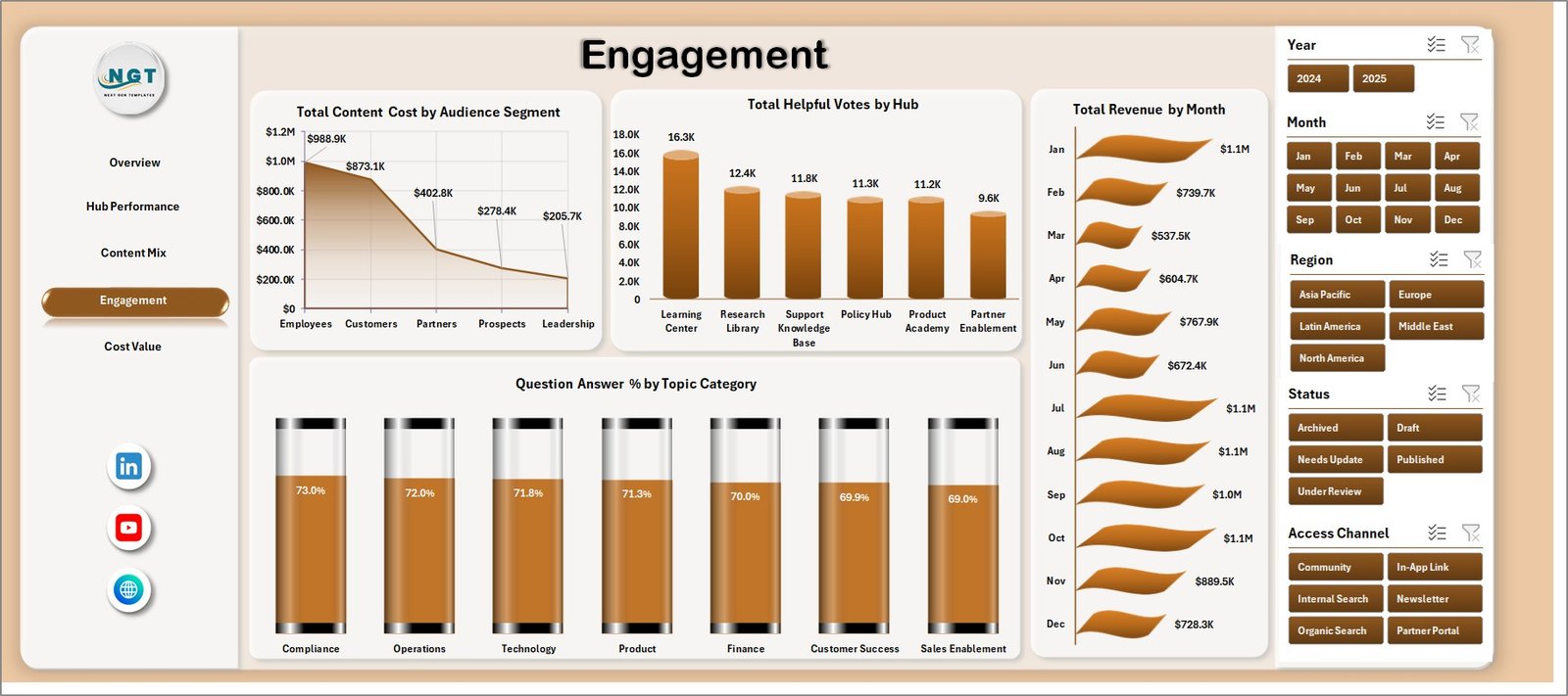
4. Engagement
The Engagement page focuses on helpful votes, revenue, cost, audience segments, hubs, months, and topic categories. It is useful for understanding not only traffic, but whether users interact with the knowledge content in meaningful ways.
Total Content Cost by Audience Segment: This chart compares content investment by audience group. It helps teams check whether cost is aligned with the audiences they serve most.
Total Helpful Votes by Hub: This visual compares helpful votes across hubs. It helps identify which hubs provide content that users find useful.
Total Revenue by Month: This trend shows revenue movement month by month. It helps connect knowledge content activity with commercial or internal value over time.
Question Answer % by Topic Category: This chart compares answer percentage by topic. It helps identify categories where users may still need clearer or more complete content.
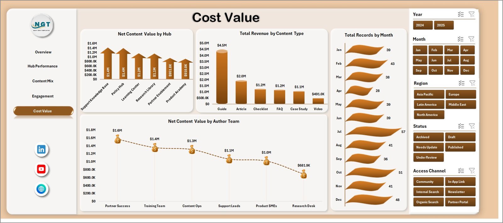
5. Cost Value
The Cost Value tab connects investment with return. It helps managers compare revenue, records, content type, hubs, author teams, and net content value before making content budget decisions.
Net Content Value by Hub: This chart compares value after considering revenue and content cost. It helps identify hubs that are delivering strong returns and hubs that may need optimization.
Total Revenue by Content Type: This visual compares revenue across content types. It helps teams see which formats are connected with the highest value.
Total Records by Month: This chart tracks how many records were created or maintained over time. It helps users spot publishing cycles, workload spikes, or inactive periods.
Net Content Value by Author Team: This chart compares net value by author team. It helps leaders understand which content teams are producing the strongest value relative to cost.
6. Data Sheet Tab
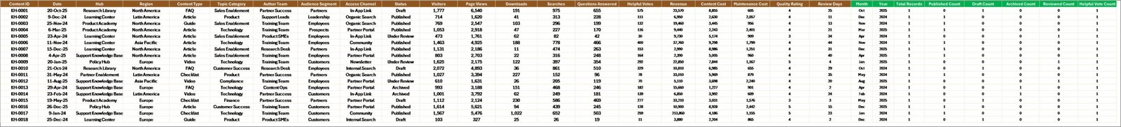
The Data Sheet is where users add or replace the source data. Keep the same structure and column format so the pivot tables, slicers, and charts can refresh correctly.
7. Support Sheet
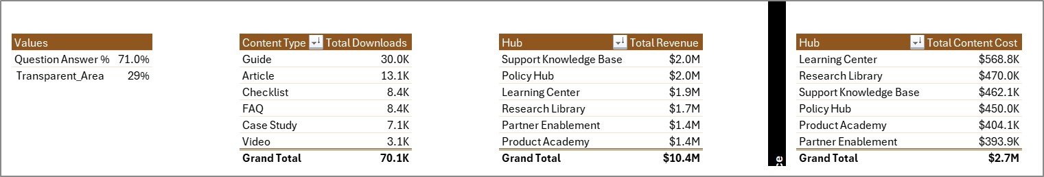
The Support Sheet contains the pivot tables used to create the entire dashboard dynamically. After updating the Data Sheet, go to the Data tab in the Excel Ribbon and click Refresh All. The pivots and charts refresh together, and this sheet can remain hidden during normal dashboard use.
Knowledge Hubs Dashboard in Excel vs. Google Sheets vs. Paid CRM/SaaS – Feature Comparison
| Feature | Knowledge Hubs Dashboard in Excel | Google Sheets alternative | Paid SaaS alternative |
|---|---|---|---|
| Cost | $17.99 one-time | Template cost or manual build | Monthly or annual subscription |
| Platform | Microsoft Excel | Google Sheets in browser | Confluence, Notion, Zendesk, BI, or CRM platform |
| Setup time | Replace data and refresh | Copy file and adjust formulas | Configuration, integrations, and onboarding |
| Real-time team collaboration | Possible through OneDrive or SharePoint | Native sharing | Usually included |
| Mobile access | Excel mobile or web for light review | Google Sheets mobile app | Vendor mobile app or browser |
| Customizable fields | Editable workbook, charts, and pivots | Editable with permissions | Often limited by admin settings or plan |
| Share with link | Possible through Microsoft 365 | Native share links | Role-controlled sharing |
| Year-1 cost at 5 users | $17.99 plus Excel licensing if needed | Low software cost plus setup time | Often hundreds or thousands |
| Knowledge hub analytics | Built for hubs, topics, audience, engagement, cost, revenue, and value | Must be configured | Depends on platform analytics and plan |
Who Should Use This Template
This template is a strong fit for knowledge managers, help center owners, content operations teams, customer support analysts, training and enablement teams, internal communications teams, and Excel users who need a practical dashboard for content performance review.
It is not a replacement for a live help desk, LMS, CMS, knowledge base publishing platform, ticketing system, or automated content workflow. Use it as an Excel reporting layer after exporting or preparing your knowledge hub data.
Real-World Use Cases
Ananya, knowledge manager: opens the Overview and Hub Performance pages before monthly content review meetings to compare visitors, page views, downloads, questions, revenue, and content cost by hub.
Rahul, support operations lead: uses Engagement to compare helpful votes and question answer percentage by topic category so the team can improve content where users still need support.
Meera, content operations analyst: uses Cost Value to compare net content value by hub and author team before recommending which topics deserve more investment.
Advantages of Knowledge Hubs Dashboard in Excel
- It gives knowledge teams a ready reporting structure instead of a blank workbook.
- It combines traffic, engagement, quality, cost, revenue, and value metrics in one file.
- It uses familiar Excel features like sheets, charts, pivots, and slicers.
- It can be edited by experienced Excel users without waiting for a software vendor.
- It works well for monthly hub performance meetings, content planning, and budget review.
Opportunities for Improvement
The dashboard is refresh-based, so it does not replace real-time analytics, automated tagging, article publishing, AI search scoring, permissions, or live support workflows. Larger teams may want to connect Excel to a governed data source, add Power Query transformations, or publish a controlled copy through Microsoft 365. Microsoft explains how PivotTables summarize worksheet data in its documentation: Overview of PivotTables and PivotCharts.
Best Practices
- Keep hub, topic category, content type, audience segment, region, author team, status, and access channel names consistent.
- Validate visitor, page view, download, question, helpful vote, cost, revenue, and rating fields before refreshing.
- Refresh the workbook after each data update using Data, then Refresh All.
- Keep one clean backup of the original workbook before changing pivot tables or chart fields.
- Hide the Support Sheet when sharing the dashboard with users who only need the analysis pages.
Explore Relevant Templates
You can download this product here: Knowledge Hubs Dashboard in Excel. You may also like Knowledge Hubs KPI Dashboard in Excel, Knowledge Hubs KPI Dashboard in Power BI, and IoT Services Dashboard in Excel.
Frequently Asked Questions
What does the Knowledge Hubs Dashboard in Excel track?
It tracks visitors, page views, downloads, questions, question answer percentage, content cost, revenue, helpful votes, average quality rating, records, and net content value.
How many worksheet tabs are included?
The workbook includes seven tabs: Overview, Hub Performance, Content Mix, Engagement, Cost Value, Data Sheet, and Support Sheet.
Do I need macros to use this dashboard?
No. The dashboard uses standard Excel sheets, pivot tables, charts, and slicers.
Can I use my own knowledge hub data?
Yes. Replace the sample rows in the Data Sheet with your own records while keeping the same column structure.
Can the Support Sheet be hidden?
Yes. The Support Sheet can remain hidden because it mainly stores the pivot tables that power the dashboard.
Is this a live knowledge base platform?
No. It is an Excel reporting dashboard, not a CMS, ticketing system, search platform, or live help center analytics tool.
About the Author
Built by PK – Microsoft Certified Professional with 15+ years of Excel, Google Sheets, and Power BI experience. Founder of NextGenTemplates, reaching 300K+ subscribers across YouTube channels. Every template is hand-built and tested before release.
Conclusion
The Knowledge Hubs Dashboard in Excel gives content, support, and knowledge management teams a clear way to review hub performance from one workbook. Instead of juggling disconnected exports, users can update the Data Sheet, refresh the workbook, and use slicers to review hub performance, content mix, engagement, and cost value.
Visit our YouTube channel for step-by-step tutorials: Youtube.com/@PK-AnExcelExpert.