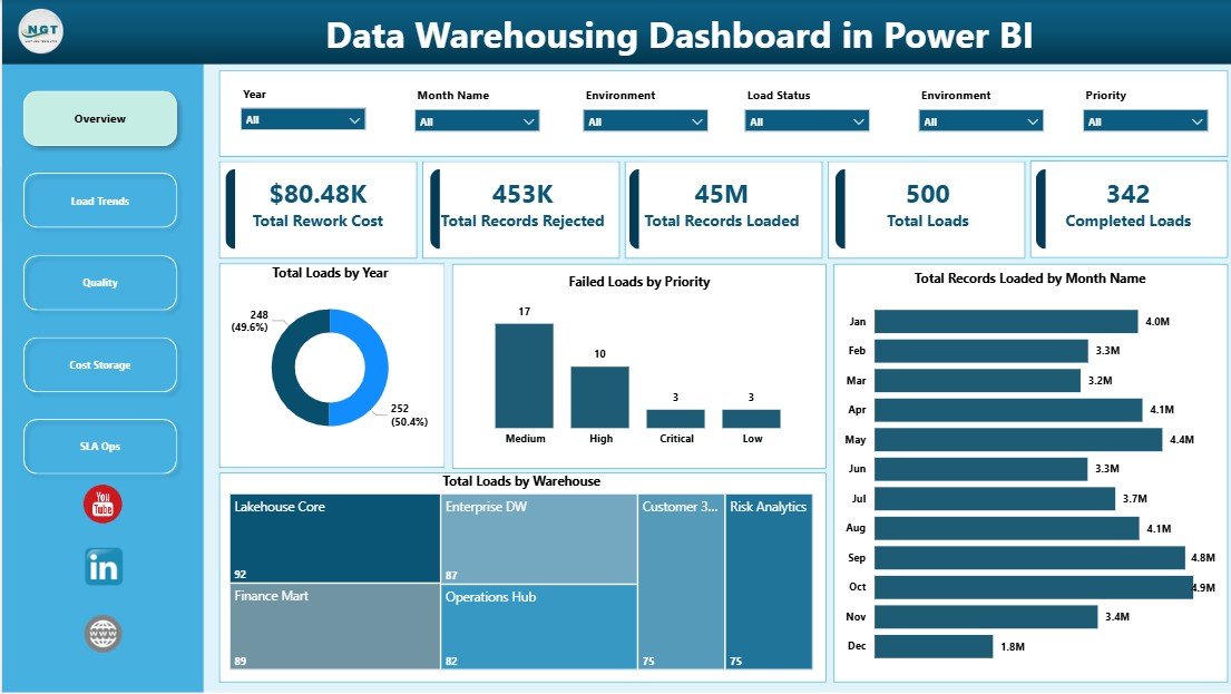
The Data Warehousing Dashboard in Power BI helps data teams monitor 5 critical warehouse operations areas: load volume, completion status, rejected records, rework cost, and SLA performance. Across 5 interactive report pages, the dashboard turns warehouse load logs into a visual operating review that managers can use for daily checks, weekly performance meetings, and monthly leadership reporting.
Data warehouse teams often run hundreds or thousands of scheduled loads each month. Even a small failure rate can create delayed reporting, rejected records, avoidable rework, and higher compute cost. This Power BI template gives teams a practical way to see those patterns without building a report model from a blank page.
Click here to purchase the Data Warehousing Dashboard in Power BI.
Key Features of Data Warehousing Dashboard in Power BI
This dashboard is designed for operational clarity. Instead of showing only one KPI, it combines load activity, quality, cost, and SLA performance into one connected Power BI report.
- 5 report pages: Overview, Load Trends, Quality, Cost Storage, and SLA Ops.
- Executive KPI cards: Total Rework Cost, Total Records Rejected, Total Records Loaded, Total Loads, and Completed Loads.
- Power BI slicers: Filter the report by operational dimensions such as warehouse, month, priority, data source, owner team, environment, region, data domain, and SLA status.
- Load performance analysis: Review load counts by year, month, warehouse, load type, and quality status.
- Quality monitoring: Track rejected records, failed loads, and rework cost by source and ownership area.
- Cost visibility: Compare compute and rework cost across regions, environments, and data domains.
- SLA operations view: Monitor whether loads are meeting service-level expectations and where missed loads are concentrated.
The file is provided as an editable Power BI template. You can open it in Power BI Desktop, replace the sample data, adjust visuals, and publish it to Power BI Service if your team uses scheduled refresh or shared workspaces. If you are new to Power BI Desktop, Microsoft provides a useful introduction here: What is Power BI Desktop?
Dashboard Pages Explanation
1. Overview Page
The Overview page is the first screen for leadership and operational review. At the top, KPI cards summarize Total Rework Cost, Total Records Rejected, Total Records Loaded, Total Loads, and Completed Loads.
Total Rework Cost shows the estimated cost of fixing quality, load, or processing issues. This gives managers a financial signal for operational waste.
Total Records Rejected counts records that did not pass load or quality checks. It helps teams understand the volume of data that needs correction or investigation.
Total Records Loaded shows total processed volume. It is useful for understanding warehouse throughput and the scale of reporting activity.
Total Loads tracks how many load events were attempted. This provides a clean activity measure for batch, incremental, or scheduled processing.
Completed Loads highlights the number of loads that finished successfully. Comparing completed loads with total loads gives an immediate reliability read.
Total Loads by Year: This chart shows annual load volume so teams can see whether warehouse processing is increasing, declining, or staying stable. It supports capacity planning and year-over-year operational review.
Failed Loads by Priority: This chart separates failures by priority level, making it clear whether high-priority pipelines are breaking more often. It helps teams decide which issues deserve urgent recovery work.
Total Records Loaded by Month Name: Monthly loaded-record volume shows seasonal or recurring processing peaks. Teams can use this chart to plan compute capacity and understand workload timing.
Total Loads by Warehouse: This chart compares load volume across warehouse destinations. It helps identify overloaded warehouses, underused environments, or operational concentration in one platform.

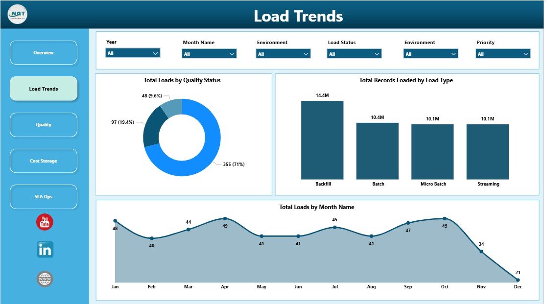
2. Load Trends
The Load Trends page explains how data movement changes over time and by operational type. It is useful for data engineers, BI leads, and managers who want to understand whether warehouse activity is predictable or volatile.
Total Loads by Quality Status: This chart separates loads by quality result so teams can quickly see passed, failed, or warning-status activity. It reveals whether quality issues are isolated events or part of a larger pattern.
Total Records Loaded by Load Type: This chart compares record volume by load type, such as full loads, incremental loads, or other configured categories. It helps teams understand which processing method carries the largest data volume.
Total Loads by Month Name: This chart shows monthly load frequency. It helps identify busy periods, quiet months, and abnormal spikes that may need deeper review.
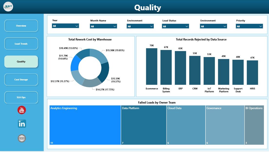
3. Quality
The Quality page focuses on rejected records, failed loads, and the cost of fixing warehouse issues. It gives teams a practical way to discuss data reliability by warehouse, source system, and ownership area.
Total Rework Cost by Warehouse: This chart shows which warehouse areas generate the highest correction cost. It helps leaders decide where to investigate data-quality problems first.
Total Records Rejected by Data Source: This chart identifies source systems or feeds that create the most rejected records. It is useful for supplier reviews, source-system cleanup, and recurring defect reduction.
Failed Loads by Owner Team: This chart maps failures to responsible teams. It supports accountability, daily standups, and focused follow-up after repeated breakages.
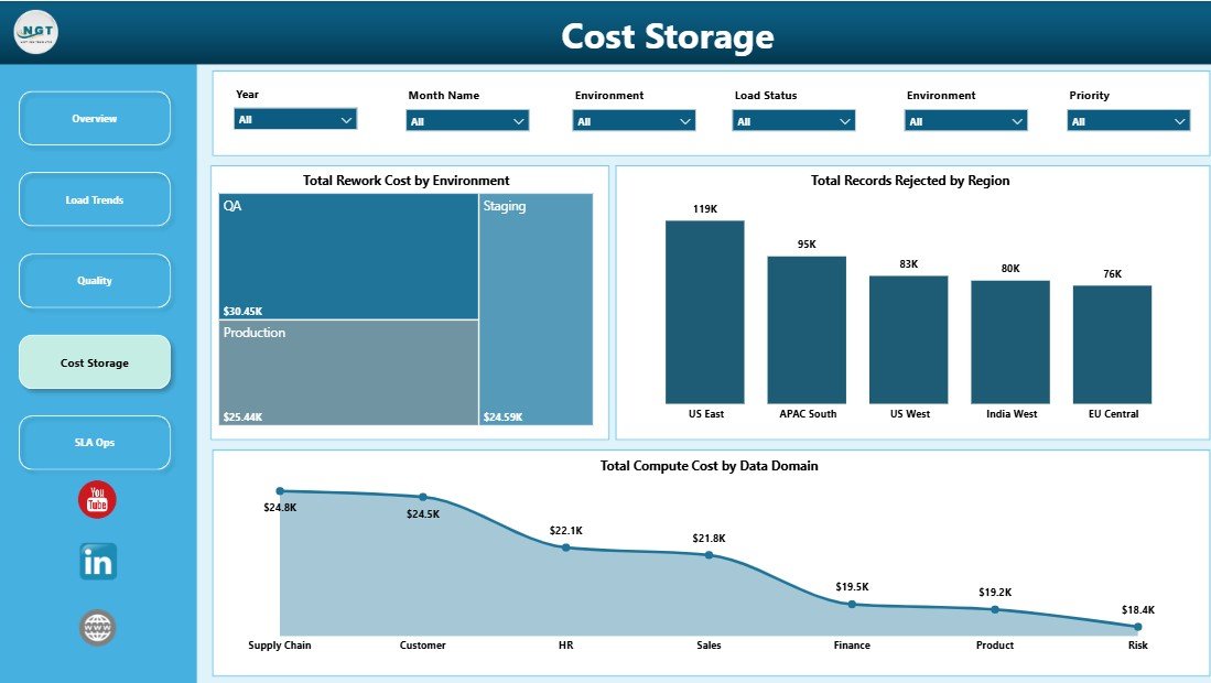
4. Cost Storage
The Cost Storage page connects data warehouse activity to cost and resource consumption. It is especially useful for teams that need to explain cloud warehouse spend or rework cost to leadership.
Total Rework Cost by Environment: This chart compares correction cost across environments such as production, testing, development, or staging. It helps teams separate live operational waste from pre-production testing issues.
Total Records Rejected by Region: This chart shows rejected records by region. It helps businesses spot whether data-quality issues are concentrated in specific geographies or operating units.
Total Compute Cost by Data Domain: This chart breaks compute cost down by subject area or domain. It helps teams find expensive data domains and prioritize optimization work.
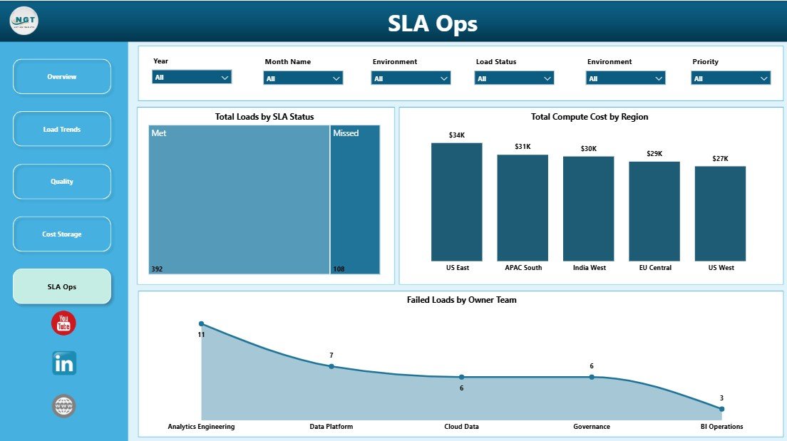
5. SLA Ops
The SLA Ops page is built for reliability review. It shows whether loads are meeting service-level expectations and which teams or regions need attention.
Total Loads by SLA Status: This chart divides loads into SLA categories such as met, missed, or at risk. It gives operations teams a fast way to see current reliability performance.
Total Compute Cost by Region: This chart compares processing cost across regions. It supports budgeting, regional chargeback, and cloud-cost optimization reviews.
Failed Loads by Owner Team: This chart highlights which teams own the most failed loads. It helps managers assign follow-up work and reduce repeated failures.
Data Warehousing Dashboard in Power BI vs. Tableau or Qlik vs. Paid Data Observability SaaS – Feature Comparison
| Feature | Data Warehousing Dashboard in Power BI | Tableau or Qlik Build | Paid Data Observability SaaS |
|---|---|---|---|
| Cost | $17.99 one-time | License cost plus development time | Recurring platform fees |
| Platform | Power BI Desktop and Power BI Service | Tableau or Qlik | Vendor-hosted cloud tool |
| Setup time | Minutes after data replacement | Hours or days to design | Days or weeks of implementation |
| Real-time team collaboration | Available when published to Power BI Service | Available in vendor platform | Available in vendor platform |
| Mobile access | Available through Power BI mobile app | Available through vendor apps | Available through vendor apps |
| Customizable fields | Full Power BI model access | Full model access | Often limited to vendor schema |
| Share with link | Yes, through Power BI Service | Yes | Yes |
| Year-1 cost at 5 users | $17.99 plus your Power BI licensing | Often hundreds or thousands | Often thousands or more |
| Load quality reporting | Built in | Custom build required | Advanced |
| Compute and rework cost analysis | Built in | Custom build required | Often available in higher plans |
Who Should Use This Template
The Data Warehousing Dashboard in Power BI is a good fit for data engineering teams, BI teams, analytics managers, IT operations teams, and consultants who need a professional reporting layer for warehouse load activity.
It is also useful for small and mid-size teams that do not want to invest in a full observability platform but still need management-ready visibility into rejected records, failed loads, SLA status, and compute cost.
This template is not intended to replace real-time alerting tools, incident management systems, or automated data observability agents. Think of it as a practical reporting and review dashboard for structured warehouse operations data.
Real-World Use Cases
Arjun, Data Engineering Lead: Arjun uses the Overview and SLA Ops pages before his weekly platform review. He can quickly show how many loads completed, which teams owned failed loads, and whether high-priority pipelines met SLA expectations.
Priya, BI Consultant: Priya uses the dashboard as a client-ready Power BI deliverable. Instead of spending days building the base report, she connects the client data and customizes the visuals to match their reporting terminology.
Marcus, IT Finance Analyst: Marcus reviews compute cost by region and data domain to support monthly cost conversations. He uses the dashboard to identify expensive domains and discuss optimization priorities with data platform owners.
Advantages of Data Warehousing Dashboard in Power BI
- Fast reporting start: The dashboard structure is already built, so teams can focus on data mapping and interpretation.
- Clear operational language: Loads, records, cost, quality, and SLA status are easy for technical and non-technical stakeholders to understand.
- Editable Power BI model: Users can adjust visuals, fields, measures, and formatting based on their internal reporting needs.
- Better accountability: Owner-team views make it easier to identify where failed-load follow-up should happen.
- Cost awareness: Compute and rework cost pages help teams connect warehouse activity with financial impact.
Opportunities for Improvement
This template is designed as a Power BI reporting dashboard, not a live incident-response tool. Teams that need automatic alerts, streaming observability, anomaly detection, or incident-ticket creation may still need a dedicated monitoring platform. The dashboard also depends on the quality of the input data: if source logs use inconsistent owner-team, status, or region names, slicers and charts will be harder to interpret.
Best Practices
- Keep warehouse, environment, priority, owner team, and SLA status values standardized.
- Refresh the report on a consistent reporting schedule, such as daily, weekly, or monthly.
- Use the Overview page for leadership meetings and the detailed pages for root-cause discussion.
- Validate rejected-record and rework-cost definitions before sharing the dashboard with executives.
- Publish to Power BI Service only after checking permissions and data sensitivity.
Explore Relevant Templates
If you want a spreadsheet version, see the Data Warehousing Dashboard in Excel. For related Power BI reporting, explore the Data Privacy Office Dashboard in Power BI and the full Power BI Dashboard Templates collection.
Frequently Asked Questions
What is the Data Warehousing Dashboard in Power BI used for?
It is used to monitor warehouse load activity, completed loads, rejected records, rework cost, compute cost, quality status, and SLA performance in Power BI.
Does the dashboard include multiple pages?
Yes. It includes Overview, Load Trends, Quality, Cost Storage, and SLA Ops pages.
Can I use my own data?
Yes. You can replace the sample data with your own warehouse load records and refresh the report.
Do I need paid Power BI licensing?
You can open and edit the .pbix file in Power BI Desktop. A paid Power BI Service license may be needed if you want sharing, workspaces, or scheduled refresh.
Is this suitable for data engineering teams?
Yes. It is built around data engineering and warehouse operations metrics such as loads, failures, rejected records, owner teams, and SLA status.
Can I customize the dashboard?
Yes. You can edit the Power BI visuals, measures, fields, colors, and pages to match your reporting process.
About the Author
Built by PK – Microsoft Certified Professional with 15+ years of Excel, Google Sheets, and Power BI experience. Founder of NextGenTemplates, reaching 300K+ subscribers across YouTube channels. Every template is hand-built and tested before release.
Conclusion
The Data Warehousing Dashboard in Power BI gives data teams a clear way to monitor load performance, data quality, rejected records, rework cost, compute cost, and SLA operations. It is practical, editable, and built for teams that want insight from warehouse operations data without starting from a blank Power BI file.
Click here to purchase the Data Warehousing Dashboard in Power BI.
For step-by-step tutorials, visit YouTube.com/@PK-AnExcelExpert.
Last updated: June 2026