Music Festivals Dashboard in Power BI is built for festival organizers, event managers, sponsorship teams, and entertainment finance analysts who need one place to review ticket revenue, festival revenue, cost, net profit, occupancy, customer rating, and sponsor ROI. Music festivals often involve several moving parts: ticket tiers, venue choices, organizer performance, regional cost differences, sales channels, and genre-level profitability. When these numbers live in different spreadsheets or exports, leadership reviews become slow and reactive.
This Power BI dashboard template gives you 5 report pages, 5 KPI cards, multiple slicers, and 16 focused chart views in an editable .pbix file. You can open it in Power BI Desktop, replace the sample source with your own festival data, refresh the model, and start reviewing performance from overview to sponsor ROI. For Power BI setup guidance, Microsoft also provides official documentation for creating reports in Power BI Desktop.
Key Features of Music Festivals Dashboard in Power BI
- 5 Power BI report pages: Overview Page, Revenue Trend, Festival Mix, Audience, and Sponsor ROI.
- 5 executive KPI cards: Total Ticket Revenue, Total Festival Revenue, Total Festival Cost, Tickets Sold, and Net Profit.
- Revenue tracking: Analyze festival revenue, ticket revenue, sales channel revenue, yearly performance, monthly performance, and quarterly performance.
- Cost and profit analysis: Review festival cost, net profit, and profit margin across regions, months, genres, and selected dashboard filters.
- Audience performance: Compare average customer rating, occupancy rate, city performance, region performance, venue type, and sales channel impact.
- Festival mix insights: Compare ticket tier demand, organizer revenue, organizer cost, and venue type utilization.
- Editable .pbix file: Adjust visuals, labels, relationships, measures, report pages, and theme choices in Power BI Desktop.
Dashboard Pages Explanation
1 – Overview Page
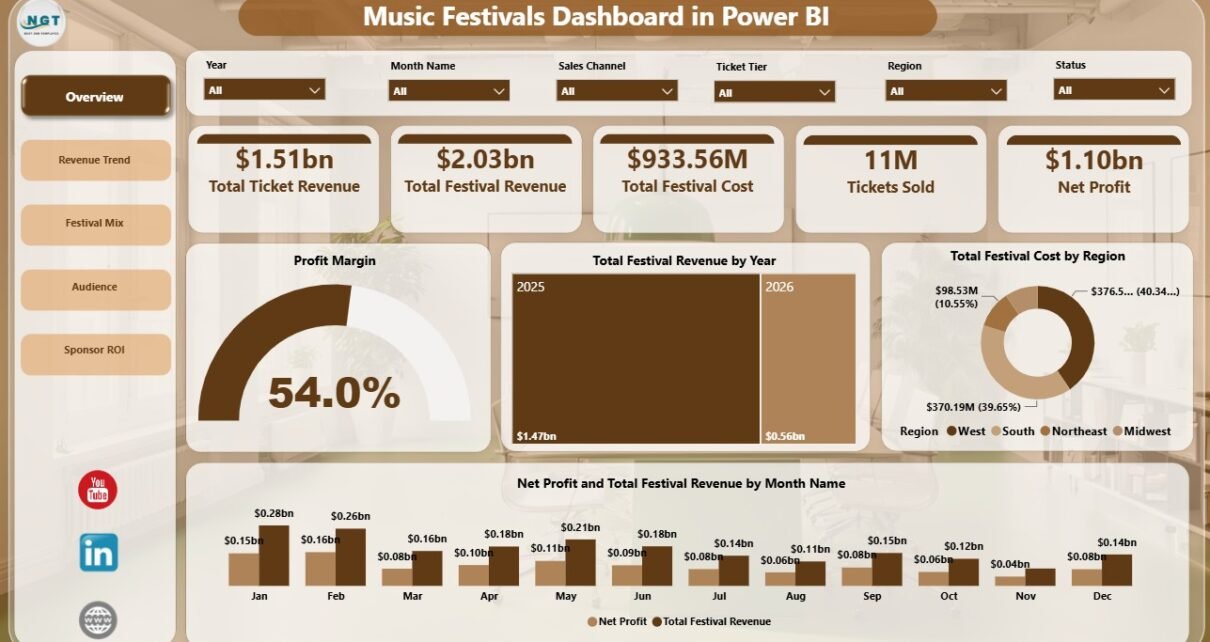
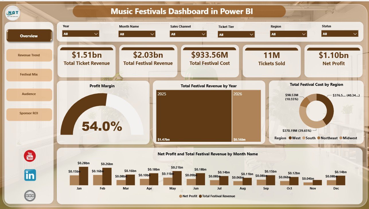
The Overview Page is the main executive view for the Music Festivals Dashboard in Power BI. At the top, the cards display Total Ticket Revenue, Total Festival Revenue, Total Festival Cost, Tickets Sold, and Net Profit. These KPIs help users understand event demand, revenue scale, expense pressure, and profitability before drilling into deeper pages.
Profit Margin by Dashboard Selection: This chart shows profit margin based on the selected filters. It is useful when users want to compare profitability by festival, region, city, organizer, genre, or another dashboard dimension.
Total Festival Revenue by Year: This visual shows year-wise festival revenue. It helps leadership understand whether the festival portfolio is growing, declining, or staying stable over time.
Total Festival Cost by Region: This chart compares regional cost pressure. It helps teams identify regions where venue costs, vendor costs, staffing, logistics, or production expenses may need closer review.
Net Profit and Total Festival Revenue by Month Name: This monthly chart compares revenue and profit together. It helps reveal whether high-revenue months are also profitable or whether costs are reducing margin.
2 – Revenue Trend
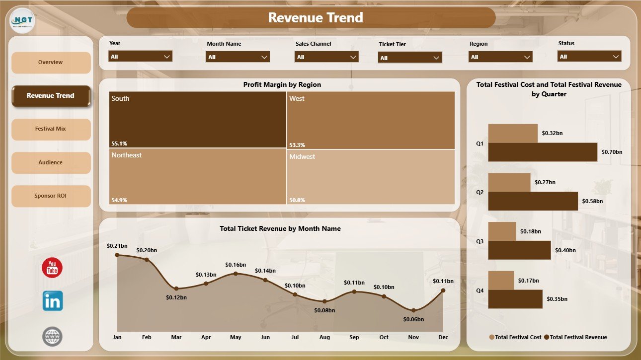
The Revenue Trend page focuses on the financial movement of the festival business. This page is useful for finance reviews, monthly performance meetings, quarterly planning, and seasonality analysis.
Profit Margin by Region: This chart compares margin across regions. It helps users find the markets where festivals are financially healthier and the regions where costs or pricing may need attention.
Total Ticket Revenue by Month Name: This chart displays ticket revenue by month. It helps teams identify high-demand periods, weaker months, and possible campaign or seasonality effects.
Total Festival Cost and Total Festival Revenue by Quarter: This visual compares quarterly revenue and cost together. It helps users see whether quarterly revenue growth is supported by controlled expenses.
3 – Festival Mix
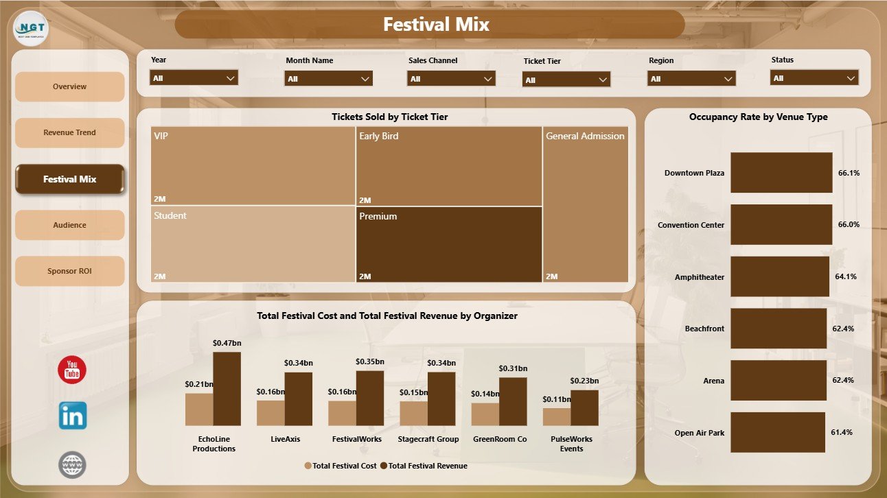
The Festival Mix page explains the shape of the festival portfolio. It shows how ticket tiers, venue types, organizers, revenue, and cost behave across the selected data.
Tickets Sold by Ticket Tier: This chart compares ticket sales by tier. It helps organizers understand whether VIP, general admission, early bird, premium, or other ticket categories are driving demand.
Occupancy Rate by Venue Type: This visual compares venue utilization by venue type. It helps teams decide whether certain venue formats are consistently filling better than others.
Total Festival Cost and Total Festival Revenue by Organizer: This chart compares organizer-level revenue and cost. It helps identify organizers that produce strong revenue while keeping expenses controlled.
4 – Audience
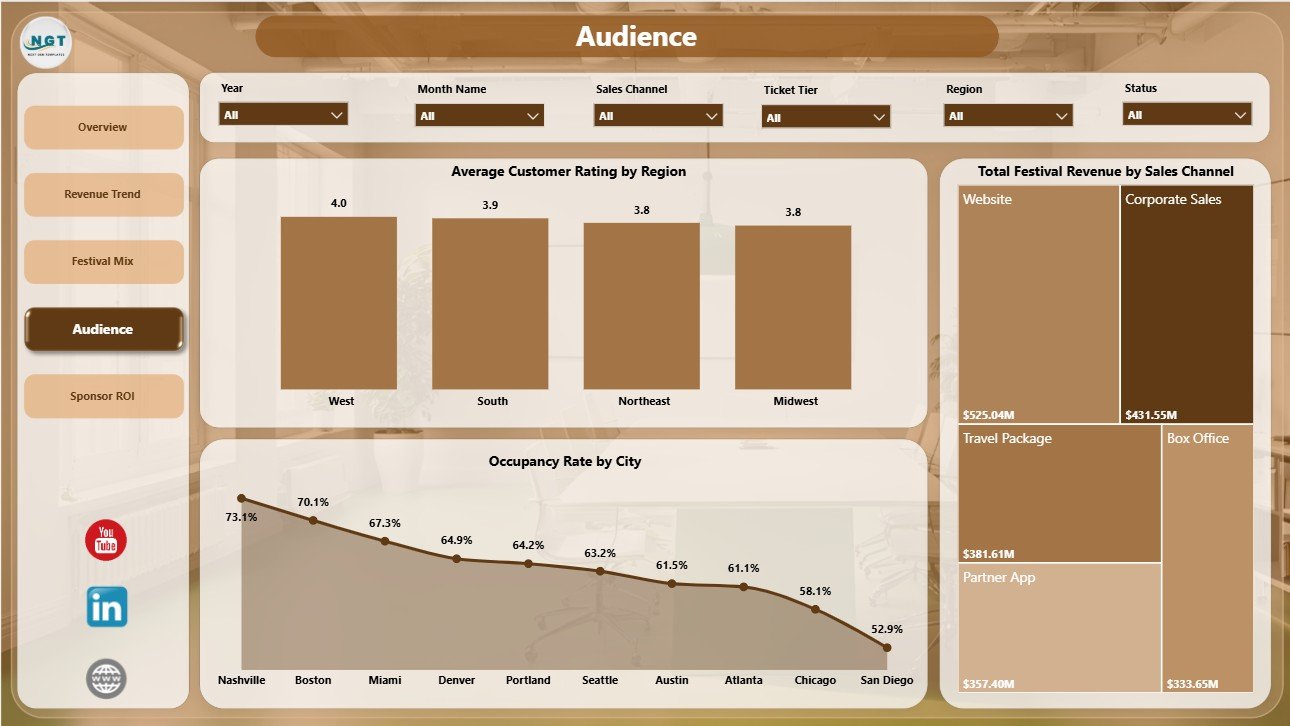
The Audience page is designed for marketing, venue, and customer experience review. It connects region-level rating, city-level occupancy, and revenue by sales channel.
Average Customer Rating by Region: This chart compares customer satisfaction by region. It helps teams identify markets where audience experience is strong and markets where service, venue, lineup, or operations may need improvement.
Occupancy Rate by City: This visual compares venue fill rate by city. It supports future event planning by showing where audience demand is strong enough to support repeat events or larger venues.
Total Festival Revenue by Sales Channel: This chart compares revenue from sales channels. It helps teams review whether direct sales, partners, online channels, agencies, or other sources are contributing the most revenue.
5 – Sponsor ROI
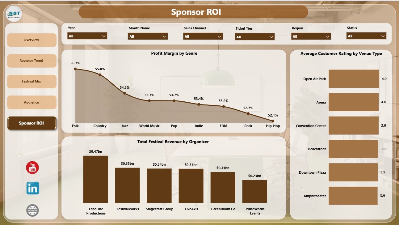
The Sponsor ROI page supports sponsor, partner, and profitability discussions. It brings together genre margin, organizer revenue, and venue-type customer rating so teams can connect audience experience with commercial performance.
Profit Margin by Genre: This chart compares margin by music genre. It helps users see whether certain festival styles are more profitable after cost and revenue are considered.
Total Festival Revenue by Organizer: This chart ranks organizer revenue. It helps show which organizers are contributing the most to overall festival revenue.
Average Customer Rating by Venue Type: This visual compares rating by venue type. It helps evaluate whether audience experience changes between stadiums, arenas, outdoor grounds, clubs, or other venue formats.
Music Festivals Dashboard in Power BI vs. Tableau vs. Paid Event SaaS – Feature Comparison
| Feature | This Power BI template | Tableau or Qlik alternative | Paid event SaaS |
|---|---|---|---|
| Cost | One-time template purchase | License and development cost | Recurring subscription |
| Platform | Power BI Desktop and Power BI Service | BI platform setup required | Vendor-hosted system |
| Setup time | Open .pbix, replace source, refresh | Build data model and visuals | Implementation and onboarding |
| Real-time team collaboration | Available after publishing to Power BI Service | Available depending on plan | Usually available by plan |
| Mobile access | Available through Power BI mobile after publishing | Available depending on plan | Usually included |
| Customizable fields | Editable visuals, model, labels, relationships, and measures | Editable with BI skills | Depends on vendor permissions |
| Share with link | Available through Power BI Service permissions | Available by plan | Depends on seats and access rules |
| Year-1 cost at 5 users | Template cost plus any Microsoft licensing needed | Often hundreds or thousands | Often hundreds or thousands |
| Festival-specific metrics | Ticket revenue, festival revenue, cost, net profit, margin, ratings, occupancy, organizers, genres, and sponsor ROI | Must be built or adapted | Depends on purchased modules |
Who Should Use This Template
This template is a good fit for music festival organizers, concert promoters, venue managers, sponsorship managers, entertainment finance teams, event operations teams, and Power BI consultants building reports for the music and live events industry.
It is especially useful when your team already exports event records from ticketing systems, spreadsheets, finance files, CRM tools, or event management platforms and wants a reporting layer in Power BI. It is not designed to replace operational systems such as ticket checkout, artist booking, payment processing, customer service, or live crowd management.
Real-World Use Cases
Maya, festival operations lead: uses the Audience and Festival Mix pages to compare occupancy by city and venue type before deciding which venues should be reused for the next season.
Daniel, sponsorship manager: uses the Sponsor ROI page to review genre margin, organizer revenue, and venue-type rating before preparing sponsor renewal conversations.
Priya, event finance analyst: uses the Overview and Revenue Trend pages to prepare a monthly leadership summary covering revenue, cost, net profit, ticket sales, and margin by region.
Advantages of Music Festivals Dashboard in Power BI
- Faster reporting: The report pages are already structured, so users do not need to start from a blank Power BI file.
- Clear executive KPIs: The cards show the core numbers a festival team usually wants first.
- Segmented analysis: Pages separate revenue, festival mix, audience, and sponsor ROI instead of forcing every visual onto one page.
- Editable model: Power BI users can update relationships, measures, field names, colors, and visuals.
- One-time cost: The dashboard is a downloadable template, not a recurring event SaaS subscription.
Opportunities for Improvement
Like any template, this dashboard works best when your source data is clean and consistently structured. Teams with complex ticketing rules, live API feeds, multi-currency reporting, or advanced sponsor attribution may need to add extra tables, measures, or report pages. If you use multiple systems for ticketing, marketing, sponsorship, and finance, you may also need a data preparation step before loading the final source into Power BI.
Best Practices
- Keep field names and data types consistent when replacing the sample source.
- Validate revenue, cost, net profit, and ticket totals against your source system before sharing the report.
- Use slicers during review meetings instead of duplicating report pages for every region or organizer.
- Separate actual data entry or exports from the Power BI report file so refreshes remain cleaner.
- Document any custom measures you add, especially if multiple people will maintain the dashboard.
- Publish to Power BI Service only after checking that sensitive financial and sponsor data has the right permissions.
Explore Relevant Templates
You can download the Music Festivals Dashboard in Power BI from NextGenTemplates. You may also find the Music Festivals Dashboard in Excel useful if your team prefers spreadsheet-based reporting. For a related Power BI event analytics product, see the Concert Promoters Dashboard in Power BI.
Frequently Asked Questions
What is included in the Music Festivals Dashboard in Power BI?
It includes 5 report pages: Overview Page, Revenue Trend, Festival Mix, Audience, and Sponsor ROI. It also includes KPI cards, slicers, and chart views for revenue, cost, net profit, tickets, margin, ratings, occupancy, organizers, regions, cities, genres, and channels.
Can I use this dashboard with my own festival data?
Yes. Open the .pbix file in Power BI Desktop, connect or replace the sample source, keep the key field structure aligned, and refresh the model.
Do I need paid Power BI to edit the file?
No. You can edit the .pbix file in Power BI Desktop. Power BI Pro or another Microsoft license may be needed if you want to publish and share through Power BI Service.
Is this template only for music festivals?
It is designed for music festivals, but it can often be adapted for concerts, event series, cultural festivals, entertainment events, venue programs, or promoter reporting if the fields are similar.
Does this replace a ticketing system?
No. It is an analytics dashboard. It does not sell tickets, process payments, book artists, issue refunds, or manage live event operations.
Can I customize the report pages?
Yes. The Power BI file is editable, so you can change pages, visuals, measures, labels, colors, and data relationships based on your reporting needs.
About the Author
Built by PK – Microsoft Certified Professional with 15+ years of Excel, Google Sheets, and Power BI experience. Founder of NextGenTemplates, reaching 300K+ subscribers across YouTube channels. Every template is hand-built and tested before release.
Conclusion
The Music Festivals Dashboard in Power BI gives event teams a practical way to review festival revenue, ticket revenue, cost, net profit, audience response, occupancy, organizer performance, genre margin, and sponsor ROI in one editable report. Instead of stitching together separate exports before every meeting, users can refresh the model and review the same structured dashboard pages.
Download the Music Festivals Dashboard in Power BI and start analyzing your festival performance with a ready Power BI template.
For more tutorials, visit youtube.com/@PKAnExcelExpert.