Mutual Funds Dashboard in Excel is a ready-to-use Excel dashboard template for advisors, fund analysts, mutual fund distributors, wealth teams, and finance professionals who need one place to review portfolio value, investment, returns, gain/loss, expenses, dividends, redemptions, investor mix, fund category performance, and risk exposure.
The workbook includes 7 worksheet tabs, 5 headline KPI cards, 19 chart views, slicers for quick filtering, a Data Sheet for source records, and a Support Sheet with pivot tables. Instead of building separate reports for fund trend, category mix, investor analysis, and risk-return review, users can update the data sheet and refresh the Excel dashboard from the Data tab.
Click here to purchase the Mutual Funds Dashboard in Excel
Key Features of Mutual Funds Dashboard in Excel
- 7 worksheet tabs – Overview Page, Fund Trend, Category Mix, Investor View, Risk Return, Data Sheet, and Support Sheet.
- 5 KPI cards – Total Current Value, Total Investment, Net Gain Loss, Portfolio Return %, and Total Expenses.
- Interactive slicers – Filter dashboard pages quickly by available fields such as year, month, region, channel, category, plan type, investor type, and risk level.
- Portfolio performance analysis – Track current value, investment, gain/loss, returns, expenses, dividends, redemptions, units, folios, and satisfaction.
- Excel pivot-table engine – The Support Sheet powers the charts dynamically and can be refreshed after data changes.
- Editable Data Sheet – Replace the sample rows with your own mutual fund records in the same format.
Dashboard Pages Explanation
1 – Overview Page
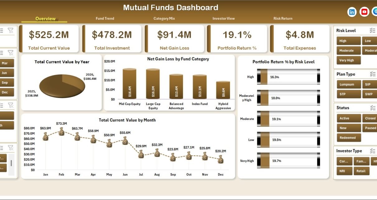
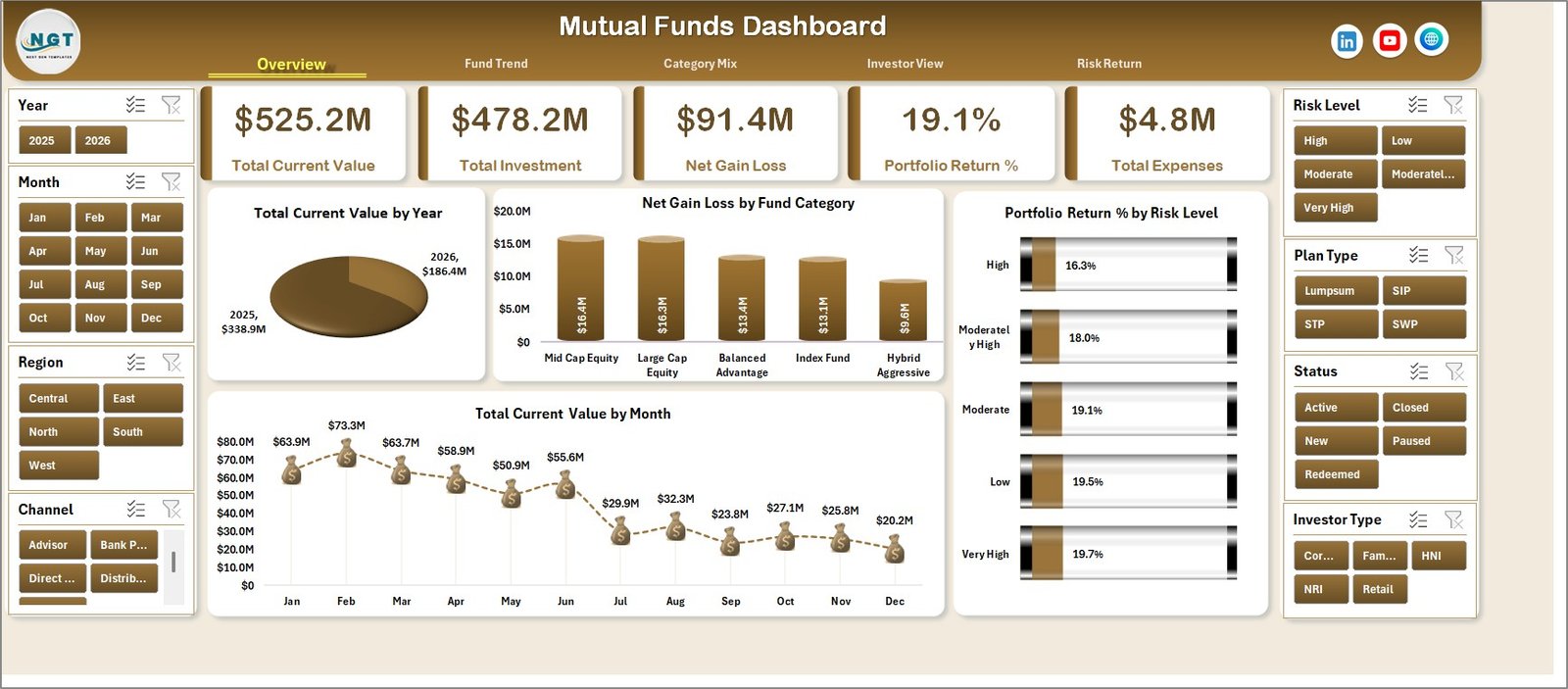
The Overview Page gives a leadership-style summary of mutual fund portfolio performance. The top cards show Total Current Value, Total Investment, Net Gain Loss, Portfolio Return %, and Total Expenses, so users can quickly understand value, money invested, profit or loss, return percentage, and total cost.
Total Current Value by Year: This chart shows year-wise current value. It helps users see whether portfolio value is growing, declining, or remaining stable across years.
Net Gain Loss by Fund Category: This chart compares gain or loss by fund category. It helps identify which categories are supporting portfolio growth and which need deeper review.
Portfolio Return % by Risk Level: This view compares return percentage across risk bands. It helps users judge whether higher-risk funds are producing enough return to justify their exposure.
Total Current Value by Month: This chart tracks current value by month. It helps spot seasonal movement, market impact, and month-to-month portfolio change.
2 – Fund Trend
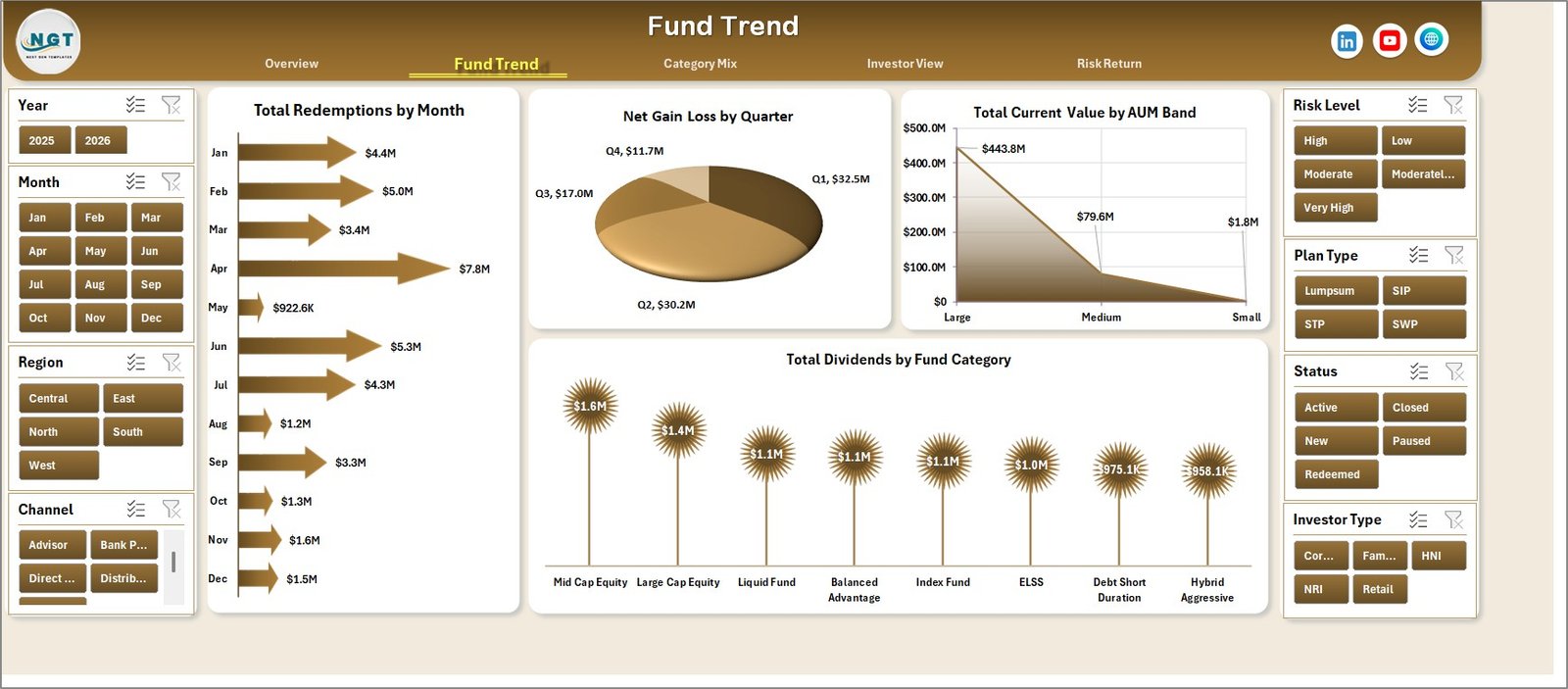
The Fund Trend tab focuses on time-based and portfolio-size analysis. It helps users review redemptions, quarter-wise gain/loss, AUM band distribution, and dividend performance by fund category.
Total Redemptions by Month: This chart shows redemption value by month. It helps advisors identify periods where investors are withdrawing more capital.
Net Gain Loss by Quarter: This chart compares gain and loss across quarters. It is useful for periodic reviews and quarterly investor reporting.
Total Current Value by AUM Band: This view groups current value by AUM band. It helps users see how value is distributed across fund-size groups.
Total Dividends by Fund Category: This chart compares dividends by category. It helps show which fund categories are contributing more income.
3 – Category Mix
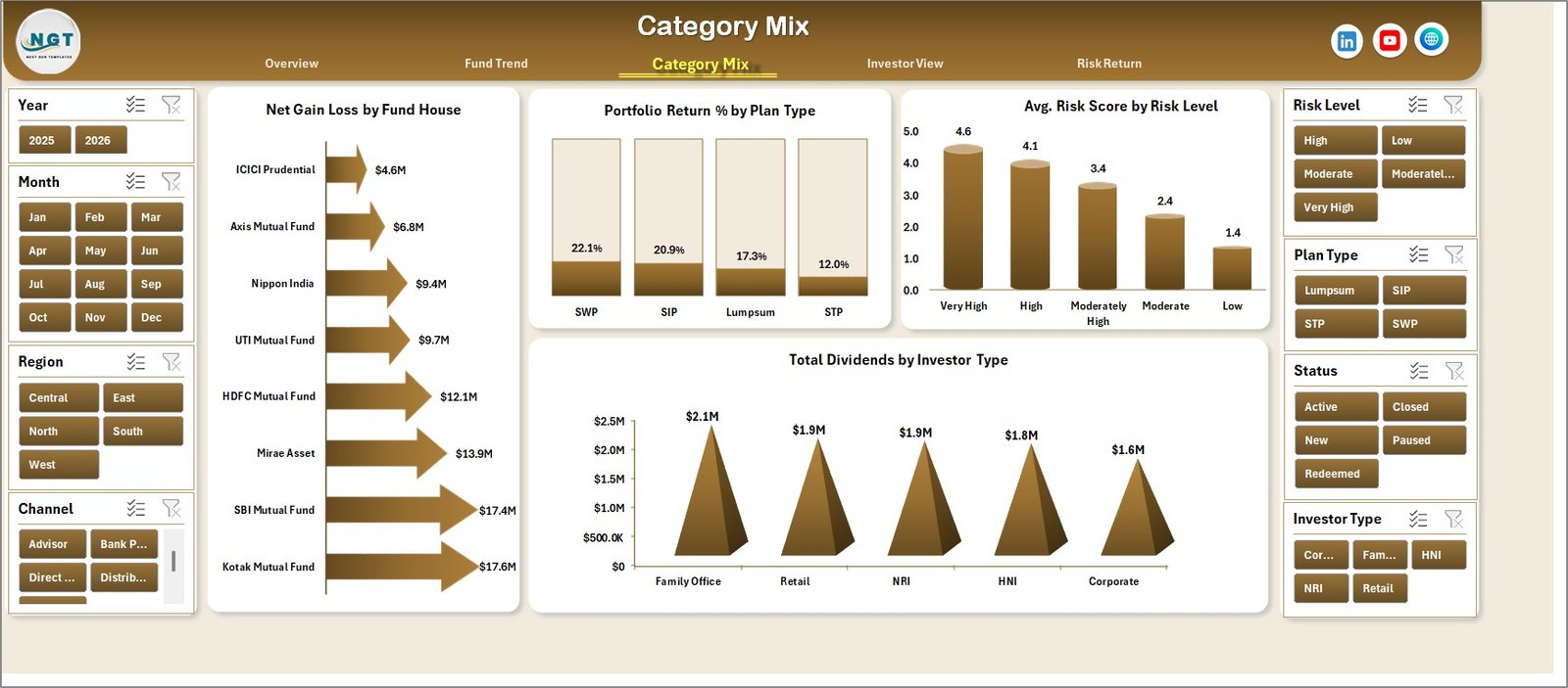
The Category Mix tab reviews performance by fund house, plan type, risk level, and investor type. It is useful for comparing product allocation, manager performance, and investor segment outcomes.
Net Gain Loss by Fund House: This chart compares gain/loss by fund house. It helps users see which fund houses are contributing stronger or weaker performance.
Portfolio Return % by Plan Type: This chart compares return by plan type. It helps review whether different plan structures are producing different outcomes.
Avg. Risk Score by Risk Level: This view compares average risk score by risk band. It helps validate whether low, medium, and high-risk labels match actual risk scores.
Total Dividends by Investor Type: This chart compares dividends by investor segment. It helps show which investor groups receive more dividend income.
4 – Investor View
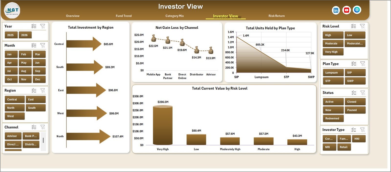
The Investor View tab connects portfolio performance with investor segmentation. It helps users analyze region, channel, plan type, units held, and risk-level allocation.
Total Investment by Region: This chart compares investment across regions. It helps show where the portfolio capital is concentrated.
Net Gain Loss by Channel: This chart compares gain/loss by channel. It helps identify whether direct, advisor, online, or other channels are producing stronger outcomes.
Total Units Held by Plan Type: This chart compares units held by plan type. It gives a non-currency view of portfolio scale.
Total Current Value by Risk Level: This chart compares current value by risk level. It helps users understand how much value is exposed to each risk band.
5 – Risk Return
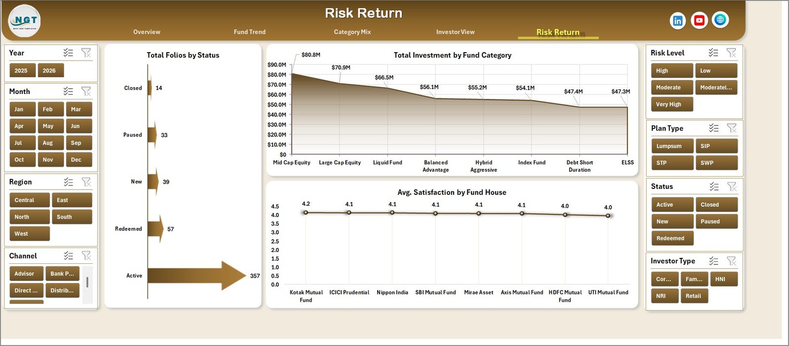
The Risk Return tab gives a compact view of folio status, fund category investment, and average satisfaction by fund house. It is useful for combining portfolio exposure with client experience signals.
Total Folios by Status: This chart compares folio count by status. It helps users review active, inactive, closed, or pending portfolio states.
Total Investment by Fund Category: This view compares investment by category. It helps identify whether capital is concentrated in equity, debt, hybrid, or other fund groups.
Avg. Satisfaction by Fund House: This chart compares average satisfaction by fund house. It helps connect investment reporting with service or client experience review.
6 – Data Sheet Tab
The Data Sheet is the source data tab. Add your mutual fund records in the same format, then refresh the workbook so pivot tables and charts update.

7 – Support Sheet
The Support Sheet contains pivot tables used to create the entire dashboard dynamically. After updating the Data Sheet, go to the Excel Ribbon, open the Data tab, and click Refresh All. All pivots and charts will refresh. This sheet can be hidden after setup.

Mutual Funds Dashboard in Excel vs. Google Sheets vs. Paid CRM/SaaS – Feature Comparison
| Feature | Mutual Funds Dashboard in Excel | Google Sheets equivalent | Paid investment SaaS |
|---|---|---|---|
| Cost | $17.99 one-time | Free DIY build or paid template | Recurring subscription or platform fee |
| Platform | Microsoft Excel | Browser-based Google Sheets | Cloud web platform |
| Setup time | Replace data and refresh pivots | Build formulas, charts, and filters | Account setup and onboarding |
| Real-time collaboration | Available through OneDrive or SharePoint | Native collaboration | Usually included by plan |
| Mobile access | Excel mobile app support depends on usage | Google Sheets mobile app | Usually included |
| Customizable fields | Editable workbook and data sheet | Editable sheet | Often limited by vendor setup |
| Share with link | Available through Microsoft sharing tools | Native link sharing | Usually account-based |
| Year-1 cost at 5 users | $17.99 plus any Microsoft licensing needed | Build time plus template cost | Often hundreds or thousands per year |
| Mutual fund dashboard pages | 5 analysis pages plus Data and Support sheets | Must be built manually | Depends on module |
Who Should Use This Template
- Financial advisors preparing client portfolio reviews.
- Mutual fund distributors tracking region, channel, and category performance.
- Wealth management teams reviewing risk, returns, dividends, and redemptions.
- Investment analysts preparing monthly or quarterly fund performance commentary.
- Excel users who want a ready workbook instead of building charts from scratch.
Real-World Use Cases
Meera, financial advisor: uses the Overview and Investor View tabs before client meetings to explain value, return, risk level, and channel performance.
Daniel, mutual fund distributor: reviews investment by region, gain/loss by channel, and units held by plan type to understand business concentration.
Priya, investment analyst: compares fund category, fund house, AUM band, and quarterly gain/loss before writing a portfolio performance note.
Advantages of Mutual Funds Dashboard in Excel
- Fast setup: Replace the sample data and refresh the workbook.
- Clear portfolio view: KPI cards summarize current value, investment, gain/loss, return, and expenses.
- Multiple analysis pages: Review trends, category mix, investor segments, and risk-return signals separately.
- Works in Excel: No separate BI subscription is required for basic use.
- Reusable workbook: Use the same template for monthly, quarterly, or client-specific reporting.
Opportunities for Improvement
This dashboard is designed as an Excel reporting template, not a live market platform. It does not include automatic NAV feeds, trading execution, CRM workflows, investor login, regulatory filing, or bank integrations. Teams that need automated data import can use Excel tools such as Power Query. Microsoft provides guidance for importing and transforming data through Power Query.
Best Practices
- Keep the Data Sheet column structure unchanged when replacing sample rows.
- Refresh all pivot tables after every data update.
- Use slicers before exporting dashboard pages for a specific client, category, region, or month.
- Hide the Support Sheet after setup so users focus on the dashboard pages.
- Save a backup copy before changing formulas, pivot tables, or chart sources.
Explore Relevant Templates
- Real Estate Investment Trusts (REITs) KPI Dashboard in Excel – useful for real estate investment KPI reporting.
- Wealth Tech Dashboard in Power BI – useful for investment analytics in Power BI.
- Investment Portfolio Checklist in Excel – useful for portfolio review checklists.
- Excel Dashboard Templates – browse more Excel dashboards.
Frequently Asked Questions
What is the Mutual Funds Dashboard in Excel?
It is an editable Excel dashboard template for reviewing mutual fund value, investment, return, gain/loss, expenses, dividends, redemptions, risk, investors, and fund mix.
How many worksheet tabs are included?
The workbook includes 7 tabs: Overview Page, Fund Trend, Category Mix, Investor View, Risk Return, Data Sheet, and Support Sheet.
Can I use my own mutual fund data?
Yes. Replace the sample rows in the Data Sheet with your own records in the same format, then refresh all pivot tables.
Does this dashboard use slicers?
Yes. Slicers are included so you can filter dashboard pages quickly without rebuilding charts.
Can I hide the Support Sheet?
Yes. The Support Sheet contains pivot tables and can be hidden after the dashboard is working.
Is this a live NAV or trading tool?
No. This is a reporting dashboard template. It does not connect automatically to live NAV feeds or execute trades.
Is this a one-time purchase?
Yes. The template is a one-time downloadable product from NextGenTemplates.
About the Author
Built by PK – Microsoft Certified Professional with 15+ years of Excel, Google Sheets, and Power BI experience. Founder of NextGenTemplates, reaching 300K+ subscribers across YouTube channels. Every template is hand-built and tested before release.
Conclusion
The Mutual Funds Dashboard in Excel gives finance professionals a structured way to monitor fund performance, investor mix, risk exposure, dividends, redemptions, and portfolio value in one workbook. With 7 tabs, 5 KPI cards, slicers, a Data Sheet, and pivot-powered dashboard pages, it saves the time usually spent rebuilding monthly reports from scratch.
Click here to purchase the Mutual Funds Dashboard in Excel
Visit our YouTube channel for step-by-step Excel tutorials: Youtube.com/@PKAnExcelExpert
Last updated: July 11, 2026