The Private Clubs Dashboard in Power BI is a ready-to-use analytics template for private clubs, country clubs, social clubs, recreational clubs, and membership-based venues. It helps management teams track dues revenue, event revenue, food beverage revenue, members, visits, referrals, retention, satisfaction, operating cost, and net operating profit across 5 Power BI report pages. The report includes 5 executive KPI cards, 19 analytical visuals, and multiple slicers, so users can move from a high-level performance review to page-level analysis without building a PBIX file from scratch.
Power BI is designed for interactive reporting, and Microsoft explains the core value of dashboards and reports in its official Power BI overview. This template gives private club teams a practical starting point: replace the sample data, refresh the report, and use slicers to filter by the available membership, location, event, month, region, tier, department, and channel fields.
Download the Private Clubs Dashboard in Power BI
Key Features of Private Clubs Dashboard in Power BI
- 5 Power BI report pages: Overview, Membership, Revenue Mix, Experience, and Operations.
- Overview KPI cards for Total Referrals, Total Visits, Total Members, Total Event Revenue, and Total Dues Revenue.
- Multiple slicers for fast filtering during leadership, finance, membership, and operations reviews.
- Revenue views for dues revenue, event revenue, food beverage revenue, and net operating profit.
- Membership views for status, active members, retention rate, member segment, membership tier, and region.
- Operational views for visits, satisfaction, cost by region, and cost by club location.
- Editable PBIX file that can be customized in Power BI Desktop.
Dashboard Pages Explanation
1 – Overview Page
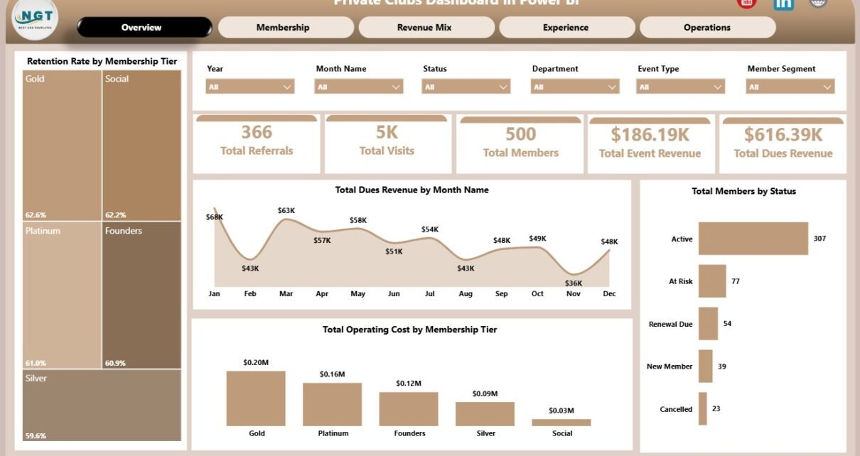
The Overview Page is the executive summary of the dashboard. At the top, it includes KPI cards for Total Referrals, Total Visits, Total Members, Total Event Revenue, and Total Dues Revenue. These cards help club leaders quickly understand engagement, member volume, and revenue movement before reviewing deeper charts.
The page also uses multiple slicers so users can filter the dashboard quickly and see filtered performance without changing formulas or rebuilding visuals.
Retention Rate by Membership Tier: This chart compares retention across membership tiers. It helps identify which tiers are keeping members engaged and which tiers may need stronger service, communication, or renewal strategies.
Total Dues Revenue by Month Name: This chart shows dues revenue by month. It helps teams review recurring revenue seasonality and detect months where collections are stronger or weaker.
Total Operating Cost by Membership Tier: This visual compares operating cost across membership tiers. It helps management understand which tiers require more operating support or service cost.
Total Members by Status: This chart breaks members into status groups. It helps separate active, inactive, pending, resigned, or other member statuses for cleaner membership review.
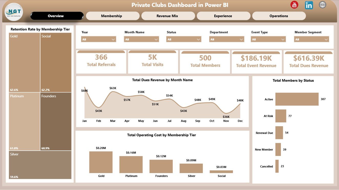
Private Clubs Dashboard in Power BI
2 – Membership Page
The Membership page focuses on member revenue, active member count, retention, and operating cost by location. It is useful for membership directors, general managers, and analysts who want to understand where the club is gaining, retaining, or losing member value.
Total Dues Revenue by Status: This chart compares dues revenue across member statuses. It helps show how much recurring revenue comes from active members and how other status groups affect the dues base.
Active Members by Region: This visual shows active members by region. It helps identify where membership participation is strongest and where regional growth may need more attention.
Retention Rate by Member Segment: This chart compares retention across member segments. It helps reveal which groups are more loyal and which segments may need additional engagement.
Total Operating Cost by Club Location: This visual compares operating cost by location. It helps management spot higher-cost locations and review whether spending aligns with revenue, satisfaction, and member volume.
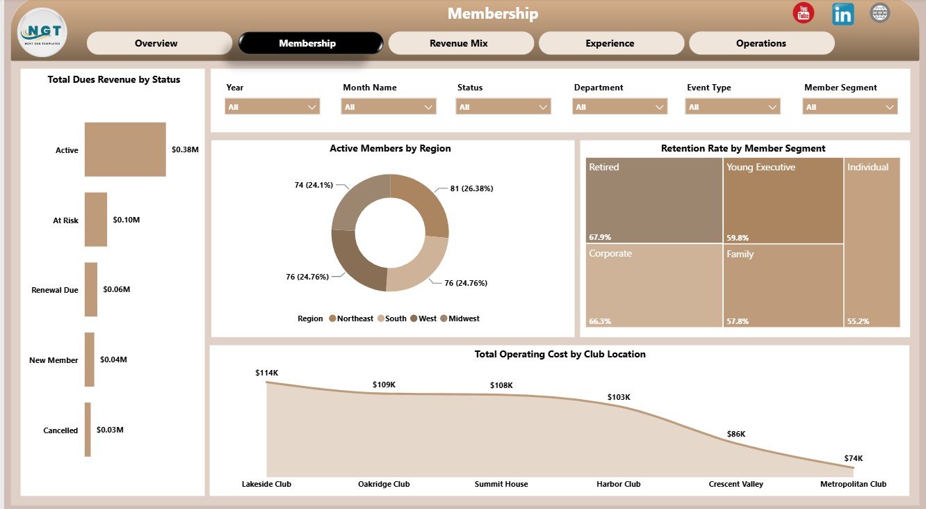
Membership Page
3 – Revenue Mix Page
The Revenue Mix page helps teams understand how club income is distributed across departments, booking channels, club locations, and event types. This page is useful when leadership wants to separate revenue volume from profit quality.
Total Event Revenue by Department: This chart compares event revenue across departments. It helps identify which departments contribute most to event-related income.
Average Satisfaction by Club Location: This visual compares satisfaction by location. It helps managers see where service quality is strong and where member experience may need attention.
Total Food Beverage Revenue by Booking Channel: This chart shows food beverage revenue by booking channel. It helps reveal which channels drive stronger dining, catering, or beverage income.
Net Operating Profit by Event Type: This visual compares profit across event types. It helps teams prioritize event formats that create stronger financial outcomes.
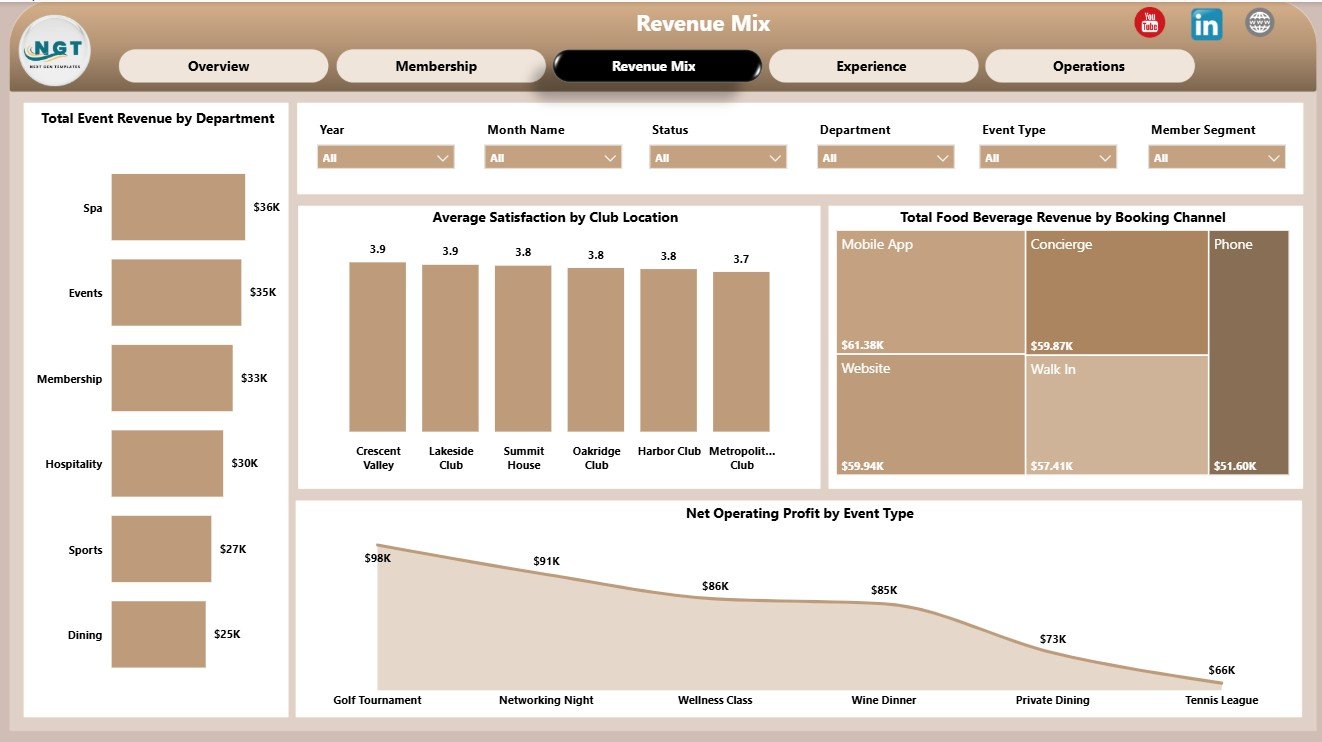
Revenue Mix Page
4 – Experience Page
The Experience page connects referrals, food beverage revenue, event revenue, and operating cost over time. It helps private clubs evaluate how member experience and engagement activity connect with measurable financial outcomes.
Total Food Beverage Revenue by Department: This chart compares F&B revenue by department. It helps identify where dining, bar, catering, or related departments contribute the most revenue.
Total Operating Cost by Year: This trend shows operating cost year by year. It helps leadership monitor whether costs are rising, stable, or improving over time.
Total Referrals by Member Segment: This visual compares referrals by member segment. It helps identify which member groups are strongest advocates for the club.
Total Event Revenue by Event Type: This chart compares event revenue across event types. It helps clubs plan event calendars around formats that generate stronger income.
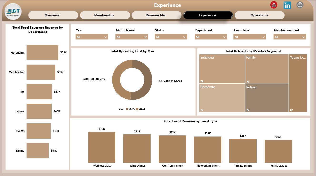
Experience Page
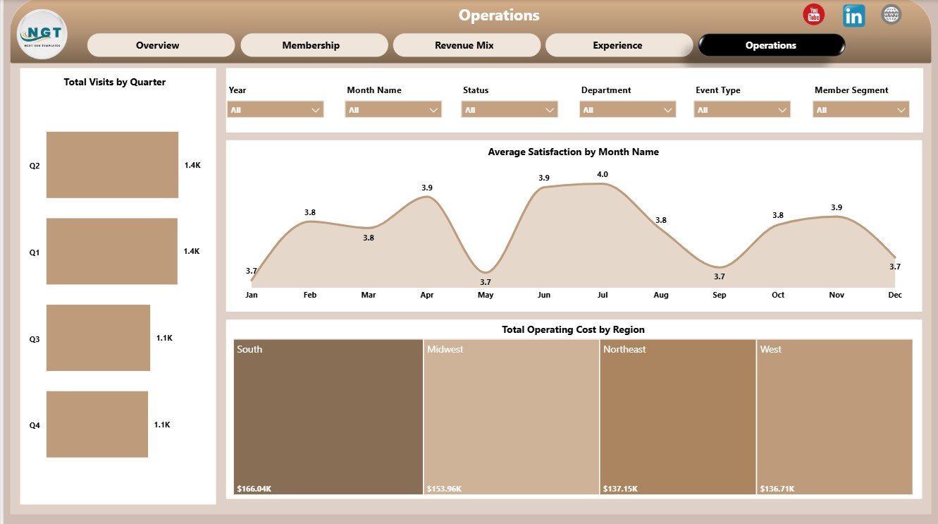
5 – Operations Page
The Operations page supports recurring operating reviews. It focuses on visit trends, satisfaction movement, and cost by region so managers can discuss member activity and operating cost in the same view.
Total Visits by Quarter: This chart shows visit volume by quarter. It helps identify seasonal club usage patterns and periods where engagement is higher or lower.
Average Satisfaction by Month Name: This chart tracks satisfaction month by month. It helps teams monitor whether member experience is improving, declining, or changing seasonally.
Total Operating Cost by Region: This visual compares operating cost by region. It helps leadership review regional cost pressure and plan operational improvements.
Operations Page
Private Clubs Dashboard in Power BI vs. Tableau vs. Paid CRM/SaaS – Feature Comparison
| Feature | Private Clubs Dashboard in Power BI | Tableau or Qlik alternative | Paid club CRM/SaaS |
|---|---|---|---|
| Cost | $17.99 one-time sale price | License cost plus report build time | Monthly or annual subscription |
| Platform | Power BI Desktop and optional Power BI Service | BI platform setup required | Vendor-hosted web platform |
| Setup time | Open PBIX, replace source, refresh | Build model, measures, and visuals manually | Onboarding, configuration, and migration |
| Real-time team collaboration | Available after publishing to Power BI Service | Available by plan | Usually included by plan |
| Mobile access | Available through Power BI mobile after publishing | Available through vendor app | Usually included |
| Customizable fields | Edit visuals, pages, measures, fields, slicers, and data connections | Editable with BI skills | Often limited by vendor settings |
| Year-1 cost at 5 users | Template cost plus Microsoft licensing choice | License cost plus analyst time | Often hundreds or thousands per year |
| Club reporting coverage | Dues, events, visits, referrals, members, retention, F&B, satisfaction, cost, and profit | Must be designed manually | Depends on module and plan |
Who Should Use This Template
This template is a good fit for private clubs, country clubs, social clubs, recreational clubs, membership directors, general managers, finance teams, event managers, food and beverage managers, and analysts who already maintain structured club data and want a Power BI reporting layer.
It is not the right fit if you need payment processing, member login portals, POS transactions, reservations, automated email communication, live accounting, or CRM workflow automation. This is an analytics dashboard template, not a full club management system.
Real-World Use Cases
Maria, membership director: Maria reviews active members by region, retention rate by member segment, and dues revenue by status before planning renewal campaigns.
James, club general manager: James reviews visits by quarter, satisfaction by month, and operating cost by region before leadership meetings.
Anika, finance analyst: Anika compares dues revenue, event revenue, food beverage revenue, operating cost, and net operating profit to prepare a board-ready performance snapshot.
Advantages of Private Clubs Dashboard in Power BI
- It gives private club teams a ready report structure instead of starting with a blank PBIX file.
- It connects membership, revenue, cost, satisfaction, referrals, visits, and event performance in one report.
- It can be refreshed when new source records are connected or loaded.
- It is editable in Power BI Desktop, so analysts can change visuals, measures, colors, and data connections.
- It supports recurring membership, operations, finance, and leadership reviews.
Opportunities for Improvement
- Add clear KPI definitions for retention rate, net operating profit, average satisfaction, active member status, and operating cost.
- Keep member segment, region, membership tier, status, club location, department, booking channel, and event type names consistent before refreshing.
- Connect exported data from CRM, POS, events, finance, or membership systems once the team is ready for a more automated workflow.
- Document any custom DAX measures added after purchase so future report users understand the calculations.
Best Practices
- Keep source columns consistent with the sample structure before refreshing the report.
- Use the same naming conventions for tiers, regions, statuses, locations, departments, and channels.
- Validate Total Referrals, Total Visits, Total Members, Total Event Revenue, and Total Dues Revenue after replacing the sample source.
- Use slicers during meetings instead of duplicating separate report pages for every group.
- Publish to Power BI Service only after checking workspace permissions, privacy settings, and data governance requirements.
Explore Relevant Templates
- Private Clubs Dashboard in Power BI
- Private Clubs Dashboard in Excel
- Browse Power BI Dashboard templates
Frequently Asked Questions
What does the Private Clubs Dashboard in Power BI track?
It tracks referrals, visits, members, event revenue, dues revenue, retention rate, operating cost, member status, active members, satisfaction, food beverage revenue, net operating profit, and related club dimensions.
How many pages are included?
The report includes 5 pages: Overview, Membership, Revenue Mix, Experience, and Operations.
Do I need Power BI Desktop?
Yes. Power BI Desktop is required to open and edit the PBIX file. Power BI Service is optional for sharing, browser access, and scheduled refresh.
Can I customize the report?
Yes. You can edit visuals, fields, slicers, measures, colors, report pages, and data connections in Power BI Desktop.
Does this replace club management software?
No. It is a reporting dashboard template, not a CRM, POS, payment processor, booking system, member portal, or live accounting tool.
About the Author
Built by PK – Microsoft Certified Professional with 15+ years of Excel, Google Sheets, and Power BI experience. Founder of NextGenTemplates, reaching 300K+ subscribers across YouTube channels. Every template is hand-built and tested before release.
Conclusion
The Private Clubs Dashboard in Power BI gives club teams a practical way to review dues revenue, event revenue, visits, referrals, members, retention, satisfaction, food beverage revenue, operating cost, and profit in one editable Power BI report. It is a strong fit when you already have structured club data and need a faster way to turn that data into recurring management insight.
For more tutorials, visit YouTube.com/@PKAnExcelExpert.
Last updated: July 28, 2026