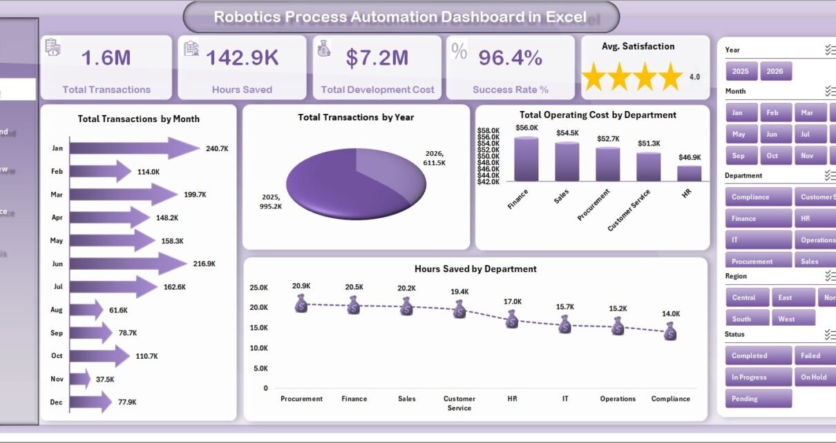
Robotics Process Automation Dashboard in Excel helps RPA managers, automation teams, IT leaders, and process improvement analysts turn automation records into a clear reporting workbook. Instead of checking separate files for transactions, successful runs, failed runs, costs, runtime hours, hours saved, departments, bot types, and platforms, this Excel dashboard brings the core view into 7 worksheet tabs with 5 KPI cards, 19 chart views, multiple slicers, a Data Sheet, and a Support Sheet.
The dashboard is built for teams that already have RPA data exported from automation platforms, ticketing tools, process logs, or internal trackers. Add the records in the same format, refresh the pivots, and use the dashboard pages to review adoption, reliability, cost, productivity, and bot performance. Microsoft also documents that PivotTables can be refreshed after source data changes, including using Refresh All when multiple PivotTables are present: Microsoft Support: Refresh PivotTable data.
Key Features of Robotics Process Automation Dashboard in Excel
- 7 worksheet tabs: Overview, Automation Trend, Department View, Bot Performance, Cost Analysis, Data Sheet, and Support Sheet.
- 5 KPI cards: Total Transactions, Hours Saved, Total Development Cost, Success Rate %, and Avg. Satisfaction.
- 19 dashboard charts: Review RPA transactions, successful runs, runtime hours, costs, errors, priorities, departments, platforms, regions, and process names.
- Multiple slicers: Filter the dashboard quickly by key RPA dimensions without rebuilding charts.
- Refreshable pivot structure: Add or replace records in the Data Sheet, then use Excel Refresh All to update the charts and cards.
- Editable workbook: Customize labels, charts, pivots, slicers, fields, and source data to match your own automation program.
Dashboard Pages Explanation
1. Overview Page
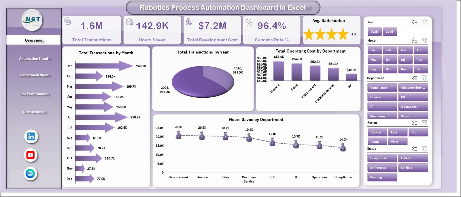
The Overview Page gives a leadership-level summary of the automation program. The top KPI cards show Total Transactions, Hours Saved, Total Development Cost, Success Rate %, and Avg. Satisfaction, so users can quickly understand scale, value, cost, reliability, and stakeholder response.
Total Transactions by Month: This chart shows how automation transaction volume changes month by month. It helps users identify adoption growth, seasonal workload patterns, and months where bot usage was unusually high or low.
Total Transactions by Year: This chart compares yearly transaction volume. It is useful for showing long-term RPA program growth and explaining whether automation coverage is increasing over time.
Total Operating Cost by Department: This chart compares automation operating cost across departments. It helps finance and IT teams identify departments with higher support or operating cost pressure.
Hours Saved by Department: This chart shows which departments are gaining the most productivity benefit from automation. It helps prioritize future RPA investment toward areas with visible time savings.
2. Automation Trend
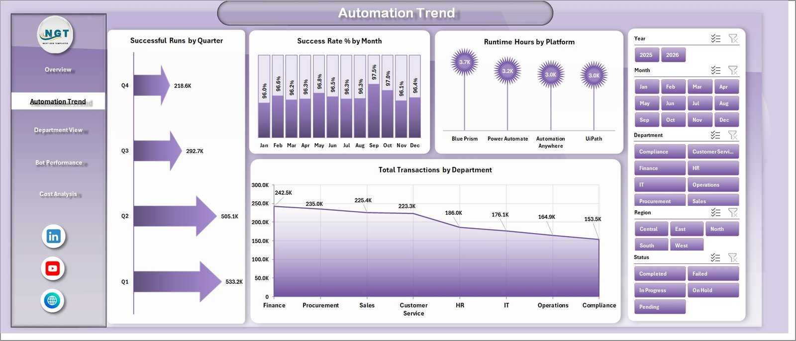
The Automation Trend sheet focuses on timing, reliability, platform usage, and department-level transaction volume. It is built for monthly and quarterly RPA performance reviews.
Successful Runs by Quarter: This chart tracks successful automation runs by quarter. It helps teams see whether the program is becoming more reliable and more frequently used over time.
Success Rate % by Month: This chart shows month-wise success percentage. A drop in success rate can point to bot failures, process changes, system issues, or exception handling problems.
Runtime Hours by Platform: This chart compares runtime hours across automation platforms. It helps technology teams understand which platform carries the most execution load.
Total Transactions by Department: This chart shows department-level transaction volume. It highlights the business units that are using automation most heavily.
3. Department View
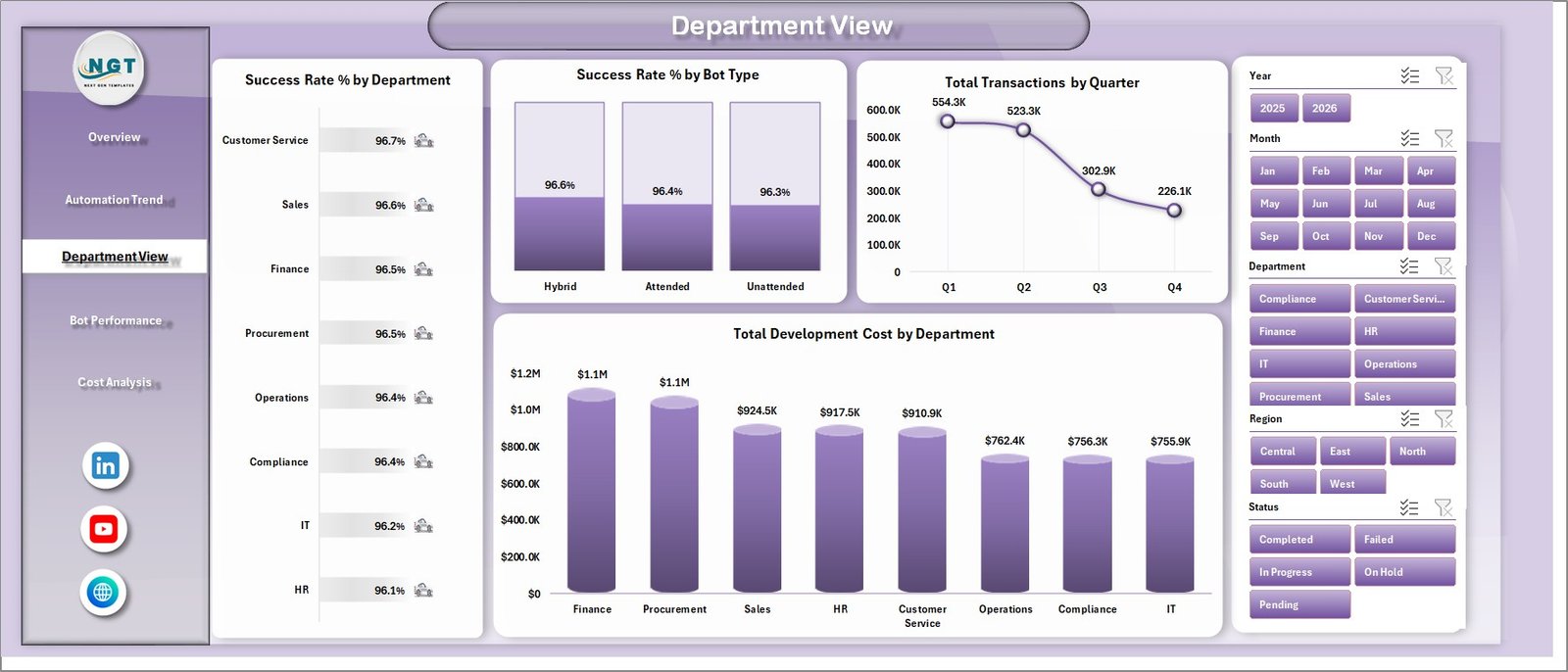
The Department View sheet compares automation performance across departments, bot types, quarters, and development cost. It helps RPA teams explain both reliability and investment at the business-unit level.
Success Rate % by Department: This chart compares success rates by department. It helps identify teams where automation is stable and teams where process cleanup or bot tuning may be needed.
Success Rate % by Bot Type: This chart compares reliability across bot types. It is useful when different bot categories have different exception patterns or maintenance needs.
Total Transactions by Quarter: This chart summarizes transaction volume by quarter. It gives a simple view of adoption momentum and workload handled by automation.
Total Development Cost by Department: This chart compares development investment by department. It helps explain where RPA build effort and budget have been allocated.
4. Bot Performance
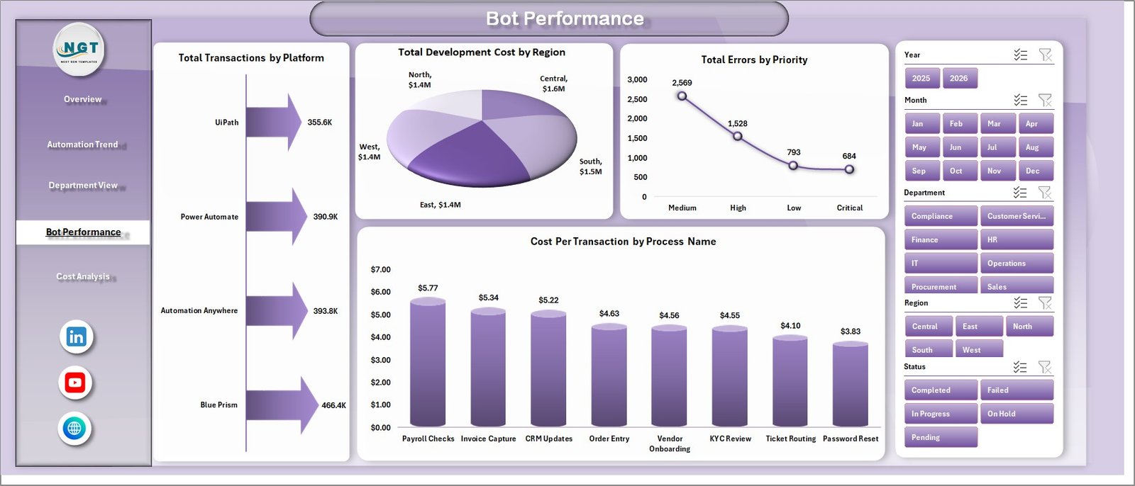
The Bot Performance sheet helps automation support teams understand platform load, regional development cost, priority errors, and process-level unit cost.
Total Transactions by Platform: This chart compares transaction volume by automation platform. It helps users understand whether one platform is handling most of the workload.
Total Development Cost by Region: This chart shows development cost by region. It supports regional budget review and helps compare where automation projects are being built.
Total Errors by Priority: This chart groups errors by priority level. It helps support teams focus on high-priority failures before lower-impact exceptions.
Cost Per Transaction by Process Name: This chart compares unit cost by process. It helps identify processes where automation cost may be too high compared with transaction volume.
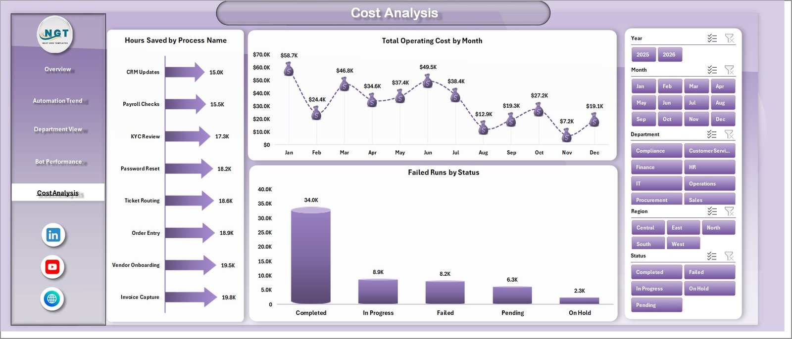
5. Cost Analysis
The Cost Analysis sheet connects time savings, operating cost, and failure status in one page. It is useful for finance, automation governance, and continuous improvement discussions.
Hours Saved by Process Name: This chart ranks processes by time saved. It helps prove which automations are producing the strongest productivity benefit.
Total Operating Cost by Month: This chart shows monthly operating cost movement. It helps teams spot cost spikes and review ongoing support expense.
Failed Runs by Status: This chart groups failed runs by status. It helps users understand whether failures are open, pending, resolved, escalated, or concentrated in a particular state.
6. Data Sheet Tab
The Data Sheet is where you add the RPA records in the same column format. Keep the structure consistent so the KPI cards, slicers, charts, and pivot tables continue to refresh correctly.

7. Support Sheet
The Support Sheet contains the pivot tables used to build the dashboard dynamically. After updating the Data Sheet, go to the Data tab in the Excel ribbon and click Refresh All. You can keep this sheet hidden during normal dashboard use.

Robotics Process Automation Dashboard in Excel vs. Google Sheets vs. Paid CRM/SaaS – Feature Comparison
| Feature | This Excel Dashboard | Google Sheets Alternative | Paid RPA/SaaS Alternative |
|---|---|---|---|
| Cost | One-time template purchase | Low software cost, but manual build time | Recurring subscription or enterprise contract |
| Platform | Microsoft Excel | Google Sheets | Vendor cloud platform |
| Setup time | Replace data and refresh | Build formulas, charts, and filters | Implementation and configuration |
| Real-time team collaboration | Available through Microsoft 365 sharing | Native browser collaboration | Usually included by role or license |
| Mobile access | Excel mobile app or shared file access | Google Sheets mobile app | Vendor app or browser |
| Customizable fields | Editable workbook and source table | Editable but must be structured carefully | Limited by vendor configuration |
| Share with link | Available through OneDrive or SharePoint | Native Google Drive sharing | Login controlled |
| Year-1 cost at 5 users | Template cost plus Excel access | Workspace access plus build time | Often much higher with licenses |
| Best fit | Refreshable RPA reporting | Lightweight shared tracking | Live orchestration and enterprise monitoring |
Who Should Use This Template
This template is a good fit for RPA program managers, automation center-of-excellence teams, IT operations leaders, business transformation managers, shared services teams, finance operations teams, process improvement analysts, consultants, and reporting teams that need a repeatable way to summarize automation results in Excel.
It is not a bot orchestrator, process mining platform, live control room, workflow builder, ticketing system, or replacement for enterprise RPA tools. Use it as a reporting layer after your automation records are exported or entered into a structured table.
Real-World Use Cases
Anika, RPA program manager: uses the Overview and Automation Trend pages before monthly governance meetings to explain transactions, success rate, hours saved, and quarterly successful runs.
Rohit, automation support lead: uses Bot Performance to find high-priority errors, platform workload, and processes with higher cost per transaction.
Meera, finance transformation analyst: uses Cost Analysis and Department View to compare development cost, operating cost, department savings, and process-level productivity benefits.
Advantages of Robotics Process Automation Dashboard in Excel
The main advantage is speed. You do not need to build a dashboard from a blank workbook. The pages, cards, slicers, pivots, and chart structure are already prepared. The second advantage is flexibility. Because it is Excel, you can adapt the workbook to your own process names, departments, regions, platforms, and reporting language. The third advantage is cost control. For teams that only need recurring reporting, a one-time Excel template can be easier to justify than another subscription.
Opportunities for Improvement
This dashboard depends on structured data. If the source records are incomplete or inconsistent, the dashboard will reflect those issues. Teams that need live bot monitoring, alerts, queue control, exception assignment, or automatic platform integration should use a dedicated RPA operations tool. This template works best when used for weekly, monthly, or quarterly reporting after data is exported from the operational systems.
Best Practices
Keep the Data Sheet structure unchanged unless you are comfortable updating pivot tables. Use consistent department, process, platform, bot type, region, status, and priority names. Refresh all pivots after replacing data. Review the Support Sheet after major changes to confirm all charts still map to the expected fields. Before sharing the workbook, hide the Support Sheet and protect any formulas or pivots you do not want casual users to edit.
Explore Relevant Templates
- Robotics Industry KPI Dashboard in Power BI
- Cybersecurity Dashboard in Google Sheets
- Roadside Assistance Networks Dashboard in Excel
- Neural Tech Startups Dashboard in Power BI
- Browse MS Excel templates
- Browse Excel dashboard templates
Frequently Asked Questions
What is the Robotics Process Automation Dashboard in Excel?
It is an Excel dashboard template for tracking RPA transactions, hours saved, development cost, operating cost, success rate, bot performance, errors, departments, platforms, and process-level results.
How many worksheet tabs are included?
The workbook includes 7 worksheet tabs: Overview, Automation Trend, Department View, Bot Performance, Cost Analysis, Data Sheet, and Support Sheet.
Can I use my own automation data?
Yes. Replace the sample data in the Data Sheet using the same format, then refresh the workbook to update the dashboard pages.
Does this template require macros?
No. The dashboard is built around Excel tables, pivot tables, slicers, KPI cards, and charts.
Can I customize the dashboard?
Yes. You can edit chart titles, slicers, fields, labels, pivot tables, formatting, and source records if you are comfortable with Excel.
Is this a live RPA monitoring system?
No. It is a reporting dashboard. It does not run bots, manage automation queues, assign exceptions, or connect live to RPA platforms.
Which Excel version should I use?
Use a modern desktop version of Microsoft Excel for the best pivot table, slicer, and refresh experience.
About the Author
Built by PK – Microsoft Certified Professional with 15+ years of Excel, Google Sheets, and Power BI experience. Founder of NextGenTemplates, reaching 300K+ subscribers across YouTube channels. Every template is hand-built and tested before release.
ConcRobotics Process Automation Dashboard in Excel helps RPA managers, automation teams, IT leaders, and process improvement analysts turn automation records into a clear reporting workbook. Instead of checking separate files for transactions, successful runs, failed runs, costs, runtime hours, hours saved, departments, bot types, and platforms, this Excel dashboard brings the core view into 7 worksheet tabs with 5 KPI cards, 19 chart views, multiple slicers, a Data Sheet, and a Support Sheet.
The dashboard is built for teams that already have RPA data exported from automation platforms, ticketing tools, process logs, or internal trackers. Add the records in the same format, refresh the pivots, and use the dashboard pages to review adoption, reliability, cost, productivity, and bot performance. Microsoft also documents that PivotTables can be refreshed after source data changes, including using Refresh All when multiple PivotTables are present: Microsoft Support: Refresh PivotTable data.
Key Features of Robotics Process Automation Dashboard in Excel
- 7 worksheet tabs: Overview, Automation Trend, Department View, Bot Performance, Cost Analysis, Data Sheet, and Support Sheet.
- 5 KPI cards: Total Transactions, Hours Saved, Total Development Cost, Success Rate %, and Avg. Satisfaction.
- 19 dashboard charts: Review RPA transactions, successful runs, runtime hours, costs, errors, priorities, departments, platforms, regions, and process names.
- Multiple slicers: Filter the dashboard quickly by key RPA dimensions without rebuilding charts.
- Refreshable pivot structure: Add or replace records in the Data Sheet, then use Excel Refresh All to update the charts and cards.
- Editable workbook: Customize labels, charts, pivots, slicers, fields, and source data to match your own automation program.
Dashboard Pages Explanation
1. Overview Page
The Overview Page gives a leadership-level summary of the automation program. The top KPI cards show Total Transactions, Hours Saved, Total Development Cost, Success Rate %, and Avg. Satisfaction, so users can quickly understand scale, value, cost, reliability, and stakeholder response.
Total Transactions by Month: This chart shows how automation transaction volume changes month by month. It helps users identify adoption growth, seasonal workload patterns, and months where bot usage was unusually high or low.
Total Transactions by Year: This chart compares yearly transaction volume. It is useful for showing long-term RPA program growth and explaining whether automation coverage is increasing over time.
Total Operating Cost by Department: This chart compares automation operating cost across departments. It helps finance and IT teams identify departments with higher support or operating cost pressure.
Hours Saved by Department: This chart shows which departments are gaining the most productivity benefit from automation. It helps prioritize future RPA investment toward areas with visible time savings.
2. Automation Trend
The Automation Trend sheet focuses on timing, reliability, platform usage, and department-level transaction volume. It is built for monthly and quarterly RPA performance reviews.
Successful Runs by Quarter: This chart tracks successful automation runs by quarter. It helps teams see whether the program is becoming more reliable and more frequently used over time.
Success Rate % by Month: This chart shows month-wise success percentage. A drop in success rate can point to bot failures, process changes, system issues, or exception handling problems.
Runtime Hours by Platform: This chart compares runtime hours across automation platforms. It helps technology teams understand which platform carries the most execution load.
Total Transactions by Department: This chart shows department-level transaction volume. It highlights the business units that are using automation most heavily.
3. Department View
The Department View sheet compares automation performance across departments, bot types, quarters, and development cost. It helps RPA teams explain both reliability and investment at the business-unit level.
Success Rate % by Department: This chart compares success rates by department. It helps identify teams where automation is stable and teams where process cleanup or bot tuning may be needed.
Success Rate % by Bot Type: This chart compares reliability across bot types. It is useful when different bot categories have different exception patterns or maintenance needs.
Total Transactions by Quarter: This chart summarizes transaction volume by quarter. It gives a simple view of adoption momentum and workload handled by automation.
Total Development Cost by Department: This chart compares development investment by department. It helps explain where RPA build effort and budget have been allocated.
4. Bot Performance
The Bot Performance sheet helps automation support teams understand platform load, regional development cost, priority errors, and process-level unit cost.
Total Transactions by Platform: This chart compares transaction volume by automation platform. It helps users understand whether one platform is handling most of the workload.
Total Development Cost by Region: This chart shows development cost by region. It supports regional budget review and helps compare where automation projects are being built.
Total Errors by Priority: This chart groups errors by priority level. It helps support teams focus on high-priority failures before lower-impact exceptions.
Cost Per Transaction by Process Name: This chart compares unit cost by process. It helps identify processes where automation cost may be too high compared with transaction volume.
5. Cost Analysis
The Cost Analysis sheet connects time savings, operating cost, and failure status in one page. It is useful for finance, automation governance, and continuous improvement discussions.
Hours Saved by Process Name: This chart ranks processes by time saved. It helps prove which automations are producing the strongest productivity benefit.
Total Operating Cost by Month: This chart shows monthly operating cost movement. It helps teams spot cost spikes and review ongoing support expense.
Failed Runs by Status: This chart groups failed runs by status. It helps users understand whether failures are open, pending, resolved, escalated, or concentrated in a particular state.
6. Data Sheet Tab
The Data Sheet is where you add the RPA records in the same column format. Keep the structure consistent so the KPI cards, slicers, charts, and pivot tables continue to refresh correctly.
7. Support Sheet
The Support Sheet contains the pivot tables used to build the dashboard dynamically. After updating the Data Sheet, go to the Data tab in the Excel ribbon and click Refresh All. You can keep this sheet hidden during normal dashboard use.
Robotics Process Automation Dashboard in Excel vs. Google Sheets vs. Paid CRM/SaaS – Feature Comparison
| Feature | This Excel Dashboard | Google Sheets Alternative | Paid RPA/SaaS Alternative |
|---|---|---|---|
| Cost | One-time template purchase | Low software cost, but manual build time | Recurring subscription or enterprise contract |
| Platform | Microsoft Excel | Google Sheets | Vendor cloud platform |
| Setup time | Replace data and refresh | Build formulas, charts, and filters | Implementation and configuration |
| Real-time team collaboration | Available through Microsoft 365 sharing | Native browser collaboration | Usually included by role or license |
| Mobile access | Excel mobile app or shared file access | Google Sheets mobile app | Vendor app or browser |
| Customizable fields | Editable workbook and source table | Editable but must be structured carefully | Limited by vendor configuration |
| Share with link | Available through OneDrive or SharePoint | Native Google Drive sharing | Login controlled |
| Year-1 cost at 5 users | Template cost plus Excel access | Workspace access plus build time | Often much higher with licenses |
| Best fit | Refreshable RPA reporting | Lightweight shared tracking | Live orchestration and enterprise monitoring |
Who Should Use This Template
This template is a good fit for RPA program managers, automation center-of-excellence teams, IT operations leaders, business transformation managers, shared services teams, finance operations teams, process improvement analysts, consultants, and reporting teams that need a repeatable way to summarize automation results in Excel.
It is not a bot orchestrator, process mining platform, live control room, workflow builder, ticketing system, or replacement for enterprise RPA tools. Use it as a reporting layer after your automation records are exported or entered into a structured table.
Real-World Use Cases
Anika, RPA program manager: uses the Overview and Automation Trend pages before monthly governance meetings to explain transactions, success rate, hours saved, and quarterly successful runs.
Rohit, automation support lead: uses Bot Performance to find high-priority errors, platform workload, and processes with higher cost per transaction.
Meera, finance transformation analyst: uses Cost Analysis and Department View to compare development cost, operating cost, department savings, and process-level productivity benefits.
Advantages of Robotics Process Automation Dashboard in Excel
The main advantage is speed. You do not need to build a dashboard from a blank workbook. The pages, cards, slicers, pivots, and chart structure are already prepared. The second advantage is flexibility. Because it is Excel, you can adapt the workbook to your own process names, departments, regions, platforms, and reporting language. The third advantage is cost control. For teams that only need recurring reporting, a one-time Excel template can be easier to justify than another subscription.
Opportunities for Improvement
This dashboard depends on structured data. If the source records are incomplete or inconsistent, the dashboard will reflect those issues. Teams that need live bot monitoring, alerts, queue control, exception assignment, or automatic platform integration should use a dedicated RPA operations tool. This template works best when used for weekly, monthly, or quarterly reporting after data is exported from the operational systems.
Best Practices
Keep the Data Sheet structure unchanged unless you are comfortable updating pivot tables. Use consistent department, process, platform, bot type, region, status, and priority names. Refresh all pivots after replacing data. Review the Support Sheet after major changes to confirm all charts still map to the expected fields. Before sharing the workbook, hide the Support Sheet and protect any formulas or pivots you do not want casual users to edit.
Explore Relevant Templates
- Robotics Industry KPI Dashboard in Power BI
- Cybersecurity Dashboard in Google Sheets
- Roadside Assistance Networks Dashboard in Excel
- Neural Tech Startups Dashboard in Power BI
- Browse MS Excel templates
- Browse Excel dashboard templates
Frequently Asked Questions
What is the Robotics Process Automation Dashboard in Excel?
It is an Excel dashboard template for tracking RPA transactions, hours saved, development cost, operating cost, success rate, bot performance, errors, departments, platforms, and process-level results.
How many worksheet tabs are included?
The workbook includes 7 worksheet tabs: Overview, Automation Trend, Department View, Bot Performance, Cost Analysis, Data Sheet, and Support Sheet.
Can I use my own automation data?
Yes. Replace the sample data in the Data Sheet using the same format, then refresh the workbook to update the dashboard pages.
Does this template require macros?
No. The dashboard is built around Excel tables, pivot tables, slicers, KPI cards, and charts.
Can I customize the dashboard?
Yes. You can edit chart titles, slicers, fields, labels, pivot tables, formatting, and source records if you are comfortable with Excel.
Is this a live RPA monitoring system?
No. It is a reporting dashboard. It does not run bots, manage automation queues, assign exceptions, or connect live to RPA platforms.
Which Excel version should I use?
Use a modern desktop version of Microsoft Excel for the best pivot table, slicer, and refresh experience.
About the Author
Built by PK – Microsoft Certified Professional with 15+ years of Excel, Google Sheets, and Power BI experience. Founder of NextGenTemplates, reaching 300K+ subscribers across YouTube channels. Every template is hand-built and tested before release.
Conclusion
The Robotics Process Automation Dashboard in Excel gives RPA teams a practical way to summarize automation performance without starting from a blank workbook. With KPI cards, trend pages, department analysis, bot performance views, cost analysis, source data, and support pivots, it is built for teams that want repeatable reporting around automation value, reliability, and cost.
For more Excel dashboarRobotics Process Automation Dashboard in Excel helps RPA managers, automation teams, IT leaders, and process improvement analysts turn automation records into a clear reporting workbook. Instead of checking separate files for transactions, successful runs, failed runs, costs, runtime hours, hours saved, departments, bot types, and platforms, this Excel dashboard brings the core view into 7 worksheet tabs with 5 KPI cards, 19 chart views, multiple slicers, a Data Sheet, and a Support Sheet.
The dashboard is built for teams that already have RPA data exported from automation platforms, ticketing tools, process logs, or internal trackers. Add the records in the same format, refresh the pivots, and use the dashboard pages to review adoption, reliability, cost, productivity, and bot performance. Microsoft also documents that PivotTables can be refreshed after source data changes, including using Refresh All when multiple PivotTables are present: Microsoft Support: Refresh PivotTable data.
Key Features of Robotics Process Automation Dashboard in Excel
- 7 worksheet tabs: Overview, Automation Trend, Department View, Bot Performance, Cost Analysis, Data Sheet, and Support Sheet.
- 5 KPI cards: Total Transactions, Hours Saved, Total Development Cost, Success Rate %, and Avg. Satisfaction.
- 19 dashboard charts: Review RPA transactions, successful runs, runtime hours, costs, errors, priorities, departments, platforms, regions, and process names.
- Multiple slicers: Filter the dashboard quickly by key RPA dimensions without rebuilding charts.
- Refreshable pivot structure: Add or replace records in the Data Sheet, then use Excel Refresh All to update the charts and cards.
- Editable workbook: Customize labels, charts, pivots, slicers, fields, and source data to match your own automation program.
Dashboard Pages Explanation
1. Overview Page
The Overview Page gives a leadership-level summary of the automation program. The top KPI cards show Total Transactions, Hours Saved, Total Development Cost, Success Rate %, and Avg. Satisfaction, so users can quickly understand scale, value, cost, reliability, and stakeholder response.
Total Transactions by Month: This chart shows how automation transaction volume changes month by month. It helps users identify adoption growth, seasonal workload patterns, and months where bot usage was unusually high or low.
Total Transactions by Year: This chart compares yearly transaction volume. It is useful for showing long-term RPA program growth and explaining whether automation coverage is increasing over time.
Total Operating Cost by Department: This chart compares automation operating cost across departments. It helps finance and IT teams identify departments with higher support or operating cost pressure.
Hours Saved by Department: This chart shows which departments are gaining the most productivity benefit from automation. It helps prioritize future RPA investment toward areas with visible time savings.
2. Automation Trend
The Automation Trend sheet focuses on timing, reliability, platform usage, and department-level transaction volume. It is built for monthly and quarterly RPA performance reviews.
Successful Runs by Quarter: This chart tracks successful automation runs by quarter. It helps teams see whether the program is becoming more reliable and more frequently used over time.
Success Rate % by Month: This chart shows month-wise success percentage. A drop in success rate can point to bot failures, process changes, system issues, or exception handling problems.
Runtime Hours by Platform: This chart compares runtime hours across automation platforms. It helps technology teams understand which platform carries the most execution load.
Total Transactions by Department: This chart shows department-level transaction volume. It highlights the business units that are using automation most heavily.
3. Department View
The Department View sheet compares automation performance across departments, bot types, quarters, and development cost. It helps RPA teams explain both reliability and investment at the business-unit level.
Success Rate % by Department: This chart compares success rates by department. It helps identify teams where automation is stable and teams where process cleanup or bot tuning may be needed.
Success Rate % by Bot Type: This chart compares reliability across bot types. It is useful when different bot categories have different exception patterns or maintenance needs.
Total Transactions by Quarter: This chart summarizes transaction volume by quarter. It gives a simple view of adoption momentum and workload handled by automation.
Total Development Cost by Department: This chart compares development investment by department. It helps explain where RPA build effort and budget have been allocated.
4. Bot Performance
The Bot Performance sheet helps automation support teams understand platform load, regional development cost, priority errors, and process-level unit cost.
Total Transactions by Platform: This chart compares transaction volume by automation platform. It helps users understand whether one platform is handling most of the workload.
Total Development Cost by Region: This chart shows development cost by region. It supports regional budget review and helps compare where automation projects are being built.
Total Errors by Priority: This chart groups errors by priority level. It helps support teams focus on high-priority failures before lower-impact exceptions.
Cost Per Transaction by Process Name: This chart compares unit cost by process. It helps identify processes where automation cost may be too high compared with transaction volume.
5. Cost Analysis
The Cost Analysis sheet connects time savings, operating cost, and failure status in one page. It is useful for finance, automation governance, and continuous improvement discussions.
Hours Saved by Process Name: This chart ranks processes by time saved. It helps prove which automations are producing the strongest productivity benefit.
Total Operating Cost by Month: This chart shows monthly operating cost movement. It helps teams spot cost spikes and review ongoing support expense.
Failed Runs by Status: This chart groups failed runs by status. It helps users understand whether failures are open, pending, resolved, escalated, or concentrated in a particular state.
6. Data Sheet Tab
The Data Sheet is where you add the RPA records in the same column format. Keep the structure consistent so the KPI cards, slicers, charts, and pivot tables continue to refresh correctly.
7. Support Sheet
The Support Sheet contains the pivot tables used to build the dashboard dynamically. After updating the Data Sheet, go to the Data tab in the Excel ribbon and click Refresh All. You can keep this sheet hidden during normal dashboard use.
Robotics Process Automation Dashboard in Excel vs. Google Sheets vs. Paid CRM/SaaS – Feature Comparison
| Feature | This Excel Dashboard | Google Sheets Alternative | Paid RPA/SaaS Alternative |
|---|---|---|---|
| Cost | One-time template purchase | Low software cost, but manual build time | Recurring subscription or enterprise contract |
| Platform | Microsoft Excel | Google Sheets | Vendor cloud platform |
| Setup time | Replace data and refresh | Build formulas, charts, and filters | Implementation and configuration |
| Real-time team collaboration | Available through Microsoft 365 sharing | Native browser collaboration | Usually included by role or license |
| Mobile access | Excel mobile app or shared file access | Google Sheets mobile app | Vendor app or browser |
| Customizable fields | Editable workbook and source table | Editable but must be structured carefully | Limited by vendor configuration |
| Share with link | Available through OneDrive or SharePoint | Native Google Drive sharing | Login controlled |
| Year-1 cost at 5 users | Template cost plus Excel access | Workspace access plus build time | Often much higher with licenses |
| Best fit | Refreshable RPA reporting | Lightweight shared tracking | Live orchestration and enterprise monitoring |
Who Should Use This Template
This template is a good fit for RPA program managers, automation center-of-excellence teams, IT operations leaders, business transformation managers, shared services teams, finance operations teams, process improvement analysts, consultants, and reporting teams that need a repeatable way to summarize automation results in Excel.
It is not a bot orchestrator, process mining platform, live control room, workflow builder, ticketing system, or replacement for enterprise RPA tools. Use it as a reporting layer after your automation records are exported or entered into a structured table.
Real-World Use Cases
Anika, RPA program manager: uses the Overview and Automation Trend pages before monthly governance meetings to explain transactions, success rate, hours saved, and quarterly successful runs.
Rohit, automation support lead: uses Bot Performance to find high-priority errors, platform workload, and processes with higher cost per transaction.
Meera, finance transformation analyst: uses Cost Analysis and Department View to compare development cost, operating cost, department savings, and process-level productivity benefits.
Advantages of Robotics Process Automation Dashboard in Excel
The main advantage is speed. You do not need to build a dashboard from a blank workbook. The pages, cards, slicers, pivots, and chart structure are already prepared. The second advantage is flexibility. Because it is Excel, you can adapt the workbook to your own process names, departments, regions, platforms, and reporting language. The third advantage is cost control. For teams that only need recurring reporting, a one-time Excel template can be easier to justify than another subscription.
Opportunities for Improvement
This dashboard depends on structured data. If the source records are incomplete or inconsistent, the dashboard will reflect those issues. Teams that need live bot monitoring, alerts, queue control, exception assignment, or automatic platform integration should use a dedicated RPA operations tool. This template works best when used for weekly, monthly, or quarterly reporting after data is exported from the operational systems.
Best Practices
Keep the Data Sheet structure unchanged unless you are comfortable updating pivot tables. Use consistent department, process, platform, bot type, region, status, and priority names. Refresh all pivots after replacing data. Review the Support Sheet after major changes to confirm all charts still map to the expected fields. Before sharing the workbook, hide the Support Sheet and protect any formulas or pivots you do not want casual users to edit.
Explore Relevant Templates
- Robotics Industry KPI Dashboard in Power BI
- Cybersecurity Dashboard in Google Sheets
- Roadside Assistance Networks Dashboard in Excel
- Neural Tech Startups Dashboard in Power BI
- Browse MS Excel templates
- Browse Excel dashboard templates
Frequently Asked Questions
What is the Robotics Process Automation Dashboard in Excel?
It is an Excel dashboard template for tracking RPA transactions, hours saved, development cost, operating cost, success rate, bot performance, errors, departments, platforms, and process-level results.
How many worksheet tabs are included?
The workbook includes 7 worksheet tabs: Overview, Automation Trend, Department View, Bot Performance, Cost Analysis, Data Sheet, and Support Sheet.
Can I use my own automation data?
Yes. Replace the sample data in the Data Sheet using the same format, then refresh the workbook to update the dashboard pages.
Does this template require macros?
No. The dashboard is built around Excel tables, pivot tables, slicers, KPI cards, and charts.
Can I customize the dashboard?
Yes. You can edit chart titles, slicers, fields, labels, pivot tables, formatting, and source records if you are comfortable with Excel.
Is this a live RPA monitoring system?
No. It is a reporting dashboard. It does not run bots, manage automation queues, assign exceptions, or connect live to RPA platforms.
Which Excel version should I use?
Use a modern desktop version of Microsoft Excel for the best pivot table, slicer, and refresh experience.
About the Author
Built by PK – Microsoft Certified Professional with 15+ years of Excel, Google Sheets, and Power BI experience. Founder of NextGenTemplates, reaching 300K+ subscribers across YouTube channels. Every template is hand-built and tested before release.
Conclusion
The Robotics Process Automation Dashboard in Excel gives RPA teams a practical way to summarize automation performance without starting from a blank workbook. With KPI cards, trend pages, department analysis, bot performance views, cost analysis, source data, and support pivots, it is built for teams that want repeatable reporting around automation value, reliability, and cost.
For more Excel dashboard tutorials, visit YouTube.com/@PKAnExcelExpert.d tutorials, visit YouTube.com/@PKAnExcelExpert.lusion
The Robotics Process Automation Dashboard in Excel gives RPA teams a practical way to summarize automation performance without starting from a blank workbook. With KPI cards, trend pages, department analysis, bot performance views, cost analysis, source data, and support pivots, it is built for teams that want repeatable reporting around automation value, reliability, and cost.
For more Excel dashboard tutorials, visit YouTube.com/@PKAnExcelExpert.