Most counseling centres already have the numbers. They sit in a spreadsheet of session records – who was seen, by which counselor, at which site, for how many hours, at what fee. What they usually do not have is a report that turns those rows into something a board will read without a fortnight of manual charting. The Career Counseling Centers Dashboard in Power BI is that report: nine pages, 93 DAX measures, a 17-column fact table and a proper M-built Date table, shipped with 500 rows of clearly labelled demo data so it is fully populated the moment you open it. Career Counseling Centers Dashboard in Power BI
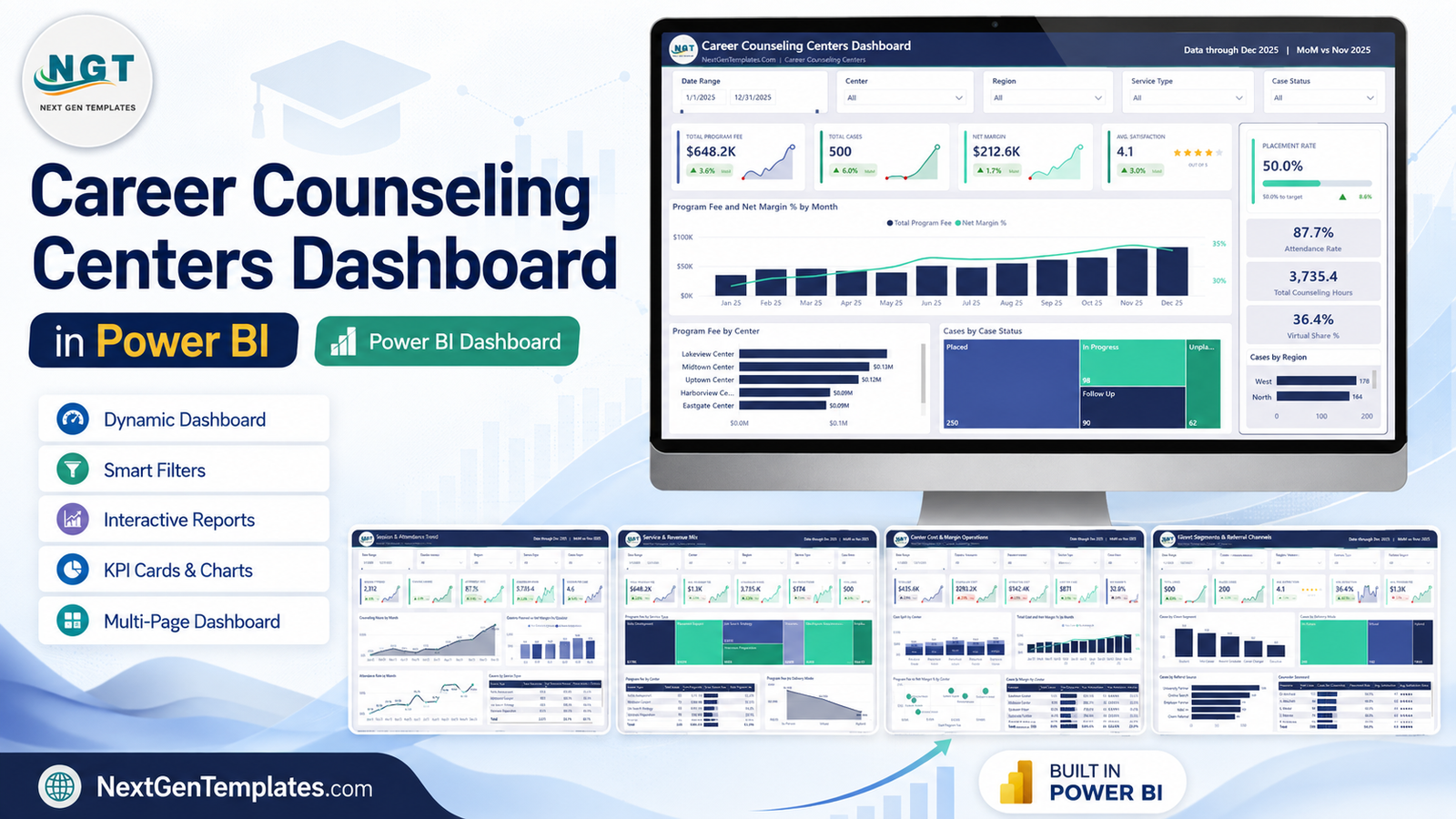
Before anything else, one clear statement about scope. This is a reporting template for data you record yourself. It gives no counselling, career or employment advice, promises no placement or client outcome, and performs no compliance function of any kind – student-records rules, data-protection duties, accreditation requirements and professional standards remain entirely yours to determine and meet. Every figure in the screenshots below is generated demo data, included only so the visuals are not empty. Career Counseling Centers Dashboard in Power BI
Key Features of the Career Counseling Centers Dashboard in Power BI
- Nine pages, one model. Five interactive dashboard pages, a Get More Dashboards page, a hidden Details drillthrough page, and two hidden tooltip pages sized 280×360.
- 93 named DAX measures. Totals, ratios, share-of-total measures, month-over-month percentage deltas and the SVG card variants that render the KPI tiles – all readable, all editable.
- 17-column fact table. Case ID, Session Date, Center, Region, Counselor, Client Segment, Service Type, Delivery Mode, Referral Source, Case Status, Sessions Planned, Sessions Attended, Counseling Hours, Program Fee, Counselor Cost, Operating Cost and Satisfaction Score.
- Synced slicers. Date Range, Center, Region and Service Type follow you across the report; each page adds one contextual fifth filter.
- KPI cards with direction. Every card carries a sparkline and a green or red month-over-month arrow, so no number is presented without its trend.
- Drillthrough on eight fields. Right-click almost any visual to reach the row-level Details page, filtered by whichever dimension you clicked.
- Excel-based source. The model imports from a plain Data.xlsx file, so colleagues can maintain the source without ever opening Power Query. Career Counseling Centers Dashboard in Power BI
Dashboard Pages Explanation
Page 1 – Overview
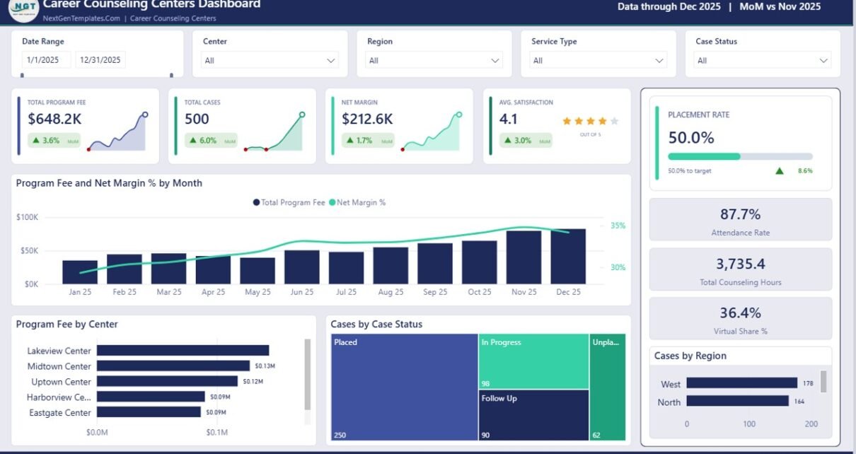
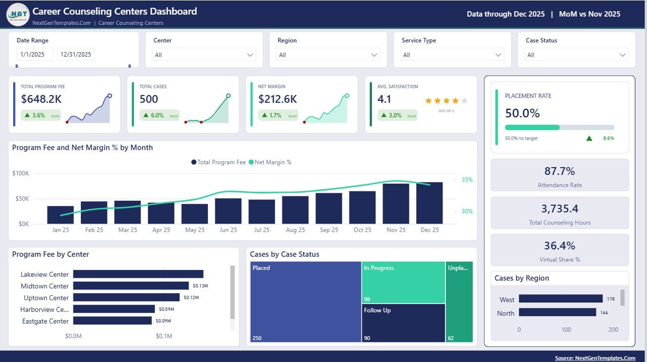
The page you would put in front of a board. Four headline cards carry Total Program Fee, Total Cases, Net Margin and Avg. Satisfaction, each with its month-over-month movement, and Avg. Satisfaction renders as a star row as well as a number. A right-hand rail holds Placement Rate against target with a progress bar, then Attendance Rate, Total Counseling Hours and Virtual Share %. The main canvas shows Program Fee and Net Margin % by Month as a column-and-line combination, Program Fee by Center as a ranked bar chart, Cases by Case Status as a treemap, and Cases by Region as a compact bar.
Page 2 – Session & Attendance Trend
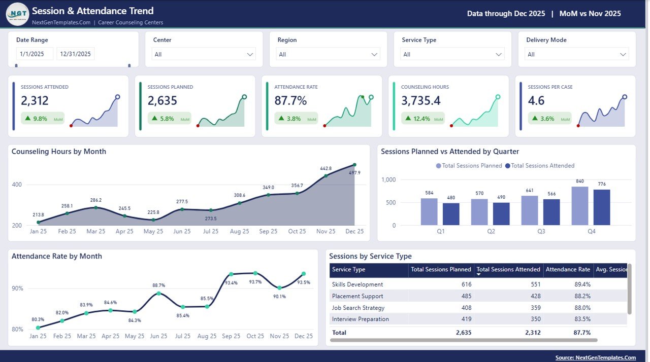
The delivery page. Five cards track Sessions Attended, Sessions Planned, Attendance Rate, Counseling Hours and Sessions per Case. Counseling Hours by Month is a labelled area chart, Attendance Rate by Month a labelled line, and Sessions Planned vs Attended by Quarter puts the planned-versus-delivered gap into one clustered column chart per quarter. Underneath, a Sessions by Service Type table lists planned, attended, attendance rate and average sessions for each service with a bold total row, so the same figure shown in the card can be traced to the service that produced it. Career Counseling Centers Dashboard in Power BI
Page 3 – Service & Revenue Mix
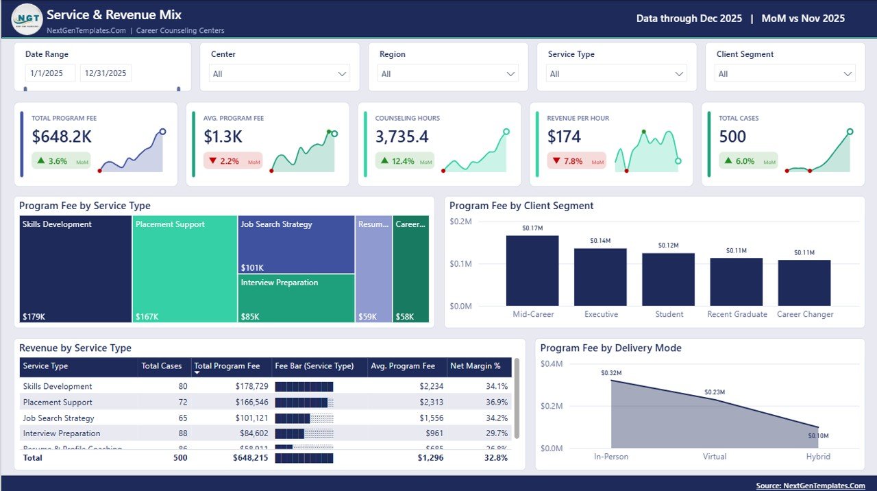
The commercial page. Total Program Fee, Avg. Program Fee, Counseling Hours, Revenue per Hour and Total Cases sit across the top – note that fee and hours can move in opposite directions, which is exactly the tension Revenue per Hour exists to surface. Program Fee by Service Type is a treemap, Program Fee by Client Segment a column chart, and Program Fee by Delivery Mode a stepped area running from in-person through virtual to hybrid. The Revenue by Service Type table adds in-cell fee bars beside case counts, average fee and net margin % per service line. Career Counseling Centers Dashboard in Power BI
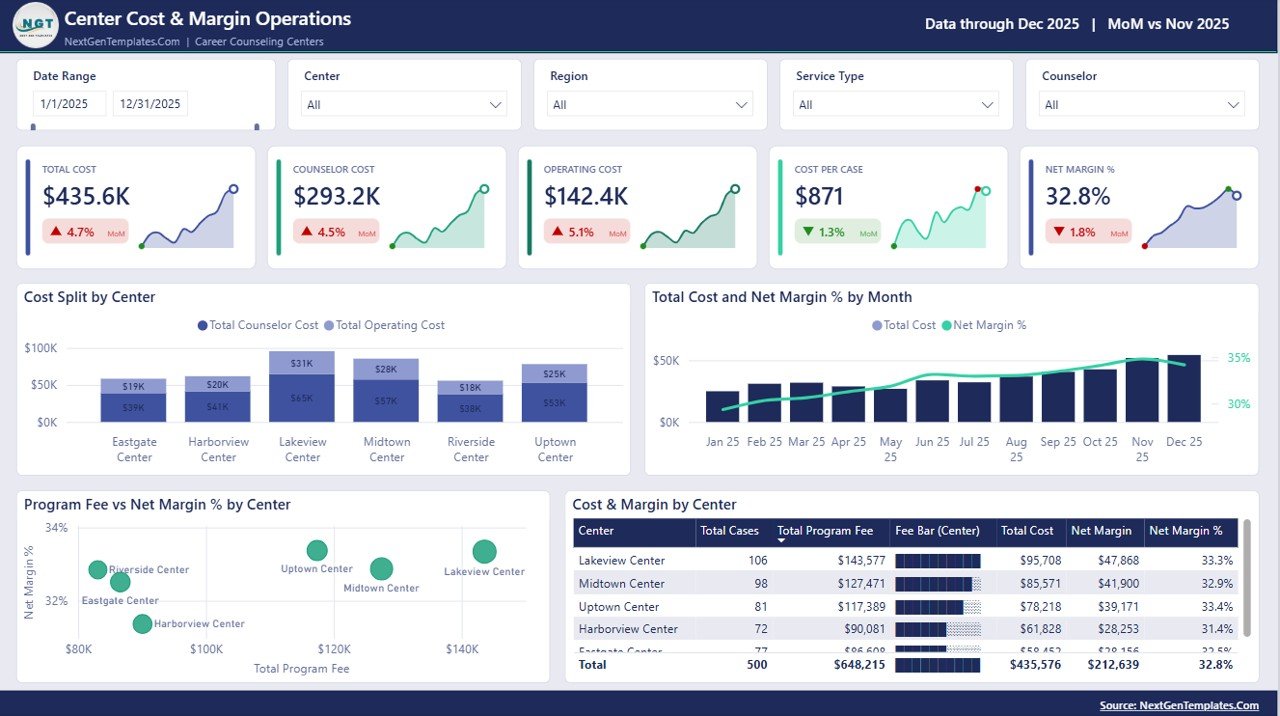
Page 4 – Center Cost & Margin Operations
The cost page, and the one most likely to change a decision. Total Cost, Counselor Cost, Operating Cost, Cost per Case and Net Margin % head the layout. Cost Split by Center stacks counselor cost against operating cost site by site; Total Cost and Net Margin % by Month pairs a column series with a margin line; Program Fee vs Net Margin % by Center plots every centre as a bubble so an outlier is visible rather than inferred; and the Cost & Margin by Center table reconciles cases, fee, cost, margin and margin % down to a total. The page-specific fifth slicer here is Counselor.
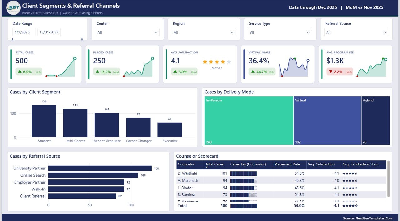
Page 5 – Client Segments & Referral Channels
Who walks through the door, and where they came from. Cards cover Total Cases, Placed Cases, Avg. Satisfaction, Virtual Share and Avg. Program Fee. Cases by Client Segment and Cases by Referral Source are ranked bar charts, Cases by Delivery Mode is a treemap, and the Counselor Scorecard table lists case load, placement rate and average satisfaction per counselor, with the satisfaction score rendered as stars alongside the decimal.
The pages you will not see in the tab strip
Four more pages ship with the file. A Get More Dashboards page closes the report with links back to the catalogue. A hidden Details page is bound as a drillthrough target on eight fields – Center, Region, Counselor, Client Segment, Service Type, Delivery Mode, Referral Source and Case Status – so right-clicking a treemap tile or a table row takes you straight to the underlying case records for exactly that selection. Two further hidden pages, Metric Detail and Trend Detail, are 280×360 tooltip pages that appear on hover. Microsoft’s own drillthrough documentation explains the mechanism if you want to add your own targets.
Career Counseling Centers Dashboard in Power BI vs. Excel vs. Paid Career-Services SaaS – Feature Comparison
| This Power BI template | The Excel version | Paid career-services SaaS | |
|---|---|---|---|
| Cost | One-off purchase | One-off purchase | Recurring per-seat subscription |
| Platform | Power BI Desktop (free) | Microsoft Excel 2016+ | Vendor cloud application |
| Setup time | Repoint the query and refresh | Paste rows and Refresh All | Implementation project |
| Real-time team collaboration | Publish to a Power BI workspace | Via OneDrive or SharePoint | Built in |
| Mobile access | Power BI mobile app | Excel mobile, limited | Native apps |
| Customizable fields | Full – model, DAX and visuals unlocked | Full – sheets and pivots unlocked | Limited to vendor fields |
| Share with link | Yes, once published | Share the file | Yes |
| Year-1 cost at 5 users | The purchase price, once | The purchase price, once | Typically four figures |
| Row-level drillthrough | Yes, on 8 fields | Pivot drill-down | Varies by plan |
| Where your data lives | Your machine or your tenant | Your machine | The vendor’s servers |
Who Should Use This Template
It suits a centre director reporting monthly to a board or trustees; an operations analyst inside a university careers service who needs planned-versus-delivered visibility across quarters; a multi-site network trying to understand why cost per case differs between its largest and smallest branches; and an independent coach who keeps a few hundred rows in a spreadsheet and wants a professional report without paying a subscription. It also suits anyone learning Power BI who would rather take apart a finished model than build one from an empty canvas.
It is not the right tool if you need case management, appointment scheduling, client-file storage or billing. It reports on records; it does not hold them. And if your session notes exist only on paper, the first job is getting them into a table.
Real-World Use Cases
The monthly trustees pack. A five-site network used to rebuild a slide deck by hand every month. Now one refresh updates the file, the Overview and Center Cost pages export straight to PDF, and the conversation moves from assembling numbers to explaining the cost-per-case gap between sites.
The timetabling review. A university careers service uses Sessions Planned vs Attended by Quarter to see where scheduled sessions and delivered sessions diverge, then drills through to the case rows to establish which service types account for the shortfall before the next term is planned.
The small-practice health check. An independent coach with two associates uses the Service & Revenue Mix page to see which service lines actually carry the margin, and the Cases by Referral Source chart to see which channels feed the practice rather than which ones feel busiest.
Advantages of the Career Counseling Centers Dashboard in Power BI
- Nothing is locked. Every measure, colour, visual and page can be renamed, recoloured or deleted. The .pbix is a working file, not a viewer.
- Reconciled totals. All five pages read the same fact table, so a figure on the Overview page matches the same figure on the cost or service page.
- Numbers arrive with direction. The month-over-month measures mean a card shows both the value and whether it improved.
- Free to run. Power BI Desktop costs nothing; a paid licence is only needed to publish and share through the Power BI service.
- A gentle source file. Because the model imports from Data.xlsx, the people who maintain the data never need to learn Power Query.
- Row-level answers. The drillthrough page means a surprising total is one right-click away from the records that caused it.
Opportunities for Improvement
Honest limitations, so nobody is surprised after purchase. The report imports from a file path, so the first task after unzipping is repointing the query at your own copy – it is two clicks, but it is not automatic. There is no data-entry form: you maintain the source in Excel. The demo data covers a single calendar year, so year-over-year comparisons need at least two years of your own records before they mean anything. The Details drillthrough is powerful but wide, and most centres will want to trim its column list to the fields they actually review. And the tooltip pages are sized for a desktop canvas; if you plan to consume this mainly on a phone, build a phone layout for the pages you use most.
Best Practices
- Keep one row per session record, never a summarised row – every measure assumes that grain.
- Delete all 500 demo rows before you load real data, rather than appending underneath them.
- Keep the 17 column headings exactly as they are; rename the values inside them freely.
- Use consistent spellings for Center, Counselor and Service Type – the slicers list whatever you type, including typos.
- Refresh once after your first load and check the total row of each table against your own control figure.
- Trim the Details drillthrough columns to what your reviewers actually need before publishing.
- Publish to a workspace if colleagues need browser access, rather than emailing copies of the file around.
Explore Relevant Templates
- Career Counseling Centers Dashboard in Power BI – the template described in this article.
- Career Counseling Centers Dashboard in Excel – the same five-page report built on pivot tables and slicers, for teams who would rather stay in a workbook.
- Colleges & Universities Dashboard in Power BI – institution-level reporting.
- Alumni Associations Dashboard in Power BI – the natural next report once clients become alumni.
- Staffing Agency Dashboard in Power BI – placement reporting from the recruiter’s side.
Frequently Asked Questions
Do I need a paid Power BI licence?
No. Power BI Desktop is free from Microsoft and will open, edit and refresh this file. A paid licence is only required if you want to publish and share the report through the Power BI service.
What is in the download?
A ZIP containing the .pbix report, the Data.xlsx source file with 500 rows of demo data, and a Power BI Dashboard – User Manual PDF.
Is the data in the screenshots real?
No. Every centre name, counselor name and figure shown above is generated demo data, included so the visuals are populated. Delete those rows and load your own.
Can I add my own measures and pages?
Yes. The model is fully open – add DAX measures, new pages, extra drillthrough targets or your own theme colours.
Will this improve placement rates or client outcomes?
No. It reports what you record and nothing more. It offers no counselling, career or employment advice, and implies no result.
Does it make my centre compliant with student-records or privacy rules?
No. It has no compliance function whatsoever. Whatever obligations apply to your records, accreditation and professional standards are yours to identify and satisfy.
About the Author
Built by PK – Microsoft Certified Professional with 15+ years of Excel, Google Sheets, and Power BI experience. Founder of NextGenTemplates, reaching 300K+ subscribers across YouTube channels. Every template is hand-built and tested before release.
Conclusion
The gap between having session records and having a centre report is usually a fortnight of manual charting that nobody has time for. The Career Counseling Centers Dashboard in Power BI closes that gap with nine pages, 93 DAX measures and a source file anyone on your team can maintain – and it does so without a subscription, a per-seat licence, or your data leaving your control. Load your rows, hit Refresh, and the report is done.
Get the Career Counseling Centers Dashboard in Power BI – instant download, lifetime access, fully unlocked. Prefer a workbook? The Excel version covers the same five pages.
For step-by-step Power BI and Excel tutorials, subscribe to youtube.com/@PKAnExcelExpert.