Channel revenue is the hardest revenue to see clearly. It arrives through other people’s companies, it is registered in one system and closed in another, and the cost of generating it – market development funds, partner training, the salaries of the channel managers themselves – sits in three more places again. By the time somebody has assembled a picture, the quarter is over.
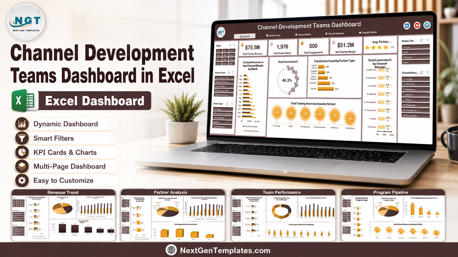
The Channel Development Teams Dashboard in Excel is a five-page workbook that assembles that picture for you. Paste your partner records into one sheet, refresh, and every KPI card, chart and slicer across all five pages updates together. It is ordinary Excel – pivot tables, pivot charts and slicers – so there is nothing to install and nothing to renew.
Why Channel Teams End Up Reporting Badly
Most channel reporting problems are not analysis problems, they are assembly problems. Four patterns come up again and again:
- Registration and closing get confused. A tier that registers 1,500 deals and closes 350 has a very different problem from a tier that registers 640 and closes 347 – but a single “deals” number hides both.
- MDF is reported as spend, not as return. Finance sees the outflow. Nobody routinely sets it against the revenue the tier actually produced.
- Partner performance and manager performance get mixed up. Partner tier, partner type and channel manager are three different cuts of the same data, and a report that only offers one of them invites the wrong conclusion.
- Pipeline has no lifecycle. Total pipeline value is a comforting number until you ask how much of it is sitting in Recruitment versus how much is in Co-Selling.
This workbook is laid out to answer each of those directly, on a page of its own.
The Five Pages
Page 1: Overview
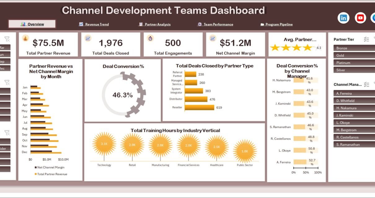
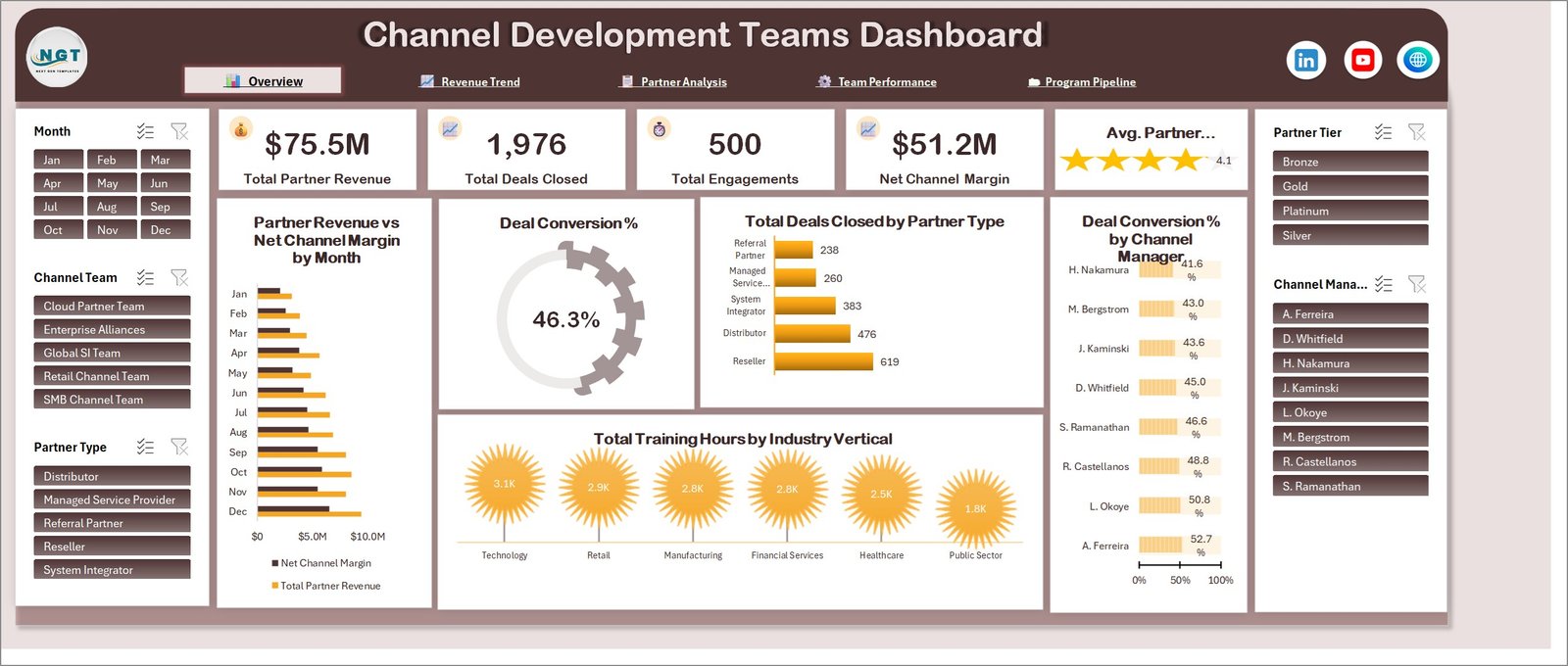
The page you open on, and the one you would put in front of a leadership team. Four KPI cards run across the top – Total Partner Revenue, Total Deals Closed, Total Engagements and Net Channel Margin – with an average partner rating tile beside them. Every card is a live pivot value, not a typed figure, so it moves when the data or a slicer moves.
Underneath sit five charts. Partner Revenue vs Net Channel Margin by Month runs both series across the twelve months so you can see whether margin is keeping pace with top line. A Deal Conversion % dial gives the single headline conversion figure. Total Deals Closed by Partner Type ranks Reseller, Distributor, System Integrator, Managed Service Provider and Referral Partner. Deal Conversion % by Channel Manager lists all eight managers in order, which turns a soft conversation into a specific one. And Total Training Hours by Industry Vertical shows where enablement effort actually landed across Technology, Retail, Manufacturing, Financial Services, Healthcare and Public Sector.
Page 2: Revenue Trend
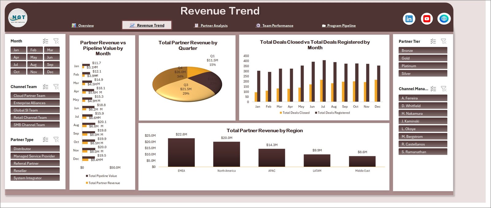
The time-series page. Partner Revenue vs Pipeline Value by Month puts booked revenue next to the pipeline behind it, month by month – the shape of that pair is the earliest warning you get about next quarter. Total Partner Revenue by Quarter shows how the year is weighted, and whether you have the classic back-loaded channel year.
Total Deals Closed vs Total Deals Registered by Month is the one to watch. The gap between the two series is your conversion story rendered as a picture, and it usually widens for a reason you can name. Finally, Total Partner Revenue by Region ranks EMEA, North America, APAC, LATAM and Middle East, so geographic concentration is visible rather than assumed.
Page 3: Partner Analysis
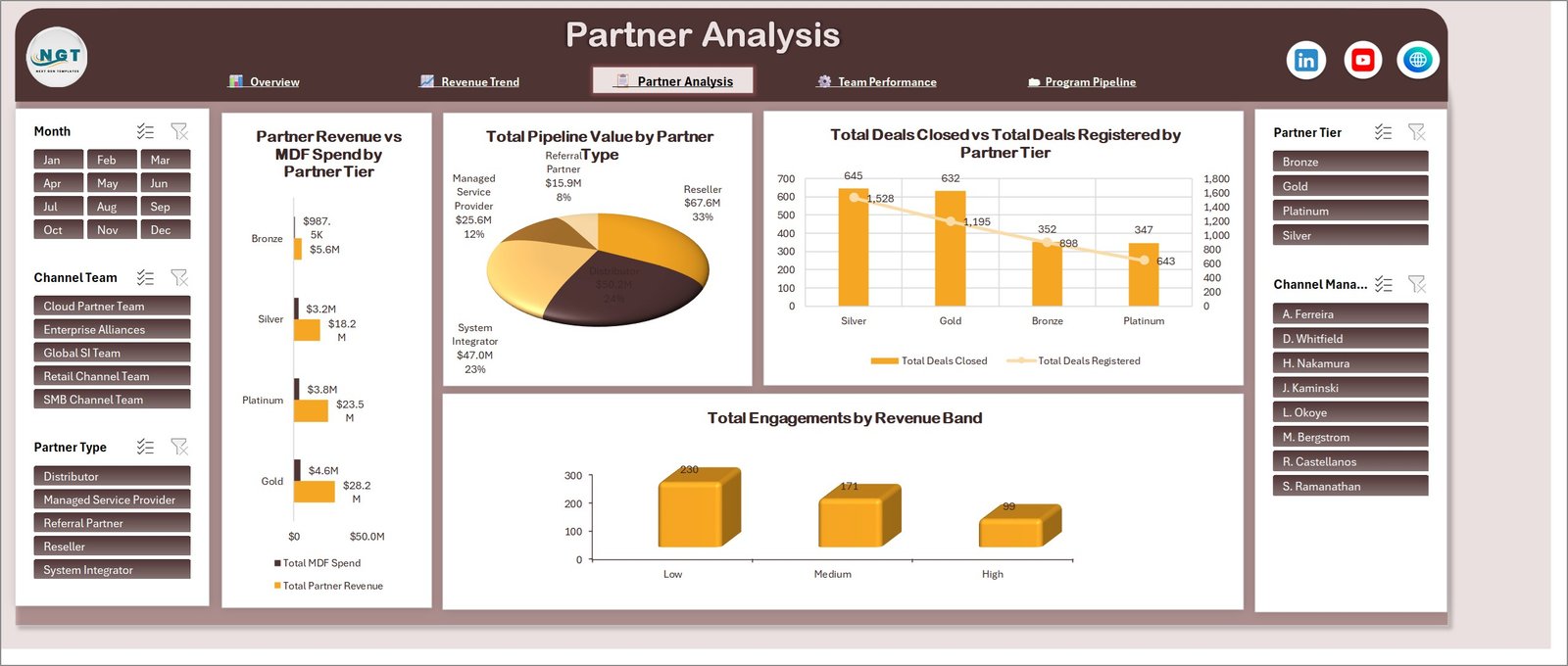
This is the page that pays for the template. Partner Revenue vs MDF Spend by Partner Tier sets what each of Bronze, Silver, Gold and Platinum returns against what it costs to support – two bars per tier, no interpretation required. If a tier is consuming funds out of proportion to what it returns, it shows up here in about two seconds.
Total Pipeline Value by Partner Type shows where future revenue is concentrated across the five partner types. Total Deals Closed vs Total Deals Registered by Partner Tier repeats the registration-versus-close comparison at tier level, which is where it is most actionable – a tier registering heavily and closing lightly needs enablement, not more recruitment. And Total Engagements by Revenue Band splits activity into Low, Medium and High bands so you can see whether effort is going where the money is.
Page 4: Team Performance
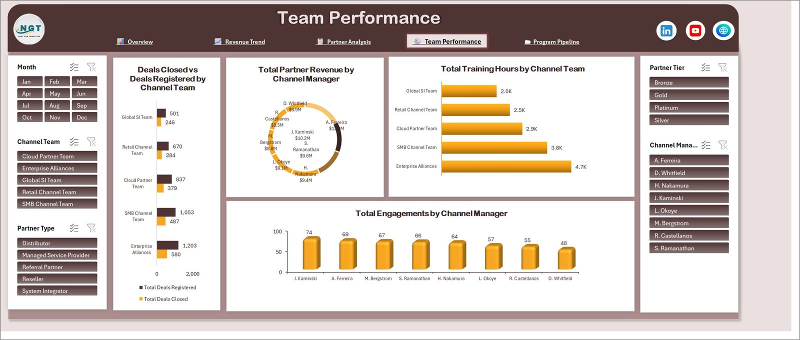
The internal view. Deals Closed vs Deals Registered by Channel Team covers Global SI Team, Retail Channel Team, Cloud Partner Team, SMB Channel Team and Enterprise Alliances, so the teams can be compared on the same basis rather than on anecdote. Total Partner Revenue by Channel Manager ranks the eight managers by revenue, and Total Engagements by Channel Manager gives the activity count sitting behind it – reading those two together is far more useful than either alone, because it separates the manager who is busy from the manager who is productive.
Total Training Hours by Channel Team completes the page by showing where enablement time went. Set it against the closing rates on the left and you have a defensible case for where the next block of training budget should go.
Page 5: Program Pipeline
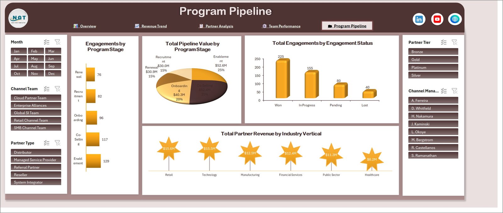
The lifecycle page. Engagements by Program Stage counts activity across Recruitment, Onboarding, Enablement, Co-Selling and Renewal, and Total Pipeline Value by Program Stage attaches money to each of those same stages. Put together they answer the question a channel programme lives or dies on: is the pipeline concentrated in stages that are close to revenue, or in stages that are close to the start?
Total Engagements by Engagement Status breaks the same activity into Won, In Progress, Pending and Lost, and Total Partner Revenue by Industry Vertical ranks Retail, Technology, Manufacturing, Financial Services, Public Sector and Healthcare – which is often the cut that tells you where to recruit next.
Five Slicers, Synced Across Every Page
Down each side of every page sit the same five slicers: Month, Channel Team, Partner Type, Partner Tier and Channel Manager. They are connected to every pivot table in the workbook, so a selection made on the Overview page is still in force when you click through to Program Pipeline.
That is what makes the dashboard usable in a live meeting. Somebody asks how Platinum partners performed in the second half through the Enterprise Alliances team – three clicks, and all five pages are answering that question. There is no filtering the same thing five times, and no risk of one page silently showing a different scope than the one next to it.
Getting Your Own Data In
- Download the ZIP from the product page and extract the workbook.
- Open the data sheet. It ships with 500 rows of demo records covering a full year.
- Replace those rows with your own export, leaving the column headers exactly as they are – the headers are what the pivot tables are bound to.
- Press Ctrl + Alt + F5, or use Data > Refresh All, to push the new data through every pivot table at once.
- Check the slicers. Any new tier, region, team or program stage you introduced will appear as a new slicer button automatically.
Two small things worth knowing. Keep dates as real dates rather than text, or the Month slicer will not group properly. And if you paste more rows than the demo set, use Insert rather than pasting below the table so the table range expands with you.
What It Does Not Do
Being straight about this saves everyone time:
- It does not connect to your CRM or PRM. This is an offline workbook. You export and paste. That is a deliberate trade – no integration project, no IT approval, no data leaving your machine – but it does mean the refresh is a manual step.
- Slicers need desktop Excel. They will not filter in Excel for the web or in the mobile app. The workbook opens in both; the interactivity does not survive the trip.
- The figures in the screenshots are demo data. Every partner name, revenue figure and conversion percentage you see above was randomly generated so the template looks complete out of the box. None of it is a benchmark and none of it should be read as one.
- It is a reporting tool, not a forecast. There is no predictive modelling here. It shows you what your data says, clearly and quickly, and leaves the judgement to you.
Also Available in Power BI
If your organisation already standardises on Power BI, the same five-page channel model is available as a Power BI report: Channel Development Teams Dashboard in Power BI. Same pages, same metrics, built natively for that tool.
Frequently Asked Questions
Do I need any add-in, Power Query or Power Pivot?
No. Native pivot tables, pivot charts and slicers only. Open and use.
Does the file contain macros?
No. It is a plain .xlsx, so there is no macro security prompt and it runs on locked-down corporate machines.
Which Excel versions work?
Excel 2016, 2019, 2021, 2024 and Microsoft 365, on Windows and Mac.
Can I add my own partner tiers, regions or program stages?
Yes. Those are just values in the data sheet. Type your own, refresh, and the charts and slicers pick them up without any rebuilding.
Can I restyle it to our brand colours?
Yes. Nothing is protected or locked. Select any chart, card or shape and change it as you would in any workbook.
Can I use it for client reporting?
Yes, for your own business or your clients’ reporting. You may not resell or redistribute the template file itself.
Get the Template
The Channel Development Teams Dashboard in Excel is available now on NextGenTemplates – a one-time purchase with instant download and lifetime access to the file. You get the complete workbook, all five dashboard pages, the supporting pivot tables and 500 rows of demo data to work from.
If you build channel reporting regularly, these are worth a look too:
- MarTech Dashboard in Excel
- Marketing Analytics Dashboard in Excel
- Sales Business Intelligence Report in Excel
- Civil Rights Organizations Dashboard in Excel
- Climate Tech Startups Dashboard in Excel
- Cloud Gaming Dashboard in Excel
Visit our YouTube channel for step-by-step Excel dashboard tutorials: Youtube.com/@PKAnExcelExpert