Most coin and stamp shops already have the data. It sits in a sales book, an invoice pad, or a spreadsheet somebody started three years ago with fourteen columns and no totals. What they do not have is a way to see the month in one screen. The Coin & Stamp Dealers Dashboard in Excel is built for exactly that gap: paste your sale log into one sheet, press refresh, and five linked report pages redraw themselves.
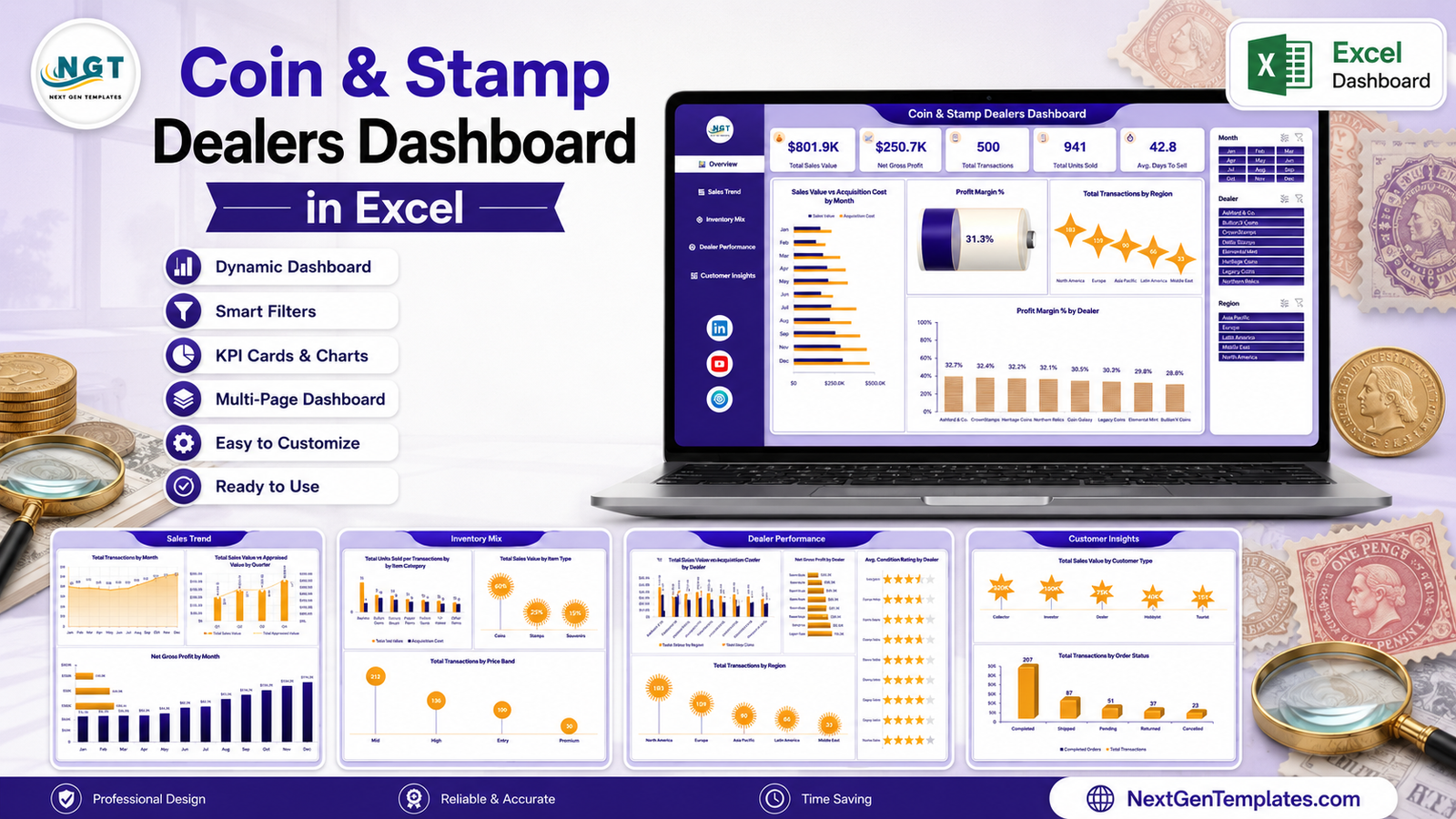
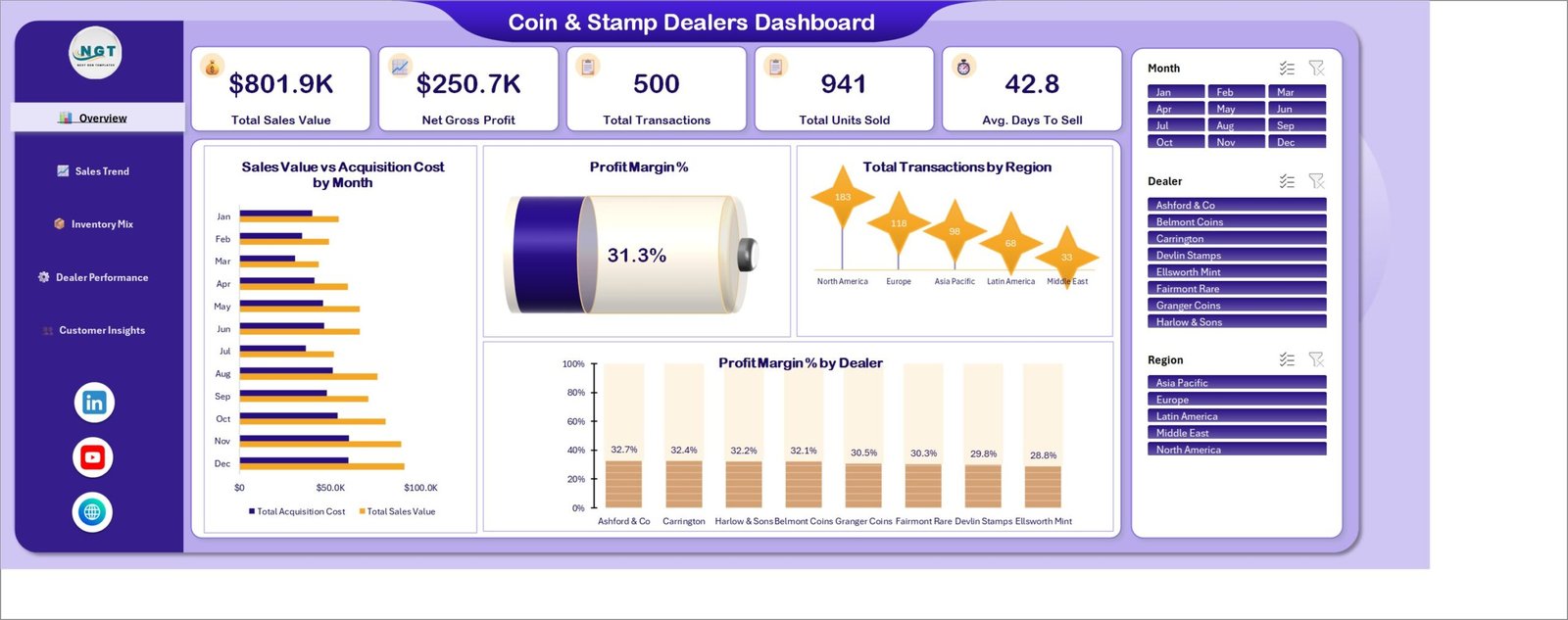
The demo file ships 500 transaction rows across 25 columns, feeding 24 pivot tables and 19 charts. On the sample data it reports $801.9K in Total Sales Value, $250.7K in Net Gross Profit, 500 transactions, 941 units sold and an average of 42.8 days to sell – a 31.3% profit margin. Those numbers are illustrative demo data, not a benchmark for your shop.
One thing to be clear about before anything else. This workbook is a record-keeping and reporting tool. It does not grade, authenticate, certify, appraise or value coins, stamps or supplies. It contains no price guide, no catalogue values, no population data and no market feed, and nothing in it is investment advice. Condition Grade, Certification, Appraised Value and Condition Rating are columns the dealer types in from their own records. The dashboard sums, averages and charts those entries – that is the whole of what it does. It is not affiliated with or endorsed by any grading service, auction house or price-guide publisher.
Key Features of the Coin & Stamp Dealers Dashboard in Excel
- Five report pages – Overview, Sales Trend, Inventory Mix, Dealer Performance and Customer Insights – linked by a fixed navigation rail down the left edge.
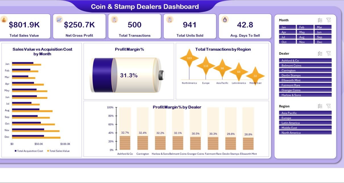
- Five KPI cards on the Overview: Total Sales Value, Net Gross Profit, Total Transactions, Total Units Sold and Avg. Days To Sell.
- Three page-synced slicers: Month, Dealer and Region. Click a region on Overview and the same filter is already applied when you land on Customer Insights.
- 24 pivot tables on a separate Support sheet, so no report page carries a formula you might overwrite.
- 19 pivot charts, each titled for the measure it shows rather than the chart type.
- A 25-column Data sheet: Transaction ID, Sale Date, Dealer, Region, Item Category, Item Type, Condition Grade, Certification, Sales Channel, Customer Type, Payment Method, Order Status, Quantity, Acquisition Cost, Sale Price, Appraised Value, Days In Inventory and Condition Rating, plus Month / Year / Quarter / Price Band helper columns.
- A plain .xlsx – no macros, no add-ins, no subscription, no external data connection. Excel 2016 or later on Windows or Mac.
Dashboard Pages Explanation
Overview
The five KPI cards run across the top, then four visuals underneath: Sales Value vs Acquisition Cost by Month as a paired bar chart, a Profit Margin % gauge reading 31.3% on the demo data, Total Transactions by Region, and Profit Margin % by Dealer. That last one is the page’s most useful chart – the eight demo dealers sit in a narrow 28.8% to 32.7% band, and a real shop’s spread is usually far wider.
Sales Trend
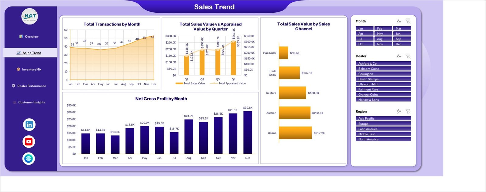
Four time-and-channel charts. Total Transactions by Month plots volume as an area curve. Total Sales Value vs Appraised Value by Quarter puts the two on a dual axis – useful if you record an appraised figure at intake, because the gap between the two lines is your own record of how sale prices compared with the numbers you wrote down, nothing more. Total Sales Value by Sales Channel ranks Online, Auction, In-Store, Trade Show and Mail Order. Net Gross Profit by Month is a plain column chart, and on the demo data it climbs steadily from $14.8K in January to $30.8K in December.
Inventory Mix
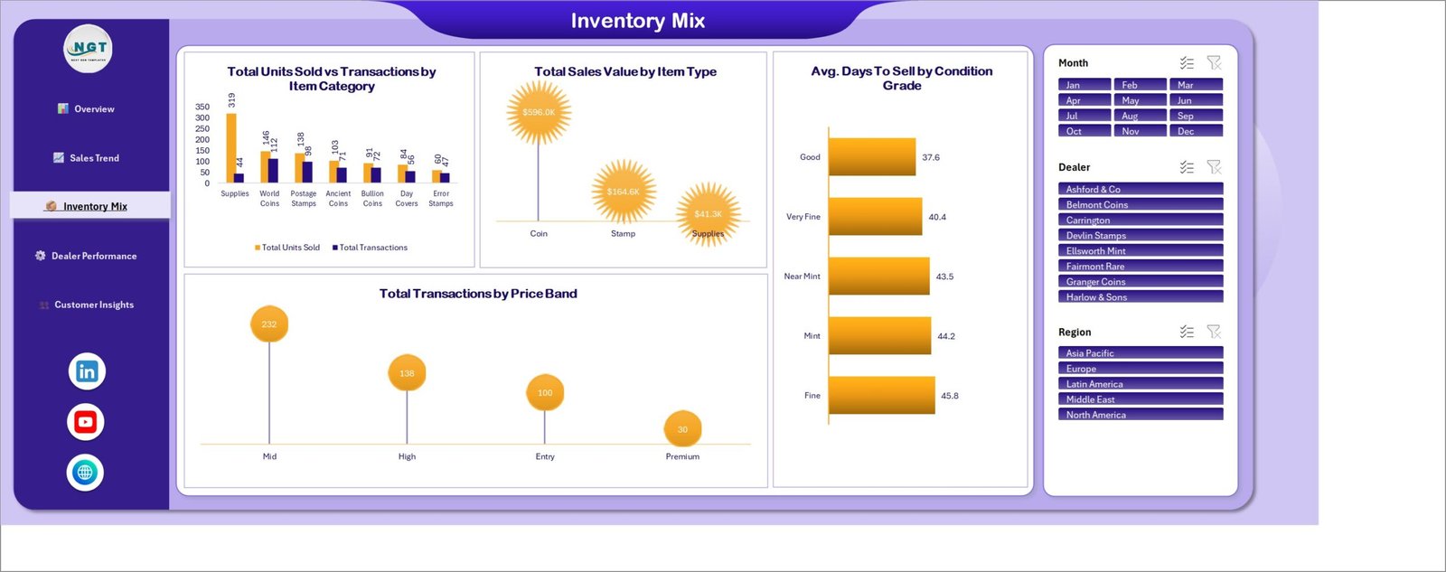
This is the stock page. Total Units Sold vs Transactions by Item Category compares seven categories – Supplies, World Coins, Postage Stamps, Ancient Coins, Bullion Coins, Day Covers and Error Stamps – and shows immediately why unit counts and transaction counts are different questions: Supplies move 319 units across only 44 transactions. Total Sales Value by Item Type rolls those up to Coin, Stamp and Supplies. Avg. Days To Sell by Condition Grade orders the five grade labels by how long rows carrying them sat in stock. Total Transactions by Price Band splits the 500 rows into Entry, Mid, High and Premium.
Dealer Performance
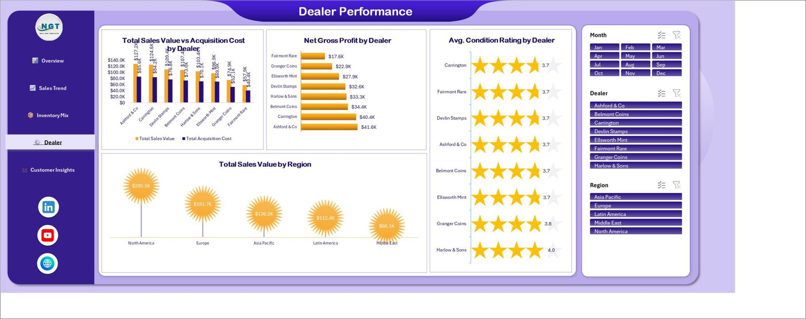
Eight dealer names, four angles. Total Sales Value vs Acquisition Cost by Dealer shows turnover against what the stock cost. Net Gross Profit by Dealer ranks them by the difference. Avg. Condition Rating by Dealer renders a star display from the Condition Rating column – again, a number the dealer entered, not an assessment the workbook made. Total Sales Value by Region closes the page. If you are a single-location shop, rename “Dealer” to your buyers, your consignors or your branches; the pivots follow whatever text is in the column.
Customer Insights
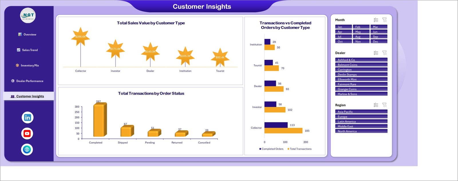
Total Sales Value by Customer Type splits the book across Collector, Investor, Dealer, Institution and Tourist. Transactions vs Completed Orders by Customer Type puts the two side by side, so you can see conversion per group rather than assuming it. Total Transactions by Order Status breaks all 500 rows into Completed (297), Shipped (87), Pending (51), Returned (37) and Cancelled (28). “Investor” is just one of five editable labels – it carries no implication about returns of any kind.
Data and Support
Behind the five pages sit two working sheets. Data is the 25-column transaction log you edit. Support holds every one of the 24 pivot tables. A user manual PDF ships alongside the workbook in the ZIP.
Coin & Stamp Dealers Dashboard vs. Google Sheets vs. Paid Inventory SaaS – Feature Comparison
| This Excel Dashboard | DIY Google Sheets build | Paid inventory SaaS (Zoho Inventory, NetSuite) | |
|---|---|---|---|
| Cost | $17.99 one-off | Free, plus your own build time | $39-$999 per month |
| Platform | Excel 2016+ / Microsoft 365 | Browser | Browser plus mobile app |
| Setup time | Under 30 minutes | 10-30 hours | 1-6 weeks of onboarding |
| Real-time team collaboration | Via OneDrive co-authoring | Yes, natively | Yes |
| Mobile access | Excel mobile, view and light edits | Yes | Yes |
| Customizable fields | Yes – add columns, extend the pivots | Yes | Limited to the vendor’s schema |
| Share with a link | Yes, from OneDrive | Yes | Yes |
| Year-1 cost at 5 users | $17.99 | $0 plus 10-30 hours of labour | $2,340-$11,988 |
| Grading or authentication built in | No – you type the labels | No | No |
| Works offline at a show table | Yes | No | No |
Who Should Use This Template
It fits an independent coin or stamp dealer, a small numismatic or philatelic shop, a collectibles trader working several channels at once, an estate or consignment buyer who needs a monthly margin picture, or the bookkeeper who already receives the shop’s sale log as a spreadsheet and has to turn it into something a partner will read.
It does not fit anyone looking for a point-of-sale till, barcode scanning, a live marketplace connection, catalogue-value lookups, population reports, grading or authentication, multi-currency conversion, or buy-and-sell recommendations. None of that is in the file, and none of it is planned – the design goal was a reporting layer over your own records, not a valuation tool.
Real-World Use Cases
A two-room shop that also does three shows a year. The owner logs sales on Sunday evening. The Sales Channel bar tells her whether the show table earned its travel costs against the online listings, and the Net Gross Profit by Month chart shows which months carried the year. She prices next season’s show stock on that instead of a hunch.
An estate buyer reselling stamp collections in lots. His cash is tied up in stock, so Avg. Days To Sell by Condition Grade is the chart he opens first. When the rows he labelled “Fine” average 45.8 days against 37.6 for “Good”, he can see where his working capital is sitting – measured from his own labels, not from any assessment the file made.
A family firm with eight buyers. The bookkeeper exports the Dealer Performance page to PDF each month. Sales value against acquisition cost per buyer, and gross profit per buyer, are the two figures the partners actually discuss, and she no longer rebuilds the pivots by hand to produce them.
Advantages of the Coin & Stamp Dealers Dashboard in Excel
- One data entry point. Everything on all five pages traces back to the Data sheet. There is no second place to keep in sync.
- Native Excel objects only. Pivot tables, pivot charts and slicers – the things Microsoft documents and supports. Nothing breaks when a macro setting changes because there are no macros.
- Synced slicers. Filter once and the filter travels, which is the difference between a dashboard and five unrelated charts.
- Auditable arithmetic. Net Gross Profit is Sale Price minus Acquisition Cost; Profit Margin % is that over Total Sales Value. You can check any figure by hand.
- It works offline. At a show table with no reliable wi-fi, that matters more than it sounds.
- Honest scope. The file never pretends to know what an item is worth, which means nothing in it can quietly mislead you.
Opportunities for Improvement
Three cosmetic issues are present in the shipped build, and it is better to say so than to let a buyer find them:
- Dealer Performance, chart title overlap. On Total Sales Value vs Acquisition Cost by Dealer, the rotated data labels ($127.2K, $109.4K, $107.4K, $103.4K) print across the second line of the chart title, so the words “by Dealer” are partly struck through. The numbers themselves are correct and readable; the title is not. Widening the chart or switching the labels to horizontal fixes it in about ten seconds.
- Dealer Performance, navigation label. The active item in the left rail on that page reads “Dealer”, while every other page lists it as “Dealer Performance” and the page banner says “Dealer Performance” too. Cosmetic inconsistency, one cell to correct.
- Inventory Mix, axis label collision. In Total Sales Value by Item Type, the marker for Supplies sits over the category axis, so the word “Supplies” prints inside the orange shape. Still legible, but untidy.
Two genuine functional limits are worth knowing as well. The demo book is single-currency – if you buy in one currency and sell in another you will need to convert before pasting. And there is no live connection to a POS, marketplace or accounting system: you paste or export into the Data sheet. Neither is a bug; both are design choices that keep the file a plain .xlsx.
Best Practices
- Keep the header row. Row 3 on the Data sheet carries the column names the pivots are bound to. Delete the 500 demo rows beneath it, not the headers.
- Standardise your labels before you paste. “Very Fine” and “very fine” become two separate categories on every chart. A quick find-and-replace saves a confusing axis later.
- Refresh with Ctrl + Alt + F5. That refreshes all 24 pivots at once. Refreshing a single pivot leaves the other pages stale.
- Record Appraised Value only if you actually keep one. An empty column is more honest than a guessed number, and the quarter chart reads fine without it.
- Log the cancelled and returned rows too. The Order Status chart is only useful if the failures are in there.
- Save a copy per year. Pivot refresh times climb once you are past tens of thousands of rows, and an annual file is easier to hand to an accountant.
- Adding a column? Add it on Data first, then add it to the field list of the relevant pivot on the Support sheet.
Explore Relevant Templates
- Antique Dealers Dashboard in Excel – the nearest relative if you also trade furniture, art or general antiques.
- Auction Houses Dashboard in Excel – consignment and lot-level reporting.
- Antique Dealers Dashboard in Power BI – the same territory for Power BI Desktop users.
- Antique Dealers KPI Dashboard in Excel – a compact month-picker scorecard, which is a different template family from this analytical dashboard.
- All Excel Dashboard templates on NextGenTemplates.
Frequently Asked Questions
Does this dashboard grade, authenticate, appraise or value coins and stamps?
No – to all four. Condition Grade, Certification, Appraised Value and Condition Rating are columns you fill in from your own records. There is no grading logic, no authentication step, no catalogue or price-guide data, and no connection to any grading service, auction platform or market feed anywhere in the file.
Is anything in it investment advice?
No. Nothing recommends what to buy, hold or sell, projects a future value, or calculates an investment return. “Investor” appears solely as one of five editable customer-type labels.
Do I need macros or add-ins?
No. It is a plain .xlsx built on native pivot tables, pivot charts and slicers, so there is no macro prompt and no add-in to install.
Can I use it for a different kind of collectibles business?
Yes. Nothing is hard-coded to coins and stamps. Change the Item Category and Item Type values on the Data sheet, refresh, and the charts relabel themselves.
How many rows will it take?
The demo ships 500. Excel pivot tables handle tens of thousands of rows comfortably; expect refresh to take a couple of seconds beyond roughly 50,000.
Does it connect to my POS, marketplace listings or accounting software?
No. There is no live connection of any kind – you paste or export your sales into the Data sheet.
What is in the download?
A single ZIP containing the .xlsx workbook and an Excel Dashboard user manual PDF.
About the Author
Built by PK – Microsoft Certified Professional with 15+ years of Excel, Google Sheets, and Power BI experience. Founder of NextGenTemplates, reaching 300K+ subscribers across YouTube channels. Every template is hand-built and tested before release.
Conclusion
The value of this template is not that it tells you anything you could not work out with enough time and enough pivot tables. It is that the pivot tables are already built, wired to slicers, and pointed at one sheet you control – so a month’s trading turns into a five-page report in the time it takes to paste and press refresh. And because it never claims to know what an item is worth, the only judgement in the file is yours.
Get the Coin & Stamp Dealers Dashboard in Excel on NextGenTemplates – instant download, lifetime access, free updates. For walkthroughs of this and every other template, subscribe at youtube.com/@PKAnExcelExpert.