Online grocery is the least forgiving corner of e-commerce. A late parcel is an annoyance; a late grocery order is a ruined dinner, and a chilled item that spent forty minutes in a warm bag is a refund plus a food-safety incident. Which is why grocery delivery teams end up tracking a dozen or more numbers every month – on-time delivery, item fill rate, substitution acceptance, cold-chain compliance, cost per completed delivery – and why those numbers usually live in four different spreadsheets owned by four different people.
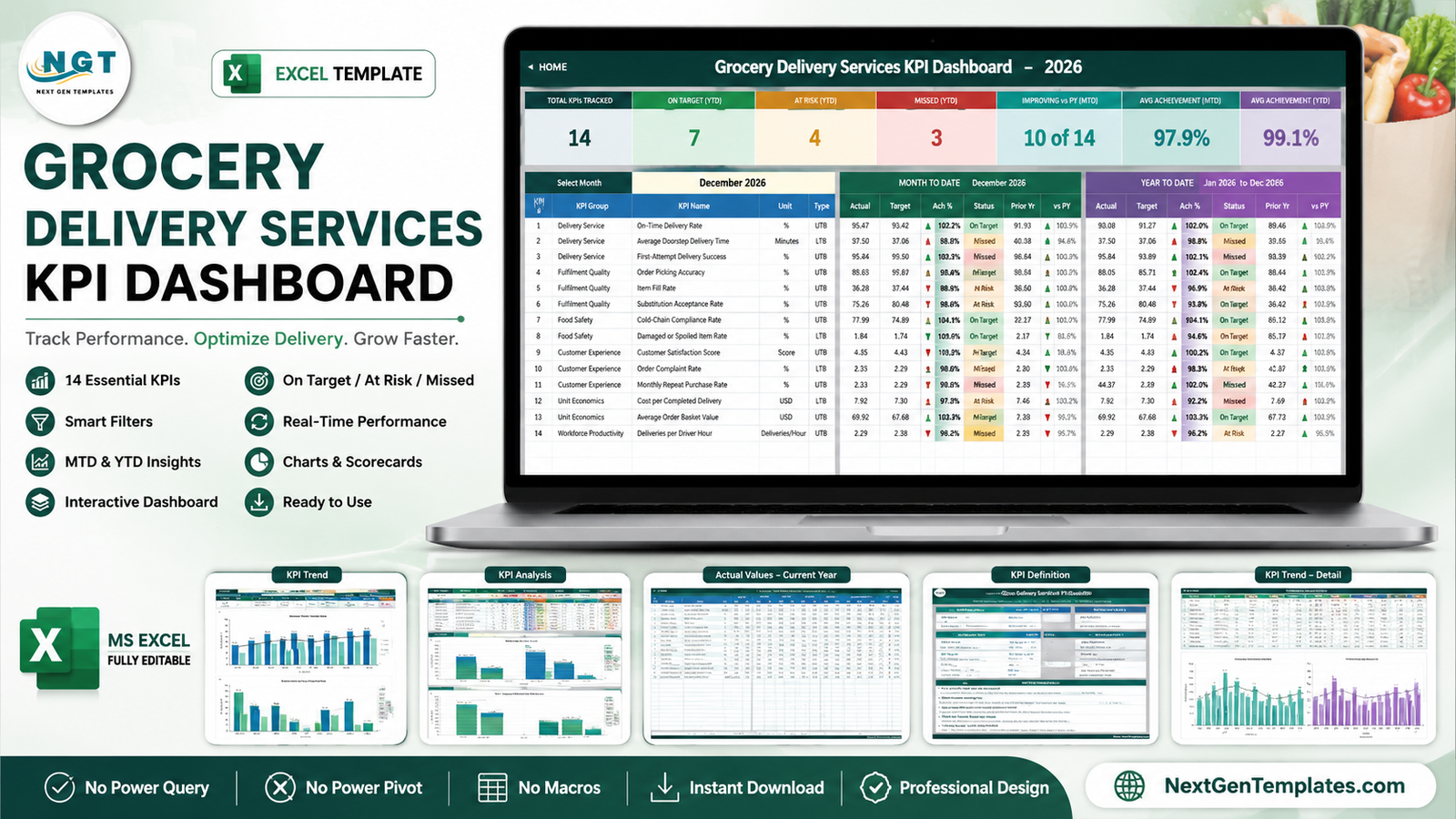
The Grocery Delivery Services KPI Dashboard in Excel puts all of them on one page. It is a month-picker KPI scorecard: choose a month from a dropdown and read 14 KPIs with month-to-date and year-to-date actual, target, achievement percentage, a traffic-light status, the prior-year figure and the year-on-year movement. Every number is a plain worksheet formula – no Power Query, no data model, no macros, nothing to refresh. Ten sheets, all unlocked, with a full set of 2026 and 2025 sample data already loaded.
It is worth being precise about what this is, because a similarly named product exists. This is the scorecard – governance, targets, traffic lights. The Grocery Delivery Services Dashboard in Excel is the analytical dashboard – transaction-level slicing with pivot charts. The scorecard answers “are we on target”; the analytical dashboard answers “why”. They are complementary.
Key Features of the Grocery Delivery Services KPI Dashboard
- One month dropdown drives the whole workbook. Cell D6 on the KPI Dashboard sheet lists the twelve months of the reporting year. Change it and the scorecard, the seven summary cards and the entire KPI Analysis page follow.
- 14 KPIs in 6 groups – Delivery Service, Fulfilment Quality, Food Safety, Customer Experience, Unit Economics and Workforce Productivity.
- Direction-aware achievement. Each KPI carries a UTB (Upper The Better) or LTB (Lower The Better) flag. Achievement is Actual / Target for UTB and Target / Actual for LTB, so beating a cost or a delivery-time target scores above 100% instead of reading as a miss.
- Traffic lights with editable thresholds – On Target from 100%, At Risk 95% to 99%, Missed below 95%. The thresholds sit in the formulas in columns L and U, so you can move them.
- Coloured direction arrows that reflect whether a movement is good for that KPI, which is why a falling cost per delivery shows a green down-arrow.
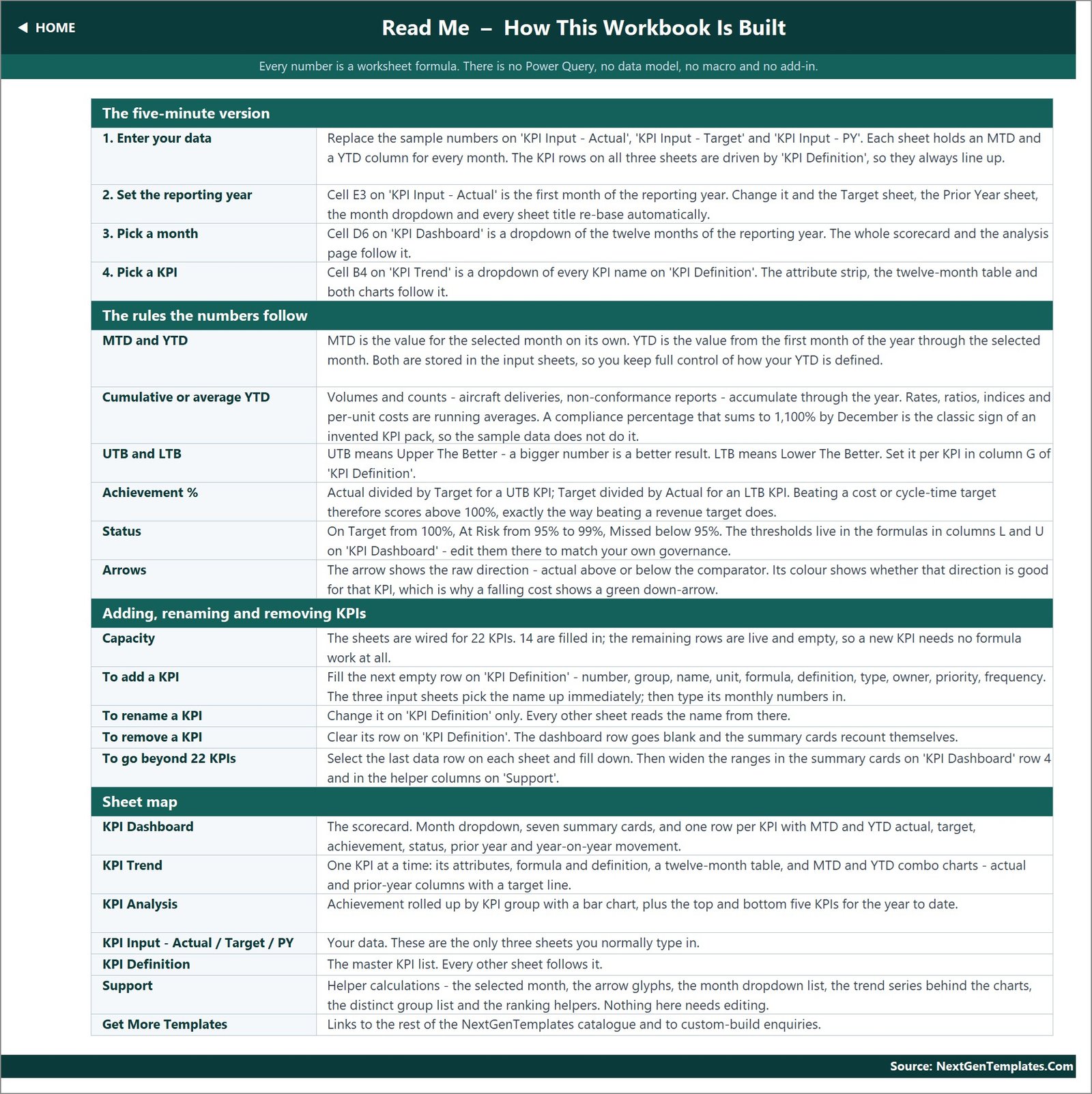
- Wired for 22 KPIs, 14 filled in. The spare rows are live, so the next eight KPIs need no formula work at all.
- Opens anywhere – Excel 2013 and later, Microsoft 365 and Excel for the web, using only VLOOKUP, MATCH, INDEX and COUNTIF.
Dashboard Pages Explanation
Ten sheets: three you type in, three you read, four that support and explain.
1. Home sheet
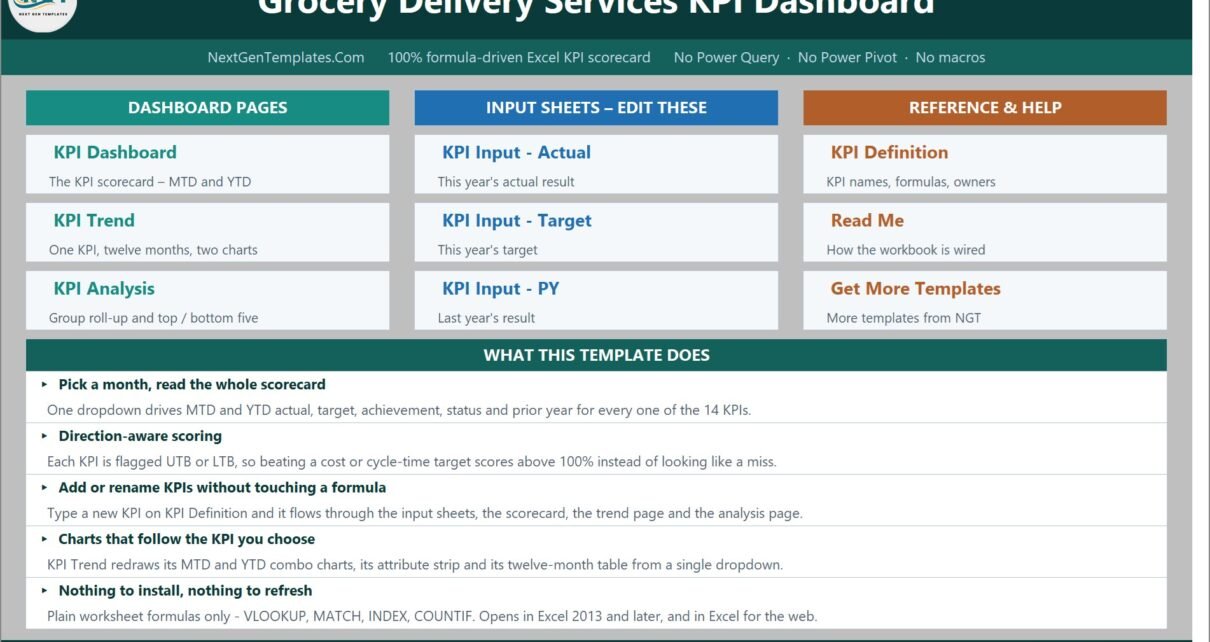
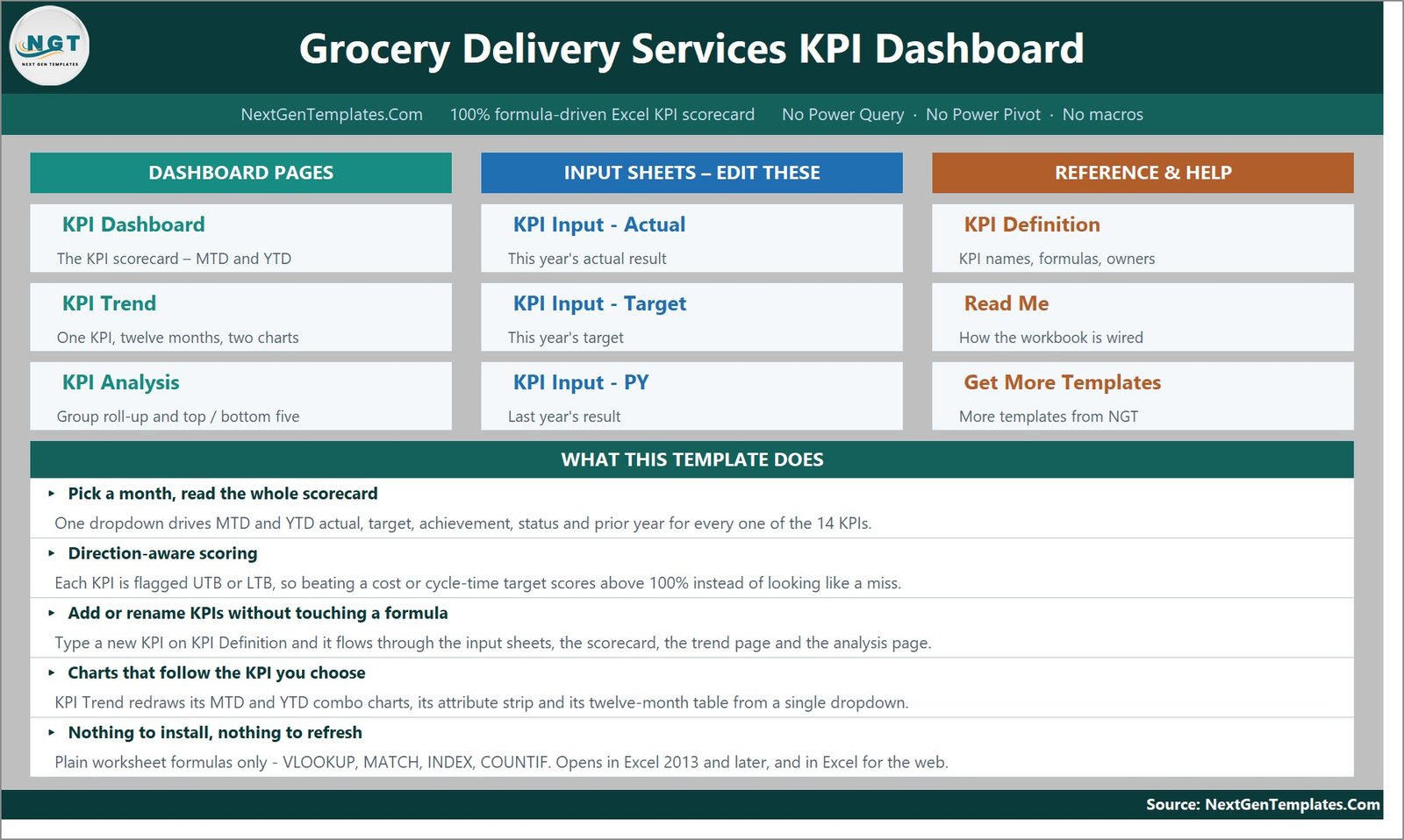
The index. Navigation buttons in three columns – Dashboard Pages, Input Sheets and Reference & Help – plus a “what this template does” panel that spells out the month picker, direction-aware scoring and the fact that nothing needs installing.
2. KPI Dashboard sheet – the scorecard
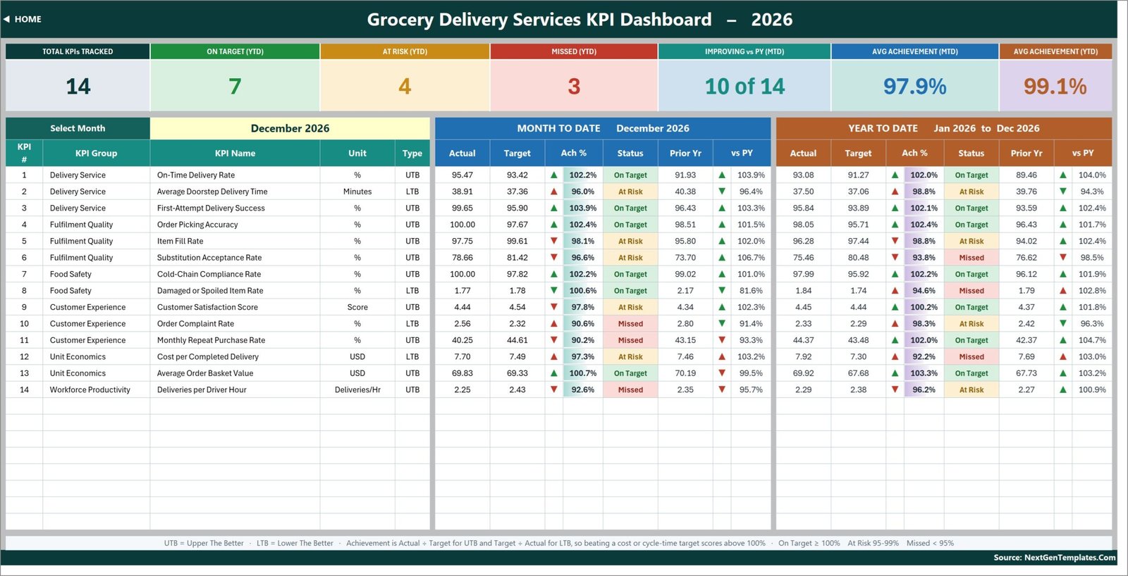
The main page. Seven summary cards run across the top: Total KPIs Tracked, On Target (YTD), At Risk (YTD), Missed (YTD), Improving vs PY (MTD), Avg Achievement (MTD) and Avg Achievement (YTD). Below them, one row per KPI with number, group, name, unit and type, then a Month To Date block and a Year To Date block that each carry Actual, Target, Ach %, Status, Prior Yr and vs PY.
In the shipped sample, December 2026 reads 7 On Target, 4 At Risk and 3 Missed, with 97.9% average MTD achievement against 99.1% YTD. On-Time Delivery Rate sits at 95.47 against a 93.42 target (102.2%, On Target), while Order Complaint Rate at 2.56 against a 2.32 target scores 90.6% and flags Missed – exactly the sort of split a real monthly review has to talk about.
3. KPI Trend sheet
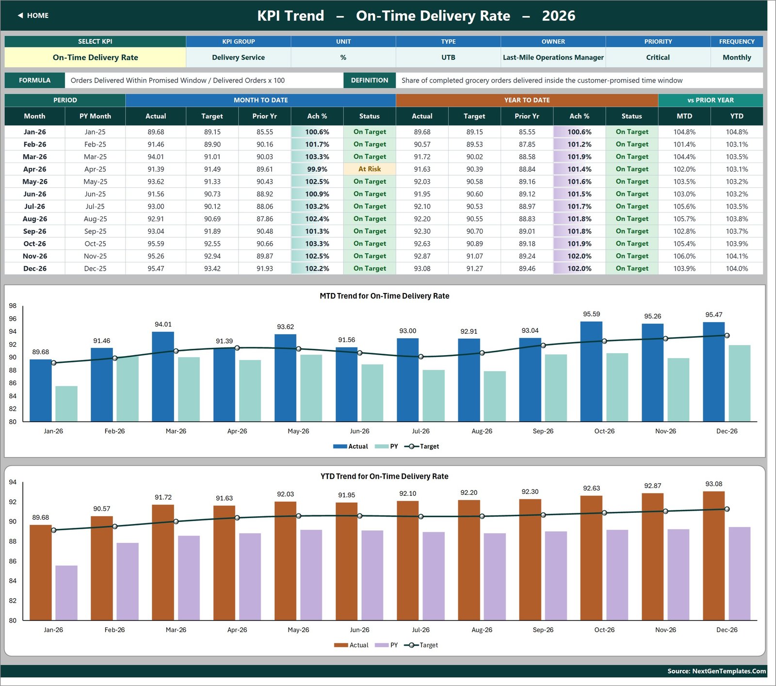
One KPI at a time. Pick it from the dropdown in B4 and the page rebuilds: an attribute strip showing KPI Group, Unit, Type, Owner, Priority and Frequency; the formula and the written definition; a twelve-month table with MTD and YTD actual, target, prior year, achievement and status side by side; and two combo charts – MTD Trend for On-Time Delivery Rate and YTD Trend for On-Time Delivery Rate – each plotting actual and prior-year columns against a target line.
4. KPI Analysis sheet
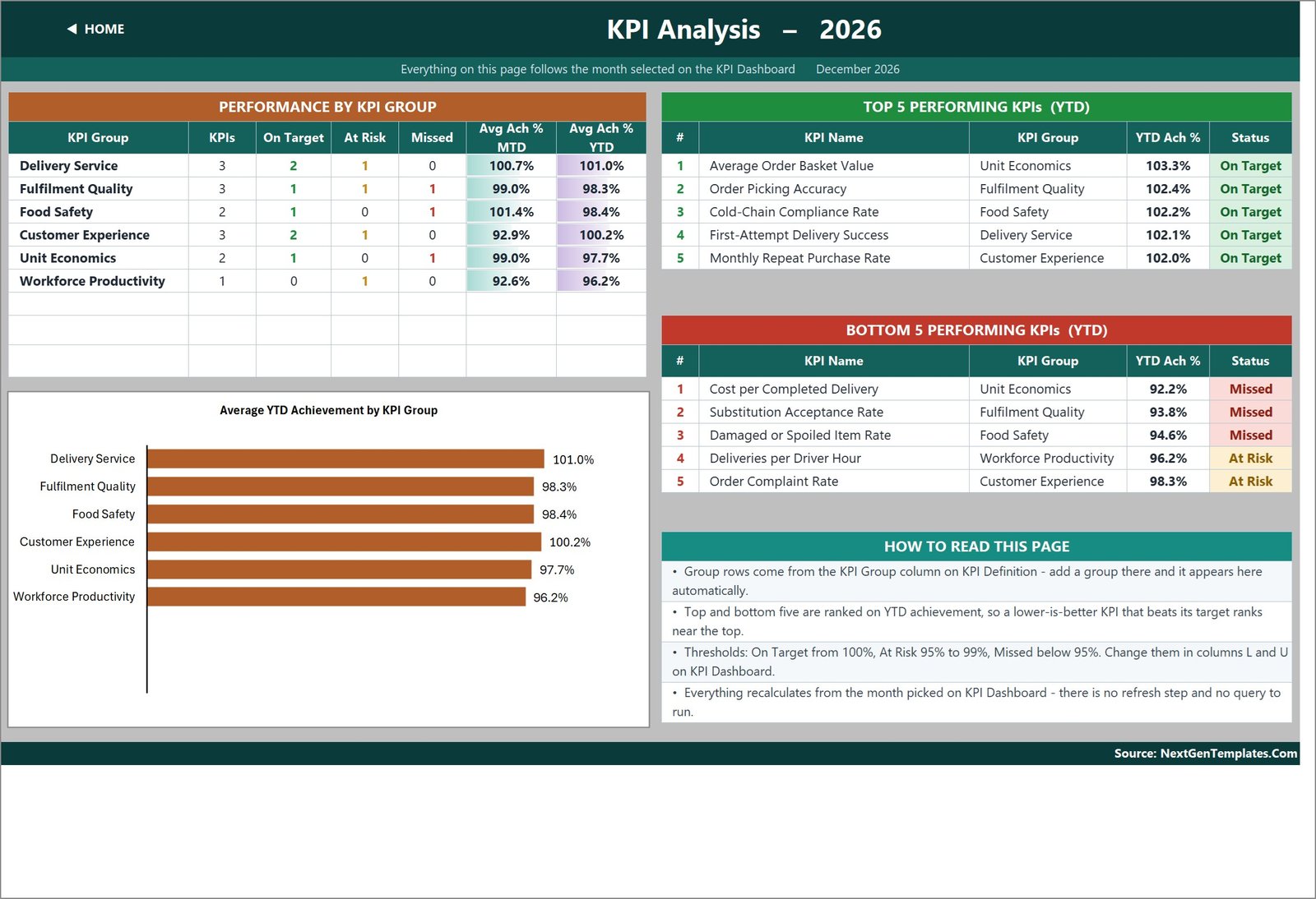
Two questions answered at once. On the left, Performance by KPI Group: how many KPIs each group holds, how many are On Target, At Risk or Missed, and average achievement for MTD and YTD, with an Average YTD Achievement by KPI Group bar chart underneath. On the right, the Top 5 and Bottom 5 performing KPIs for the year to date. In the sample, Average Order Basket Value leads at 103.3% and Cost per Completed Delivery trails at 92.2%.
5, 6 and 7. The three input sheets
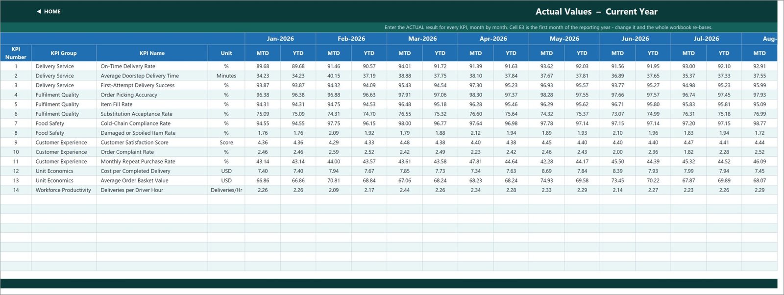
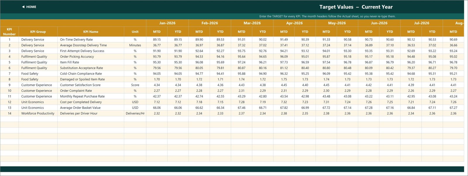
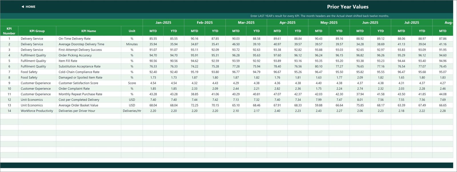
KPI Input – Actual holds this year’s results, KPI Input – Target holds the targets and KPI Input – PY holds last year. Each has an MTD and a YTD column for every month, so you keep control of how YTD is defined – volumes accumulate, rates and per-unit costs are running averages. Cell E3 on the Actual sheet is the first month of the reporting year; change it and the Target sheet, the PY sheet, the month dropdown and every sheet title re-base themselves.
8. KPI Definition sheet
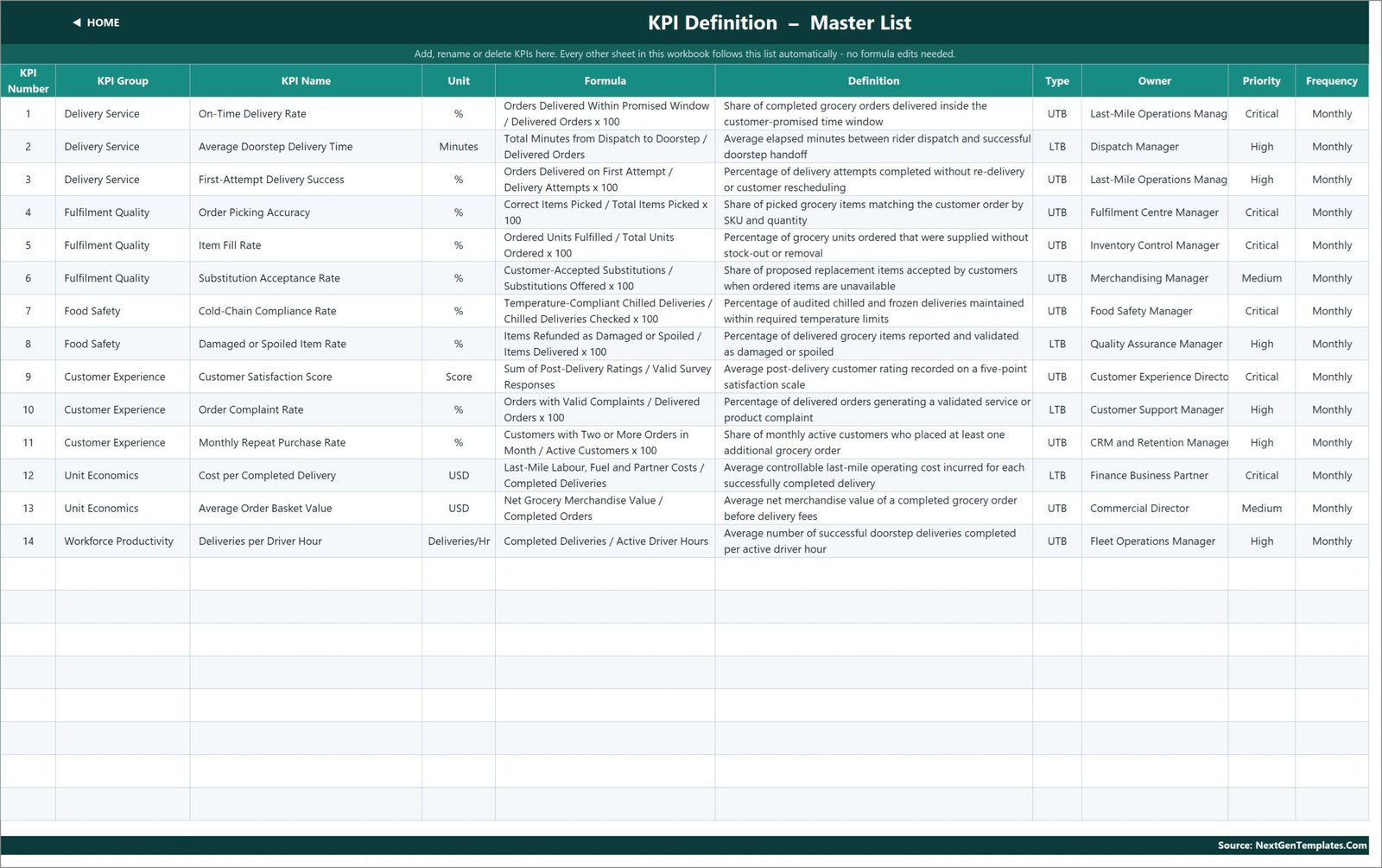
The master list and the only place you rename anything: KPI Number, Group, Name, Unit, Formula, Definition, Type, Owner, Priority and Frequency. The shipped rows carry real formulas – On-Time Delivery Rate is Orders Delivered Within Promised Window / Delivered Orders x 100, Cost per Completed Delivery is Last-Mile Labour, Fuel and Partner Costs / Completed Deliveries – and real owners, from Last-Mile Operations Manager to Fleet Operations Manager.
9 and 10. Read Me and Get More Templates
Read Me is a five-minute setup guide plus the rules the numbers follow and a full sheet map. Get More Templates links to the rest of the NextGenTemplates catalogue.
Excel KPI Scorecard vs. Google Sheets vs. Paid Delivery Analytics SaaS – Feature Comparison
| This Excel KPI scorecard | Google Sheets KPI scorecard | Paid delivery analytics SaaS (Zoho Inventory / NetSuite ERP add-on) | |
|---|---|---|---|
| Cost | 19.99 one-off (12.99 on sale) | 16.99 one-off | 60-250 per user per month |
| Platform | Excel 2013+, Microsoft 365, Excel for the web | Browser, any device | Vendor cloud only |
| Setup time | Under 30 minutes | Under 30 minutes | 2-8 weeks with an implementation partner |
| Real-time team collaboration | OneDrive / SharePoint co-authoring | Native | Native |
| Mobile access | Excel mobile app | Sheets mobile app | Vendor app |
| Customizable fields | Every cell and formula unlocked | Fully editable | Admin-controlled, often chargeable |
| Share with link | OneDrive share link | Native share link | Seat-based logins |
| Year-1 cost at 5 users | 19.99 total | 16.99 total | 3,600-15,000 |
| Works offline | Yes | Limited | No |
| Cold-chain and food-safety KPIs out of the box | Yes | Yes | Usually a custom field build |
Who Should Use This Template
Last-mile operations managers who run a monthly KPI review. Dark-store and fulfilment-centre managers who report pick accuracy and fill rate upward. Grocery e-commerce founders who need a board-ready single page. Food safety and quality leads who own cold-chain compliance. Finance business partners who own cost per completed delivery and average order basket value. And consultants who need a defensible scorecard to hand a client on day one.
It is not the right tool if you need live order-level data. This reads monthly summary numbers that you enter; it is not an API feed, a route optimiser or a WMS.
Real-World Use Cases
The monthly ops review. A 40-rider grocery service enters 14 numbers into three sheets, picks December from the dropdown, and walks leadership down one page: on-time delivery at 102.2% of target, first-attempt success at 103.9%, average doorstep delivery time at 96.0% and slipping. The KPI Trend page for Average Doorstep Delivery Time supplies the twelve-month picture without anyone building a chart.
The dark-store network. Three Fulfilment Quality KPIs – order picking accuracy, item fill rate and substitution acceptance – roll into a single line on KPI Analysis: 3 KPIs, 1 On Target, 1 At Risk, 1 Missed, 98.3% average YTD achievement. The Bottom 5 table becomes the business case for fixing the substitution catalogue.
The finance partner’s slide. Cost per Completed Delivery is an LTB KPI, so a month that lands under target scores above 100% with a green arrow. The slide no longer needs a footnote explaining why a lower number is good.
Advantages of the Grocery Delivery Services KPI Dashboard
- Nothing to install and nothing to refresh. Plain worksheet formulas mean no macro security prompt, no broken query and no “the data model failed to load” on a colleague’s machine.
- The KPI list is data, not code. Rename a KPI on KPI Definition and the input sheets, the scorecard, the trend page and the analysis page all follow. Microsoft’s own guidance on VLOOKUP covers the lookup pattern the workbook uses if you want to trace it.
- LTB handling is built in, which is the single most common thing hand-built scorecards get wrong.
- Ownership is on the page. Every KPI names an owner, a priority and a frequency, so the review has someone to ask.
- Sample data ships with it, so you can evaluate the logic before committing your own numbers.
Opportunities for Improvement
Being honest about the edges: the workbook reads monthly summary values, so it will not slice a single day or a single rider – that is a job for the analytical dashboard. Charts on the KPI Trend page cover one KPI at a time by design, which keeps the page readable but means cross-KPI overlays need a manual chart. And because YTD is stored rather than derived, you own the definition – a rate that you accidentally sum instead of average will show it. The Read Me sheet flags exactly this trap.
Best Practices
- Set cell E3 on KPI Input – Actual before you type anything else – it re-bases the whole workbook.
- Decide UTB or LTB for every KPI on day one. It is the flag that makes the traffic lights honest.
- Keep YTD consistent: accumulate volumes and counts, average rates, ratios and per-unit costs.
- Move the thresholds in columns L and U to match your own governance rather than arguing with the default 95%.
- Fill in the Owner column properly. A scorecard without names is a report; with names it is a review.
- Save a dated copy each month before overwriting, so you keep an audit trail.
Explore Relevant Templates
- Grocery Delivery Services KPI Dashboard in Excel – the template covered in this article.
- Grocery Delivery Services Dashboard in Excel – the transaction-level analytical dashboard.
- Grocery Delivery Services Dashboard in Power BI – the same analysis as a .pbix report.
- Last-Mile Delivery KPI Dashboard in Power BI – a Power BI scorecard for wider last-mile operations.
- Hypermarkets KPI Dashboard in Excel – the store-side scorecard built on the same engine.
Frequently Asked Questions
Is this the KPI scorecard or the analytical dashboard?
The scorecard. Month picker, traffic lights, KPI Trend and KPI Analysis pages, driven by monthly summary numbers you enter. The analytical Grocery Delivery Services Dashboard in Excel is a separate, transaction-level product.
Which versions of Excel does it work in?
Excel 2013 and later on Windows and Mac, Microsoft 365, and Excel for the web. It uses only VLOOKUP, MATCH, INDEX and COUNTIF – no dynamic arrays, no Power Query, no Power Pivot and no macros.
Can I add my own KPIs?
Yes. The sheets are wired for 22 KPIs and 14 are used, so the next eight need no formula work – fill the next empty row on KPI Definition and type the monthly numbers. To go beyond 22, select the last data row on each sheet and fill down, then widen the ranges in the summary cards on KPI Dashboard row 4 and in the helper columns on the Support sheet.
Why does a cost KPI score above 100% when the number fell?
Because it is flagged LTB, so achievement is Target / Actual. Beating a cost target scores above 100% exactly the way beating a revenue target does. Set the flag per KPI in column G of KPI Definition.
Do I need to refresh anything?
No. Every number is a worksheet formula, so the scorecard is correct the moment you change a cell.
Is the workbook locked?
No. Every sheet, formula, colour and label is editable – add a logo, restyle it in your brand colours, or delete a page you do not need.
What do I get when I buy it?
An instant download of a ZIP containing the .xlsx workbook with all ten sheets and full 2026 and 2025 sample data, lifetime access to the file, and email support for setup questions.
About the Author
Built by PK – Microsoft Certified Professional with 15+ years of Excel, Google Sheets, and Power BI experience. Founder of NextGenTemplates, reaching 300K+ subscribers across YouTube channels. Every template is hand-built and tested before release.
Conclusion
Grocery delivery lives and dies on a small set of numbers that are usually scattered across a team. This workbook gathers 14 of them onto one page, scores them in the right direction, colours them honestly and shows you both the month and the year at once – without a single macro or query to maintain. Pick a month, read the page, and spend the meeting talking about the three KPIs that are red instead of hunting for them.
Download the Grocery Delivery Services KPI Dashboard in Excel from NextGenTemplates, or email info@NextGenTemplates.Com if you want the same 14 KPIs wired to your own data.
For more Excel dashboard and KPI walkthroughs, subscribe to PK: An Excel Expert on YouTube.