Running a hypermarket means holding half a dozen numbers in tension at the same time. Basket value and gross margin pull against each other. Labour cost and checkout queue time pull against each other. Inventory turns and on-shelf availability pull against each other. By the time the monthly review comes round, most teams are stitching those numbers together from four different reports and a hurried spreadsheet.
The Hypermarkets KPI Dashboard in Excel replaces that stitching with one scorecard. Pick a month from a dropdown and the workbook shows every KPI’s actual, target, achievement percentage, traffic-light status and prior-year comparison – for the month and for the year to date – on a single page.
What This Template Actually Is
This is a KPI scorecard, and it is worth being precise about that, because NextGenTemplates also publishes analytical Excel dashboards with similar names and they are a different kind of tool.
A scorecard takes one number per KPI per month. You type what happened, what you were aiming for, and what happened in the same month last year. The workbook does the rest: the achievement maths, the direction logic, the colour coding, the year-to-date roll-up and the charts. There is no transaction table, no pivot cache, no data model and no refresh step.
An analytical dashboard works the other way round – you feed it raw rows and slice them. Both are useful. The scorecard tells you which KPI missed; an analytical dashboard tells you why.
Everything here is a plain worksheet formula – VLOOKUP, MATCH, INDEX, COUNTIF. No Power Query, no Power Pivot, no macros, no add-ins. It is a .xlsx, so it opens on locked-down machines and in Excel for the web, and there is no macro warning to click past.
The Scorecard Page
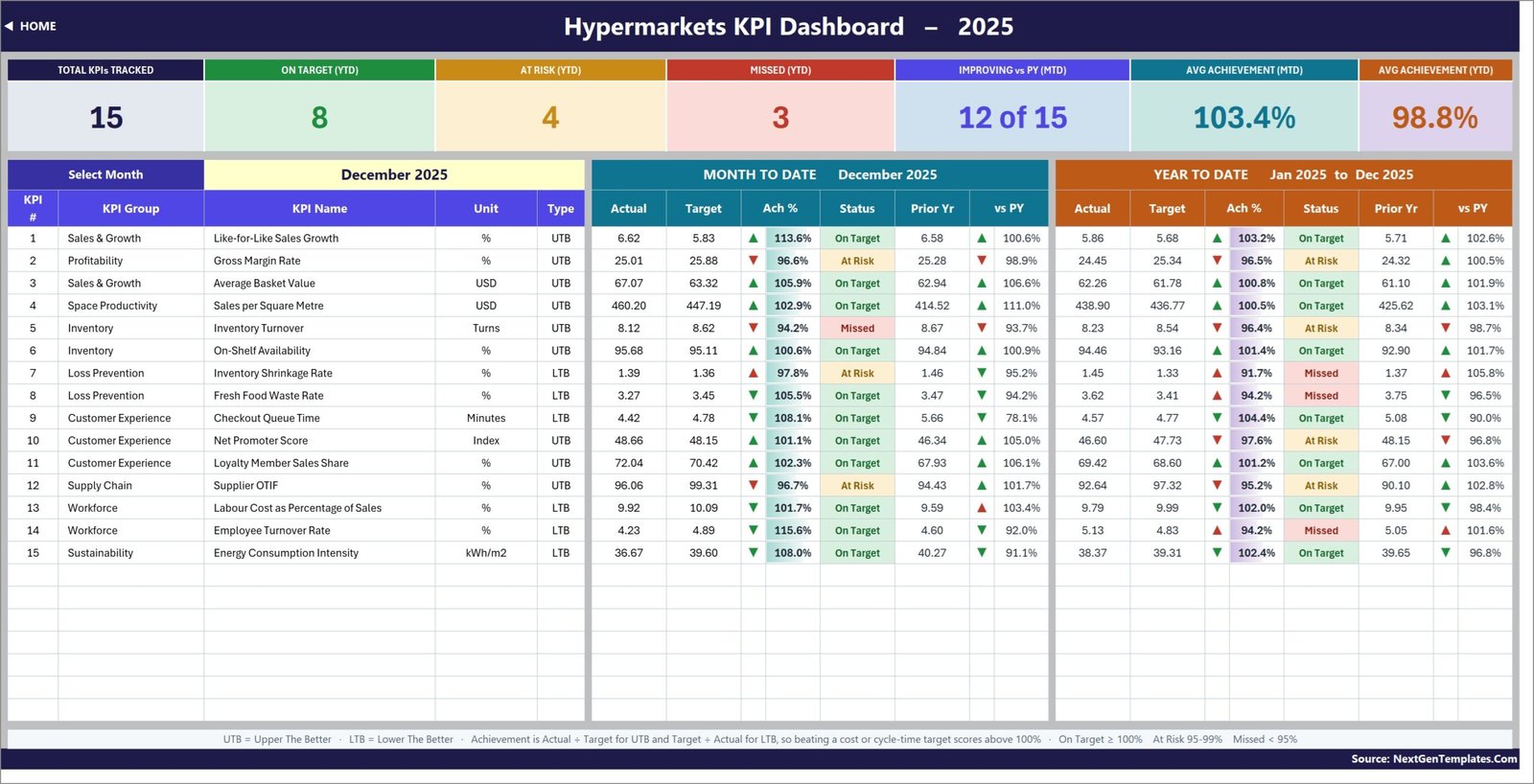
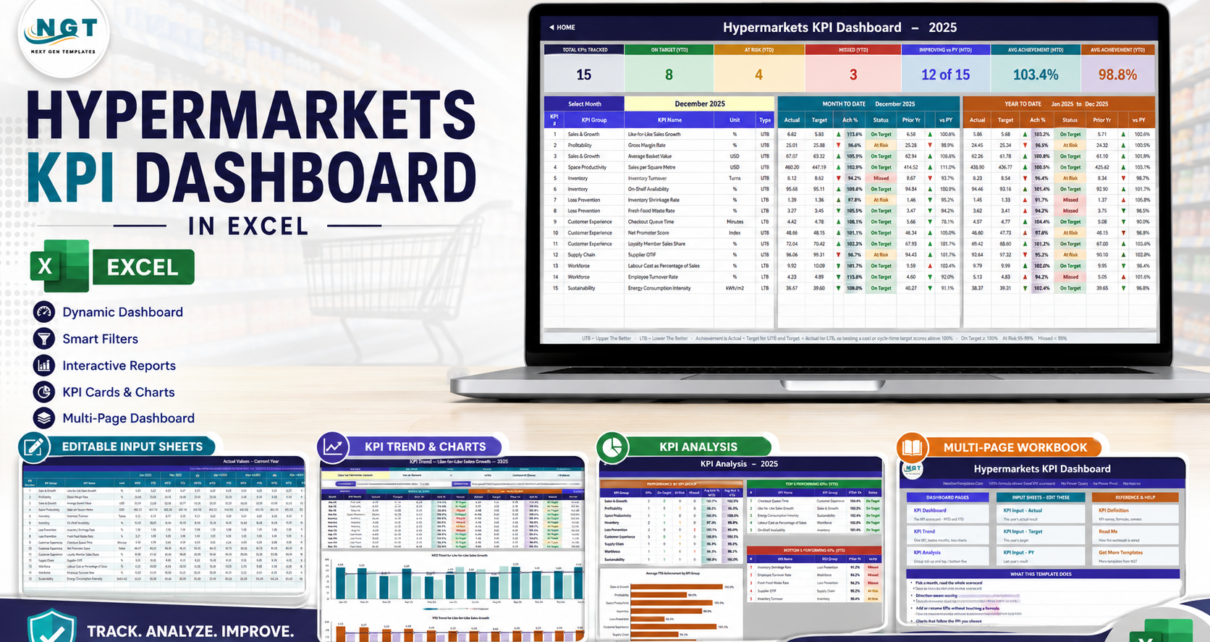
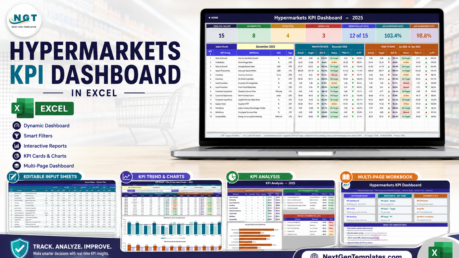
The KPI Dashboard sheet is where the month is chosen and everything else follows. Seven summary cards run across the top – Total KPIs Tracked, On Target (YTD), At Risk (YTD), Missed (YTD), Improving vs PY (MTD), Avg Achievement (MTD) and Avg Achievement (YTD). In the supplied sample data for December 2025 they read 15 tracked, 8 on target, 4 at risk, 3 missed, 12 of 15 improving versus prior year, 103.4% average MTD achievement and 98.8% average YTD achievement.
Below the cards, one row per KPI, split into two blocks. The Month to Date block gives actual, target, achievement %, status, prior year and vs PY. The Year to Date block gives the same six columns for January through the selected month.
Direction-aware achievement, which is the part most templates get wrong
Every KPI carries a type: UTB (upper the better) or LTB (lower the better). Achievement is Actual / Target for a UTB KPI and Target / Actual for an LTB KPI.
That single rule is what makes the page readable. Inventory Shrinkage Rate coming in at 1.39% against a 1.36% target is a miss. Checkout Queue Time coming in at 4.42 minutes against a 4.78 minute target is a win – and it scores 108.1%, not 92%. Cost, waste and cycle-time KPIs sit alongside sales KPIs and are scored on the same 100% scale, so a manager reading the column does not have to remember which way each arrow should point.
Status follows from achievement: On Target from 100%, At Risk from 95% to 99%, Missed below 95%. Those thresholds live in visible formulas on the sheet, so if your governance uses different bands you edit them directly.
The 15 Hypermarket KPIs
The pack ships with 15 KPIs spread across 9 groups, chosen to cover the whole store rather than just the till.
| KPI Group | KPI | Unit | Direction |
|---|---|---|---|
| Sales & Growth | Like-for-Like Sales Growth | % | Higher is better |
| Sales & Growth | Average Basket Value | USD | Higher is better |
| Profitability | Gross Margin Rate | % | Higher is better |
| Space Productivity | Sales per Square Metre | USD | Higher is better |
| Inventory | Inventory Turnover | Turns | Higher is better |
| Inventory | On-Shelf Availability | % | Higher is better |
| Loss Prevention | Inventory Shrinkage Rate | % | Lower is better |
| Loss Prevention | Fresh Food Waste Rate | % | Lower is better |
| Customer Experience | Checkout Queue Time | Minutes | Lower is better |
| Customer Experience | Net Promoter Score | Index | Higher is better |
| Customer Experience | Loyalty Member Sales Share | % | Higher is better |
| Supply Chain | Supplier OTIF | % | Higher is better |
| Workforce | Labour Cost as Percentage of Sales | % | Lower is better |
| Workforce | Employee Turnover Rate | % | Lower is better |
| Sustainability | Energy Consumption Intensity | kWh/m2 | Lower is better |
Each one arrives with its calculation formula, a plain-English definition, an owner job title, a priority and a reporting frequency on the KPI Definition sheet. Like-for-Like Sales Growth, for instance, is defined as (Current Comparable Sales / Prior-Year Comparable Sales – 1) x 100, owned by the Commercial Director, priority Critical, reported Monthly. That makes the workbook usable as a KPI dictionary as well as a report.
KPI Trend – One KPI, Twelve Months
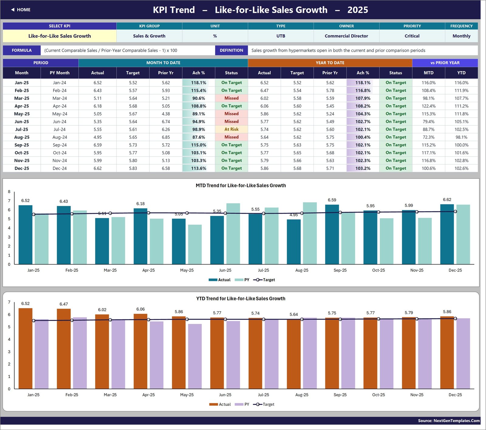
Pick a KPI from the dropdown at the top of the KPI Trend sheet and the whole page redraws. You get an attribute strip (group, unit, type, owner, priority, frequency), the KPI’s formula and definition, a twelve-month table with MTD and YTD actual, target, prior year, achievement and status, and two combo charts:
- MTD Trend for the selected KPI – Actual and prior-year columns against a Target line.
- YTD Trend for the selected KPI – the same view for the cumulative or running-average year-to-date figure.
This is where the scorecard earns its keep in a review meeting. The dashboard page says Like-for-Like Sales Growth finished December at 113.6% of target; the trend page shows it missed in March, May, June and August and recovered from September onwards – a different conversation entirely.
KPI Analysis – Where the Problems Cluster
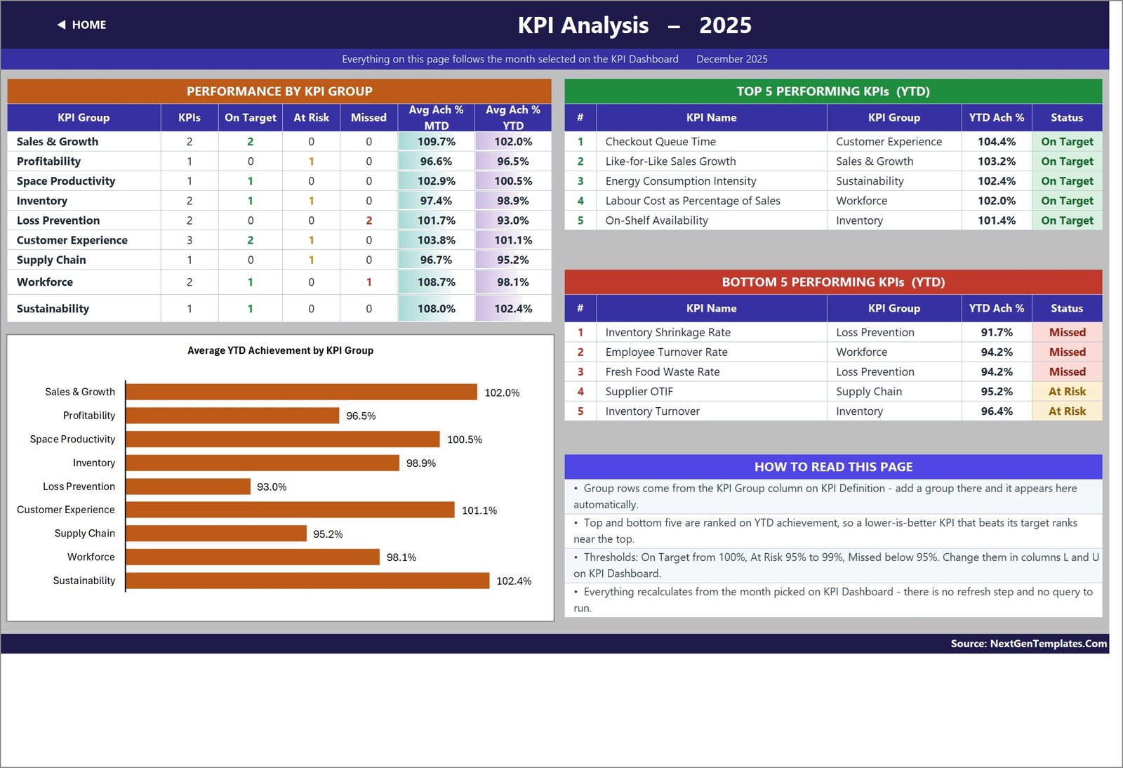
The KPI Analysis sheet rolls the scorecard up by KPI group: how many KPIs sit in each group, how many are on target, at risk or missed, and the average MTD and YTD achievement for the group. An Average YTD Achievement by KPI Group bar chart puts the groups side by side.
To the right, ranked Top 5 and Bottom 5 KPI tables for the year to date. Because the ranking uses direction-aware achievement, a lower-is-better KPI that beat its target ranks near the top exactly as a sales KPI would. In the sample year, Checkout Queue Time leads on 104.4% while Inventory Shrinkage Rate sits bottom on 91.7% – and the group table shows Loss Prevention as the weakest group at 93.0%, which is where a store manager would start.
Everything on this page follows the month picked on the KPI Dashboard, so the analysis and the scorecard can never disagree.
The Three Sheets You Type Into
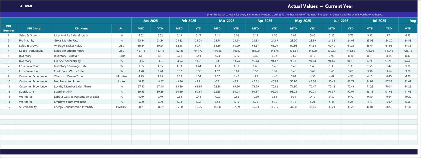
Data entry is deliberately boring. Three sheets – KPI Input – Actual, KPI Input – Target and KPI Input – PY – each hold an MTD and a YTD column for every month of the reporting year. The KPI rows on all three come from the KPI Definition sheet, so they always line up, and the Target and Prior Year sheets take their month headers from the Actual sheet, so a date is never typed twice.
Holding MTD and YTD separately is a deliberate design choice, and the Read Me sheet explains why: volumes and counts accumulate through the year, while rates, ratios, indices and per-unit costs are running averages. A compliance percentage that adds up to 1,100% by December is the classic sign of a KPI pack that was never thought through. Keeping both columns under your control avoids that.
Changing the KPIs
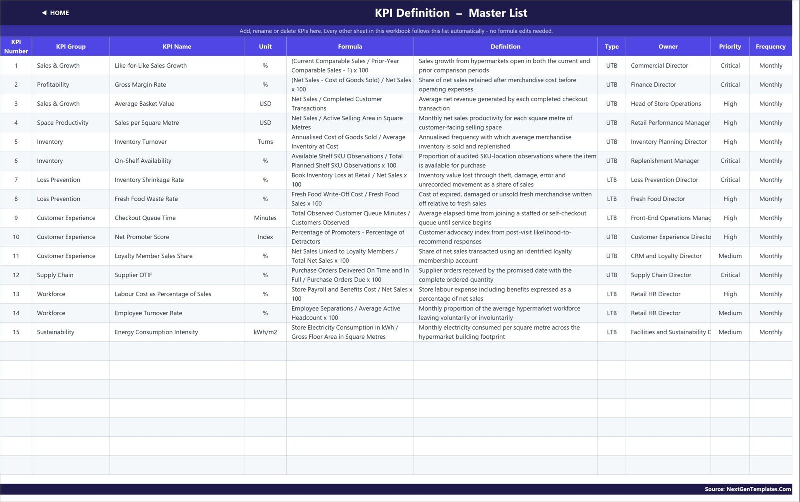
The KPI Definition sheet is the master list, and every other sheet reads from it. Rename a KPI there and the change appears on the input sheets, the scorecard, the trend dropdown and the analysis roll-up. Clear a row and the dashboard row goes blank and the summary cards recount themselves.
The sheets are wired for 22 KPIs. Fifteen are filled in, so there are seven live, empty rows waiting – add a KPI by typing its number, group, name, unit, formula, definition, type, owner, priority and frequency into the next blank row. No formula editing at all. If you need more than 22, the Read Me sheet explains the fill-down and range widening involved.
One more single-cell control worth knowing: cell E3 on KPI Input – Actual holds the first month of the reporting year. Change it and the Target sheet, the Prior Year sheet, the month dropdown and every sheet title re-base themselves. A fiscal year starting in April takes one edit.
Who Gets the Most Out of It
- Hypermarket and superstore general managers preparing the monthly performance pack.
- Area and regional managers who need this month against target and against last year on one page.
- Retail finance and FP&A teams reporting margin, labour cost and shrink beside sales rather than in separate files.
- Replenishment, category and supply chain managers tracking on-shelf availability, inventory turns and supplier OTIF.
- Loss prevention and fresh food teams who need shrinkage and waste scored against a target, not quoted in isolation.
- Retail consultants who want a client-ready scorecard without building the formula engine from scratch.
Getting Started in Ten Minutes
- Download the zip, unzip it and open the .xlsx. Nothing to install, no macro prompt.
- Set the first month of your reporting year in cell E3 on KPI Input – Actual.
- On KPI Definition, keep, rename or replace the supplied KPIs and set each one’s UTB / LTB type.
- Replace the sample numbers on the three input sheets with your own.
- Pick your month on KPI Dashboard and read the scorecard.
- Use KPI Trend to drill into any single KPI, and KPI Analysis to see which group is dragging.
- Adjust the 100 / 95 status thresholds on the dashboard sheet if your governance uses different bands.
Frequently Asked Questions
Do I need Power Query, Power Pivot or macros?
No. Every number is a plain worksheet formula and the file is a .xlsx. It opens in Excel 2013 and later, in Microsoft 365 and in Excel for the web.
Is this the same as an analytical Hypermarkets dashboard?
No. This is the month-picker KPI scorecard – one number per KPI per month, with achievement, status and trend. An analytical dashboard is driven by a transaction table with slicers. They pair well but they are separate templates.
Can I use my own KPIs?
Yes. Edit the KPI Definition sheet and the rest of the workbook follows. Seven empty live rows are ready for additions with no formula work.
Why does a lower-is-better KPI show above 100%?
Because achievement for an LTB KPI is Target / Actual. Coming in under a cost, waste or queue-time target correctly scores above 100%.
Can it handle more than one store?
It is built as a single scorecard. The usual pattern is one copy per store or region plus a consolidated group copy. A multi-store version with a store selector is available as a custom build.
Does it include sample data?
Yes – twelve months of realistic actual, target and prior-year figures for all 15 KPIs, so the whole thing works the moment you open it.
Get the Template
The Hypermarkets KPI Dashboard in Excel is available now on NextGenTemplates, with instant download, full editability and lifetime access to the file.
Download the Hypermarkets KPI Dashboard in Excel
You may also want to look at the Grocery Delivery Services KPI Dashboard in Excel for the online fulfilment side of the basket, the Container Tracking Dashboard in Excel for inbound retail logistics, or the Robo Advisors KPI Dashboard in Excel to see the same scorecard engine applied to a very different industry.
Need the same scorecard built around your own KPI list, in Excel, Power BI or Google Sheets? Tell us the KPIs that matter and we will build it – info@NextGenTemplates.Com.