Running a subscription box means watching the same handful of numbers every month: how many people joined, how many left, what a box costs to pack and ship, and whether the margin survived all of it. Most teams end up rebuilding that view in a spreadsheet every month. Subscription Box KPI Dashboard in Power BI
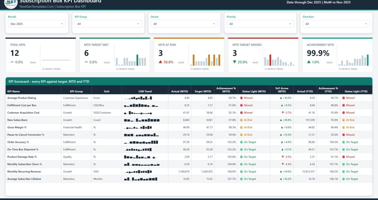
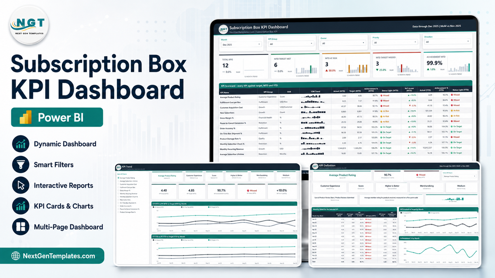
The Subscription Box KPI Dashboard in Power BI is the built version of that view. Pick a month, and twelve subscription box KPIs score themselves against target with traffic lights, MTD and YTD achievement, a 12-month sparkline and a year-on-year arrow.
Scorecard, not analytical dashboard
Worth settling this before anything else, because we publish both and the names look alike.
A scorecard answers “are we hitting our numbers this month?” It is a table of KPIs, each with a target, a status light and a trend. That is this template.
An analytical dashboard answers “why did that number move?” It is chart-led, and slices one transactional dataset by product, region, cohort and time. That is a different template.
Plenty of teams keep both – the scorecard for the monthly review, the analytical dashboard for the investigation that follows a red light. But they are not substitutes, and buying one expecting the other is the most common mix-up we see.
Page 1 – the KPI Scorecard
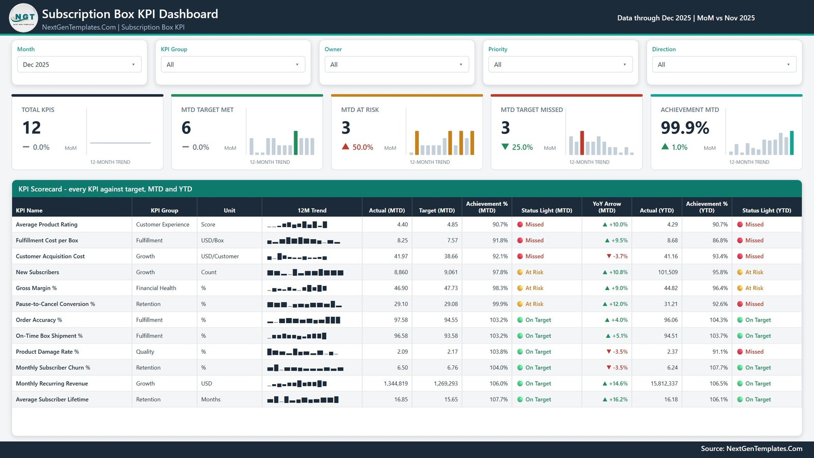
Five slicers run across the top: Month, KPI Group, Owner, Priority and Direction. Under them, five headline cards, each with its own 12-month trend:
- Total KPIs – how many KPIs are in scope after the slicers
- MTD Target Met
- MTD At Risk
- MTD Target Missed
- Achievement MTD – the overall achievement figure, with its month-on-month change
Then the table itself, headed KPI Scorecard – every KPI against target, MTD and YTD. Each row carries the KPI name, its group, its unit, a 12-month sparkline, Actual and Target MTD, Achievement % MTD, a status light, a YoY arrow, then Actual YTD, Achievement % YTD and a second status light.
That second light is the part people find most useful. A KPI can be green this month and red for the year, or the reverse, and putting both on the same row stops a single good month from hiding a bad year.
How the scoring actually works
Two rules do all the work, and both are documented in the workbook’s Read Me sheet rather than buried in DAX.
Achievement is direction-aware. Higher-is-better KPIs score Actual / Target. Lower-is-better KPIs score Target / Actual. So beating a cost target – packing a box for less than planned, or holding churn below plan – reads above 100% and turns green, instead of looking like a shortfall. You set the direction per KPI with UTB or LTB in the data pack.
The thresholds are fixed and simple. On Target at 100% or more. At Risk from 95% up to 100%. Missed below 95%. Because the twelve KPIs are in different units – dollars, counts, percentages, months, a five-point rating – every cross-KPI figure on the page is either an Achievement % or a count of KPIs. Absolute values only ever appear per KPI, where they mean something.
One more piece of design worth calling out, because it is the single most common mistake in a hand-built KPI pack: YTD sums for additive measures and averages for rates. Money, volume and counts add up from January. A percentage, ratio, day-count or index averages across the months so far. A compliance percentage that reaches 1,900% by December makes every YTD chart useless, and the data pack tells you so directly.
Page 2 – KPI Trend
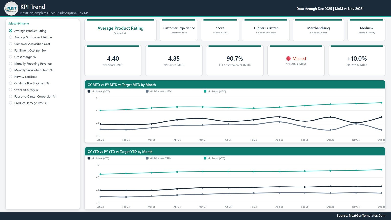
All twelve KPIs sit in a single-select list down the left. Choose one and the whole page becomes that KPI.
Six context cards name the selected KPI plus its group, unit, direction, owner and priority – so you always know whether you are looking at a higher-is-better score or a lower-is-better cost, and whose number it is. Five value cards below them give KPI Actual (MTD), KPI Target (MTD), KPI Achievement % (MTD), KPI Status (MTD) and KPI YoY % (MTD).
The two charts are the point of the page:
- CY MTD vs PY MTD vs Target MTD by Month – this year’s actual, last year’s actual and the target, all on one line chart across twelve months
- CY YTD vs PY YTD vs Target YTD by Month – the same three series on a cumulative basis
Prior year is a real series read from your data, not a calculated offset, which is why the data pack asks for actuals for the reporting year and the year before it.
Page 3 – KPI Definition
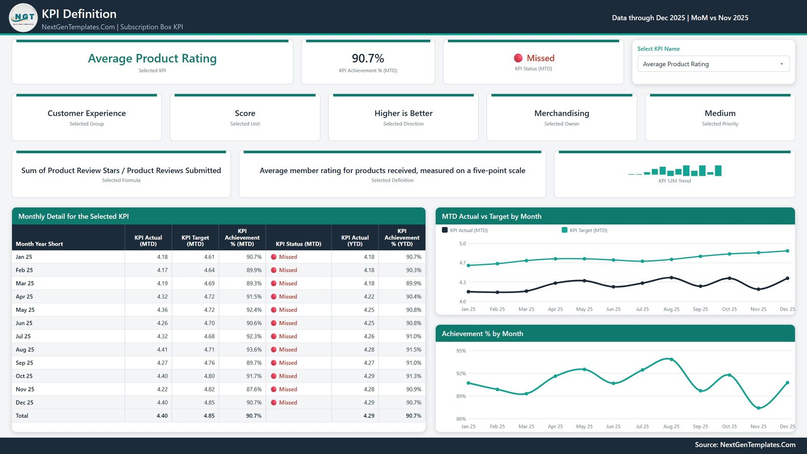
The same KPI selection, synced across from page 2. This page exists to answer “what exactly is this number?” – the question that derails more monthly reviews than any missed target.
It shows the selected formula and the selected definition in plain English, side by side, along with a 12-month trend. For Average Product Rating, for example, the formula reads “Sum of Product Review Stars / Product Reviews Submitted” and the definition reads “Average member rating for products received, measured on a five-point scale.”
Underneath sits Monthly Detail for the Selected KPI – a month-by-month table of Actual MTD, Target MTD, Achievement % MTD, status, Actual YTD and Achievement % YTD, with a total row – beside MTD Actual vs Target by Month and Achievement % by Month.
Both the formula and the definition are columns you type in the data pack. They are documentation you own, not fixed text baked into the report.
Page 4 – Get More Templates
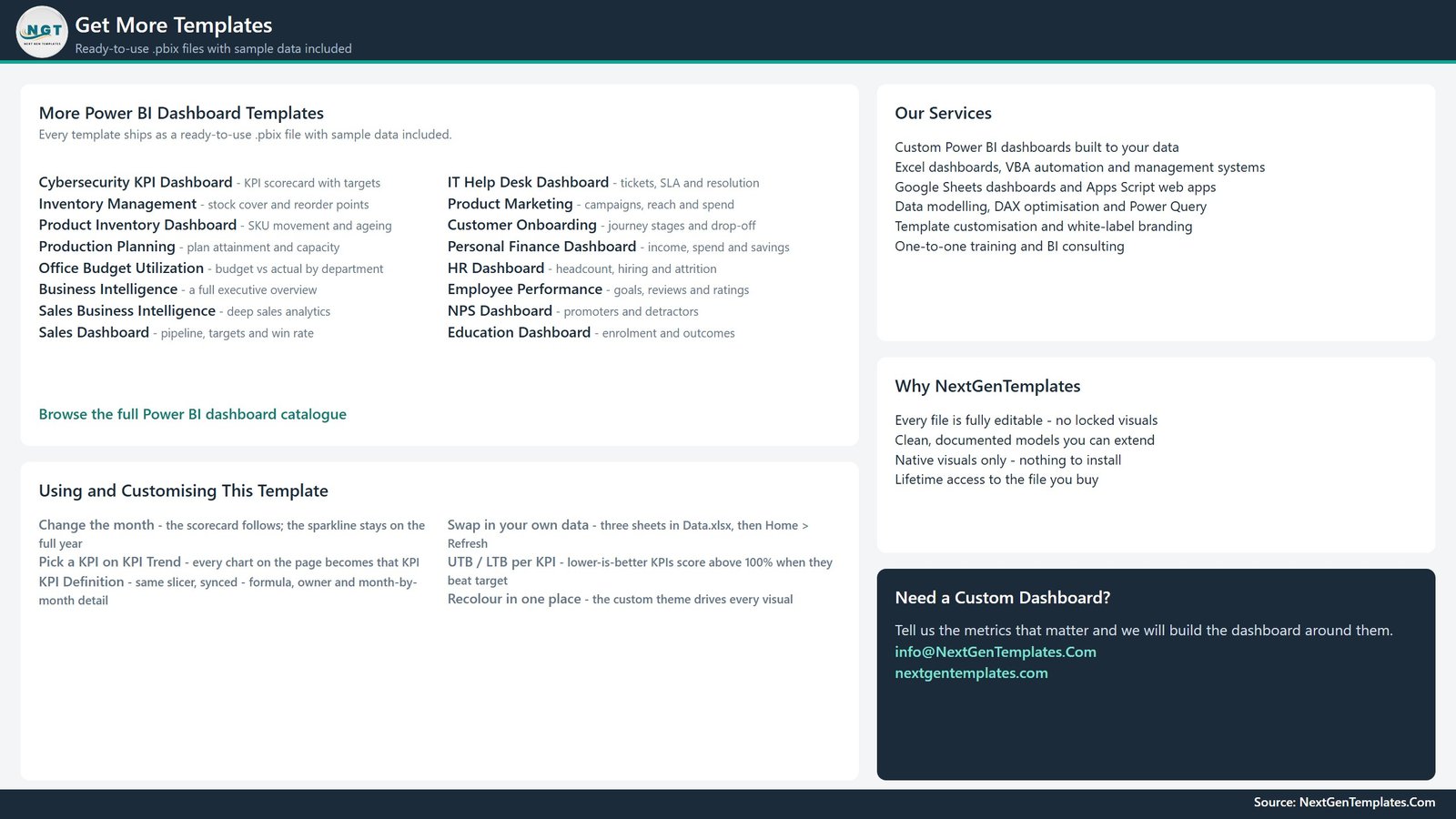
Being straight about this one: page 4 is a NextGenTemplates catalogue page. It lists other Power BI dashboards, carries a short “Using and Customising This Template” reference, and gives our contact details. It ships inside the file. We show it in the product gallery rather than hiding it, and you can delete the page in ten seconds if you do not want it in your own copy.
The twelve KPIs
| KPI | Group | Unit | Direction |
|---|---|---|---|
| Monthly Recurring Revenue | Growth | USD | Higher is better |
| New Subscribers | Growth | Count | Higher is better |
| Customer Acquisition Cost | Growth | USD/Customer | Lower is better |
| Monthly Subscriber Churn % | Retention | % | Lower is better |
| Average Subscriber Lifetime | Retention | Months | Higher is better |
| Pause-to-Cancel Conversion % | Retention | % | Higher is better |
| On-Time Box Shipment % | Fulfillment | % | Higher is better |
| Order Accuracy % | Fulfillment | % | Higher is better |
| Fulfillment Cost per Box | Fulfillment | USD/Box | Lower is better |
| Product Damage Rate % | Quality | % | Lower is better |
| Average Product Rating | Customer Experience | Score | Higher is better |
| Gross Margin % | Financial Health | % | Higher is better |
None of these are locked in. The KPI name is the join key across the three data sheets, so renaming one in all three sheets renames it everywhere in the report. Add a KPI by adding a row to KPI Definition plus its monthly target and actual rows. Delete one by removing its rows. Refresh, and the counts, the KPI list, the scorecard and every chart follow.
What is in the download
- Subscription Box KPI Dashboard in Power BI.pbix – four visible pages plus two hidden tooltip pages that appear when you hover over the trend visuals
- Data.xlsx – four sheets: Read Me, Input_ Target, Input_ Actual and KPI Definition
- Power BI Dashboard – User Manual.pdf
Native Power BI visuals throughout – nothing to install, nothing locked, no protected model.
Filling in your own numbers
- Unzip, and keep the .pbix and Data.xlsx in the same folder.
- Open the .pbix in Power BI Desktop (free) and click through the sample data first.
- Read the workbook’s Read Me sheet. It is one page and it explains the MTD/YTD rules above.
- Fill KPI Definition – one row per KPI, with UTB or LTB for direction, plus unit, group, owner, priority, formula and definition.
- Fill Input_ Target – one row per KPI per month, MTD and YTD.
- Fill Input_ Actual – the same, for the reporting year and the prior year.
- Home > Refresh. Moved the workbook? Home > Transform data > Data source settings > Change Source.
- Recolour once through the theme if you want your own brand – it drives every visual.
What it does not do
Three honest limits, so nobody is surprised after buying.
It does not connect to your billing or commerce stack. No Shopify, Recharge, Stripe, Chargebee or 3PL connector. The report reads the included Excel workbook and nothing else. You export or type your monthly numbers in and refresh.
It does not refresh by itself. Update the workbook, then refresh in Power BI Desktop. There is no schedule and no live feed.
It does not tell you what good looks like. Every target and every threshold in the file is a placeholder for you to overwrite. We do not benchmark churn, CAC, margin, damage rate or anything else against an industry figure, and we do not recommend a target. The numbers in the screenshots are realistic sample values, not real operational data.
Related templates
- SaaS Business KPI Dashboard in Power BI – the same scorecard design for a software subscription business
- Order Fulfillment KPI Dashboard in Excel – if the pick, pack and ship side is where your attention goes
- Product Development KPI Dashboard in Power BI
- Grocery Delivery Services KPI Dashboard in Excel
- Hypermarkets KPI Dashboard in Excel
- Robo Advisors KPI Dashboard in Excel
Get it
The Subscription Box KPI Dashboard in Power BI is a one-off purchase with lifetime access to the file you buy – .pbix, Excel data pack and user manual in a single download.
If your KPI list looks nothing like ours, that is fine – swap it out, or email info@NextGenTemplates.Com and we will build the scorecard around the metrics you actually review.