Cloud gaming is one of the few subscription businesses where the product quality is measured in milliseconds. A player on a $21 Ultimate plan who waits 60 ms for a frame churns faster than one on a $9 Standard plan at 25 ms. That makes the usual split – revenue reporting over here, infrastructure monitoring over there – actively unhelpful. The Cloud Gaming Dashboard in Power BI was built to put both on the same canvas.
The sample model carries 500 usage records across eight data centres, five regions, six device types, four streaming qualities, four subscription tiers and twelve months of 2025. Opening figures: $1.29M subscription revenue, 117.4K active users, 313.3K streaming hours, 424.9K sessions, a 4.2 out of 5 player rating and a 35.4 ms average latency. Five pages, thirty-plus visuals, five synced slicers per page.
One clarification up front, because NextGenTemplates ships two Power BI lines with similar names. This is the analytical dashboard – built for month-over-month trend analysis, cross-filtering and drillthrough. It is not the KPI scorecard line, which is a month-picker grid of traffic lights and sparkline rows. Different template, different way of reviewing numbers.
Key Features of the Cloud Gaming Dashboard in Power BI
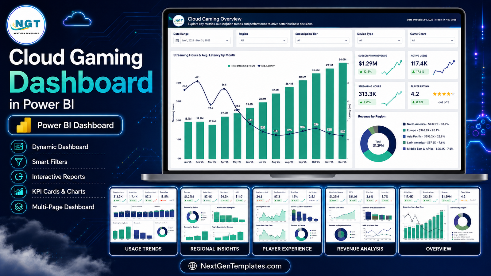
- Five report pages: Cloud Gaming Overview, Usage Trends, Regional Insights, Player Experience and Revenue Analysis – plus a hidden Details drillthrough page and tooltip pages that appear on hover.
- Synced slicers. Date Range, Region, Subscription Tier and Device Type stay in step across every page. The fifth slicer changes to suit the page: Game Genre, Streaming Quality, Data Center, Service Status or Game Title.
- SVG KPI cards with semantic deltas. Each card shows a month-over-month arrow and a sparkline, coloured by whether the movement is good or bad rather than merely up or down – so the 4.1% fall in Avg Session (min) reads red while the 1.6% rise in Sessions / User reads green.
- Latency treated as a core metric, not an afterthought: Avg. Latency by Data Center, an Under 40 ms share, and a Latency vs Player Rating scatter.
- Revenue against infrastructure cost on two separate pages, so gross margin is a measure in the model rather than a calculation someone does in a side spreadsheet.
- Two scorecard tables with in-cell data bars and star ratings: a Regional Scorecard and a Device Experience Scorecard.
- A readable semantic model – an import fact table, an M-generated date table and named DAX measures. ARPU, gross margin and optimal-service share are each defined once.
Dashboard Pages Explanation
Page 1 – Cloud Gaming Overview
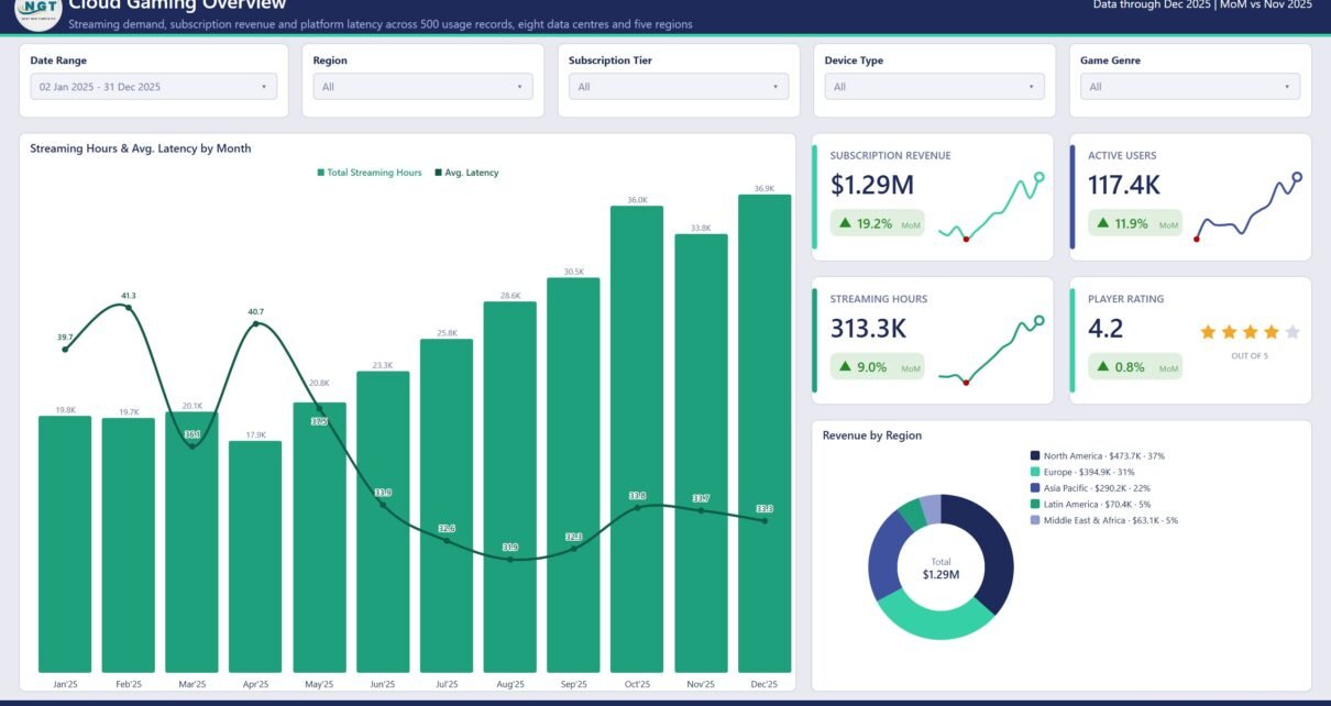
The landing page answers “how did the year go” in one screen. Four KPI cards carry Subscription Revenue $1.29M (up 19.2% MoM), Active Users 117.4K (up 11.9%), Streaming Hours 313.3K (up 9.0%) and Player Rating 4.2 out of 5 (up 0.8%).
Below them, a combo chart plots Streaming Hours & Avg. Latency by Month – hours as columns climbing from 19.8K in January to 36.9K in December, latency as a line that peaks at 41.3 ms in February and settles around 33 ms by year end. That single pairing is the story of the sample year: demand nearly doubled while the platform got faster.
To the right, Revenue by Region is a donut with the values written into the legend: North America $473.7K (37%), Europe $394.9K (31%), Asia Pacific $290.2K (22%), Latin America $70.4K (5%) and Middle East & Africa $63.1K (5%).
Page 2 – Usage Trends
Five cards: Active Users 117.4K, Total Sessions 424.9K, Streaming Hours 313.3K, Avg Session 44.2 minutes and Sessions / User 3.62.
Active Users & Sessions Per User by Month shows users growing 7.6K to 12.7K while sessions per user hovers between 3.36 and 3.83 – growth coming from new players rather than heavier ones. Streaming Hours by Quarter makes the acceleration blunt: 59.6K, 62.0K, 84.9K, 106.8K.
Sessions & Avg. Session Length by Device ranks PC 123.3K, Mobile 90.5K, Smart TV 77.5K, Console 65.2K, Tablet 48.1K and Browser 20.2K, with a session-length line that runs the other way – tablet sessions average 47 minutes against PC’s 43. Streaming Hours by Tier closes the page: Premium 107.9K (34%), Ultimate 97.8K (31%), Standard 88.4K (28%), Free Trial 19.1K (6%).
Page 3 – Regional Insights
This is the infrastructure page. Cards read Active Users 117.4K, Subscription Revenue $1.29M, Avg Latency 35.4 ms (down 1.1%), Optimal Service 70.8% and Revenue / Hour $4.13.
Avg. Latency by Data Center ranks all eight: London 25.1 ms, Frankfurt 25.6, Virginia 30.1, Oregon 32.6, Tokyo 34.5, Singapore 40.9, Sao Paulo 51.9 and Dubai 59.8. Revenue vs Infrastructure Cost by Region pairs each region’s earnings against its running cost – North America $473.7K against $225.3K, Middle East & Africa $63.1K against $37.6K.
The Regional Scorecard table pulls it together with active users, revenue with a data bar, infra cost, margin, latency, optimal share and a star rating per region. It is where the counter-intuitive readings show up: Latin America has the highest optimal-service share at 86.0% but the thinnest margin at 30.5%.
Page 4 – Player Experience
Cards: Player Rating 4.2, Avg Latency 35.4 ms, Under 40 ms 70.6% (down 3.8%), Rated 4.5+ 31.2% and a 1440p & 4K Mix of 38.6% (up 22.5%).
Active Users & Player Rating by Quality shows 1080p carrying the largest cohort at 52.6K users while ratings climb steadily with resolution – 4.10 at 720p, 4.24 at 1080p, 4.30 at 1440p, 4.32 at 4K. The Latency vs Player Rating scatter plots each data centre so you can see whether Dubai’s 59.8 ms actually costs stars. Usage Records by Service Status splits the 500 records into Optimal 354 (71%), Degraded 81 (16%), Congested 35 (7%) and Outage 30 (6%), and the Device Experience Scorecard closes the page with records, sessions, hours, latency, under-40ms share and rating for all six device types.
Page 5 – Revenue Analysis
The unit-economics page. Subscription Revenue $1.29M against Infrastructure Cost $683.4K leaves Gross Profit $608.9K; Revenue / User is $11.01 and Revenue / Session $3.04.
Revenue & Gross Margin by Month is the honest chart in the report: revenue rises from $88.3K in January to $150.3K in December while gross margin falls from 51.3% to 43.3%. Growth is being bought with infrastructure. Gross Profit by Quarter still climbs ($133.7K, $126.3K, $161.4K, $187.4K), and Revenue & Revenue Per User by Tier shows ARPU stepping $0.86, $9.02, $14.95, $21.15 from Free Trial to Ultimate. A Revenue by Game Genre treemap ends the page: Action $311.6K, Shooter $280.5K, Racing $179.5K, RPG $170.2K, Strategy $147.3K, Sports $124.9K, Simulation $78.5K.
Cloud Gaming Dashboard in Power BI vs. Tableau vs. Paid Analytics SaaS – Feature Comparison
| This template (Power BI) | Tableau / Qlik build | Paid analytics SaaS | |
|---|---|---|---|
| Cost | $17.99 once | $75/user/month plus build time | $500-$2,000/month |
| Platform | Power BI Desktop (free) | Tableau Desktop licence | Vendor cloud only |
| Setup time | Under an hour | 2-6 weeks | 4-8 week onboarding |
| Real-time team collaboration | Via Power BI Service | Via Tableau Server | Built in |
| Mobile access | Power BI mobile app | Tableau mobile | Native apps |
| Customisable fields | Full – it is your model | Full | Vendor-defined |
| Share with link | Yes, once published | Yes | Yes |
| Year-1 cost at 5 users | $17.99 | $4,500+ | $6,000-$24,000 |
| Latency and data-centre analysis | Included | Build it yourself | Usually an add-on |
| Revenue vs infrastructure cost | Included | Build it yourself | Often a separate product |
Who Should Use This Template
Cloud gaming and game-streaming operators are the obvious fit, but the shape of the report suits anyone selling a latency-sensitive subscription: remote desktop providers, cloud rendering services, live video platforms. Inside those businesses it lands with platform and infrastructure leads who need cost beside performance, subscription and growth managers working tier economics, player-experience analysts, and finance teams who want gross margin by month without exporting anything.
It also works as a teaching file. If you are learning Power BI, a finished five-page report with a real semantic model, synced slicers, drillthrough and tooltip pages is far more instructive than a blank canvas.
Real-World Use Cases
Building the case for an edge node. Dubai runs 59.8 ms, the slowest of the eight centres. Filtering Regional Insights to Middle East & Africa gives $63.1K revenue, $37.6K infrastructure cost, a 40.5% margin and a 70.5% optimal-service share – enough to argue for a second node with numbers rather than complaints.
Finding the upgrade cohort. Standard players generate 88.4K streaming hours against Premium’s 107.9K, but at $9.02 ARPU versus $14.95. Heavy usage on a cheaper tier is exactly the profile an upgrade campaign should target.
Separating outages from congestion. Only 31.2% of records rate 4.5 or above. Slicing Player Experience by Service Status splits the 30 Outage records from the 81 Degraded ones, which are different problems with different owners.
Explaining a margin slide. Revenue up, margin down eight points across the year. The Revenue vs Infrastructure Cost chart shows which regions drove the cost, before anyone assumes it was pricing.
Advantages of the Cloud Gaming Dashboard in Power BI
- Revenue, usage, latency and cost live in one model, so cross-filtering actually answers questions instead of raising them.
- Nothing is locked. Rename measures, add pages, restyle the theme, delete visuals.
- Power BI Desktop is free, so the whole team can open the file even if only one person has a Pro licence.
- The sample data is complete and internally consistent, so every visual renders before you connect anything.
- The drillthrough page means any number can be traced to underlying records without leaving the report.
- One-off price against a per-seat SaaS subscription.
Opportunities for Improvement
Being straight about the limits: this reads a periodic export, so it is reporting rather than live monitoring – if you need alerting when a data centre degrades, that is an observability tool’s job. There is no built-in connector to any specific streaming vendor; you point Power Query at your own source. Churn and retention cohorts are not modelled, so a subscription team will want to add them. And the latency figures are only as good as the measurements in your data – the report does not probe anything itself.
Best Practices
- Explore all five pages with the sample data loaded before swapping the source, so you know what each measure means.
- Keep the column names when you connect your own export, or remap them once in Power Query rather than editing visuals one by one.
- Set the Date Range slicer first; everything else stays synced as you move between pages.
- Use Ctrl-click to multi-select in slicers, and right-click into Drill through to Details whenever a number looks wrong.
- Read margin and latency together. A region that looks cheap to run often looks different once the optimal-service share is beside it.
- Refresh on a schedule after publishing to the Power BI Service – see the official Microsoft Learn guide to data refresh.
Explore Relevant Templates
- Cloud Gaming Dashboard in Power BI – the template covered in this post
- Cloud Gaming Dashboard in Excel – same topic, for teams without Power BI
- Gaming Esports Dashboard in Power BI – tournaments, viewers and prize pools
- Board Game Startups Dashboard in Power BI
- Subscription Box KPI Dashboard in Power BI – the scorecard format, for recurring revenue
Frequently Asked Questions
Do I need a paid Power BI licence?
No. Power BI Desktop is free from Microsoft and opens the .pbix. A Pro or PPU licence is only needed to publish and share through the Power BI Service.
Is this the KPI scorecard version?
No. This is the analytical dashboard – twelve months of trend, cross-filtering and drillthrough. The KPI scorecard line is a separate template built around a month picker and traffic lights.
Can I replace the sample data with my own?
Yes. Open Transform Data, point the source query at your usage export and keep the column names, or remap them in Power Query. The 500 records shipped with the file are demo data.
Are the revenue and latency numbers real?
No. Every figure in the screenshots – revenue, regions, data-centre names, ratings and latency – is generated sample data used to demonstrate the visuals.
Does it monitor my platform in real time?
No. It reports on data you supply on a refresh schedule. It is not an alerting or observability tool.
Can I add pages and measures?
Yes. Nothing is locked – add pages, write DAX, change the theme colours or remove visuals you do not need.
How many screenshots are in the gallery?
Five, one per report page. The file also contains a hidden Details drillthrough page and tooltip pages that only appear when you interact with a visual.
About the Author
Built by PK – Microsoft Certified Professional with 15+ years of Excel, Google Sheets, and Power BI experience. Founder of NextGenTemplates, reaching 300K+ subscribers across YouTube channels. Every template is hand-built and tested before release.
Conclusion
Cloud gaming numbers only make sense together. Revenue without latency flatters a platform that is quietly annoying its best players; latency without cost turns every slow region into a blank cheque. This report keeps both in one model across five pages, with 500 sample records already loaded so you can see how every measure behaves before connecting a single row of your own.
Get the Cloud Gaming Dashboard in Power BI from NextGenTemplates – instant download, editable .pbix, free lifetime updates. For walkthroughs and Power BI tutorials, subscribe at youtube.com/@PKAnExcelExpert.