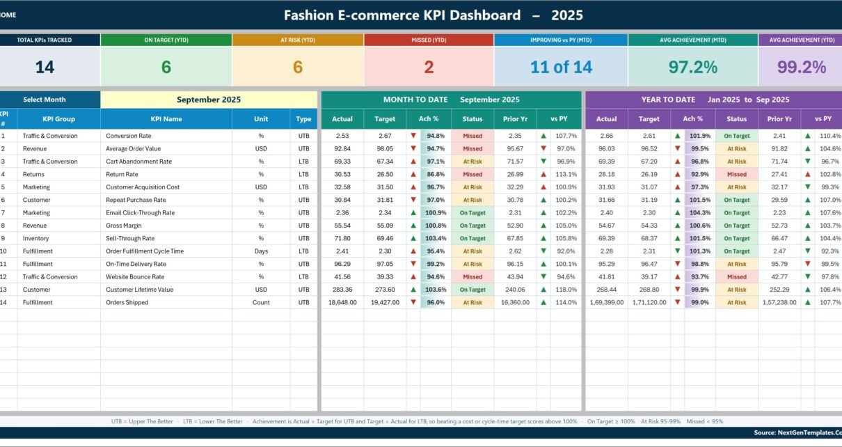
Most online fashion brands can recite their KPIs. Far fewer can put every one of them on a single screen with a target, a prior-year comparison and a status colour beside each number. The Fashion E-commerce KPI Dashboard in Excel is built for that monthly job and nothing else: 14 KPIs across 7 KPI groups, month-to-date and year-to-date side by side, and one dropdown that redraws the entire scorecard. The sample workbook opens on September 2025 and reads 6 On Target, 6 At Risk and 2 Missed for the year to date, with 11 of 14 KPIs improving against last year, an average MTD achievement of 97.2% and an average YTD achievement of 99.2%.
Every figure in the file is a plain worksheet formula – VLOOKUP, MATCH, INDEX and COUNTIF. There is no Power Query, no data model, no macro and no add-in, so the workbook opens in Excel 2013 and later and in Excel for the web with nothing to enable and nothing to refresh.
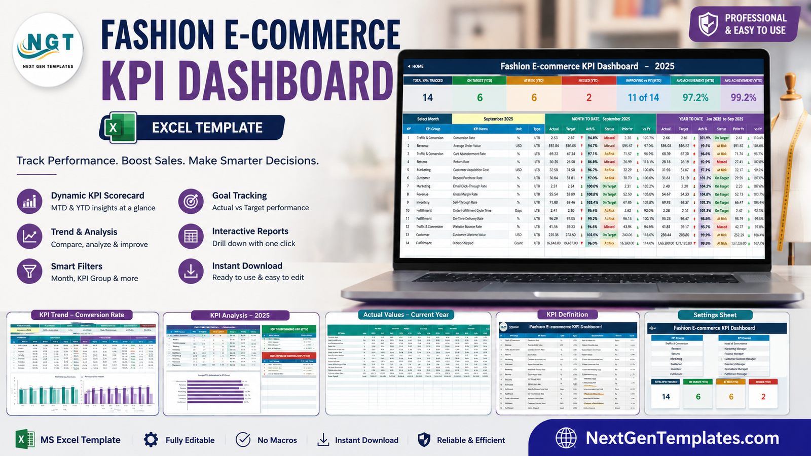
One clarification before you read on, because the catalogue holds two templates with almost the same name. This is the KPI scorecard line: a month picker, traffic lights, a KPI Trend page and a KPI Analysis page over typed monthly figures. It is not the analytical Fashion E-commerce Dashboard in Excel, which is a pivot-and-slicer report built over a transaction table. Different template, different job. The comparison further down says which one fits which meeting.
Key Features of the Fashion E-commerce KPI Dashboard in Excel
14 KPIs, grouped the way a fashion e-commerce team is actually organised. Traffic & Conversion holds Conversion Rate, Cart Abandonment Rate and Website Bounce Rate. Revenue holds Average Order Value and Gross Margin. Returns holds Return Rate. Marketing holds Customer Acquisition Cost and Email Click-Through Rate. Customer holds Repeat Purchase Rate and Customer Lifetime Value. Inventory holds Sell-Through Rate. Fulfillment holds Order Fulfillment Cycle Time, On-Time Delivery Rate and Orders Shipped.
One dropdown drives the whole workbook. Cell D6 on the KPI Dashboard sheet lists the twelve months of the reporting year. Change it and the MTD block, the YTD block, the seven summary cards and every table and chart on the KPI Analysis page re-read from the new month. There is no refresh, no query and no recalculation step to remember.
Achievement that knows which direction is good. Each KPI is typed UTB (Upper The Better) or LTB (Lower The Better) on the KPI Definition sheet. Achievement is Actual divided by Target for a UTB KPI and Target divided by Actual for an LTB one, so pushing Customer Acquisition Cost or Order Fulfillment Cycle Time below target scores above 100% exactly the way beating a revenue target does. That single rule is what stops a cost-reduction win from reading as a miss.
Traffic lights with editable thresholds. Status is On Target from 100%, At Risk from 95% to 99%, and Missed below 95%. Those thresholds live in the formulas in columns L and U of the KPI Dashboard sheet, so a team whose governance says 98% is the line can move them without rebuilding anything.
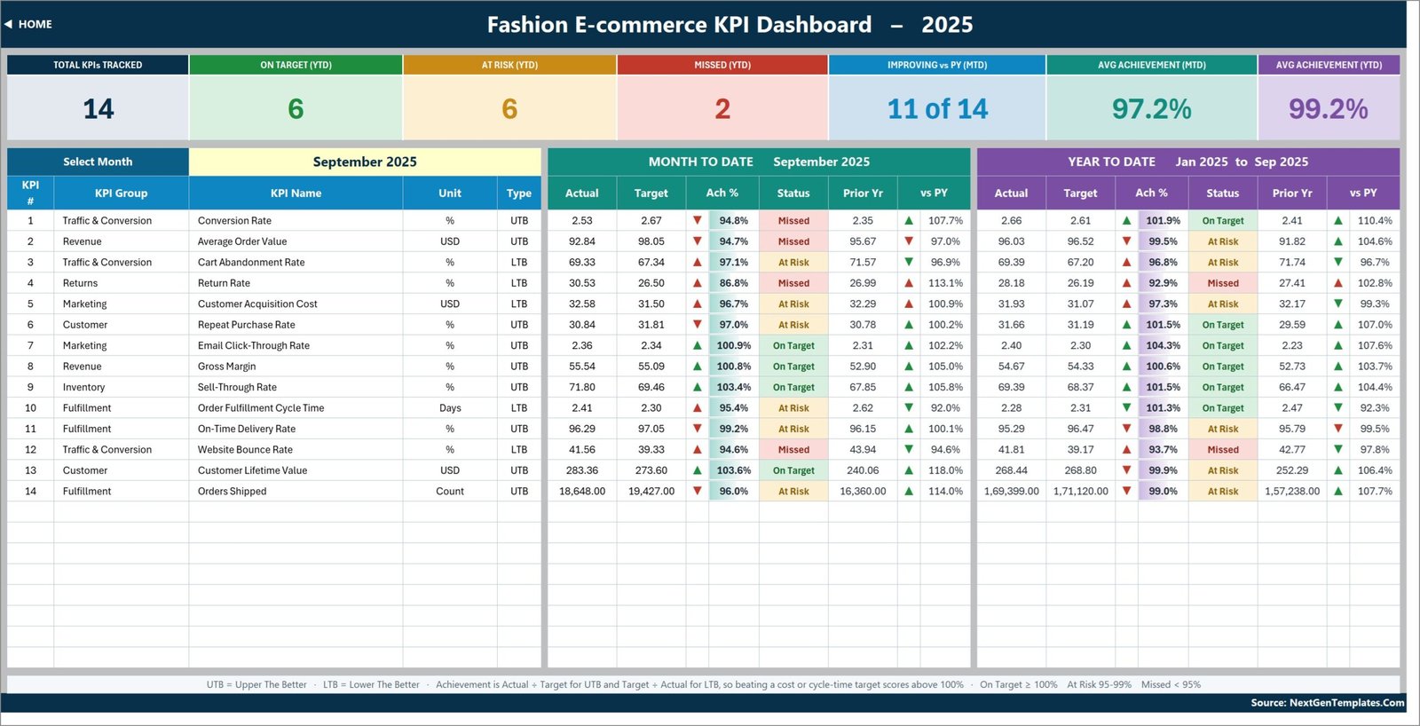
Seven summary cards across the top. Total KPIs Tracked, On Target (YTD), At Risk (YTD), Missed (YTD), Improving vs PY (MTD), Avg Achievement (MTD) and Avg Achievement (YTD). In the shipped sample those read 14, 6, 6, 2, 11 of 14, 97.2% and 99.2%.
Room to grow without formula work. The sheets are wired for 22 KPIs and 14 are filled in, so eight rows are already live and empty. Type a fifteenth KPI on KPI Definition and it appears on the three input sheets, the scorecard, the trend dropdown and the analysis roll-up on its own.
Dashboard Pages Explanation
The workbook ships ten pages you actually use, plus a Support sheet that holds the lookup plumbing behind the charts and dropdowns and needs no editing.
Home
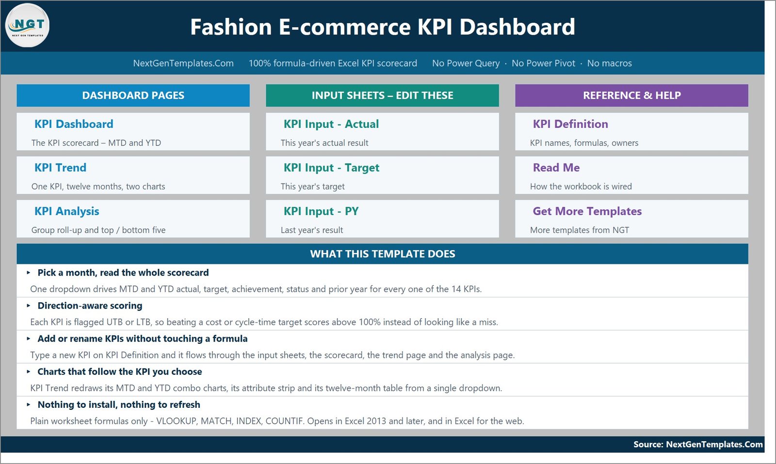
A navigation page in three columns – Dashboard Pages, Input Sheets and Reference & Help – each button carrying a one-line description of what that sheet does. Below it, a What This Template Does panel covers the month picker, direction-aware scoring, adding KPIs, the charts and the no-install promise.
KPI Dashboard
The scorecard, and the page you will screenshot for the monthly pack. The seven cards sit above a month dropdown and one row per KPI, split into a Month To Date block and a Year To Date block. Each block carries Actual, Target, Achievement %, Status, Prior Yr and vs PY, with a coloured arrow for direction and a traffic-light status cell. In the September 2025 sample, Return Rate is the worst performer at 86.8% MTD and 92.9% YTD, while Customer Lifetime Value runs 103.6% MTD against a 273.60 target.
KPI Trend
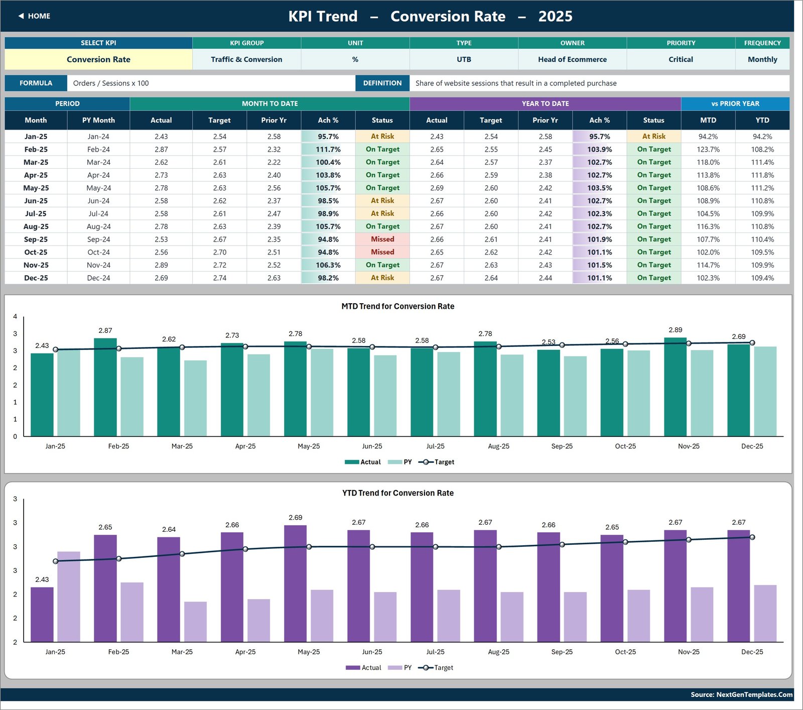
One KPI at a time, twelve months deep. A dropdown in cell B4 picks the KPI and the attribute strip fills in its group, unit, type, owner, priority and frequency alongside the formula and a plain-English definition. Pick Conversion Rate and the strip reads Traffic & Conversion, %, UTB, Head of Ecommerce, Critical, Monthly, with the formula Orders / Sessions x 100. Under the strip sits a twelve-month table showing each month against its prior-year month, and two combo charts – MTD Trend for Conversion Rate and YTD Trend for Conversion Rate – each plotting Actual and Prior Year as columns against a Target line.
KPI Analysis
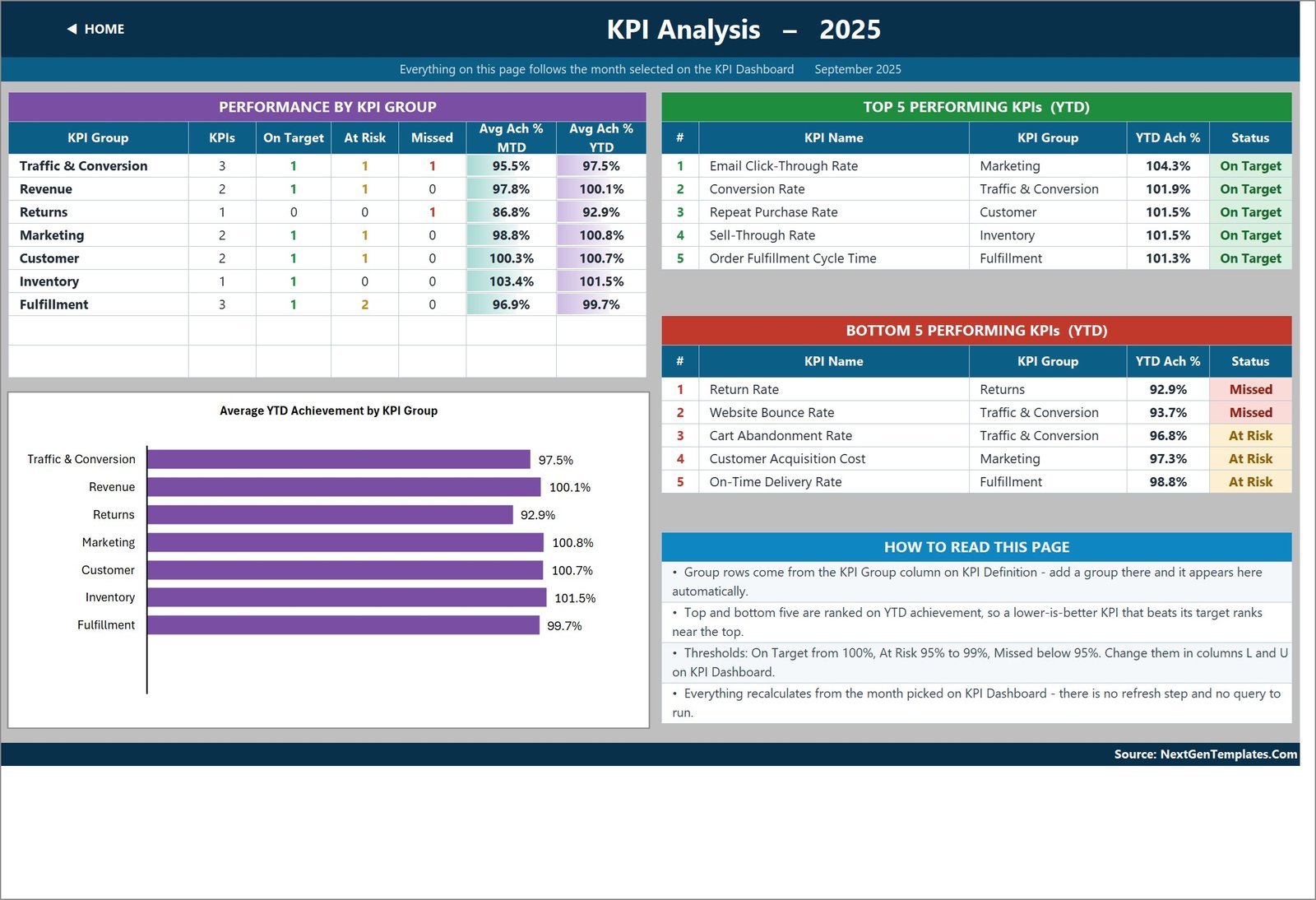
The roll-up, and the page that turns a wall of numbers into an agenda. Performance By KPI Group counts how many KPIs in each group are On Target, At Risk and Missed and averages their MTD and YTD achievement – in the sample, Returns sits at 92.9% YTD while Inventory leads at 101.5%. Average YTD Achievement by KPI Group charts the same seven numbers. Beside it, Top 5 Performing KPIs and Bottom 5 Performing KPIs rank every KPI on year-to-date achievement: Email Click-Through Rate leads at 104.3%, and Return Rate props up the bottom at 92.9%.
KPI Input – Actual, Target and PY
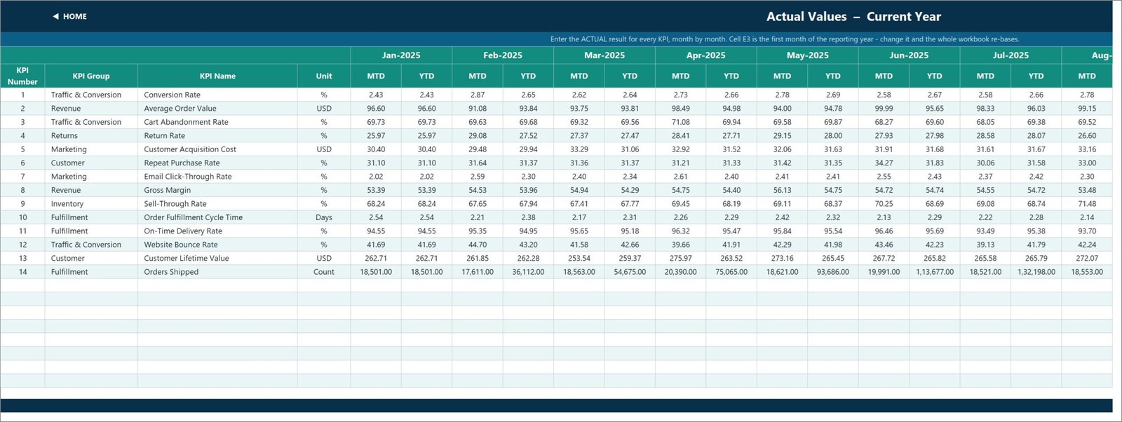
The three sheets you type in. Each is one row per KPI with an MTD and a YTD column for every one of the twelve months. Cell E3 on KPI Input – Actual sets the first month of the reporting year; change it and the Target sheet, the Prior Year sheet, the month dropdown and every sheet title re-base together. The KPI rows on all three sheets are read from KPI Definition, so they cannot drift out of line with each other.
KPI Definition
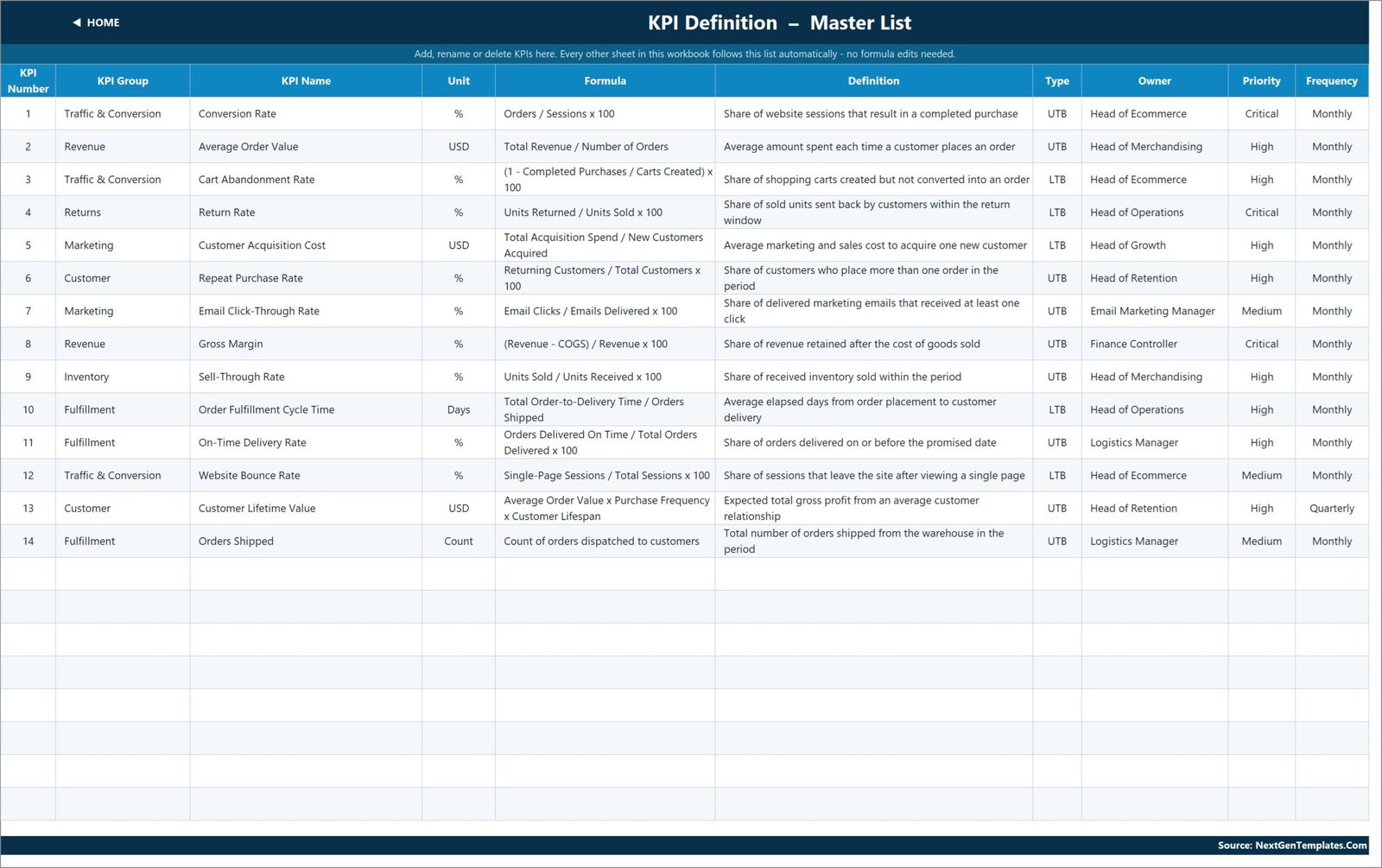
The master list every other sheet follows: KPI number, group, name, unit, formula, definition, type, owner, priority and frequency. It is also where the template quietly does its best work, because each KPI ships with a named owner – Conversion Rate to the Head of Ecommerce, Gross Margin to the Finance Controller, Repeat Purchase Rate and Customer Lifetime Value to the Head of Retention, Order Fulfillment Cycle Time to the Head of Operations, Orders Shipped to the Logistics Manager. Rename a KPI here and it changes everywhere.
Read Me and Get More Templates
Read Me explains the wiring in four blocks: the five-minute setup, the rules the numbers follow, how to add or rename or remove a KPI, and a sheet-by-sheet map. Get More Templates links back to the rest of the catalogue.
Fashion E-commerce KPI Dashboard in Excel vs. a Google Sheets Scorecard vs. Paid E-commerce Analytics
| Feature | Fashion E-commerce KPI Dashboard in Excel | Google Sheets KPI scorecard | Glew / Daasity / Looker Studio Pro |
|---|---|---|---|
| Cost | $12.99 one-time | $9.99-$16.99 one-time | $79-$499 per month |
| Platform | Excel 2013+ and Excel for the web | Browser only | Browser only, vendor-hosted |
| Setup time | Under 15 minutes – type your numbers in | Under 15 minutes | Days – store connection, data mapping, QA |
| Real-time team collaboration | Via OneDrive or SharePoint co-authoring | Native | Native |
| Mobile access | Excel mobile app, read-friendly | Sheets mobile app | Vendor mobile app |
| Customizable fields | Type a row on KPI Definition – no formula edits | Type a row | Vendor field mapping |
| Share with link | Via OneDrive share link | Native share link | Vendor seats |
| Works without a live store feed | Yes – it is a typed scorecard | Yes | No – needs a live Shopify or Magento connection |
| Direction-aware scoring (UTB / LTB) | Built in per KPI | Usually manual | Configurable |
| Year-1 cost at 5 users | $12.99 total | $9.99-$16.99 total | $948-$5,988 |
The honest read: if your team lives in a browser and edits together all day, a Google Sheets scorecard wins on collaboration. If you need live order-level data refreshed hourly, buy the SaaS. If what you need is a defensible monthly KPI pack that a founder or a board can read in ninety seconds, this workbook does that job for the price of roughly one day of the subscription.
Who Should Use This Template
It fits:
- E-commerce managers at online fashion and apparel brands who owe a monthly KPI pack to a founder, an investor or a board.
- D2C clothing, footwear and accessories brands turning over roughly $100K to $20M a year that have outgrown an ad-hoc spreadsheet but do not want a $79-a-month analytics subscription.
- Heads of Merchandising, Retention, Growth and Operations who each own two or three KPIs and would rather share one scorecard than circulate four separate reports.
- Agencies and fractional CFOs preparing monthly performance decks for several fashion e-commerce clients.
- Anyone who wants MTD and YTD against target and prior year on one screen without learning Power Query or DAX.
It does not fit:
- Teams wanting a live Shopify, WooCommerce or Magento connection. This workbook has no API connector and never pulls data on its own – you type or paste your monthly figures in.
- Order-level or SKU-level analysis. There is no transaction table here. If you want to slice thousands of order rows by category, channel and region, the analytical Fashion E-commerce Dashboard in Excel is the right file.
- Daily or hourly monitoring. The whole workbook is built on a monthly grain.
- Enterprise teams that need SSO, audit logging or row-level security on their reporting layer.
Real-World Use Cases
Priya runs e-commerce at a 40-person womenswear brand. On the third working day of each month she pastes her figures into the three input sheets, picks the closed month in cell D6, and screenshots the KPI Dashboard for the founder’s pack. The two red cells – Return Rate and Website Bounce Rate in the sample data – become the agenda for that month’s trading meeting, and nobody argues about the numbers because the target and the prior year are sitting right next to them.
Daniel is Head of Retention at a footwear D2C label. He owns Repeat Purchase Rate and Customer Lifetime Value, so he lives on the KPI Trend page. He picks his KPI, reads the twelve-month table, and compares this year’s bars against the pale prior-year bars before committing budget to the next lifecycle campaign. The attribute strip reminds everyone in the room that Customer Lifetime Value is reviewed quarterly, not monthly, which changes how much weight a single month deserves.
Meera runs a three-person agency reporting for five fashion e-commerce clients. She keeps one copy of the workbook per client with the KPI Definition sheet tuned to each brand’s language and owners. Five near-identical monthly decks, no rebuilding, and no per-seat SaaS bill for clients who would never approve one.
Advantages of the Fashion E-commerce KPI Dashboard in Excel
- Nothing to install or enable. Plain worksheet functions – VLOOKUP, MATCH, INDEX and COUNTIF – mean the file opens on a locked-down corporate laptop where macros are blocked and add-ins are not permitted.
- Direction-aware scoring is built in. The single most common failure in a hand-rolled scorecard is treating a cost KPI like a revenue KPI. This one gets it right per row and shows the arrow colour to match, so a falling Customer Acquisition Cost shows a green down-arrow.
- Ownership is on the page. A KPI with a named owner and a stated review frequency gets chased. A KPI in an unattributed grid does not.
- The data stays in your file. No store credentials, no vendor account, no data leaving the machine – which matters when the numbers are commercially sensitive and the reader is an investor.
- MTD and YTD are both stored, not derived. You keep control of how your year-to-date is defined, which matters because rates and ratios should be running averages while volumes accumulate.
- It scales to 22 KPIs with no formula work, and beyond that with a fill-down.
Opportunities for Improvement
Two cosmetic issues are present in the shipped sample, and it is fairer to name them than to let a buyer find them.
The Read Me carries an example from a different template. Under “Cumulative or average YTD”, the explanation of which KPIs accumulate and which are running averages illustrates the point with “aircraft deliveries, non-conformance reports” – wording carried over from an aerospace workbook built on the same engine. The rule it describes is correct and applies here exactly as written; only the example is wrong for a fashion brand. Rewrite that one cell in your copy if it will be seen by a client.
Orders Shipped uses Indian digit grouping in the sample. On the scorecard, the year-to-date Orders Shipped figures render as 1,69,399.00 and 1,71,120.00 rather than 169,399 and 171,120. It is a number-format setting on those cells and nothing more – the arithmetic is unaffected – but it is worth reformatting before the file goes in front of a Western audience. Selecting the row and applying a standard comma format fixes it.
Beyond the defects, two genuine design limits. There is no connector, so somebody has to type or paste twelve months of actual, target and prior-year numbers the first time – budget half an hour for the initial load. And the workbook is monthly by design, so it will not tell you what happened yesterday.
Best Practices
- Set the reporting year first. Put your own first month in cell E3 of KPI Input – Actual before you type anything else. Everything downstream re-bases from it, and doing it later means re-checking your column alignment.
- Fix the KPI list before you load numbers. Rename, reorder and re-own on KPI Definition first. The three input sheets follow it, so a rename after loading costs nothing, but a reorder is easier before there is data to look at.
- Be deliberate about UTB and LTB. Cart Abandonment Rate, Return Rate, Customer Acquisition Cost, Website Bounce Rate and Order Fulfillment Cycle Time are all Lower The Better here. Get one of those wrong and the status column will confidently tell you the opposite of the truth.
- Keep YTD honest. Volumes and counts accumulate through the year; rates, ratios and per-unit costs are running averages. A conversion rate that sums to 30% by December is the classic sign of a scorecard nobody checked.
- Move the thresholds once, at the start. If your business calls 98% the At Risk line rather than 95%, edit columns L and U on KPI Dashboard before the first review, not halfway through the year.
- Screenshot the scorecard, present the analysis page. The KPI Dashboard is the record; Top 5 and Bottom 5 on KPI Analysis is the conversation.
Explore Relevant Templates
- Fashion & Apparel KPI Dashboard in Excel – the same scorecard shape aimed at brand and wholesale apparel rather than online retail.
- Footwear & Accessories KPI Dashboard in Excel – the sister category, useful if you run more than one product line.
- Online Marketplaces KPI Scorecard in Excel – for the Amazon, Etsy and marketplace side of the same business.
- Retail Inventory KPI Scorecard in Excel – pairs well when sell-through and stock cover deserve a page of their own.
- Fast Fashion Brands KPI Dashboard in Excel – a new addition to the same scorecard line, tuned to high-turnover fast fashion.
- Fashion KPI Scorecard in Google Sheets – the browser-based equivalent if your team does not use Excel.
For order-level analysis rather than a scorecard, look at the analytical Fashion E-commerce Dashboard in Excel or Fashion E-commerce Dashboard in Power BI. Plenty of teams own one of each: the scorecard for the monthly pack, the analytical dashboard for digging into why a number moved.
Frequently Asked Questions
What KPIs does the Fashion E-commerce KPI Dashboard in Excel track?
Fourteen: Conversion Rate, Average Order Value, Cart Abandonment Rate, Return Rate, Customer Acquisition Cost, Repeat Purchase Rate, Email Click-Through Rate, Gross Margin, Sell-Through Rate, Order Fulfillment Cycle Time, On-Time Delivery Rate, Website Bounce Rate, Customer Lifetime Value and Orders Shipped. They are grouped into Traffic & Conversion, Revenue, Returns, Marketing, Customer, Inventory and Fulfillment.
Does it connect to Shopify, WooCommerce or Google Analytics?
No. The workbook has no API connector and pulls no data on its own. You type or paste your monthly actual, target and prior-year figures onto the three input sheets. That is deliberate – it means the file works for any platform and any store, with no credentials and no vendor lock-in.
How is this different from the Fashion E-commerce Dashboard in Excel?
They are two different templates. This one is the KPI scorecard: a month picker, traffic-light statuses, a KPI Trend page and a KPI Analysis page over 14 typed KPIs. The analytical Fashion E-commerce Dashboard is a pivot-and-slicer report built over a transaction table. Use the scorecard to report performance and the analytical dashboard to investigate it.
How long does setup take?
Under 15 minutes if your monthly figures are already to hand. Rename the KPIs on KPI Definition, set the reporting year in cell E3 of KPI Input – Actual, paste your actual, target and prior-year numbers, then pick a month on the KPI Dashboard sheet. There is no data model to load and no query to refresh.
Can I add my own KPIs?
Yes. The sheets are wired for 22 KPIs and 14 are filled in, so eight rows are already live and empty. Type a new KPI on KPI Definition and it flows through to the three input sheets, the scorecard, the KPI Trend dropdown and the KPI Analysis roll-up with no formula editing. To go past 22, select the last data row on each sheet and fill down.
Does it need macros, Power Query or an add-in?
No. Every number is a plain worksheet formula. There is no macro, no Power Query, no Power Pivot data model and no add-in, so the file opens in Excel 2013 and later and in Excel for the web with nothing to enable.
Can I change the On Target and At Risk thresholds?
Yes. They are written into the formulas in columns L and U of the KPI Dashboard sheet – On Target from 100%, At Risk from 95% to 99%, Missed below 95%. Edit those two columns once and the statuses, the summary cards and the KPI Analysis counts all follow.
About the Author
Built by PK – Microsoft Certified Professional with 15+ years of Excel, Google Sheets and Power BI experience. Founder of NextGenTemplates, reaching 300K+ subscribers across YouTube channels. Every template is hand-built and tested before release.
Conclusion
A KPI scorecard earns its place when it removes an argument. This one does that in a narrow, useful way: fourteen fashion e-commerce KPIs, each with a target, a prior-year comparison, a direction-aware achievement percentage and a status colour, all driven by one month dropdown and all computed with formulas anyone on the team can open up and read. There is no connector to break, no query to refresh and no subscription to renew.
Fix the two cosmetic items named above – the aerospace example in the Read Me and the digit grouping on Orders Shipped – and you have a monthly pack that takes fifteen minutes to produce and holds up in front of a board.
Get it here: Fashion E-commerce KPI Dashboard in Excel – $12.99, instant download, one-time payment, lifetime access.
Browse more KPI Dashboard templates or the full MS Excel template catalogue.
For step-by-step video walkthroughs, visit YouTube.com/@PK-AnExcelExpert.