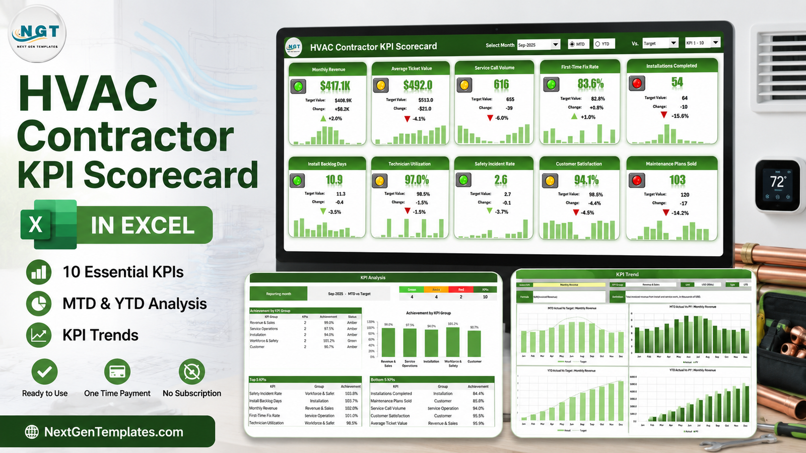
Most HVAC companies already know their numbers. What they usually do not have is one page that puts all of them side by side, marked against target, for a single month. The HVAC Contractor KPI Scorecard in Excel is that page: 10 KPIs across 5 groups, a single month dropdown that re-points the whole workbook, red / amber / green traffic lights that respect each KPI’s direction, and a twelve-month sparkline on every tile. It is nine worksheets, has room for 20 KPIs, and runs on 100% plain worksheet formulas – no macros, no Power Query, no Power Pivot, no add-ins.
One thing worth settling before anything else: this is a scorecard, not an analytical dashboard. It does not sit on a table of jobs and let you slice by technician, branch or job type. It takes the finished monthly figures you already close on and grades them. Both approaches are useful; they are just different tools, and mixing them up is the most common reason a template disappoints.
Key Features of the HVAC Contractor KPI Scorecard in Excel
- A single month picker. Choose Sep-2025 in the header and the tile wall, the analysis page and the trend page all move together.
- MTD / YTD radio toggle. The same ten tiles switch between the month in isolation and the year to date.
- Three comparison bases. The “Vs.” dropdown grades actual against Target, against the same period last year (PY), or against the Prior Month.
- Direction-aware scoring. Each KPI is flagged UTB (upper the better) or LTB (lower the better) on the KPI Definition sheet. Install Backlog Days and Safety Incident Rate go green when they fall, not red.
- Editable RAG bands. Out of the box, green is at or above target, amber is within 10%, red is more than 10% off. Two small tables on the Color Settings sheet control that, and every page follows them.
- Twelve-month sparkline per tile, so a KPI that is green today but has been sliding since spring still looks wrong.
- Room for 20 KPIs. The Scorecard displays ten at a time; a KPI-set picker in the header flips between KPI 1-10 and KPI 11-20.
- Only two sheets take typing. Input Data holds the numbers, KPI Definition holds the names and rules. Everything else is derived.
- Nothing to enable. Formulas, conditional formatting, camera pictures and sparklines – it opens like any other workbook.
Sheet-by-Sheet Walkthrough
Home
A plain navigation page. Eight linked cards, each with a one-line description of the sheet behind it, and a footer that states what the file is: “100% formulas. No macros, no Power Query, no add-ins.”
Scorecard
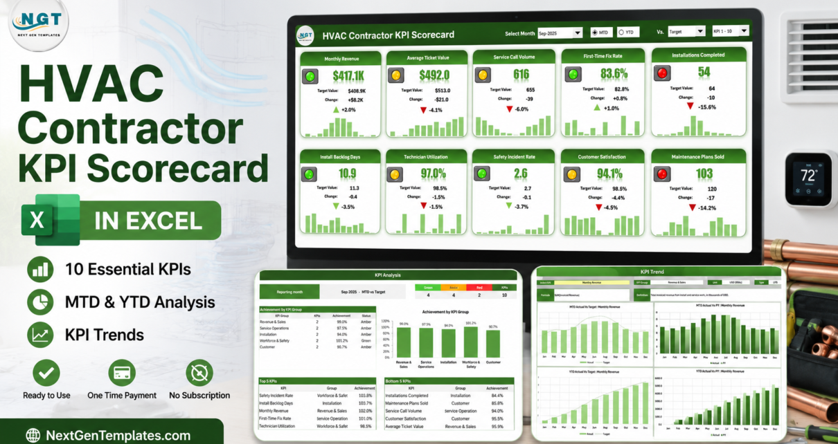
The page you will actually live in. A header strip carries Select Month, the MTD / YTD toggle, the “Vs.” comparison dropdown and the KPI-set picker. Below it, ten tiles in two rows of five. Each tile shows the KPI name, a traffic light, the value, the target value, the absolute change, the percentage variance with an up or down arrow, and a twelve-month sparkline.
In the sample month, Sep-2025 MTD versus Target, that reads: Monthly Revenue $417.1K against a $408.9K target, +2.0%, green. Average Ticket Value $492.0 against $513.0, -4.1%, amber. Service Call Volume 616 against 655, -6.0%, amber. First-Time Fix Rate 83.6% against 82.8%, +1.0%, green. Installations Completed 54 against 64, -15.6%, red. Install Backlog Days 10.9 against 11.3 – lower is better, so -3.5% is green. Technician Utilization 97.0% against 98.5%, amber. Safety Incident Rate 2.6 against 2.7, green. Customer Satisfaction 94.1% against 98.5%, amber. Maintenance Plans Sold 103 against 120, -14.2%, red.
KPI Analysis
The roll-up. A banner strip counts the month: 4 green, 4 amber, 2 red, 10 KPIs. An “Achievement by KPI Group” table and matching column chart show Revenue & Sales at 99.0% (amber), Service Operations 97.5% (amber), Installation 94.0% (amber), Workforce & Safety 101.2% (green) and Customer 90.7% (amber). Underneath, two automatic tables: Top 5 KPIs and Bottom 5 KPIs, ranked by achievement. In the sample, Safety Incident Rate leads at 103.8% and Installations Completed trails at 84.4%.
KPI Trend
One KPI at a time. Pick it from the Select KPI cell and the page shows its group, unit and direction type, its formula text and its written definition – for Monthly Revenue: SUM(Invoiced Revenue), “Total invoiced revenue from install and service work, in thousands of USD.” Then four charts across twelve months: MTD Actual vs Target, MTD Actual vs PY, YTD Actual vs Target and YTD Actual vs PY.
Input Data
The typing sheet. One numbered block per KPI – KPI-1: Monthly Revenue, KPI-2: Average Ticket Value, and so on – each with twelve monthly rows and six columns: MTD Actual, MTD Target, MTD PY, YTD Actual, YTD Target, YTD PY.
KPI Definition
Ten rows, nine columns: number, KPI Group, KPI Name, Unit, Formula, Definition, Type (UTB or LTB), YTD Basis (Sum or Average) and a Check column that turns red if you create a duplicate KPI name.
Color Settings
Two RAG band tables – one for upper-the-better KPIs, one for lower-the-better – plus the report title and the reporting year. The year is what makes the month picker read “Sep-25” rather than just “Sep”.
Read Me and Get More Templates
Read Me explains what you type, why YTD is entered rather than calculated, how direction and traffic lights work, how to add a KPI, and why KPI names must be unique. Get More Templates is the standard NextGenTemplates index page.
HVAC Contractor KPI Scorecard in Excel vs. Google Sheets vs. Paid Field Service Software – Feature Comparison
| This scorecard (Excel) | Google Sheets scorecard | Paid field service platform | |
|---|---|---|---|
| Cost | One-time, under $20 | One-time, under $20 | Typically a few hundred dollars a month |
| Platform | Excel for Windows desktop | Browser, any device | Vendor cloud platform |
| Setup time | Under an hour once you have the numbers | About the same | Weeks of implementation |
| Real-time team collaboration | No – it is a file | Yes | Yes |
| Mobile access | Not designed for it | Yes | Yes |
| Customisable KPI names and formulas | Yes – all 20 rows | Yes | Limited to the vendor’s metric set |
| Share with a link | No – share the file | Yes | Yes |
| Year-1 cost at 5 users | Under $20 total | Under $20 total | Thousands of dollars |
| Pulls jobs and invoices automatically | No – you type the monthly figures | No | Yes, it is the system of record |
| Traffic lights that respect KPI direction | Yes, UTB and LTB per KPI | Yes | Varies by vendor |
Who Should Use This Template
The owner or general manager of a residential or light-commercial HVAC company who closes a month and wants one page for the Monday meeting. The operations manager who has to report first-time fix rate and install backlog to a franchisor or an outside investor on a fixed schedule. The bookkeeper or office manager who already assembles these figures by hand and wants the output to look finished. And the fractional CFO or consultant carrying several trade clients, who wants the same shape of report for each one.
It is the wrong tool if you want dispatch, scheduling or invoicing – it reports, it does not run the business. It is also the wrong tool if you need per-technician or per-job drill-down; that is what an analytical dashboard built on a job table is for.
Real-World Use Cases
Monthly ops review. Close the month, type the ten figures, print the Scorecard. The two red lights write the agenda.
Multi-branch reporting. One copy per branch, each with its own report title on Color Settings, so three branches produce three identical-looking pages rather than three arguments about format.
Lender or investor packs. The KPI Analysis page – group achievement plus top and bottom five – is close to a finished slide as it stands.
Target setting for next year. Because Input Data holds twelve months of Actual, Target and Prior Year, the KPI Trend page doubles as the evidence for what next year’s targets should be.
Advantages of the HVAC Contractor KPI Scorecard in Excel
- It opens. No macro warning, no Power Query refresh, no add-in prompt, no broken external link. On a locked-down company laptop that matters more than any feature.
- Direction handling is built in. Plenty of homemade scorecards quietly punish a falling backlog. This one does not.
- The RAG bands are a setting, not a rewrite. Tighten amber from 10% to 5% in one cell and every tile, both counters and the group table all follow.
- It is honest about YTD. Rather than guessing whether your year-to-date figure should be a sum or an average, it asks you to type it and to record the rule you used in the YTD Basis column.
- Sparklines catch slow drift that a single month’s variance cannot.
Opportunities for Improvement
An honest list, so you know what you are buying:
- YTD is not calculated for you. That is a deliberate design choice, but it does mean twice as much typing as a workbook that rolls it up automatically.
- No data import. There is no connector to accounting or field service software, and no macro to pull anything in. Every figure is typed.
- Ten tiles at a time. With a full 20 KPIs you toggle between two sets rather than seeing everything at once.
- Desktop Excel for Windows only. Camera pictures and sparklines do not travel well to Excel for the web, the mobile apps or Excel for Mac.
- On the KPI Analysis page, two of the group names in the Top 5 / Bottom 5 tables are clipped by the column width (“Workforce & Safet”, “Service Operation”). Widening the column fixes it in a second, but it is there in the file as shipped.
Best Practices
- Set the definitions before the numbers. Fill KPI Definition first – especially Type and YTD Basis – so whoever fills the sheet next month uses the same rules.
- Pick targets from your own history, not from a benchmark article. The sample targets in the file are placeholders.
- Do not change a KPI’s name mid-year. Every page looks KPIs up by name, so renaming one halfway through breaks its own history.
- Keep names unique – the Check column on KPI Definition tells you when they are not.
- Review MTD and YTD together. A red month inside a green year is a different conversation from a red month inside a red year.
- Save one copy per year. The workbook is built around a single reporting year set on Color Settings.
- If you want a refresher on the underlying Excel features, Microsoft’s own Excel help centre covers sparklines and conditional formatting.
Explore Relevant Templates
Prefer Google Sheets? The same scorecard is available for it – the HVAC Contractor KPI Scorecard in Google Sheets is the same month-picker build in the browser.
Same scorecard, other trades: Plumbing Business KPI Scorecard in Excel and Electrical Contractor KPI Scorecard in Excel.
If you want analysis rather than a report card: the HVAC Service Dashboard in Excel and the HVAC Service Dashboard in Power BI are slicer-driven builds on a job table. To capture the work orders in the first place, try the Maintenance Work Order Data Entry System in Excel.
Frequently Asked Questions
Is this the same as an HVAC contractor KPI dashboard?
No. A dashboard is analytical – it sits on a table of jobs or invoices and lets you slice it with charts and slicers. This scorecard takes finished monthly figures and grades them against target with traffic lights, a group roll-up and a trend page. NextGenTemplates lists an HVAC Contractor KPI Dashboard separately; it is a different template answering a different question, not another edition of this one.
Do I need Excel for Windows?
Yes. It is built and tested in Excel for Windows desktop, 2016 or later including Microsoft 365. It uses camera pictures and sparklines, so it is not designed for Excel for the web, the mobile apps or Excel for Mac.
Does it import from my accounting or field service software?
No. There is no connector, no query and no macro. You type the monthly figures onto Input Data.
Does it alert me when a KPI goes red?
No. There are no notifications, no emails and no scheduling. The traffic lights change on screen when the file is open.
Can I use my own KPIs instead of the ten supplied?
Yes. Rename all ten on KPI Definition, or extend to 20. The header picker switches the Scorecard between KPI 1-10 and KPI 11-20.
Are the sample figures real HVAC benchmarks?
No. Everything in the screenshots is demonstration data, and the targets are placeholders.
What is in the download?
A ZIP containing the .xlsx workbook and a PDF user manual.
About the Author
Built by PK – Microsoft Certified Professional with 15+ years of Excel, Google Sheets, and Power BI experience. Founder of NextGenTemplates, reaching 300K+ subscribers across YouTube channels. Every template is hand-built and tested before release.
Conclusion
If your HVAC business already produces monthly numbers and what is missing is a single page that grades them, the HVAC Contractor KPI Scorecard in Excel does that job with one dropdown and no dependencies. Ten KPIs, five groups, direction-aware traffic lights, an analysis page and a trend page – and a workbook that simply opens on any Windows desktop copy of Excel from 2016 onward.
Get the HVAC Contractor KPI Scorecard in Excel – one payment, instant download, no subscription. Prefer the browser? Take the Google Sheets edition instead.
For step-by-step Excel tutorials, subscribe to youtube.com/@PKAnExcelExpert.