Every electrical contracting business measures roughly the same things: what the jobs earned, how the crews ran against the estimate, how fast the money came in, and whether anybody got hurt. The trouble starts the month someone asks whether 25.7% gross margin is good, whether 66.7 days sales outstanding is worse than last November, and who exactly is supposed to fix the change orders nobody billed. The Electrical Contractor KPI Dashboard in Power BI answers all of that on one screen: 14 electrical-contracting KPIs across 8 KPI groups, each with a target, a month-to-date and year-to-date traffic light, a year-on-year arrow, a 12-month sparkline, a named owner and a priority. It ships as an editable .pbix with a plain Excel data pack holding 24 months of sample actuals and 12 months of targets, so every visual renders before you have typed a single number of your own.
One thing to be clear about before anything else, because the words look alike in a catalogue: this is a KPI scorecard. It answers “did we hit the number this month, and who owns it”. It is not an analytical dashboard that slices jobs, crews and cost codes so you can explore why – that is a different kind of report. And it is emphatically not a compliance, licensing or safety system; more on that below, because it matters on this trade more than most.
Key Features of the Electrical Contractor KPI Dashboard in Power BI
- 14 KPIs across 8 groups – Financial, Sales, Operations, Workforce, Service, Quality, Supply Chain and Safety. The full list: Job Gross Margin %, Contract Revenue Booked, Days Sales Outstanding, Change Order Recovery %, Bid-to-Win Rate %, Average Job Value, Labour Hours vs Estimate %, On-Time Project Completion %, Technician Billable Utilisation %, Service Call Response Time, Inspection First-Pass Rate %, Rework Cost % of Revenue, Material Waste % of Purchases and Recordable Incident Rate.
- MTD and YTD in the same row. Actual, Target, Achievement % and a status light for the month, then Actual, Achievement % and a status light for the year to date, plus a year-on-year arrow.
- Direction-aware scoring. Every KPI is typed UTB (higher is better) or LTB (lower is better). Beating a DSO, rework or material-waste target scores above 100%, which is the single most common thing hand-built scorecards get wrong.
- Five synced slicers – Month, KPI Group, Owner, Priority, Direction – and the summary cards recount themselves as you filter.
- A 12-month sparkline on every KPI row that keeps showing the whole year even when the selected month changes.
- Twelve ownership lines – Chief Estimator, VP Business Development, Controller, Project Controls Manager, Sales Operations Lead, Field Operations Manager, Director of Construction, Service Manager, Service Dispatch Supervisor, Quality Manager, Purchasing Manager, Safety Director.
- Fully editable .pbix. Native Power BI visuals only. Nothing locked, nothing to install from AppSource, no subscription needed to open or edit it.
- An Excel data pack, not a black box. Three input sheets and a Read Me. Type over the numbers, hit Refresh.
Dashboard Pages Explanation
Six pages: four you navigate to, and two hidden 280 x 360 report-page tooltips that surface on hover.
Page 1 – KPI Scorecard
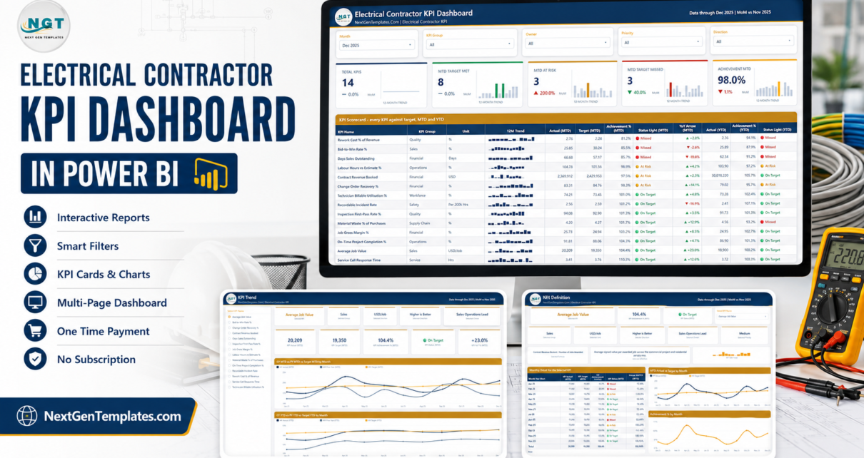
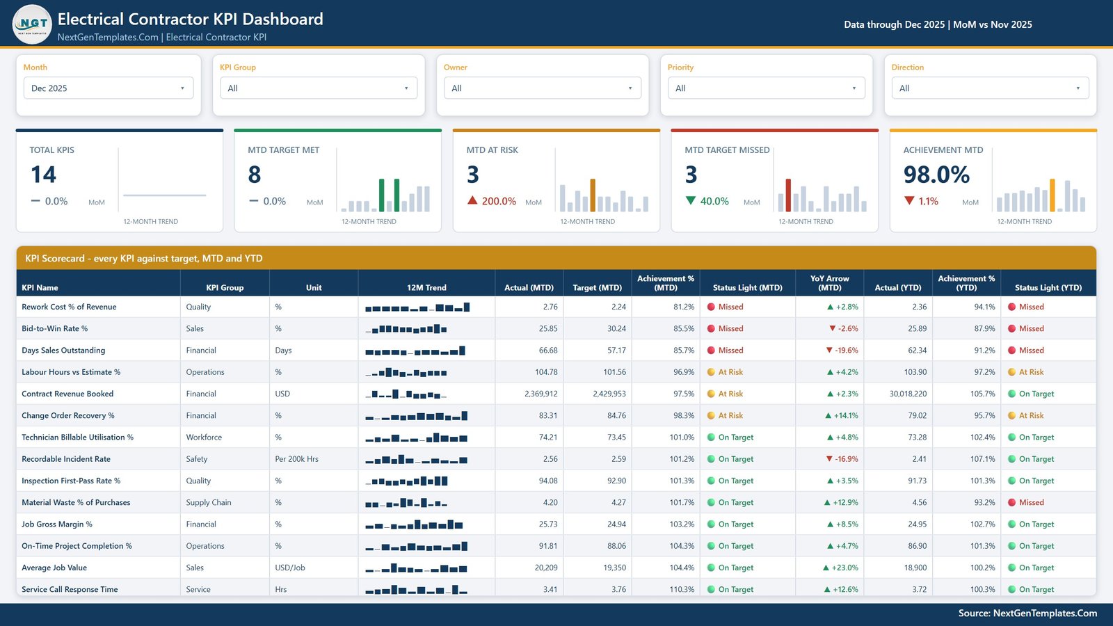
The month view, and the page most people will live on. Five slicers run across the top. Below them sit five summary cards – Total KPIs, MTD Target Met, MTD At Risk, MTD Target Missed and Achievement MTD – each carrying its own 12-month mini-trend and a month-on-month delta. Then the scorecard table itself: one row per KPI with name, group, unit, sparkline, Actual (MTD), Target (MTD), Achievement % (MTD), Status Light (MTD), YoY arrow, Actual (YTD), Achievement % (YTD) and Status Light (YTD), sorted so the worst achievement sits at the top.
In the sample month shipped with the file – December 2025 – that reads 14 KPIs, 8 on target, 3 at risk, 3 missed, and 98.0% achievement overall. The three misses are Rework Cost % of Revenue, Bid-to-Win Rate % and Days Sales Outstanding, which is a realistic set of problems for a contractor to be having at once.
Page 2 – KPI Trend
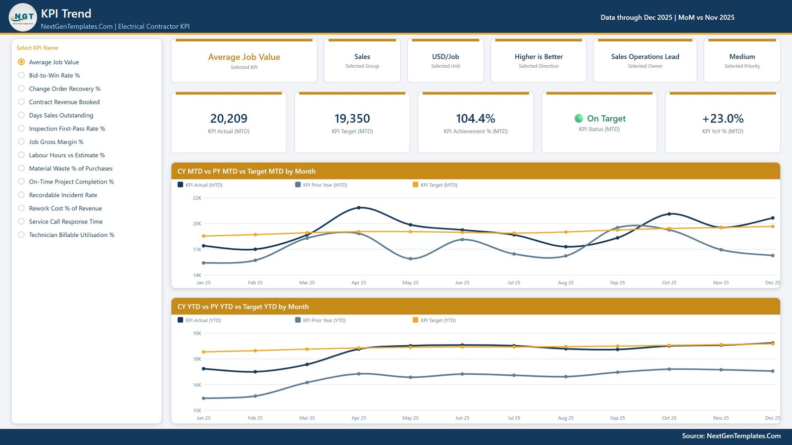
Choose one KPI from the list down the left and the entire page becomes that KPI. Six context cards restate the selection – KPI, group, unit, direction, owner, priority – and five value cards give Actual (MTD), Target (MTD), Achievement % (MTD), status and YoY %. Two line charts follow: CY MTD vs PY MTD vs Target MTD by Month and CY YTD vs PY YTD vs Target YTD by Month, each with three series across the twelve months. This is the page for “is it drifting, or was last month a blip”.
Page 3 – KPI Definition
The same KPI selection carries over, because the two pages share a synced slicer rather than a drillthrough – you do not right-click your way here, you just switch page and the selection is already made. What is added is the documentation: the formula, the plain-English definition, the group, unit, direction, owner, priority and a 12-month trend. Under that, a month-by-month table (Actual MTD, Target MTD, Achievement % MTD, status, Actual YTD, Achievement % YTD, with a total row) beside MTD Actual vs Target by Month and Achievement % by Month.
It is the page you open when the argument in the room is about the definition rather than the number.

Page 4 – Get More Templates
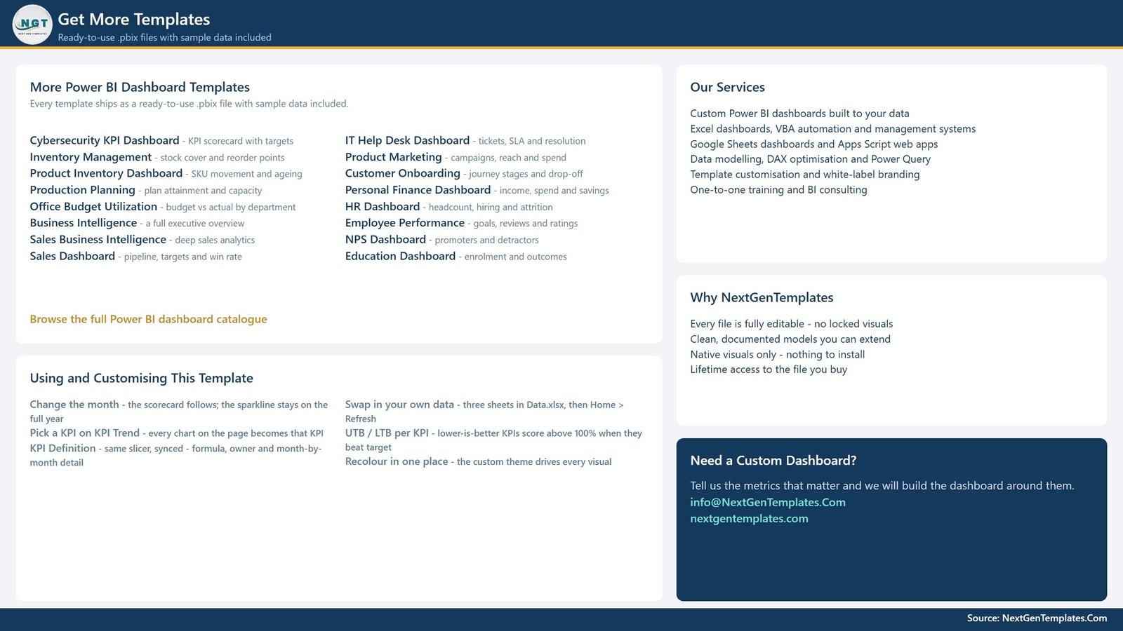
An in-file reference page rather than an analysis page – it lists other NextGenTemplates Power BI dashboards and the services on offer. It earns its place because of the “Using and Customising This Template” panel in the lower left: how to change the month, how the KPI slicer syncs across pages, how UTB and LTB scoring behaves, and how to swap in your own data. Worth reading once, then ignoring. It is shown here rather than quietly cropped out, so you know exactly what the four pages are.
The two hidden pages
KPI Detail and Trend Detail are 280 x 360 tooltip pages, hidden in view mode by design. They appear when you hover a chart point and are not pages you can click to. If you open the file in Power BI Desktop you will see them in the page tabs; that is normal.
The data pack
One Data.xlsx, four sheets:
- Read Me – how the three sheets join, and how MTD and YTD are meant to behave.
- Input_ Target – 168 rows: 14 KPIs x 12 months, MTD and YTD.
- Input_ Actual – 336 rows: the same for the reporting year and the year before it. The prior year is what every PY and YoY figure reads from, so do not skip it.
- KPI Definition – 14 rows x 9 columns: group, name, unit, formula, definition, type (UTB/LTB), owner, priority.
Keep it in the same folder as the .pbix. If you move them, Home > Transform data > Data source settings > Change Source.
Electrical Contractor KPI Dashboard in Power BI vs. a Spreadsheet Scorecard vs. Job-Costing Software Reporting – Feature Comparison
| This Power BI scorecard | A hand-built spreadsheet | Job-costing / FSM software reporting | |
|---|---|---|---|
| Target per KPI per month (MTD and YTD) | Yes, typed by you | Only if you build it | Sometimes |
| Lower-is-better KPIs scored correctly | Yes, per KPI | Rarely | Varies |
| Money, field, service, quality and safety on one page | Yes – 8 groups | Usually one tab each | Usually one module each |
| Named owner and priority per KPI | Yes | Manual | Rarely |
| Prior-year comparison built in | Yes, MTD and YTD | Manual | Sometimes |
| Connects live to your accounting or FSM system | No – you type or paste monthly figures | No | Yes, it is the system of record |
| Checks NEC / IEC / NFPA 70E compliance | No | No | No |
| Tracks licences, permits, inspections, certification expiry | No | No | Sometimes |
| Cost model | One-time, lifetime access to the file | Your time | Per user, per month |
| Editable | Fully – native visuals, nothing locked | Fully | No |
Who Should Use This Template
Commercial and residential electrical contractors, design-build and hard-bid shops, and service and maintenance divisions – specifically the person who runs the monthly review: the owner, the controller, the operations manager or the chief estimator. It works for a firm with three crews and for a multi-branch operation, because the KPI list is yours to edit rather than something baked into the file.
It is the wrong tool if you want any of the following, and it is worth being blunt about it on this trade:
- Code compliance. The template does not check, interpret or evidence NEC, IEC, NFPA 70E or any other electrical code, standard or local amendment. It contains no code content at all.
- Licensing, permits, inspections or certification validity. There is no licence register, permit log, inspection scheduler or expiry alert anywhere in it.
- A safety management system. Recordable Incident Rate is a number a person types into a spreadsheet cell. It is not an incident log, not OSHA 300/300A recordkeeping, and it evidences nothing on its own. The same goes for Inspection First-Pass Rate – a monthly count you supply, not proof that anything passed.
- Accounting or estimating software. No job costing, progress billing, retainage, payroll, WIP schedules, take-offs or bid pricing. It reports what those systems produced, after the month closed.
- Live data. No connector to Sage, QuickBooks, Vista, Procore, ServiceTitan or anything else.
- A benchmark. The targets shipped in the sample are placeholders. Nothing here tells you what a good margin, DSO or incident rate is in your market.
Real-World Use Cases
- The monthly owners’ meeting. Fourteen KPIs, three lights, misses at the top. The agenda writes itself.
- Estimating review. Bid-to-Win Rate % and Average Job Value together, trended against last year – a falling hit rate with a rising average job value is a mix change, not a pricing problem.
- Field productivity. Labour Hours vs Estimate % beside Technician Billable Utilisation %. Running over the bid hours and paying for hours that never reached a job are two separate failures with two separate owners.
- Cash review. Days Sales Outstanding next to Change Order Recovery %. Slow collections and unbilled extra work are very often the same conversation.
- Service desk performance. Service Call Response Time over twelve months with the target line beside it.
- Quality economics. Inspection First-Pass Rate % against Rework Cost % of Revenue – what the corrections cost, not just how often they happen.
- Per-branch reporting. Duplicate the workbook per branch, or prefix the KPI names and use the KPI Group slicer.
Advantages of the Electrical Contractor KPI Dashboard in Power BI
- It is honest about direction. Cost and cycle-time KPIs score above 100% when they beat target, so nobody has to mentally invert half the table.
- Definitions travel with the numbers. Page 3 carries the formula and a written definition per KPI, which kills most of the “that’s not how I calculate it” arguments.
- Accountability is structural, not cultural. Owner and priority are columns, not conventions, and the Owner slicer means a manager can filter to their own KPIs in one click.
- It renders before you do any work. Two years of sample data means you can evaluate the file properly, not stare at blank visuals.
- Nothing is locked. Recolour it, move visuals, delete a page, add your own measures.
- It is not dynamic in the parts that shouldn’t be. The KPI list is data, not code, so adding a fifteenth KPI is three spreadsheet rows and a Refresh – not a report rebuild.
Opportunities for Improvement
An honest list, because knowing the edges before you buy is worth more than a fifth bullet about how easy it is:
- Manual data entry. Fourteen KPIs x two figures x one month is a five-minute job, but it is a job, every month, and nobody else will do it for you.
- Twelve target months. The shipped file covers one reporting year of targets and two years of actuals. Rolling into a new year means extending the target sheet.
- YTD for rates must be an average. The Read Me says so and the sample data does it correctly, but if you paste in a cumulative sum for a percentage KPI, every YTD chart will be nonsense. This is on you, not the file.
- No page for cross-KPI analysis. There is no “performance by group” chart or top/bottom-five ranking page here – the scorecard table plus the group slicer does that job instead.
- Single-entity by design. One workbook is one business unit. Multi-branch means multiple files or a naming convention.
Best Practices
- Set the KPI Definition sheet before you set a single target. Get the formula and the owner agreed first; the numbers are easy once the definitions are not disputed.
- Type UTB/LTB carefully. It is the one column with fixed values, and getting it wrong inverts a KPI’s status light silently.
- Load the prior year properly. Every PY and YoY figure on pages 1, 2 and 3 comes from it. A missing prior year does not error – it just quietly shows nothing.
- Keep the KPI count around twelve to fifteen. The scorecard table is designed to fit on one screen; forty KPIs turns it back into a spreadsheet.
- Set targets you would defend. The three status bands (100%+, 95-100%, under 95%) are this template’s convention. If your business needs different bands, change them – but change them once, in advance, not after a bad month.
- Keep safety records where they belong. Report the incident rate here; keep the incident records in your safety system.
Explore Relevant Templates
- Electrical Contractor KPI Dashboard in Excel – the same scorecard idea built as a workbook.
- Electrical Contractor KPI Scorecard in Excel and the Google Sheets scorecard – lighter, single-page scorecards from a different line. Companions to this file, not duplicates of it.
- Plumbing Business KPI Dashboard in Power BI – the same four-page structure for the neighbouring trade.
- Preventive Maintenance Dashboard in Power BI – analytical rather than scorecard: it slices work orders and assets to explore why.
- HVAC Service Dashboard in Excel – useful for firms running both trades.
- Browse the whole Power BI KPI Dashboard category.
Frequently Asked Questions
Does the Electrical Contractor KPI Dashboard in Power BI check NEC, NFPA 70E or any electrical code?
No. It contains no code content of any kind. It does not check compliance, interpret a standard, or evidence that any installation was compliant. Nothing on any page is a code or safety determination, and it should never be presented as one.
Does it track licences, permits, inspections or certification expiry?
No. There is no licence register, permit log, inspection scheduler or expiry alerting anywhere in the file. Inspection First-Pass Rate % is a monthly percentage you type in – it is a management metric, not an inspection record.
Is the Recordable Incident Rate a safety management system?
No. It is a buyer-typed monthly figure on a management scorecard. It is not an incident log, not OSHA 300/300A recordkeeping, and on its own it evidences nothing. Any safety-sounding KPI here is a number somebody entered by hand.
Does it connect to Sage, QuickBooks, Procore or ServiceTitan?
No. There is no live connector to any accounting, ERP or field-service platform. You paste fourteen monthly numbers into an Excel workbook and press Refresh. That is deliberate: it keeps the file portable and keeps you out of an integration project.
Do I need a paid Power BI licence?
No. Power BI Desktop is a free download from Microsoft and opens, edits and uses this file completely. A Pro or Premium licence only matters if you later publish it to a Power BI workspace to share online.
Can I add or remove KPIs?
Yes – it is designed for it. Nothing in the report hard-codes a KPI name. Add a row to KPI Definition plus its monthly target and actual rows, rename a KPI in all three sheets, or delete one entirely, then Refresh. Counts, table, slicers and charts all follow.
Why does a lower-is-better KPI score above 100%?
Because that is correct. Higher-is-better KPIs score Actual / Target; lower-is-better KPIs score Target / Actual. A DSO of 57 days against a target of 60 has beaten its target, so it scores above 100% and lights green. On Target is 100% or more, At Risk is 95-100%, Missed is below 95% – the template’s own convention, not an industry standard.
How many pages does the report have?
Six. Four you navigate to – KPI Scorecard, KPI Trend, KPI Definition, Get More Templates – plus two hidden 280 x 360 tooltip pages, KPI Detail and Trend Detail, that appear on hover.
Is there a drillthrough to the definition page?
No, and it is worth knowing before you go hunting for a right-click menu. KPI Definition is reached by simply switching page: it shares a synced KPI slicer with KPI Trend, so whatever you selected there is already selected here.
Is a user manual included?
No. This line ships the .pbix and Data.xlsx only. The guidance lives inside the files – the Read Me sheet in the workbook and the “Using and Customising This Template” panel on page 4 of the report.
Is the sample data real?
No. Every number is realistic sample data generated for the template – 24 months of actuals and 12 months of targets. It is not real company data and it is not a benchmark.
Can I rebrand the colours?
Yes. The report is driven by a custom theme, so recolouring in one place changes every visual. You can also move, resize or delete anything, including whole pages.
About the Author
Built by PK – Microsoft Certified Professional with 15+ years of Excel, Google Sheets, and Power BI experience. Founder of NextGenTemplates, reaching 300K+ subscribers across YouTube channels. Every template is hand-built and tested before release.
Conclusion
An electrical contracting business does not need a bigger report. It needs the same fourteen numbers, scored the same way, in front of the same people, every month – with a name against each one and a definition you can point at when somebody disagrees. That is what the Electrical Contractor KPI Dashboard in Power BI does: four pages, five synced slicers, MTD and YTD traffic lights, a prior-year comparison and documentation attached to every metric. Open it in the free Power BI Desktop, paste in your own month, and the review runs itself. Just remember what it is not – it reports on your business, it does not certify anything about your work.
For step-by-step Excel and Power BI tutorials, visit youtube.com/@PKAnExcelExpert.