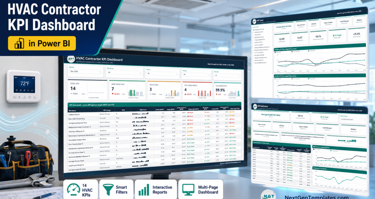
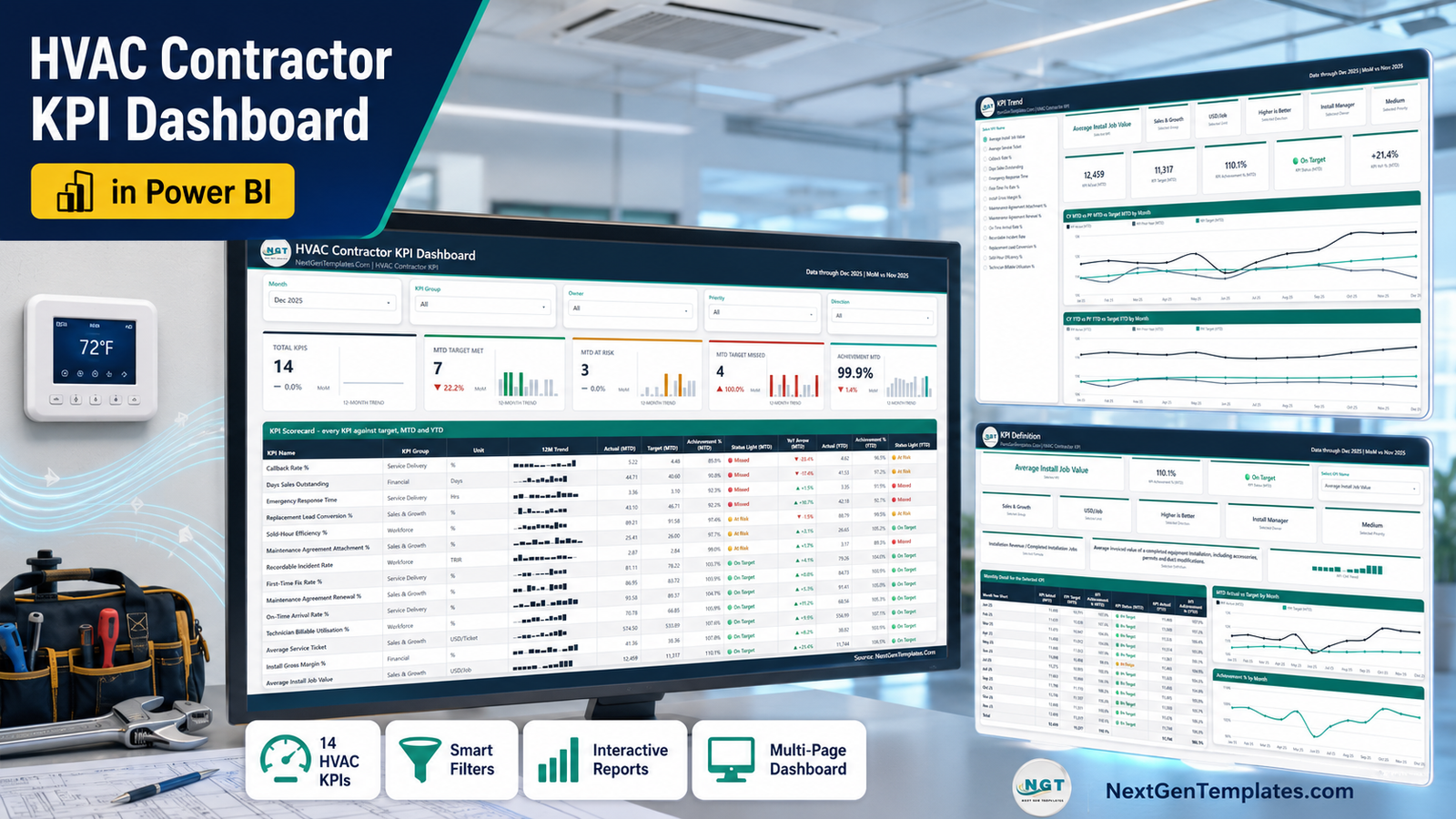
Most HVAC contractors already have the numbers. They sit in the dispatch board, the accounting package and three spreadsheets somebody rebuilds every month. What is usually missing is one page that says, plainly, which of those numbers beat target this month and which did not. The HVAC Contractor KPI Dashboard in Power BI is that page: 14 heating and cooling KPIs, scored month-to-date and year-to-date against target, on four report pages driven by a single Excel workbook you control.
The template ships with a full sample year loaded – 14 KPI definitions, 168 monthly target rows and 336 actual rows covering the reporting year and the year before it, so every prior-year comparison works out of the box. In the shipped December 2025 view, 7 KPIs are On Target, 3 are At Risk and 4 are Missed, with an overall MTD achievement of 99.9 percent. That is the shape of the answer you get every month once your own numbers are in.
Key Features of the HVAC Contractor KPI Dashboard in Power BI
14 KPIs in four groups
The KPI set is built for a residential and light-commercial contractor rather than a generic services business:
- Service Delivery – First-Time Fix Rate %, Callback Rate %, On-Time Arrival Rate %, Emergency Response Time (hours to a no-heat or no-cool call).
- Workforce – Technician Billable Utilisation %, Sold-Hour Efficiency %, Recordable Incident Rate (TRIR).
- Sales and Growth – Maintenance Agreement Attachment %, Maintenance Agreement Renewal %, Replacement Lead Conversion %, Average Install Job Value, Average Service Ticket.
- Financial – Install Gross Margin %, Days Sales Outstanding.
Scoring that understands direction
Four of the 14 KPIs are lower-is-better: Callback Rate, Emergency Response Time, Recordable Incident Rate and Days Sales Outstanding. Each KPI carries a UTB or LTB flag, and the model scores LTB KPIs as Target divided by Actual. A callback rate under target therefore reads above 100 percent and turns green, exactly like a margin that beat plan. Traffic lights are On Target at 100 percent and above, At Risk from 95 to 100 percent, and Missed below 95 percent.
Five slicers, synced across the report
Month, KPI Group, Owner, Priority and Direction. Owner matters more than it sounds: each KPI is assigned to a real role – Service Manager, Dispatch Supervisor, Field Operations Manager, Safety Coordinator, Sales Manager, Customer Care Lead, Comfort Advisor Lead, Install Manager or Controller – so a one-click filter turns the board into that person’s review sheet.
Sparklines that ignore the month filter
Every scorecard row carries a 12-month trend sparkline that keeps the full year even when the report is filtered to a single month. You see December’s number and December’s context at the same time.
Dashboard Pages Explained
Page 1 – KPI Dashboard
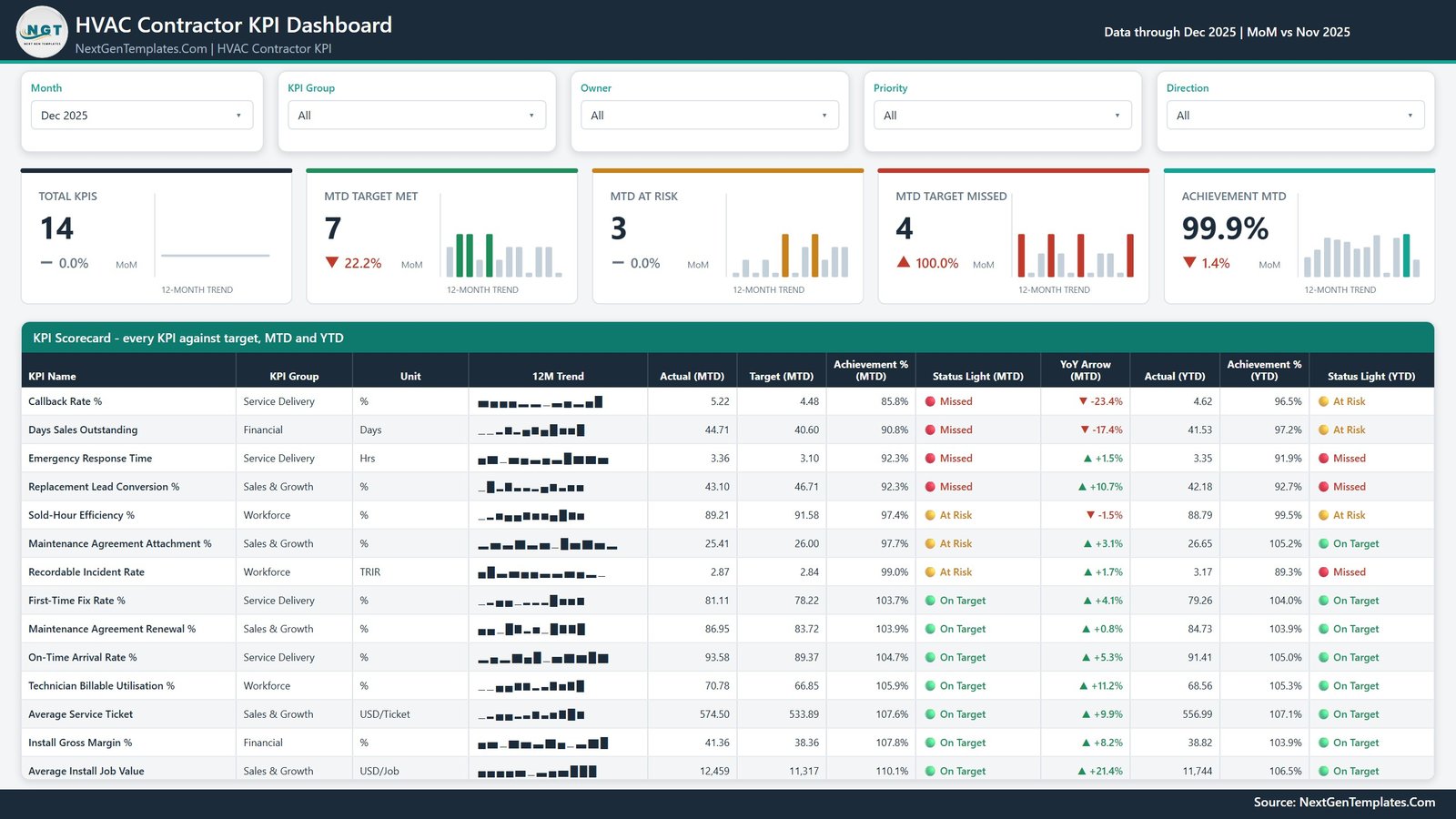
The slicer row runs across the top, then five summary cards: Total KPIs, MTD Target Met, MTD At Risk, MTD Target Missed and Achievement MTD. Each carries a month-on-month delta and its own 12-month trend bar – in the sample, MTD Target Met falls 22.2 percent month on month while MTD Target Missed doubles, which is the story of the month in two cards.
Below sits the KPI Scorecard: KPI Name, KPI Group, Unit, 12M Trend, Actual (MTD), Target (MTD), Achievement % (MTD), Status Light (MTD), YoY Arrow (MTD), Actual (YTD), Achievement % (YTD) and Status Light (YTD). Rows are ordered worst to best on MTD achievement, so the four Missed KPIs sit at the top where they belong. The MTD and YTD lights are deliberately separate – Recordable Incident Rate is At Risk for the month but Missed for the year, and a single blended light would have hidden that.
Page 2 – KPI Trend
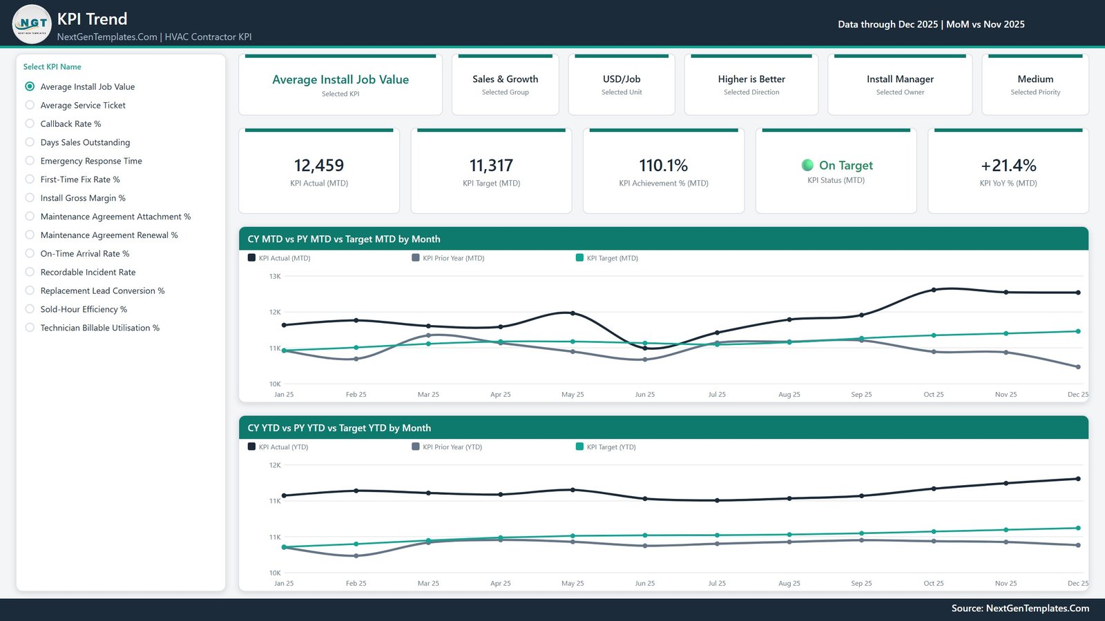
Pick one KPI from the list on the left and the entire page follows it. An attribute strip repeats the selected group, unit, direction, owner and priority, then five cards give KPI Actual (MTD), KPI Target (MTD), KPI Achievement % (MTD), KPI Status (MTD) and KPI YoY % (MTD). Two charts fill the rest of the page: CY MTD vs PY MTD vs Target MTD by Month and CY YTD vs PY YTD vs Target YTD by Month, each plotting actual, prior year and target as three lines across twelve months.
Page 3 – KPI Definition
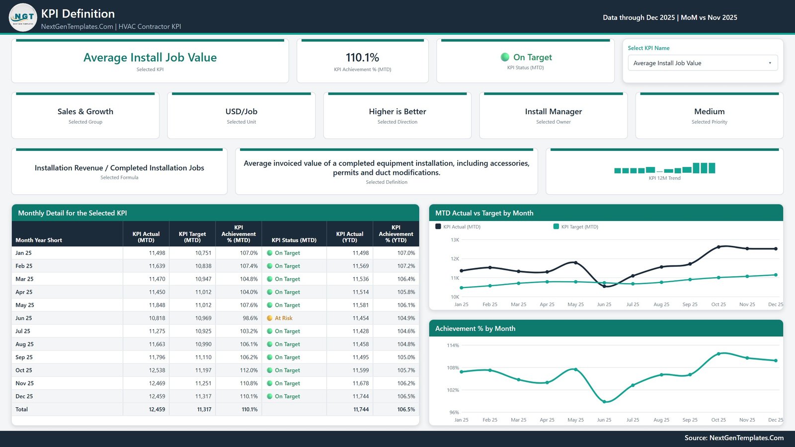
The same KPI picker, synced, plus the two things arguments are usually about: the formula and the definition. Average Install Job Value, for example, is Installation Revenue divided by Completed Installation Jobs, defined as the average invoiced value of a completed equipment installation including accessories, permits and duct modifications. Underneath, a Monthly Detail table lists all twelve months with MTD actual, target, achievement and status alongside the YTD pair, and two charts show MTD Actual vs Target by Month and Achievement % by Month.
Page 4 – Get More Templates
A catalogue page with a short customisation guide: change the month, pick a KPI on KPI Trend, swap in your own data through the three sheets in Data.xlsx, and recolour the whole report from one custom theme.
HVAC Contractor KPI Dashboard in Power BI vs. Excel vs. Paid Field Service Software – Feature Comparison
| This Power BI template | Excel KPI dashboard | ServiceTitan / Housecall Pro reporting | |
|---|---|---|---|
| Cost | One-time 19.99 USD | One-time 19.99 USD | Roughly 300-400 USD per month, seat-based |
| Platform | Power BI Desktop, free from Microsoft | Microsoft Excel 2013 or later | Vendor cloud only |
| Setup time | About 20 minutes to swap the sample year | About 20 minutes | Weeks of onboarding and data migration |
| Real-time team collaboration | Only after publishing to a Power BI workspace | Through OneDrive or SharePoint | Yes, built in |
| Mobile access | Power BI mobile app after publishing | Excel mobile | Yes |
| Customisable fields | Add, rename or delete any KPI in the workbook | Same, via the definition sheet | Fixed vendor report set |
| Share with a link | Yes, once published | File share | Yes |
| Year-1 cost at 5 users | 19.99 USD | 19.99 USD | 18,000 USD and up |
| Connects to your dispatch board | No – you enter the monthly numbers | No | Yes, it is the dispatch board |
| You keep the historical file | Yes, forever | Yes | No, it stays in the vendor account |
Who Should Use This Template
It suits residential and light-commercial HVAC contractors running roughly 5 to 60 technicians; service managers who already export monthly figures from ServiceTitan, FieldEdge or Housecall Pro and want one management board to review them on; owners who run a monthly numbers meeting and want the agenda set by the scorecard rather than by whoever speaks first; and controllers who need Install Gross Margin and Days Sales Outstanding reviewed beside the operational KPIs that drive them.
It does not suit anyone wanting a live feed from their field service platform, anyone who needs job-level costing or scheduling, or anyone who would rather not install Power BI Desktop at all – the Excel and Google Sheets editions exist for exactly that reason.
Real-World Use Cases
The first-Monday review. A 22-technician residential shop opens Page 1 with the month set to the one just closed. The four Missed KPIs sit at the top of the scorecard, and the YoY arrows next to them separate a genuinely bad month from normal seasonal noise. Callback Rate at 85.8 percent of target with a minus 23.4 percent YoY arrow is a different conversation from a KPI that is simply below plan.
The owner review by role. Filter the Owner slicer to Comfort Advisor Lead and only Replacement Lead Conversion remains. Open Page 2 on that KPI and you have twelve months of actual against target with last year underneath – enough to tell whether a coaching change worked.
The margin conversation. Filter to the Financial group and Install Gross Margin and Days Sales Outstanding sit side by side. Page 3 carries the agreed formula for each, so the meeting is about the number rather than about how it was calculated.
Advantages of the HVAC Contractor KPI Dashboard in Power BI
- Nothing in the report hard-codes a KPI. Add, rename or delete rows in the workbook, hit Refresh, and the cards, scorecard, KPI list and charts all follow.
- Native Power BI visuals only, so there is no custom visual to install, approve or re-license.
- MTD and YTD are scored separately and shown together, which is where most home-made HVAC scorecards fall down.
- YTD is handled correctly by unit: additive KPIs accumulate, while rates, ratios and day-counts average rather than sum. A percentage that reaches 1,900 percent by December is the single most common defect in a hand-built KPI pack.
- Because the KPIs use different units, every cross-KPI figure on the report is an achievement percentage or a count of KPIs. Absolute values only appear per KPI, where they mean something.
- One custom theme drives every visual, so re-branding the report to your company colours is a single change.
Opportunities for Improvement
Being straight about the limits: the data source is an Excel workbook, so the numbers are as current as your last refresh – there is no API connection to a dispatch board or an accounting package. The report is monthly by design, so it will not answer a question about last Tuesday. Targets are entered per KPI per month rather than derived from a budget model. And sharing with colleagues in a browser needs a Power BI Pro licence or a published workspace; on the desktop alone it is a single-user file.
Best Practices
- Agree the formula before the first month. Type it into the KPI Definition sheet so it appears on Page 3 and stops the calculation being re-litigated each quarter.
- Load the prior year on day one. Every PY figure and YoY arrow reads from the second year in Input_ Actual, and back-filling later is more work than doing it once.
- Set Type carefully. UTB and LTB is what makes a callback or response-time target score above 100 percent when it is beaten.
- Assign a real owner to every KPI. A KPI nobody owns never moves, and the Owner slicer is what makes the review efficient.
- Keep the .pbix and Data.xlsx in the same folder. If you move them, use Home then Transform data then Data source settings to repoint the query. See the Microsoft Learn guide to Power BI Desktop if you are new to refreshing a file-based model.
- Review 14 KPIs monthly, not 40. The set is deliberately small enough to get through in one meeting.
Explore Relevant Templates
- HVAC Contractor KPI Dashboard in Power BI – the template described in this post.
- HVAC Contractor KPI Dashboard in Excel – the same scorecard as plain worksheet formulas.
- HVAC Contractor KPI Dashboard in Google Sheets – the browser-based edition.
- HVAC Contractor KPI Scorecard in Excel – a lighter ten-KPI monthly scorecard.
- HVAC Service Dashboard in Power BI – job-level service analytics rather than a KPI scorecard.
- Every Power BI KPI Dashboard in the catalogue.
Frequently Asked Questions
Do I need a paid Power BI licence?
No. Power BI Desktop is free from Microsoft and opens the file. A Pro or Premium licence is only needed to publish the report to a workspace and share it with colleagues.
Does it connect to ServiceTitan, FieldEdge or Housecall Pro?
No. Every number comes from the included Excel workbook, which you fill from whichever system you run. That keeps the template usable no matter what platform sits underneath.
How many KPIs does it ship with, and can I change them?
It ships with 14, and yes. Add a row to KPI Definition plus its monthly target and actual rows, then Refresh. The KPI name is the join key, so rename it in all three sheets if you rename it at all.
What are the traffic light thresholds?
On Target is 100 percent and above, At Risk is 95 to 100 percent, and Missed is below 95 percent. They live in the model and can be changed.
Why does the sparkline not change when I pick a month?
That is intentional. The 12-month trend keeps the full year so you can see the selected month in context rather than as a single bar.
Is the sample data real?
No. It is realistic sample data for a residential HVAC contractor, not real operational figures. Replace it with your own and refresh.
About the Author
Built by PK – Microsoft Certified Professional with 15+ years of Excel, Google Sheets, and Power BI experience. Founder of NextGenTemplates, reaching 300K+ subscribers across YouTube channels. Every template is hand-built and tested before release.
Conclusion
An HVAC contractor does not need more reports. It needs one page that answers whether the month beat target, which KPIs did not, and who owns them. The HVAC Contractor KPI Dashboard in Power BI does that with 14 KPIs, MTD and YTD traffic lights, prior-year comparison and a definition page that keeps everyone honest about the formulas – in an editable .pbix with a complete sample year already loaded.
For walkthroughs of this and other Power BI and Excel templates, subscribe to youtube.com/@PKAnExcelExpert.