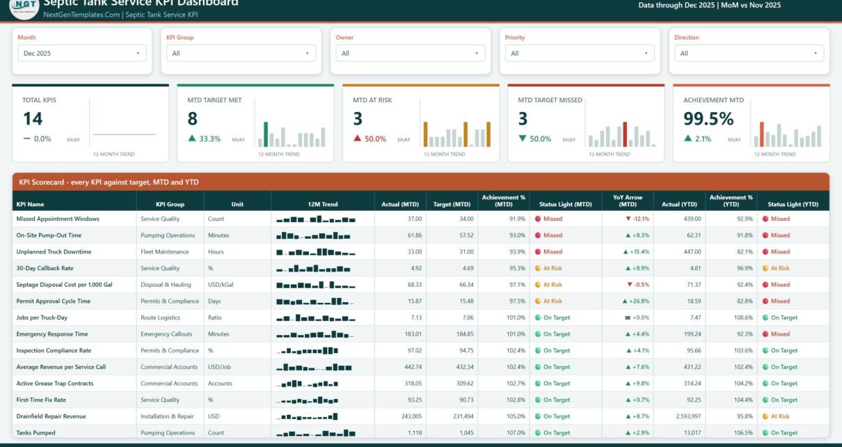
A septic company already knows its numbers. Tanks pumped, tipping fees, the callbacks nobody wants to discuss – they exist, somewhere, in a job book or an accounting export. What is usually missing is a single monthly page that says whether each of those numbers beat its target, and who owns it. That is what the Septic Tank Service KPI Dashboard in Power BI does: 14 septic-service KPIs, 9 KPI groups, month-to-date and year-to-date traffic lights on the same row, driven entirely by an Excel data pack you overwrite with your own figures.
This is the KPI Dashboard family – a month picker, a target-versus-actual scorecard, a KPI Trend page and a KPI Definition page. It is not the analytical dashboard line that slices revenue by route or technician, and it is not the lighter KPI Scorecard family. Same trade, three different builds; the walkthrough below should make it obvious which one you actually want.
What the Septic Tank Service KPI Dashboard in Power BI measures
Fourteen KPIs, grouped into nine areas of the business. Seven are higher-is-better (UTB), seven are lower-is-better (LTB), and that distinction is wired into the scoring rather than left to the reader.
| KPI | Group | Unit | Direction | Owner |
|---|---|---|---|---|
| Tanks Pumped | Pumping Operations | Count | Higher is better | Field Operations Manager |
| Septage Disposal Cost per 1,000 Gal | Disposal & Hauling | USD/kGal | Lower is better | Disposal Coordinator |
| On-Site Pump-Out Time | Pumping Operations | Minutes | Lower is better | Field Operations Manager |
| Emergency Response Time | Emergency Callouts | Minutes | Lower is better | Dispatch Supervisor |
| First-Time Fix Rate | Service Quality | % | Higher is better | Service Quality Lead |
| Missed Appointment Windows | Service Quality | Count | Lower is better | Dispatch Supervisor |
| 30-Day Callback Rate | Service Quality | % | Lower is better | Service Quality Lead |
| Drainfield Repair Revenue | Installation & Repair | USD | Higher is better | Installation Manager |
| Average Revenue per Service Call | Commercial Accounts | USD/Job | Higher is better | Commercial Manager |
| Active Grease Trap Contracts | Commercial Accounts | Accounts | Higher is better | Commercial Manager |
| Jobs per Truck-Day | Route Logistics | Ratio | Higher is better | Route Planner |
| Unplanned Truck Downtime | Fleet Maintenance | Hours | Lower is better | Fleet Supervisor |
| Permit Approval Cycle Time | Permits & Compliance | Days | Lower is better | Compliance Officer |
| Inspection Compliance Rate | Permits & Compliance | % | Higher is better | Compliance Officer |
Four of them are flagged Critical in the shipped sample – Tanks Pumped, Emergency Response Time, Drainfield Repair Revenue and Unplanned Truck Downtime – seven are High and three are Medium. Owner and priority are ordinary spreadsheet columns, so you can rewrite them to match your own org chart.
How direction-aware scoring works
This is the part most home-made septic scorecards get wrong. If you divide actual by target for every KPI, then a month where your septage disposal cost came in under budget scores below 100% and shows red, which is nonsense. The Septic Tank Service KPI Dashboard in Power BI scores each KPI according to its direction:
- Higher is better (UTB): Achievement % = Actual / Target.
- Lower is better (LTB): Achievement % = Target / Actual.
In the shipped December 2025 sample, Emergency Response Time came in at 183.01 minutes against a 184.85-minute target and scores 101.0%, On Target – because faster is better. Septage Disposal Cost per 1,000 Gal came in at $68.33 against a $66.34 target and scores 97.1%, At Risk – because $2 over budget on every thousand gallons is not a win. The bands are the same for every KPI: On Target at 100% or more, At Risk from 95% up to 100%, Missed below 95%.
Page 1: the KPI Scorecard
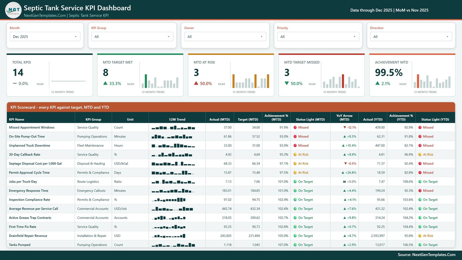
Five slicers sit across the top – Month, KPI Group, Owner, Priority and Direction. The Month slicer is single-select, and it drives everything below it. Under the slicers, five summary cards: Total KPIs, MTD Target Met, MTD At Risk, MTD Target Missed and Achievement MTD, each with its own 12-month trend bar and a month-on-month delta. In the December 2025 sample they read 14 / 8 / 3 / 3 / 99.5% – and the three counts add up to the fourteen, which is the first thing worth checking on any scorecard.
Then the table itself: KPI Name, KPI Group, Unit, a 12-month sparkline, Actual (MTD), Target (MTD), Achievement % (MTD), Status Light (MTD), YoY Arrow (MTD), Actual (YTD), Achievement % (YTD) and Status Light (YTD). Rows sort worst-first by achievement, so the conversation starts where it should.
Two rows in the sample show exactly why you want both horizons on one line:
- Emergency Response Time – On Target for December at 101.0%, but Missed for the year at 92.3% (199.24 minutes against a 183.80 target). One good month does not fix a bad year.
- Drainfield Repair Revenue – On Target for December at 105.0% ($243,005 against $231,494), but At Risk for the year at 95.8% ($2,593,997 against a $2,706,703 target). The biggest-ticket line in the business is quietly behind.
One honest note about the YoY Arrow column. The arrow is a plain movement indicator and it is not direction-aware: it prints green and points up whenever the number rose, red and down whenever it fell, whichever way is better for that KPI. In the sample, Unplanned Truck Downtime carries a green up arrow at +15.4% even though more downtime is worse, and Missed Appointment Windows carries a red down arrow at -12.1% even though fewer misses is better. Read the Status Light columns for good-or-bad; read the arrow only as “up or down against last year”.
Page 2: KPI Trend
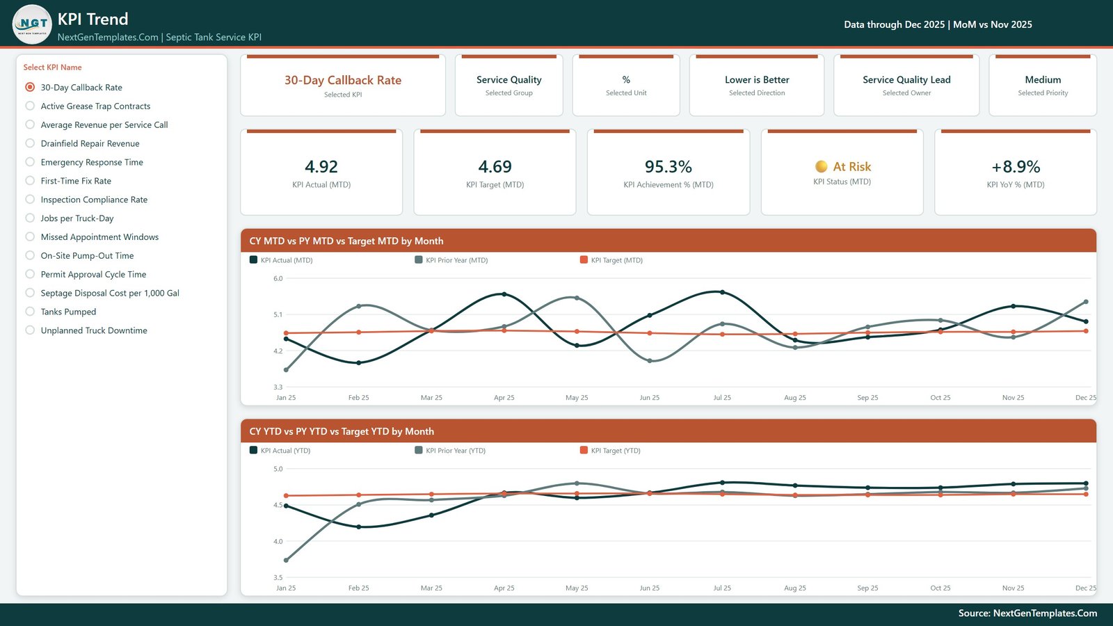
A “Select KPI Name” list runs down the left with all fourteen KPIs on it. Pick one and six context cards name it: the KPI, its group, its unit, its direction, its owner and its priority. Below those sit five value cards – KPI Actual (MTD), KPI Target (MTD), KPI Achievement % (MTD), KPI Status (MTD) and KPI YoY % (MTD) – and two line charts, CY MTD vs PY MTD vs Target MTD by Month and CY YTD vs PY YTD vs Target YTD by Month. Three lines on each: this year, last year and target.
The prior-year line is real history, not a projection. The data pack carries 24 months of actuals – January 2024 through December 2025 – so every PY line and YoY figure comes from typed numbers.
Page 3: KPI Definition
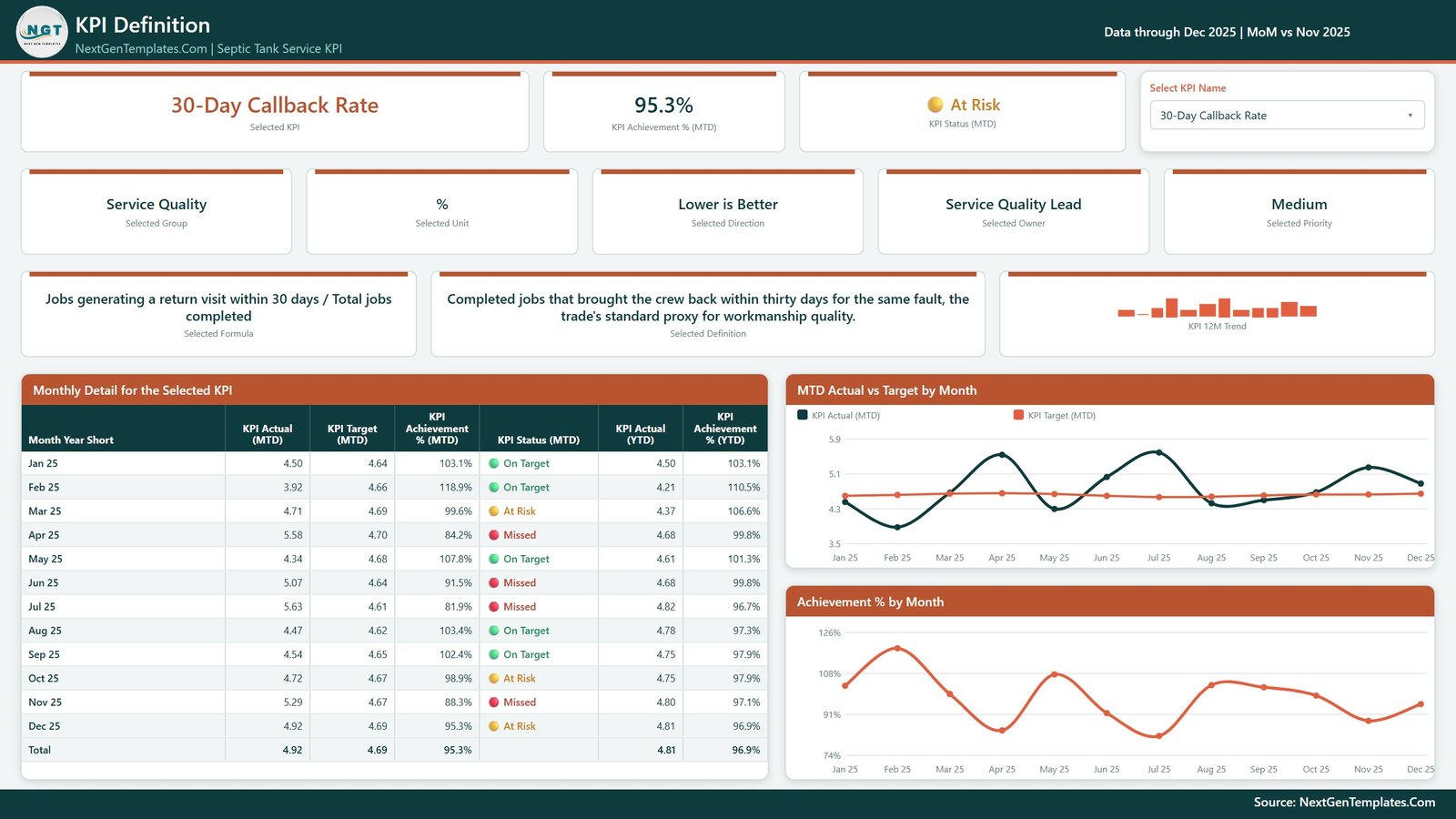
Same KPI selection, this time as a dropdown, and the page answers the question that derails most KPI meetings: how is this actually calculated? Pick 30-Day Callback Rate and the Selected Formula card reads “Jobs generating a return visit within 30 days / Total jobs completed”, with the written definition beside it – “completed jobs that brought the crew back within thirty days for the same fault, the trade’s standard proxy for workmanship quality”.
Below that sits Monthly Detail for the Selected KPI: twelve rows, one per month, with Actual (MTD), Target (MTD), Achievement % (MTD), the status light, Actual (YTD) and Achievement % (YTD). Two charts finish the page – MTD Actual vs Target by Month and Achievement % by Month. It is the page you screenshot into a review pack.
There is no drill-through in this build. Worth stating plainly, because builds in this family vary. You reach KPI Definition from the page tabs, and its KPI selector is synced with the KPI Trend page’s selector, so whatever you picked is already applied when you switch. Two further pages exist as 280×360 hover tooltips and are hidden in view mode – those are the only hidden pages.
Page 4: Get More Templates
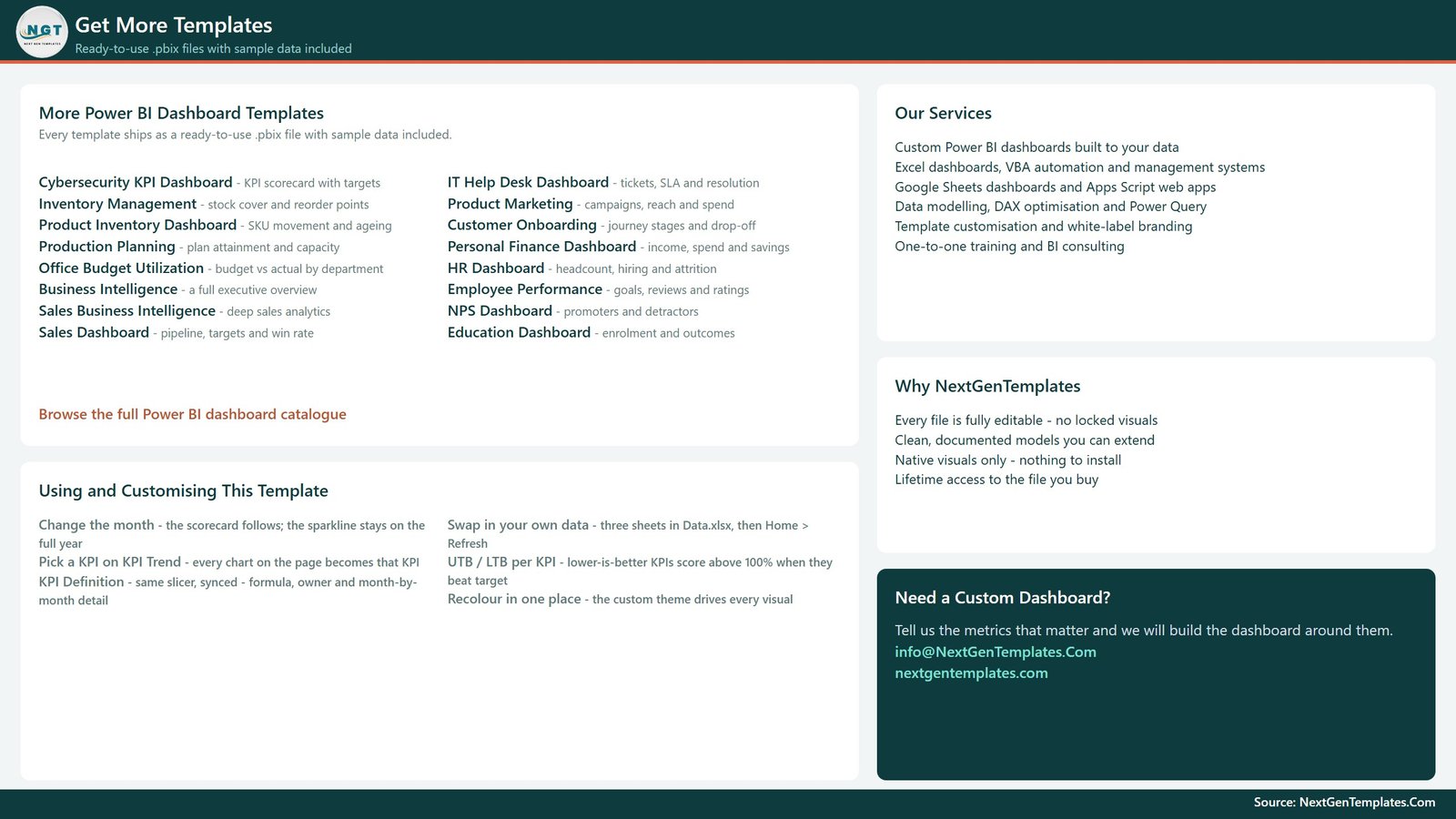
The fourth page is a reference and upsell page: other NextGenTemplates Power BI dashboards, a short “Using and Customising This Template” panel and our contact details. It is not a report page and we would rather say so than pad the page count.
The data pack, and swapping in your own numbers
The download is one ZIP with three files: the .pbix, Data.xlsx and a Power BI Dashboard user manual PDF. Keep them in one folder. Data.xlsx has four sheets:
- Read Me – the rules, including the one people get wrong most often (see below).
- KPI Definition – one row per KPI: group, name, unit, formula, written definition, Type (UTB or LTB), owner, priority.
- Input_ Target – one row per KPI per month for the reporting year, MTD and YTD.
- Input_ Actual – the same, for the reporting year and the year before it.
Nothing in the report hard-codes a KPI. The KPI Name is the join key across all three sheets, so you can add a KPI, delete one, or rename one in all three places, press Home > Refresh, and the counts, the scorecard, the selector list and every chart follow.
The YTD rule from the Read Me. For anything additive – money, gallons, counts – the YTD figure adds up from January. For a rate, a ratio, a Days figure or an index, YTD is the average of the months so far, never a sum. A compliance percentage that reaches 1,900% by December is the classic KPI-pack mistake, and it makes every YTD chart useless.
One setup step you cannot skip. The Power Query source path saved in the file is the folder the report was built in, so your first refresh will fail until you repoint it: Home > Transform data > Data source settings > Change Source, then select your copy of Data.xlsx.
What it does not do
Being clear about this saves everybody time. The Septic Tank Service KPI Dashboard in Power BI is a monthly, company-level reporting layer. It is not dispatch, scheduling or routing software. It does not connect to ServiceTitan, Jobber, Housecall Pro, QuickBooks, Xero, Sage, or any GPS or telematics platform – there is no API, no gateway and no scheduled refresh against a live source. It is not a septage manifest, hauler-licence or permit management system, it does not perform EPA, state or county regulatory reporting, and it does not handle DOT or FMCSA fleet compliance. Permit Approval Cycle Time and Inspection Compliance Rate are figures you type in, however you calculate them. And there are no benchmarks anywhere in the file: every number shipped, including all fourteen targets, is sample data to be replaced.
Per-job, per-route and per-technician drill-down is also out of scope – jobs, routes and technicians are not dimensions in the model. If that is what you need, an analytical dashboard is the right shape, not a KPI scorecard.
Which edition should you buy?
The same septic KPI Dashboard exists on three platforms, and a lighter Scorecard family exists alongside it:
- Power BI – this one. Best if you already have Power BI Desktop, want the sparkline-in-row scorecard and the two-chart trend page, and are happy to refresh from a spreadsheet.
- Google Sheets – the Septic Tank Service KPI Dashboard in Google Sheets, live now, for teams that work in the browser and want to share a link.
- Excel – the Septic Tank Service KPI Dashboard in Excel, prepared alongside this one.
- KPI Scorecard family – a lighter single-file build with its own shorter KPI list, live in Excel and Google Sheets. Close in name, different in build – I wrote it up separately in Septic Tank Service KPI Scorecard in Excel.
Frequently asked questions
Do I need a paid Power BI licence?
No. Power BI Desktop is free from Microsoft and opens, edits and refreshes the file. It is Windows-only. A Pro or Premium seat matters only if you want to publish the report to the Power BI Service and share it with colleagues.
Can I change the KPIs?
Yes – add, delete or rename them in the three sheets and refresh. Nothing is hard-coded. The KPI Name is the join key, so a rename must happen in KPI Definition, Input_ Target and Input_ Actual together.
Is there a drill-through page?
No. KPI Definition is reached from the page tabs and its selector is synced with KPI Trend. The only hidden pages are two 280×360 tooltip pages that appear on hover.
Are the sample numbers real septic-industry data?
No. Every figure is realistic sample data, including all fourteen targets. There is no benchmark set and no external data source behind any number.
What exactly is in the download?
One ZIP: the .pbix report, Data.xlsx and a Power BI Dashboard user manual PDF. One payment, lifetime access to the file.
More Power BI KPI dashboards on this blog
The same scorecard build is published for several neighbouring trades, each with its own KPI list. If you run more than one service line, these are worth a look:
- Plumbing Business KPI Dashboard in Power BI – the closest neighbour, truck-and-technician economics.
- HVAC Contractor KPI Dashboard in Power BI – seasonal callouts and maintenance contracts.
- Electrical Contractor KPI Dashboard in Power BI – the other licensed trade on the same build.
- Roofing Contractor KPI Dashboard in Power BI – project-weighted rather than route-weighted.
Get the Septic Tank Service KPI Dashboard in Power BI
Fourteen septic-service KPIs, scored against target for the month and the year, with a named owner on every row. $12.99 (regular $19.99), one payment, lifetime access to the file, no subscription.
Download the Septic Tank Service KPI Dashboard in Power BI on NextGenTemplates