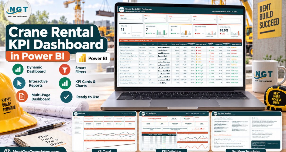
The Crane Rental KPI Dashboard in Power BI scores 13 KPIs across 7 KPI groups on four report pages, backed by two hidden tooltip pages and five slicers. Every KPI carries its own direction flag, so six higher-is-better metrics score Actual divided by Target and seven lower-is-better metrics score Target divided by Actual. A full 2025 sample year and a 2024 prior year ship inside the data pack, so the report opens populated and you can see exactly how it behaves before you type a single number of your own.
Most crane hire companies already know their numbers; they just keep them in five places. Utilisation lives in the fleet planner’s spreadsheet, mobilisation times in the dispatch log, breakdown hours in the workshop diary, rate discounts in the sales team’s quotes and debtor days in the accounts system. Nothing scores any of it against a target, so nobody can say whether last month was good. This report pulls that into one monthly view where every metric has a target, an achievement percentage and a red, amber or green light.
Key Features of the Crane Rental KPI Dashboard in Power BI
This is a KPI scorecard report from our Power BI KPI dashboard family, not one of our analytical Power BI dashboards. It answers “did we hit target this month, and are we better or worse than last year” rather than slicing hire-contract data, and that focus is what makes it usable in a monthly management meeting.
- 13 crane-hire KPIs. Crane Rental Revenue, Revenue per Crane, Days Sales Outstanding, Rental Rate Realisation %, Quote-to-Order Win Rate %, Time Utilisation %, Mobilisation Lead Time, Lift Plan Turnaround, Unplanned Downtime Hours, Maintenance Cost per Engine Hour, PM Schedule Compliance %, Lift Incidents per 100k Crane Hours and Operator Overtime %.
- Seven KPI groups. Financial, Commercial, Fleet, Operations, Maintenance, Safety and People, so the KPI Group slicer can narrow the scorecard to one function.
- Direction-aware achievement. Seven of the thirteen KPIs are lower-is-better. Lift Incidents per 100k Crane Hours at 4.30 against a 4.93 target scores 114.7%, exactly as it should.
- Documented status bands. On Target at 100% or more, At Risk from 95% to 100%, Missed below 95%. The same bands drive the header counts and both status-light columns.
- A YoY % that reads the right way round. For lower-is-better KPIs a fall is shown as a positive improvement, so green always means better than last year and red always means worse. Checked against the data pack on every KPI in the shipped file.
- MTD and YTD in one row. The scorecard table carries actual, target, achievement % and a status light for the selected month, then actual, achievement % and status for the year to date.
- Owner and priority built into the model. The shipped KPIs are assigned to 10 named roles at three priority levels, and both are slicers.
Dashboard Pages Explanation
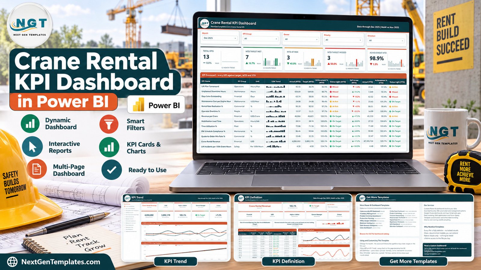
The .pbix holds six pages: four you navigate to and two hidden tooltip pages, KPI Detail and Trend Detail, that appear when you hover a visual.
Page 1: KPI Scorecard
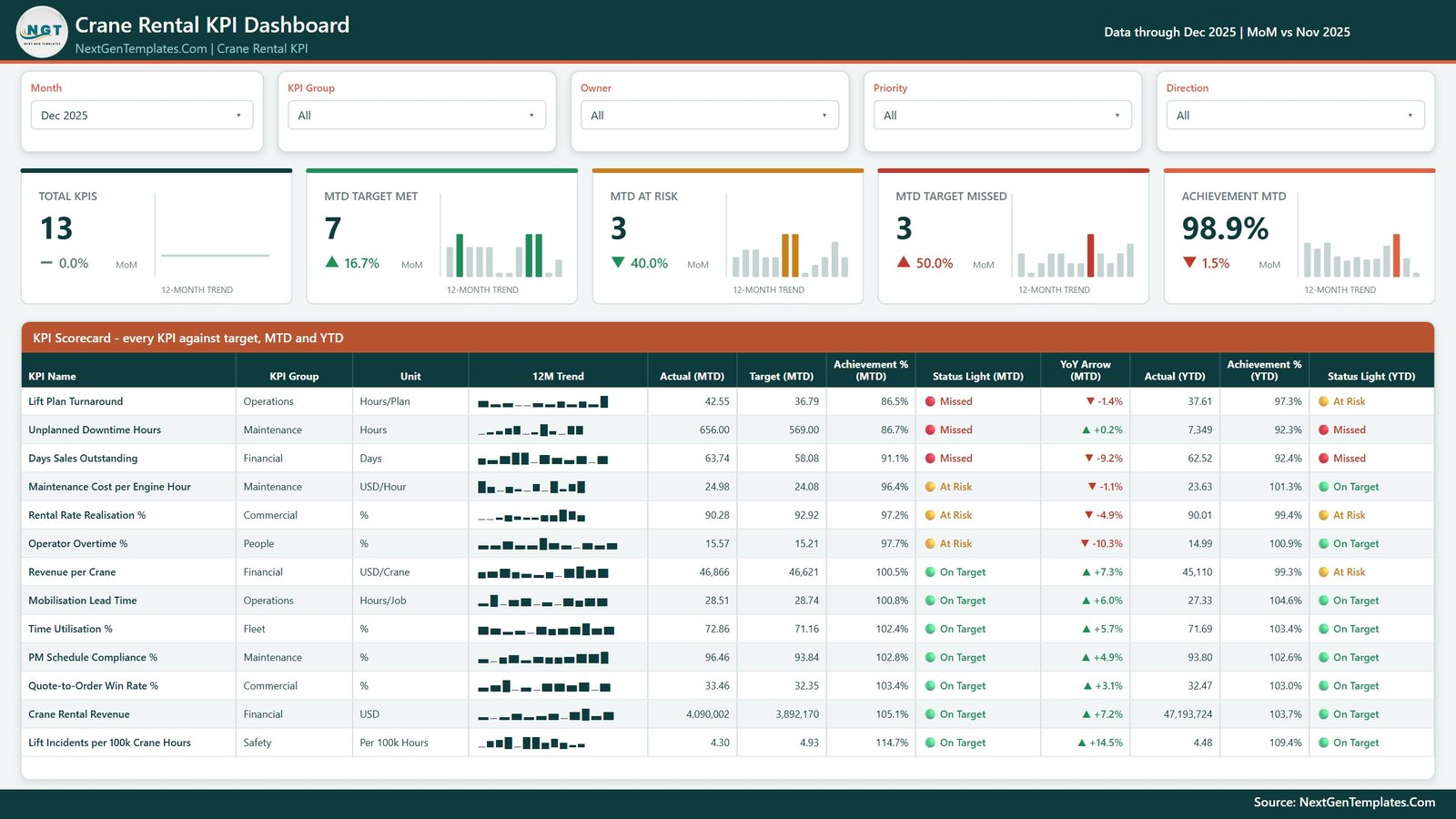
The month view and the page you will live on. Five slicers (Month, KPI Group, Owner, Priority and Direction) sit above five header cards: Total KPIs, MTD Target Met, MTD At Risk, MTD Target Missed and Achievement MTD, each with a month-over-month change and a 12-month trend bar. Below them, a 13-row table gives every KPI its group, unit, sparkline, MTD actual, target, achievement %, status light and YoY arrow, then YTD actual, achievement % and status light.
In the shipped December 2025 sample the split is 7 On Target, 3 At Risk and 3 Missed, at 98.9% Achievement MTD. The misses are Lift Plan Turnaround (42.55 hours against a 36.79-hour target, 86.5%), Unplanned Downtime Hours (656 against 569, 86.7%) and Days Sales Outstanding (63.74 days against 58.08, 91.1%). Crane Rental Revenue reached 47,193,724 for the year, 103.7% of its YTD target.
Page 2: KPI Trend
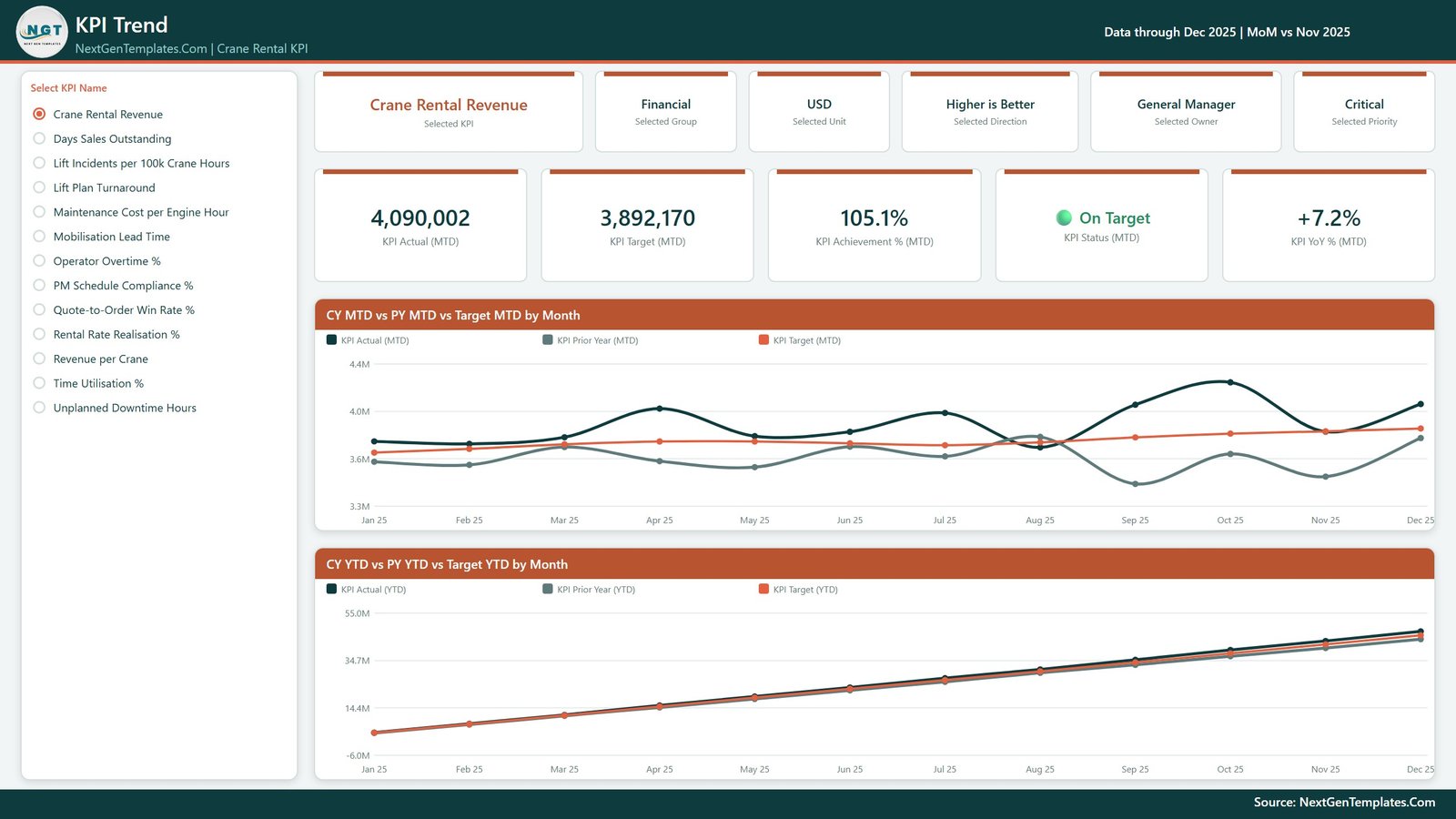
Choose one KPI from the list on the left and the entire page reshapes around it. Six context cards restate the KPI name, group, unit, direction, owner and priority; five value cards give MTD actual, target, achievement %, status and YoY %. Two charts follow: CY MTD vs PY MTD vs Target MTD by Month, and CY YTD vs PY YTD vs Target YTD by Month. For Crane Rental Revenue, owned by the General Manager, it reads 4,090,002 against a 3,892,170 target, 105.1% and On Target, with a +7.2% YoY showing it beat December 2024.
Page 3: KPI Definition
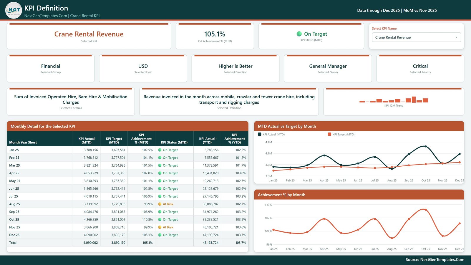
The same KPI, explained rather than charted. Cards show the formula (Sum of Invoiced Operated Hire, Bare Hire & Mobilisation Charges for the example KPI), the plain-English definition, group, unit, direction, owner, priority and a 12-month trend. Underneath, a Monthly Detail for the Selected KPI table lists actual, target, achievement % and status for January to December with a total, alongside MTD Actual vs Target by Month and Achievement % by Month charts. October 2025 is the strongest revenue month at 110.8%, while August and November sit just under target and show At Risk.
Page 4: Get More Templates
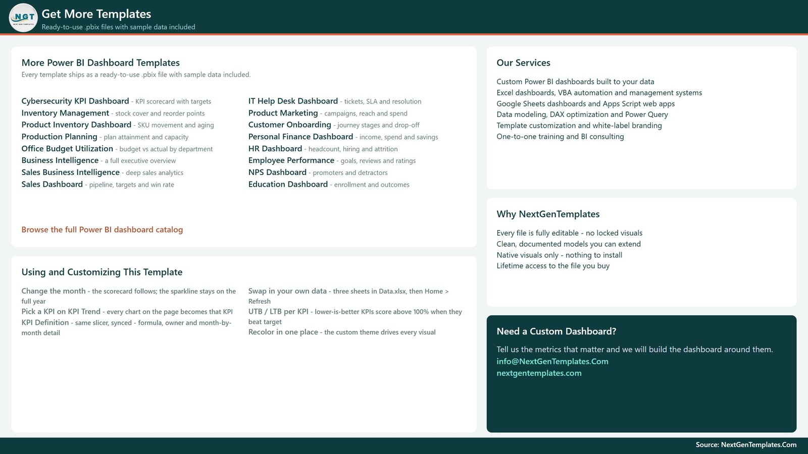
A catalogue and help page rather than a data page. It lists other Power BI dashboards from the same library, our services, and a Using and Customizing This Template panel covering the month picker, the KPI Trend selection, swapping in your own data, how UTB and LTB KPIs are scored and the single place to change the colour theme.
The data pack
Data.xlsx ships alongside the report with four sheets. Read Me explains the model. Input_ Target holds 156 rows, one per KPI per month. Input_ Actual holds 312 rows covering both 2025 and 2024, and that prior year is what every PY and YoY figure reads from. KPI Definition holds each KPI’s group, unit, formula, definition, UTB or LTB type, owner and priority. The download ZIP also includes a Power BI dashboard user manual PDF.
Power BI KPI Dashboard vs. Tableau or Qlik vs. Rental Management Software – Feature Comparison
| Feature | This Power BI KPI Dashboard | Tableau / Qlik | Rental management software |
|---|---|---|---|
| Cost | $12.99 one-time ✅ | $70-115 / user / month | Quote-based subscription |
| Platform | Power BI Desktop (free) ✅ | Paid desktop plus server | Vendor cloud or server |
| Setup time | Under 10 minutes ✅ | Days of modelling | Weeks of implementation |
| KPI targets and RAG bands built in | Yes, 13 KPIs pre-scored ✅ | Build it yourself | Reports fixed to their schema |
| Lower-is-better metrics scored correctly | Yes, per-KPI UTB/LTB flag ✅ | Manual calculated field | Varies |
| Add or rename a KPI | Edit a spreadsheet row ✅ | Edit the workbook | Vendor-controlled fields |
| Prior-year comparison out of the box | Yes, CY vs PY vs Target ✅ | Build it yourself | Varies by plan |
| Bookings, dispatch and hire invoicing | No, reporting only | No | Yes ✅ |
| Year-1 cost at 5 users | $12.99 ✅ | $4,200-6,900 | Recurring, several thousand dollars |
For a crane hire company that wants a scored, target-driven monthly KPI pack without a per-seat BI bill or a software migration, this Power BI KPI dashboard sits in the sweet spot.
Who Should Use This Template
Perfect for:
- Owners and general managers of crane hire companies running mobile, crawler or tower cranes on operated or bare hire
- Fleet, dispatch and workshop managers who already record utilisation, mobilisation times and breakdown hours and want them scored monthly against a target
- Finance and sales leads reporting rate realisation, win rate and debtor days upward to an owner or board
- Power BI users who would rather adapt a finished, well-modelled KPI report than start from an empty canvas
Not a fit if:
- You need bookings, dispatch boards, hire contracts or invoicing; this is a reporting layer, not a rental management system
- You want live telematics or a connector to your rental ERP; the source is an Excel workbook you maintain
- You are looking for lifting operations or safety-compliance software; it produces no lift plans, load charts, inspection records or operator training records and makes no regulatory claim
- You want industry benchmarks; every target in the file is one you set yourself, and the sample figures are fictional
Real-World Use Cases
Daniel owns a crane hire company with a mixed fleet of mobile and crawler cranes. On the first Monday of each month he opens the scorecard, filters Priority to Critical, and finds Unplanned Downtime Hours Missed while Crane Rental Revenue is still On Target. That pairing tells him breakdowns are eating available fleet days before revenue shows it, so he books a review with the workshop manager.
Priya is the credit manager. Before the month-end finance meeting she picks Credit Manager in the Owner slicer, which leaves Days Sales Outstanding on screen. It is running at 63.74 days against a 58.08-day target and is 9.2% worse than a year earlier, a specific number she can take into the conversation about account terms with slow-paying contractors.
Tom runs dispatch. He works from the KPI Trend page, flipping between Mobilisation Lead Time and Time Utilisation %. The CY vs PY chart shows mobilisation is faster than last year at 28.51 hours per job and utilisation is up to 72.86%, so he can show the operations meeting that the improvement has held for months, not just one good week.
Advantages of the Crane Rental KPI Dashboard in Power BI
It removes the argument about what “good” means. Every KPI has a target, an achievement percentage and a band. A 97.2% on Rental Rate Realisation % is At Risk, not “fine”, and everybody in the room reads it the same way.
It respects the direction of a metric. Plenty of home-made scorecards divide actual by target for everything, which quietly rewards rising downtime and slower mobilisation. The per-KPI UTB or LTB flag means the seven lower-is-better metrics score correctly, and the YoY % follows the same rule.
It costs $12.99 once. Five seats of a mainstream BI tool runs to several thousand dollars in year one. This is a one-time purchase of a file you own, opened by free software.
It is genuinely editable. Nothing in the report hard-codes a KPI name. Add a row to the KPI Definition sheet with matching target and actual rows, press Refresh, and the counts, the scorecard, the KPI list and every chart pick it up.
Opportunities for Improvement
A few things are worth knowing before you buy, all observed in the shipped file.
YTD values are typed, not calculated. Input_ Target and Input_ Actual each carry an MTD and a YTD column that you fill in. The Read Me is clear that money and counts should add up from January while rates and days should be averaged, but the report trusts what you enter. A YTD percentage summed by mistake will show a nonsense achievement figure.
The hover detail lives on hidden pages. KPI Detail and Trend Detail are tooltip pages hidden in view mode. They work as intended, but anyone editing the report needs to unhide them in Power BI Desktop to restyle them, and there is no right-click drillthrough page.
It is monthly, company-level reporting. There is no crane, depot, customer or contract dimension, so you cannot filter to a single crane or a single job. Companies that need that detail should keep it in their rental software and feed only the monthly totals here.
The YTD trend chart’s axis starts below zero. On the KPI Trend page the CY YTD vs PY YTD vs Target YTD chart uses an automatic axis that can open at a negative value for revenue. It is cosmetic, and fixing the axis minimum at zero in the format pane takes a minute.
Best Practices
- Keep the .pbix and Data.xlsx in the same folder. If you move them, re-point the source once through Home > Transform data > Data source settings > Change Source.
- Load the prior year into Input_ Actual on day one. Every PY and YoY figure reads from it, and without it the trend pages lose half their value.
- Keep YTD honest: a running total for revenue and downtime hours, an average of the months so far for utilisation, win rate, debtor days and incident rates.
- Set the UTB or LTB flag before you set targets. It decides how the KPI is scored, and getting it wrong inverts the status light.
- Assign an owner to every KPI. The Owner slicer is what turns one report into a set of per-manager views for fleet, workshop, dispatch and finance.
- Start with the thirteen shipped KPIs for a quarter before adding your own. Most companies find thirteen is already more than they review properly.
Explore Relevant Templates
Excel and Google Sheets editions of this crane rental KPI dashboard are in preparation. Available now for the same trade is the Crane Rental KPI Scorecard in Google Sheets, which belongs to our scorecard line rather than this dashboard line; its full walkthrough is on NeoTechNavigators.
For fleet and machinery analytics on this blog, see our write-ups of the Heavy Machinery Dashboard in Power BI, the Agro Machinery Rental Dashboard in Power BI and the Rental Services Dashboard in Power BI. For other KPI dashboards built on exactly the same model, read about the Elevator Maintenance KPI Dashboard in Power BI and the Concrete Contractor KPI Dashboard in Power BI.
On the store, the Equipment Rental Business KPI Scorecard in Google Sheets covers general plant and tool hire, and the Paving Contractor KPI Dashboard in Power BI scores another construction trade.
Frequently Asked Questions
What KPIs does the Crane Rental KPI Dashboard in Power BI track?
It tracks 13 KPIs in 7 groups, from Crane Rental Revenue, Revenue per Crane and Rental Rate Realisation % to Time Utilisation %, Mobilisation Lead Time, Unplanned Downtime Hours, Maintenance Cost per Engine Hour and Operator Overtime %. Each has a formula, a definition, an owner and a priority in the data pack.
How long does setup take?
Under 10 minutes if your monthly actuals and targets already exist somewhere. Unzip the download, open the .pbix in Power BI Desktop, replace the rows in Data.xlsx with your own and press Refresh. Deciding your targets takes longer than configuring the file.
Do I need a paid Power BI licence?
No. Power BI Desktop is free from Microsoft and will open, refresh, filter and print this report. A Power BI Pro licence is only required if you want to publish to the Power BI Service and share the report with colleagues online.
Can I add my own KPIs?
Yes. The report hard-codes no KPI name. Add a row to the KPI Definition sheet, add its monthly target and actual rows, then press Refresh. The header counts, scorecard, KPI list and every chart update automatically, and deleting a KPI works the same way in reverse.
How does this compare to rental management software?
Rental management platforms are subscriptions that handle bookings, dispatch, hire contracts and invoicing. This template is a $12.99 one-time reporting layer that scores the monthly numbers you already have. If you need to run hires, buy a platform; if you need to know whether last month hit target, use this.
Does it cover lifting safety or regulatory compliance?
No. Lift Incidents per 100k Crane Hours and PM Schedule Compliance % are performance counts you enter yourself, not inspection, certification or incident records. Nothing in the file plans lifts, checks load charts or verifies operator competence. Keep those in the systems your regulator and insurer expect.
Where does the sample data come from?
It is fictional sample data covering January to December 2025 plus a full 2024 prior year, not real figures from any company. It exists so the report opens populated and you can see how each visual behaves. Replace it with your own numbers and refresh.
About the Author
Built by PK – Microsoft Certified Professional with 15+ years of Excel, Google Sheets and Power BI experience. Founder of NextGenTemplates, reaching 300K+ subscribers across YouTube channels. Every template is hand-built and tested before release. For deeper Power BI reading, Microsoft’s own Power BI documentation on Microsoft Learn is the best free reference available.
Conclusion
A crane hire business rarely struggles because nobody counted the hires. It struggles slowly, because rate discounts crept up a point a quarter and breakdown hours rose a few at a time, and nothing scored either against a target until the margin had gone. This report turns that into a monthly discipline: thirteen metrics, thirteen targets, three colours and a prior year to compare against.
👉 Click here to Purchase the Crane Rental KPI Dashboard in Power BI
Instant download · One-time payment · No subscription · Lifetime access
🎥 For step-by-step video tutorials, visit Youtube.com/@PKAnExcelExpert
Last updated: September 2026